Icons are everywhere—on mobile apps, websites, dashboards, and devices. They’re small, but they do big things. Icons help us find a menu, delete a file, or save something for later. Designers love them for good reason: they’re stylish, space-saving, and often universal. But here’s the question—are they really accessible to everyone?
It’s easy to focus on how icons look, but what about how they function for people using screen readers, people with low vision, or anyone who relies on keyboard navigation? In this article, we’ll take a closer look at the benefits and challenges of using icons, the common accessibility mistakes, and the steps designers and developers can take to create accessible icons that improve user experience without sacrificing style.
Why Icons Matter (Beyond Aesthetics)
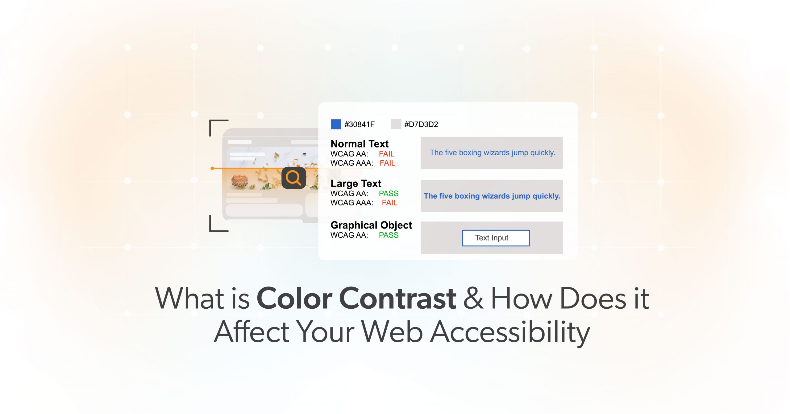
Well-designed icons help users make sense of content faster. According to research aligned with WCAG guidance, familiar icons can support users with reading or cognitive challenges by serving as helpful visual cues. A simple “trash can” icon can quickly signal delete. A “magnifying glass” screams search. When paired with labels, these accessible icons create a faster and clearer experience for all users.
Saving Space on Smaller Screens
Icons also shine when space is tight—especially on mobile. Instead of cramming menus or actions into text links, icons can simplify the interface and reduce visual clutter. When used thoughtfully, accessible icons help you keep things clean while making the site easier to use.
Common Accessibility Challenges with Icons
Ambiguity: One Icon, Many Meanings
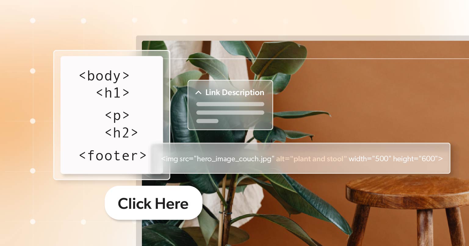
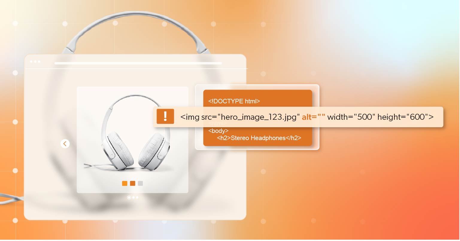
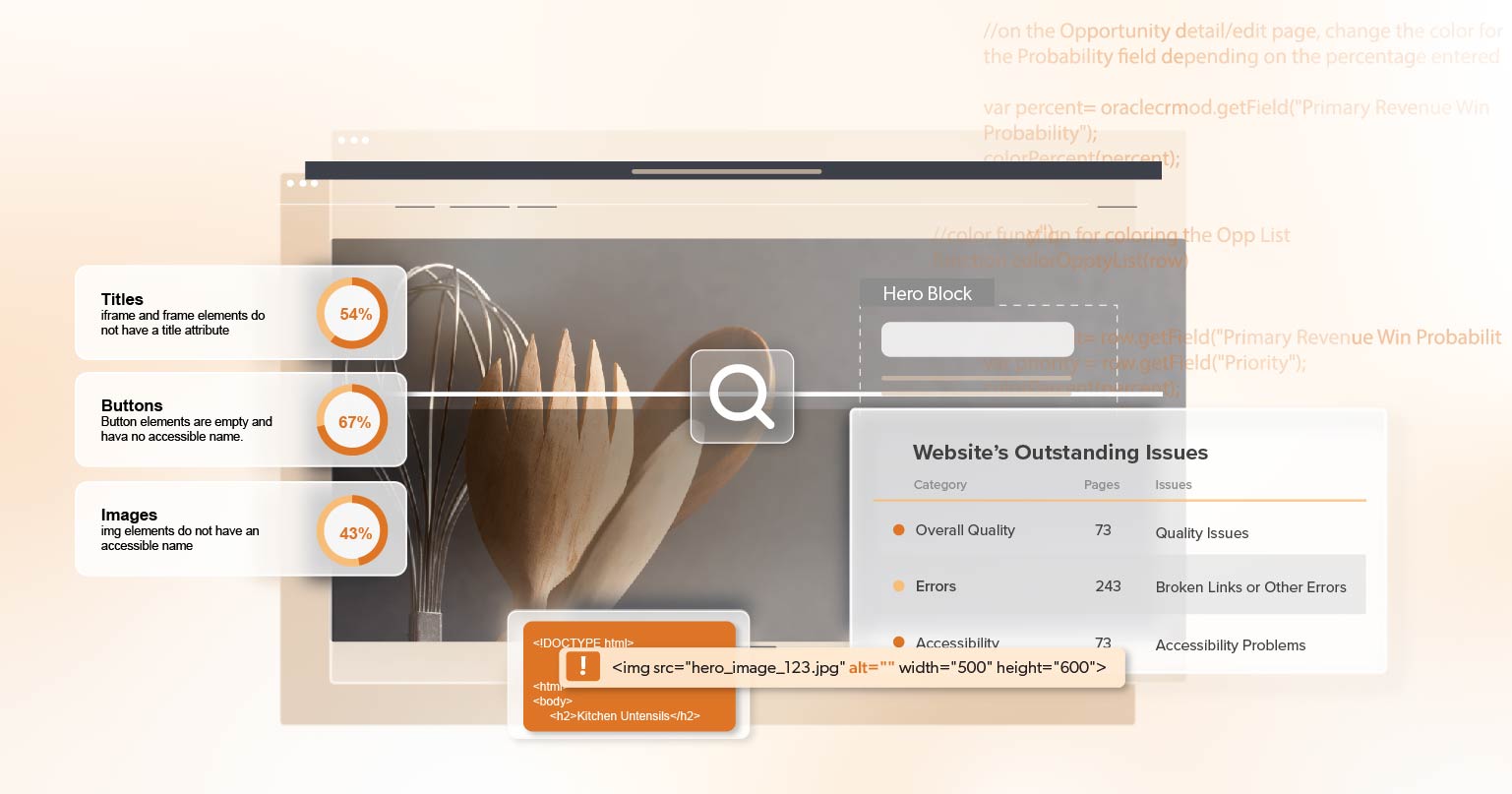
Icons aren’t always as clear as we think. A heart icon might mean “like,” “save,” or “favorite.” Without proper labeling, users may misinterpret its purpose. WCAG requires that all non-text elements, including icons, have text alternatives that clearly explain what they do. Accessible icons must carry meaning that’s clear—both visually and programmatically.
Decorative Icons That Get in the Way
Not every icon needs to be “read.” Some are purely decorative—like flourishes in a logo or background design. But if these aren’t properly hidden from screen readers, they add clutter and confusion. WCAG recommends using aria-hidden= "true" or similar methods to hide decorative icons. That way, screen reader users don’t have to sift through unnecessary details.
Size, Contrast, and Clickability
Icons that are too small or faint are hard to see or click—especially for users with motor or vision challenges. WCAG suggests a touch target size of at least 44×44 pixels. Icons should also meet contrast guidelines (at least a 3:1 ratio against the background). And if someone’s using a keyboard to navigate, your icons must have clear focus indicators and be easy to tab to.
Best Practices for Creating Accessible Icons
1. Label Every Interactive Icon
Icons that do something—like opening a menu or submitting a form—need a clear label. You can add a visible text label, a hidden <span> for screen readers, or an aria-label attribute. For example:
<button aria-label= "Open menu">
  <svg aria-hidden="true" width="24" height="24" role="img">
    <!-- SVG path here -->
  </svg>
</button>
This makes sure your accessible icons work for both sighted and non-sighted users.
2. Hide Decorative Icons Properly
If an icon doesn’t add meaning, it shouldn’t be read by assistive technology. Use:
<span aria-hidden="true">
  <svg><!-- Decorative SVG --></svg>
</span>
Or:
<svg role="presentation"><!-- Decorative SVG --></svg>This keeps screen reader output clean and focused on relevant content.
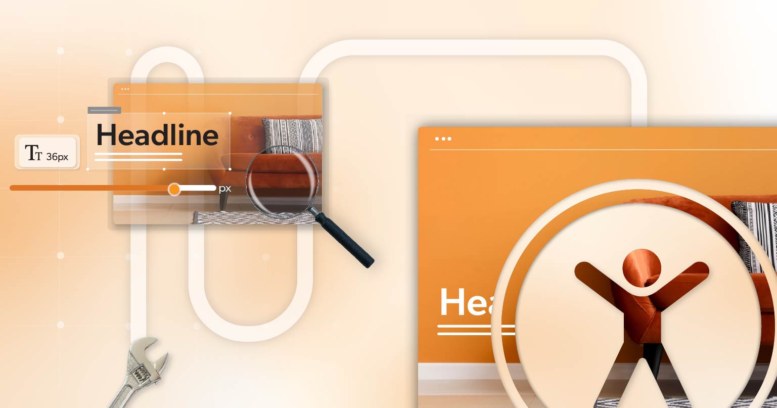
3. Pay Attention to Size, Contrast, and Focus
Accessible icons should be big enough to click easily and bold enough to see. Stick to WCAG’s minimum target size of 44×44 px. Use color contrast of at least 3:1 for non-text icons. And don’t forget to add a visible focus style for keyboard users—like a border or shadow:
button:focus {
  outline: 2px solid #000;
  outline-offset: 2px;
}
4. Stay Consistent
Use the same icon for the same action across your site. If a magnifying glass opens search in one place, don’t use it for zoom somewhere else. Consistency helps users feel confident in what each icon means—and that’s what accessible icons are all about.
5. Avoid Icon Fonts and Emojis
While they may seem handy, icon fonts can confuse screen readers. Emojis can also be read out in unexpected ways. It’s safer and more predictable to use SVG icons with proper labels.
6. Test in the Real World
Use tools like Lighthouse, or WAVE to catch basic issues. Then test manually: try navigating with a keyboard, check screen reader output, and validate that your icons have the right labels and focus states. Real-world testing is essential to making sure your accessible icons actually work.
A Closer Look: Two Icon Examples
The Right Way to Do a Menu Icon
Let’s say you’re building a mobile menu. Instead of just throwing in a hamburger icon, here’s how to make it accessible:
<button aria-label= "Open menu">
  <svg aria-hidden="true" width="24" height="24">
    <!-- Hamburger icon SVG path -->
  </svg>
</button>
With proper labeling, contrast, sizing, and keyboard focus styles, this is a perfect example of accessible icons done right.
Clarifying a Heart Icon
Got a heart icon to save a product? Don’t leave users guessing. Add supporting text:
<button aria-label= "Save to favorites">
  <svg aria-hidden="true" width="24" height="24">
    <!-- Heart icon path -->
  </svg>
</button>
This helps screen readers speak the correct action and helps all users understand what it does.
Looking Ahead: The Future of Icon Accessibility
Think Global
Icons don’t always mean the same thing across cultures. Something that makes sense in the U.S. may not be clear in Japan or Brazil. When designing accessible icons, test with a global audience if your site serves one.
Customize and Personalize
If you’re creating custom icons for your brand, take extra care with labeling and testing. Better yet, offer users the ability to switch between icons, text, or both—especially for key actions. It’s all about giving people choices that fit their needs.
Final Thoughts: Make Icons That Include Everyone
Icons are powerful little tools. They help us move faster, understand more, and make the web a little smoother. But for them to work for everyone, they need to be designed with care.
That means using accessible icons that have clear labels, hiding decorative ones, following size and contrast rules, being consistent, and testing thoroughly. These steps don’t take away from good design—they enhance it.
At 216digital, we work with design and development teams to review their UI patterns and create accessible experiences—icons included. If you’re ready to take the next step in making your digital spaces more inclusive, let’s talk. Schedule your ADA accessibility briefing today and let us help you turn thoughtful design into inclusive action.