
• Accessible Navigation Design Patterns: 2026 Best Practices for WCAG Conformance

    Accessible Navigation Design Patterns: 2026 Best Practices for WCAG Conformance

    In the first half of 2025, more than 2,000 website accessibility lawsuits were filed, marking a 37% increase from the previous year. This surge in litigation highlights a critical reality for modern enterprises: the very gateway to your digital experience is often your greatest liability. When organizations implement overly complex accessible navigation design patterns, they frequently introduce technical debt that triggers ADA demand letters and alienates users with disabilities. Maintaining a sophisticated site structure doesn’t have to mean compromising on conformance or inviting legal risk.

    Key Takeaways

    • Identify why navigation menus are frequently cited in ADA demand letters and how they serve as the foundational roadmap for users relying on assistive technologies.
    • Compare the technical merits of the Disclosure pattern against the ARIA Menubar to select the most stable accessible navigation design patterns for your specific site architecture.
    • Implement critical technical requirements, including robust keyboard support and visible focus management, to ensure your interface remains navigable for all users.
    • Evaluate your information architecture depth to optimize discoverability without introducing unnecessary technical debt or compliance gaps.
    • Move beyond static remediation by establishing a framework for ongoing monitoring that protects your WCAG 2.2 conformance as your digital presence expands.

    Table of Contents

    • Why Navigation is the Foundation of ADA Compliance
    • Core Accessible Navigation Design Patterns: Examples and Use Cases
    • Choosing the Right Pattern for Your Site Structure
    • Technical Implementation: Beyond the Visual Layout
    • Strategic Remediation: Aligning Design with WCAG 2.2 Standards

    Why Navigation is the Foundation of ADA Compliance

    Navigation is the critical gateway to your digital content. For users relying on screen readers or keyboard-only inputs, the global header serves as their primary roadmap. If this roadmap is broken, the entire site becomes a dead end. This is why Web accessibility standards focus so heavily on structural landmarks. A logical heading structure paired with properly defined navigation landmarks ensures that assistive technology can skip directly to the core information. Without these anchors, users are forced to listen to every menu item on every page load, creating a frustrating experience that often leads to immediate site abandonment.

    The technical requirements for accessible navigation design patterns have become more stringent under WCAG 2.2, which was finalized as a W3C Recommendation on October 5, 2023. Design teams must now account for specific success criteria like “Focus Appearance” and “Target Size (Minimum).” These standards require that interactive elements, such as menu links, have a minimum footprint of 24 by 24 CSS pixels. This change prevents “fat-finger” errors for mobile users and assists those with motor impairments. Compliance also demands that the focus indicator has sufficient contrast against its background, ensuring that keyboard users never lose their place within a complex menu structure.

    The Legal High Stakes of Navigation Design

    Automated scanners used by plaintiffs’ firms can identify navigation barriers in seconds. Because the global header appears on every page, a single coding error in the menu is multiplied across the entire domain. This makes menus “low-hanging fruit” for accessibility-related litigation. Common citations in ADA demand letters often center on “keyboard traps,” where a user can enter a dropdown menu but cannot exit it using only the “Tab” or “Esc” keys. With the DOJ’s Title II deadlines approaching on April 26, 2027, for larger public entities, the pressure to align with standard-aligned design has never been higher. This is why “Phase 1” risk mitigation always prioritizes the global header. Correcting these high-visibility errors provides an immediate shield against the most common technical triggers for litigation.

    Defining Accessible Navigation Patterns

    Core Accessible Navigation Design Patterns: Examples and Use Cases

    Selecting the correct structural framework for your site’s header is a strategic decision that impacts both user retention and legal safety. While many developers reach for the most complex ARIA attributes available, the most effective accessible navigation design patterns prioritize simplicity and native browser behavior. By choosing patterns that align with user expectations, you reduce the risk of creating “keyboard traps” that often trigger ADA litigation. Understanding the distinction between these patterns allows you to build a site that is both aesthetically pleasing and fully compliant with WCAG 2.2 standards. To help you build time-sensitive and innovative digital products from the ground up, you can visit Kanda Software to explore their full-service development capabilities.

    The Disclosure Pattern: Simple and Robust

    The Disclosure pattern is currently the gold standard for modern web design. It relies on a straightforward mechanism: a <button> element that toggles the visibility of a nested list. This pattern is exceptionally compatible with mobile devices and screen readers because it doesn’t rely on complex keyboard instructions. For a standard B2B services menu with three sub-items, the button clearly announces its “expanded” or “collapsed” state to assistive technology. This provides the user with immediate clarity regarding the menu’s behavior. Unlike hover-based menus, the Disclosure pattern requires an intentional click or tap, which aligns with the needs of users with motor impairments or those using touch interfaces.

    The ARIA Menubar: Proceed with Caution

    The ARIA Menubar pattern is designed to mimic the functionality of desktop applications, such as Microsoft Word or Excel. While it offers powerful keyboard shortcuts, like using arrow keys to move between items, it’s often a poor fit for standard websites. Most web users expect to navigate using the “Tab” key, not arrow keys. Implementing a Menubar pattern can actually confuse visitors who aren’t familiar with its specific requirements. Unless you are building a highly complex web application, we generally recommend avoiding this pattern in favor of more intuitive Disclosure models. Aligning your site with these standards often requires professional accessibility consultation and training to ensure your development team avoids these common implementation pitfalls.

    Mega Menus: Handling Complexity Concurrently

    For eCommerce sites or large organizations, mega menus are often necessary to display high-density information. To keep these accessible, you must utilize internal landmarks within the overlay. This allows screen reader users to jump between categories without tabbing through every individual link. For complex, multi-stage user journeys, a step by step navigation pattern can also be integrated to provide the necessary structure for intricate processes. A critical requirement for any mega menu is the “Esc” key functionality. A user must be able to dismiss a large overlay instantly to return to the main content. Without this escape route, large menus can become digital cages for keyboard-only users, significantly increasing your liability risk.

    Vertical and Sidenav Patterns

    Choosing the Right Pattern for Your Site Structure

    Many stakeholders are still guided by the “three-click” myth, which is the outdated belief that every page must be reachable within three clicks. In reality, users with disabilities prioritize clarity and predictability over click counts. A five-click journey with clear labels and logical focus management is far superior to a crowded, three-click mega menu that overwhelms a screen reader. Following W3C’s Navigation Design Principles ensures that you’re building on a foundation of established usability rather than chasing visual trends. Custom, “creative” navigation often lacks the standardized ARIA roles required for compliance, making it a primary target for automated audits and demand letters.

    Small to Medium Sites: The Case for Flat Navigation

    For sites with limited pages, the most protective strategy is to avoid dropdowns entirely. Flat navigation reduces code complexity and eliminates the risk of keyboard traps in sub-menus. This approach also yields significant benefits for SEO and mobile usability by presenting a clear, crawlable hierarchy. You can see how this applies to specific industries in our guide on ADA compliance for retail websites, where streamlined categories often lead to higher conversion rates and lower legal risk. If you’re just getting started with compliance, completing an accessibility audit for small business is an essential first step to identify navigation barriers before they attract legal scrutiny. By keeping the DOM simple, you ensure that assistive technologies can process your roadmap without error.

    Enterprise and eCommerce: Managing the Mega Menu

    Accessible Navigation Design Patterns: 2026 Best Practices for WCAG Conformance

    Technical Implementation: Beyond the Visual Layout

    Keyboard support is the non-negotiable bedrock of digital conformance. Every interactive element within your navigation must be reachable via the “Tab” key and dismissible via the “Esc” key. Focus management is equally critical; hiding the “focus ring” to satisfy a specific brand aesthetic is a direct violation of WCAG 2.2 standards. Regulators expect focus indicators to be highly visible and have sufficient contrast against their background. If a keyboard user cannot see where they are on the page, the navigation is fundamentally broken. Mobile responsiveness adds another layer of complexity, as the ubiquitous “hamburger” menu often lacks the proper labels and focus traps required for screen reader users. Equipping your engineering team with digital accessibility training for developers is one of the most effective ways to ensure these technical standards are consistently applied across every deployment.

    To ensure your site meets these rigorous technical requirements, consider our professional WCAG & Section 508 Conformance services to audit and remediate your existing code structure.

    The Keyboard-First Workflow

    Building a compliant menu starts with a rigorous testing protocol that ignores the mouse entirely. You should follow a logical sequence to verify your implementation:

    • Step 1: Confirm all menu items, including nested sub-links, are reachable in a logical tab order.
    • Step 2: Implement “Skip to Main Content” links at the top of the DOM to allow users to bypass repetitive navigation blocks.
    • Step 3: Verify that submenus close immediately when the keyboard focus leaves the group or when the “Esc” key is pressed.

    Screen Reader UX: Semantic HTML over ARIA

    There’s a common misconception that more ARIA attributes equal better accessibility. In reality, the “No ARIA is better than bad ARIA” rule remains the industry standard. Native semantic HTML elements like <ul> and <li> provide more innate structure to screen readers than a complex web of custom roles. When you do use ARIA, stick to essential states like aria-expanded to signal the status of a toggle and aria-controls to link a button to its target container. You should avoid “automatic” hover-opening menus because they’re unpredictable for screen reader users and often lead to focus loss. Instead, provide clear “active state” feedback so visitors always know their current location within your site’s hierarchy.

    Strategic Remediation: Aligning Design with WCAG 2.2 Standards

    Remediation is not a finish line; it’s a continuous state of vigilance. For high-growth organizations, digital interfaces are constantly evolving as new product categories, service lines, and marketing initiatives are launched. One-time fixes for accessible navigation design patterns often fail because they don’t account for this dynamic nature. When a developer adds a new submenu without the proper ARIA attributes, or a content manager introduces a deeply nested category that breaks the tab order, your previous compliance efforts are instantly neutralized. This “compliance drift” is one of the most common reasons businesses receive ADA demand letters even after undergoing a professional audit.

    To maintain a defensible position, you must integrate accessibility into the earliest stages of your UX wireframing phase. Waiting until the development cycle is nearly complete to address navigation barriers is a costly mistake that leads to rushed, fragile code. Manual testing remains a non-negotiable component of this process. While automated tools are excellent for catching syntax errors, they cannot replicate the lived experience of a user navigating a complex mega menu with a screen reader. Strategic remediation requires a blend of expert oversight and robust technical standards to ensure your roadmap remains clear for every visitor. Pairing this oversight with structured digital accessibility training for developers transforms compliance from a reactive chore into a permanent feature of your development lifecycle.

    Continuous Monitoring with a11y.Radar

    The most effective way to prevent regression is through a11y.Radar Ongoing Monitoring. This system provides a protective layer over your site, catching broken attributes and navigation barriers in real-time before they can be identified by external scanners. As your site scales, maintaining accessible navigation design patterns becomes increasingly complex. Our ADA web accessibility compliance services are designed to provide this continuous oversight, ensuring that every update to your global header remains aligned with WCAG 2.2 standards. By receiving automated alerts the moment a navigation element fails, your team can correct issues immediately, significantly reducing your long-term legal risk.

    The Path to Conformance

    Your journey toward a compliant digital presence should begin with a comprehensive WCAG 2.2 audit. This initial assessment identifies current navigation blockers and provides a prioritized roadmap for technical remediation. Once the immediate high-risk issues are resolved, the focus shifts to internal empowerment. Training your design and development teams on the “Disclosure” pattern ensures that future site expansions are built on a foundation of conformance. This proactive stewardship transforms accessibility from a reactive chore into a strategic advantage that supports business growth. Just as you might discover Cascade Outdoor Services to ensure the structural integrity of your physical property, securing your site’s digital foundation today requires a framework that values integrity, thoroughness, and professional excellence.

    Securing Your Digital Gateway for 2026 and Beyond

    Navigation is the first element regulators and automated scanners evaluate when auditing your site. By prioritizing accessible navigation design patterns, you move beyond reactive patching toward proactive stewardship of your digital presence. We’ve established that the Disclosure model provides a robust shield against common keyboard traps, while semantic HTML ensures your roadmap remains clear for every visitor. Maintaining this level of conformance requires vigilance, especially as your site architecture expands and new categories are introduced.

    Our team of specialists focuses on WCAG 2.2 remediation, bringing deep expertise in BigCommerce and Shopify accessibility to every engagement. We don’t just fix current issues; we provide the tools for long-term stability. Through our proprietary a11y.Radar monitoring platform, we catch broken attributes and navigation barriers before they become legal liabilities, ensuring your site remains a safe and inclusive space for all users.

    Protect your business with professional ADA web accessibility compliance services and ensure your site’s foundation is built for both inclusivity and growth. Your commitment to a better user experience today creates a more resilient and successful business tomorrow.

    Frequently Asked Questions

    What is the most accessible navigation pattern for a small website?

    Flat navigation is the most accessible choice for small sites because it eliminates the risk of hidden sub-menus and keyboard traps. By presenting all primary links directly in the header, you ensure that assistive technologies can map the site architecture without complex interactions. This simplicity reduces technical debt and provides a predictable experience for users with motor or cognitive impairments, making it a highly defensive design strategy.

    Can mega menus ever be truly ADA compliant?

    Yes, mega menus can achieve full ADA compliance if they are built with structural landmarks and robust keyboard support. You must ensure that the “Esc” key instantly dismisses the menu and that the tab order remains logical throughout the expanded overlay. Without these features, large menus become digital cages for keyboard users, which is a primary trigger for legal demand letters in the eCommerce sector.

    Do I need to use ARIA roles for my website navigation?

    You don’t always need complex ARIA roles; semantic HTML is often superior for accessible navigation design patterns. Native elements like <nav>, <ul>, and <li> are automatically recognized by screen readers. You should only introduce ARIA attributes, such as aria-expanded or aria-controls, when native HTML cannot describe the dynamic state of a toggle or menu button.

    How do I make a hamburger menu accessible for mobile users?

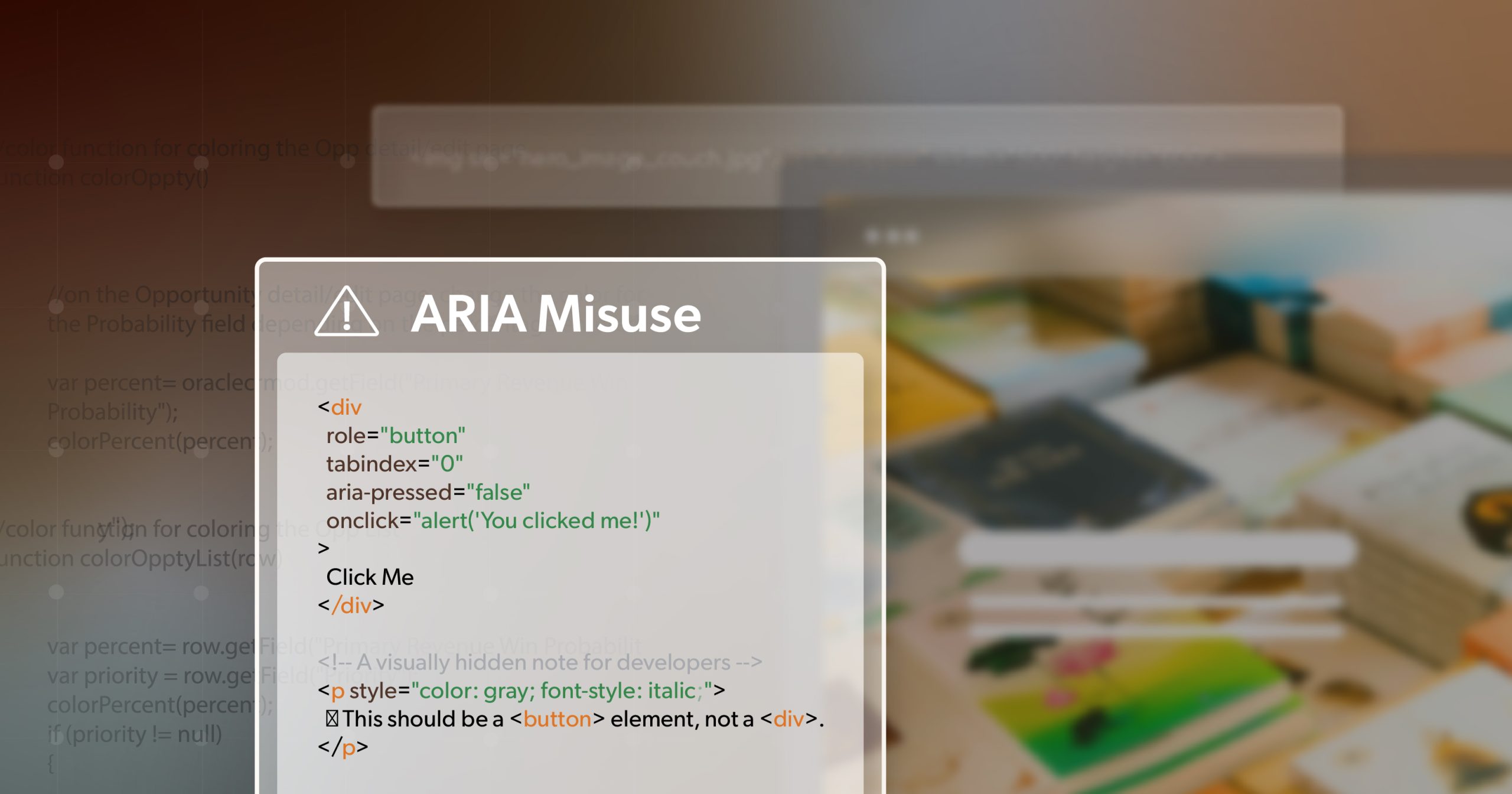
    To make a hamburger menu accessible, you must use a <button> element rather than a generic <div>. The menu trigger needs a clear text label or aria-label to announce its purpose to screen readers. Once the menu is open, you must trap the keyboard focus within the drawer so users don’t accidentally tab into the background content, ensuring a secure mobile experience.

    Should submenus open on hover or on click for accessibility?

    Submenus should always open on click rather than hover to ensure maximum accessibility. Hover interactions are notoriously difficult for screen reader users to track and are impossible to replicate on touch-screen devices. Intent-based click interactions provide clear programmatic feedback to assistive technologies, confirming that a section has expanded and is ready for navigation, which aligns with WCAG 2.2 principles.

    What is the difference between the Disclosure pattern and the Menubar pattern?

    The Disclosure pattern uses simple buttons to toggle the visibility of nested lists, which follows standard web expectations. In contrast, the Menubar pattern mimics desktop software by requiring arrow-key navigation. Because most web visitors expect to use the “Tab” key to move between links, the Menubar pattern often creates confusion and increases the risk of technical non-conformance for typical business websites.

    How does WCAG 2.2 affect website navigation design in 2026?

    WCAG 2.2 introduces stricter requirements for focus appearance and target size that directly impact accessible navigation design patterns. Every interactive menu element must now have a minimum target size of 24 by 24 CSS pixels to accommodate users with limited mobility. Additionally, the focus indicator must have high visual contrast, ensuring that keyboard users never lose their place within your site’s global header.

    Why is keyboard focus management so important for navigation?

    Keyboard focus management is essential because it provides the visual cursor for users who don’t use a mouse. If the focus ring is hidden or has low contrast, these users cannot determine which menu item they are about to activate. This lack of clarity is a fundamental barrier to navigation and remains one of the most common technical failures cited in web accessibility litigation today.

    SEO Team

    July 3, 2026
    Web Accessibility Remediation
    ADA Compliance, ARIA, Disclosure Pattern, keyboard accessibility, Navigation Design, UX Design, WCAG, Web Accessibility
  • Why ARIA Links Break More Often Than You Think

    Links are supposed to be the easy part. You write a few words, wrap them in an , and move on.

    But ARIA links have a way of turning “easy” into “why is this broken in Safari” surprisingly fast. Not because ARIA is bad, and not because links are fragile. It usually happens when we start doing clever things to link text. We hide it. We replace it. We split it into tiny pieces for styling. Then we assume every tool people use will still understand the link the same way.

    That assumption is where the trouble starts.

    The focus here is understanding why ARIA links break across browsers, what the testing uncovered, and how small markup choices can ripple out into very real barriers for users.

    How ARIA Links Get Their Accessible Name

    A link needs a name. That name is what tools use to announce it, list it, or make it usable.

    In the best case, the name is just the visible text inside the link. Simple, reliable, and supported everywhere.

    When we start building ARIA links, we often change that name in one of two ways. We override it with aria-label, or we hide the visible text (often with aria-hidden) and hope ARIA will fill the gap.

    Here’s the catch. Screen readers look at the accessibility tree, where ARIA is meant to live. But many browser-native features do not behave like screen readers. Some look at rendered text instead. Some use a simplified “reading view” model. Some apply their own rules to decide what counts as readable content.

    So an ARIA label can be “correct” in the accessibility tree, yet still get ignored by other tools that your users rely on.

    ARIA Link Patterns That Break Across Browsers

    In the original write-up, the author tried a bunch of versions of the same link, including multilingual cases. Three patterns kept causing breakage.

    ARIA Links and aria-label on Visible Text

    This is a common move. It can happen on purpose, like when someone wants a “cleaner” name, or by accident, like when a component always injects an aria-label.

    In the tests, browser speech tools did not treat that aria-label as the link’s name. Edge Read Aloud did not announce the aria-label value for any link. Chrome reader mode text-to-speech did not announce the aria-label value for any link. Safari’s Speech feature did not announce the aria-label value for any link.

    So you end up with ARIA links that may sound fine in a screen reader, but feel unlabeled in browser read-aloud tools. That’s a big deal because a lot of people use read-aloud features without ever touching a screen reader.

    There’s another issue too. In the tests, the aria-label values were intentionally different from the visible label so it was easy to spot. That mismatch causes a known WCAG barrier (SC 2.5.3 Label in Name), but the practical problem is even simpler. Users hear one thing and see another. That erodes trust fast.

    ARIA Links and aria-hidden Inside Links

    This one looks harmless until it isn’t.

    aria-hidden="true" removes content from the accessibility tree. If the text inside your link is hidden, then for many tools, the label is effectively gone.

    In the tests, Chrome Reader Mode visually hid every link with aria-hidden. Firefox Reader Mode visually hid every link with aria-hidden. Edge Read Aloud did not announce links with aria-hidden, regardless of other attributes. Chrome reader mode text-to-speech did not announce links with aria-hidden, regardless of other attributes.

    So now your ARIA links can disappear from reader views, or get skipped by speech features, even though they still look clickable on the standard page.

    There was also a more subtle interaction issue. When the tester highlighted aria-hidden links, Chrome and Edge wouldn’t let them link to the highlighted text, though that behavior shifted once more content was added. Either way, it’s a reminder that hiding text changes more than announcements. It changes how pages behave.

    ARIA Links With Split Text Spans

    This is the “design made me do it” pattern. It’s often used for animations, hover effects, or custom typography.

    The tests showed it can create a surprising amount of fallout. Text split into letter spans did not auto-translate. Firefox Reader Mode styled span-split links as white instead of blue or purple. Safari Speech jumped past most of the page when it hit span-split text. After that jump, Safari announced subsequent links with the wrong link text, including pulling Korean text for English links. Safari Speech did not announce the span-separated letters and also did not announce the visible word those letters formed.

    So you can end up with a link that looks fine, but breaks translation, looks unclickable in reader view, and causes speech tools to lose their place.

    That last part is especially rough. When a speech feature starts skipping content or mislabeling later links, the whole page becomes harder to trust. Users can’t just “work around” that.

    Cross-Browser Results for ARIA Links

    One of the best takeaways from the cross-browser checks is this: these are not edge-case bugs in one browser. Each browser failed in its own way.

    Chrome and Edge

    • Reader mode and text-to-speech ignored aria-label on links.
    • Reader mode hid links when aria-hidden was involved.
    • Some selection and “link to highlight” behavior broke around aria-hidden content.

    Firefox

    • Reader view hid aria-hidden links.
    • Span-split links lost normal link styling and showed up as white text.

    Safari

    • Speech skipped content after span-split links.
    • It then announced later links with the wrong label, sometimes in the wrong language.
    • It ignored aria-label values for link naming.

    If your testing only includes one browser and one screen reader, it’s easy to miss all of this. The links will “work” in the sense that you can click them. But they won’t work the same way for people who browse differently.

    Why ARIA Links Break in Reader Mode and Speech

    ARIA labels live in the accessibility tree. Many browser reading tools do not rely on that tree the way screen readers do. Instead, they often prioritize what they can extract from rendered text or from a simplified reading model.

    On top of that, aria-hidden removes content from the tree, and some tools treat that as “remove from reading,” not merely “ignore for screen readers.” When the visible label is hidden, those tools are left with less content to work with, and the link can become empty or disappear.

    Per-letter spans create a different kind of problem. They turn a word into fragments, and many tools don’t rebuild those fragments into a single word reliably. Translation and reading modes are especially sensitive here because they’re trying to extract coherent content, not just replay the DOM.

    So the link is still a link, but its label becomes unstable. It might be visible but not readable to speech. It might be readable in one mode but missing in another. It might translate in one browser but not another.

    That inconsistency is the barrier.

    What Broken ARIA Links Feel Like for Users

    When ARIA links fail this way, users don’t experience it as “ARIA isn’t supported.” They experience it as missing information, broken reading flow, or a page that feels unreliable.

    Reader Mode can show a page that looks mostly right, but key links are missing. Read-aloud can skip links or move through them without saying their names. Translation can work for paragraphs while navigation or call-to-action links remain untranslated. Links can lose their visual cues in reading view and look like plain text, which makes people hesitate to click.

    Speech tools can be the most disruptive. When they jump around, skip content, or start announcing the wrong link text, users lose confidence in the whole page. Even basic tasks like highlighting and sharing text can become awkward when the words inside the link aren’t treated as real text.

    None of this requires a screen reader. These are everyday tools. Plenty of users lean on them for fatigue, focus, dyslexia support, language support, low vision support, or just convenience.

    Safer Patterns for ARIA Links

    You don’t have to give up design. You just need to be careful about what you do to the actual link label.

    Keep a real text label in the link. If your link has visible text, keep it as real text inside the <a>. That’s the most stable way to get a consistent accessible name across tools.

    Use aria-label only when there is no visible text. Icon-only links are the right case for this. If text exists, it should usually carry the name.

    Avoid aria-hidden on link labels. If an icon is decorative, hide the icon. Do not hide the words people need.

    Avoid splitting words into separate spans. If you want animation, animate the container, an underline, a background, or a pseudo-element. Keep the word intact.

    If you inherit a design system that already does this, treat it like a compatibility issue and add guardrails. Make sure there’s still a readable text node somewhere that tools can use. Keep the visible label aligned with the computed name. Test in Reader Mode and speech features, not only in screen readers.

    Quick Tests for ARIA Links

    A few fast checks can reveal the same problems that showed up in the browser experiments. These don’t take long, but they make it clear whether your link text holds up beyond a screen reader.

    • Open Chrome Reader Mode and confirm the links still appear, still look like links, and keep the right text.
    • Use Edge Read Aloud and listen for link names. Watch for links that go silent.
    • Try Firefox Reader View and make sure the links keep normal styling instead of turning into plain text.
    • Use Safari Speech and watch for skipped sections or incorrect labels on later links.
    • Translate the page and see whether link text is translated as a full word instead of letter fragments.
    • Highlight link text and check that selection behaves normally across the whole label.
    • Inspect the accessibility tree to confirm the computed name matches what’s visible.
    • Finish with a screen reader pass as a second layer instead of the only one.

    If a link pattern fails any of these, it’s a sign your ARIA links are doing too much.

    Sanity-Check Your ARIA Links

    If your links have been “mostly fine” in screen reader checks but still feel weird in Reader Mode or read-aloud, you’re not alone. That’s exactly why these patterns are sneaky. They don’t break the click. They break the label, the reading flow, and the trust people build as they move through a page.

    The upside is you don’t need a big rebuild to clean this up. Start with one or two link components that get used everywhere. Keep the visible text intact. Be careful with aria-label when text is already on screen. Don’t hide the label with aria-hidden. Avoid splitting words into lots of spans. Then run the quick checks again. When it’s fixed, you’ll hear it right away.

    At 216digital, we help teams pressure-test link patterns in the same places users feel these failures. Reader modes, speech tools, translation, selection, and yes, screen readers too. If your components rely on ARIA links or stylized link labels, schedule an ADA Strategy Briefing. We’ll help you tighten the markup so links stay predictable across the tools and browsers your users actually use.
    Greg McNeil

    February 12, 2026
    How-to Guides, Web Design & Development
    ARIA, ARIA links, aria-describedby, aria-label, How-to, Web Accessibility, Website Accessibility
  • aria‑selected: Practical Guide for Interactive UI

    Modern web applications thrive on interactivity. Tabs, listboxes, and data grids make complex tasks easier for sighted users—but without proper semantics, those same widgets can shut people out.

    For example, a set of tabs may look visually distinct, but unless screen readers know which tab is currently selected, the component is unusable for blind users. Similarly, keyboard-only users can be stranded if selection isn’t tied to focus and navigation logic.

    That’s where aria-selected comes in. This attribute bridges the gap between visual presentation and assistive technology, ensuring state changes are clearly communicated. In this guide, we’ll cover what aria-selected means, when to use it, real-world code examples, and best practices for building accessible interactions.

    Decoding aria-selected

    According to the WAI-ARIA specification, aria-selected communicates the selection state of an element in a widget. It doesn’t change visuals—it adds semantic meaning to the accessibility tree so assistive tech can interpret the UI correctly.

    Values Explained

    • true → This item is selected.
    • false → This item is selectable but not selected.
    • (Absence) → This item isn’t selectable at all.

    Tip: Roles that support aria-selected include: tab, option, row, gridcell, and treeitem. Use it only where a “selected” state makes sense.

    aria-selected vs. Other Attributes

    It’s easy to confuse aria-selected with other ARIA attributes. Here’s how to know when you’re using the right one:

    AttributePrimary PurposeTypical Components
    aria-selectedIndicates which item is currently chosenTabs, listboxes, grids, tables
    aria-checkedBinary on/off stateCheckboxes, radios
    aria-pressedToggle button active stateToolbar buttons
    aria-currentDenotes user’s current locationNav links, breadcrumbs

    Practical Use Cases & Code

    Tabs

    Tabs are a classic single-select widget. Only one tab can be selected at a time.

    <div role="tablist" aria-label="Profile sections">
      <button id="tab-overview" role="tab" aria-selected="true"
              aria-controls="panel-overview">Overview</button>
      <button id="tab-settings" role="tab" aria-selected="false"
              aria-controls="panel-settings">Settings</button>
    </div>
    
    <div id="panel-overview" role="tabpanel" aria-labelledby="tab-overview">
      <!-- Overview content -->
    </div>
    <div id="panel-settings" role="tabpanel" aria-labelledby="tab-settings" hidden>
      <!-- Settings content -->
    </div>

    Implementation Notes

    • On click, Enter, or Space: update aria-selected, swap focus, and show the panel.
    • Keyboard navigation: Left/Right (or Up/Down for vertical), Home/End for quick jumps.

    Listbox (Multi-Select)

    Listboxes can be single- or multi-select. Here’s a multi-select version:

    <ul role="listbox" aria-label="Choose toppings"
        aria-multiselectable="true" tabindex="0"
        aria-activedescendant="opt-pepperoni">
      <li id="opt-pepperoni" role="option" aria-selected="true">Pepperoni</li>
      <li id="opt-mushroom"  role="option" aria-selected="false">Mushrooms</li>
      <li id="opt-olive"     role="option" aria-selected="false">Olives</li>
    </ul>

    Interaction Details

    • Arrow keys move focus; aria-activedescendant updates to track the active item.
    • Space toggles selection state.
    • Ctrl/Shift + Arrow supports range selection like desktop apps.

    Grids / Spreadsheets

    Grids allow row and cell-level navigation. They’re common in dashboards and spreadsheets.

    <div role="grid" aria-label="Sales records" aria-activedescendant="cell-1-2">
      <div role="row">
        <div role="columnheader" aria-colindex="1">Date</div>
        <div role="columnheader" aria-colindex="2">Sales</div>
      </div>
    
      <div role="row" aria-rowindex="1">
        <div id="cell-1-1" role="gridcell" aria-colindex="1" aria-selected="false">Jan</div>
        <div id="cell-1-2" role="gridcell" aria-colindex="2" aria-selected="true">5 000</div>
      </div>
      <div role="row" aria-rowindex="2">
        <div id="cell-2-1" role="gridcell" aria-colindex="1" aria-selected="false">Feb</div>
        <div id="cell-2-2" role="gridcell" aria-colindex="2" aria-selected="false">4 200</div>
      </div>
    </div>

    JavaScript Must Handle

    • Arrow keys move focus across cells and sync aria-activedescendant.
    • Space/Enter toggles aria-selected.
    • Optional: persist state (e.g., in localStorage) to remember selections.

    Best Practices for aria-selected

    Focus Management

    • In single-select widgets: focus stays inside, arrow keys update selection.
    • In multi-select widgets: focus moves independently, Space/Enter toggles states.
    • Always update aria-activedescendant dynamically.

    Visual Feedback Beyond Color

    • Don’t rely on color alone. Use icons, bold text, or borders.
    • WCAG 2.2 requires at least 3:1 contrast for selected/focus states.

    Keyboard Navigation

    • Tabs: Arrow keys, Home/End, Enter/Space to activate.
    • Listbox/Grid: Arrow keys plus Space/Enter (and Ctrl/Shift combos for multi-select).
    • Optional: Escape to clear selection or exit.

    Testing Your Implementation

    Accessibility doesn’t stop at code—it must be validated.

    • Screen reader testing: NVDA, JAWS, and VoiceOver should announce selection changes correctly.
    • Keyboard walkthroughs: Confirm focus order and selection behavior.
    • Automated checks: Useful for catching missing attributes, but always supplement with manual testing.

    Bonus Patterns

    Once you’re comfortable with the basics, aria-selected can also power:

    • ARIA Trees: File explorer-like navigation.
    • Carousels: Tabs-like controls for slide navigation.
    • Email-style panels: Combining aria-selected with aria-multiselectable for Gmail-style selection logic.

    Build with Inclusion from the Start

    The aria-selected attribute may seem small, but it represents a bigger principle: creating interfaces where everyone can interact equally.

    Accessibility is about thoughtful interaction design, not just compliance checklists. By implementing aria-selected correctly, you close the gap between a slick UI and one that’s truly inclusive.

    Don’t wait until launch—or worse, until a lawsuit—to think about accessibility. Build it in from the beginning, and both your users and your future self will thank you.

    Want clarity on how your site measures up or how to improve implementation? Schedule a private ADA briefing with 216digital and get expert insight on real-world accessibility practices.

    Greg McNeil

    September 29, 2025
    How-to Guides, Uncategorized
    Accessibility, ARIA, aria-selected, web developers, web development, Website Accessibility
  • Why ARIA Alone Won’t Fix Your Website’s Accessibility

    Why ARIA Alone Won’t Fix Your Website’s Accessibility

    ARIA (Accessible Rich Internet Applications) has become a mainstay in modern front-end work, giving us a way to make complex interfaces more usable for people relying on assistive tech. But here’s the catch: despite how widely it’s used now, accessibility issues on the web haven’t actually gone down. In fact, reports like the annual WebAIM Million consistently show that pages using ARIA often rack up more accessibility errors than those that don’t. That’s a red flag—and it raises an important question: if ARIA is meant to improve accessibility, why does more ARIA so often lead to worse outcomes?

    What ARIA Is—and What It’s Supposed to Do

    At its core, ARIA is just a spec for adding semantic meaning where HTML alone doesn’t cut it. When we build custom UI components—think tab lists, modals, or live regions—ARIA roles and attributes tell screen readers what those elements are, how they behave, and when their state changes.

    For example, aria-live lets us announce new content to screen readers without forcing a page reload. aria-label gives an accessible name to elements that don’t have visible text. Using role="tablist" clarifies the relationship between grouped tab controls. When used correctly, these attributes bridge the gap between how something looks visually and how it’s experienced non-visually.

    When Is It Necessary?

    There are valid cases where ARIA is the right tool—like custom widgets that don’t exist in native HTML, dynamic content that needs to be announced, or modal dialogs that require managing focus. In these edge cases, it can give essential context to assistive tech users. The trick is restraint: only reach for ARIA when HTML alone can’t deliver the behavior you need.

    Why It Shouldn’t Be the Default Tool

    The W3C’s first rule of ARIA is dead simple: “Don’t use ARIA if you can use native HTML.” There’s a reason for that. Semantic elements like <button>, <nav>, and <input> come with baked-in keyboard support, focus behavior, and screen reader semantics.

    Replacing these with <div>s or <span>s and trying to patch on ARIA roles is a recipe for trouble. It adds complexity we have to maintain, and it increases the cognitive load on assistive tech users, who now have to deal with custom keyboard logic or missing states that native elements would have handled out of the box.

    Common ARIA Misuse That Breaks Accessibility

    Misusing ARIA is the fastest way to make things worse. Some of the most common mistakes we see:

    • Redundant ARIA: e.g. adding role="button" on a native <button>, which can confuse announcements.
    • Incorrect roles or attributes:  like using aria-checked on something that’s not checkable.
    • Static ARIA states: setting aria-expanded="true" and never updating it when the element collapses.
    • Overriding native behavior : trapping focus or breaking expected tab order.
    • Misused aria-hidden: This one’s especially nasty. It hides content from assistive tech, which is fine for decorative icons or offscreen helper text. But if you throw it on meaningful content like links or form controls, it removes them from the accessibility tree entirely. That creates “empty” focusable elements and violates the rule that aria-hidden="true" must never be on focusable items.

    Take a link that only has an SVG icon with aria-hidden="true". Visually it looks fine, but to a screen reader, it’s just an empty link with no name. Compare that to a native <button> with either visible text or an aria-label—it automatically conveys its purpose. Misusing it like this doesn’t just fail to help; it strips meaning away.

    Why ARIA Usage Correlates with More Errors

    The WebAIM Million keeps showing the same trend: pages with ARIA average almost twice as many detectable errors as those without. That doesn’t mean ARIA is inherently bad—it means it’s often used wrong.

    Here’s why that happens so often:

    • More moving parts: Every ARIA attribute is another thing that has to stay in sync as the UI changes.
    • Misunderstood implementation: Developers sometimes add it without fully understanding how screen readers will interpret it. For instance, putting aria-hidden on a logo or nav link effectively removes it from the experience for assistive tech users.
    • No real testing: There’s a tendency to assume that if ARIA is present, accessibility is solved. Without testing, it’s easy to miss that it’s actually broken.

    The Real Fix: Manual Testing and Developer Discipline

    Automated tools are useful for catching low-hanging fruit like missing alt text, color contrast issues, or syntax errors. But they can’t tell you if your ARIA actually works. They’ll detect if aria-expanded is present—but not if it updates correctly when toggled.

    Same thing with aria-hidden: they’ll warn you that it’s there, but not if you used it correctly. Maybe the hidden element is decorative (fine) or maybe it’s essential (not fine). Only a human can tell. Most ARIA issues are about behavior and context, which tools can’t judge.

    Testing It in the Real World

    To know your ARIA implementation works, you’ve got to test it like real users would:

    • Keyboard-only navigation: Make sure everything interactive is reachable by tab, focus order makes sense, and keys like Enter, Space, and Arrow keys behave as expected.
    • Screen reader testing: Try NVDA on Windows, VoiceOver on macOS, or JAWS if you’re in enterprise. Confirm that roles, labels, and states are being announced correctly—and that hidden content stays hidden without killing important info.
    • User testing: If possible, bring in assistive tech users or trained accessibility testers to see how your UI holds up in practice.

    Doing this builds confidence that your ARIA-enhanced components are actually usable.

    Build a Feedback Loop Into the Dev Process

    Accessibility shouldn’t be a post-launch patch job. Bake it into your development flow. Do accessibility checks during code reviews, QA, and design iterations. When you add ARIA, document the behavior you expect, and get feedback from teammates or AT users to verify it works.

    Practical Guidelines for Responsible ARIA Use

    If you want to use it safely, stick to a few core habits:

    • Follow the WAI-ARIA Authoring Practices (APG): They provide vetted patterns and working code examples.
    • Use ARIA only when you have to: Lean on semantic HTML first, and treat it as a fallback.
    • Test thoroughly:  Validate behavior with keyboard and screen readers, not just automated checkers.
    • Review aria-hidden usage carefully: Only hide decorative or duplicate content. Never hide focusable items, form controls, or nav links.
    • Document your decisions: Leave comments or README notes explaining why it was added and how it’s supposed to work.
    • Make accessibility a team effort: It’s not just the job of one dev or QA engineer. Everyone owns it.

    ARIA Isn’t a Shortcut—It’s a Responsibility

    ARIA is powerful, but it’s not magic. Used carelessly, it creates new barriers and frustrates the very people it’s meant to support. Used deliberately—with a “native first” mindset, real testing, and team buy-in—it can make complex interfaces accessible without breaking usability.

    Respect ARIA’s complexity, but don’t fear it. Real accessibility comes from thoughtful use of semantic HTML, strategic ARIA when it’s actually needed, and consistent real-world testing.

    If you want to level up your accessibility practices and cut risk, 216digital offers ADA briefings built specifically for dev teams. Schedule one today and start building better, more inclusive code.

    Greg McNeil

    September 12, 2025
    How-to Guides, Legal Compliance
    Accessibility, ARIA, keyboard accessibility, WCAG, web developers, web development, Website Accessibility
  • Up and Coming ARIA Implementation

    Web accessibility is always evolving. Keeping up isn’t just beneficial—it’s crucial. Accessible Rich Internet Applications (ARIA) help developers build experiences that are usable by everyone, especially those with disabilities. As web standards advance, new ARIA attributes and roles emerge. Recently, ARIA 1.3 has introduced several notable features developers should start adopting now.

    Many of these are still in what could be called the “infrastructure stage”—they’re well-defined and available, but support across assistive tech and browsers remains inconsistent. That’s precisely why now is the time to pay attention. Understanding emerging ARIA implementation ensures your projects remain inclusive, user-friendly, and future-proof.

    This article explores fresh ARIA implementation options, their current support levels, and how developers can practically integrate them into real-world workflows.

    New and Noteworthy ARIA Attributes

    aria-errormessage

    Effective error messaging can significantly enhance usability. The ARIA implementation of aria-errormessage connects specific error messages to input fields when aria-invalid="true" is active. Unlike aria-describedby, this explicitly identifies the message as an error, and it’s only announced when the field is invalid—streamlining feedback for screen reader users.

    Support: Strong across JAWS, NVDA, and iOS VoiceOver. More limited in other environments.

    Example

    <label for="email">Email:</label>
    <input type="email" id="email" aria-invalid="true" aria-errormessage="emailError">
    <span id="emailError">Please enter a valid email address.</span>

    aria-description

    This attribute supplements existing descriptive labels by offering additional, programmatically available context that isn’t always visible on screen. It’s ideal for providing hints that enhance usability without cluttering the UI. For example, use aria-description="You are here:" to add orientation to breadcrumb navigation.


    Support: Currently handled well by NVDA and iOS VoiceOver; other screen readers may ignore it or misinterpret its purpose.

    Example

    <button aria-label="Download" aria-description="Downloads the current report in PDF format.">Download</button>

    aria-details

    The ARIA implementation of aria-details links an element to rich, supplementary content—replacing the outdated and poorly supported longdesc. It’s perfect for enhancing understanding of charts, data tables, and complex graphics.

    Support: Announced in some screen readers, but there’s currently no direct navigation path from the referenced element to the details content—limiting usability in production environments.

    Example

    <img src="chart.png" alt="Sales Chart" aria-details="chartDetails">
    <div id="chartDetails">
      <p>This chart shows sales data from Q1 to Q4, highlighting growth trends.</p>
    </div>

    aria-keyshortcuts

    Keyboard accessibility remains critical for many users. The ARIA implementation of aria-keyshortcuts lets developers document expected key commands directly in markup, making interfaces easier to learn and navigate via screen readers.

    Important note: This does not create functionality—it simply advertises the shortcut to assistive tech.

    Support: Fairly robust in Chrome and Edge; less so in Firefox and mobile platforms.

    Example

    <button aria-label="Mute" aria-keyshortcuts="Ctrl+M">Mute</button>

    aria-placeholder

    This attribute serves as a screen-reader-friendly version of the native placeholder attribute, particularly useful for custom form controls like div[contenteditable]. Unlike native placeholders, the text won’t be announced after the field is filled, avoiding redundancy.

    Support: Surprisingly consistent across JAWS, NVDA, VoiceOver, and TalkBack.

    Example

    <div contenteditable="true" role="textbox" aria-placeholder="Enter your comment here..."></div>

    Emerging ARIA Roles Enhancing Semantic Meaning

    Editorial and Collaborative Roles

    Roles like role="mark", role="comment", and role="suggestion" provide semantic meaning in collaborative environments—useful in rich text editors, document workflows, and feedback tools.

    • mark: Highlights text.
    • comment: Marks feedback or user-generated discussion.
    • suggestion: Flags proposed edits or changes.

    Support: Varies widely. role="mark" is gaining traction due to its alignment with <mark>. Others are still emerging.

    Example

    <p>The final decision was <span role="suggestion">to postpone the launch</span> until next quarter.</p>

    Technical and Temporal Roles

    New semantic roles such as role="code" and role="time" help describe technical or time-based content when native elements like <code> or <time> aren’t feasible—particularly in component-based frameworks.

    Support: Minimal at present but useful for long-term semantic clarity.

    Example

    <div role="code">const sum = (a, b) => a + b;</div>
    <div role="time" datetime="2025-06-06T13:49:19-04:00">June 6, 2025, 1:49 PM EDT</div>

    role=”image”

    This is functionally equivalent to role="img" but offers a clearer, natural-language alternative. While it doesn’t change behavior, it can improve code readability and naming consistency across projects.

    Example

    <div role="image" aria-label="Company Logo">
      <img src="logo.png" alt="">
    </div>

    Practical Implementation Considerations

    Assessing Support Across Assistive Technologies

    Not every ARIA implementation feature enjoys uniform support. The ecosystem includes screen readers like JAWS, NVDA, VoiceOver, TalkBack, and browsers like Chrome, Edge, Firefox, and Safari. Always test your ARIA implementations across a matrix of platforms and devices. What works well in one may fail silently in another.

    Tested Environments (May 2025)

    • Windows 11: JAWS, NVDA, Narrator
    • macOS Sequoia: VoiceOver
    • iOS 18.4: VoiceOver (Safari)
    • Android 15: TalkBack (Chrome)

    Support varies—stay informed and test often.

    Best Practices for Adoption

    1. Use semantic HTML first. ARIA should enhance—not replace—native elements.
    2. Progressively enhance. Build baseline functionality, then layer in ARIA attributes where they add real value.
    3. Test with real users. Automated tests only go so far. Gather feedback from people who use assistive tech every day.
    4. Implement gracefully. Ensure content degrades without breaking if ARIA features aren’t supported.
    5. Stay proactive. Keep track of ARIA spec updates and screen reader changelogs.

    Conclusion

    Web accessibility isn’t static. Staying ahead of emerging ARIA implementation trends helps developers build experiences that are not just compliant, but genuinely inclusive. Attributes like aria-errormessage, aria-description, and editorial roles like role="comment" signal the future of accessible interaction.

    Many of these features may still be waiting for widespread support—but early adoption by thoughtful developers will shape best practices and standards moving forward.

    To lead with confidence in this evolving space, consider scheduling an ADA briefing with 216digital. Their accessibility experts can help you implement forward-looking ARIA features in a way that’s both robust and user-first—positioning your organization as a leader in inclusive design.

    Greg McNeil

    June 6, 2025
    How-to Guides
    Accessibility, ARIA, How-to, WCAG, WCAG Compliance, web developers, web development
  • ARIA Alert 101: Loud, Clear, and Accessible

    If you’ve built interactive web apps, you know how crucial timely feedback is for a good user experience. But here’s something developers often overlook: what about users who rely on assistive technologies like screen readers? For them, getting real-time notifications isn’t just convenient—it’s essential. That’s exactly why understanding how to use an ARIA alert matters.

    This guide breaks down what ARIA alerts are, how they work, where they shine, and how to implement them correctly—without overwhelming users or creating redundant announcements.

    What Exactly Is an ARIA Alert?

    An ARIA alert is your app’s way of tapping a screen reader user on the shoulder. By using role="alert", you’re signaling that the content inside that element is critical and should be announced immediately—without needing to move focus or interaction.

    Technically, role="alert" behaves the same as setting aria-live="assertive" and aria-atomic="true". That means:

    • The content update will be read aloud right away.
    • The entire updated region will be announced, not just the changed portion.

    Use it when urgency matters—like an error message or a warning about a session timeout.

    How ARIA Alerts Actually Work (And Why They Can Be Tricky)

    For an ARIA alert to trigger, it must announce a change. If you statically load a message with no updates, nothing will happen—even if you’ve assigned role="alert".

    Here’s the trick: the alert container must exist in the DOM when the page loads, and its content must change dynamically. You can do this by:

    • Inserting new text into the container.
    • Revealing text that was previously hidden with CSS (e.g., display: none → display: block).

    A reliable pattern is to preload an empty alert container, then inject or unhide content as needed. This ensures assistive tech is “watching” the region.

    Real-World Scenarios for Using ARIA Alerts

    Let’s look at some common, effective use cases:

    • Form validation: “Oops! Please enter a valid email.”
    • Session timeouts: “You’ll be logged out in 1 minute.”
    • Connection issues: “Unable to save changes—check your connection.”

    Here’s an updated practical implementation using best practices:

    <div role="alert" aria-live="assertive" aria-atomic="true" id="email-alert"></div>
    <form id="contactForm">
      <label for="email">Email:</label>
      <input type="email" id="email-input" placeholder="Enter email">
      <button type="submit" onclick="validateEmail(event)">Submit</button>
    </form>
    <script>
    function validateEmail(event) {
      event.preventDefault();
      const email = document.getElementById('email-input').value;
      const alertBox = document.getElementById('email-alert');
      alertBox.textContent = ''; // Clear previous message
      if (!email.includes('@')) {
        // Trigger update
        alertBox.textContent = 'Please provide a valid email address.';
      }
    }
    </script>

    Pro tip: Clearing the alert content first helps some screen readers recognize the change reliably.

    alert vs. alertdialog: Know the Difference

    Use role="alert" for passive, immediate notifications that require no interaction. But if your message needs a user response—like confirming an action or acknowledging a warning—role="alertdialog" is a better fit.

    It shifts focus into the alert and keeps the user there until they respond—perfect for time-sensitive prompts.

    When Another Role Fits Better

    ARIA alerts aren’t the only live region role. Use the right tool for the right job:

    • Use role="status" for passive, non-urgent updates, such as “Settings saved.”
    • When presenting chat logs or continuously updating feeds, apply role="log".
    • Countdowns or ticking clocks are best served with role="timer".
    • For moving text like stock tickers or news crawls, assign role="marquee".

    This prevents alert fatigue and keeps your UI meaningful and calm.

    Best Practices for ARIA Alerts

    To ensure your ARIA alert implementation actually helps users, keep these principles in mind:

    • Avoid using aria-live="assertive" on top of role="alert" — it’s redundant and may cause double announcements.
    • Don’t assign role="alert" to the trigger (like a button); apply it to the message container.
    • Avoid focusing the alert — screen readers will announce it automatically.
    • Leave the container empty at first — content must be injected or toggled dynamically to trigger an announcement.

    Here’s an example using a hidden alert message:

    <div role="alert">
      <span id="error-message" style="display:none; color:red;">Please provide a valid email address.</span>
    </div>
    <script>
    function submitForm(event) {
      event.preventDefault();
      const emailField = document.getElementById('email');
      const errorMessage = document.getElementById('error-message');
      if (!emailField.value || !emailField.value.includes('@')) {
        errorMessage.style.display = 'block';
      } else {
        errorMessage.style.display = 'none';
        alert('Form submitted successfully');
      }
    }
    </script>

    Common Pitfalls (and How to Fix Them)

    • Too many alerts: It’s tempting to ARIA-ify everything, but overusing alerts overwhelms users. Use sparingly and meaningfully.
    • Alerts that vanish too quickly: Follow WCAG 2.2.3 (AAA) recommendations and give users enough time to absorb information—especially at slower screen reader speeds.
    • Missing initial DOM presence: Screen readers may not monitor the alert region if developers add it after the page loads and it wasn’t in the initial DOM.
    • Static content: No matter the role, alerts only fire when content updates. Don’t forget to trigger a change—whether inserting, revealing, or replacing content.

    Advanced Tips to Polish Your ARIA Alerts

    Reuse One Container

    Don’t overcomplicate things with multiple regions. Instead, keep a single reusable alert container:

    const alertContainer = document.getElementById('reusable-alert');
    alertContainer.textContent = '';
    setTimeout(() => {
      alertContainer.textContent = 'Your session will expire soon!';
    }, 50);

    The slight delay ensures screen readers detect the change.

    Hidden Alerts for Assistive Tech Only

    Sometimes, users with screen readers need information that sighted users don’t. You can use visually hidden alerts to serve that audience without affecting your UI:

    <div role="alert" class="visually-hidden">
      Background task completed successfully.
    </div>

    This preserves visual clarity while maintaining inclusivity.

    Testing: Manual Beats Automated

    While tools like Lighthouse are helpful, automated testing can’t catch everything. To verify ARIA alert functionality:

    • Use screen readers directly (NVDA, JAWS, VoiceOver).
    • Test updates dynamically—don’t rely on static behavior.
    • Confirm timing, visibility, and repeatability.

    Get feedback from real users whenever possible.

    Make Critical Updates Count With ARIA Alerts

    An ARIA alert isn’t just a technical fix—it’s a way to respect your users’ need for timely, clear communication. When implemented well, it’s like adding a layer of empathy to your UI. You’re saying, “Hey, I’ve got your back—even if you can’t see what’s on the screen.”

    If you’re unsure whether your alerts are firing at the right moments—or want expert help ensuring your digital experience is accessible—connect with the team at 216digital. We offer accessibility audits, developer guidance, and hands-on remediation services tailored to your site.

    Let’s make accessibility loud, clear, and effective—together.

    Greg McNeil

    June 5, 2025
    How-to Guides
    Accessibility, ARIA, ARIA alert, How-to, web developers, web development, Website Accessibility
  • Mastering ARIA in HTML: A Guide for Developers

    If you’re building digital experiences in 2025, you know the landscape has evolved significantly. Mobile dominates, and for over a billion people with disabilities worldwide, accessibility isn’t a luxury—it’s essential. As front-end developers and accessibility specialists, our role extends beyond coding for functionality—we’re creating inclusive experiences.

    This is precisely where ARIA in HTML steps up. When native HTML can’t clearly communicate what dynamic interfaces are doing—like expanding menus, modal dialogs, or custom widgets—ARIA bridges those gaps. Used effectively, it connects aesthetic, intuitive front-end design with genuinely accessible user experiences.

    Let’s explore how to effectively incorporate ARIA in HTML, steer clear of common pitfalls, and ensure your mobile-first designs prioritize inclusion from the outset.

    Understanding ARIA in HTML

    ARIA, or Accessible Rich Internet Applications, is a W3C specification designed to enhance semantic meaning in web content. Essentially, it’s metadata crafted specifically to communicate clearly with assistive technologies like screen readers.

    You might wonder—why not rely exclusively on semantic HTML?

    We absolutely should prioritize semantic HTML. However, certain custom components—like custom dropdowns or dynamic interfaces—can surpass what native HTML can express. That’s exactly where ARIA in HTML becomes indispensable.

    ARIA Comprises Three Key Components

    • Roles: Clearly define an element’s function.
    • States: Indicate conditions that change dynamically (expanded/collapsed).
    • Properties: Offer consistent, generally static information (labels or relationships).

    Let’s explore these individually to clarify their application.

    ARIA Roles – Clearly Defining Element Purpose

    ARIA roles inform assistive technologies precisely what an element represents. They’re foundational to implementing ARIA effectively.

    Common Role Categories

    • Landmark Roles guide users through structural sections: <nav role="navigation" aria-label="Main Navigation">…</nav>
    • Widget Roles identify interactive controls: <div role="button" tabindex="0" aria-pressed="false">Toggle</div>
    • Document Structure Roles illustrate content hierarchies, such as headings, articles, or lists.
    • Abstract Roles provide a structural foundation but aren’t directly used in code.

    ARIA roles effectively transform generic <div> elements into meaningful components, but only when a suitable native element isn’t available. For instance, always prefer <button> over div[role="button"] when possible.

    ARIA States and Properties – Capturing Dynamic Interactivity

    ARIA truly demonstrates its value in conveying dynamic content behavior. When UI elements change states—like expanding menus, selecting items, or providing live updates—ARIA states and properties clearly relay this to assistive technology.

    • States (change dynamically): aria-expanded, aria-checked, aria-pressed
    • Properties (typically static): aria-labelledby, aria-describedby, aria-controls

    Example: Expandable Menu

    <button aria-expanded="false" aria-controls="menu">Menu</button>
    <ul id="menu" hidden>
      <li><a href="#">Item 1</a></li>
      <li><a href="#">Item 2</a></li>
    </ul>

    Example: Labeled Input

    <label id="emailLabel">Email:</label>
    <input type="email" aria-labelledby="emailLabel">

    States and properties ensure screen reader users consistently understand UI changes in real-time, creating seamless interactions.

    ARIA in Mobile Web Development – Best Practices

    Mobile development introduces unique accessibility considerations. Small screens, touch interfaces, and various screen readers can complicate implementation, but well-executed ARIA enhances the responsive design experience.

    Mobile Considerations

    • Touch Targets: Ensure sufficient size and spacing.
    • Screen Readers: Regularly test with VoiceOver (iOS) and TalkBack (Android).
    • Responsiveness: Maintain ARIA accuracy through layout shifts.

    Best Practices

    • Always use native HTML elements first. Opt for <button> when possible.
    • Avoid redundant roles. A <nav> inherently has navigation context and typically doesn’t require role="navigation" unless clarified with aria-label.
    • Ensure all interactive elements are keyboard-accessible.
    • Provide clear accessible names with aria-label or aria-labelledby.

    Common Pitfalls

    • Misusing aria-hidden: Avoid hiding interactive elements, as it disrupts user experiences.
    • Incorrect roles: Assign roles strictly aligned with functionality—avoid role="button" on non-interactive headings.

    When implemented thoughtfully, ARIA in HTML fosters accessible, intuitive mobile experiences.

    ARIA and WCAG – Achieving Accessibility Standards

    Web Content Accessibility Guidelines (WCAG) provide essential standards for digital accessibility. ARIA complements WCAG, offering practical ways to achieve compliance and enhance experiences.

    WCAG Principles Supported by ARIA

    • Perceivable: Communicates dynamic content clearly (e.g., aria-live).
    • Operable: Facilitates keyboard control via appropriate roles and states.
    • Understandable: Clarifies purpose using meaningful labels.
    • Robust: Ensures future-proof, compatible experiences.

    Correct ARIA use significantly advances your site towards WCAG 2.2 AA compliance, enhancing accessibility comprehensively.

    Testing ARIA Implementations – Tools and Techniques

    Effective ARIA in HTML requires rigorous testing—without it, even perfect code can fail users.

    Recommended Tools

    • WAVE: Quickly identify visual ARIA issues via Chrome.
    • NVDA (Windows) and VoiceOver (macOS/iOS): Essential screen reader testing.
    • BrowserStack Workflow Scanner: Detects ARIA issues in user workflows.

    Testing Strategies

    • Automated Tests: Detect immediate issues like missing labels or roles.
    • Manual Tests: Tab through interactive elements; ensure clarity with screen readers.
    • User Tests: Real-world feedback remains crucial for catching overlooked issues.

    Comprehensive testing ensures ARIA implementations genuinely enhance user accessibility rather than hindering it.

    ARIA You Ready for Accessibility?

    ARIA in HTML isn’t a magical solution—it’s a powerful tool. Utilized effectively, it allows developers to build accessible digital experiences that resonate with everyone, particularly crucial for mobile users dependent on assistive technology.

    As developers, designers, and accessibility experts, we’re collectively responsible for crafting an inclusive web. Let’s commit to making accessibility integral—not an afterthought.

    Need guidance with ARIA strategies or comprehensive accessibility audits? 216digital offers expertise and support. Schedule a quick ADA compliance briefing and discover how your site can confidently meet and surpass WCAG standards.

    Let’s continue advancing accessibility, enhancing experiences one ARIA attribute at a time.

    Greg McNeil

    May 27, 2025
    How-to Guides
    Accessibility, ARIA, aria-describedby, aria-label, How-to, WCAG, Web Accessibility
  • aria-label vs aria-labelledby: When and How to Use Each

    As developers, we know every interactive element—buttons, dialogs, inputs—needs an accessible name. Good semantic HTML handles this automatically. But let’s face it, our apps get complicated. Sometimes, buttons only show icons, dialogs pull their titles from external components, or complex widgets break the neat semantic model. That’s where ARIA attributes come in. Specifically, aria-label and aria-labelledby help us provide clear, 

    screen-reader-friendly names. But they aren’t interchangeable. Knowing when to use each can save you debugging headaches down the line.

    The Common Ground

    First off, let’s review their similarities. Both aria-label and aria-labelledby override native labels provided by HTML. Both directly influence what assistive technologies like screen readers announce. Ideally, though, these ARIA attributes should be your fallback, not the go-to solution—semantic HTML labels are always best.

    Quick side note: If you’re ever curious about the details, check out the Accessible Name Computation Algorithm.

    Using aria-label: Direct and Hidden

    aria-label lets you set an accessible name directly with a string—no extra DOM needed. Here’s a simple example you’ve probably seen before:

    <button aria-label="Search">
      <svg aria-hidden="true" focusable="false">...</svg>
    </button>

    Perfect for icon buttons or elements that don’t have visible labels. But there’s a catch:

    • It’s invisible to sighted users. If your visual UI doesn’t clearly indicate the button’s purpose, this can confuse people.
    • It’s static and won’t automatically update with dynamic content changes.
    • Localization is manual—you need to integrate these labels into your internationalization setup.

    Use aria-label when simplicity outweighs these drawbacks—like icon-only buttons that stay consistent across languages.

    aria-labelledby: Harness Visible Content

    aria-labelledby points directly to visible content already on the page to build the accessible name. This is super helpful for complex widgets or dialogs:

    <div role="dialog" aria-labelledby="dialog-title">
      <h2 id="dialog-title">Settings</h2>
      <!-- More dialog content -->
    </div>

    This is great because:

    • Updates to referenced elements automatically update the accessible name—handy for localization or dynamic UI changes.
    • You can reference multiple IDs to build richer, descriptive names.

    The downside? It requires stable IDs. Reference a missing ID, and your screen reader users will hear nothing—a silent fail you won’t catch easily without testing.

    Picking the Right Attribute

    Choosing between these two attributes boils down to visibility and localization:

    • Visible text already on screen? Use aria-labelledby.
    • Icon-only or hidden label? Use aria-label.
    • Multiple languages or dynamic content? Lean heavily towards aria-labelledby.

    Following these simple guidelines can help keep your UI accessible and your codebase clean.

    Common Mistakes (And How to Dodge Them)

    Let’s get real: we’ve all made these mistakes:

    1. Using both attributes at once: Screen readers only honor aria-labelledby. The leftover aria-label just confuses whoever touches your code next.
    2. Referencing IDs that don’t exist: Silent errors are the worst. Double-check your references with automated tools like axe-core.
    3. Static English aria-labels on multilingual sites: Always leverage your translation pipeline or use aria-labelledby with translated DOM elements.

    Quick example: Imagine a delete button labeled with aria-label="Delete" in English. When your app gets translated into Spanish, this button label stays stuck in English. Switching to aria-labelledby referencing a translated element solves it instantly.

    Performance and Maintenance Tips

    In frameworks like React or Vue, manage your DOM carefully. Always ensure referenced elements exist in the DOM before referencing components mount. Add automated accessibility checks (like Lighthouse) into your CI/CD setup. They’ll quickly catch misconfigured labels and help you maintain consistent accessibility.

    Advanced Label Composition

    Need more detail? Stack IDs with aria-labelledby:

    <span id="action">Confirm</span>
    <span id="item">your subscription</span>
    <button aria-labelledby="action item">...</button>

    Now the screen reader clearly announces, “Confirm your subscription.”

    Dynamic content? Even simpler:

    const statusLabel = document.getElementById("status");
    statusLabel.textContent = isExpired ? "Expired" : "Active";
    // aria-labelledby references statusLabel automatically

    This dynamic updating is invaluable for reactive or state-driven UI.

    Testing Your Accessible Names

    Don’t skip manual checks. Fire up VoiceOver, NVDA, or even JAWS and tab through your components the way real users do. Navigate end‑to‑end, listen for odd announcements, and confirm the focus order feels right. Then pair those spot checks with automated tools in CI so labeling issues get fixed long before code ships.

    Wrapping Up: Making Strategic Choices

    Understanding when to use aria-label versus aria-labelledby might seem minor, but it significantly impacts users’ experience. Choose aria-label for simplicity and directness, especially on icon-driven interfaces. Go with aria-labelledby when leveraging visible, dynamic, or localized content.

    Remember, accessibility is about making your interfaces clear for everyone, not just users relying on assistive tech. The strategic use of these attributes ensures your app feels polished and intuitive.

    Need a quick gut‑check? Schedule an ADA briefing with 216digital. We’ll walk through your codebase together and make sure every label—and the rest of your accessibility stack—hits the mark.

    Greg McNeil

    May 9, 2025
    How-to Guides
    Accessibility, ARIA, aria-label, Web Accessibility, web developers, web development
  • How to Use aria-describedby for Web Accessibility

    Have you ever looked at a form, seen the bold text or red borders, and instantly known what to do next? That’s because as visual users, we get a lot of clues from layout, color, and spacing. But for someone using a screen reader, those visual hints don’t exist. Instead, they rely on code—programmatic clues—to make sense of what’s on the screen.

    That’s where aria-describedby comes in. If you’ve ever struggled to make a form, button, or modal accessible, you’re not alone. aria-describedby is a powerful tool that helps users understand what’s happening—if you use it right.

    In this article, I’ll walk you through how to use aria-describedby the right way. We’ll go through practical code examples, real use cases, and common mistakes. I’ll also show you how it ties into making things like captions and subtitles more accessible, especially for users with assistive technology.

    Unpacking aria-describedby

    aria-describedby lets you link an element to other content that gives extra detail. It points to the ID(s) of one or more elements that contain helpful text. Think of it like this:

    • aria-labelledby gives something its name.
    • aria-describedby gives it extra explanation.

    If a screen reader sees an input with aria-describedby= "pw-hint", it will read the input label and the hint.

    Why It’s Important

    Used correctly, aria-describedby helps you meet the Web Content Accessibility Guidelines (WCAG) success criteria. It improves accessibility for users who rely on screen readers. It’s especially helpful when native HTML doesn’t cover all the information a user needs. This matters for users navigating complex interfaces—like forms, modals, or media players with captions and subtitles.

    When Should You Use aria-describedby?

    • Form fields: Add help text or error messages.
    • Buttons: Clarify what will happen, especially for destructive actions.
    • Dialogs/modals: Explain what the dialog is for.
    • Tooltips: Offer extra information without cluttering the interface.
    • Live status updates: Let users know when things change, like upload progress or loading indicators.

    aria-describedby can even support captions and subtitles in video players by giving extra context for the screen reader user, describing what’s happening beyond the visual content.

    When Not to Use It

    • If HTML already does the job (like using <label> or <fieldset>).
    • If it adds repetitive or unnecessary text.

    Code Walkthroughs: Real-World Examples

    Let’s get into some code. These examples show how to use aria-describedby in ways that make a real difference.

    Form Fields

    Password Requirements

    <label for="pw">Password</label>
    <input type="password" id="pw" aria-describedby="pw-hint">
    <p id= "pw-hint">Password must be at least 12 characters long and include a number.</p>

    Error Messages

    <label for="email">Email address</label>
    <input type="email" id="email" aria-invalid="true" aria-describedby="email-error">
    <p id="email-error" class="error">Please enter a valid email address.</p>

    Multiple Descriptions

    <input type="text" id="username" aria-describedby="username-req username-tip">
    <p id="username-req">Must be at least 8 characters.</p>
    <p id="username-tip">Displayed on your profile.</p>

    Buttons

    Destructive Action Explanation

    <button aria-describedby="delete-desc">Delete Account</button>
    <p id= "delete-desc">This will permanently remove your account and all data.</p>

    Dialogs and Modals

    Accessible Dialog

    <div role="dialog" aria-modal="true" aria-labelledby="dialogTitle" aria-describedby="dialogDesc">
      <h2 id="dialogTitle">Confirm Deletion</h2>
      <p id= "dialogDesc">This action is permanent and cannot be undone.</p>
    </div>

    Tooltips and Live Regions

    Accessible Tooltip

    <input type="text" id="first" aria-describedby="tip1">
    <div id="tip1" role="tooltip">Optional field.</div>

    Status Messages

    <div aria-describedby="upload-status">
      <input type="file" onchange="showUploadStatus()">
      <div id="upload-status" aria-live="polite">Uploading...</div>
    </div>

    These techniques can also apply to custom media players. You can use aria-describedby to point to captions and subtitles that are visible on screen but also need to be announced programmatically.

    Common Mistakes to Avoid

    • Too Many Descriptions: Linking to 3 or 4 IDs might overwhelm users.
    • Broken References: Make sure every ID you point to actually exists.
    • Redundant Content: Don’t repeat what’s already in the label.
    • Timing Issues: Don’t change the text dynamically during focus unless absolutely necessary.
    • Inconsistent Patterns: Keep your approach consistent across similar components.

    Best Practices for Effective Implementation

    • Write Clear Descriptions: Keep them short, useful, and easy to understand.
    • Avoid Jargon: Explain things in plain language.
    • Keep Descriptions Visible: If possible, don’t hide the text—what helps screen reader users can help sighted users, too.
    • Use Native HTML First: ARIA is a supplement, not a substitute.
    • Test Often:
      • Use screen readers like NVDA, JAWS, and VoiceOver.
      • Test in browsers like Chrome, Firefox, and Safari.
    • Stay Consistent:
      • Create reusable components.
      • Document your design patterns.
      • Automate accessibility checks.

    This also applies to any content with captions and subtitles—they should be clearly described in a way that works for both visual and non-visual users.

    Beyond the Code: Organizational Tips

    • Code Reviews Should Include Accessibility
    • Use Linters and Audits: Tools like Google Lighthouse or  WAVE to catch ARIA  barriers.
    • Add Accessibility to Your QA Checklist
    • Train Your Team: Make sure everyone knows what ARIA does and doesn’t do.

    If you’re building tools with captions and subtitles, include accessibility from the start. Don’t bolt it on later.

    Accessible Descriptions, Better UX

    aria-describedby is one of those quiet heroes of accessibility. It helps fill the gaps between what users see and what assistive tech can tell them.

    Used well, it improves the user experience for everyone—not just people using screen readers. It’s especially helpful in forms, dialogs, and anything with captions and subtitles, where the added context can be critical.

    So remember: use aria-describedby intentionally, test it thoroughly, and keep your patterns consistent. And if your team needs help making your site or app more accessible, 216digital offers expert guidance to help you meet compliance standards—while creating a better experience for all users.

    Let’s keep building an internet that works for everyone. One line of code at a time.

    Greg McNeil

    April 11, 2025
    How-to Guides
    ARIA, aria-describedby, How-to, Web Accessibility, web developers, web development, Website Accessibility
  • Why No ARIA Is Better Than Bad ARIA

    It’s tempting to think of ARIA (Accessible Rich Internet Applications) as the one-stop solution for all your accessibility needs. After all, ARIA exists to help developers create web content that works better for people who use assistive technology, like screen readers. But here’s the catch: if you misuse ARIA—or in places where it isn’t needed—you can end up making your site less accessible, not more.

    This post will explain why semantic HTML should always be your go-to approach, when and why ARIA is beneficial, the most common ARIA mistakes, and best practices for getting it right. By the end, you’ll see how “less is more” often applies to ARIA and why sticking to native elements can save you—and your users—a lot of trouble.

    What Is ARIA (and Why Does It Matter)?

    ARIA stands for Web Accessibility Initiative – Accessible Rich Internet Applications. Created by the World Wide Web Consortium (W3C), ARIA provides a set of roles, states, and properties that help assistive technologies (like screen readers) understand the meaning and function of different elements on a webpage. It’s beneficial for complex or dynamic interfaces that native HTML elements don’t fully cover—such as custom sliders or tab interfaces.

    However, the real power of ARIA depends on how it’s used. Applying ARIA roles in the wrong places or mislabeling states can lead to confusion and errors. Users relying on screen readers might hear incorrect information about what’s on the page or even miss out on essential controls. If you’re not cautious, you could do more harm than good.

    Why Semantic HTML Should Be Your First Choice

    Before jumping into ARIA, remember that semantic HTML is the foundation of accessible web design. Native elements, like <header>, <nav>, <button>, and <footer>, come with many built-in features that screen readers and other assistive tools already understand.

    What is Semantic HTML?

    It refers to HTML elements that clearly describe their meaning. For instance, a <nav> element signals that it contains navigation links. A <button> says, “I’m something clickable!” to both users and screen readers.

    Why Does it Matter?

    When you use semantic elements, you’re using markup that browsers and screen readers know how to interpret. This often means you don’t need ARIA at all—because everything is already handled for you.

    Real-world Example

    If you need a button, just use <button> instead of a <div> with role= "button". Screen readers automatically identify a <button> as a button, while a <div> is just a generic container. Adding a role= "button" to that <div> can work, but it’s extra code and is often less reliable than using a <button> in the first place.

    By relying on these built-in elements, your code is simpler and more intuitive. You’re also less likely to cause confusion when you mix ARIA roles with native roles.

    When (and Why) ARIA Is Actually Needed

    So, if semantic HTML is so powerful, why do we have ARIA at all?

    Filling the Gaps

    HTML is great, but it’s not perfect. Some interactive elements—like complex sliders, tab panels, or sortable tables—aren’t natively supported (or are only partially supported) by standard HTML tags. ARIA helps fill in these gaps by providing additional metadata.

    Roles, States, and Properties

    ARIA is split into three main categories: roles (what is this thing?), states (what is its current condition?), and properties (how does it behave?). These allow screen readers to give users a clearer picture of what’s happening on the page.

    Example: Tabs and sliders

    If you’re building a tab interface from scratch, you might rely on a series of <div> elements. You’d need ARIA attributes like role= "tablist", role= "tab“, and role= "tabpanel", plus properties like aria-selected= "true" or aria-hidden= "true" to show which tab is active.

    Ultimately, ARIA becomes crucial when the default HTML elements don’t cover the level of interactivity or complexity you need. That might be a custom widget or a specialized interface that doesn’t map neatly to existing HTML tags.

    The Most Common ARIA Mistakes (and Why They’re a Problem)

    Misusing Roles

    Sometimes, developers add ARIA roles to elements out of habit, without stopping to see if the native element would have worked better. If you set role= "button" on a <div>, you must also manually manage keyboard interactions and focus states. If you don’t, assistive technology users may be unable to click or navigate to this “button” effectively.

    Example

    <!-- Not so good -->
    <div role="button" tabindex="0" onclick="doSomething()">
      Click me
    </div>
    
    <!-- Better -->
    <button onclick="doSomething()">Click me</button>

    Using a <button> means you get keyboard focus, click events, and screen reader recognition by default—no extra ARIA or scripting needed.

    Redundant or Conflicting Roles

    Many elements come with built-in roles. A <nav> element is understood as “navigation,” and a <ul> is understood as a list. If you add role= "navigation" to a <nav>, you’re restating something already known. In some cases, overriding a native role with a custom role can even interfere with how assistive technologies interpret the element.

    Example

    <!-- Not so good -->
    <nav role="navigation">
      <!-- Navigation links here -->
    </nav>
    
    <!-- Better -->
    <nav>
      <!-- Navigation links here -->
    </nav>

    Here, adding role= "navigation" is unnecessary and could create confusion in some tools.

    Incorrect State Management

    ARIA states, like aria-expanded or aria-checked, must accurately reflect the element’s real condition. If your dropdown menu is closed but you have aria-expanded= “true”, a screen reader user will hear that the menu is open—even though it isn’t. This mismatch can be very disorienting.

    Example

    <!-- Not so good: says it's expanded when it's actually closed -->
    <button aria-expanded="true" onclick="toggleMenu()">Menu</button>
    
    <!-- Better: toggle the value dynamically with JavaScript -->
    <button aria-expanded="false" onclick="toggleMenu()">Menu</button>

    Make sure your script updates aria-expanded to reflect the actual state of the menu (true when open, false when closed).

    ARIA Overload

    Adding too many ARIA attributes can clutter the information that screen readers must process. For instance, overusing aria-live regions can cause screen readers to constantly read out changes that might not be important. This can frustrate users and cause them to miss critical content.

    Example

    <!-- Not so good: multiple live regions announcing frequent updates -->
    <div aria-live="polite">Update 1</div>
    <div aria-live="polite">Update 2</div>
    <div aria-live="polite">Update 3</div>
    
    <!-- Better: only announce genuinely important changes -->
    <div aria-live="polite" id="importantUpdates"></div>
    

    If you really need to announce multiple updates, try grouping them or letting users opt-in.

    Misusing aria-hidden

    aria-hidden= "true" tells screen readers to ignore an element. If you add this attribute to interactive content—like a button, form field, or link—you’re effectively locking out users who rely on assistive tech.

    Important: Hiding something visually is not always the same as hiding it from screen readers. Don’t use aria-hidden if the content is still necessary for some users.

    Example

    <!-- Not so good: Interactive element is hidden from screen readers -->
    <button aria-hidden="true" onclick="doSomething()">Buy Now</button>
    
    <!-- Better: If you need to hide it visually for some reason, do so with CSS,
         but keep it accessible to screen readers. -->
    <button class="visually-hidden" onclick="doSomething()">Buy Now</button>

    (“Visually hidden” classes typically hide elements from sighted users but keep them available to assistive tech.)

    Why “No ARIA” is Often the Best Choice

    The golden rule is this: bad ARIA is worse than no ARIA at all. Why? Because at least with no ARIA, the user experience reverts to the default behaviors of native HTML, which assistive technologies are designed to understand. But if you add incorrect ARIA roles or states, you can mislead screen readers entirely.

    In many cases, the standard HTML element does everything you need. By default, a <button> is keyboard-accessible, announces itself as a button, and can have an accessible label. Adding role= "button" to a <div> only means more overhead for you and possibly less clarity for users.

    Best Practices for Using ARIA the Right Way

    Use Native HTML First

    Always check whether you can use a built-in HTML element. This approach is simpler to code, more reliable, and better for accessibility out of the gate.

    Example

    Instead of:

    <div role="button" tabindex="0">Submit</div>

    Use:

    <button>Submit</button>

    No extra attributes, no confusion—just a straightforward button.

    Be Precise with Roles and States

    If you must use ARIA, choose the exact role that matches the purpose of your element. Also, keep an eye on the current state—like aria-expanded, aria-checked, or aria-selected—and update it only when something changes.

    Example

    <button aria-expanded="false" aria-controls="menu" onclick="toggleMenu()">Menu</button>
    <ul id= "menu" hidden>
      <li>Home</li>
      <li>Services</li>
      <li>Contact</li>
    </ul>

    In this example, setting aria-expanded= "false" on the button shows it’s not expanded. When the user clicks, you can switch that to true in your JavaScript.

    Don’t Add ARIA Where It’s Not Needed

    If an element already serves a clear function, adding a role that duplicates it is just noise for screen readers.

    Example

    <!-- Not so good -->
    <ul role="list">
      <li>Item 1</li>
      <li>Item 2</li>
    </ul>
    
    <!-- Better -->
    <ul>
      <li>Item 1</li>
      <li>Item 2</li>
    </ul>

    A <ul> is already recognized as a list by assistive technology.

    Test with Real Assistive Tech

    Tools like automated accessibility checkers are helpful, but they can’t catch everything. The best way to confirm your site’s accessibility is to test it with screen readers (like NVDA, JAWS, or VoiceOver) and try navigating entirely with a keyboard. If you can, get feedback from people who actually use these tools every day—they can point out mistakes or obstacles you might miss otherwise.

    Conclusion

    Using ARIA incorrectly can do more harm than good. In fact, it can make websites less accessible and confusing for users who rely on screen readers. The first step to building an accessible website is to stick with semantic HTML wherever possible. If you need ARIA—especially for complex custom widgets—be sure to use it carefully, accurately reflecting each element’s true roles and states. Then, test your work with real users and assistive technologies to make sure you’re making things better, not worse.

    Following these guidelines helps create a smoother experience for every visitor, including those using assistive technology. Remember: if you can solve your problem with native HTML, do that first. If not, ARIA can be a fantastic tool—just be sure you’re using it correctly.

    Need Help with Web Accessibility?

    Making a website accessible can be tricky, especially when it comes to knowing how and when to use ARIA. 216digital specializes in web accessibility, from ARIA best practices to full WCAG compliance. If you’re ready to take the next step toward a more inclusive web experience, reach out to us today! Let’s work together to ensure your site remains welcoming—and functional—for every user.

    Greg McNeil

    February 4, 2025
    How-to Guides
    Accessibility, ARIA, How-to, WCAG, Web Accessibility, web developers, web development
1 2
Next Page

Find Out if Your Website is WCAG & ADA Compliant


    By submitting this form, you consent to follow-up from 216 Digital by call, email, or text regarding your inquiry. Msg & data rates may apply. Reply STOP to opt out or HELP for help.

    216digital Logo

    Our team is full of professionals in Web Accessibility Remediation, eCommerce Design & Development, and Marketing – ready to help you reach your goals and thrive in a competitive marketplace. 

    216 Digital, Inc. BBB Business Review

    Get in Touch

    2208 E Enterprise Pkwy
    Twinsburg, OH 44087
    216.505.4400
    info@216digital.com

    Support

    Support Desk
    Acceptable Use Policy
    Accessibility Policy
    Privacy Policy

    Web Accessibility

    Settlement & Risk Mitigation
    ADA Title II & Section 508
    Monitoring Service by a11y.Radar

    Development & Marketing

    eCommerce Development
    PPC Marketing
    Professional SEO

    About

    About Us
    Contact

    Copyright © 2026 216digital. All Rights Reserved.