
• ECommerce Accessibility Consulting: The 2026 Merchant’s Buying Guide

    ECommerce Accessibility Consulting: The 2026 Merchant’s Buying Guide

    Did you know that 78% of all digital accessibility claims now target the eCommerce sector, with federal filings projected to surpass 5,500 by the end of 2026? For many merchants, the drive to create a high-converting, custom storefront feels like it’s on a collision course with strict WCAG 2.2 standards and the rising threat of predatory litigation. You’ve likely felt the tension between maintaining a beautiful brand aesthetic and the technical necessity of professional eCommerce accessibility consulting. It’s common to worry that meeting these requirements might break your checkout flow or dilute your unique design. We agree that you shouldn’t have to sacrifice your brand’s identity to achieve legal safety.

    This guide will show you how to secure your business against risk while capturing the 20% of the market that relies on assistive technology to shop online. You’ll learn how to transform compliance from a defensive burden into a strategic advantage that improves user experience for every customer. We will outline the essential steps for long-term stability, including the transition from basic automated scans to expert manual remediation and the implementation of continuous monitoring that survives your next site update.

    Key Takeaways

    • Understand why eCommerce is currently the primary target for digital accessibility litigation and how inclusive design captures a significant underserved market.
    • Identify the critical components of professional eCommerce accessibility consulting, specifically focusing on the non-negotiable need for functional screen reader testing.
    • Learn to distinguish between high-risk automated overlays and the manual remediation strategies required for true WCAG 2.2 alignment.
    • Establish a proactive roadmap for conformance that integrates risk assessment with ongoing monitoring to protect your storefront against future site updates.
    • Discover how specialized technical stewardship can align your legal requirements with enhanced user experience to drive higher conversion rates.

    Table of Contents

    • Why eCommerce Accessibility Consulting is a Business Imperative in 2026
    • Core Services of a Specialized eCommerce Accessibility Consultant
    • Evaluating Consulting Models: Manual Remediation vs. Automated Overlays
    • The Roadmap to Conformance: From Audit to Continuous Monitoring
    • Securing Your Storefront with 216digital’s eCommerce Expertise

    Why eCommerce Accessibility Consulting is a Business Imperative in 2026

    eCommerce has become the primary target for digital litigation. Recent data reveals that 78% of all digital accessibility claims now focus on the retail sector, with federal filings projected to exceed 5,500 by the end of 2026. For high-growth merchants, this isn’t just a technical hurdle; it’s a significant financial risk. A single demand letter can cost between $5,000 and $25,000 to settle before a lawsuit is even filed. When you factor in the emergency remediation required to satisfy a settlement, the total cost of reactive fixing often triples the price of proactive strategy, which is why many firms with international interests integrate these efforts into a broader consultoría de estrategia de TI México to ensure long-term stability.

    Waiting for a legal threat to arrive is a high-stakes gamble that rarely pays off. Professional eCommerce accessibility consulting serves as a protective shield, identifying vulnerabilities before they become liabilities. Most storefronts remain exposed. In early 2026, research showed that 95.9% of the top one million homepages still contained detectable WCAG failures. By addressing these barriers now, you move your business from a state of vulnerability to one of documented stewardship—an approach that ensures all users, including new fathers, can navigate your content effectively; read more about specialized support for parents.

    The Legal Landscape: ADA, WCAG 2.2, and Section 508

    The regulatory environment for national retailers has shifted toward stricter enforcement. While the ADA doesn’t explicitly name websites, U.S. courts consistently interpret it to cover digital storefronts as places of public accommodation. Most legal actions now benchmark success against WCAG 2.2 Level AA. These Web accessibility standards provide the technical framework for identifying and correcting barriers in the buyer’s journey. Additionally, the April 2026 deadline for ADA Title II compliance has set a new pace for public sector expectations, which quickly filters down into the private sector as the universal business standard. Ignoring these shifts risks not only expensive settlements but also lasting damage to your brand’s reputation as an inclusive retailer.

    The ROI of Inclusion: Conversion and Market Reach

    Compliance isn’t just about avoiding pain; it’s about capturing a massive, underserved audience. The “Purple Dollar” refers to the combined spending power of households with at least one person with a disability, a market segment that controls billions in annual eCommerce revenue. When your site is accessible, you’re effectively opening your doors to the 20% of the population that relies on assistive technology. This focus on inclusive design naturally leads to better user experiences for everyone. Clearer navigation, better contrast, and logical layouts reduce bounce rates across your entire customer base. There is also a powerful synergy between accessibility and eCommerce search engine optimization. Search engines reward sites that prioritize clean code, descriptive metadata, and fast, logical site structures, all of which are core components of a truly accessible storefront.

    Core Services of a Specialized eCommerce Accessibility Consultant

    Generic accessibility audits often fail because they treat an online store like a static blog. Specialized eCommerce accessibility consulting focuses on the complex, interactive elements that define the modern shopping experience. From dynamic product filters to AJAX-powered carts, every micro-interaction is a potential barrier for users with disabilities and a potential trigger for a demand letter. A professional consultant doesn’t just hand you a list of errors; they provide a strategic roadmap designed to neutralize your highest legal risks first. This proactive stewardship ensures that your site isn’t just compliant on paper, but truly usable for the 20% of the market relying on assistive technology.

    Auditing the eCommerce Buyer Journey

    The path from homepage to checkout is fraught with technical hurdles that automated tools often miss. Professional consultants prioritize testing dynamic elements such as product filters, quick-view modals, and AJAX carts that update content without a page refresh. If a screen reader doesn’t announce that an item was successfully added to the cart, the user experience breaks immediately. Ensuring accessible checkout experience optimization is non-negotiable for preventing cart abandonment among assistive technology users. While automated scans are a useful starting point, they typically only detect 30-40% of WCAG failures. A deep-dive audit must include manual testing by experts who use screen readers to verify that a buyer can actually complete a purchase without assistance.

    Technical Remediation and Developer Support

    Most internal development teams are experts in driving sales, not navigating the nuances of WCAG 2.2. A specialized consultant bridges this gap by providing actionable code snippets and technical guidance rather than vague suggestions. This level of support is vital for platform-specific builds. For instance, BigCommerce accessibility development requires a deep understanding of how Stencil themes handle keyboard focus and aria-labels. This precise technical alignment ensures your storefront meets the U.S. Department of Justice guidance on web accessibility. By focusing on Phase 1 Risk Mitigation, you can prioritize fixing the most visible failures that attract predatory litigation. This approach gives your team the breathing room to implement long-term maintenance strategies while maintaining your custom design and checkout flow. If you are concerned about your current liability, a professional accessibility consultation can provide the technical clarity needed to protect your brand.

    Evaluating Consulting Models: Manual Remediation vs. Automated Overlays

    Merchants are often lured by the promise of a “one-click” fix for digital compliance. Automated overlays, those small accessibility widgets that sit on the side of a storefront, claim to solve every WCAG failure instantly through a single line of code. However, professional eCommerce accessibility consulting reveals a different reality. These tools are often viewed as a digital scarlet letter by plaintiffs’ attorneys. They signal that a business is aware of its accessibility gaps but has chosen a superficial bandage instead of a structural fix. In many cases, these overlays actually increase your legal liability by interfering with the assistive software that users already have installed on their devices.

    The Failure of Automated-Only Solutions

    AI-driven tools lack the human judgment required to interpret context. An automated script might identify that an image has alt text, but it cannot determine if that text accurately describes a product’s unique features or matches the surrounding sales copy. This limitation is particularly dangerous for complex retail environments. According to academic research on eCommerce accessibility challenges, a significant percentage of retail sites fail specifically because of these intricate, dynamic interactions that AI simply cannot navigate. The “Overlay Lawsuit” trend is a direct result of this failure. Plaintiffs now target sites with visible widgets because they know the underlying code remains broken. Manual code changes are the only bulletproof defense; they resolve the root cause of the barrier rather than attempting to mask it with a temporary software layer.

    Choosing a Long-Term Compliance Partner

    When evaluating a firm, you must be vigilant against “accessibility washing.” This occurs when a provider sells automated scans as a “certified” solution without performing the deep technical work required for true conformance. A strategic partner acts as both a shield and a guide, prioritizing long-term stability over quick fixes. You should ask prospective consultants if their process includes functional testing with real assistive technology users. Their platform-specific history is equally vital. Their experience with Shopify ADA compliance services, for example, should demonstrate a clear understanding of how liquid themes and third-party apps impact the DOM. A transparent remediation process ensures that your team is trained to maintain standards, preventing future site updates from reintroducing old risks. This collaborative approach builds a foundation of accessibility that survives the frantic pace of modern eCommerce growth.

    ECommerce Accessibility Consulting: The 2026 Merchant’s Buying Guide

    The Roadmap to Conformance: From Audit to Continuous Monitoring

    Achieving true WCAG 2.2 conformance is a methodical journey. It isn’t a one-off project but a strategic shift in how you manage your digital storefront. A comprehensive roadmap for eCommerce accessibility consulting follows five distinct stages designed to move your business from a state of vulnerability to one of documented stewardship:

    • Discovery and Risk Assessment: Identifying your current legal liability and storefront vulnerabilities.
    • Deep-Dive Audit: A thorough cataloging of WCAG failures throughout the entire buyer journey.
    • Strategic Remediation: Implementing code-level fixes for high-priority Phase 1 barriers.
    • Verification Testing: Validating that all technical corrections function correctly with real screen readers and assistive tools.
    • Ongoing Monitoring: Establishing a system of continuous oversight to prevent compliance decay.

    Professional eCommerce accessibility consulting ensures that no technical detail is overlooked. By following this structured path, you address the root causes of barriers rather than applying superficial fixes that fail to provide long-term protection.

    Phase 1 Risk Mitigation: Stopping the Clock on Litigation

    The first goal of any professional engagement is to neutralize “litigation triggers.” These are the low-hanging fruit for predatory lawsuits, including missing alt text, poor color contrast, and keyboard traps that prevent users from navigating your site. By addressing these high-visibility failures, you demonstrate a commitment to proactive stewardship. Part of this phase includes establishing a public Accessibility Statement, which serves as a formal declaration of your intent and provides a point of contact for users experiencing issues. This initial work creates a critical baseline for ongoing website accessibility monitoring, ensuring that your store doesn’t revert to a vulnerable state after the initial project is complete.

    Continuous Compliance for Dynamic eCommerce

    Modern eCommerce sites are never static. Every new banner, product upload, or third-party app integration carries the risk of compliance decay. A single unoptimized image or a new script can break your keyboard navigation and re-expose you to legal threats. To combat this, we utilize a11y.Radar, our proprietary platform that provides automated oversight for the modern merchant. By integrating accessibility into your CI/CD pipeline, you ensure that new code meets standards before it ever reaches production. This technical oversight is most effective when paired with digital accessibility training for developers. Educating your team on how to build with inclusion in mind prevents errors at the source. If you’re ready to secure your business against future risks, contact our team to protect your storefront.

    Securing Your Storefront with 216digital’s eCommerce Expertise

    Selecting a partner for eCommerce accessibility consulting requires more than a basic technical checklist. Generalist firms often lack the deep rooted understanding of how retail platforms actually function. They might identify a WCAG failure but won’t understand how a specific fix impacts your Shopify checkout flow or your BigCommerce theme’s performance. At 216digital, we’ve spent over 25 years at the intersection of design, development, and digital marketing. This extensive history allows us to act as a shield for your business, providing protective stewardship that generalists simply can’t match. We don’t just find errors; we align your storefront with the highest technical standards while enhancing your eCommerce search engine optimization strategy. This synergy ensures that your site is more discoverable, more usable, and legally secure.

    The Authoritative Protector for National Brands

    Our role is that of the Authoritative Protector. We recognize that for national brands, the stakes of a demand letter extend far beyond a settlement fee; it’s about protecting your brand’s integrity and long term stability. We’ve seen how predatory litigation targets the most successful merchants, and our Phase 1 Risk Mitigation is designed to stop that clock immediately. Because we are a full service agency, we ensure that accessibility never compromises your aesthetics. We treat your storefront as a cohesive ecosystem where legal safety and high end design coexist. Our experience in eCommerce remediation proves that you can have a beautiful, high converting site that remains fully accessible to the 20% of the market relying on assistive technology.

    Next Steps: Your Accessibility Consultation

    Starting your journey toward conformance doesn’t have to be an overwhelming technical burden. During your initial discovery call, we move beyond generic audits to understand your specific operational challenges and business goals. We’ll discuss your current storefront architecture and identify the most immediate risks to your revenue. Whether you’re managing a boutique catalog or a massive enterprise inventory, we customize a maintenance plan that fits your growth trajectory. This initial consultation is the first step in moving from a reactive state of worry to a proactive state of excellence. Protect your business with eCommerce accessibility consulting from 216digital and gain the peace of mind that comes from professional technical oversight.

    Future-Proofing Your Digital Storefront

    The legal and technical landscape of 2026 demands more than a reactive approach to digital standards. By choosing professional eCommerce accessibility consulting, you’re doing more than just checking a box for WCAG 2.2 conformance. You’re building a foundation of inclusive design that protects your brand from predatory litigation while expanding your reach to a massive, loyal market segment. True compliance requires the deep technical expertise found in manual remediation; this ensures your custom checkout flows and dynamic product features remain functional for every customer without compromising your brand’s unique aesthetic.

    Since 1999, 216digital has acted as a strategic guide for national brands, providing the protective stewardship needed to navigate high-stakes regulatory requirements. Our 25+ years of eCommerce experience, paired with our proprietary a11y.Radar platform for 24/7 monitoring, ensures your store remains secure even as you update content and launch new products. It’s time to turn compliance into your competitive advantage. Request an ADA Risk Mitigation Audit from 216digital to secure your storefront today. You’ve worked hard to build your business; let’s ensure it’s protected for the long term.

    Frequently Asked Questions

    What is the average cost of eCommerce accessibility consulting?

    Professional assessment costs typically scale with the complexity and page count of your storefront. Industry benchmarks indicate that a manual audit for a medium sized website can range from $1,500 to $5,000, while ongoing monitoring services across the sector can cost between $1,000 and $30,000 per year. These figures represent the initial assessment; technical remediation is a separate investment that depends on the volume of code corrections required to reach conformance.

    How long does it take to make a Shopify or BigCommerce store ADA compliant?

    The timeline for achieving conformance depends on the current state of your theme and the number of third party apps installed. A standard remediation project often spans several weeks to a few months. This duration includes the initial deep dive audit, the technical correction of code, and final verification testing to ensure every fix works with assistive technologies like screen readers.

    Do I really need a consultant if I use an accessibility overlay?

    An accessibility overlay is not a substitute for professional eCommerce accessibility consulting. While these widgets claim to provide instant compliance, they often fail to resolve structural code issues and can even interfere with the assistive software users already have installed. Plaintiffs’ attorneys frequently target sites with visible overlays because they signal unaddressed vulnerabilities in the underlying storefront code.

    Can an accessibility consultant help if I already received a demand letter?

    A consultant is a critical asset for merchants who have already received a demand letter. While we don’t provide legal representation, we offer high stakes risk mitigation to address the technical failures cited in legal complaints. By quickly implementing Phase 1 remediation, you demonstrate proactive stewardship and a commitment to correction, which is often a vital component of a legal settlement strategy.

    What is the difference between WCAG 2.1 and WCAG 2.2 for eCommerce?

    WCAG 2.2 builds upon the requirements of 2.1 by adding nine new success criteria that focus on mobile interactions and cognitive disabilities. For eCommerce merchants, these standards are particularly relevant to checkout flows and interactive product modals. Meeting these updated criteria ensures that your store remains aligned with the latest international benchmarks for digital inclusion.

    How often should I have my eCommerce site audited for accessibility?

    You should audit your storefront at least once a year, or whenever you implement significant site updates or new third party integrations. Because eCommerce environments are dynamic, adding new product categories or changing your checkout script can easily break your accessibility. Regular oversight ensures that minor code changes don’t evolve into major legal liabilities over time.

    Does web accessibility improve my SEO rankings?

    Accessibility and search engine optimization share a deep technical synergy. Search engines reward websites that prioritize clean code, descriptive metadata, and logical site structures, all of which are core components of an accessible site. By improving your storefront’s accessibility, you’re naturally optimizing for search crawlers, which can lead to better indexing and higher organic rankings.

    Is manual remediation better than automated accessibility tools?

    Manual remediation is the only way to achieve comprehensive WCAG 2.2 conformance and true user usability. Automated scans are efficient for catching simple errors, but they typically only detect 30% to 40% of all failures. Manual testing by experts who use assistive technology is essential for identifying complex user experience barriers that automated software simply cannot interpret.

    SEO Team

    July 14, 2026
    Web Accessibility Remediation
    ADA Compliance, eCommerce Accessibility, online retail, Risk Management, screen reader testing, User Experience, WCAG 2.2, Web Accessibility
  • Accessible Checkout Experience Optimization: Reducing Friction and Legal Risk

    Accessible Checkout Experience Optimization: Reducing Friction and Legal Risk

    With 3,117 website accessibility lawsuits filed in U.S. federal courts in 2025, a 27% increase over the previous year, the most critical point of failure for your brand isn’t your homepage. It’s your checkout line. For many eCommerce leaders, accessible checkout experience optimization feels like a moving target, particularly when managing the technical nuances of WCAG 2.2. You likely recognize that every friction point in a multi-step form is a potential exit for a customer, yet the fear of an ADA demand letter often overshadows the massive opportunity to serve the 25% of the population living with disabilities.

    We’re here to bridge that gap. This guide will show you how to transform your payment flow into an inclusive, high-converting powerhouse that achieves full WCAG 2.2 Level AA conformance. We’ll examine technical remediation for complex forms, specific strategies to reduce abandonment among assistive technology users, and proactive methods to shield your business from evolving legal liabilities.

    Key Takeaways

    • Understand the dual impact of accessibility on your bottom line, from tapping into trillion-dollar global spending power to mitigating the rising risk of ADA litigation.
    • Master the technical nuances of WCAG 2.2, including the “Redundant Entry” rule which now classifies repetitive data requests as a compliance failure.
    • Implement accessible checkout experience optimization by prioritizing single-page flows and utilizing ARIA labels to communicate dynamic cart updates to assistive technology.
    • Learn how to audit your checkout sub-domain to identify and remediate “Blocker” issues that physically prevent users from completing their transactions.
    • Discover the importance of ongoing monitoring through tools like a11y.Radar to ensure your storefront remains compliant as inventory and codebases evolve.

    Table of Contents

    • The High Stakes of Checkout Accessibility: Revenue Loss and Legal Liability
    • Technical Foundations: Mapping WCAG 2.2 to the Checkout Journey
    • Accessible Checkout Examples: Best Practices for High-Conversion Storefronts
    • The 2026 Optimization Roadmap: Auditing and Remediating Your Cart
    • Fortifying Your Storefront with 216digital and a11y.Radar

    The High Stakes of Checkout Accessibility: Revenue Loss and Legal Liability

    Accessible checkout experience optimization is the methodical removal of technical and design barriers that prevent users with visual, motor, or cognitive impairments from completing a transaction. It’s a process that moves beyond aesthetics to address the core functionality of your storefront. When a screen reader cannot identify a “Place Order” button or a user with limited mobility cannot navigate a credit card form via keyboard, the result is more than a lost sale. It’s a total failure of your digital infrastructure. In 2025 alone, 3,117 website accessibility lawsuits were filed in U.S. federal courts, representing a 27% increase from the previous year. The checkout sequence is the most frequent target for this litigation because it’s the most complex and critical part of the user journey.

    The financial implications extend far beyond legal defense fees. People with disabilities represent approximately 16% of the global population, or 1.3 billion people, according to 2026 World Health Organization data. This demographic controls what is often called the “Purple Pound,” a trillion-dollar global spending power that many eCommerce brands inadvertently ignore. Proactive remediation is an investment in market share. While the cost of professional alignment with the Web Content Accessibility Guidelines (WCAG) is a predictable operational expense, the cost of a settled ADA lawsuit and the subsequent forced remediation under a court-ordered deadline is exponentially higher and far more damaging to your brand’s reputation.

    The Economic Case for Inclusive Design

    Inclusive design isn’t just for a niche audience; it benefits the “silent majority” of your customer base. As the Baby Boomer generation ages, a significant portion of your high-value shoppers now experience age-related changes in vision and motor control. Features like high-contrast text and large, clear tap targets make your site easier for everyone to use. Additionally, accessible code is inherently cleaner code. By prioritizing accessible checkout experience optimization, you often see a direct correlation with faster mobile load times and improved SEO performance. You also reduce customer support overhead. When users can navigate the cart without errors, your team spends less time troubleshooting “broken” forms and more time driving growth.

    The Legal Landscape: ADA and WCAG 2.2 Conformance

    Effective risk management requires a strategic approach. Our ADA Risk Mitigation (Phase 1) protocols prioritize the most critical conversion paths, specifically the cart and checkout. In 2026, the standard for excellence has shifted from WCAG 2.1 to WCAG 2.2. This update introduces specific criteria that govern complex transactional forms, such as the “Redundant Entry” rule. This rule mandates that your system must not ask for the same information twice in the same session, a common friction point in multi-step checkouts. You must also be wary of “quick-fix” accessibility overlays. These third-party scripts often fail to secure the dynamic elements of a checkout sequence, leaving your business vulnerable to litigation while providing a false sense of security.

    Technical Foundations: Mapping WCAG 2.2 to the Checkout Journey

    Achieving true accessible checkout experience optimization requires a rigorous alignment with the latest technical standards. The Web Content Accessibility Guidelines (WCAG) version 2.2, published in late 2023, introduced several success criteria that directly impact transactional forms. One of the most significant changes for eCommerce is the “Redundant Entry” rule (Success Criterion 3.3.7). This mandate dictates that information previously entered by the user in the same process must be either auto-populated or available for selection. Forcing a customer to re-type their shipping address when it matches their billing address is no longer just a UX friction point; it’s a documented compliance failure that can trigger legal scrutiny.

    Beyond data entry, the visibility of the interface is paramount for users navigating via keyboard or screen magnifiers. The “Focus Not Obscured” criteria (2.4.11 and 2.4.12) ensure that when a user tabs through your checkout, the active element remains visible. Many modern storefronts utilize sticky headers, “free shipping” banners, or chat widgets that inadvertently overlap input fields. If a user cannot see the field they are currently interacting with because a promotional overlay is blocking it, your checkout is non-compliant. If you are concerned about how these technical nuances affect your current conversion rates, our team offers specialized WCAG & Section 508 Conformance audits to secure your digital infrastructure.

    Input Assistance and Error Recovery

    Effective error handling is the difference between a completed sale and a frustrated exit. Your system must provide real-time error identification that screen readers can immediately announce using ARIA-live regions. Avoid relying solely on red borders to signal a mistake, as this excludes users with color-blindness. Instead, provide clear, text-based instructions and suggestions that guide the user to a resolution without requiring them to hunt for the problem.

    Keyboard Navigation and Focus Management

    Keyboard traps are a critical blocker in the checkout journey. These occur when a user enters a component, such as a shipping method selector or a login modal, but cannot exit it using only their keyboard. Your tab order must follow a logical, predictable sequence that mirrors the visual flow of the page. Implementing “Skip to Content” links is also essential, allowing users to bypass repetitive navigation menus and jump directly to the cart details.

    Timing and Session Management

    Checkout sessions often involve sensitive data and time-limited offers, but rigid countdown timers create immense pressure for users with cognitive impairments. You must allow users to extend session timeouts without losing their progress or cart data. Accessible Authentication is a mechanism that does not require users to perform cognitive function tests, such as solving puzzles or memorizing complex patterns, to access their accounts. This ensures that security measures don’t become insurmountable barriers to a successful purchase.

    Accessible Checkout Examples: Best Practices for High-Conversion Storefronts

    Implementing accessible checkout experience optimization requires a strategic shift in user interface design. Traditional multi-step checkouts often fragment the user journey, creating “black boxes” where customers with cognitive impairments lose track of their progress. In contrast, an optimized single-page flow keeps the entire context visible. While single-page checkouts are often preferred for conversion, they must be architected with precision. This includes using programmatically determinable progress indicators. For a blind user, a visual progress bar is useless unless the code explicitly states, “Step 2 of 4: Shipping Method.” Without this clarity, the user is left guessing their location within the transaction, which significantly increases the legal risk and liability for the merchant.

    Form Design: Labels, Placeholders, and Grouping

    Proper form structure is the backbone of an accessible cart. Never use placeholders as a substitute for proper <label> elements. Placeholders disappear once a user starts typing, which creates navigation hurdles for those with short-term memory challenges. Use <fieldset> and <legend> tags to group related inputs, such as “Shipping Address” versus “Billing Address.” This ensures screen readers provide the necessary context for each field. On mobile devices, ensure all touch targets, including “Remove Item” or “Apply Code” buttons, meet the minimum size requirement of 44×44 pixels to accommodate users with limited motor precision.

    Payment Methods and Third-Party Integrations

    Accessible Checkout Experience Optimization: Reducing Friction and Legal Risk

    The 2026 Optimization Roadmap: Auditing and Remediating Your Cart

    Strategic oversight is required to secure your most valuable digital asset. A comprehensive WCAG 2.2 audit must target the checkout sub-domain with surgical precision. It’s not enough to run a generic scan across your homepage; you need to identify “Blocker” issues. These are technical failures that physically stop a user from completing a purchase, such as an unlabelled credit card field or a submit button that isn’t reachable via keyboard. By prioritizing these high-stakes errors, you immediately reduce your exposure to litigation while recapturing revenue that would otherwise be lost to technical friction.

    Execution of this roadmap involves a shift from reactive fixes to proactive stewardship. You should deploy automated monitoring to catch new barriers introduced during routine marketing updates or inventory changes. However, automation is only one piece of the puzzle. To achieve true accessible checkout experience optimization, your team must understand the lived experience of the user. This means looking beyond the code to the actual logic of the transaction. If you’re ready to identify the vulnerabilities in your current flow, our team can provide a specialized Accessibility Consultation to guide your remediation strategy.

    Manual vs. Automated Testing: The Hybrid Advantage

    Automated accessibility scanners are efficient for catching low-hanging fruit, such as poor color contrast or missing alt text. However, these tools typically only detect 30 to 40% of total barriers. They often miss complex logic gaps in a transactional flow, such as whether a screen reader correctly announces a change in shipping costs. Manual testing using native screen readers like NVDA, JAWS, or VoiceOver is essential to find these gaps. Our ADA Risk Mitigation (Phase 1) protocols utilize this hybrid approach to address the most visible legal threats first, providing a shield for your business while improving the user experience for everyone.

    Mobile-First Accessibility

    Mobile commerce now dominates the market, yet mobile checkouts often present the most significant accessibility hurdles. You must optimize for screen magnification and high-contrast modes to support users with low vision. A common failure is poor “Virtual Keyboard” management. When a user taps into an input field, the resulting on-screen keyboard shouldn’t obscure critical “Place Order” buttons or real-time error messages. Additionally, ensure that any gesture-based navigation, like swiping to remove an item from the cart, has a simple, click-based alternative. This level of detail ensures that your mobile storefront remains perceivable and operable for all users, regardless of their device or assistive technology.

    Fortifying Your Storefront with 216digital and a11y.Radar

    Securing your eCommerce environment against technical and legal failure requires more than a standard developer’s oversight. At 216digital, we operate as a strategic partner for brands that cannot afford the downtime or reputational damage associated with digital inaccessibility. Our methodology for accessible checkout experience optimization integrates technical remediation with high-performance eCommerce Design & Development. We don’t view accessibility as a separate department; it’s a fundamental pillar of your site’s health. By aligning your storefront with WCAG 2.2 standards, we simultaneously improve your search visibility. Search engines reward the clean, semantic code required for assistive technologies, creating a powerful synergy between Professional SEO and inclusive design.

    Experience shows that a single remediation project is only the beginning of a secure digital strategy. True protection comes from ongoing oversight and a commitment to maintaining standards as your business scales. We provide the expertise needed to turn compliance from a legal burden into a competitive advantage, ensuring that your brand remains a welcoming environment for the 25% of the population with disabilities. This long-term maintenance strategy prevents the cycle of “fix and fail” that many businesses experience when they treat accessibility as a one-time task.

    Phase 1: Immediate Risk Mitigation for eCommerce

    The first step in our consultation process is identifying the vulnerabilities that attract predatory litigation. We prioritize “low-hanging fruit” like missing form labels, poor color contrast, and broken keyboard navigation in your checkout sequence. These are the primary defense lines that shield your brand from immediate risk. Our ADA Risk Mitigation (Phase 1) service provides a customized roadmap that addresses these visible threats while laying the groundwork for full WCAG 2.2 conformance. This phase ensures that your most critical conversion paths, including contact forms and navigation menus, are secure and operable for every visitor.

    Continuous Compliance with a11y.Radar

    A one-time audit is insufficient for a dynamic eCommerce site. As you add new inventory, update marketing banners, or tweak your checkout flow, “compliance drift” inevitably occurs. This is where a11y.Radar Ongoing Monitoring becomes indispensable. Our proprietary platform provides real-time alerts when new accessibility barriers are introduced to your production environment. It integrates directly into your existing development and marketing workflows, allowing your team to maintain conformance without slowing down your growth. This persistent vigilance provides the long-term stability and peace of mind that a single remediation project cannot offer. Contact 216digital today to secure your checkout and protect your brand revenue.

    Securing Your Digital Future through Inclusivity

    The path to a resilient storefront requires a shift from viewing compliance as a hurdle to recognizing it as a strategic asset. By prioritizing accessible checkout experience optimization, you don’t just shield your business from the rising tide of ADA litigation; you open your doors to a massive, underserved global market. We’ve explored how technical alignment with WCAG 2.2 and the removal of cognitive barriers can transform your conversion rates. However, true security in the fast-moving world of eCommerce requires more than a one-time fix.

    As specialists in BigCommerce accessibility development and Shopify ADA compliance services, we understand the nuances of high-volume transactional flows. Our team provides the expert guidance and technical remediation necessary for Phase 1 ADA Risk Mitigation, while our proprietary a11y.Radar platform ensures your site remains inclusive as your inventory grows. Don’t leave your revenue or your reputation to chance. Protect your brand and boost your revenue with an eCommerce accessibility audit. Taking these steps today ensures a frictionless experience for every customer and long-term stability for your brand.

    Frequently Asked Questions

    Does an accessible checkout really improve conversion rates for everyone?

    Yes, accessible checkout experience optimization creates a “curb-cut effect” where improvements for disabled users benefit every shopper. Features like clear error messages, logical tab orders, and high-contrast text reduce the cognitive load for mobile shoppers, aging users, and those in distracting environments. By removing barriers for the 25% of the population with disabilities, you inherently create a smoother, more intuitive path to purchase for your entire customer base.

    What are the most common accessibility barriers in eCommerce checkouts?

    The most prevalent barriers include keyboard traps in promo modals, form fields lacking descriptive labels, and error messages that rely solely on color to signal a mistake. Additionally, many carts fail to announce dynamic updates, such as price changes or item removals, to screen reader users. These “Blocker” issues physically prevent a segment of your audience from completing their transaction, directly impacting your revenue and increasing legal vulnerability.

    How does WCAG 2.2 change the requirements for online forms?

    WCAG 2.2 introduces critical criteria such as “Redundant Entry,” which prohibits requiring users to re-enter the same information multiple times in a single session. It also mandates “Accessible Authentication,” ensuring that login walls don’t require cognitive function tests like solving puzzles or memorizing patterns. These standards are designed to support users with cognitive and motor impairments while streamlining the checkout process for every visitor on your storefront.

    Can I just use an accessibility overlay to make my checkout ADA compliant?

    No, accessibility overlays are not a substitute for core code remediation and often increase your risk. These third-party scripts frequently fail to secure complex, dynamic elements like payment iframes and real-time cart updates, leaving your business exposed to litigation. True compliance requires fundamental adjustments to your site’s underlying architecture to ensure it’s perceivable, operable, and robust for all assistive technologies, rather than a superficial “quick-fix” layer.

    How often should I audit my checkout process for accessibility?

    You should perform a comprehensive audit at least quarterly or after any significant code deployment. Because eCommerce environments are dynamic, “compliance drift” occurs whenever you update marketing banners, add new payment methods, or modify your checkout sub-domain. Implementing a11y.Radar Ongoing Monitoring provides real-time alerts between these deep-dive audits, ensuring that new barriers don’t persist long enough to attract predatory demand letters or frustrate your customers.

    What is the difference between automated and manual accessibility testing for carts?

    Automated testing uses software to scan for objective failures like missing alt text, whereas manual testing involves experts using native screen readers to navigate the actual purchase path. Automation typically identifies only 30 to 40% of barriers. Manual testing is required to find subjective “logic gaps,” such as whether a screen reader user can actually perceive that a discount was successfully applied to their order total.

    Is guest checkout considered an accessibility best practice?

    Yes, offering a guest checkout option is a primary accessibility best practice that reduces cognitive friction. It significantly lowers the memory requirements associated with account creation and password management. For users with cognitive impairments or those using mobile devices, removing the mandatory registration wall simplifies the transaction flow, which is a core component of successful accessible checkout experience optimization and overall conversion growth.

    How do I handle third-party payment gateways that aren’t accessible?

    You must either work with your vendor to secure a compliant integration or switch to a provider that prioritizes accessibility. Since you are legally responsible for the accessibility of your entire checkout journey, a non-compliant third-party iframe creates a significant liability. Ensure that any gateway you implement allows for full keyboard navigation and does not trap users within the payment modal, which effectively blocks the completion of the sale.

    Kayla Laganiere

    June 27, 2026
    Uncategorized
    ADA Compliance, Checkout Optimization, Conversion Rate Optimization, eCommerce Accessibility, User Experience, WCAG 2.2, Web Accessibility
  • How Content Order Impacts Accessibility and User Experience

    How Content Order Impacts Accessibility and User Experience

    If you build modern interfaces, you probably lean on Flexbox, Grid, and positioning every day. With a few lines of CSS, you can rearrange entire sections, change layouts at different breakpoints, and keep one codebase working across phones, laptops, and large screens.

    The downside is easier to miss: the more we shuffle things visually, the more likely it is that the visual order drifts from the actual HTML order and undermines accessibility. When that happens, people using a keyboard or screen reader can have a very different experience from what the design suggests. Focus jumps in ways they don’t expect. Announcements feel out of place. It becomes harder to stay oriented on the page.

    For users who rely on assistive tech, it can feel disorienting when the page organization changes unexpectedly. “Next” may not always mean “next,” and navigating the page can require more effort to stay oriented.

    This isn’t only a UX problem. It ties directly to WCAG 1.3.2 Meaningful Sequence and 2.4.3 Focus Order, which both expect content and focus to follow a logical, predictable path. That same alignment supports accessibility and reduces risk from a legal perspective.

    In the rest of this article, we’ll look at how order breaks, where they tend to happen, and practical ways to design, test, and fix layouts so they stay flexible without becoming unpredictable.

    Why Content Order Matters More Than It Looks

    How Assistive Technologies See Your Layout and Accessibility

    Screen readers don’t “see” layout. They move through the DOM in source order, using headings, landmarks, lists, and controls to understand how the page is structured. That’s the experience for someone listening linearly or jumping by element type.

    Keyboard users follow the same underlying map. Each press of Tab moves through links, buttons, and form fields in DOM order, unless you’ve changed it with tabindex or custom scripting.

    When the visual layout suggests one order and the DOM provides another, people feel things like:

    • Focus jumping to unexpected areas.
    • Content is being announced without a clear context.
    • A mental model of the page that never really settles

    Once trust is lost, every interaction requires more effort.

    WCAG’s View: Meaningful Sequence, Focus Order, and Accessibility

    Two Web Content Accessibility Guidelines (WCAG)  criteria are especially relevant:

    • WCAG 1.3.2 Meaningful Sequence requires at least one programmatically determinable reading order that preserves meaning. If someone moves through the content in DOM order, it still needs to make sense.
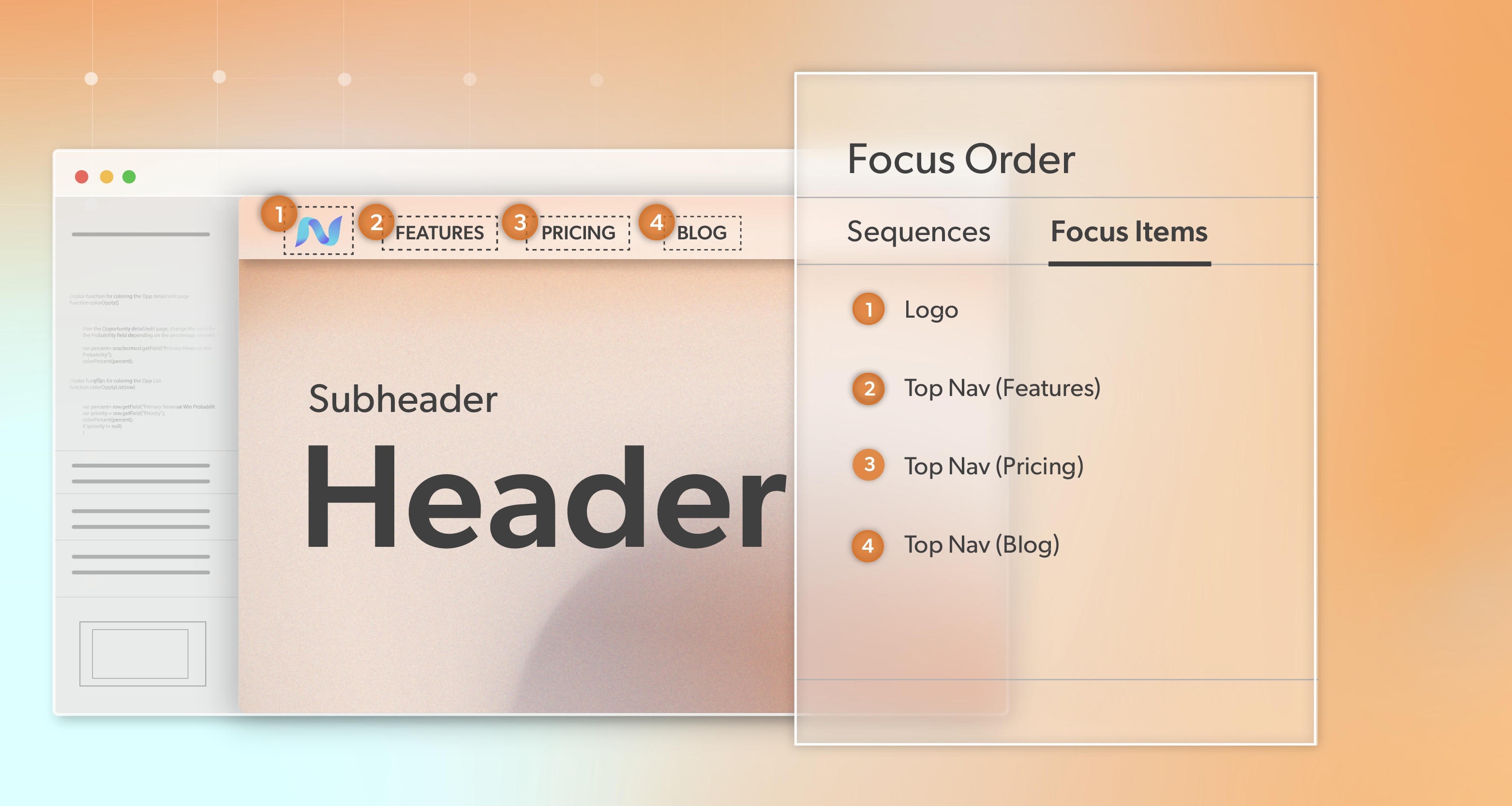
    • WCAG 2.4.3 Focus Order requires that focusable elements receive focus in an order that preserves meaning and operability. Keyboard users should not feel like focus is bouncing randomly around the page.

    These expectations sit near the center of a solid accessibility approach.WCAG does not forbid visual rearrangement. It becomes a problem when the rearrangement changes how users understand the page or makes it harder to complete tasks. There can be more than one acceptable logical order, but at least one needs to be consistent and predictable.

    The Human Impact Behind Accessibility

    Behind these rules are people trying to do simple things: check an account, complete a form, submit a request.

    Users with low vision or some cognitive disabilities may rely heavily on predictable patterns to stay oriented. They remember where search usually appears, where the main button usually sits, and how navigation is arranged.

    Keyboard and screen reader users build similar expectations over time. When focus jumps in ways that don’t line up with what they see on screen, they lose confidence in the layout. Some keep going, slowly. Others stop and leave.

    How CSS Reordering Breaks Reading and Focus Order

    Common CSS Features That Can Disrupt Logical Order and Accessibility

    Most order-related issues come from a small set of tools we use all the time:

    • position: absolute or position: fixed, which pull elements out of normal flow
    • The order property in Flexbox and Grid
    • flex-direction: row-reverse and column-reverse
    • Grid behaviors like grid-auto-flow: dense, line-based positioning, and grid-template-areas

    These features are useful, and sometimes necessary. Problems begin when they’re used to fix hierarchy or flow rather than just adjust appearance.

    What This Looks Like in Practice

    Navigation Example

    Say the DOM order for your navigation is: Home, Contact, About, Blog.

    Design wants “Contact” on the far right, so you use order in a flex container to produce: Home, About, Blog, Contact.

    Visually, this layout looks correct. However, for a keyboard user, pressing Tab navigates in the following order: Home, Contact, About, Blog. This means focus jumps from Home to Contact (on the far right), then back to About and Blog (toward the center).

    This jump is unexpected, as nothing on-screen explains why the focus shifts. Screen reader users also hear a sequence that doesn’t match the visual layout, making navigation confusing.

    Card Layout Example

    You have a grid of cards, and you want a “featured” card at the top. Instead of moving it in the DOM, you position it using Grid placement or position: absolute.

    On screen, it appears first. In the DOM, it still sits midway through the list. Keyboard and screen reader users only encounter it after several other cards, even though the design is signaling that it’s the main item.

    Screen Readers and Flex/Grid Nuances

    Different browser and screen reader combinations handle Flexbox and Grid differently. Some combinations try to align with visual order in certain situations; others follow DOM order strictly. That behavior can also change over time as engines evolve.

    The safe rule is simple: treat DOM order as the source of truth. If the order matters to the user, fix it in the markup, not just in CSS.

    Real-World Patterns Where Things Go Wrong

    These patterns show up often in production interfaces and quietly cause accessibility problems if no one is watching for them.

    Global Navigation and Utility Links

    Common issues in navigation and headers include:

    • Moving “Contact,” “Sign in,” or “Cart” to the far right using order or reversed flex directions
    • Placing search or language controls visually near the top, but leaving them late in the DOM

    Keyboard users end up with a navigation path that feels out of sync with what they see.

    Hero Sections, Promos, and Feature Blocks

    Hero areas and promotional content can introduce similar gaps:

    • A main hero button that visually looks like the first action but appears later in the DOM
    • Promotional banners positioned over content but rendered late, so focus reaches them long after users expect

    Design signals one priority; source order signals another.

    Forms and Multi-Column Layouts

    Multi-column forms look neat, but they’re easy to misalign structurally:

    • DOM order runs all the way down the left column, then all the way down the right, while the visual layout suggests row-by-row reading
    • Error messages or helper text appear far from the related fields in the DOM.

    Screen readers end up reading labels, inputs, and messages in a confusing sequence.

    Dashboards and Responsive Grids

    Dashboards and grid layouts bring their own risks:

    • Drag-and-drop widgets change visual position, but the DOM order stays the same.
    • Product or article grids change column counts across breakpoints, but the underlying order still reflects the original layout.

    Sighted users see one arrangement; keyboard and screen reader users move through another.

    Designing Layouts That Keep Source & Visual Order in Sync

    A helpful first check: if you remove all CSS, does the page still read in a sensible way from top to bottom?

    Start with headings, landmarks, and content in a logical sequence. Use HTML elements that match their purpose, and add ARIA landmarks only when they’re truly needed. The better the structure, the easier everything else becomes.

    Treat DOM Order as the Single Source of Truth

    Set a clear expectation within your team:

    If something needs to move for meaning or flow, change its position in the DOM instead of relying on visual reordering.

    Reserve Flexbox/Grid order and absolute positioning for small visual refinements that don’t change the content’s meaning. When the markup matches the intended reading order, ongoing accessibility work stays much more manageable.

    Mobile-First Thinking to Avoid Reordering Hacks

    Designing from the smallest breakpoint forces you to decide what actually comes first in the linear flow. Once that order is set, larger layouts should build on it rather than fight it.

    Instead of relying on row-reverse or heavy reordering to fix desktop layouts, adjust your HTML so each breakpoint builds on the same clear sequence.

    When Visual and Logical Order Can Safely Diverge

    There are places where visual and DOM order can differ without causing issues, such as:

    • Independent articles or cards that don’t depend on each other
    • Decorative elements whose position doesn’t change the meaning or task flow

    Even there, keep focus order predictable within each unit and keep related elements together.

    Responsive Design and the Reordering Trap

    Responsive layouts often move panels around: sidebars shift from right to top, filters move above or below results, utility sections change position as the screen shrinks.

    If those changes are made only with Flexbox or Grid reordering rather than structural changes, keyboard focus and reading order can feel out of sync with the visual layout. Over time, that chips away at accessibility across breakpoints.

    Strategies to Avoid Paint-Over Layouts

    A few practical habits help here:

    • Prefer stacking and modest visual shifts over large reordering jumps.
    • Decide early how content should flow linearly as the viewport changes.
    • When you do reorder at a breakpoint, test that view with keyboard and assistive tech, not just by eye.

    Emerging Tools: reading-flow and Future Support

    New CSS features like reading-flow (currently available in some browsers) aim to align reading and focus order with visual order in flex, grid, and block layouts.

    They’re promising, but support is still evolving. Treat them as enhancements, not a replacement for a clean structure. A clear DOM order will remain the more stable foundation.

    Testing Reading and Focus Order in Everyday Workflows

    Keyboard-Only Walkthroughs

    One of the simplest and most useful tests is to set the mouse aside and use only the keyboard.

    Tab through navigation, search, forms, checkout, and key dashboards. Watch for:

    • Focus landing in unexpected places.
    • Important elements are being skipped.
    • Visible focus not matching what you would expect to come next.

    This kind of quick check catches many accessibility issues long before formal testing.

    Using Tools to Visualize Tab Stops and Sequences

    There are tools and browser extensions that overlay numbers and lines to show the actual tab sequence. They make it easy to see when Flexbox, Grid, or positioning has produced a focus path that doesn’t match the design.

    Adding these checks to regular QA is more effective than treating them as a one-time audit.

    Screen Reader Spot-Checks

    Short passes with a screen reader are also valuable. With NVDA, VoiceOver, or another option, move through key flows and confirm:

    • Headings and regions follow a logical sequence.
    • Instructions, labels, fields, and messages appear together in a sensible order.

    Structural Smoke Tests in the Browser

    For a quick structural check, temporarily disable CSS in dev tools or with an extension, then read the page in DOM order.

    If it still makes sense, you likely have a solid base. If not, you’ve found a structural problem that is worth fixing before it spreads.

    Fixing Existing Interfaces Without Starting From Scratch

    Prioritize High-Risk Flows First

    You don’t need to refactor everything at once. Start where order matters most:

    • Global navigation
    • Sign-up and sign-in flows
    • Checkout and payment
    • Important forms and dashboards

    Compare how the layout looks with how keyboard focus and reading order actually move, and note the mismatches that affect meaning or task success.

    Refactor Layouts to Respect Source Order

    From there, adjust markup so the DOM reflects the intended order:

    • Move sections in the HTML so they match the intended sequence.
    • Group labels, fields, and messages together
    • Replace heavy CSS-based reordering with patterns that rely on better structure.

    This improves usability and gives you a more predictable layout to maintain long-term accessibility.

    Bake Order Rules Into Your Design System

    Your design system is a good place to codify these expectations:

    • The visual and DOM orders should match by default.
    • Exceptions must be documented and tested.
    • Core layout components for nav, cards, and forms should ship with safe reading and focus patterns built in.

    Continuous Improvements, Not One-Off Accessibility Cleanup

    Order and focus shouldn’t be left to occasional audits. Add a few simple checks to code review:

    • Does tab order match what we see?
    • Are we using order, row-reverse, column-reverse, or absolute positioning in ways that might change meaning?

    Where it fits, linting or CI rules can also flag risky layout patterns early.

    Source Order: The Thing You Can’t Fake With CSS

    When visual layout and DOM order stay aligned, interfaces feel calmer and easier to use. People can trust that what they see on screen matches what their keyboard and tools will encounter.

    Small structural decisions—good HTML order, clear roles, careful use of layout features—can make a noticeable difference in both user experience, accessibility, and compliance.

    If your team is planning a redesign, cleaning up legacy layouts, or just trying to understand where to focus first, you don’t have to figure everything out alone. An ADA-focused briefing with 216digital can help you map out your highest-impact order issues, connect them to legal risk, and build better habits into your ongoing design and development work.

    When you’re ready, setting up that conversation can give your next release cycle a stronger foundation—visually, technically, and legally.

    Greg McNeil

    November 17, 2025
    How-to Guides, WCAG Compliance
    content order, How-to, User Experience, WCAG, WCAG conformance, web developers, web development
  • How to Conduct Accessibility User Testing

    You can pass every automated test and still fail your users. That’s the uncomfortable truth behind many accessibility initiatives. True accessibility goes far beyond technical compliance—it’s about how people actually experience your product. Accessibility user testing isn’t a last-minute box to check; it’s a powerful way to build digital experiences that work for everyone.

    In this article, we’ll walk you through how to conduct accessibility user testing in a way that’s respectful, strategic, and truly impactful. Whether you’re a UX professional, web developer, or product manager, you’ll leave with clear, practical guidance to take your testing process from good intentions to real results.

    What Automated and Manual Testing Miss

    Accessibility tools like Google Lighthouse and WAVE are fantastic for catching code-level issues—missing alt text, low contrast, missing labels. But that’s just the surface. These tools don’t understand user intent. They can’t tell if your focus order makes sense, or if a screen reader user can actually make sense of your modal flow.

    Manual testing helps fill some of those gaps. Keyboard-only navigation, zoom testing, and screen reader simulations can uncover a lot—especially when done by experienced testers. But even this falls short of the lived experience.

    Take a modal dialog as an example. You might trap focus correctly, label everything with ARIA, and pass every automated check. But in practice? A screen reader user may still struggle because the modal doesn’t announce in the expected order or re-focus correctly on close. That’s the kind of thing only accessibility user testing with real people can reveal.

    Why User Testing with People with Disabilities Is the Game-Changer

    No simulation can match the perspective of someone who uses assistive tech every day. People who rely on screen readers, switch devices, or voice navigation uncover friction and failure points that even seasoned accessibility professionals can overlook.

    Here’s the shift: stop thinking of users with disabilities as edge cases. They’re not. They’re part of your audience—your customers, students, patients, or users. Designing for them improves your product for everyone.

    Accessibility user testing isn’t just about catching bugs. It’s a critical feedback loop that improves usability, product-market fit, and even innovation. When you integrate it early and often, you don’t just “fix accessibility”—you build better experiences from the ground up.

    Planning Your Accessibility User Testing Program

    Define Clear Objectives

    Start with real-world tasks. Instead of running a general audit, design your tests around meaningful user journeys:

    • Is it possible for a blind user to complete a purchase from start to finish?
    • Someone with low dexterity—can they successfully submit your job application form?
    • And what about users with cognitive differences—can they easily locate your support content?

    Clear, task-based goals help you focus your sessions and gather actionable insights.

    Build a Representative Participant Pool

    Many teams fall into the trap of testing only with blind screen reader users. That’s important—but not enough.

    To make your testing inclusive:

    • Include participants with motor impairments, cognitive disabilities, low vision, and voice input users.
    • Recruit from diverse sources and advocacy organizations.
    • Pay your testers. Always. Accessibility user testing is specialized work and should never rely on free labor. Follow ethical compensation practices and provide flexible scheduling and support.

    Pre-Test Logistics and Respectful Setup

    Before the session, send a tech-check checklist to participants. This might include browser compatibility, assistive tech setup, and ensuring a quiet space.

    Also, ask about accommodations in advance:

    • Do they prefer screen sharing or phone interviews?
    • Do they need additional time?
    • Would they like the questions in advance?

    Offering flexible formats—remote, hybrid, or in-person—ensures participants can engage comfortably. Respect starts with planning.

    Running Meaningful and Inclusive Testing Sessions

    Session Structure That Works

    Start with a warm-up task or small talk to ease anxiety and build trust. Remember, this isn’t a test of the participant—it’s a test with them.

    Structure your session around a few focused tasks. Example:

    • “Please use the site to find and register for a webinar.”
    • “Try to contact customer support using your preferred method.”

    Observe closely—but don’t interrupt unless necessary. Let participants narrate their thought process if they’re comfortable. This gives you insight into confusion points, workaround strategies, and breakdowns in usability.

    Accessibility user testing is about listening. Often, the most valuable insights come not from what users can or can’t do, but from the effort it takes them to do it.

    Ask Thoughtful, Open-Ended Questions

    Instead of “Did that work for you?” try:

    • “How did that process feel?”
    • “What was easy or hard about that task?”
    • “Was there anything that surprised or confused you?”

    Create space for honest feedback, and resist the urge to jump in with fixes. Your goal is to understand, not defend.

    From Feedback to Action

    Once your accessibility user testing sessions are complete, consolidate your notes into themes. What barriers kept coming up? Were there recurring moments of friction?

    Tag issues by severity and impact. Some will be quick fixes—labeling buttons, adjusting tab order. Others may require bigger design shifts. Either way, track them in your product backlog and prioritize them alongside other critical bugs.

    Also, share findings with your team. Make video clips or quotes part of your sprint reviews or design critiques. Seeing real users struggle—or succeed—can be a powerful motivator for accessibility buy-in across your organization.

    Make It Part of Your Process

    Accessibility user testing isn’t a one-off effort. Integrate it into every major phase of development:

    • Early design prototypes
    • Beta versions before release
    • Major feature updates

    The earlier you involve users, the more you catch—and the less expensive it is to fix. Consider building an accessibility testing panel you can tap into regularly. Make it part of your QA cycle, not just a compliance afterthought.

    User-Tested, People-Approved

    Automated tools and manual audits are important—but they only take you so far. To build truly inclusive experiences, you need to go deeper. Accessibility user testing gives you something no tool ever will: real human insight.

    By listening to and designing with people with disabilities, you move from compliance to compassion. From checking boxes to opening doors. From good enough to genuinely excellent. And that’s not just better accessibility—it’s better UX, period.

    If you’re ready to elevate your accessibility strategy with meaningful user feedback, 216digital can help. Schedule an ADA briefing with our accessibility team to discuss how user testing fits into a comprehensive, long-term solution. Together, we’ll help you build experiences that work for everyone—starting now.

    Greg McNeil

    June 13, 2025
    Testing & Remediation, Uncategorized
    Accessibility testing, Manual Testing, User Experience, user testing, Users experience, Web Accessibility Remediation
  • Keyboard Navigation: A Guide to Accessible Web Testing

    Have you ever tried using the internet without a mouse?

    For millions of people, that’s not just a thought experiment—it’s how they navigate the internet every day. Whether it’s because of physical limitations, visual impairments, or using assistive tech, the keyboard is their main tool. But here’s the thing: if your website doesn’t work smoothly with a keyboard, you’re not just creating a frustrating experience—you’re leaving people behind. 

    So, how does your site stack up? Let’s dive into why keyboard navigation matters and how it plays a key role in building an accessible web.

    Why Keyboard Navigation Matters

    Keyboard navigation is a lifeline for users who can’t rely on a mouse due to physical limitations, visual impairments, or the use of assistive technologies. Moreover, it’s an excellent starting point for testing overall web accessibility. If your website works seamlessly with a keyboard, you’re likely on track to create an inclusive experience for all users.

    How to Navigate a Website with Keyboard Shortcuts

    Before you start testing your website’s accessibility, it’s helpful to understand the most common keyboard shortcuts users rely on. These shortcuts allow people to move through links, buttons, forms, and other interactive elements.

    • Tab Key: Moves focus to the next interactive element.
    • Shift + Tab: Moves focus to the previous element.
    • Enter or Spacebar: Activates a focused element, such as clicking a link or button.
    • Arrow Keys: Scroll through pages or navigate dropdown menus.
    • Escape (Esc): Closes modals, dropdowns, or pop-ups.
    • Ctrl + F: Opens a search bar (in most browsers) to find specific content on the page.

    For Mac users on Safari, enabling full keyboard navigation is a quick adjustment:

    1. Open Safari Preferences.
    2. Go to the Advanced tab.
    3. Check the box next to “Press Tab to highlight each item on a webpage.”

    With these basics in mind, you’re ready to put your website to the test.

    Testing Your Website for Keyboard Navigation

    Keyboard testing doesn’t require fancy tools—just a keyboard, a browser, and a little know-how. Follow this step-by-step guide to evaluate your site’s accessibility.

    Start with the Basics: Can You Navigate Without a Mouse?

    Unplug your mouse and navigate through your homepage and other key pages using only the keyboard. Can you access all essential features and content?

    Check Focus Indicators

    Focus indicators are crucial for users who rely on visual cues. As you use the Tab key, ensure there’s a visible outline around the element currently in focus. Check for the following:

    • The focus indicator is easy to see and contrasts well with the background.
    • The focus moves logically through elements in the order they appear on the page.

    If the focus jumps around or disappears, it creates a frustrating experience for users.

    Test Interactive Elements

    Interactive elements like buttons, links, and form fields should be fully accessible. Specifically:

    • Can you submit a form using the Enter or Spacebar key?
    • Can you open and close modals or dropdown menus with the keyboard?
    • Do navigation menus function seamlessly?

    Verify Skip Navigation Links

    Skip navigation links allow users to bypass repetitive elements, like menus, and jump straight to the main content. To check this:

    • Ensure the skip navigation link is present and functional.
    • Verify it’s one of the first focusable elements when using the Tab key.

    Watch Out for Keyboard Traps

    Keyboard traps occur when users get stuck in an element, like a modal or widget, and can’t move forward. Ensure users can exit these areas by pressing the Escape key or tabbing out.

    Tips for Better Keyboard Navigation

    Creating an accessible website doesn’t happen by accident. Here are a few tips to enhance keyboard navigation for all users:

    • Design with Focus in Mind: Use CSS to style focus outlines for clarity and visibility. Avoid removing focus outlines entirely.
    • Ensure Logical Focus Order: Use semantic HTML (e.g., <button> and <a>) and avoid custom elements that might disrupt natural focus flow.
    • Leverage ARIA Roles and Labels: Use ARIA (Accessible Rich Internet Applications) roles and labels to make custom components like sliders or dropdowns keyboard accessible.
    • Test Regularly: Accessibility is not a one-and-done task. Regular testing ensures your website stays accessible as it evolves.

    Common Challenges and How to Address Them

    Even with the best intentions, challenges may arise. Here are some common issues and solutions:

    • Invisible Focus: Use the :focus pseudo-class in CSS to style interactive elements for better visibility.
    • Complex Widgets: Components like carousels or accordions can lack keyboard support. Build these elements with accessibility in mind or use accessible libraries.
    • Poorly Labeled Links: Ensure all links and buttons have clear, descriptive text or labels so users know what action they’ll perform.

    Why Focus on Keyboard Navigation?

    Beyond accessibility, testing your website for keyboard navigation improves overall user experience and usability. Keyboard accessibility is often a foundation for ensuring compatibility with screen readers and other assistive technologies. If your website works well for a keyboard user, it’s likely on its way to meeting broader accessibility standards like WCAG 2.1.

    Next Steps: Make Your Website Keyboard-Accessible

    Keyboard navigation is more than just a best practice—it’s a cornerstone of inclusive design that invites everyone to participate fully on the web. By ensuring your site is keyboard-accessible, you create a welcoming experience for users of all abilities, reinforce your brand’s commitment to accessibility, and lay a strong foundation for broader ADA compliance.

    If you’re ready to take the next step toward digital inclusion, reach out to 216digital to schedule an ADA briefing. We’ll help you assess your website, develop a tailored plan, and guide you through the process of building an online presence that works for everyone. Don’t wait—contact us today and let’s make the internet a more accessible place together.

    Greg McNeil

    December 24, 2024
    How-to Guides, Testing & Remediation
    Accessibility testing, keyboard accessibility, Keyboard Navigation, User Experience, Web Accessibility
  • Why Accessibility Is Key to UX Success

    Here’s a secret: websites that are easier to use for people with disabilities are easier to use for everyone. Applying simple HTML5 core concepts like semantic markup and landmark regions will naturally make your website easier to navigate with a keyboard and have a more logical structure. This is great for onsite SEO, user experience (UX) – and web accessibility, with no additional effort required.

    How Web Accessibility Enhances UX

    At its core, web accessibility is about removing barriers that might prevent people from using your site. When a website is accessible, it’s usable by everyone—regardless of their abilities, devices, or environments.

    Here’s how accessibility directly impacts UX:

    Improved Usability for All

    Accessible design benefits people with disabilities and creates a better experience for everyone. Features like straightforward navigation, readable fonts, and intuitive layouts make your site easier to use, regardless of age, device, or tech-savviness.

    Inclusive Design for Diverse Audiences

    Accessibility ensures your site is usable for people with visual, auditory, cognitive, or motor disabilities. For example:

    • Screen reader support helps blind or low-vision users navigate content.
    • Keyboard-friendly navigation aids people with motor impairments.
    • Clear text and structure assist individuals with cognitive challenges.

    Enhanced Mobile Experience

    Basic accessibility principles—like scalable typography, responsive layouts, and touch-friendly designs—naturally improve mobile usability. Mobile users account for significant web traffic.

    The Benefits of Accessible Design

    Investing in web accessibility isn’t just the right thing to do—it’s also good business. Here are some key benefits:

    Reaching a Wider Audience

    Approximately 15% of the global population lives with some form of disability. By ensuring your site is accessible, you’re inviting millions of potential customers to engage with your content and services.

    Boosting SEO

    Accessible websites often perform better in search engine rankings. Practices like adding alt text for images, using descriptive headings, and providing transcripts for videos improve your SEO by making your content easier for search engines to index.

    Building a Positive Brand Image

    A commitment to accessibility shows your audience that you care about inclusivity. This fosters trust, strengthens your reputation, and makes your brand socially responsible.

    Legal Compliance and Risk Reduction

    Accessible websites help you comply with regulations like the Americans with Disabilities Act (ADA) and Web Content Accessibility Guidelines (WCAG), reducing the risk of lawsuits or fines.

    Overcoming Challenges in Accessibility

    Despite its benefits, implementing accessibility can come with challenges:

    Misconceptions About Accessibility

    Some believe accessibility only benefits a small audience or that it’s too costly or complex to implement. In reality, accessibility improves UX for all users and can be cost-effective when integrated early.

    Technical Hurdles

    Developers might need help understanding WCAG guidelines or implementing complex ARIA roles. Clear documentation and ongoing education can address this.

    Resistance to Change

    Most teams have enough on their plates and do not want to add any additional steps to their existing workflows. However, building a general awareness of accessibility concepts will naturally improve your site’s inclusivity without any extra work.

    Strategies for Integrating Accessibility Into UX Design

    To create a truly inclusive experience, accessibility needs to be a priority from the start. Here’s how to integrate it into your design process:

    Start Early in the Design Process

    Accessibility is most uncomplicated to implement when it’s considered from the beginning. Start with semantic HTML, readable fonts, and a logical content structure.

    Focus on User Testing

    Test your site with real users, including those with disabilities. Tools like screen readers and keyboard navigation can simulate some experiences, but real feedback is invaluable.

    Use Accessibility Tools

    Incorporate tools like:

    • Lighthouse: Google’s tool for auditing accessibility, performance, and SEO.
    • WAVE: An accessibility evaluation tool that highlights issues directly on your site.

    Educate Your Team

    Train designers, developers, and content creators to understand accessibility principles and WCAG guidelines. Make accessibility a team-wide responsibility.

    Iterate and Improve

    Accessibility isn’t a one-and-done task. Regularly review your site for compliance, usability, and opportunities for improvement.

    Practical Tips for Accessible UX

    Here are some specific ways to improve accessibility while enhancing UX:

    Prioritize Clear Navigation

    Ensure menus are intuitive and consistent across devices. Use breadcrumbs, logical page hierarchy, and descriptive labels to guide users.

    Provide Text Alternatives

    Add alt text to images, video captions, and audio content transcripts. This makes your media accessible to screen readers and enhances SEO.

    Design for Keyboard Navigation

    Ensure all interactive elements—buttons, links, forms—are reachable and operable using just a keyboard.

    button:focus {  
      outline: 3px solid #005fcc;  
    }  

    Ensure Sufficient Color Contrast

    Low contrast can make text unreadable for users with low vision. Use tools like the Contrast Checker to verify WCAG-compliant contrast ratios.

    Use ARIA Sparingly

    Accessible Rich Internet Applications (ARIA) roles can enhance accessibility but shouldn’t replace semantic HTML. Use ARIA roles to clarify interactive components, like modals or accordions.

    Accessibility’s Role in a Better Web

    When accessibility and UX align, everyone wins. Your site becomes more straightforward to use, more engaging, and more inclusive. For users with disabilities, accessible design opens doors to equal participation in the digital world. For businesses, it means more satisfied customers, better performance metrics, and a stronger reputation.

    As the web continues to evolve, let’s commit to creating digital spaces that are open and enjoyable for all. Accessibility isn’t a barrier—it’s the foundation of great UX.

    If you would like to evaluate your site’s user experience for everyone, including users with disabilities, reach out to 216digital using the contact form below.

    Greg McNeil

    December 12, 2024
    How-to Guides, The Benefits of Web Accessibility
    Accessibility, Accessible Design, User Experience, UX, Web Accessible Design, Website Accessibility
  • Making Your Website Accessible Across All Devices

    In today’s digital world, websites aren’t just accessed on desktops—they’re viewed on everything from smartphones to tablets. But with this variety of devices comes a significant challenge: ensuring your website works for everyone, no matter what screen they’re using. This is especially important for people with disabilities.

    Web accessibility is about more than just following the rules. It’s about making sure everyone can navigate, interact with, and enjoy your site. If your website isn’t accessible, you’re not only missing out on a large audience but also putting your business at risk of legal trouble. And as devices become more diverse, testing your site across different screen sizes and input methods is crucial.

    In this article, we’ll explore why web accessibility matters across different devices and share ways you can ensure your site is user-friendly and inclusive for everyone.

    Why Web Accessibility Matters

    Ensuring web accessibility is not just a best practice; it’s a vital responsibility. Web accessibility guarantees that people with disabilities can fully engage with digital content—whether that’s perceiving, understanding, navigating, or interacting with it. In the U.S., this is a legal requirement under the Americans with Disabilities Act (ADA). Failing to meet these standards doesn’t just alienate a significant portion of your potential audience; it can also expose businesses to serious legal risks.

    But accessibility is about more than avoiding lawsuits. It’s about creating a digital experience that works for everyone, regardless of how they access your site. Users interact with websites across a wide range of devices—desktops, mobile phones, and tablets—each bringing its own set of accessibility challenges. Comprehensive, device-specific testing is essential to make sure that your website remains fully functional and inclusive, no matter how users access it.

    Understanding Device-Specific Accessibility Challenges

    Web Accessibility on Desktops

    Desktops typically offer a full-sized screen and a mouse with a keyboard. While this setup may seem straightforward, it presents its challenges. Many users rely on keyboard navigation due to mobility impairments. If your site isn’t designed for keyboard users, navigating through forms, menus, and interactive elements can be frustrating.

    Web Accessibility Challenges:

    • Missing or improper use of semantic HTML.
    • Lack of focus indicators for interactive elements.
    • Insufficient contrast between the text and background colors.

    Mobile Devices

    Mobile devices are now a primary way people access the internet. However, small screens and touch interfaces create unique hurdles. For example, touch targets (like buttons) must be large enough for users with dexterity issues to tap accurately.

    Accessibility Challenges:

    • Inadequate touch target sizes.
    • Poorly designed forms that are difficult to fill out on a small screen.
    • Inconsistent navigation may confuse users who switch between mobile and desktop views.

    Web Accessibility on Tablets

    Tablets straddle the line between desktop and mobile devices, often combining features. Users may interact with tablets via touch or keyboard, making it vital for websites to accommodate both methods. Tablets can also be used in various orientations, which may affect layout and functionality.

    Accessibility Challenges:

    • Orientation changes that disrupt layout.
    • Inconsistent behavior between touch and keyboard navigation.
    • Complications with zoom functionality affect users with visual impairments.

    Effective Testing Methods and Tools

    Now that we’ve explored the challenges let’s discuss how to test for accessibility effectively across different devices. Testing for web accessibility is an ongoing process that requires attention to detail and a proactive approach.

    1. Manual Testing for Web Accessibility

    Manual testing involves using your website as a user would. This means navigating through your site using keyboard-only navigation and screen readers. Pay close attention to how easily you can access all content.

    Tips for Manual Testing:

    • Navigate your site using only the keyboard (Tab, Enter, Arrow keys).
    • Test with various screen readers (like JAWS, NVDA, or VoiceOver).
    • Attempt to use your site on different devices and in different orientations.

    2. Automated Testing Tools

    While automated tools can’t catch every issue, they can help identify many common accessibility problems. Tools like Lighthouse and WAVE can scan your website to ensure compliance with WCAG (Web Content Accessibility Guidelines) standards.

    Recommended Tools:

    • Lighthouse: Built into Chrome Developer Tools for performance and accessibility audits.
    • WAVE: A visual feedback tool that shows you accessibility issues directly on your site.

    3. User Testing for Web Accessibility

    Involving real users in your testing process is invaluable. This approach can reveal issues that automated tools might miss. Consider creating a focus group that includes users with various disabilities to gather their feedback.

    How to Conduct User Testing:

    • Recruit participants with different abilities and device preferences.
    • Observe them as they navigate your site.
    • Collect qualitative feedback on their experience.

    Final Thoughts

    Making your website accessible to everyone is not just a legal requirement—it’s a crucial part of creating a welcoming online experience. With people accessing websites on various devices, understanding and addressing web accessibility challenges is essential.

    To ensure your site meets these standards, consider scheduling an ADA briefing with the experts at 216digital. Our experts will guide you through the steps needed to ensure your website not only meets legal standards but also serves all users effectively. Let’s work together to create a web that’s accessible to everyone!

    Greg McNeil

    September 18, 2024
    Legal Compliance
    ADA Compliance, digital accessibility, responsive web design, User Experience, user testing, Web Accessibility
  • Simplicity is Key to Conversions: User Experience (UX) Produces Profit

    Simplicity is Key to Conversions: User Experience (UX) Produces Profit

    Our brains are handling a lot right now. Processing work, making plans for the weekend, reminding you to breathe. You clearly have a lot on your plate. When it comes to focus and cognitive thinking, however, as humans we operate a bit differently. The human brain is not an automated processor meant to produce output multiple times a minute. Automated problem solving vs. logic and reasoning are what separate man from machine. We prefer to take on one small task at a time, solve it, process what we learned and move on to the next. The more practical the process, the easier it is for us. It is much more efficient than juggling multiple balls in the air at once. Keep it simple.

    Websites and eCommerce stores are no different. Simplistic design and rational navigation will always crank out the most conversions because these factors make sense to our brains. The structure is tailored towards the user. It helps define the overall experience for them and that is a crucial ranking factor with Google. Believe me, they will notice. Social Media Cleveland

    Guiding visitors towards the conversion funnel isn’t tricky marketing or a psychological sales trigger. It is just common sense. In fact, most users will expect some sort of assistance leading them through the process, especially the checkout. ECommerce developers know this, which is why the structure or layout of a site is one of many factors in the world of user experience or UX as it is commonly called.

    What Makes Up User Experience

    At its core, user experience (UX) is simply making the experience of the user, a pleasant one. That’s you. Whether you realize it or not, the structure, the placement, the ease of checkout and any other things related to the function of the site is designed for you. Let’s break down UX to some of its core features and discuss how a website can work with you to meet your goals. There are multiple factors that help a site function and most importantly, help you succeed. Some of the most common features that assist the user conversions include:

    • The site’s navigation
    • The site’s visual design
    • The site’s technical optimization
    • The site’s content

    Here’s how each of these features makes your life easier and serve a purpose on a website.

    Findability

    When navigating a site, the easier it is to find what you are looking for, the better. Part of the reason is the conversion process. If you are looking to purchase something or submit a form, all signs should point to this. Users should not have to use a search toolbar to see products or checkout. Most eventually will get bored or frustrated and leave the page. This can lead to an ever-climbing bounce rate as you find more and more users navigating away. Make sure your menu or toolbar is practical and the placement of the pages makes sense. A website with a sensible layout can lead to maximum conversions.

    Visibility

    Cleveland SEO servicesA site should absolutely be relatable and appealing. The aesthetic design should pull users and make them want to stay. The main toolbar should be eye-catching and draw the user to it. The best placement for the main navigation center is in the header or above the fold of the page. Most successful sites have their main features in this area, such as the blog, the cart or main login area.

    It is often said “less is more” and the same is true of a website layout. In the digital age, the content should be compact and precise. Avoid lengthy paragraphs that would prevent a user from reading the entire post and break up information into more manageable pieces. Use bullets, logos, shorter lines and visual aids to draw the reader through the content. Also, be sure to include interactive buttons, hyperlinks or images that will keep your users stimulated. If it looks pretty, they are going to want to click on it.

    Usability

    A website has many visitors but they aren’t always human users. It is crucial to remember the robots are watching too. For a site to function properly, there are a number of technical optimization tools to use that will get you into the rankings. Things like SEO, page speed, image alt tags and mobile friendliness will earn you bonus points with the robots. In fact, some of these features are an absolute must with the Google algorithm updates. Missing any one of them could cost you rankings and site traffic.

    Avoid the penalties and do your research. Get quality SEO keywords in your content and update it often. It is also vital that your site has an app that caches page content. This will dramatically decrease your load time, which the search engine robots will like. Humans will like it too.

    Likability

    One of the most challenging tactics to conquer is the site’s content. In order for a user to interact with your site and come backDigital Marketing often, you have to have some sort of draw. Users have to like being there. Having quality images and technical cues are great, but at the end of the day, the users are reading your content. If it isn’t engaging or the content is difficult to follow, most users will leave. Some key things to remember in your content, along with optimizing for the search engines, are your style and voice. These should appeal to your audience, in addition to your topic choices. Never talk down to visitors or become too “preachy” in your delivery.

    Also, do some marketing trends research. See what people are talking about and join the conversation. It is just as much your responsibility to be entertaining as to be informative. This will help build your audience and most importantly, keep them coming back for more. Focus on digital campaigns and enhancing your visibility.

    **

    For those looking for assistance with digital marketing campaigns and enhancing visibility, 216digital offers Cleveland SEO services to help you with your rankings. We also offer Cleveland web development and digital marketing assistance. Let us help you build your brand and become successful. We are eCommerce developers with a passion to be creative and a drive to help you succeed. Contact us for help with Miva design or if you have been considering Miva developers for your website.


    Greg McNeil

    August 21, 2018
    Ecommerce Platforms, SEO
    Digital Marketing, SEO, User Experience, UX

Find Out if Your Website is WCAG & ADA Compliant


    By submitting this form, you consent to follow-up from 216 Digital by call, email, or text regarding your inquiry. Msg & data rates may apply. Reply STOP to opt out or HELP for help.

    216digital Logo

    Our team is full of professionals in Web Accessibility Remediation, eCommerce Design & Development, and Marketing – ready to help you reach your goals and thrive in a competitive marketplace. 

    216 Digital, Inc. BBB Business Review

    Get in Touch

    2208 E Enterprise Pkwy
    Twinsburg, OH 44087
    216.505.4400
    info@216digital.com

    Support

    Support Desk
    Acceptable Use Policy
    Accessibility Policy
    Privacy Policy

    Web Accessibility

    Settlement & Risk Mitigation
    ADA Title II & Section 508
    Monitoring Service by a11y.Radar

    Development & Marketing

    eCommerce Development
    PPC Marketing
    Professional SEO

    About

    About Us
    Contact

    Copyright © 2026 216digital. All Rights Reserved.