In the first half of 2025, more than 2,000 website accessibility lawsuits were filed, marking a 37% increase from the previous year. This surge in litigation highlights a critical reality for modern enterprises: the very gateway to your digital experience is often your greatest liability. When organizations implement overly complex accessible navigation design patterns, they frequently introduce technical debt that triggers ADA demand letters and alienates users with disabilities. Maintaining a sophisticated site structure doesn’t have to mean compromising on conformance or inviting legal risk.
Key Takeaways
- Identify why navigation menus are frequently cited in ADA demand letters and how they serve as the foundational roadmap for users relying on assistive technologies.
- Compare the technical merits of the Disclosure pattern against the ARIA Menubar to select the most stable accessible navigation design patterns for your specific site architecture.
- Implement critical technical requirements, including robust keyboard support and visible focus management, to ensure your interface remains navigable for all users.
- Evaluate your information architecture depth to optimize discoverability without introducing unnecessary technical debt or compliance gaps.
- Move beyond static remediation by establishing a framework for ongoing monitoring that protects your WCAG 2.2 conformance as your digital presence expands.
Why Navigation is the Foundation of ADA Compliance
Navigation is the critical gateway to your digital content. For users relying on screen readers or keyboard-only inputs, the global header serves as their primary roadmap. If this roadmap is broken, the entire site becomes a dead end. This is why Web accessibility standards focus so heavily on structural landmarks. A logical heading structure paired with properly defined navigation landmarks ensures that assistive technology can skip directly to the core information. Without these anchors, users are forced to listen to every menu item on every page load, creating a frustrating experience that often leads to immediate site abandonment.
The technical requirements for accessible navigation design patterns have become more stringent under WCAG 2.2, which was finalized as a W3C Recommendation on October 5, 2023. Design teams must now account for specific success criteria like “Focus Appearance” and “Target Size (Minimum).” These standards require that interactive elements, such as menu links, have a minimum footprint of 24 by 24 CSS pixels. This change prevents “fat-finger” errors for mobile users and assists those with motor impairments. Compliance also demands that the focus indicator has sufficient contrast against its background, ensuring that keyboard users never lose their place within a complex menu structure.
The Legal High Stakes of Navigation Design
Automated scanners used by plaintiffs’ firms can identify navigation barriers in seconds. Because the global header appears on every page, a single coding error in the menu is multiplied across the entire domain. This makes menus “low-hanging fruit” for accessibility-related litigation. Common citations in ADA demand letters often center on “keyboard traps,” where a user can enter a dropdown menu but cannot exit it using only the “Tab” or “Esc” keys. With the DOJ’s Title II deadlines approaching on April 26, 2027, for larger public entities, the pressure to align with standard-aligned design has never been higher. This is why “Phase 1” risk mitigation always prioritizes the global header. Correcting these high-visibility errors provides an immediate shield against the most common technical triggers for litigation.
Defining Accessible Navigation Patterns
Core Accessible Navigation Design Patterns: Examples and Use Cases
The Disclosure Pattern: Simple and Robust
The Disclosure pattern is currently the gold standard for modern web design. It relies on a straightforward mechanism: a <button> element that toggles the visibility of a nested list. This pattern is exceptionally compatible with mobile devices and screen readers because it doesn’t rely on complex keyboard instructions. For a standard B2B services menu with three sub-items, the button clearly announces its “expanded” or “collapsed” state to assistive technology. This provides the user with immediate clarity regarding the menu’s behavior. Unlike hover-based menus, the Disclosure pattern requires an intentional click or tap, which aligns with the needs of users with motor impairments or those using touch interfaces.
The ARIA Menubar: Proceed with Caution
The ARIA Menubar pattern is designed to mimic the functionality of desktop applications, such as Microsoft Word or Excel. While it offers powerful keyboard shortcuts, like using arrow keys to move between items, it’s often a poor fit for standard websites. Most web users expect to navigate using the “Tab” key, not arrow keys. Implementing a Menubar pattern can actually confuse visitors who aren’t familiar with its specific requirements. Unless you are building a highly complex web application, we generally recommend avoiding this pattern in favor of more intuitive Disclosure models. Aligning your site with these standards often requires professional accessibility consultation and training to ensure your development team avoids these common implementation pitfalls.
Mega Menus: Handling Complexity Concurrently
For eCommerce sites or large organizations, mega menus are often necessary to display high-density information. To keep these accessible, you must utilize internal landmarks within the overlay. This allows screen reader users to jump between categories without tabbing through every individual link. For complex, multi-stage user journeys, a step by step navigation pattern can also be integrated to provide the necessary structure for intricate processes. A critical requirement for any mega menu is the “Esc” key functionality. A user must be able to dismiss a large overlay instantly to return to the main content. Without this escape route, large menus can become digital cages for keyboard-only users, significantly increasing your liability risk.
Vertical and Sidenav Patterns
Choosing the Right Pattern for Your Site Structure
Many stakeholders are still guided by the “three-click” myth, which is the outdated belief that every page must be reachable within three clicks. In reality, users with disabilities prioritize clarity and predictability over click counts. A five-click journey with clear labels and logical focus management is far superior to a crowded, three-click mega menu that overwhelms a screen reader. Following W3C’s Navigation Design Principles ensures that you’re building on a foundation of established usability rather than chasing visual trends. Custom, “creative” navigation often lacks the standardized ARIA roles required for compliance, making it a primary target for automated audits and demand letters.
Small to Medium Sites: The Case for Flat Navigation
For sites with limited pages, the most protective strategy is to avoid dropdowns entirely. Flat navigation reduces code complexity and eliminates the risk of keyboard traps in sub-menus. This approach also yields significant benefits for SEO and mobile usability by presenting a clear, crawlable hierarchy. You can see how this applies to specific industries in our guide on ADA compliance for retail websites, where streamlined categories often lead to higher conversion rates and lower legal risk. If you’re just getting started with compliance, completing an accessibility audit for small business is an essential first step to identify navigation barriers before they attract legal scrutiny. By keeping the DOM simple, you ensure that assistive technologies can process your roadmap without error.
Enterprise and eCommerce: Managing the Mega Menu

Technical Implementation: Beyond the Visual Layout
Keyboard support is the non-negotiable bedrock of digital conformance. Every interactive element within your navigation must be reachable via the “Tab” key and dismissible via the “Esc” key. Focus management is equally critical; hiding the “focus ring” to satisfy a specific brand aesthetic is a direct violation of WCAG 2.2 standards. Regulators expect focus indicators to be highly visible and have sufficient contrast against their background. If a keyboard user cannot see where they are on the page, the navigation is fundamentally broken. Mobile responsiveness adds another layer of complexity, as the ubiquitous “hamburger” menu often lacks the proper labels and focus traps required for screen reader users. Equipping your engineering team with digital accessibility training for developers is one of the most effective ways to ensure these technical standards are consistently applied across every deployment.
To ensure your site meets these rigorous technical requirements, consider our professional WCAG & Section 508 Conformance services to audit and remediate your existing code structure.
The Keyboard-First Workflow
Building a compliant menu starts with a rigorous testing protocol that ignores the mouse entirely. You should follow a logical sequence to verify your implementation:
- Step 1: Confirm all menu items, including nested sub-links, are reachable in a logical tab order.
- Step 2: Implement “Skip to Main Content” links at the top of the DOM to allow users to bypass repetitive navigation blocks.
- Step 3: Verify that submenus close immediately when the keyboard focus leaves the group or when the “Esc” key is pressed.
Screen Reader UX: Semantic HTML over ARIA
There’s a common misconception that more ARIA attributes equal better accessibility. In reality, the “No ARIA is better than bad ARIA” rule remains the industry standard. Native semantic HTML elements like <ul> and <li> provide more innate structure to screen readers than a complex web of custom roles. When you do use ARIA, stick to essential states like aria-expanded to signal the status of a toggle and aria-controls to link a button to its target container. You should avoid “automatic” hover-opening menus because they’re unpredictable for screen reader users and often lead to focus loss. Instead, provide clear “active state” feedback so visitors always know their current location within your site’s hierarchy.
Strategic Remediation: Aligning Design with WCAG 2.2 Standards
Remediation is not a finish line; it’s a continuous state of vigilance. For high-growth organizations, digital interfaces are constantly evolving as new product categories, service lines, and marketing initiatives are launched. One-time fixes for accessible navigation design patterns often fail because they don’t account for this dynamic nature. When a developer adds a new submenu without the proper ARIA attributes, or a content manager introduces a deeply nested category that breaks the tab order, your previous compliance efforts are instantly neutralized. This “compliance drift” is one of the most common reasons businesses receive ADA demand letters even after undergoing a professional audit.
To maintain a defensible position, you must integrate accessibility into the earliest stages of your UX wireframing phase. Waiting until the development cycle is nearly complete to address navigation barriers is a costly mistake that leads to rushed, fragile code. Manual testing remains a non-negotiable component of this process. While automated tools are excellent for catching syntax errors, they cannot replicate the lived experience of a user navigating a complex mega menu with a screen reader. Strategic remediation requires a blend of expert oversight and robust technical standards to ensure your roadmap remains clear for every visitor. Pairing this oversight with structured digital accessibility training for developers transforms compliance from a reactive chore into a permanent feature of your development lifecycle.
Continuous Monitoring with a11y.Radar
The most effective way to prevent regression is through a11y.Radar Ongoing Monitoring. This system provides a protective layer over your site, catching broken attributes and navigation barriers in real-time before they can be identified by external scanners. As your site scales, maintaining accessible navigation design patterns becomes increasingly complex. Our ADA web accessibility compliance services are designed to provide this continuous oversight, ensuring that every update to your global header remains aligned with WCAG 2.2 standards. By receiving automated alerts the moment a navigation element fails, your team can correct issues immediately, significantly reducing your long-term legal risk.
The Path to Conformance
Your journey toward a compliant digital presence should begin with a comprehensive WCAG 2.2 audit. This initial assessment identifies current navigation blockers and provides a prioritized roadmap for technical remediation. Once the immediate high-risk issues are resolved, the focus shifts to internal empowerment. Training your design and development teams on the “Disclosure” pattern ensures that future site expansions are built on a foundation of conformance. This proactive stewardship transforms accessibility from a reactive chore into a strategic advantage that supports business growth. Just as you might discover Cascade Outdoor Services to ensure the structural integrity of your physical property, securing your site’s digital foundation today requires a framework that values integrity, thoroughness, and professional excellence.
Securing Your Digital Gateway for 2026 and Beyond
Navigation is the first element regulators and automated scanners evaluate when auditing your site. By prioritizing accessible navigation design patterns, you move beyond reactive patching toward proactive stewardship of your digital presence. We’ve established that the Disclosure model provides a robust shield against common keyboard traps, while semantic HTML ensures your roadmap remains clear for every visitor. Maintaining this level of conformance requires vigilance, especially as your site architecture expands and new categories are introduced. For organizations looking to integrate these standards into a broader growth strategy, you can learn more about ContentFactory and their strategic business advisory services.
Our team of specialists focuses on WCAG 2.2 remediation, bringing deep expertise in BigCommerce and Shopify accessibility to every engagement. We don’t just fix current issues; we provide the tools for long-term stability. Through our proprietary a11y.Radar monitoring platform, we catch broken attributes and navigation barriers before they become legal liabilities, ensuring your site remains a safe and inclusive space for all users.
Protect your business with professional ADA web accessibility compliance services and ensure your site’s foundation is built for both inclusivity and growth. Your commitment to a better user experience today creates a more resilient and successful business tomorrow.
Frequently Asked Questions
What is the most accessible navigation pattern for a small website?
Flat navigation is the most accessible choice for small sites because it eliminates the risk of hidden sub-menus and keyboard traps. By presenting all primary links directly in the header, you ensure that assistive technologies can map the site architecture without complex interactions. This simplicity reduces technical debt and provides a predictable experience for users with motor or cognitive impairments, making it a highly defensive design strategy.
Can mega menus ever be truly ADA compliant?
Yes, mega menus can achieve full ADA compliance if they are built with structural landmarks and robust keyboard support. You must ensure that the “Esc” key instantly dismisses the menu and that the tab order remains logical throughout the expanded overlay. Without these features, large menus become digital cages for keyboard users, which is a primary trigger for legal demand letters in the eCommerce sector.
Do I need to use ARIA roles for my website navigation?
You don’t always need complex ARIA roles; semantic HTML is often superior for accessible navigation design patterns. Native elements like <nav>, <ul>, and <li> are automatically recognized by screen readers. You should only introduce ARIA attributes, such as aria-expanded or aria-controls, when native HTML cannot describe the dynamic state of a toggle or menu button.
How do I make a hamburger menu accessible for mobile users?
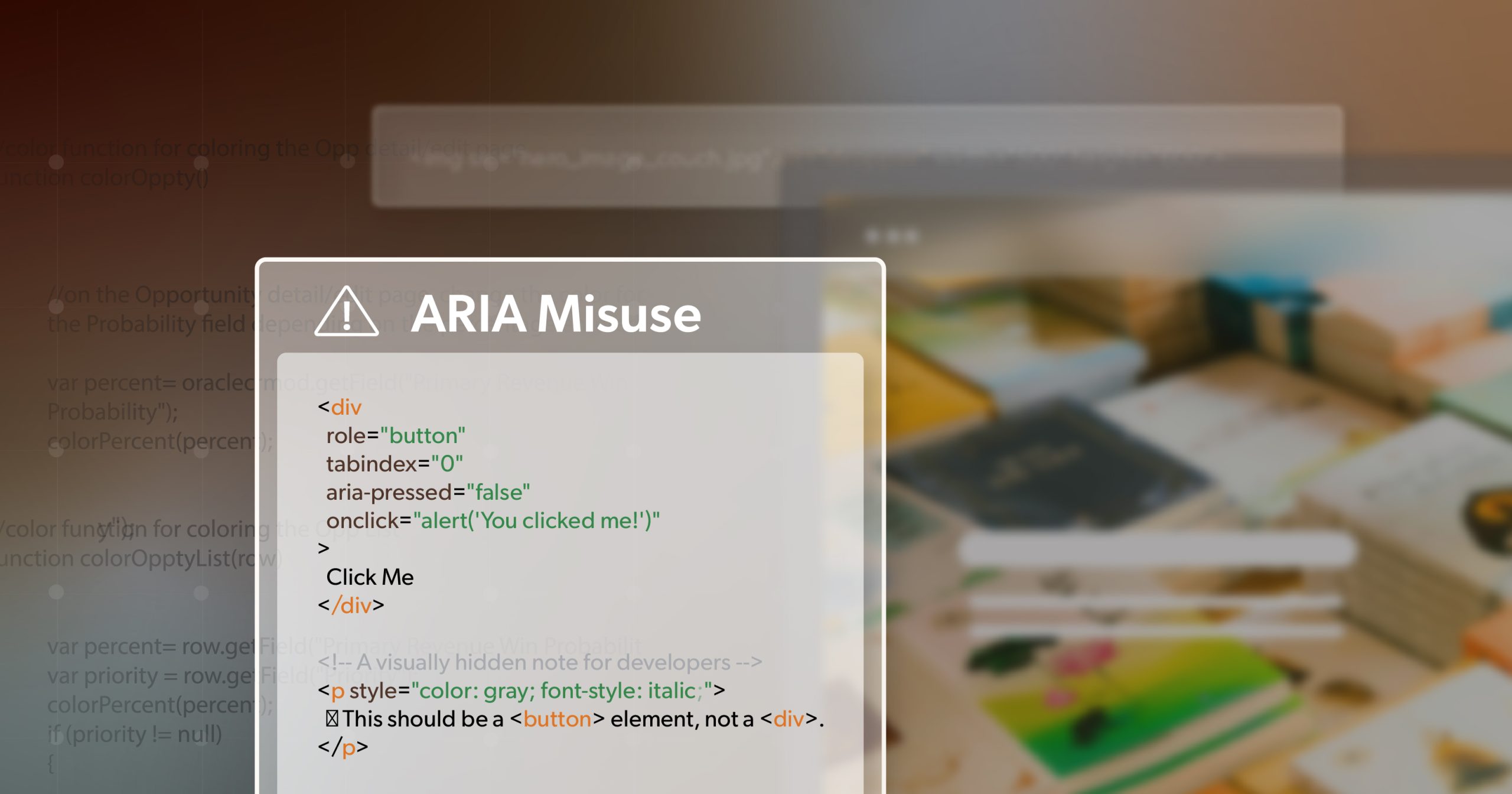
To make a hamburger menu accessible, you must use a <button> element rather than a generic <div>. The menu trigger needs a clear text label or aria-label to announce its purpose to screen readers. Once the menu is open, you must trap the keyboard focus within the drawer so users don’t accidentally tab into the background content, ensuring a secure mobile experience.
Should submenus open on hover or on click for accessibility?
Submenus should always open on click rather than hover to ensure maximum accessibility. Hover interactions are notoriously difficult for screen reader users to track and are impossible to replicate on touch-screen devices. Intent-based click interactions provide clear programmatic feedback to assistive technologies, confirming that a section has expanded and is ready for navigation, which aligns with WCAG 2.2 principles.
What is the difference between the Disclosure pattern and the Menubar pattern?
The Disclosure pattern uses simple buttons to toggle the visibility of nested lists, which follows standard web expectations. In contrast, the Menubar pattern mimics desktop software by requiring arrow-key navigation. Because most web visitors expect to use the “Tab” key to move between links, the Menubar pattern often creates confusion and increases the risk of technical non-conformance for typical business websites.
How does WCAG 2.2 affect website navigation design in 2026?
WCAG 2.2 introduces stricter requirements for focus appearance and target size that directly impact accessible navigation design patterns. Every interactive menu element must now have a minimum target size of 24 by 24 CSS pixels to accommodate users with limited mobility. Additionally, the focus indicator must have high visual contrast, ensuring that keyboard users never lose their place within your site’s global header.
Why is keyboard focus management so important for navigation?
Keyboard focus management is essential because it provides the visual cursor for users who don’t use a mouse. If the focus ring is hidden or has low contrast, these users cannot determine which menu item they are about to activate. This lack of clarity is a fundamental barrier to navigation and remains one of the most common technical failures cited in web accessibility litigation today.