216digital.
Web Accessibility

Phase 1
Web Remediation for Lawsuit Settlement & Prevention


Phase 2
Real-World Accessibility


a11y.Radar
Ongoing Monitoring and Maintenance


Consultation & Training

Is Your Website Vulnerable to Frivolous Lawsuits?
Get a Free Web Accessibility Audit to Learn Where You Stand
Find Out Today!

Web Design & Development

Marketing

PPC Management
Google & Social Media Ads


Professional SEO
Increase Organic Search Strength

Interested in Marketing?
Speak to an Expert about marketing opportunities for your brand to cultivate support and growth online.
Contact Us

About

Blog

Contact Us
  • SEO in 2018: Times They are a Changin’

    SEO in 2018: Times They are a Changin’

    A new year is upon us and with it a plethora of updates and algorithm changes to make you second guess your ranking methods. From Google’s surprise, mid-december Maccabee update to the FCC’s net neutrality repeal, 2017 was full of web-related shifts. So to help, we’ve compiled a list of some the best SEO & digital marketing articles covering the 2018 trends to look out for.

    • Voice Search
    • Featured Snippets
    • Mobile-First Indexing
    • Meta-Description Length
    • Video Content

    The rise of Voice Search

    google home
    Image courtesy of NDB Photos. Licensed under Creative Commons 2.0.

    With the increase in smart speaker sales like Alexa and Google Home, there may soon be a shift in the way people search online. Though the impact of new voice search related keywords is unsure, it seems likely this’ll be a factor in the coming years.

    • SEO in 2018: Optimizing for voice search and SEO without SERPs is here with Google Assistant, Home and Amazon Echo. Here’s how to survive. by Bryson Meunier
    • OK, Google: How Do I Optimize My Site for Voice Search? By Dan Shewan
    • How to Optimize for Voice Search by Sherry Bonelli

    The push for Featured Snippets

    rich snippet bread

    Google’s continued focus on user friendly experiences means featured/rich snippets or knowledge boxes are becoming the norm. In fact, back in 2015 Ben Goodsell reported that the CTR on a featured page increased from 2% to 8% after it was placed in an featured snippet. And the number of these featured snippets in search engines has only grown – meaning that optimizing for them now could mean a huge boost in organic traffic.

    • Google’s latest search updates brings more content to Featured Snippets & Knowledge Panel info by Amy Gesenhues
    • Featured snippets: Optimization tips & how to ID candidate snippets by Brian Ussery
    • How to optimize featured snippets for voice search by Jessie Moore

    The start of Mobile-first indexing

    online shopping

    Following the trend of users searching mostly on mobile, Google announced in November that it planned to move towards indexing the mobile versions of sites first. This means that Google will consider the mobile version of your site before the desktop version when ranking. So more than just having a responsive site, it’s key to have a truly mobile friendly version.

    • Google’s Mobile First Indexing: Tracking When Google Moves Your Site and Preparing for the Switch by Vanessa Fox
    • Google Begins Mobile-First Indexing by Moving M-Dot Site to Responsive by Andreea Sauciuc
    • Mobile-First Indexing: Everything we know, and how it could affect you by Sam Underwood

    The increase in meta-description length

    meta description

    For anyone doing SEO, the 155 character limit is all too familiar. However, the frustration of crafting a tempting summary with a targeted keyword in the limited character length is about to be a thing of the past. Google recently boosted their snippet limit to 300 characters!

    • How Long Should Your Meta Description Be? (2018 Edition) by Dr. Peter J. Meyers
    • Google officially increases length of snippets in search results by Barry Schwartz
    • (Update) 5 Tips for Google’s New Meta Title Guidelines in 2018 by Adam Fifield

    The growth of video content

    youtube graphic

    Youtube is the second largest search engine after Google, and the growth in video search is only projected to continue. After all, watching a video is more engaging than reading text. And the use of visuals, voice, and written text to explain ideas is a lot easier for people to understand.

    • The 3-Part Secret to Video Marketing in 2018 by Anthony Helmstetter
    • YouTube SEO: The Ultimate Guide by Brian Dean
    • 4 Exciting Video Marketing Trends for 2018 by Michael Brenner
     

    And for all you All-In-One Guide fans –

    • How are you changing your content marketing program in 2018? By Rachel Lindteigen
    • How to Rank in 2018: The SEO Checklist – Whiteboard Friday by Rand Fishkin
    • Digital advertising in 2018: 5 trends to watch by Ginny Marvin
    • 29 Experts on the Most Important 2018 Social Media Trends by Danny Goodwin


    Anything we’re missing? Let us know!

    Greg McNeil

    January 2, 2018
    Content Marketing, Responsive, SEO
  • Black Friday Shopping: Is Your Online Business Ready?

    Black Friday Shopping: Is Your Online Business Ready?

    America’s favorite shopping season is right around the corner and with it a barrage of online bargain shoppers. Is your site ready to handle the Black Friday shopping rush? If the answer is anything but yes, you may want to consider a quick preparatory revamp. Why? Because the year-end holiday season is not only the best time to meet your annual sales goals, but a great time to capture new customers. Following Thanksgiving, Black Friday and the last two months of the year are prime for gift-giving; people are shopping for themselves, their family, and their friends. Not to mention, over the last eight years, Black Friday retail e-commerce spending alone went from $534 million USD to $1970 million USD  – and it’s only expected to rise again this year. Which means optimizing your site for online sales now can ensure your business is ready to roll this holiday season. So how can you prepare? The first step is to decide which holidays you want to run promotions on. Once you’ve determined that and set up a promotional calendar, you can move on to polishing your website and online holiday marketing strategy. To make it easier, we’ve compiled a checklist to help get you on your way.

    Getting Your Website in Gear

    Image of a person browsing an ecommerce platform
    1. Check Your Server Traffic Capacity. Black Friday weekend is sure to draw a lot of traffic to your site, especially if you are running promotional deals. So making sure your server can handle the influx of customers is likely to make both their and your experience easier.  Check your server capacity before the season starts at  LoadImpact.com or Blitz.io.
    2. Create Landing Pages for Your Black Friday Deals. If you plan on setting your customers up with some awesome deals, it’s important to make sure they know what they are and where to find them. Landing pages on your website specifically made for the Black Friday/Cyber Monday promotions can help alert your customers to all the seasonal discounts you have on offer. Going the extra mile and creating a banner for your deals to be displayed on every page, will also help ensure no one misses out!
    3. Make sure your website is mobile friendly. The share of mobile sales on Black Friday in 2013 went from 27%  to 48% in 2016. And with more and more customers turning to their phones for online shopping, having a site with responsive design is more important than ever. Don’t know whether your site is mobile ready? Check it out with Google’s Mobile-Friendly Test. And if you still can’t figure it out, let us take a look!
    4. Test and troubleshoot everything. Even with the best promotions, the holiday shopping season could still be a complete bust if your customers aren’t able to make purchases from your site.  Whether it’s a broken link or simply a slow loading page, it’s important to make sure you’ve tested the durability of your landing pages and made sure your promotional coupons are working fine.
    5. Make the checkout process as seamless as possible. Simplicity is key. Customers like it when they can make a purchase with the fewest clicks possible – and obvious clicks at that. So spend some time ensuring your website has a user friendly interface with clear add/delete item and checkout buttons. And if you need a little help, let us know.
    6. Have your Shipping and Returns Policy for the shopping season in fine print. To prevent any future misunderstandings or complaints, it’s best to have your holiday season shipping and returns policy listed on your website where customers can easily access or see it.
    7. Track EVERYTHING. To make sure you’re getting the results you want and your leads are converting into sales, keep a detailed track record of every change you’ve made to your site and how it has affected your conversions.  A great way to do this is through tracking your Google Analytics and Facebook Pixel data.

    Marketing Yourself Right

    Images of a persons Startup company Now that you have your website ready to go the next thing to tackle is your marketing strategy. To start, look at your past marketing data to see how your business performed during previous years. This will make it easier to plan a marketing strategy as you’ll have a better idea of what worked and what didn’t. Once you have that data, you can start to plan for the future holiday season. And the following tips will help you put your best foot forward!
    1. Research your customers. A good marketing strategy starts with great research. For example, do you know 100% who your customers are? Have you created buyer personas? If you haven’t, check your Google Analytics demographics to ensure that the personas you have in mind match the factual customer data retrieved by Google. This will help you market to not only your current customers, but all potential buyers as well. Still unsure? Take a look at this helpful B2B Buyer Persona Guide for a more in-depth look on how to make your customer-data work for you.
    2. Create a winning PPC Campaign. Pay-per-click is one of the best ways to reach targeted customers. If you have optimized your campaign with the right keywords, your ad should appear at the top of Google’s search results. However, if you did not have the time to get your SEO and keyword targeting in place, PPC can help! For example:
      1. Shopping Ads is one of the best ways to get your products in front of your customers, because its CPC is much lower when compared to a Text Ad, and it can get you better conversion rates. You can also target local customers with Google’s Zip Code Targeting.
      2. And if you are already running PPC campaigns, the holiday season is a good time to start a remarketing campaign. Reach your customers who are actively searching for your products, or are loyal to your business with remarketing campaigns.
    3. Utilize social media for customer insights. Your social media channels can be a treasure trove of information. Places like Facebook, Twitter, and Instagram are full of consumer opinions on products and services. And not just on products they currently use, but items they are interested in buying. Put this information to use by –
      1. Promoting your Black Friday deals on social media sites like Twitter or Facebook.
      2. Creating product hype and awareness by offering special discounts to  your followers.
      3. Closely monitoring comments or mentions on your social channels and responding to any customer queries and feedback promptly. You can even make use of social listening tools to listen to what people are saying online about your brand or products.
      4. Creating your own hashtags for the holiday season. You can stick to the regular hashtags of #BlackFriday and #CyberMonday, of course, but you can also create hashtags specific to your business. If you do, make sure you plug them on all your marketing channels- website, social media, and emails.
      5. Using Facebook Dynamic Shopping ads, which are a great way target customers who visited your website and added a product to their cart but never followed through with the purchase.
    4. Start an email campaign targeting current customers. When it comes to getting results, email marketing is still very effective. Triggered emails like those to customers that abandoned full online shopping carts, still tend to bring in more customers than many social media campaigns.  To get the most out of your email campaign –
      1. Categorize your email lists.  Segmenting your emails into specific customer lists based on products they’ve looked at or purchased is likely to get you more email open rates.
      2. Personalize! Include the name of the subscriber and offer specific promotions based on their location.
      3. Create and manage your email workflows in advance. This will ensure that every email is catered to the customer receiving it, and be less work for you in the long run.
      4. Leverage your current customer base through exclusive deals. Not only will this help build anticipation for future Black Friday deals, but it will show your loyal customers that there is  some advantage in following you.
      5. Create a countdown timer for your emails to promote urgency.

    In the End

    No one knows your customers as well as you do and any website adjustment or marketing campaign should be planned with them in mind. However, we hope these tips will help get you and your site on your way to holiday-ready! And if you still have questions, let us know!

    Sources

    Desktop retail spending on Thanksgiving Day, Black Friday and Cyber Monday in the United States from 2008 to 2016 Share of mobile online sales on Black Friday from 2013 to 2016 How to Create Detailed Buyer Personas for Your Business Get Local with ZIP Code targeting Effects of List Segmentation on Email Marketing Stats Why You Should Spend More on Google Shopping vs Text Ads

    Greg McNeil

    October 18, 2017
    Ecommerce Platforms, Google AdWords, Google Analytics, PPC, Responsive, SEO, Social Media Marketing
    Digital Marketing, ecommerce design, ecommerce website, PPC, responsive design, responsive web design, SEO
  • 8 Features of Excellent Websites in 2017

    8 Features of Excellent Websites in 2017

    By now many of us have earned our stripes in web surfing. We’ve experienced a countless number of websites, and are savvy enough to know which sites are well crafted and which could use a serious face-lift – usually within the first five seconds of a visit. But what is it that makes a website “great?” Below are eight features many high-performing websites currently employ that put them at the top of their rank.

    1. High Quality, Authentic Images

    Humans are visual creatures. Think back to the last time you sat through a presentation where the speaker went on for seemingly forever without any graphics or visuals to break through the monotony. You may have absorbed some of the information, but chances are you walked away without having gained anything more than a headache.

    This same principle applies to websites. Throw large columns of text at a user when they’re not expecting it (i.e. not a blog post) and they will leave your site without even a basic understanding of what you were trying to communicate. Studies show that users only read about 28% of the words on a page. Add that in with the fact that humans process images 60,000 times faster than words, and the best way to quickly express a message becomes obvious.

    Not just any image will do, however. The best performing images for a website follow a few guiding rules:

    • High Quality: With faster internet speeds comes more capability of loading high resolution images. Low quality, pixilated imagery will make your site appear dated and untrustworthy.
    • Authentic: Gone are the days when users would be appeased by staged stock images of smiling business people shaking hands. We know they’re fake, your users know they’re fake, and they no longer represent real businesses made of real people. It’s recommended to use images of your own team, office, and products to boost authenticity.
    • Closely Related: That beautiful image of a sprawling scenic overlook may be eye catching, but if it doesn’t do much to describe what you’re selling, it won’t be an effective use of browser real estate. Images on your website should be companions to your content and remind users why they’re there.

    2. Consistent Brand Voice

    Computer Screen With A Hello Speech Bubble.

    Though not limited to website design, a well thought-out brand voice is an important part of engaging users. All of your content on your website should follow the tone of your brand and reflect the core values of your business. Users will come to recognize your brand by various factors:

    • Tone: How do you want to communicate with your users? Consider your audience and the way that they use your site. For example, a financial institution may want to use a tone of voice that comes across as being professional and cordial, whereas a toy store can speak more whimsically.
    • Buzzwords: What kind of language will resonate best with your users? The types of words you might use for a gym will differ greatly from those used for a spa. Think of the types of keywords a user might search for, or what will draw them in.
    • Conciseness: How quickly should the user be taking in your content? If you want to draw your viewers in with a well-crafted aesthetic, you may need to pad your copy with the appropriate amount of wordage to paint the right picture. However, if you want your users to quickly flow through your site and into a purchase or action, you’ll want to keep your copy short and sweet.

    Once you have your brand voice, be sure to keep it consistent on every page of your site. This will keep your business recognizable and put users at ease.

    3. Fast Loading Times

    Loading Progress Bar.

    Have you ever clicked on a link to a website and hit the back button in frustration when it took too long to load? Users today have grown accustomed to fast load times and don’t want to wait. About 50% of all web users expect a web page to load in 2 seconds or less, and 40% will completely abandon the attempt after 3 seconds.

    This means that if your website is slow to load, you will only be gaining at maximum 60% of the traffic that you could get. There are many factors when considering the speed of your website:

    • Image sizes: Remember those high quality images we talked about? Unfortunately, images can have large file sizes that will bog down the performance of your site. Consider keeping the number of images on your site down to raise site speed, or use a program to optimize their size.
    • Hosting: Your site speed may be completely out of your hands if you’ve chosen an inexpensive hosting plan. Though cheap, oftentimes you are sharing a server with many other money-conscious business owners, which will slow down your site’s performance. If it’s your hosting that’s the issue, consider upping your plan.
    • Optimization: There are several ways to improve your site’s overall speed from the backend; too many to name here. If your site is slow, consider asking a web developer to optimize all of your settings.

    4. Simple Navigation

    Web Browser Showing A Generic Website Layout.

    Have you ever gone to a store for something basic like toothpaste and been completely overwhelmed by the number of choices you have to pick from? Suddenly, a simple errand has turned into a confusing situation. Users feel the same about website navigation; give them too many choices and they will give up and leave.

    This phenomenon, called the paradox of choice, deems that the more options presented to us, the more likely we are to become overwhelmed and not pick anything at all. In web design, 7 navigation links is generally considered the maximum number to hold, with 5 being the more optimal number. When choosing navigation links for your site, consider the purpose of your website and which ones would be absolutely necessary for a user to have a positive experience. If your site is very large and requires a multitude of navigation items, consider using a mega menu.

    5. Mobile First

    Mobile Phone Next To A Computer Monitor.

    Mobile-friendly websites are no longer a nice feature to have in 2017; they’re absolutely necessary. More people are browsing the web on mobile devices than desktops, pulling in at a ratio of about 56:44. This means that if you’re not catering to your mobile audience, you’re missing out on over half of your potential!

    Creating a great mobile experience is more than just having a responsive website, however. Mobile first design means exactly what it sounds like. Rather than designing based on a desktop monitor and shrinking it down for mobile, modern websites are now being designed first for mobile to create the best possible experience. Some factors that make mobile an entirely different medium from desktop:

    • Screen ratio: Many phones and tablets are designed to be held horizontally by default, meaning the screen size sits at a completely different ratio than most Desktop monitors. Side-by-side columns on desktop screens become far too narrow on mobile devices. Simply stacking the columns on top of each other for mobile is not the best solution either. After all, which column is more important/should be on top? Mobile first design addresses this issue before it even arises.
    • Screen size: Mobile devices have far less screen real estate than desktop monitors. Thus, making a desktop first design and paring it down for mobile often becomes a task of cutting out content that isn’t necessary. Mobile first design forces designers to first consider what is important for the user to have, preventing unnecessary content in your desktop view.
    • Touch interaction: Unlike most desktop monitors, mobile devices can be tapped and pinched, adding another dimension to the user’s experience. Rather than adding these features as an afterthought, mobile first design ensures that the entirety of the site is easily accessible to mobile users.

    6. Engaging Micro Interactions

    Website On A Tablet Showing A Section That Changes Color To Show It Was Clicked.

    Micro interactions are those little experiences we encounter on the web that serve a single purpose, such as a checkmark showing us that we filled in a form field correctly, or a confirmation that an order went through. These interactions are so common now that most of us barely take notice, but their effectiveness is anything but miniscule.

    Micro interactions serve to delight, engage, and deliver positive reinforcement to users to let them know that they’re performing the correct actions. Imagine hitting “send” in an email app and not receiving any indication that the button had been clicked or the email had been sent. How can you be sure that your email went out? Small indicators, such as the button changing color when clicked, the browser sending you out of your draft and into your inbox, or a notification alerting you that your mail has been sent tells the user that they have done everything correctly and that their job is done. Other examples of micro interactions include:

    • Play buttons turning into pause buttons when clicked
    • Form fields highlighting with a colored border when clicked
    • Load animations indicating that content is being loaded
    • Links changing color when hovered over to indicate that they can be clicked

    7. Frictionless (In the Right Places)

    Generic Website Showing A Product Page With A Buy Now Call To Action.

    Friction in web design refers to anything that stands between a user and their desired action. For example, a multi-page form before ordering a product, or a pop-up intrusion when reading an article. Generally speaking, friction on a website is frustrating for users and can drastically reduce conversion rates. Web users are in a hurry and want to consume content quickly – why stop them from doing what they came to your site to accomplish? Friction can be reduced in multiple ways, including:

    • Reducing the number of form inputs. Do you really need to ask for a user’s phone number, middle name, etc?
    • Clear call to actions. Users don’t want to have to search all over your website to find what they’re looking for. Identify what users most want to accomplish on your site and make it easy for them to access.
    • Make your header sticky. Users are now used to scrolling, however it can be frustrating to have to scroll all the way back to the top of a page just to access the navigation. Keep your header always in view for easy, seamless navigation.

    Though friction prevents users from doing what they want, it is not necessarily always a bad thing; in fact, there are times when you want to add friction to create a better experience, as it makes users stop and think. Experienced web designers know when to apply the brakes on a user’s journey, such as making a user confirm before deleting something. Accidental clicks are a real occurrence, so asking a user if they’re sure they want to delete something before it disappears for good can prevent frustrating experiences.

    8. Expert Usage of Color

    Color Wheel Showing Red, Orange, Yellow, Green, Blue And Purple.

    Have you ever wondered why so many fast-food restaurants use red and yellow for their logos, or why so many businesses paint everything with blue? Design isn’t just about making things look nice; a good designer understands the psychology of color and how best to employ them on a website. Each color can evoke an emotion from users. (Keep in mind that these meanings can vary from culture to culture.)

    • Red: The color of passion and aggression, red is full of energy and can evoke a sense of urgency.
    • Orange: This color is a mixture of red’s passion and yellow’s optimism, creating an upbeat hue that expresses playfulness. It is also the color of impulse, and thus is often used in “buy now” buttons.
    • Yellow: Bright and fun, yellow expresses happiness, sunlight, and a cheery tone.
    • Green: The color of both money and the earth, green is used to express wealth and environmental consciousness.
    • Blue: This color evokes trustworthiness and professionalism, making it an excellent choice for many businesses. However, blue can also express sadness and moodiness, so be careful.
    • Purple: Wisdom and royalty come to mind with purple, making it a good choice for businesses that want to express reverence or knowledge.
    • Black: Though not technically a color, black evokes luxury, making it excellent for expressing wealth.

    In Conclusion

    Though none of the features listed above are absolutely necessary to craft a high-performing website (I’m looking at you, Craigslist), they are important to keep in mind when considering the performance of your own site. If your numbers are down or you’re looking into a redesign, keep these tips in mind and you’ll be well on your way to an excellent website in 2017.

    Sources

    • Do Visuals Really Trump Text?
    • How Loading Time Affects Your Bottom Line
    • The paradox of choice and how it affects web design

    Greg McNeil

    September 18, 2017
    Responsive
  • The Necessity of Google AMP in the Mobile Age

    The Necessity of Google AMP in the Mobile Age

    In our last AMP article, we covered how Google’s Accelerated Mobile Pages work and how you can utilize them to help boost your mobile ecommerce.
    Since then, Google has continued to enhance its mobile user experience. Rolling out new AMP updates like AMP Bind, which allows internet retailers to create product pages with interactive elements for color and size selection. As well as giving Adwords users the ability to use AMP pages as landing pages for their ads.

    But that’s not all.

    The new AMP updates also utilize Google’s Brotli to reduce document sizes by a further 10% and compress images 50% more efficiently without a loss in quality.

    These additions, coupled with applications like AMP Lite – Google’s optimized version of AMP for users with a slower internet connection or a low-end smartphone – have allowed Google’s AMP pages to load nearly 30 times faster than their non-Amp counterparts.

    So why the focus on mobile pages?

    If you spend the majority of your time in an office – home or work – you may be used to conducting most of your online activity via a desktop. For the rest of the world, however, smartphones are king.

    Think about it.

    When was the last time you waited until you had access to a desktop to look up a restaurant or search the IMDB of an actor whose movie history you can’t remember?

    The joy of owning a mobile device is its near instantaneous access. You not only have the whole of the web at your fingers, but you can take it with you anywhere you go.

    Consider this:

    As of 2016, comScore Mobile Metrix® reports that Americans spend an average of 87 hours a month browsing the web on their smartphones, as opposed to the 34 hours they spend browsing on a desktop.

    Looking at places like the U.K., Italy, and Spain, the numbers are similar. Most people are accessing the web through their phones.

    But why?

    It’s simple – affordability.

    Many people don’t have the money to invest in both a phone and a computer, so they go with the more logical – usually cheaper – choice.

    And in developing countries with larger populations like Nigeria, China, Peru, and India, this distinction is even more noticeable.

    For example, in a study conducted by MIT, 620 out of 690 million internet users in China go online via a mobile device. That’s almost 90%!

    Following the Trend

    So what does this mean for the future of web pages?

    It’s hard to say. As smartphone technology continues to advance, the stripped down versions of AMP pages may change.

    However, as it stands now, that easy mobile access is key.

    Want to AMP up your page? Contact us today for a quote!

    Sources

    • Google brings expanded AMP support to search and display ads
    • Google’s AMP now powers 2B+ mobile pages and 900K domains, loads 2x faster
    • Bringing the speed of AMP to search & display ads
    • What’s coming for SEO in 2017? 5 hot SEO trends from the SMX East conference
    • AMP For Retailers: Is It Worth It?
    • World Wide Web, Not Wealthy Western Web (Part 1)
    • 31 Mobile Marketing Statistics to Help You Plan for 2017
    • Internet Mobile internet usage surpasses desktop usage for the first time in history

    Greg McNeil

    July 12, 2017
    Responsive
  • Google AMP Pages for Ecommerce – INFOGRAPHIC

    Google AMP Pages for Ecommerce – INFOGRAPHIC

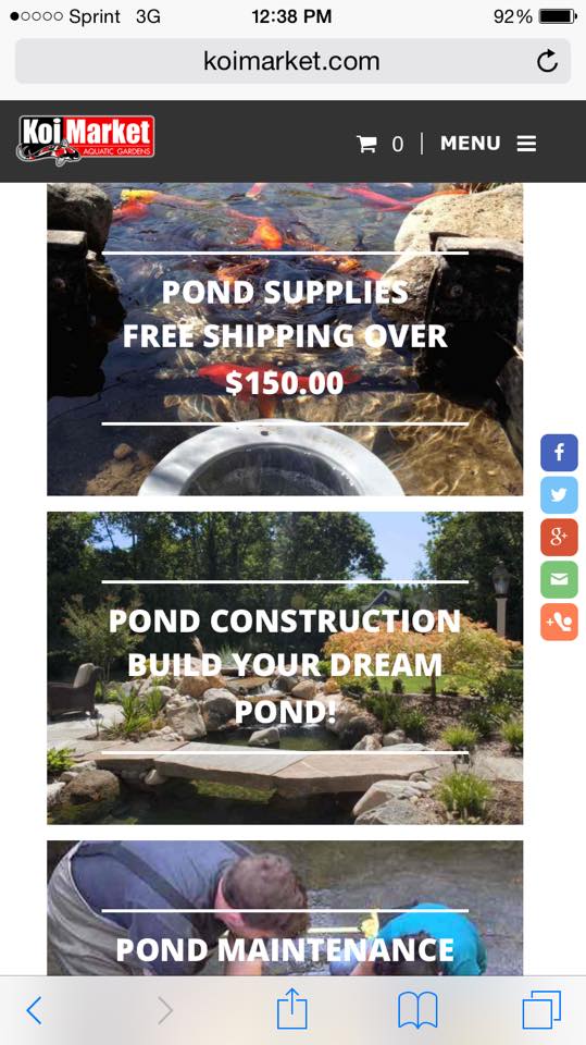
    Fast-loading product pages could make or break your conversion rate.

    As an independent ecommerce retailer, you know how tough it is to compete with the big boys. Amazon can outsell us all, and they can afford fast-loading mobile functionality at scale. Luckily, independent e-retailers can optimize their experiences to compete—and it’s cheaper than you might think. With the increasing growth of mobile shopping, Google’s AMP project offers a unique opportunity for ecommerce stores to load product, category, and home pages instantly for on-the-go mobile customers. [clickToTweet tweet=”#AMP for #ecommerce means lightning-fast product, category, and home pages. @216_digital” quote=”#AMP for #ecommerce means lightning-fast product, category, and home pages. ” theme=”style1″] Accelerated Mobile Pages (AMP) is an open-source project that aims to kick the mobile web into high gear. AMP was originally intended for publishers, whose sites often load slowly on mobile due to multiple JavaScript queries for numerous ads. But AMP is great for ecommerce, too. 
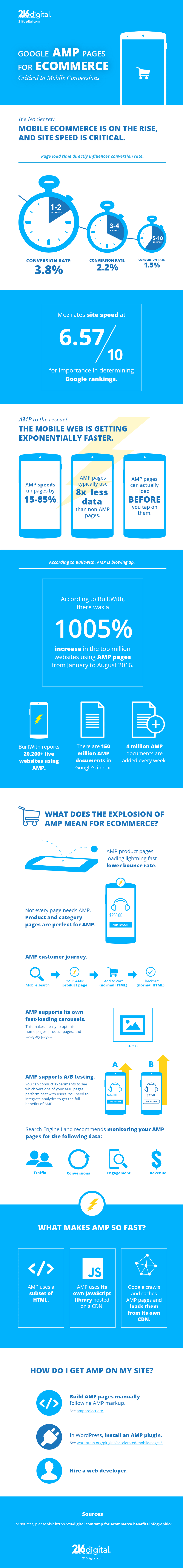
Slow mobile load times can kill an ecommerce store. The first pages in the conversion funnel MUST load lightning-fast. You don’t want to blow the customer’s moment of expectation. AMP is the perfect solution. So what does AMP for ecommerce mean? Let’s break it down. amp-infographic2-04

    What is AMP?

    AMP is an open web standard that cranks up page load on mobile. It uses a limited subset of HTML. It does not allow 3rd party JavaScript, only the AMP JavaScript library, which must be pulled from the AMP CDN (content delivery network). AMP pages are cached and served from a free Google CDN. This combination produces lightning-fast load times on mobile. amp-screenshot2-pencil 
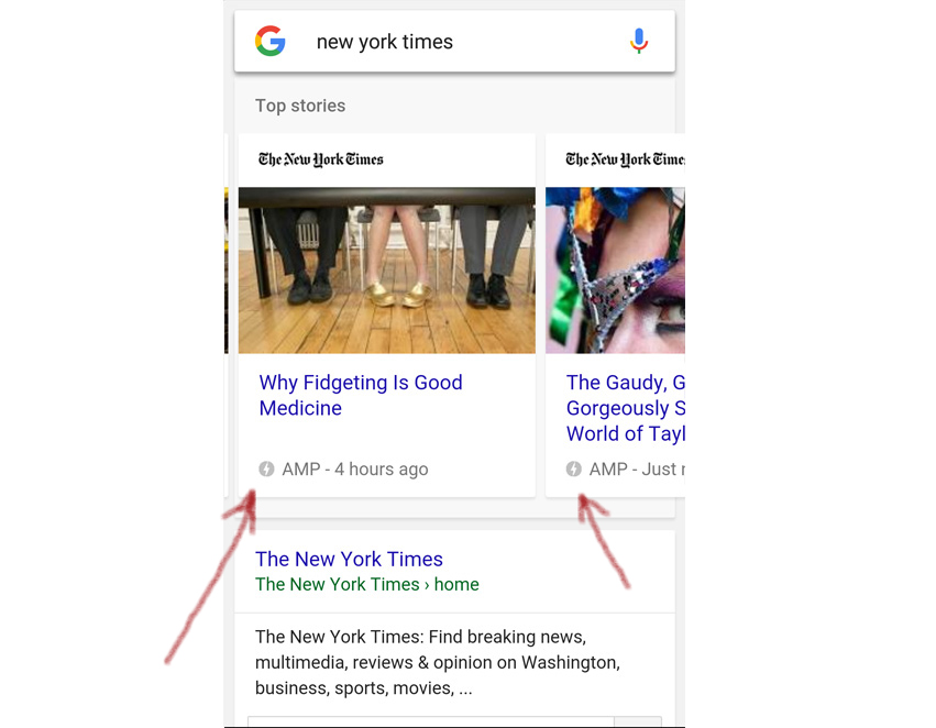
In mobile search results, AMP pages appear in a carousel at the top of search. They are notated with the lightning bolt symbol and the word AMP. AMP results may also appear below the carousel. “AMP pages are highly distilled versions of the corresponding HTML page,” says 216digital developer Justin Sims. “They’re not as media-rich or as heavy as other pages.” [clickToTweet tweet=”#AcceleratedMobilePages are highly distilled versions of the corresponding HTML page. @216_digital” quote=”#AcceleratedMobilePages are highly distilled versions of the corresponding HTML page. ” theme=”style1″]

    Why is this important?

    As AMP picks up momentum, we fully expect it to become the new standard for mobile development in certain environments. Google reports that it has indexed 150 million AMP pages, and that 4 million new AMP pages are added every week. That’s a fast-growing trend. Since AMP represents a new competitive edge for those sites that use it, it’s critical to adopt this standard early.

    How do I get AMP on my ecommerce store?

    “With any large-scale, widely adopted platform, there will be easy 3rd party solutions implemented,” says 216digital developer Justin Sims. “WordPress and Magento already have premade AMP solutions. At the end of the day, though, there will be a huge difference in quality and effectiveness between manually developed amp pages and those generated through plugins.” In other words, AMP plugins will work for simple situations, but they may not offer the full control which more complex ecommerce stores require. In that case, an experienced developer can help you get the most out of AMP, either with or without a plugin. cta-ampdev-long

    How can I tell if AMP is doing its job?

    AMP supports A/B testing. That means you can gather real data on two or more versions of an AMP page to see what drives conversions and what doesn’t. As Search Engine Land reports, you’ll want to set up Analytics to monitor four dimensions of page performance. Ideally, you would compare these stats for AMP pages against non-AMP versions of the same products on your site. If you can’t do that, you can compare your AMP pages against different products that generally perform the same as your AMPed products. Here are the four dimensions to monitor: – Traffic – Engagement – Conversions – Revenue

    Is Google giving AMP pages a ranking boost?

    Not directly. “To clarify, this is not a ranking change for sites,” says the Google Webmaster Central blog. But think about this. Google DOES consider load speed and engagement/CTR (click through rate) metrics when ranking a page. As more and more users surf the web on mobile, mobile engagement data will make up a bigger slice of the overall engagement data for a page. And as knowledge of AMP spreads, users will likely prefer the results that are marked with the AMP lightning bolt, ⚡. Will Google give AMP pages a ranking boost? No. But users will. [clickToTweet tweet=”Will @google give #AcceleratedMobilePages a ranking boost? No. But users will. @216_digital” quote=”Will @Google give #AcceleratedMobilePages a ranking boost? No. But users will. ” theme=”style1″]

    What does Google Cache mean for onsite traffic?

    AMP pages are served off a free Google CDN, not off your server. For many of us, that may sound like a red flag. But wait. This is actually a win. Think of it like this: you give up increased traffic to your domain at the very top of the conversion funnel. In return, you get super-fast load times, and you’re still displaying your product and branding. The conversion funnel still leads to you. Google doesn’t get the money; you do. Even better, your domain-level bounce rate *could* go down. People are more likely to abandon your site because the product they landed on wasn’t what they wanted. Now, if they abandon your AMP product page, the bounce happens from Google’s AMP cache domain, NOT from your domain. Once you transition customers to your domain, which you should do at the add-to-cart stage, they are actually much closer to buying if you’ve offered them a value proposition that meets their needs. Plus you’ve already wowed them with a lightning-fast product page. To capitalize on the value which the speed of AMP offers, you need to optimize your onsite checkout for fast load time and seamless UX on mobile.

    Two versions of the same page? Isn’t that duplicate content?

    In this case, no. Will Critchlow explains on Distilled.net: “You should always link to the canonical version (which is the desktop version). That should have a rel=”amphtml” link to the AMP version (and the original AMP version and all cached versions should have a rel=”canonical” link back to the original).” In other words, proper AMP markup tells Google, “There are two versions of this page, the AMP version and the desktop version. The desktop version is the canonical (original) version.” Duplicate content issue solved!

    What pitfalls should I know about?

    A misconfigured AMP page shows an AMP error in Google SERPs. It’s important to hire a developer who understands AMP. Make an annotation in Analytics so you know when you published your AMP pages. If your stats take a dive, there might be something wrong.

    Do I need to AMP my entire ecommerce store?

    Luckily, no. AMP will only help your business when it’s applied to pages that might show up in SERPs or in social media feeds. In ecommerce, that means your homepage, some product pages, and major category pages. If you’re practicing content marketing with a blog, you could also apply AMP to your content marketing articles, since you want these to be discovered in SERPs and on social media. You do NOT need to AMP your cart or checkout pages, since these lie farther down the conversion funnel. The main purpose of AMP is to secure the customer’s commitment higher in the funnel, at the stage when many people abandon mobile pages because of slow load times. Note, however, that your checkout process MUST still be fast and painless. Cart abandonment is a real problem at checkout. AMP can’t help you with that. If you don’t optimize your checkout experience on mobile, all that AMPing will be in vain. We recommend trying AMP on a few select product and category pages, as well as your homepage. If you begin to see a higher conversion rate on your AMP pages, you can start rolling it out to more pages. The best part? You can move as fast or slow as you want in building out more AMP pages for your site. We recommend faster, though, especially for products which will have high demand this holiday season.

    AMP is so stripped down. What ecommerce functionality is left?

    Again, AMP is really only appropriate for use on homepages, category pages, and product pages. You can’t build every page of your purchase flow with AMP. But the fact that it doesn’t support the usual bells and whistles doesn’t matter. The goal is not to build the entire conversion funnel in AMP, but rather, to use AMP to serve up product pages—fast. AMP is well-suited to these 3 types of pages because it DOES support product carousels, though they have to be hand-coded in AMP markup. AMP also supports social sharing, with Twitter, Facebook, Pinterest, LinkedIn, and Google+ coming preconfigured. You can also manually configure any social network that isn’t preconfigured. A thumbnail carousel with large image display is still under development. See the GitHub thumbnail carousel documentation for more. AMP also allows you to display different content depending on whether a user is logged in or not. This has obvious applications in ecommerce.

    The Bottom Line

    The mobile ecommerce experience doesn’t have to be slow. AMP offers the perfect solution for slow-loading product, category, and homepages. If you’re interested in exploring the possibilities of AMP for ecommerce, get in touch today. Let’s start talking about your next big thing.

    Sources:

    https://econsultancy.com/blog/10936-site-speed-case-studies-tips-and-tools-for-improving-your-conversion-rate/ https://www.ampproject.org/how-it-works/ https://www.internetretailer.com/2016/08/04/handbook-holidays-mobile http://blog.custora.com/2016/01/2015-e-commerce-holidata-recap/ https://moz.com/search-ranking-factors https://engineering.pinterest.com/blog/building-faster-mobile-web-experience-amp http://trends.builtwith.com/widgets/Accelerated-Mobile-Pages https://webmasters.googleblog.com/2016/08/amp-your-content-preview-of-amped.html https://www.ampproject.org/docs/get_started/about-amp.html https://www.ampproject.org/docs/get_started/technical_overview.html http://searchengineland.com/mobile-marketing-amplification-content-performance-measurement-253336 https://amphtml.wordpress.com/2016/08/24/optimize-your-amp-pages-with-amp-experiment/amp/

    Greg McNeil

    September 14, 2016
    Responsive
  • Miva Customization: Retro ReadyTheme

    Miva Customization: Retro ReadyTheme

    Miva Retro ReadyTheme Customization: Tailored To Your Needs!

    Miva users know that Miva is the ecommerce world’s best-kept secret. With Miva now offering responsive ReadyThemes free with every license, it’s easier than ever to put a functional, beautiful skin on your Miva store. In fact, most of our clients agree: Miva ReadyThemes really nail it after just a little customization. Bee Bald Man Care Products sells skin care products for the head. Their products offer incredible value for bald and non-bald men alike. But men aren’t the only ones who love Bee Bald; women use their products, too. Bee Bald has a developed a great brand. Clearly, they needed a great website to match. When Bee Bald came to us for a redesign, we knew that the Miva Retro ReadyTheme was perfect—well, nearly perfect. Bee Bald founder Dennis Fisher wanted to make a few changes to the theme. He had some ideas on how to optimize this theme for his business, and we were happy to help. The fact is, a pre-loaded theme is rarely a perfect fit for a business owner’s vision. Every business is unique, and themes are designed to please a wide user base. Bee Bald needed something unique. We agreed that Dennis had some great ideas to take his online store to the next level. So how did we take the Bee Bald store to the next level? Let’s dive right in.

    Miva Retro ReadyTheme Customization: Homepage Layout

    Dennis liked the Retro ReadyTheme overall. “As a template, it was great,” he says. “But it’s not all things to all people.” Specifically, he wasn’t happy with the theme’s homepage layout. The stock layout was functional and looked great, but that functionality didn’t quite fit his product line. We adjusted the homepage product offering template, replacing the stock configuration with a product carousel. We also tweaked the colors and the copy to match Dennis’s specifications. As you can see, the resulting Bee Bald homepage looks stunning. Dennis has developed an amazingly cohesive brand—one that really sells his product to his niche. Clearly, Dennis’s design decisions were one key part of building that awesome brand. Honestly, we think a lot of marketers could take a cue from Dennis. It’s obvious that a great ecommerce design appeals to online shoppers. However, a great design coupled to a cohesive brand also makes a great impression on other businesses. In Dennis’s case, as he hammered out relationships with distributors the old-fashioned way, his website turned into a stellar asset. Dennis could throw someone a link with confidence, knowing his website design would showcase the excellent quality of his product line.

    Responsive Web Design: Critical In Today’s Ecommerce Market

    Ouch. Looks like non-responsive design. (Original photo courtesy of Jan Vašek; modified by 216digital.)
    Ouch. Looks like non-responsive design. (Original photo courtesy of Jan Vašek; modified by 216digital.)
    Dennis was getting a lot of mobile traffic on his old site, but mobile users weren’t converting. Dennis thought that mobile users were leaving the site because it wasn’t resizing to the small screens of phones. We agreed—and the same is true for all non-responsive sites today. If you’re not serving pages optimized for mobile devices you’re losing sales. For ecommerce store owners, mobile website design isn’t an option. It’s a necessity. The Retro ReadyTheme is fully mobile responsive out of the box. However, when you add custom extensions to a responsive theme, you have to ensure that the customizations look great on mobile, too. Dennis needed a store locator module for his site. We integrated a powerful store locator module into the new Bee Bald site—but we knew that that alone wasn’t enough. We made sure the store locator module was fully mobile responsive and integrated into the look and feel of the theme. That way, customers could find a Bee Bald store on the go—and they wouldn’t be distracted by a clunky store locator experience.
    Bee Bald looks great on mobile.
    Bee Bald looks great on mobile.
    We believe it’s the little things that count, so we also tightened up the overall look of Dennis’s Retro ReadyTheme installation. These incremental changes added up to a great overall brand impression—on mobile and on desktop.

    The Cleveland Connection: A Local B2B Partnership

    photo by: Rick Harris 1
    photo by: Rick Harris
    An entrepreneur often wears all the hats. When Dennis started gearing up for the launch of Bee Bald, he was learning about the ecommerce world from scratch. Since the technical aspect of ecommerce was so new to him, he realized only shortly before launch that he needed to make changes to the proposal he’d submitted to his developer. The developer was local to the Cleveland, OH area, but they weren’t quite prepared to deal with the nuances of changing a Miva project on the fly. While Dennis’s relationship with his original developer had showed initial promise, he began to realize it wasn’t till-death-do-us-part. He needed a dedicated Miva developer. Enter 216digital. Justin Sims, our lead web developer, took over Dennis’s project. When we asked Dennis to reflect on his experience with us, we could hear the genuine appreciation in his voice. “Justin did a terrific job,” Dennis said. “He was accessible and responsive. He helped streamline the process.”  Now that’s an aspect of responsive web design that you don’t hear about every day—responding right away to a client’s needs and concerns. In the process of working with us, Dennis learned a lot about Miva. We didn’t keep any secrets from him. Dennis can now perform many store updates himself, meaning we’re billing him less. A lot of companies wouldn’t do that. Why give away the secrets that build value into your services? We simply don’t see it that way. Dennis is our client, and it was our job to build the best ecommerce tool we could for him. Dennis was equipped to learn Miva, and we were happy to teach him.

    The Bottom Line

    At 216digital, we have a passion for all things Cleveland. Cleveland beers, Cleveland sports teams, we’re 216 all the way. (That’s the area code around here, by the way.) It was exciting to help a Cleveland-area entrepreneur achieve his business goals. Of course, our clients come from all over. If you aren’t from the Cleveland area, we’ll show you the Cleveland work ethic as we create a stellar ecommerce site for you. So, when you’re ready to start that next project, remember 216digital. With 15 years of experience as a Miva certified partner, we can make your Miva ReadyTheme nail it!

    Greg McNeil

    August 5, 2015
    Ecommerce Platforms, Miva, Responsive
  • Miva Customization: Suivant ReadyTheme

    Miva Customization: Suivant ReadyTheme

    Miva Suivant ReadyTheme Customization: The Sky’s The Limit!

    If you use the Miva shopping cart platform, or if you’re looking to start a Miva store, you’ve probably heard of Miva ReadyThemes. These themes offer beautiful, functional styling right out of the box. However, they look even better with a little customization. Here at 216digital, we regularly customize Miva ReadyThemes for our clients. One of our favorite recent projects was a redesign via ReadyTheme for D’Andre New York, a seller of fine shearling coats. In this post, we’ll talk about that project and explain the Miva Suivant ReadyTheme customization that we performed.

    D’Andre New York: A Great Product Deserves a Great Website

    D’Andre New York sells fine shearling coats. These jackets feature beautiful, understated styling. Since they’re made of real wool, the moisture-wicking property of the material gives the wearer natural climate control. That means shearling coats can be worn comfortably in summer or winter. With this natural flexibility and their finely-tailored lines, shearling jackets are the pinnacle of outerwear style. Of course, high quality comes with a price tag. Shearling jackets typically range in price from $1000 to $3000. D’Andre New York’s target customer is affluent, style-conscious, and expects high quality. If the product itself delivers on all these—which it certainly does—then shouldn’t the website that sells the product display that same excellence? That was our reasoning, and Tatiana, owner of D’Andre, agreed. She wanted a redesign of her website, something that would showcase the beauty, durability, and value of her shearling products.

    D’Andre’s Legacy Site

    Image of Dandreny Legacy Website D’Andre New York’s old site had excellent functionality, and it had served the business well for years. However, the site was built in the days of low-resolution screens, and it looked a little small on today’s larger monitors. Worse, the site was built long before the mobile responsive revolution. It was awkward and cumbersome to use on a mobile device. With more and more customers shopping and purchasing products directly from their phones, D’Andre stood to lose out on potential business. With each sale worth a few thousand dollars, D’Andre needed to convert every prospect who came their way.
    D’Andre New York’s legacy site in mobile simulation. Get ready to zoom and scroll!
    D’Andre New York’s legacy site in mobile simulation. Get ready to zoom and scroll!
    It wasn’t just the resolution and lack of mobile responsiveness that worried us. D’Andre sells a fine product to an affluent market. We believed that D’Andre’s old site didn’t quite convey the level of luxury and comfort that wearers could expect from a shearling jacket. We thought the site ought to display the excellence that D’Andre’s shearling coats provide. Clearly, it was time for a redesign.

    Miva Suivant ReadyTheme: Almost Ready To Rock And Roll

    Miva ReadyThemes give Miva store owners beautiful, functional online stores right out of the box. But as with all cookie-cutter solutions, ReadyThemes leave a bit to be desired in the details. A little customization takes a Miva ReadyTheme to the next level. D’Andre New York had chosen the Miva Suivant ReadyTheme. We agreed that this theme was perfect for a retailer of fine shearling jackets. It just needed a few tweaks. For starters, the Miva Suivant ReadyTheme has a large header. This isn’t necessarily a problem—except that by default, that header anchors to the top of the screen when the user scrolls. It’s not too noticeable on desktop, but on a mobile device, that pinned header eats up a lot of real estate. For every client using the Suivant ReadyTheme, we routinely recommend customizing the header. In D’Andre’s case, we changed the header so it wouldn’t stick to the top of the screen. We reasoned that users know where the header is. They know to scroll up if they need to use the navigation bar. This change significantly improved the user experience of D’Andre’s new website. The header wasn’t the only tweak that the Suivant ReadyTheme needed. With the ongoing evolution of SEO (search engine optimization), Google now values good content more than ever, and many web users find value in useful, informative content. Blogs and magazines can display the entirety of a piece of content without compromising other organizational goals. However, in an ecommerce setting, selling product is critical. Too much content on a product or category page could keep the all-important buy buttons hidden from site visitors. Yet content is critical for SEO! What’s a webmaster to do? For all our clients doing customized ReadyThemes, it’s a simple fix. We custom-code an option to display the first 150 characters or so of the content, followed by a “read more” button. This gives us the best of both worlds: 300+ word content for SEO purposes (and for those readers who want to educate themselves fully), and product imagery and buy buttons still displayed above the fold for users who are close to making a purchase. For D’Andre New York, this solution was a no-brainer.

    Optimizing D’Andre’s Onsite Content

    Speaking of content, it’s one of the most important components of branding. Content that doesn’t convey the right brand impression negatively affects marketing. In the case of D’Andre New York, we recognized at once that Tatiana’s great luxury brand needed content that created an opulent, luxurious impression. With Tatiana’s permission, our SEO content writing team began writing new copy for the D’Andre website. Our process was simple. We researched other luxury brands, such as Rolex and Mercedes-Benz, to get a feel for the appropriate voice and tone. We settled on two points of focus for D’Andre. For Tatiana’s women’s collection, our content revolved around the word “elegance.” For the men’s collection, we chose the word “achievement.” These words matched D’Andre’s brand perfectly. With these two ideas in place, the rest of the content flowed. The result was a unique, memorable brand identity in all D’Andre’s onsite content.

    Image Optimization: A Key Element In Ecommerce Marketing

    Customers want to see what they’re buying. In the case of D’Andre’s fine shearling coats, customers want to see not only the overall look of the jacket, but also the elegant details of accents and trim. With D’Andre’s old site, product images looked small on larger screens, preventing customers from getting a complete picture of the jacket they were considering. Every product image on the site existed in two separate files: a tiny thumbnail version, and the full-sized version. Since the thumbnail had to be created manually in an image editor, and since both images had to be uploaded manually, the old system required double the work on catalog updates. Enter the Miva Image Machine. This state-of-the art functionality dynamically creates multiple image sizes from one image file, eliminating the need to create thumbnail sizes manually and upload them separately. The Image Machine also allows alternative images. These show up as thumbnail images below the main image on a product page. Users can click on any of these alternative images and view the full-sized image in a popup. This allows store owners to provide multiple views of a product, giving customers a sense of what the product looks like from different angles.

    The Bottom Line

    We saw at once that Tatiana’s company offered a great product. We wanted to improve the overall value of her brand by optimizing the impression her company made on web visitors. With a little Miva Suivant ReadyTheme customization, Tatiana’s redesign was ready to go, clearly communicating the luxury and style that customers could expect from D’Andre New York. It was a pleasure to work with Tatiana. Through deep market analysis and ongoing communication, we formed a partnership with her to improve the marketability of her brand. We think you’ll agree—the new D’Andre New York website looks beautiful, fully matching the luxury and elegance which D’Andre offers its customers. If you’re considering a responsive Miva design for your ecommerce store, get in touch with us today. We specialize in Miva design and development, and all our work is fully mobile-responsive. Whether you need tweaks to a Miva ReadyTheme or a ground-up custom design, we’ll turn your vision into a reality. Drop us a line, and let’s start talking about your next big thing.

    Greg McNeil

    July 17, 2015
    Miva, Responsive, SEO
  • Future-proofing: Why You Should Go to A Responsive Design

    Future-proofing: Why You Should Go to A Responsive Design

    In case you haven’t heard, having a responsive website is going to be a bigger part of web design moving forward. The common practice in the past was for mobile versions of sites to be given their own subdomain. Essentially, you had two websites with duplicate information and you had twice as much work when you needed to change something. This doubles your development and maintenance costs. It also caused problems when your site was listed in search engines. Now, you could prevent a mobile version of your site from being crawled and listed as a duplicate in search results, then just serve up the mobile version of the site when a mobile browser was detected. However, Google prefers to know exactly what they are serving and a redirect like that is considered bad practice.

    Sites with a “mobile version” also had their limitations. They could only support two screen resolutions: desktop and mobile. Using a tablet, you usually ended up with an over sized smartphone version of the site, or you could end up with a desktop version that was still too small. And if you used the built-in browser on your gaming system, all bets were off. It can be tremendously frustrating not only from the side of usability, but also from a design perspective. Good responsive design practice fixes all of this.

    Google is trying to unify search results and they have been striving for a consistent user experience across all platforms. For the last few months, websites have been eligible for the “mobile-friendly” label within Google Search results if they use a responsive design. The criteria it uses are things like avoidance of flash and other uncommon software on mobile devices, legible text without zooming, automatic horizontal sizing which is scalable to whatever size screen, and “finger friendly” spacing of links.

    This is all great for the end-user, but in the future it could have a big impact on you. Google has been experimenting with the mobile-friendly label in their Search ranking. Sites without a responsive design could be penalized and dropped down the list. It could literally undo the years of hard work on SEO and marketing just by adding a criteria that your site isn’t prepared for.

    Luckily, we at 216digital are experts in responsive design and can quickly and efficiently create a responsive version of your website. If you’d like to read more about the mobile-friendly label and responsive design, Google has provided a few resources to help educate you further and we’ve linked them below.

    Mobile-friendly Test
    Webmasters Mobile Guide
    Mobile usability report
    How-to guide for third-party software

    Greg McNeil

    March 9, 2015
    Responsive
    responsive design
  • The Basics of Responsive Web Design

    The Basics of Responsive Web Design

    Implementing a responsive web design can have a tremendous impact on the overall custom experience your site offers. As consumers rely more and more on phones, tablets, and other mobile devices to stay informed, stay connected, and shop, it’s more critical than ever that your site utilizes a design that is easy to use on any device. Customers will look for every reason to exit out of your webpage, and if your website is difficult to navigate from a phone, they won’t stay long enough to buy anything and they won’t recommend it to their friends. That’s why making your website as user friendly as possible will work to your benefit, and 216digital is here to help you make it happen.

    The mobile view a user experiences on 216digital's site.
    The mobile view a user experiences on 216digital’s site.

    Here we’ve gathered together some reasons why you should seriously consider making your website responsive:

    1. Make sure your customers don’t tap dance: One of the most frustrating parts of using a website that isn’t optimized for mobile devices is the tapping and zooming you have to do to get to the content you want. To make things as easy and enjoyable as possible for your customers, you’ll want to make sure that your website’s images and content are properly presented and don’t require the customer to manipulate their device in some awkward fashion in order to make use of it.

    2. Make sure your website rankings don’t suffer: Google Webmasters recently released an article stating that “We see these [mobile friendly] labels as a first step in helping mobile users to have a better mobile web experience. We are also experimenting with using the mobile-friendly criteria as a ranking signal.” This means that your website could be hit hard in the coming years if it isn’t mobile friendly. Future-proof your website and don’t be left in the dust!

    3. Always think of the customer: Responsive web design isn’t just for customers using smaller, handheld devices. It should also scale-up and conform to fit the screens of larger devices, like televisions, that customers might be using through their gaming systems or other peripherals. By keeping the quality of your customers’ experiences a priority, you’ll be sure to have a website that will respond to all of their needs, no matter the device they are using.

    4. Leave the reading glasses at home: If your website isn’t optimized, many times the text is either much too large or way too small to be read easily. And, remember, your customers might be using a larger screen, like a TV, but sitting further away and still not able to read what’s on your site. The whole point of your website is to make it effortless for your customers to breeze through checkout when they decide to buy your product. So, if the site’s text is too small to read, that complication will not bode well for your bottom line. Making sure your text is readable is crucial to success.

    The desktop view a user experiences on 216digital's site.
    The desktop view a user experiences on 216digital’s site.

    216digital is here to simplify this whole process for you. Responsive web design is not only helpful, but in light of the ever-widening array of web-enabled devices available to consumers, it’s become absolutely essential. Nonetheless, it can also be time consuming and cumbersome to learn, which is difficult while trying to manage your online business. Let 216digital take responsive web design off your list of worries. Our team of expert designers knows exactly how to build your website to respond to whatever size screen your customers are using, so that you can entice them, no matter the device. Check out some of our work—we think you’ll like what you see.

    Greg McNeil

    March 2, 2015
    Responsive
    responsive web design
216digital Scanning Tool

Audit Your Website for Free

Find Out if Your Website is WCAG & ADA Compliant


    216digital Logo

    Our team is full of expert professionals in Web Accessibility Remediation, eCommerce Design & Development, and Marketing – ready to help you reach your goals and thrive in a competitive marketplace. 

    216 Digital, Inc. BBB Business Review

    Get in Touch

    2208 E Enterprise Pkwy
    Twinsburg, OH 44087
    216.505.4400
    info@216digital.com

    Support

    Support Desk
    Acceptable Use Policy
    Accessibility Policy
    Privacy Policy

    Web Accessibility

    Settlement & Risk Mitigation
    WCAG 2.1/2.2 AA Compliance
    Monitoring Service by a11y.Radar

    Development & Marketing

    eCommerce Development
    PPC Marketing
    Professional SEO

    About

    About Us
    Contact

    Copyright 2024 216digital. All Rights Reserved.