
By now many of us have earned our stripes in web surfing. We’ve experienced a countless number of websites, and are savvy enough to know which sites are well crafted and which could use a serious face-lift – usually within the first five seconds of a visit. But what is it that makes a website “great?” Below are eight features many high-performing websites currently employ that put them at the top of their rank.
1. High Quality, Authentic Images
Humans are visual creatures. Think back to the last time you sat through a presentation where the speaker went on for seemingly forever without any graphics or visuals to break through the monotony. You may have absorbed some of the information, but chances are you walked away without having gained anything more than a headache.
This same principle applies to websites. Throw large columns of text at a user when they’re not expecting it (i.e. not a blog post) and they will leave your site without even a basic understanding of what you were trying to communicate. Studies show that users only read about 28% of the words on a page. Add that in with the fact that humans process images 60,000 times faster than words, and the best way to quickly express a message becomes obvious.
Not just any image will do, however. The best performing images for a website follow a few guiding rules:
- High Quality: With faster internet speeds comes more capability of loading high resolution images. Low quality, pixilated imagery will make your site appear dated and untrustworthy.
- Authentic: Gone are the days when users would be appeased by staged stock images of smiling business people shaking hands. We know they’re fake, your users know they’re fake, and they no longer represent real businesses made of real people. It’s recommended to use images of your own team, office, and products to boost authenticity.
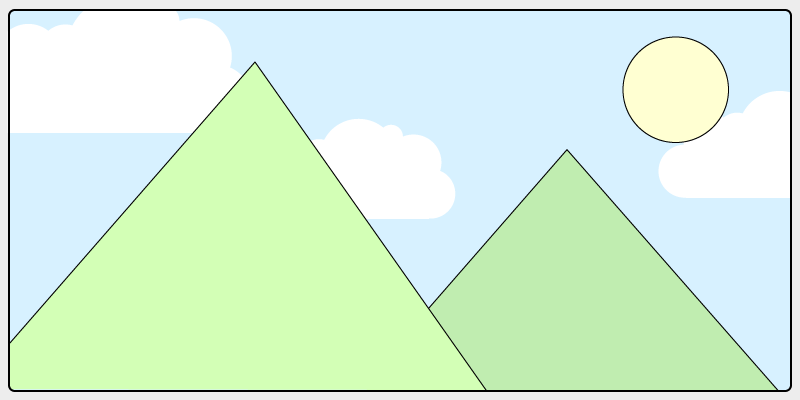
- Closely Related: That beautiful image of a sprawling scenic overlook may be eye catching, but if it doesn’t do much to describe what you’re selling, it won’t be an effective use of browser real estate. Images on your website should be companions to your content and remind users why they’re there.
2. Consistent Brand Voice

Though not limited to website design, a well thought-out brand voice is an important part of engaging users. All of your content on your website should follow the tone of your brand and reflect the core values of your business. Users will come to recognize your brand by various factors:
- Tone: How do you want to communicate with your users? Consider your audience and the way that they use your site. For example, a financial institution may want to use a tone of voice that comes across as being professional and cordial, whereas a toy store can speak more whimsically.
- Buzzwords: What kind of language will resonate best with your users? The types of words you might use for a gym will differ greatly from those used for a spa. Think of the types of keywords a user might search for, or what will draw them in.
- Conciseness: How quickly should the user be taking in your content? If you want to draw your viewers in with a well-crafted aesthetic, you may need to pad your copy with the appropriate amount of wordage to paint the right picture. However, if you want your users to quickly flow through your site and into a purchase or action, you’ll want to keep your copy short and sweet.
Once you have your brand voice, be sure to keep it consistent on every page of your site. This will keep your business recognizable and put users at ease.
3. Fast Loading Times
Have you ever clicked on a link to a website and hit the back button in frustration when it took too long to load? Users today have grown accustomed to fast load times and don’t want to wait. About 50% of all web users expect a web page to load in 2 seconds or less, and 40% will completely abandon the attempt after 3 seconds.
This means that if your website is slow to load, you will only be gaining at maximum 60% of the traffic that you could get. There are many factors when considering the speed of your website:
- Image sizes: Remember those high quality images we talked about? Unfortunately, images can have large file sizes that will bog down the performance of your site. Consider keeping the number of images on your site down to raise site speed, or use a program to optimize their size.
- Hosting: Your site speed may be completely out of your hands if you’ve chosen an inexpensive hosting plan. Though cheap, oftentimes you are sharing a server with many other money-conscious business owners, which will slow down your site’s performance. If it’s your hosting that’s the issue, consider upping your plan.
- Optimization: There are several ways to improve your site’s overall speed from the backend; too many to name here. If your site is slow, consider asking a web developer to optimize all of your settings.
4. Simple Navigation
Have you ever gone to a store for something basic like toothpaste and been completely overwhelmed by the number of choices you have to pick from? Suddenly, a simple errand has turned into a confusing situation. Users feel the same about website navigation; give them too many choices and they will give up and leave.
This phenomenon, called the paradox of choice, deems that the more options presented to us, the more likely we are to become overwhelmed and not pick anything at all. In web design, 7 navigation links is generally considered the maximum number to hold, with 5 being the more optimal number. When choosing navigation links for your site, consider the purpose of your website and which ones would be absolutely necessary for a user to have a positive experience. If your site is very large and requires a multitude of navigation items, consider using a mega menu.
5. Mobile First
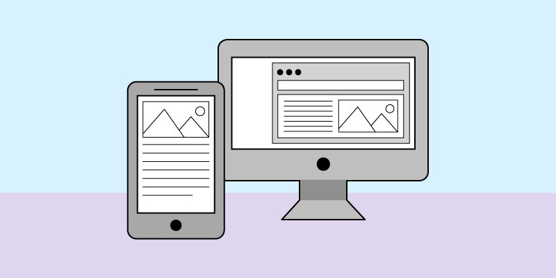
Mobile-friendly websites are no longer a nice feature to have in 2017; they’re absolutely necessary. More people are browsing the web on mobile devices than desktops, pulling in at a ratio of about 56:44. This means that if you’re not catering to your mobile audience, you’re missing out on over half of your potential!
Creating a great mobile experience is more than just having a responsive website, however. Mobile first design means exactly what it sounds like. Rather than designing based on a desktop monitor and shrinking it down for mobile, modern websites are now being designed first for mobile to create the best possible experience. Some factors that make mobile an entirely different medium from desktop:
- Screen ratio: Many phones and tablets are designed to be held horizontally by default, meaning the screen size sits at a completely different ratio than most Desktop monitors. Side-by-side columns on desktop screens become far too narrow on mobile devices. Simply stacking the columns on top of each other for mobile is not the best solution either. After all, which column is more important/should be on top? Mobile first design addresses this issue before it even arises.
- Screen size: Mobile devices have far less screen real estate than desktop monitors. Thus, making a desktop first design and paring it down for mobile often becomes a task of cutting out content that isn’t necessary. Mobile first design forces designers to first consider what is important for the user to have, preventing unnecessary content in your desktop view.
- Touch interaction: Unlike most desktop monitors, mobile devices can be tapped and pinched, adding another dimension to the user’s experience. Rather than adding these features as an afterthought, mobile first design ensures that the entirety of the site is easily accessible to mobile users.
6. Engaging Micro Interactions
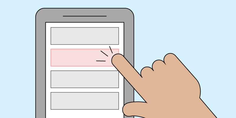
Micro interactions are those little experiences we encounter on the web that serve a single purpose, such as a checkmark showing us that we filled in a form field correctly, or a confirmation that an order went through. These interactions are so common now that most of us barely take notice, but their effectiveness is anything but miniscule.
Micro interactions serve to delight, engage, and deliver positive reinforcement to users to let them know that they’re performing the correct actions. Imagine hitting “send” in an email app and not receiving any indication that the button had been clicked or the email had been sent. How can you be sure that your email went out? Small indicators, such as the button changing color when clicked, the browser sending you out of your draft and into your inbox, or a notification alerting you that your mail has been sent tells the user that they have done everything correctly and that their job is done. Other examples of micro interactions include:
- Play buttons turning into pause buttons when clicked
- Form fields highlighting with a colored border when clicked
- Load animations indicating that content is being loaded
- Links changing color when hovered over to indicate that they can be clicked
7. Frictionless (In the Right Places)
Friction in web design refers to anything that stands between a user and their desired action. For example, a multi-page form before ordering a product, or a pop-up intrusion when reading an article. Generally speaking, friction on a website is frustrating for users and can drastically reduce conversion rates. Web users are in a hurry and want to consume content quickly – why stop them from doing what they came to your site to accomplish? Friction can be reduced in multiple ways, including:
- Reducing the number of form inputs. Do you really need to ask for a user’s phone number, middle name, etc?
- Clear call to actions. Users don’t want to have to search all over your website to find what they’re looking for. Identify what users most want to accomplish on your site and make it easy for them to access.
- Make your header sticky. Users are now used to scrolling, however it can be frustrating to have to scroll all the way back to the top of a page just to access the navigation. Keep your header always in view for easy, seamless navigation.
Though friction prevents users from doing what they want, it is not necessarily always a bad thing; in fact, there are times when you want to add friction to create a better experience, as it makes users stop and think. Experienced web designers know when to apply the brakes on a user’s journey, such as making a user confirm before deleting something. Accidental clicks are a real occurrence, so asking a user if they’re sure they want to delete something before it disappears for good can prevent frustrating experiences.
8. Expert Usage of Color
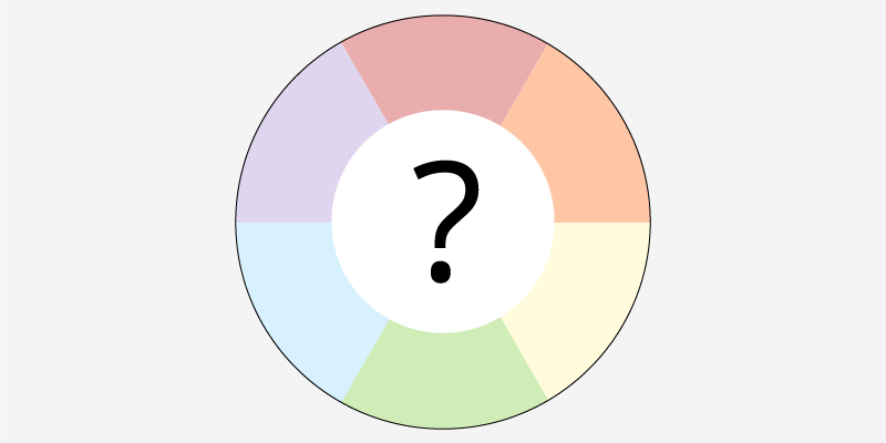
Have you ever wondered why so many fast-food restaurants use red and yellow for their logos, or why so many businesses paint everything with blue? Design isn’t just about making things look nice; a good designer understands the psychology of color and how best to employ them on a website. Each color can evoke an emotion from users. (Keep in mind that these meanings can vary from culture to culture.)
- Red: The color of passion and aggression, red is full of energy and can evoke a sense of urgency.
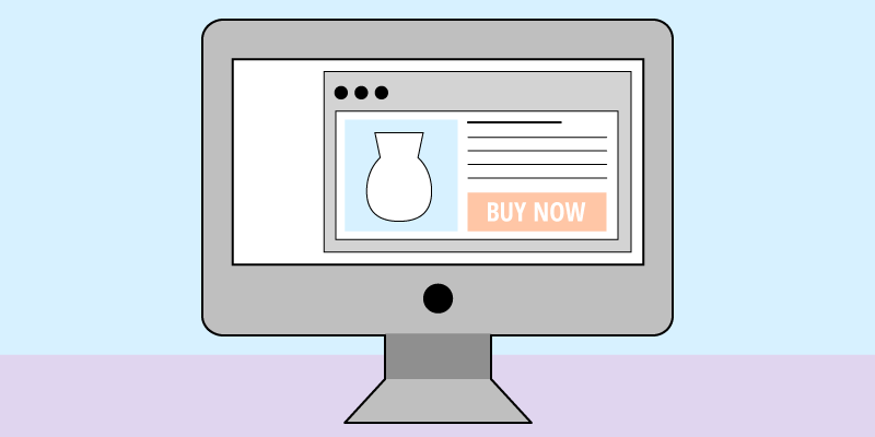
- Orange: This color is a mixture of red’s passion and yellow’s optimism, creating an upbeat hue that expresses playfulness. It is also the color of impulse, and thus is often used in “buy now” buttons.
- Yellow: Bright and fun, yellow expresses happiness, sunlight, and a cheery tone.
- Green: The color of both money and the earth, green is used to express wealth and environmental consciousness.
- Blue: This color evokes trustworthiness and professionalism, making it an excellent choice for many businesses. However, blue can also express sadness and moodiness, so be careful.
- Purple: Wisdom and royalty come to mind with purple, making it a good choice for businesses that want to express reverence or knowledge.
- Black: Though not technically a color, black evokes luxury, making it excellent for expressing wealth.
In Conclusion
Though none of the features listed above are absolutely necessary to craft a high-performing website (I’m looking at you, Craigslist), they are important to keep in mind when considering the performance of your own site. If your numbers are down or you’re looking into a redesign, keep these tips in mind and you’ll be well on your way to an excellent website in 2017.