Your website is accessible. You’re done now, right? Not quite.
While remediation is a crucial first step, it’s really just the beginning. Accessibility isn’t something you finish once—it’s something you maintain. Websites are always changing. Content gets updated, plugins refresh, new features roll out—and with each shift, there’s a chance that accessibility issues reappear.
According to WebAIM’s 2024 report, over 96% of homepages had detectable WCAG errors. Many of those errors weren’t new—they crept back in after earlier fixes. Without a way to keep accessibility in check, even small changes can undo progress and put organizations right back at risk.
That’s why ongoing monitoring is so important. And that’s where a11y.Radar comes in.
Why “One and Done” Doesn’t Work
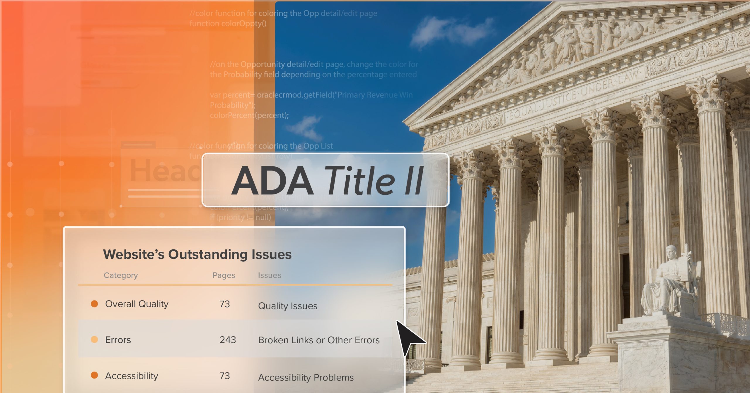
It’s natural to feel like accessibility work is complete after an audit. But the truth is, compliance is a moving target. Sites evolve every day, and standards continue to shift. WCAG guidelines are updated, ADA enforcement grows, and states add their own rules. What passes now might not pass six months from now.
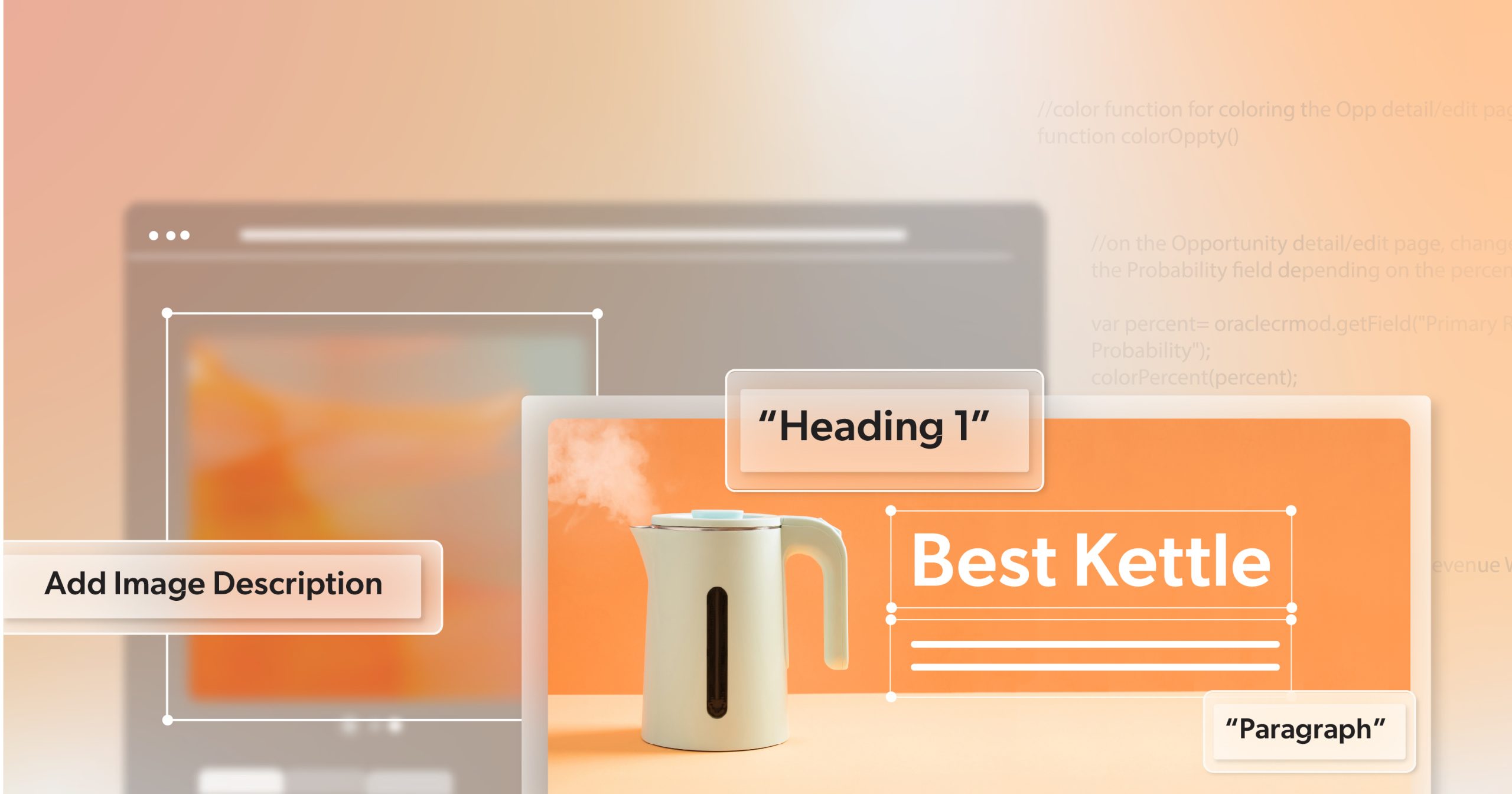
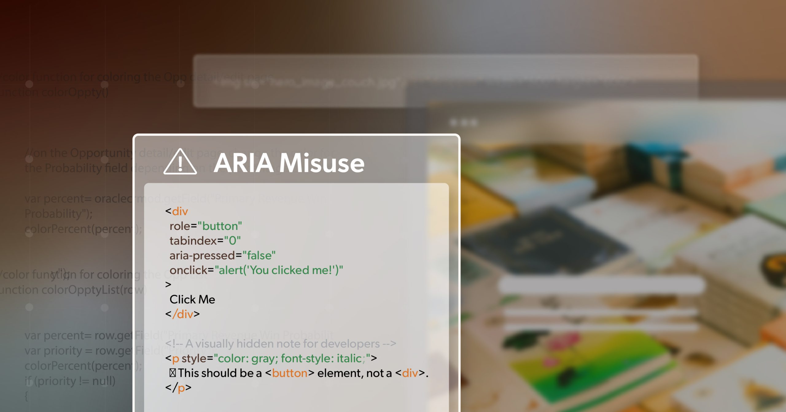
Even small oversights can add up. A missing ALT tag, a mislabeled form, or a CMS update that disrupts your site structure—any of these can affect usability for people with disabilities. Over time, those unnoticed changes also increase the risk of legal action.
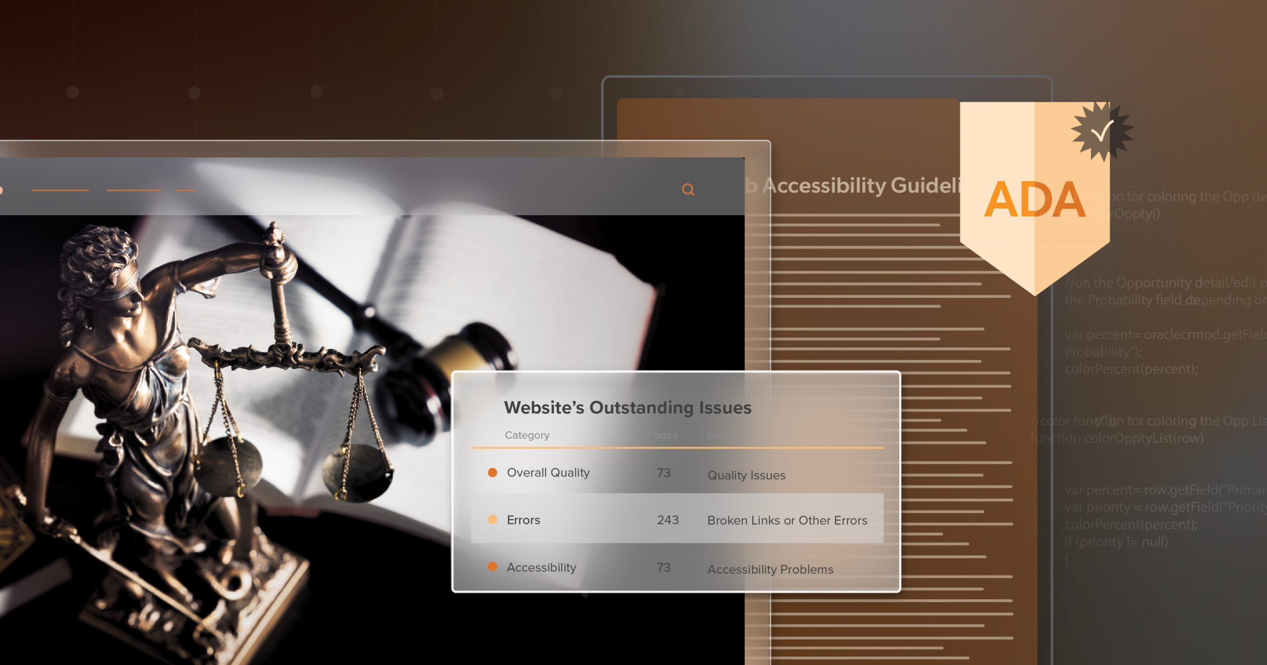
And that risk is real. In 2024, 4,000 accessibility lawsuits were filed in U.S. courts. Many weren’t first-time cases. In fact, 41% of all federal lawsuits in 2024 were filed against companies that had already faced a digital accessibility lawsuit. Once a business appears on the radar, it often becomes a repeat target—sometimes from a new plaintiff, sometimes aimed at a sister brand or parent company, and sometimes even circling back to the same website.
The Cost of Letting Issues Linger
Accessibility problems don’t just affect users—they affect your team too. When issues surface after launch, they’re far harder to fix. Developers have to step away from active work, QA has to retest, and releases get delayed. That cycle costs time and energy, and it chips away at morale.
It also costs more. Studies have shown that post-launch accessibility fixes can be up to ten times more expensive than addressing them earlier. Add the risk of legal complaints or demand letters, and the impact multiplies quickly.
For many teams, it isn’t a lack of commitment that causes setbacks—it’s the lack of ongoing visibility.
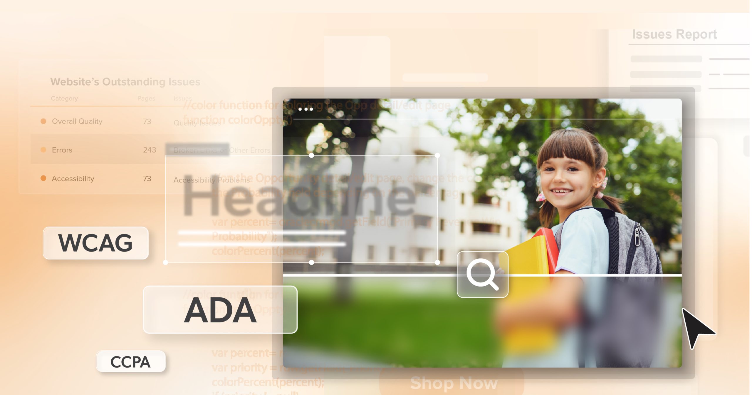
How a11y.Radar Helps You Keep Watch
This is where a11y.Radar proves valuable. Built from years of remediation work, it was designed to answer a common question: how do we stay compliant after the fixes are done?
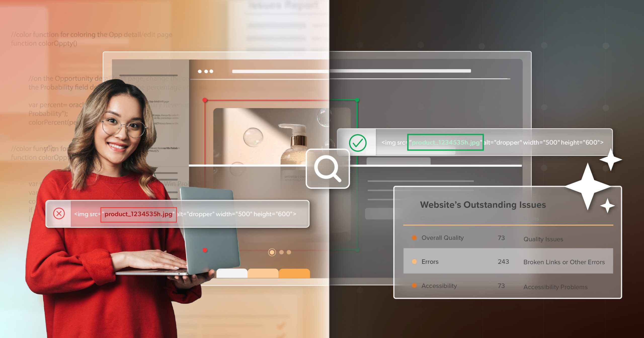
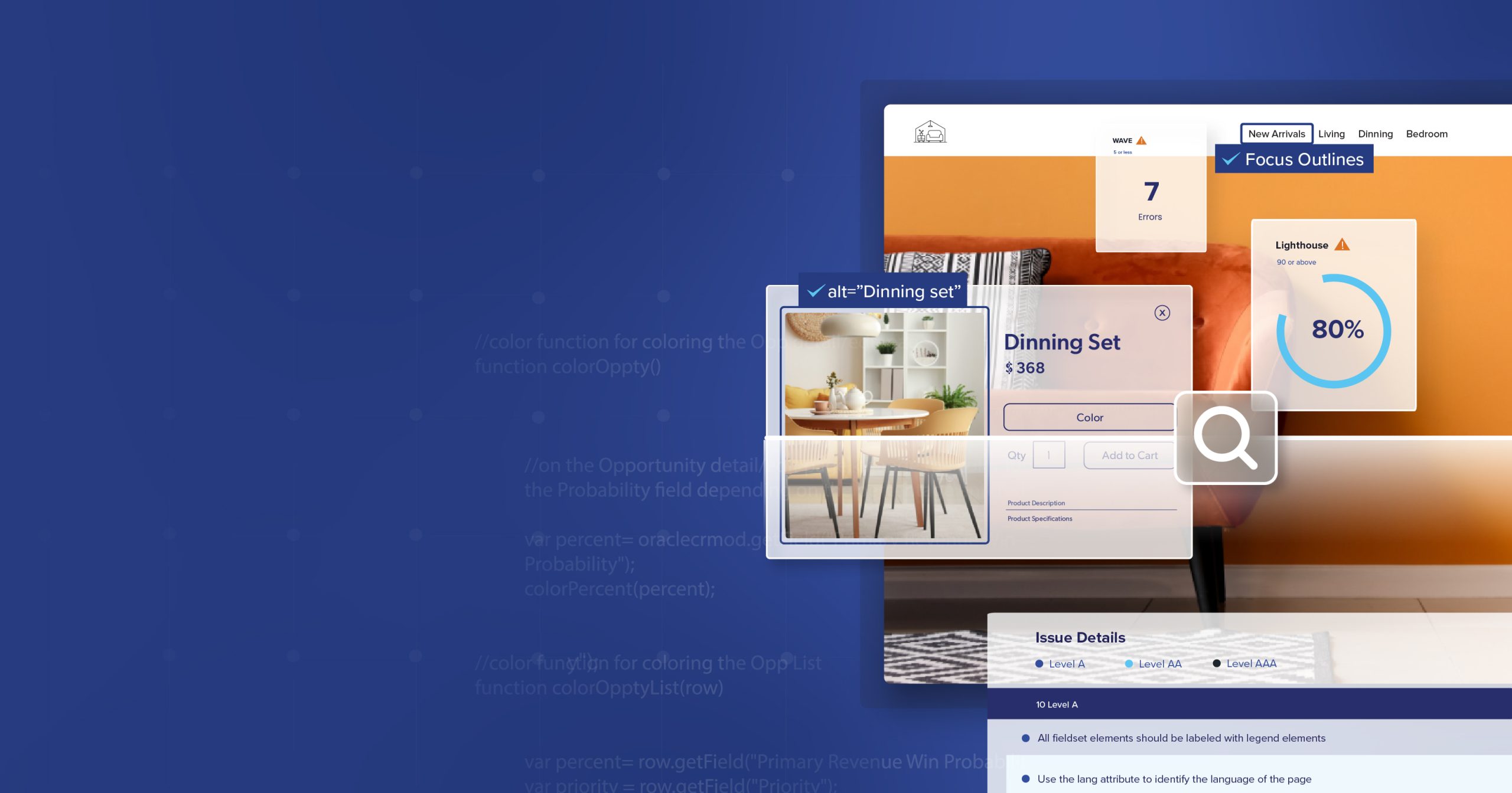
The platform runs recurring ADA and WCAG audits, scanning for the same kinds of issues law firms often use when targeting businesses. But instead of being surprised by those results, you get to see them first. Dashboards show your current compliance health, alerts highlight new problems quickly, and reports track issues over time so patterns become easier to spot.
Rather than treating accessibility like an occasional project, a11y.Radar makes it a steady part of how your site is maintained.
A Practical Difference for Teams
The benefits of ongoing monitoring show up in day-to-day work. Developers can push new features without worrying that a small change will break compliance unnoticed. Managers and stakeholders have clear visibility into accessibility status without extra meetings or reports. And when questions arise, monitoring logs provide a record of diligence and care.
Clients who use a11y.Radar often notice fewer disruptions to their sprint cycles and lower long-term remediation costs. But the real gain is stability. Teams move forward with confidence instead of being pulled back into cycles of rework.
Why a11y.Radar Isn’t an Overlay or Widget
It’s easy to confuse accessibility monitoring tools with overlays or plug-in widgets, but they couldn’t be more different. Overlays are marketed as quick fixes—drop in a snippet of code and, supposedly, your site is “compliant.” In reality, they don’t correct the underlying barriers. The same issues remain in the code, which means automated scans—and the law firms that rely on them—still find them.
Overlays also bring their own problems. They often interfere with assistive technologies like screen readers, creating new frustrations for the very users they claim to help. That’s why accessibility experts consistently caution against relying on them.
a11y.Radar works differently. It doesn’t attempt to “fix” anything on the surface. Instead, it monitors your site continuously, showing you where real issues exist so they can be corrected properly. Its role is transparency—alerting you to problems early, tracking them over time, and giving your team the information needed to address them at the source.
This approach doesn’t create the illusion of accessibility. It gives you the clarity to maintain it.
Automation and Human Judgment Together
Automation does a lot of the heavy lifting, but it isn’t the whole answer. Scans can confirm whether an ALT attribute exists, but they can’t judge whether the description is meaningful. They can flag a contrast error but can’t measure how usable the design feels in practice.
That’s why a11y.Radar also supports manual testing. Accessibility specialists step through your site with the same tools and perspectives users rely on, catching nuances that automation alone might miss. Together, automated scans and expert reviews create a more complete picture—one that protects both compliance and user experience.
Building Accessibility That Lasts
Accessibility work doesn’t stop after the first round of fixes. Websites and applications will continue to change, and with change comes the possibility of new barriers. The difference between falling behind and staying ahead often comes down to whether you’re monitoring consistently.
With a11y.Radar, teams gain a clear view of their compliance status, the ability to catch problems early, and the reassurance that progress won’t slip away. It helps reduce unnecessary rework, lowers legal risk, and gives developers and decision-makers more confidence in every release.
Accessibility is ongoing by nature. The more it becomes part of routine maintenance, the less it feels like a burden—and the more it supports a reliable, inclusive experience for everyone who uses your site.
Schedule a complimentary ADA Strategy Briefing to speak with one of our accessibility experts about a11y.Radar ADA Monitoring.