216digital.
Web Accessibility

ADA Risk Mitigation
Prevent and Respond to ADA Lawsuits


WCAG & Section 508
Conform with Local and International Requirements


a11y.Radar
Ongoing Monitoring and Maintenance


Consultation & Training

Is Your Website Vulnerable to Frivolous Lawsuits?
Get a Free Web Accessibility Audit to Learn Where You Stand
Find Out Today!

Web Design & Development

Marketing

PPC Management
Google & Social Media Ads


Professional SEO
Increase Organic Search Strength

Interested in Marketing?
Speak to an Expert about marketing opportunities for your brand to cultivate support and growth online.
Contact Us

About

Blog

Contact Us
  • Building an Accessible Website on a Tight Timeline

    There is a particular kind of nervous energy that comes with a full rebrand and relaunch. The clock is loud. New visuals are on the way. Navigation is changing. Content is being rewritten, merged, or retired. Everyone is juggling feedback from leadership, stakeholders, and real users—all while trying not to break traffic or conversions.

    Under that pressure, it is easy to assume something has to give. Too often, accessibility is pushed into “phase two” or handed to a single champion to figure out later. But it does not have to work that way. With clear goals, reusable patterns, and honest feedback loops, you can ship a fast, stable, truly accessible website even when the deadline feels uncomfortably close.

    This article pulls from a real full rebuild on a compressed schedule: what helped us move faster, what we would adjust next time, and how to keep people and performance in focus as you go. Take what is useful, adapt it to your team, and use it to steady the next launch that lands on your plate.

    Start with Clarity, Not Wireframes

    When time is tight, vague goals turn into stress.

    Before anyone opens Figma or a code editor, pause long enough to write down what “launch” actually means:

    • “Must launch” goals
      The essential pieces: your new homepage, top-traffic templates, core conversion flows, and basic SEO hygiene like titles, descriptions, canonicals, and redirects.
    • “Should” and “Could” items
      Lower-traffic sections, seasonal content, and “it would be nice if…” features. These are valuable, but they belong in phases 2 or 3, not on the critical path.

    Then look at your pages with a bit of distance. Instead of a long list in a ticketing tool, create a small priority matrix that weighs:

    • How much traffic each page receives?
    • How much business value does it drive?
    • Which template family does it belong to (homepage → key landing templates → high-intent pages such as pricing, contact, or product flows)

    From that view, you can sketch a realistic path to launch. Design, content, and development no longer have to move in a straight line. If your base layout and components are stable, teams can work in parallel instead of waiting on each other.

    A few shared tools keep that picture clear for everyone:

    • One spreadsheet tracking pages, owners, components, status, and risks
    • A living IA map with redirects flagged
    • A short daily standup and a twice-weekly issue triage

    It sounds simple, but that shared map is often what keeps work grounded and your accessible website from getting lost inside a noisy project.

    Designing an Accessible Website from Components Up

    On a tight timeline, the design system becomes more than a style guide. It is how you create speed without letting quality slide.

    Rather than designing one page at a time, start with the building blocks you know you will reuse:

    • Hero sections
    • Split content blocks
    • Tab sets
    • Testimonial or quote blocks
    • Carousels or sliders
    • Form layouts, including error states and help text

    For each pattern, accessibility is part of the brief, not an extra pass at the end:

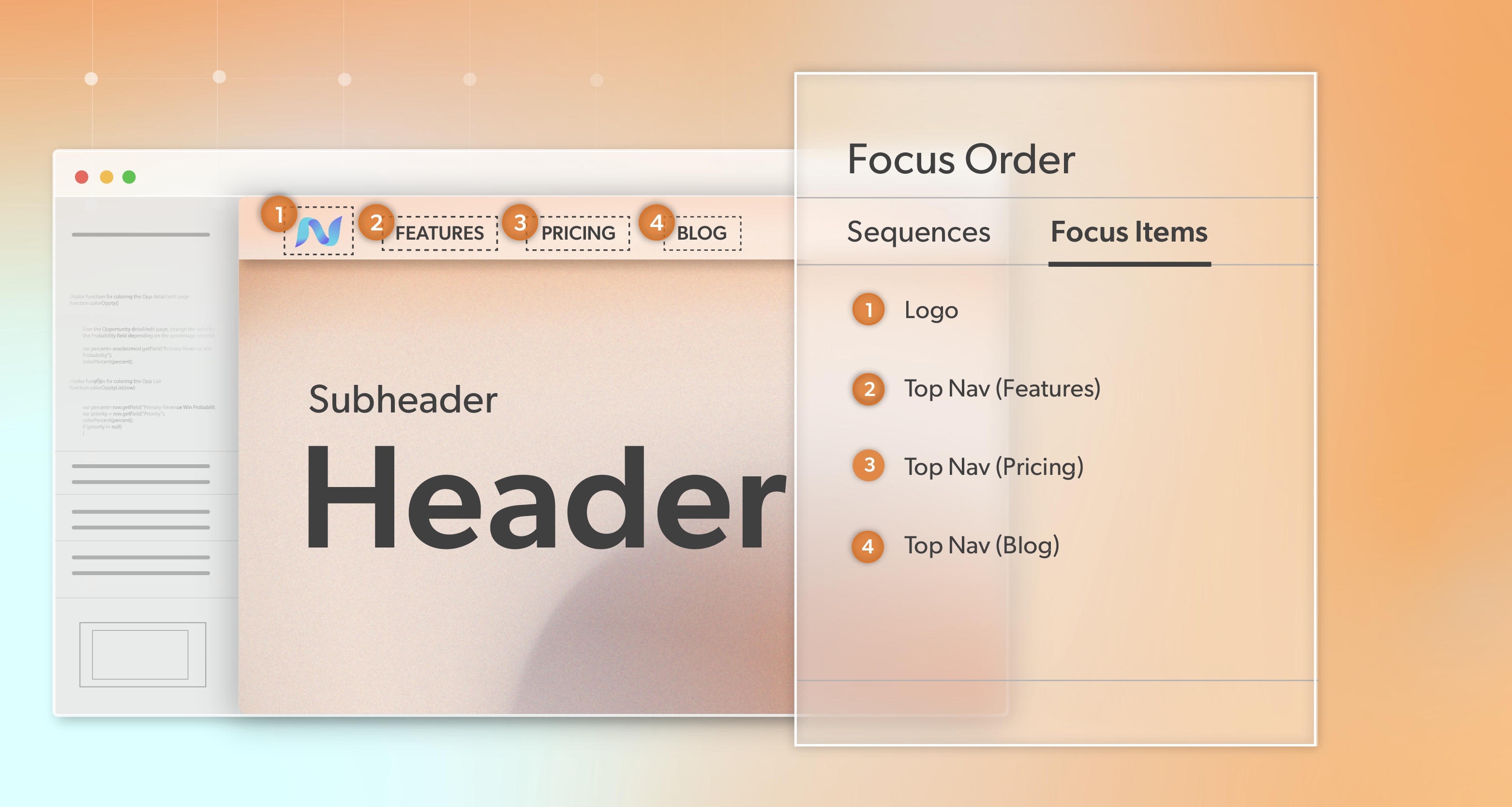
    • Keyboard navigation that follows a sensible order and shows a clear, high-contrast focus state
    • HTML landmarks—header, nav, main, footer—and headings in a clean hierarchy
    • ARIA only where native HTML cannot express the behavior
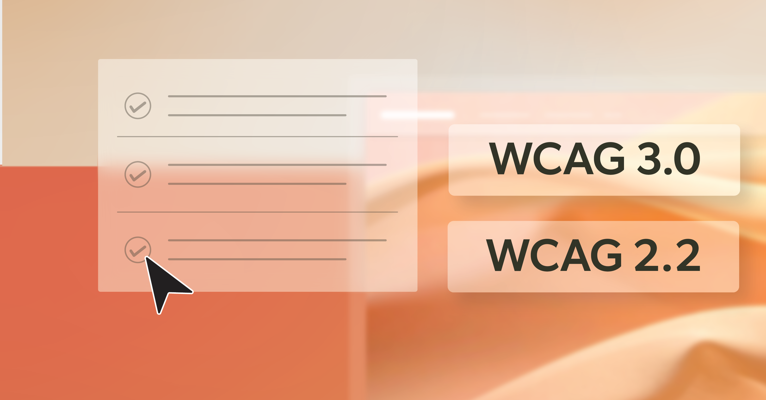
    • Color, type, and spacing tokens that meet WCAG 2.2 AA, so designers don’t have to check contrast on every decision.

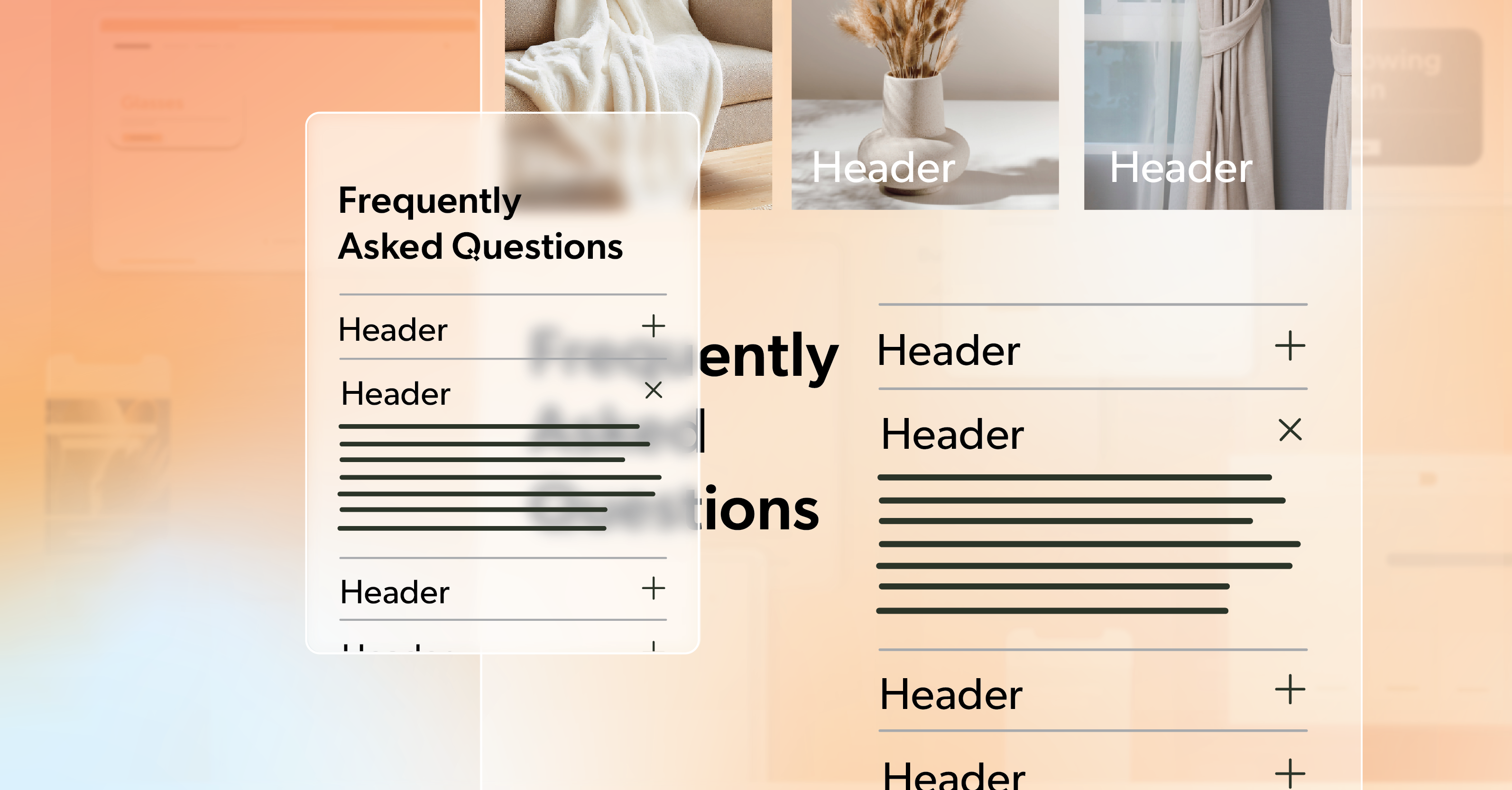
    Some patterns are easy to get almost right and still end up frustrating people. Tabs, carousels, and accordions deserve extra time: arrow-key support and roving tabindex for tabs, visible pause controls for sliders, and aria-expanded states plus motion settings that respect prefers-reduced-motion for accordions.

    Each component gets a small accessibility checklist and a handful of tests. That might feel slower up front. In reality, it frees teams to move quickly later because they trust the building blocks under every new layout.

    Tooling That Gives Your Accessible Website Time Back

    When deadlines are tight, you want people solving real problems, not chasing issues a tool could have caught.

    Helpful habits here include:

    • Local linting and pattern libraries
      Linters for HTML, JavaScript, and ARIA catch common mistakes before a pull request is even opened. A component storybook with notes about expected keyboard behavior and states makes reviews quicker and more focused.
    • Automated checks in CI
      Your pipeline can validate HTML, identify broken links, verify basic metadata, generate sitemaps, and ensure images have alt text where they should.
    • Performance budgets
      Agree on reasonable thresholds for LCP, CLS, and INP. When a change pushes you over those limits, treat it as a real regression, not an item for “later.”

    After launch, continuous accessibility monitoring keeps an eye on real content and campaigns as they roll out. Tools like a11y.Radar helps you see when a new landing page, promo block, or plugin introduces a fresh set of issues, so your accessible website stays aligned with your original intent instead of drifting over time.

    Browser extensions and quick manual checks still matter. They are often where nuance shows up. But letting automation handle the repeatable checks means those manual passes can focus on judgment and edge cases.

    Redirects, Voice, and All the Invisible Decisions

    Relaunches tend to stir up every piece of content you have: long-running blog posts, support docs, landing pages, one-off campaign pages, and forgotten PDFs. How you handle that swirl directly affects real people trying to find what they need.

    Structurally:

    • Map each old URL to a new destination and set permanent redirects.
    • Validate redirects in bulk so you do not discover broken flows after users do.
    • Align internal links and breadcrumbs with your new IA so pathways feel more consistent and less random.

    For the words and media themselves, think about what it feels like to scan a page while using a screen reader, magnification, or a mobile phone in bright light:

    • Write alt text that explains the role of an image, not just what it looks like.
    • Add captions and transcripts where you can, especially for core video and audio.
    • Keep headings short and clear.
    • Use link text that tells people where they are going next.

    Right before you publish, do a quick sweep for titles, descriptions, open graph tags, canonicals, and analytics events. It is basic hygiene, but it protects the hard work you have put into the content itself.

    This is also where roles matter. Someone needs to own copy approval, someone needs to own accessibility checks, and someone needs to own analytics and SEO. Clear lanes keep decisions moving and protect the tone and clarity of the experience you are building.

    Turning Design Files into Real-World Performance

    At some point, everything leaves Figma and lands on real devices with real network constraints. That moment is where a site either feels light and responsive or heavy and fragile.

    A few choices make a big difference:

    • Plan how assets will travel from design to production: icon systems, responsive images with srcset and sizes, and modern formats where they help.
    • Keep CSS lean by shipping critical styles first and deferring the rest, rather than loading everything at once.
    • Be intentional with JavaScript. Lean on native controls when you can, split code where it makes sense, and defer non-essential scripts until after people can read and interact with core content.

    Before launch, run tests that look like your users’ reality, not just the best-case lab profile: mid-range devices, slower networks, busy pages. Watch not just the scores but how quickly the page feels usable.

    These choices shape how your accessible website feels in everyday use—how quickly someone can read an article, submit a form, or complete a checkout without fighting the page.

    QA Loops That Protect Real People

    QA is where all the decisions made along the way show up side by side. When time is short, it can be tempting to “spot check a few pages” and call it done. That almost always hides something important.

    A lightweight but focused plan works better:

    • A keyboard-only pass through each template type to confirm you can reach everything, see focus at all times, and escape any interactive element without getting stuck.
    • Screen reader checks using common setups—NVDA or JAWS with a browser on Windows, VoiceOver on macOS or iOS—especially on interactive components such as menus, tabs, and dialogs.
    • Mobile testing with zoom at 200% to confirm content reflows and tap targets are large enough to hit without precision.

    Add a regression sweep on your highest-traffic legacy URLs to make sure redirects, analytics, and key flows still behave as expected.

    When issues show up, prioritize them by impact, how often they are likely to surface, and how hard they are to fix. High-impact accessibility and performance bugs move to the front of the line. The goal is not a perfect spreadsheet of checks; it is protecting the people who will rely on this build every day.

    Ship Fast, Stay Accessible, and Don’t Go It Alone

    A fast relaunch does not have to be reckless. With clear priorities, solid components, supportive tools, and a few disciplined feedback loops, you can move quickly and still ship an accessible website that feels thoughtful and dependable.

    If you are planning a rebuild—or living through one right now—and want another perspective on your accessibility and performance posture, 216digital can help. Schedule an ADA briefing with our team. We will look at where you are, highlight risk areas, and outline practical next steps that respect your timeline and stack, so you can launch quickly and know your work is welcoming the people you built it for.

    Greg McNeil

    November 20, 2025
    Testing & Remediation
    Accessibility, Accessibility Remediation, Accessibility testing, automated testing, Web Accessibility Remediation, Website Accessibility
  • ADA Lawsuits: Can You Be Sued Again During Remediation?

    When a business gets pulled into ADA lawsuits over its website, the first instinct is usually simple: “Fix it, fast.” Very quickly, though, another question creeps in:

    If we’re already working on remediation, can we still be sued again?

    The uncomfortable answer is yes. Separate people—or advocacy groups—can still bring their own claims while you’re actively fixing issues. The ADA is a public civil rights law, and it doesn’t include a universal “grace period” that pauses legal exposure once remediation begins.

    That can feel discouraging, especially when your team is putting in real effort and genuinely wants to do the right thing. But this isn’t about punishing good intentions. At its core, the law is about access—whether people with disabilities can truly use your site to browse, book, buy, and get support without barriers.

    The good news is that you’re not stuck. Once you understand how courts look at “remediation in progress,” you can make clearer decisions, reduce risk, and turn a stressful situation into a structured, manageable plan.

    This article is for informational purposes only and is not legal advice. Always work with qualified legal counsel on your specific situation.

    Now, let’s take a quick step back and look at how the ADA applies to websites in the first place—because that context matters when you’re facing ongoing legal pressure.

    ADA, Websites, & Why Compliance Isn’t a One-Time Box To Check

    Before diving further into repeat claims, it helps to ground the conversation in how the law actually views digital experiences.

    Quick Refresher: ADA And Digital Spaces

    Under ADA Title III (and sometimes Title II), many businesses qualify as “places of public accommodation.” Today, websites and apps serve as the digital front door to those spaces.

    When a website’s design prevents a person with a disability from completing basic tasks—such as checking out, booking a service, logging in, or accessing essential information—the law treats that breakdown as a genuine access barrier. Courts and the U.S. Department of Justice have repeatedly compared inaccessible websites to physical locations with no ramp or blocked entrances.

    The Practical Standard: WCAG As The Benchmark

    The ADA itself does not spell out one specific technical standard for web accessibility. In practice, Web Content Accessibility Guidelines (WCAG) —most often WCAG 2.1 Level AA—has become the widely accepted benchmark.

    When teams say a site is “compliant,” they’re typically referring to two things:

    • The site substantially aligns with WCAG, and
    • Users can complete core journeys—searching, browsing, signing in, purchasing, contacting support, and accessing their accounts—without major barriers.

    Why Websites Are Vulnerable To Repeated Claims

    Here’s where things get especially tricky: websites are never truly “finished.”

    Marketing launches new campaigns. Developers add plugins and redesign layouts. Content teams upload images, PDFs, and promotional banners. Each update creates a fresh opportunity for accessibility gaps, even after earlier fixes.

    A missing alt tag here, a mislabeled button there, a keyboard trap inside a modal—small changes can quietly reopen doors that had just been closed. This constant movement explains why multiple people can run into similar problems over time.

    With that backdrop, we can return to the central concern: what actually happens when you’re already fixing your site and a new legal claim lands anyway?

    Can You Face New ADA Lawsuits While You’re Fixing Things?

    This is the question that keeps most teams up at night—and unfortunately, the answer isn’t as comforting as anyone would like.

    There’s No Automatic “Grace Period”

    Legally speaking, there’s no built-in pause button. Courts focus on what happened when a specific person tried to use your site.

    If that individual encountered meaningful barriers at that moment, the fact that your team is actively making improvements doesn’t erase their experience. From the court’s perspective, access is evaluated in real time.

    Multiple Plaintiffs, Overlapping Issues

    Each person with a disability has their own potential claim. If one blind user files a lawsuit over an inaccessible checkout, that doesn’t automatically prevent another blind user—or a user with a different disability—from bringing a similar claim later.

    Likewise, settling with one plaintiff does not “cover” everyone else. Unless the settlement takes the form of a formal court order with clearly defined terms, other parties can still assert their own rights if they encounter the same barriers.

    Different Types Of Pressure At Once

    In practice, this often shows up as a mix of:

    • Informal demand letters,
    • Formal lawsuits filed in court, and
    • Occasional regulatory attention or guidance from agencies like the DOJ.

    Dealing with all of this at once is one of the reasons a structured, documented remediation plan is far more effective than scattered one-off fixes.

    Haynes v. Hooters

    This case shows why “we’re working on it” doesn’t automatically stop new claims. Hooters had already settled a prior ADA website case and agreed to make its site accessible. When a different blind plaintiff later sued over similar barriers, Hooters argued that the new case was moot because of that earlier settlement and its remediation plans.

    The Eleventh Circuit disagreed and allowed the new case to move forward. The court explained that promises made to someone else—and plans for future fixes—did not guarantee accessibility for this new plaintiff or long-term compliance.

    In practical terms, remediation helps, but it isn’t a shield on its own if barriers still exist.

    At this point, the natural follow-up question is: if remediation doesn’t automatically block claims, why does it still matter so much?

    What Courts And Opposing Counsel Actually Look At

    When the legal arguments fade into the background, most cases come down to a few very practical questions.

    Two Moments That Matter Most

    Courts tend to focus on two key points in time:

    • When the plaintiff attempted to use your site, and
    • The condition of the site at the time the court reviews the case.

    If barriers existed at the time of the visit, liability may still exist for that experience—even if fixes came later. Once teams fully resolve those exact barriers, some claims may become “moot,” but that outcome does not undo the time, cost, and disruption earlier ADA lawsuits created.

    When Remediation Can Strengthen Your Position

    In Diaz v. The Kroger Co., the court dismissed the case after Kroger demonstrated that:

    • All specific barriers named in the complaint had been fixed, and
    • The website now conforms to WCAG 2.0 AA, the standard cited in that lawsuit.

    The lesson here is simple: to argue mootness successfully, you need more than a promise. You need proof that the barriers are gone and that controls exist to keep them from coming back.

    Patterns Vs. Isolated Mistakes

    Courts and plaintiffs don’t just look for one broken button. They look for patterns. Are similar problems scattered across numerous pages? Is there any sign of training, audits, or an accessibility policy?

    A site with a few lingering issues and a visible program in place looks very different from a site where accessibility has never been part of the process.

    Documentation As Protection

    Process matters. Documentation that often proves useful includes:

    • Date-stamped audit reports and issue lists,
    • Prioritized remediation roadmaps,
    • Tickets, pull requests, and QA sign-offs tied to accessibility work,
    • Notes from manual testing and assistive technology sessions.

    None of this guarantees a win, but it gives your legal team something concrete to stand on.

    From here, the focus shifts to what courts often refer to as “good-faith effort,” and what that looks like in the real world.

    What “Good-Faith Effort” Looks Like In Practice

    Good faith isn’t just a statement—it’s visible through consistent action.

    Start With A Full, Expert-Led Audit

    Rather than chasing bugs at random, it’s far more effective to begin with a thorough accessibility audit aligned to WCAG 2.1 AA or higher. That audit should evaluate:

    • Core templates and layouts,
    • Checkout, booking, and account flows,
    • Forms, navigation, and interactive components,
    • Third-party tools used in key user journeys.

    Automated tools can help surface issues, but they don’t tell the whole story. Manual testing with keyboard navigation and screen readers is essential.

    Prioritize The Issues That Truly Block Users

    Once issues are identified, triage becomes critical. Blocking problems should come first, including:

    • Navigation that can’t be operated with a keyboard,
    • Buttons and icons with no accessible name,
    • Forms without usable labels and error messages,
    • Components that trap focus.

    Fixing these first doesn’t just help legally—it immediately improves day-to-day usability.

    Build A Realistic Remediation Roadmap

    Strong remediation doesn’t happen in chaos. It usually happens in phases:

    • 1: Critical path fixes,
    • 2: Broader WCAG alignment,
    • 3: Long-term safeguards in design systems and QA workflows.

    A roadmap like this keeps teams aligned and gives leadership and counsel clarity on progress.

    Communicate With Users—Carefully And Honestly

    Many organizations choose to publish an accessibility statement during remediation. When handled well, it can:

    • Acknowledge ongoing improvements,
    • Invite users to report issues, and
    • Provide support channels for assistance.

    This should always be coordinated with legal counsel, but it clearly signals that accessibility is being taken seriously.

    At this point, the technical work is underway. Now the focus shifts to how that work connects with legal strategy.

    Navigating ADA Lawsuits While Improving Your Website

    Accessibility remediation works best when legal and technical teams are aligned.

    Keep Legal Counsel Closely Involved

    Sharing your audit findings and remediation plans allows attorneys to:

    • Respond more effectively if new ADA lawsuits or demand letters arrive.
    • Decide when to highlight remediation progress.
    • Assess whether tools like consent decrees are appropriate.

    Handling Communications With Plaintiffs’ Attorneys

    If another letter arrives mid-remediation, it’s important not to ignore it—or respond emotionally. Instead, work through counsel to acknowledge the concerns, share progress when helpful, and prioritize any legitimate issues that are identified.

    Avoid Moves That Look Like Avoidance

    Fast platform swaps, taking large parts of the site offline, or making bold public promises without proof can backfire. These moves often frustrate users and may not hold up in court if barriers reappear once the site returns.

    Even with careful planning, a few common mistakes can keep organizations stuck in a cycle of repeat claims.

    Common Missteps That Invite Repeat Claims

    Many organizations facing ADA lawsuits don’t fail because they don’t care—they fail because they rely on shortcuts.

    Relying Only On “Quick-Fix” Tools

    Overlay tools and widgets often sound appealing under pressure, but they typically do not correct underlying code issues and can conflict with assistive technologies.

    Treating Accessibility As An Afterthought

    Holiday campaigns, product launches, and page redesigns are frequent sources of regressions when accessibility checks are skipped under tight timelines.

    Ignoring Content And Third-Party Risk

    Images without alt text, untagged PDFs, and third-party widgets all introduce new exposure if left unmanaged.

    These issues point toward the need for a longer-term approach, not just a one-time cleanup.

    Turning Remediation Into A Long-Term Accessibility Program

    Once early fires are under control, the focus shifts to sustainability.

    Accessible design systems, standardized testing processes, team training, and ongoing monitoring all help prevent regressions. Building accessibility directly into your site—rather than adding it only after complaints—significantly reduces your risk of future ADA lawsuits.

    At that point, accessibility stops being a crisis response and becomes part of responsible digital operations.

    Moving Forward Without the Constant “What If”

    It can be frustrating to learn that more than one of these ADA lawsuits can land even while you’re actively fixing your site. But that doesn’t mean you’re doomed to keep reliving the same cycle. When accessibility becomes part of how you design, build, and maintain your digital experiences—not just something you scramble to address when a letter arrives—the entire situation starts to change.

    The real shift is from reacting to planning. Instead of asking, “How do we get through this one case?” you begin asking, “How do we make accessibility a normal, manageable part of how we operate?” That mindset, backed by real remediation, documentation, and monitoring, is what gives you a steadier footing—for your users and in any future legal conversations.

    If you’re unsure where you stand or what to prioritize next, this is exactly where 216digital can help. We’re a web development agency with deep expertise in web accessibility, and we offer personalized ADA briefings designed to help small businesses understand their obligations, assess their exposure, and chart a practical path forward.

    Greg McNeil

    November 19, 2025
    Legal Compliance
    ADA Compliance, ADA Lawsuit, ADA Lawsuits, ADA non-compliance, Web Accessibility, Website Accessibility
  • Can WCAG Conformance Boost Your Organic Traffic?

    Most digital teams live in a constant release cycle. New campaigns. Fresh content. Layout tweaks. A redesigned checkout flow. Accessibility tickets often sit in the backlog with labels like “phase two” or “after launch.” You intend to get there, but there is always another deadline.

    Meanwhile, leadership asks tough questions about growth:

    • What’s preventing organic traffic from moving in the right direction?
    • Why are our rankings slipping on important terms?
    • If the funnel looks look strong on paper,, where is the experience breaking down for real users?

    It is natural, then, to ask a simple question: if you invest in WCAG conformance in a serious way, will it actually move the numbers you care about—organic traffic, keyword visibility, conversions—or is it just a legal and compliance cost?

    The emerging evidence, and what many teams are seeing in practice, points in the same direction: accessible, standards-aligned websites tend to rank better, earn more search coverage, and perform more consistently over time. That lines up with how search engines evaluate sites today. Accessibility work improves structure, clarity, speed, and usability—the same signals search engines and people reward every day.

    Instead of treating accessibility as a line item under “compliance,” it is more helpful to view it as a long-term acquisition and retention engine that can support growth for years.

    Why WCAG Conformance Now Shapes Search Performance

    The way search works has changed. Old tricks do not carry much weight anymore. Search engines now pay close attention to how pages are built, how fast they load, and how easy they are to use.

    At the same time, user expectations have risen. People notice when forms are hard to complete, when navigation is confusing, or when content is hard to read. They back out, bounce, and often do not return. That behavior feeds back into your rankings and reach.

    This is where accessibility and search meet. Many of the patterns that support people with disabilities—clear headings, focusable buttons, meaningful link text, readable contrast, well-structured HTML—also help search engines better understand your content and give users a smoother path to completion.

    In other words, WCAG conformance is not separate from modern SEO. It sits in the middle of it.

    How Accessibility Work Translates Into Better Rankings

    Under the surface, search performance improves when your site becomes easier to understand, render, and use. That is exactly what happens when you invest in accessibility in a sustained way.

    Clear Structure That Crawlers and People Can Follow

    Think of your HTML structure as the way you introduce a page to both people and search tools. When there is one clear H1, followed by H2 and H3 headings that break the topic into logical sections, the page feels like a guided path instead of a wall of text. Screen readers can skip to the right section, and crawlers can see how your ideas fit together.

    Swapping generic <div>s for meaningful elements like <header>, <main>, <nav>, <article>, and <footer> adds another layer of clarity. Assistive technologies can jump to the right region, and search engines can read the layout as a coherent page instead of a pile of blocks.

    That discipline with structure makes it easier for visitors to find what they need—and for your pages to be recognized as strong matches for the topics you care about.

    Accessible Media That Also Boosts Discoverability

    Alt text, captions, and transcripts are essential for many users. They also carry real SEO weight. Descriptive alt text on product images can help you show up for specific, high-intent searches. Transcripts for video content add indexable text that strengthens your topical authority.

    You are not stuffing keywords; you are describing what is actually on the page in a way that people and machines can both understand.

    Performance, Comfort, and Engagement

    Accessibility work often leads to more efficient pages: compressed images, lighter scripts, fewer layout shifts, and better handling of motion and animation. Those changes help users with motion sensitivity or slow connections—and they also improve performance metrics that search engines care about.

    When pages load faster and behave in a stable, predictable way, people tend to stay longer, view more content, and complete more tasks. Analytics will often show this as lower bounce rates, deeper scroll, and better funnel completion.

    Why AI Search Rewards Accessible Websites

    Search is no longer the only way people find and use your content. AI assistants, answer engines, and other tools pull from your site, summarize it, and surface it in new contexts.

    These AI-driven systems depend on well-organized markup to interpret your content accurately. They analyze the structure—such as lists, descriptive labels, table headers, and ARIA attributes—to determine the meaning and importance of your content. This approach is closely related to how assistive technologies interpret pages for users.

    Strong WCAG conformance makes your content easier for these systems to parse and reuse. If your pages are well-structured, labeled, and accessible, you stand a better chance of being the site that gets referenced, cited, or clicked when users rely on AI tools to research a topic or compare options.

    On the other hand, sites lacking clear structure, missing labels, or using inconsistent markup become difficult for both search engines and AI tools to analyze. Those pages might look polished at a glance, but technical gaps can prevent important content from being surfaced at the right moment.

    ROI Beyond Traffic: Conversions, Markets, and Risk

    Traffic alone does not pay the bills. The business impact of WCAG conformance extends beyond rankings and impressions.

    Accessible forms, buttons, and interactive elements reduce friction in the flows that matter most: signups, cart checkout, appointment booking, and contact requests. When every user can see labels, understand errors, and move forward with a keyboard or assistive tech, completion rates usually improve.

    Accessibility also opens the door wider for older users and people with permanent, temporary, or situational disabilities. Better contrast, readable fonts, and consistent navigation patterns can be the difference between “I gave up” and “I finished my purchase.” That shift shows up in revenue, not just in a compliance report.

    On a practical level, clearer interfaces and stronger self-service content often mean fewer “I can’t figure this out” emails or calls, especially during busy campaigns. When you address major barriers early, you lower the chances of a complaint or legal demand and spare your team the stress of rushed, last-minute fixes.

    How to See ROI From Accessibility Improvements

    If you care about data, the next question is simple: how do you show that WCAG conformance is paying off?

    The most effective approach is to treat accessibility like any other strategic initiative:

    • Capture a baseline before major changes: accessibility audit results, current organic traffic, keyword footprint, and conversion metrics.
    • Tag accessibility-related releases in your roadmap or analytics notes so you can connect improvements to specific changes.
    • Track trends over time rather than looking for overnight spikes.

    As search engines index your updated pages and visitors run into fewer obstacles, numbers often shift in small but noticeable ways. You may see more organic traffic to important sections, stronger rankings for priority terms, better engagement, and more people finishing key tasks. Each of these gains supports the others and can change how your site performs without a big jump in content volume or ad spend.

    It helps to look at accessibility as steady improvement rather than a quick growth hack. The impact builds as you keep removing barriers and maintaining accessible patterns over time, and the benefits tend to last because they are rooted in a better experience rather than a short-lived tactic.

    How to Phase Accessibility Into Your Process

    Many organizations worry that accessibility will blow up their roadmap. In practice, accessibility work can be phased in a way that supports ongoing projects instead of blocking them.

    A human-led audit is a strong place to start. Automated tools help, but they only catch a slice of the issues. A thoughtful audit looks at templates, user journeys, assistive-tech behavior, and SEO implications, then ranks issues by impact and effort.

    From there, teams can focus on high-value templates first—home, category, product or service pages, core landing pages, and key forms—while folding accessibility fixes into existing sprints. Design systems, content guidelines, and development checklists can then lock in those gains so new work launches in better shape.

    Ongoing monitoring closes the loop. Light-weight checks on new pages, components, and third-party tools prevent regression and keep your site moving in the right direction.

    Partnering with a team that lives in both accessibility and SEO makes this process smoother. At 216digital, for example, accessibility is built into how we think about risk, performance, and growth—not treated as a separate track.

    The Long View: Turning Accessibility Into Sustainable Growth

    Taken together, all of this points in the same direction. Accessibility is not just protection against complaints or lawsuits. Sites that take it seriously are seeing real gains in organic traffic, keyword reach, and authority. Just as important, they are easier to use—for everyone.

    The same practices that support a screen reader user or someone with low vision also help a busy shopper on a phone, a first-time visitor trying to compare options, and a search engine deciding which result to place at the top of the page. That is the foundation of sustainable growth online.

    If accessibility feels big or hard to scope, you do not have to solve it all at once. Start by understanding where you are today. Focus first on the templates and flows that matter most to your users and your revenue. Build better patterns into the way you already design, write, and ship. Over time, WCAG conformance becomes part of how your site works, not an occasional project.

    If you are unsure how accessible your current site is, or what kind of SEO and business impact you could expect from a focused accessibility effort, a brief ADA-focused conversation with 216digital can help. You will walk away with a clearer view of your risk, your opportunity, and practical ideas for where to start.

    Investing in accessibility means investing in the people who use your site—and in a digital presence that can keep earning trust, traffic, and revenue over time. When you are ready, 216digital is here to help you turn that investment into results.

    Greg McNeil

    November 18, 2025
    The Benefits of Web Accessibility, WCAG Compliance
    Digital Marketing, Marketing, SEO, WCAG, WCAG Compliance, WCAG conformance
  • How Content Order Impacts Accessibility and User Experience

    How Content Order Impacts Accessibility and User Experience

    If you build modern interfaces, you probably lean on Flexbox, Grid, and positioning every day. With a few lines of CSS, you can rearrange entire sections, change layouts at different breakpoints, and keep one codebase working across phones, laptops, and large screens.

    The downside is easier to miss: the more we shuffle things visually, the more likely it is that the visual order drifts from the actual HTML order and undermines accessibility. When that happens, people using a keyboard or screen reader can have a very different experience from what the design suggests. Focus jumps in ways they don’t expect. Announcements feel out of place. It becomes harder to stay oriented on the page.

    For users who rely on assistive tech, it can feel disorienting when the page organization changes unexpectedly. “Next” may not always mean “next,” and navigating the page can require more effort to stay oriented.

    This isn’t only a UX problem. It ties directly to WCAG 1.3.2 Meaningful Sequence and 2.4.3 Focus Order, which both expect content and focus to follow a logical, predictable path. That same alignment supports accessibility and reduces risk from a legal perspective.

    In the rest of this article, we’ll look at how order breaks, where they tend to happen, and practical ways to design, test, and fix layouts so they stay flexible without becoming unpredictable.

    Why Content Order Matters More Than It Looks

    How Assistive Technologies See Your Layout and Accessibility

    Screen readers don’t “see” layout. They move through the DOM in source order, using headings, landmarks, lists, and controls to understand how the page is structured. That’s the experience for someone listening linearly or jumping by element type.

    Keyboard users follow the same underlying map. Each press of Tab moves through links, buttons, and form fields in DOM order, unless you’ve changed it with tabindex or custom scripting.

    When the visual layout suggests one order and the DOM provides another, people feel things like:

    • Focus jumping to unexpected areas.
    • Content is being announced without a clear context.
    • A mental model of the page that never really settles

    Once trust is lost, every interaction requires more effort.

    WCAG’s View: Meaningful Sequence, Focus Order, and Accessibility

    Two Web Content Accessibility Guidelines (WCAG)  criteria are especially relevant:

    • WCAG 1.3.2 Meaningful Sequence requires at least one programmatically determinable reading order that preserves meaning. If someone moves through the content in DOM order, it still needs to make sense.
    • WCAG 2.4.3 Focus Order requires that focusable elements receive focus in an order that preserves meaning and operability. Keyboard users should not feel like focus is bouncing randomly around the page.

    These expectations sit near the center of a solid accessibility approach.WCAG does not forbid visual rearrangement. It becomes a problem when the rearrangement changes how users understand the page or makes it harder to complete tasks. There can be more than one acceptable logical order, but at least one needs to be consistent and predictable.

    The Human Impact Behind Accessibility

    Behind these rules are people trying to do simple things: check an account, complete a form, submit a request.

    Users with low vision or some cognitive disabilities may rely heavily on predictable patterns to stay oriented. They remember where search usually appears, where the main button usually sits, and how navigation is arranged.

    Keyboard and screen reader users build similar expectations over time. When focus jumps in ways that don’t line up with what they see on screen, they lose confidence in the layout. Some keep going, slowly. Others stop and leave.

    How CSS Reordering Breaks Reading and Focus Order

    Common CSS Features That Can Disrupt Logical Order and Accessibility

    Most order-related issues come from a small set of tools we use all the time:

    • position: absolute or position: fixed, which pull elements out of normal flow
    • The order property in Flexbox and Grid
    • flex-direction: row-reverse and column-reverse
    • Grid behaviors like grid-auto-flow: dense, line-based positioning, and grid-template-areas

    These features are useful, and sometimes necessary. Problems begin when they’re used to fix hierarchy or flow rather than just adjust appearance.

    What This Looks Like in Practice

    Navigation Example

    Say the DOM order for your navigation is: Home, Contact, About, Blog.

    Design wants “Contact” on the far right, so you use order in a flex container to produce: Home, About, Blog, Contact.

    Visually, this layout looks correct. However, for a keyboard user, pressing Tab navigates in the following order: Home, Contact, About, Blog. This means focus jumps from Home to Contact (on the far right), then back to About and Blog (toward the center).

    This jump is unexpected, as nothing on-screen explains why the focus shifts. Screen reader users also hear a sequence that doesn’t match the visual layout, making navigation confusing.

    Card Layout Example

    You have a grid of cards, and you want a “featured” card at the top. Instead of moving it in the DOM, you position it using Grid placement or position: absolute.

    On screen, it appears first. In the DOM, it still sits midway through the list. Keyboard and screen reader users only encounter it after several other cards, even though the design is signaling that it’s the main item.

    Screen Readers and Flex/Grid Nuances

    Different browser and screen reader combinations handle Flexbox and Grid differently. Some combinations try to align with visual order in certain situations; others follow DOM order strictly. That behavior can also change over time as engines evolve.

    The safe rule is simple: treat DOM order as the source of truth. If the order matters to the user, fix it in the markup, not just in CSS.

    Real-World Patterns Where Things Go Wrong

    These patterns show up often in production interfaces and quietly cause accessibility problems if no one is watching for them.

    Global Navigation and Utility Links

    Common issues in navigation and headers include:

    • Moving “Contact,” “Sign in,” or “Cart” to the far right using order or reversed flex directions
    • Placing search or language controls visually near the top, but leaving them late in the DOM

    Keyboard users end up with a navigation path that feels out of sync with what they see.

    Hero Sections, Promos, and Feature Blocks

    Hero areas and promotional content can introduce similar gaps:

    • A main hero button that visually looks like the first action but appears later in the DOM
    • Promotional banners positioned over content but rendered late, so focus reaches them long after users expect

    Design signals one priority; source order signals another.

    Forms and Multi-Column Layouts

    Multi-column forms look neat, but they’re easy to misalign structurally:

    • DOM order runs all the way down the left column, then all the way down the right, while the visual layout suggests row-by-row reading
    • Error messages or helper text appear far from the related fields in the DOM.

    Screen readers end up reading labels, inputs, and messages in a confusing sequence.

    Dashboards and Responsive Grids

    Dashboards and grid layouts bring their own risks:

    • Drag-and-drop widgets change visual position, but the DOM order stays the same.
    • Product or article grids change column counts across breakpoints, but the underlying order still reflects the original layout.

    Sighted users see one arrangement; keyboard and screen reader users move through another.

    Designing Layouts That Keep Source & Visual Order in Sync

    A helpful first check: if you remove all CSS, does the page still read in a sensible way from top to bottom?

    Start with headings, landmarks, and content in a logical sequence. Use HTML elements that match their purpose, and add ARIA landmarks only when they’re truly needed. The better the structure, the easier everything else becomes.

    Treat DOM Order as the Single Source of Truth

    Set a clear expectation within your team:

    If something needs to move for meaning or flow, change its position in the DOM instead of relying on visual reordering.

    Reserve Flexbox/Grid order and absolute positioning for small visual refinements that don’t change the content’s meaning. When the markup matches the intended reading order, ongoing accessibility work stays much more manageable.

    Mobile-First Thinking to Avoid Reordering Hacks

    Designing from the smallest breakpoint forces you to decide what actually comes first in the linear flow. Once that order is set, larger layouts should build on it rather than fight it.

    Instead of relying on row-reverse or heavy reordering to fix desktop layouts, adjust your HTML so each breakpoint builds on the same clear sequence.

    When Visual and Logical Order Can Safely Diverge

    There are places where visual and DOM order can differ without causing issues, such as:

    • Independent articles or cards that don’t depend on each other
    • Decorative elements whose position doesn’t change the meaning or task flow

    Even there, keep focus order predictable within each unit and keep related elements together.

    Responsive Design and the Reordering Trap

    Responsive layouts often move panels around: sidebars shift from right to top, filters move above or below results, utility sections change position as the screen shrinks.

    If those changes are made only with Flexbox or Grid reordering rather than structural changes, keyboard focus and reading order can feel out of sync with the visual layout. Over time, that chips away at accessibility across breakpoints.

    Strategies to Avoid Paint-Over Layouts

    A few practical habits help here:

    • Prefer stacking and modest visual shifts over large reordering jumps.
    • Decide early how content should flow linearly as the viewport changes.
    • When you do reorder at a breakpoint, test that view with keyboard and assistive tech, not just by eye.

    Emerging Tools: reading-flow and Future Support

    New CSS features like reading-flow (currently available in some browsers) aim to align reading and focus order with visual order in flex, grid, and block layouts.

    They’re promising, but support is still evolving. Treat them as enhancements, not a replacement for a clean structure. A clear DOM order will remain the more stable foundation.

    Testing Reading and Focus Order in Everyday Workflows

    Keyboard-Only Walkthroughs

    One of the simplest and most useful tests is to set the mouse aside and use only the keyboard.

    Tab through navigation, search, forms, checkout, and key dashboards. Watch for:

    • Focus landing in unexpected places.
    • Important elements are being skipped.
    • Visible focus not matching what you would expect to come next.

    This kind of quick check catches many accessibility issues long before formal testing.

    Using Tools to Visualize Tab Stops and Sequences

    There are tools and browser extensions that overlay numbers and lines to show the actual tab sequence. They make it easy to see when Flexbox, Grid, or positioning has produced a focus path that doesn’t match the design.

    Adding these checks to regular QA is more effective than treating them as a one-time audit.

    Screen Reader Spot-Checks

    Short passes with a screen reader are also valuable. With NVDA, VoiceOver, or another option, move through key flows and confirm:

    • Headings and regions follow a logical sequence.
    • Instructions, labels, fields, and messages appear together in a sensible order.

    Structural Smoke Tests in the Browser

    For a quick structural check, temporarily disable CSS in dev tools or with an extension, then read the page in DOM order.

    If it still makes sense, you likely have a solid base. If not, you’ve found a structural problem that is worth fixing before it spreads.

    Fixing Existing Interfaces Without Starting From Scratch

    Prioritize High-Risk Flows First

    You don’t need to refactor everything at once. Start where order matters most:

    • Global navigation
    • Sign-up and sign-in flows
    • Checkout and payment
    • Important forms and dashboards

    Compare how the layout looks with how keyboard focus and reading order actually move, and note the mismatches that affect meaning or task success.

    Refactor Layouts to Respect Source Order

    From there, adjust markup so the DOM reflects the intended order:

    • Move sections in the HTML so they match the intended sequence.
    • Group labels, fields, and messages together
    • Replace heavy CSS-based reordering with patterns that rely on better structure.

    This improves usability and gives you a more predictable layout to maintain long-term accessibility.

    Bake Order Rules Into Your Design System

    Your design system is a good place to codify these expectations:

    • The visual and DOM orders should match by default.
    • Exceptions must be documented and tested.
    • Core layout components for nav, cards, and forms should ship with safe reading and focus patterns built in.

    Continuous Improvements, Not One-Off Accessibility Cleanup

    Order and focus shouldn’t be left to occasional audits. Add a few simple checks to code review:

    • Does tab order match what we see?
    • Are we using order, row-reverse, column-reverse, or absolute positioning in ways that might change meaning?

    Where it fits, linting or CI rules can also flag risky layout patterns early.

    Source Order: The Thing You Can’t Fake With CSS

    When visual layout and DOM order stay aligned, interfaces feel calmer and easier to use. People can trust that what they see on screen matches what their keyboard and tools will encounter.

    Small structural decisions—good HTML order, clear roles, careful use of layout features—can make a noticeable difference in both user experience, accessibility, and compliance.

    If your team is planning a redesign, cleaning up legacy layouts, or just trying to understand where to focus first, you don’t have to figure everything out alone. An ADA-focused briefing with 216digital can help you map out your highest-impact order issues, connect them to legal risk, and build better habits into your ongoing design and development work.

    When you’re ready, setting up that conversation can give your next release cycle a stronger foundation—visually, technically, and legally.

    Greg McNeil

    November 17, 2025
    How-to Guides, WCAG Compliance
    content order, How-to, User Experience, WCAG, WCAG conformance, web developers, web development
  • Who’s Responsible for Web Accessibility in Your Organization?

    Most organizations recognize the value of accessibility and discuss it regularly, sometimes with real urgency. The real challenge comes after the meeting is over.

    A design issue is spotted. Someone points it out during a review. Engineering gets a ticket. Weeks later, support hears about the same problem from a customer. The issue is clear and inconvenient, but no one truly owns it.

    Without clear ownership, accessibility becomes a recurring issue rather than a matter of regular maintenance. Teams fix what they can, when they can. But as priorities change and deadlines approach, accessibility work gets pushed aside until the next complaint, audit, or legal question arises.

    Breaking that cycle is not about another checklist or tool. It is an accountability problem.

    When Everyone Owns Accessibility, No One Can Prove It

    Saying that “everyone owns accessibility” sounds like teamwork, but in reality, it usually leads to two common results.

    First, accessibility becomes reactive. Work happens in short bursts, triggered by audits, complaints, or tight deadlines. Teams fix what is visible, ship, and move on. Without a steady cadence or shared baseline, accessibility becomes something teams return to under pressure, not something the product reliably carries.

    Second, teams struggle to defend their accessibility work. It is not that the work is not happening, but no one is tracking it in a way that shows continuity. People make decisions in meetings, personal preferences, or old tickets that no longer reflect the product. When leadership, legal, or procurement asks about accessibility, teams end up giving scattered answers.

    Simple questions stall conversations:

    • Who defines what “meets the bar” at the component level?
    • Where do accessibility standards live for this product today?
    • Who has the authority to stop drift, not just respond after something breaks?

    When there are not clear answers to these questions, accessibility becomes a set of good intentions spread across teams. People are trying, but there is no real alignment. This leads to recurring gaps as the product changes.

    Those gaps rarely stay contained.

    Why Repeat Lawsuits Keep Happening

    If accessibility were a one-time fix, lawsuits would be spread out, mostly hitting first-time targets, and then taper off as organizations corrected course. That is not what 2024 showed. UsableNet found that 41% of accessibility lawsuits were against organizations that had already faced noncompliance claims. That pattern points to a maintenance problem, not just an awareness issue.

    It underscores a tough truth: “we fixed it” is not the same as “we maintain it.” Accessibility has to hold up beyond the initial remediation sprint. It needs to survive redesigns, plugin updates, content pushes, and everyday product changes. Without ownership, it rarely does.

    What Users Experience Is Consistency

    Users do not see your internal efforts. They notice whether your product is reliable.

    When accessibility lacks an owner, reliability becomes inconsistent. Things work as expected in one place, then fall apart in another. Keyboard navigation breaks. Headings lose structure. Error messages come and go, leaving users unsure what will happen next.

    These are not rare problems. They are common signs of fragmented decision-making. Teams fix issues in their own areas, but without strong shared patterns, the user experience is not consistent across releases.

    Clear ownership changes this. It makes accessibility a repeatable process instead of an improvised one.

    How Good Intentions Still Lead to Fragmented Accessibility

    Fragmentation often begins with reasonable actions that are never linked together.

    Design teams keep a checklist, but they do not connect it to engineering acceptance criteria. Engineers fix issues, but they do not push those fixes back into shared components. Content teams try their best, but they do not have consistent guidelines to prevent common errors. Support hears about barriers, but they cannot turn that feedback into prioritized work.

    As a result, accessibility becomes a set of incomplete systems.

    Teams sometimes leave a few standards in a document untouched. They label tickets with “make this accessible” without defining what done looks like. Designers let the library drift when accessibility is treated as optional. QA testers apply different checks depending on who is testing and how much time they have.

    Over time, the organization ends up fixing the same issues again and again. This is not due to failure, but because the work is not built into shared patterns.

    What Ownership Looks Like in Practice

    Ownership does not mean one person is responsible for every fix. That approach fails quickly.

    Ownership means someone is accountable for making sure accessibility keeps progressing and has the authority to connect work across teams so it does not fall behind.

    In practice, strong owners usually do four things well.

    They turn expectations into practical standards. Instead of relying on vague statements like “be accessible,” teams define clear requirements for components and user journeys. For example:

    • Which keyboard interactions must menus and dialogs support?
    • How should forms handle and surface errors?
    • Where are specific content-structure requirements expected on high-traffic templates?

    Checkpoints align with how teams already work.
    Teams build accessibility into design reviews, code reviews, QA cycles, and content sign-offs. By doing that, they catch issues early, when the fixes are simpler and far less costly.

    Clear documentation keeps knowledge from scattering.
    They document patterns, decisions, and known issues so teams keep accessibility knowledge shared and accessible instead of letting it sit with one person or disappear across scattered files.

    Sustainable practices anchor long-term accessibility.
    They treat training, time, and support as essential. Vendors are given clear expectations, not used as a shortcut to avoid responsibility.

    This approach matches W3C guidance on planning and managing accessibility, which stresses assigning responsibilities and building follow-through into the process, rather than treating accessibility as a one-time effort.

    The Legal Direction Reinforces Maintenance

    A few years ago, many teams treated accessibility as a project: audit, fix, and move on. That approach no longer fits current compliance expectations, especially in the public sector.

    For state and local governments under Title II of the ADA, the DOJ’s 2024 rule sets WCAG 2.1 Level AA as the technical standard for web content and mobile apps, with compliance deadlines beginning in April 2026 for larger entities and in April 2027 for smaller jurisdictions.

    There may be different rules and processes, but the direction is the same. Accessibility is something to maintain. Ownership helps make this expectation manageable, even after deadlines pass and work continues to evolve.

    Making Ownership Practical Instead of Aspirational

    Most organizations already have someone who is the unofficial go-to person for accessibility. People turn to them when an issue comes up or a question is raised. The first step is to make this role official.

    Start by doing three things.

    • Name the owner formally. When the role stays informal, teams push it aside for whatever feels more urgent.
    • Define scope realistically. The owner is not expected to fix everything alone. Their value is in coordinating, setting standards, and ensuring continuity.
    • Protect time to lead, not just react. An owner who is always reacting to problems cannot build a system that prevents them.

    Next, create a short roadmap based on what you already know, such as audit findings, support trends, and recurring issues. Start by focusing on high-impact user journeys and templates that change frequently.

    Early successes matter because they show that accessibility can improve reliability without slowing teams down.

    Conclusion: Accessibility Needs Backbone

    Accessibility does not happen by accident. Without ownership, efforts remain scattered and reactive. With ownership, accessibility becomes a repeatable, measurable part of the team’s process.

    Clear ownership does not mean one person carries the entire load. It puts someone in charge of coordinating decisions, enforcing consistent standards, and resolving accessibility issues before they turn into a crisis.

    If your team is still unsure where accessibility should live, or if the people carrying it are stretched thin, 216digital can help. An ADA Strategy Briefing gives you a clear view of where responsibility sits today, where risk tends to build, and what it takes to move toward sustainable, development-led accessibility that your teams can maintain over time.

    Greg McNeil

    November 14, 2025
    Web Accessibility Remediation
    Accessibility Remediation, Accessibility testing, accessible websites, automated testing, Web Accessibility, Website Accessibility
  • Cart Abandonment: The Silent Cost of Inaccessible Checkout

    If you’re responsible for an eCommerce checkout, you probably know the feeling: traffic looks healthy, people add items to their carts, and yet the numbers at the finish line never quite match the intent you can see earlier in the funnel. You fix the obvious bugs, streamline a few steps, experiment with payment options, and the needle moves—but usually not enough to fully account for the gap.

    It’s tempting to attribute the rest to “user behavior,” pricing sensitivity, or simple indecision. But a meaningful share of that loss is not hesitation at all. It’s customers who hit a barrier inside the flow—often a barrier created by inaccessible patterns—and simply cannot complete the purchase. In your analytics, those sessions still get categorized as cart abandonment. For the shopper, it feels less like they changed their mind and more like the checkout stopped cooperating.

    This article looks at that gap through the lens of accessibility: how small barriers in your checkout path quietly push people out, and how addressing them can reduce friction, improve completion, and recover revenue you’re already paying to acquire.

    The Hidden Cost of Inaccessibility

    Most dashboards tell a similar story: high abandonment rates, drop-offs at payment, and plenty of incomplete sessions. The data is clear; the underlying causes are not always visible.

    Globally, more than 70% of online carts never convert. Baymard’s research estimates that businesses could recover more than $260 billion in sales each year by improving usability and accessibility alone.That’s not a small optimization; it’s a massive opportunity.

    At a basic level, we call it cart abandonment when someone adds items and doesn’t check out. But that neutral phrase conceals a tougher reality: some portion of those “abandons” are people who wanted to buy and couldn’t, because the experience failed them at exactly the moment it mattered.

    When Barriers Replace Intent

    Consider a payment form where errors appear only as red text, with no programmatic association to the invalid field and no meaningful ARIA support. A screen reader user presses “Submit.” The page refreshes. There is no announcement, no clear cue, and no directional feedback—just silence. From their perspective, nothing happened, and the flow provides no recoverable path forward.

    Or take a tiny “I agree” checkbox with a narrow hit area that is difficult to activate with limited motor control—or, just as realistically, on a small phone while holding a coffee. Or a “Place order” button with low contrast that visually disappears into its background for users with low vision, glare, or reduced contrast sensitivity.

    In each case, the user’s intent has not changed; the interface has simply become uncooperative. The business loses the sale, and the customer leaves wondering whether this is a brand they can trust with future purchases. Your analytics show an exit, but they do not reveal the barrier that caused it.

    Your analytics show an exit. They don’t show the barrier that caused it.

    Why Cart Abandonment Isn’t Inevitable

    There’s a widespread belief that a large share of abandonment is “just how eCommerce works.” Some of it is: people price-compare, get distracted, or decide to wait for a promotion.

    But a measurable slice of cart abandonment has less to do with indecision and more to do with friction baked into the experience—friction that disproportionately impacts keyboard users, screen reader users, and customers relying on alternative inputs. When the flow requires guesswork, precision tapping, or visual-only cues, “abandonment” becomes the predictable outcome.

    Where Testing Usually Falls Short

    Inside most teams, checkout feels “fine.” You know the flow. You know where promo codes live and what the error messages mean. You’ve walked through the process so many times that the rough edges blur out.

    At the same time, audits of major eCommerce sites consistently find accessibility issues in the checkout path. The disconnect often comes from how testing is done:

    • Accessibility audits run only before big launches, if they run at all.
    • Tools like Lighthouse or WAVE are considered complete coverage.
    • Real users who rely on screen readers, keyboard navigation, or alternative inputs rarely test the flow end-to-end.

    From the team’s perspective, nothing is obviously broken. From some customers’ perspectives, the experience dead-ends halfway through.

    Once you’ve watched a handful of real users try to complete checkout with assistive tech, the abandonment rate stops feeling like a fixed “industry norm” and starts looking like something you can influence.

    Where Accessibility and Conversion Intersect

    Accessibility and conversion optimization are often treated as separate workstreams. In reality, they meet in the same details people rely on to get through checkout.

    Reduce the number of steps, and everyone has less to track. Make labels clear and persistent, and people make fewer mistakes. Keep tab order logical and visible focus always present, so keyboard users stop getting lost. Structure your DOM so that screen readers get the same hierarchy and messaging that sighted users see, and recovery from errors becomes possible.

    One Form, Two Experiences

    Take a simple shipping form. If the ZIP/postal code field isn’t properly labeled for assistive tech, a screen reader user might just hear “edit, edit, edit” as they move through the field. They’re guessing which field is which.

    Add a proper label, tie error text to the field with aria-describedby, and announce validation changes through an appropriate live region. Now that same user hears which field failed, why it failed, and what to do next.

    The code changes are small. The impact on that person’s ability to finish checkout is huge. Scale that mindset across every step, and you’re not just “more accessible”—you’ve made the whole flow more predictable and less stressful for everyone.

    The High Cost of Friction

    Research into checkout behavior surfaces the same reasons people leave over and over: unexpected costs at the last second, long or confusing flows, technical errors, totals that aren’t clear until the end. On the surface, it looks like generic UX cleanup.

    Underneath, many of those reasons connect directly to accessibility:

    • Long, branching flows are especially hard for users with cognitive disabilities or attention challenges.
    • Vague or visually isolated error messages fail everyone, and completely fail screen reader users if they’re not exposed programmatically.
    • Totals buried below the fold or styled with low-contrast text are easy to miss for users with low vision or on small screens.

    Turning the Funnel Into a Debugging Map

    This is where cart abandonment stops being an abstract KPI and starts behaving like a debugging map. That sharp drop at step three isn’t just “leakage”—it’s a signal that something there is harder than it should be.

    When you go into those high-friction spots and deliberately design for a wider range of people, you lower the barrier for everyone. Suddenly, more of the traffic you already paid for is able to finish the journey.

    The Perception Gap Between Teams and Shoppers

    From inside your organization, checkout likely feels straightforward. You’ve tested it on staging. You know the happy path. You know where the “Apply coupon” link is hiding and that the primary action is always that big button in the bottom corner.

    How It Feels to Shoppers

    For a new user—especially someone navigating with assistive tech—the same flow can feel very different.

    In some cases, designers hide the coupon field behind a hover interaction that keyboard users never trigger. Elsewhere, a form error may appear as a small line of red text at the top of the page, with no announcement—leaving screen reader users unaware that anything went wrong. And sometimes, the “Place order” button is excluded from the tab order entirely, making it impossible to reach without a mouse.

    Each of those decisions makes sense in isolation. Together, they add confusion. Enough confusion, and the easiest option is to abandon the attempt—and cart abandonment climbs again.

    What You Learn From Watching Shopper Usage

    Analytics will tell you where people drop. They won’t tell you that a missing focus state or an unannounced error was the last straw.

    Sitting in on a session where someone uses a screen reader, keyboard-only navigation, or voice control to move through your checkout is often eye-opening. Suddenly, the rough edges you’ve learned to ignore become impossible to unsee. And you walk away with a clear list of fixes.

    Building Accessible Checkouts That Convert

    You don’t have to start over to make a meaningful difference. A practical first step is to stop treating accessibility and usability as separate reviews. Look at both at the same time, in the same flow.

    Run the “Three Ways” Test

    One simple sanity check: run your own checkout three ways—mouse, keyboard only, and with a screen reader (even if you’re not an expert user).

    Pay attention to:

    • Where focus jumps somewhere unexpected.
    • Where you lose track of where you are in the flow.
    • Where an error appears, but you’re not sure what went wrong or how to fix it.

    Start by tightening the fundamentals: give every input a clear label in the DOM, tie error messages directly to the fields they describe, and announce important live updates—such as validation results—in ways assistive technologies can detect and communicate.

    Simplify the Path

    Then look at the flow itself. Are you asking for more information than you actually need? Is guest checkout hidden behind account creation? Are you spreading related decisions across too many screens?

    Trimming unnecessary fields, making steps visible, and keeping the path short reduces cognitive load. Users feel less like they’re stepping into a maze and more like they’re following a clear route.

    Don’t Neglect Mobile

    On mobile, all of this matters even more. Check that buttons and tap targets are comfortably large and well spaced. Make sure essential actions aren’t clustered so tightly that users mis-tap under pressure. Confirm that autofill and voice input work as expected, given that your field markup is clean and consistent.

    These are not cosmetic tweaks. They’re the kinds of changes that remove specific blockers and let more people finish their orders without fighting the interface.

    Accessibility as a Conversion Strategy, Not Just Compliance

    Moving Beyond “We Have To”

    It’s easy for accessibility to get filed under “things we do to avoid legal risk.” In actual product work, it lines up directly with revenue.

    Many eCommerce leaders now say they believe accessibility best practices help reduce cart abandonment and improve overall performance. That belief isn’t theoretical; it comes from what teams see after they ship meaningful changes: more successful checkouts, fewer “it wouldn’t let me pay” support tickets, and more customers coming back because the experience was smooth.

    What It Signals to Customers

    An accessible checkout also sends a quiet but powerful signal about your brand. When people can move through the experience without wrestling the interface—no matter how they navigate—they’re more likely to trust you with the next purchase, and the one after that.

    Because your site and stack will keep evolving, accessibility shouldn’t be a one-off initiative. It belongs alongside performance, reliability, and UX as something you measure, tune, and revisit over time.

    Closing the Gap Between Click and Confirm

    More often than not, cart abandonment isn’t about disinterest. It’s about something getting in the way—a form that’s harder to use than it needs to be, an error that doesn’t quite make sense, a button that’s easy to miss.

    Looking at checkout through an accessibility lens gives you a way to tune those rough spots. Small changes in form labels, error messages, and step-by-step navigation can make the experience easier and more predictable for users. When checkout feels straightforward and dependable, more shoppers are able to follow through on the intent they already had.

    If you’re ready to understand how accessibility is shaping your own conversion funnel, scheduling an ADA briefing with 216digital is a great next step. Our team will help you surface the barriers that are costing you customers and outline realistic ways to turn them into a smoother, more inclusive checkout experience.

    Greg McNeil

    November 13, 2025
    How-to Guides, Uncategorized
    Accessibility testing, add to cart, checkout, ecommerce design, ecommerce website, How-to
  • Email Accessibility Tips for Better Newsletters

    Email Accessibility Tips for Better Newsletters

    Newsletters are still one of the most personal ways to reach people online. They share updates, spark interest, and keep relationships going—all right there in your reader’s inbox. Once the design looks polished and the list is ready, it’s easy to feel like the work is done.

    But even the best-looking email can fall short for someone using a screen reader. A missing heading tag, a jumbled reading order, or an unlabeled image can make a message that feels seamless to one person confusing to another.

    Email accessibility often gets left behind—not because people don’t care, but because it’s easy to think of it as something separate from web accessibility. In truth, it’s all connected. The same principles that make your website inclusive—clear structure, descriptive alt text, and meaningful markup—apply just as much to your emails.

    An accessible email isn’t a bonus feature. It’s a sign of good communication: thoughtful, professional, and built for everyone.

    The steps below show how to bring accessibility into your process naturally, without slowing your team down or changing the way you already design and send.

    Start with a Strong Foundation

    Every accessible email starts with clean, well-structured HTML. A simple one- or two-column layout works best. Multi-column or grid-heavy designs may look great on desktop but can become confusing when read aloud or viewed on mobile.

    Keep your code organized so it flows naturally from top to bottom, left to right. When your layout collapses for smaller screens, content should still read in a logical order.

    Use semantic markup to structure content:

    • <h1>, <h2>, and <h3> tags for headings
    • <p> tags for paragraphs
    • Avoid using styled <div> elements to imitate headings or sections

    If you rely on tables for layout, apply role="presentation" so assistive technologies don’t interpret them as data tables. And try to keep navigation minimal—five or six identical header links can feel repetitive for someone navigating by keyboard or screen reader.

    Finally, test your message with images turned off. Many email clients block images by default, so make sure your message still makes sense when visuals are missing.

    Make Links and Buttons Clear and Consistent

    Screen reader users often jump between links to navigate quickly. That’s why each link should make sense on its own.

    Instead of vague prompts like “Click here” or “Learn more,” use language that describes the action:

    • “Download our June 2025 Report”
    • “View featured products”
    • “Register for our next webinar”

    For buttons, stick to properly coded <a> tags styled with CSS. If you’re using nonstandard elements, include role="button" and test keyboard functionality. Avoid relying on image-based buttons without text alternatives or ARIA labels.

    A few more details to keep in mind:

    • When a link opens a page, make sure focus lands in a logical place—at the top or at a key heading, not mid-page.
    • Treat unsubscribe and preference links as essential navigation elements. They should be easy to find, clearly labeled, and fully accessible.

    Communicate Without Relying on Vision

    Images, icons, and videos make emails engaging, but they shouldn’t be the only way you communicate.

    • Add descriptive alt text to every meaningful image.
      • Example: <img src="banner.jpg" alt="50% off sale ends July 31">
    • For decorative visuals, use empty alt text (alt="") so screen readers skip them.
    • Never put important text—like “Register Now” or event details—inside an image unless that information also appears as live text.

    If your email includes video or audio, make sure there are captions, transcripts, and accessible controls. Avoid autoplaying media; it can disrupt assistive technology users.

    And once again—preview your message with images blocked. It’s one of the simplest ways to catch email accessibility issues before you hit send.

    Keep Tables Simple and Purposeful

    Tables are sometimes necessary, but they can quickly complicate email accessibility if used carelessly. Before adding one, ask: Could this be a list instead?

    If you truly need a data table:

    • Use <th> tags for headers
    • Identify rows and columns properly
    • Avoid merged or nested cells, which confuse screen readers

    When a table is only for layout, mark it with role="presentation". In most cases, modern spacing and stacking techniques can replace layout tables without losing visual balance.

    Prioritize Readability in Typography and Contrast

    Readable text helps everyone—not just users with disabilities.

    • Choose simple, widely supported fonts like Arial, Helvetica, or Calibri.
    • Set body text at 14–16 pixels with line spacing around 1.4–1.5 for comfort.
    • Left-align paragraphs rather than centering or justifying them.
    • Maintain color contrast ratios of at least 4.5:1 for body text.

    Avoid using color alone to convey meaning. Pair color cues with icons, labels, or underlines. Use emoji and symbols sparingly—they can sound awkward when read aloud by screen readers.

    Leave breathing room between sections, and test your email in dark mode to confirm text and background colors remain readable. These small checks can make a big difference in overall legibility.

    Reduce Friction with URLs and Attachments

    Accessibility isn’t just about visuals—it’s about ease of use.

    • Replace long, exposed URLs with descriptive links.
    • If you must include a raw link, place it on its own line for clarity.
    • Ensure attachments like PDFs are tagged and labeled 
    • Summarize key information within the email body when possible, so users don’t need to download a separate file.

    Always include a plain-text version of your email for users relying on text-only clients or low-bandwidth connections.

    Even your subject line and preview text play a role in accessibility. These are the first things a screen reader announces, so be specific:

    Instead of “July Newsletter,” try “July Updates: Accessibility Toolkit and Webinar Dates.”

    Test as a Natural Part of Your Process

    Testing shouldn’t feel like a separate task—it should be part of your regular workflow for email accessibility.

    Before sending, confirm that:

    • Headings follow a logical hierarchy
    • All images include alt text
    • Links are descriptive
    • Contrast meets WCAG standards
    • The message reads naturally with images turned off

    Check how your email performs in multiple clients—Outlook, Gmail, Apple Mail—and on different devices. Then, try it with a screen reader like NVDA, JAWS, or VoiceOver. Notice whether headings make sense, focus moves predictably, and buttons behave correctly.

    Other valuable tests:

    • Navigate using only your keyboard
    • Zoom in to 200% and ensure the layout still holds together
    • Ask teammates or testers who use assistive tech for feedback

    Automated tools can flag issues like missing alt text or low contrast, but human review ensures quality. Once testing becomes routine, email accessibility starts to feel natural—not like an extra step, but part of how you craft great communication.

    Email Accessibility: The Message Everyone Can Read

    Accessibility works best when it’s built in, not added at the last step. When your structure is clear, headings are properly marked, alt text is descriptive, and links communicate purpose, your message feels effortless—no matter how someone reads it.

    That’s what email accessibility really delivers: communication that’s consistent, inclusive, and easy for everyone to engage with. It’s not extra work; it’s smarter work that helps your team create better results with less rework and greater reach.

    If you’re ready to strengthen that process, 216digital can help. Schedule an ADA briefing, and we’ll walk through your templates, review your workflow, and show you how to make email accessibility a seamless part of every campaign you send.

    Greg McNeil

    November 12, 2025
    How-to Guides
    Accessibility, email accessibility, How-to, Web Accessibility, Website Accessibility
  • Is ChatGPT a Substitute for Web Accessibility Remediation?

    Is ChatGPT a Substitute for Web Accessibility Remediation?

    If you’ve worked in digital long enough, you’ve probably heard it: “Couldn’t we just use ChatGPT to fix the accessibility stuff?”

    It’s an honest question. The tools are impressive. AI can summarize dense docs, spit out code snippets, even draft copy that sounds decent. When you’re staring at a backlog with limited budget, “free and fast” feels like a gift.

    Here’s the truth: speed without understanding rarely saves time. ChatGPT is great at producing. What it isn’t great at is deciding. And web accessibility—the real kind, not just error cleanup—is full of decisions.

    So, while it can support web accessibility remediation, it can’t replace it. Because remediation isn’t just about fixing what’s broken; it’s about understanding why it broke and what the right fix means in the context of your design, your users, and your codebase.

    What Remediation Really Looks Like

    Real remediation is closer to detective work than to one-off development. You trace how a problem shows up in the interface, how it travels through templates, and why it keeps coming back.

    It starts with discovery—learning how the site is put together and where risky flows live, like checkout or account pages. Then comes testing, both automated and human, to catch what scanners miss: poor focus order, ambiguous instructions, unlabeled controls, shaky widget behavior.

    From there, you triage and translate findings into work your team can actually ship. You plan fixes, weigh impact and effort, and roll changes through your stack. Finally, you validate with real assistive tech—keyboard, screen readers, voice control—to confirm the fix is a fix for real people.

    AI can sit beside you for parts of that journey. It can help reason through code or rephrase unclear labels. But it can’t feel when something “technically passes” yet still fails a user. That kind of judgment is learned, not generated—and it’s why web accessibility remediation stays a human-led process.

    Where ChatGPT Earns Its Keep

    Used by someone who understands accessibility, ChatGPT is genuinely helpful. It’s fast at rewriting small markup patterns. It can unpack a WCAG success criterion in plain language. It can draft alt text you’ll refine, or outline starter docs a team will own.

    It’s also great for teaching moments: when a new dev asks, “Why ARIA here?” AI can frame the idea before a specialist steps in with specifics.

    Think of it as an eager junior colleague—useful, quick, and worth having in the room. Just don’t hand it the keys.

    The Problem of “No Opinion”

    Here’s where AI hits the wall: it has no sense of context and no opinion of its own.

    Accessibility isn’t a math problem. Two developers can solve the same issue differently—both valid on paper, one far more usable in practice. That judgment call is the job.

    Because ChatGPT predicts what looks right, it can sound confident and still be wrong: adding a <label> but leaving a placeholder that confuses screen readers; copying a title into alt and causing duplicate announcements; “fixing” contrast by nudging color values without checking the full component state.

    Some barriers simply require a human to decide. Take alt text, for example: ChatGPT can’t actually see what an image is, how it’s being used, or what role it plays in the design. It doesn’t understand whether that image conveys meaning or is purely decorative—and that context determines whether alt text is needed at all. Without that judgment, even the best AI guess risks being wrong for the user.

    When you’re fixing accessibility, “almost right” is often still wrong. And when someone asks you to show due diligence, “we asked a chatbot” isn’t a defensible audit trail for web accessibility remediation.

    The Hidden Cost of “Free”

    Teams that lean too hard on AI learn fast that “free” isn’t free.

    You spend hours double-checking output, rewriting prompts, and chasing new issues that didn’t exist before. Sometimes you even end up debugging phantom problems the model invented.

    Meanwhile, the real barriers remain. Automated tools and AI together tend to catch only a slice of what actually affects users; the messy, contextual stuff slips through.

    So the report looks cleaner, the error count drops, and real people still struggle. That’s not progress. That’s paperwork dressed up as progress—and it leaves risk on the table, which is the opposite of web accessibility remediation.

    Even if AI manages to correct every automated scan error, it won’t protect you from real exposure. We’re now seeing a clear shift in ADA litigation: most new lawsuits aren’t built on automated findings anymore. They’re targeting manual issues—things uncovered by human testing and user experience barriers—because that’s where easy wins live for plaintiff firms. So even if AI covers one base, it leaves another wide open—and that’s the one most likely to cost you.

    Why Human-Led Web Accessibility Remediation Still Matters

    When you bring in a team that lives this work, you’re getting far more than bug fixes—you’re gaining traction. Instead of chasing one-off errors, you start to see the larger patterns behind what keeps breaking and why.

    A strong remediation partner brings clarity to your roadmap by tying priorities to real user impact and legal risk. Their fixes hold up through redesigns because they focus on underlying causes rather than surface-level symptoms.

    There’s also the advantage of human validation—review that’s defensible, thoughtful, and grounded in actual user experience. With the right process, accessibility becomes part of everyday development instead of something bolted on at the end.

    That’s the real promise of web accessibility remediation: not perfection, but predictability you can trust as your site evolves.

    How to Use AI the Right Way (With Guardrails)

    AI belongs in the workflow. It just doesn’t belong in charge.

    Use ChatGPT to speed up work you already understand, not to make calls you can’t verify. Let it draft checklists, summarize long audit exports, or propose markup for a pattern you’ve already chosen.

    Then layer on what AI can’t do: manual testing, AT validation, and the human decision-making that turns “technically correct” into “genuinely usable.”

    With that guardrail, AI becomes an accelerator for web accessibility remediation, not a shortcut that creates rework.

    What You Actually Get from Professional Remediation

    When you bring in a team that lives this work, you’re getting far more than bug fixes—you’re gaining traction. Instead of chasing one-off errors, you start to see the larger patterns behind what keeps breaking and why.

    A good remediation partner helps you understand where to focus first by tying priorities to real user impact and legal risk. They deliver fixes that continue to hold up through redesigns because the underlying causes—not just the surface-level symptoms—are addressed.

    You also gain something automated tools can’t offer: human validation that stands up to scrutiny. And with the right team, accessibility becomes part of how your site operates going forward, rather than something added after the fact.

    That’s the real value of web accessibility remediation. It’s not about perfection—it’s about creating a level of predictability you can trust as your site evolves.

    AI Doesn’t Make Judgment Calls—People Do

    ChatGPT is a powerful tool. It can teach, inspire, and save time—but it can’t care. Accessibility is about care: for users, for quality, for inclusion.

    AI can suggest the “how.” People understand the “why.” And perhaps most importantly, AI can’t shield you from the kinds of lawsuits that automation no longer catches.

    If your team is experimenting with AI and you want to make sure it helps instead of hurts, start with a conversation. Schedule an ADA briefing with 216digital. We’ll show where AI fits safely, where human oversight is non-negotiable, and how to build a plan that keeps your site open to everyone.

    That’s web accessibility remediation done right—fast where it can be, thoughtful where it must be.

    Greg McNeil

    November 10, 2025
    Testing & Remediation
    Accessibility Remediation, Accessibility testing, AI-driven accessibility, automated testing, Web Accessibility Remediation
  • Thinking About WCAG 3.0? Not So Fast

    Thinking About WCAG 3.0? Not So Fast

    If you’ve been near a development or compliance conversation lately, you’ve probably heard rumblings about WCAG 3.0. Teams are curious. Vendors are hinting. Leadership wants to know if the roadmap should shift. The September 2025 Working Draft added to that momentum, especially with talk about modern UX considerations, cognitive accessibility, and even early ideas around AI.

    It’s encouraging to see this evolution. Still, the best move right now is a steady one: keep an eye on WCAG 3.0, but continue building around WCAG 2.2.

    WCAG 3.0 offers potential, but it’s still taking shape. WCAG 2.2 is what organizations can confidently rely on today—from both a practical and legal standpoint.

    This overview explains why 3.0 remains a work in progress, why 2.2 is still the right foundation, and how you can stay prepared for the future without redirecting your entire strategy.

    WCAG 3.0: Still a Moving Target

    At this stage, WCAG 3.0 is a Working Draft, not a finalized rule set. The W3C has been clear that significant pieces will continue to evolve, and some will change before anything approaches a stable release.

    Several foundational areas still have unanswered questions:

    • Conformance: The draft explores a scoring-based approach and new ways of rating outcomes. It’s an interesting direction, but not locked in.
    • Testing and sampling: The methods outlined today are early concepts. They aren’t yet clear enough to support reliable testing requirements or contract language.
    • Emerging concepts: Topics like cognitive support, dark patterns, and AI bias are under discussion—not defined in a way that would hold up in a policy meeting or contract review.

    There’s real value in following the work and experimenting where it makes sense. It just isn’t mature enough to serve as the basis for compliance decisions. Think of WCAG 3.0 as research and early modeling—not something to build KPIs or procurement language around.

    What’s Enforceable Right Now

    Most legal and procurement frameworks are still tied to the WCAG 2.x family. WCAG 3.0 isn’t written into laws, vendor requirements, or enforcement mechanisms.

    A quick look at the landscape:

    • United States – Section 508: The governing rule incorporates WCAG 2.0 Level AA by reference. That’s the enforceable baseline across federal agencies and their acquisitions.
    • United States – ADA Title II (state & local): The Department of Justice’s 2024 final rule points to WCAG 2.1 AA for covered web content and mobile apps—again, not WCAG 3.0.
    • European Union: The European Accessibility Act relies on EN 301 549, which maps to WCAG 2.1 (with some additions). That’s the practical reference across the EU—especially for procurement.
    • Canada: Federal guidance is increasingly steering organizations toward EN 301 549 and WCAG 2.1 AA as standards are being updated.
    • Australia: Government guidance and many public bodies state WCAG 2.1 AA as the target. The DDA is the legal backdrop, but day-to-day expectations align with 2.x.

    Across these regions, WCAG 2.x remains the documented, enforceable reference. WCAG 3.0 is still too early to factor into risk conversations around litigation, enforcement, or compliance audits.

    Separately, the W3C published WCAG 2.2 as a Recommendation in October 2023 and updated it in December 2024. Because policy updates lag behind standards, 2.2 is the most future-friendly version to align with—even if your existing contracts reference 2.0 or 2.1.

    In other words: If you’re working toward 2.2, you’re exactly where you should be.

    Why WCAG 2.2 Still Deserves Your Focus

    WCAG 2.2 is a practical, incremental extension of the 2.x model that many teams already use. It gives organizations meaningful improvements without requiring a re-education effort from scratch.

    Some highlights:

    • It’s backward-compatible. If you meet WCAG 2.2, you also meet 2.1 and 2.0 (with one exception: 4.1.1 Parsing was retired). This protects existing work and simplifies updates.
    • It introduces nine new success criteria targeted at gaps seen in real-world usage:
      • 2.4.11 / 2.4.12 Focus Not Obscured and 2.4.13 Focus Appearance support keyboard users more reliably.
      • 2.5.7 Dragging Movements gives users alternatives when drag-and-drop actions are difficult.
      • 2.5.8 Target Size (Minimum) helps reduce touch-target issues on mobile.
      • 3.2.6 Consistent Help, 3.3.7 Redundant Entry, and 3.3.8 / 3.3.9 Accessible Authentication reduce cognitive friction—especially in forms and multi-step processes.

    These updates reflect how people actually use websites today: mobile navigation, mixed input methods, and form-heavy tasks. They also map directly to common user pain points—and, often, legal risk.

    If you’re looking for a clear place to invest in accessibility that benefits real users and keeps you aligned with modern expectations, WCAG 2.2 is a safe and productive choice.

    Practical Steps for Teams

    If you want to make steady progress without guessing what WCAG 3.0 will look like, here are actions that fit well into the next one or two quarters.

    1. Audit & Align to WCAG 2.2 AA

    Update policy docs, design systems, acceptance criteria, and procurement language to 2.2 AA. Treat it as the organization’s default reference.

    2. Test with both automation and humans

    Use automated checks to catch the easy wins, then verify with manual reviews and assistive technologies (such as screen readers, keyboard-only access, and voice). That’s how you catch the issues 2.2 emphasizes (focus visibility, target size, redundant entry).

    3. Prioritize High-impact Criteria

    • Validate keyboard flow and focus visibility
    • Confirm headings and ARIA landmarks
    • Check that touch targets meet minimum sizes
    • Provide alternatives to drag interactions

    These are high-impact changes with direct user benefit.

    4. Tighten Your Procurement Expectations

    • Request VPATs/ACRs that reflect WCAG 2.2 AA
    • Add language that requires delivery—not just promises—to help ensure fixes are part of the scope

    U.S. federal purchasing still references earlier versions, but using 2.2 now helps you stay ahead.

    5. Manage accessibility the same way you manage risk

    • Track issues alongside privacy and security
    • Prioritize by impact on real tasks (checkout, account creation, navigation paths)

    This shifts your focus from theoretical compliance to meaningful outcomes.

    6. Close the loop with users

    • Invite people with disabilities into testing
    • Conduct moderated sessions
    • Keep an open channel for feedback

    Tools can’t surface everything—lived experience often reveals what automated scans miss.

    Keep an Eye on WCAG 3.0 — Without Rebuilding for It

    Staying observant doesn’t mean rethinking your roadmap. As you explore new features—especially those involving AI, personalization, or experimental interactions—keep WCAG 3.0 in your periphery.

    A balanced approach might include:

    • Monitoring W3C updates and Working Draft notes
    • Running small internal pilots to explore emerging topics like cognitive support, dark-pattern detection, or algorithmic fairness
    • Keeping WCAG 3.0 exploration clearly distinct from compliance or contractual expectations

    Think of it as learning ahead—not rebuilding ahead.

    Clearing Up a Few Common Misunderstandings

    As conversations circulate, a few assumptions come up again and again. It helps to address them directly:

    “WCAG 3 will replace WCAG 2 next year”

    Draft to adoption takes years. Regulations must be updated before anything becomes enforceable.

    “If we wait, we’ll skip extra work”

    Delays just increase accessibility debt. Fixing issues under 2.2 now removes work you’d otherwise carry forward.

    “WCAG 3 will make compliance easier”

    It may someday. Right now, the model is still forming and is more complex than the current structure.

    “Once WCAG 3 is out, we can stop paying attention to 2.x”

    WCAG 2.x will remain in place for some time. Policies and procurement don’t shift overnight.

    “Focusing on 2.2 means we’re falling behind”

    The W3C recommends using 2.2 to future-proof your efforts. It’s a forward-looking choice.

    Build Habits That Will Carry Forward

    The teams that succeed under WCAG 3.0 will already be practicing steady, continuous accessibility—not chasing a checklist of criteria.

    Some ways to make that part of your culture:

    • Integrate automated checks into your CI/CD workflow
    • Gate merges on high-severity issues
    • Keep an internal accessibility playbook within your design system
    • Run periodic accessibility retrospectives
    • Recognize incremental improvements—visible focus, reduced cognitive load, fewer drag-only interactions

    Small improvements build momentum and help teams avoid the last-minute scramble when standards evolve.

    Prepared for Tomorrow, Grounded in Today

    WCAG 3.0 is an exciting step forward, but it’s still evolving. For now, the most reliable and enforceable standards remain WCAG 2.x, with WCAG 2.2 offering the clearest path to stay aligned with both current expectations and future direction.

    Focus on the work that helps users today. Continue to test, iterate, and build accessibility into your everyday delivery. You’ll be well-positioned for whatever comes next—without unnecessary disruption.

    If you’d like clarity on where your organization stands or where to invest next, our team at 216digital offers personalized ADA briefings and roadmaps rooted in WCAG 2.2, with an eye toward WCAG 3.0 as it matures. We’re here to help you stay confident, compliant, and ready for what’s ahead.

    Greg McNeil

    October 31, 2025
    WCAG Compliance
    Accessibility, WCAG, WCAG 2.2, WCAG 3.0, WCAG Compliance, WCAG conformance, Web Accessibility, Website Accessibility
  • How Good Is Your Accordion Accessibility, Really?

    How Good Is Your Accordion Accessibility, Really?

    You’ve seen it before — those long, scroll-heavy pages packed with information. Even with great content, the layout can feel like a wall of text. It’s easy to lose your place. Harder still to stay focused.

    That’s why accordions became so popular. They let you tuck sections away, helping people find what matters without forcing them to wade through everything else. They keep things clean, organized, and easier to digest.

    But here’s the trade-off: an accordion that isn’t coded for accessibility can lock people out instead of inviting them in. Keyboard users can get stuck. Screen readers might skip entire sections or misreport whether content is open or closed. What looks tidy on the surface can be chaotic behind the scenes.

    In this article, we’ll walk through how to build an accordion that’s not just functional but genuinely inclusive. By the end, you’ll understand what good accordion accessibility looks like — and how small development choices make a big difference for real users.

    The Anatomy of an Accordion

    At its core, an accordion is simple:

    • A header or button people click or focus on.
    • A content panel that expands or collapses to show details.

    These pairs usually live inside a wrapper — maybe a <div> or a <ul> if you want to give screen readers a count of how many sections there are. Adding an aria-label to that wrapper can help clarify that this group of buttons belongs together.

    Here’s a basic structure:

    <ul aria-label="Accordion Control Group">
      <li>
        <button aria-controls="panel1" aria-expanded="false" id="accordion1">Section One</button>
        <div id="panel1" hidden>
          <p>Content for this section.</p>
        </div>
      </li>
    </ul>

    Think of this as the skeleton. Once you have a clear hierarchy, you can start layering in keyboard behavior and ARIA states. Structure isn’t decoration — it’s how assistive technologies understand your layout and read it back to users. That’s the foundation of solid accordion accessibility.

    Keyboard Navigation: Where Real Accessibility Begins

    The keyboard test is where most accordions fall apart. If you can’t open, close, and move through the component using only a keyboard, something’s missing.

    A few simple rules make all the difference:

    • Enter or Space should open and close sections.
    • Tab should move forward through headings and visible content.
    • Shift + Tab should move backward through that same flow.

    When a section collapses, focus should jump back to the button that opened it — not vanish into the page. And every focusable element needs a visible indicator, whether that’s an outline or a subtle highlight.

    For longer accordions, a “Skip accordion” link above the section is a small courtesy that goes a long way. It lets keyboard users move past the entire block when they don’t need it.

    A good gut check? Set your mouse aside. If you can comfortably navigate the entire component using only your keyboard, your accordion accessibility is already miles ahead.

    Semantic HTML: Let Meaning Do the Heavy Lifting

    A lot of accessibility work is about using the right tools from the start. Semantic HTML gives browsers and assistive tech the information they need without extra code.

    Here’s one solid pattern:

    <h3>
      <button
        type="button"
        aria-expanded="false"
        aria-controls="panel1"
        id="accordion1-button">
        Billing Details
      </button>
    </h3>
    <div id="panel1" role="region" aria-labelledby="accordion1-button" hidden>
      <p>Your billing information goes here.</p>
    </div>

    This approach works because:

    • <button> is already accessible and keyboard-friendly.
    • aria-controls connects the button to its panel.
    • role="region" helps screen readers describe the area once it’s expanded.

    If you add icons or arrows, hide them from screen readers with aria-hidden="true". They’re visual cues, not meaningful content.

    When your markup already carries meaning, ARIA becomes a way to enhance — not patch — your accordion accessibility.

    Getting ARIA Right

    ARIA attributes are what make dynamic elements “talk” to assistive technology. Used well, they keep users informed about what’s changing on screen.

    The essentials:

    • aria-expanded shows whether a section is open or closed.
    • aria-controls links the button to the content it manages.
    • aria-hidden keeps hidden content out of the accessibility tree.
    • aria-labelledby ties the panel back to its header.

    Your JavaScript should keep these in sync. When a section opens, switch aria-expanded to “true” and remove the hidden attribute. When it closes, set it back to “false” and hide the content again.

    Add some visual feedback — an arrow that rotates or a smooth transition — so the interaction feels cohesive for everyone.

    Good accordion accessibility doesn’t just meet a spec; it creates a consistent, predictable experience no matter how someone browses.

    Native vs. Custom: Choosing the Right Path

    If you’re building something simple, the native <details> and <summary> tags might do everything you need. They’re semantic, keyboard-ready, and require almost no JavaScript.

    <details>
      <summary>Return Policy</summary>
      <p>Most items can be returned within 30 days.</p>
    </details>

    The downside? Styling can be limited, and behavior may vary slightly across screen readers — especially on iOS.

    For more complex use cases, like multi-step forms or sections that animate open one at a time, a custom setup gives you full control. Just remember that every bit of custom logic means you’re also responsible for maintaining the accessibility that native elements give you for free.

    Putting It All Together

    Imagine a checkout form split into three collapsible sections: Personal Info, Billing, and Shipping.

    Each section uses a button with aria-expanded and aria-controls. Each panel has role="region" and a unique ID. When users open a section, screen readers announce “Billing section expanded,” and focus moves smoothly to the first field.

    If JavaScript fails, the content is still visible and usable. That’s resilience — and it’s a hallmark of good accordion accessibility.

    When you build this way, you’re not adding “extra” accessibility. You’re writing cleaner, smarter code that works for everyone.

    Testing What You’ve Built

    No accessibility checklist is complete without testing.

    Manual Testing

     Use only your keyboard. Confirm that focus behaves as expected and hidden panels can’t be tabbed into.

    Screen Reader Testing

    Run through your accordion with NVDA, JAWS, or VoiceOver. Listen for clear announcements of “expanded” and “collapsed” states.

    Automated Tools

    Tools like Lighthouse or WAVE can flag broken ARIA references, missing labels, or overlapping IDs. Automated scans are helpful, but they’re not the finish line. Real users will always notice things an algorithm won’t. The goal isn’t perfection — it’s progress and empathy in practice.

    Keep Expanding Accessibility

    When built with care, accessible accordions do more than tidy up a layout — they make a site feel calmer, smarter, and easier to use. They’re a small reminder that good code and good experience go hand in hand.

    Every time you improve an interactive element, you make the web a little more welcoming.

    If you’re ready to take a closer look at your site’s accessibility — from accordions to forms, modals, and beyond — schedule an ADA briefing with 216digital. We’ll help you identify where your code stands today and how to make accessibility part of your workflow going forward.

    Greg McNeil

    October 30, 2025
    How-to Guides
    Accessibility, accessible accordion, accordion, accordion accessibility, How-to, web developers, web development, Website Accessibility
Previous Page
1 … 3 4 5 6 7 … 45
Next Page

Find Out if Your Website is WCAG & ADA Compliant


    By submitting this form, you consent to follow-up from 216 Digital by call, email, or text regarding your inquiry. Msg & data rates may apply. Reply STOP to opt out or HELP for help.

    216digital Logo

    Our team is full of professionals in Web Accessibility Remediation, eCommerce Design & Development, and Marketing – ready to help you reach your goals and thrive in a competitive marketplace. 

    216 Digital, Inc. BBB Business Review

    Get in Touch

    2208 E Enterprise Pkwy
    Twinsburg, OH 44087
    216.505.4400
    info@216digital.com

    Support

    Support Desk
    Acceptable Use Policy
    Accessibility Policy
    Privacy Policy

    Web Accessibility

    Settlement & Risk Mitigation
    WCAG 2.1/2.2 AA Compliance
    Monitoring Service by a11y.Radar

    Development & Marketing

    eCommerce Development
    PPC Marketing
    Professional SEO

    About

    About Us
    Contact

    Copyright © 2026 216digital. All Rights Reserved.