Forms, reports, policies—documents are at the heart of how organizations communicate. They guide collaboration within teams, shape the way businesses present information to clients, and carry essential services from government agencies to the people who rely on them. Yet in conversations about accessibility, documents are often left behind while websites and apps take center stage.
Here’s the truth: more than 1.3 billion people worldwide live with disabilities. When documents aren’t accessible, they don’t just frustrate users—they block access to opportunities, services, and information. And those barriers come with consequences: compliance risks, wasted resources, and lasting damage to trust.
This article explores why document accessibility matters, the risks of ignoring it, and the practical steps any organization can take to make inclusivity part of every page.
Why Documents Get Left Behind
When accessibility comes up, the spotlight usually lands on websites and apps. Documents, by comparison, are treated like static files—uploaded once and quickly forgotten. But unlike a web page that can be redesigned or corrected on the fly, a document can sit in a folder for years, carrying the same barriers forward each time it’s shared.
That’s where the challenge really begins. Over time, organizations accumulate thousands of forms, reports, and guides. Without document accessibility built in, every one of those files can become a roadblock for someone simply trying to get information. And here’s the irony: even if your website is fully compliant, a single inaccessible PDF can undo that progress in one click.
Think about the typical customer or employee journey. They may interact with your website first, but sooner or later, they’ll be asked to download a policy, fill out a form, or read a report. If that moment becomes a dead end because the file wasn’t created with accessibility in mind, the experience fractures. What could have been a seamless process becomes a frustrating—and sometimes exclusionary—obstacle.
It’s not a minor detail. It’s a gap that matters.
The Ripple Effect of Inaccessible Documents
Ignoring accessibility doesn’t just inconvenience a few people—it ripples outward, affecting user experience, compliance, operations, and public trust.
Excluding People Who Rely on Assistive Technology
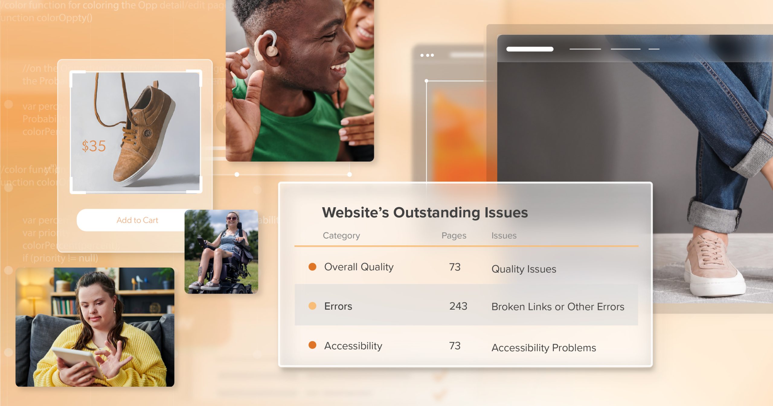
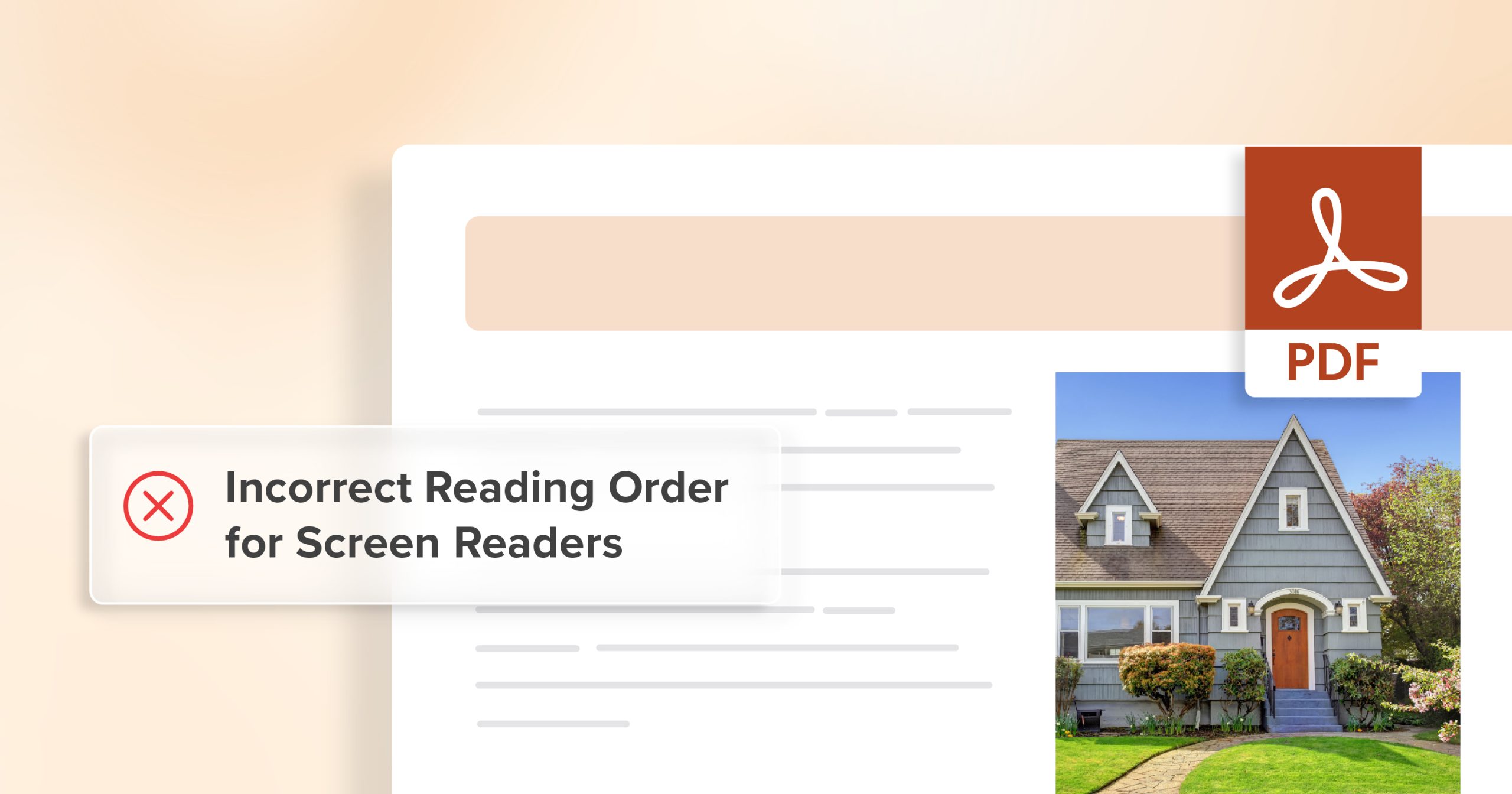
Picture navigating a long policy document with no headings, a jumbled reading order, or unlabeled tables. For someone using a screen reader, that isn’t just confusing—it’s exclusion. Instead of being empowered with information, the user is essentially told: this wasn’t made with you in mind. Document accessibility flips that experience, replacing confusion with clarity and restoring equal access.
For many people, this isn’t a matter of preference; it’s a matter of participation. A job seeker filling out an application, a student applying for financial aid, or a patient reviewing a health policy—each of these moments hinges on clear, usable documents. When accessibility is missing, doors close. When it’s present, those same doors open wide.
Legal and Compliance Risks
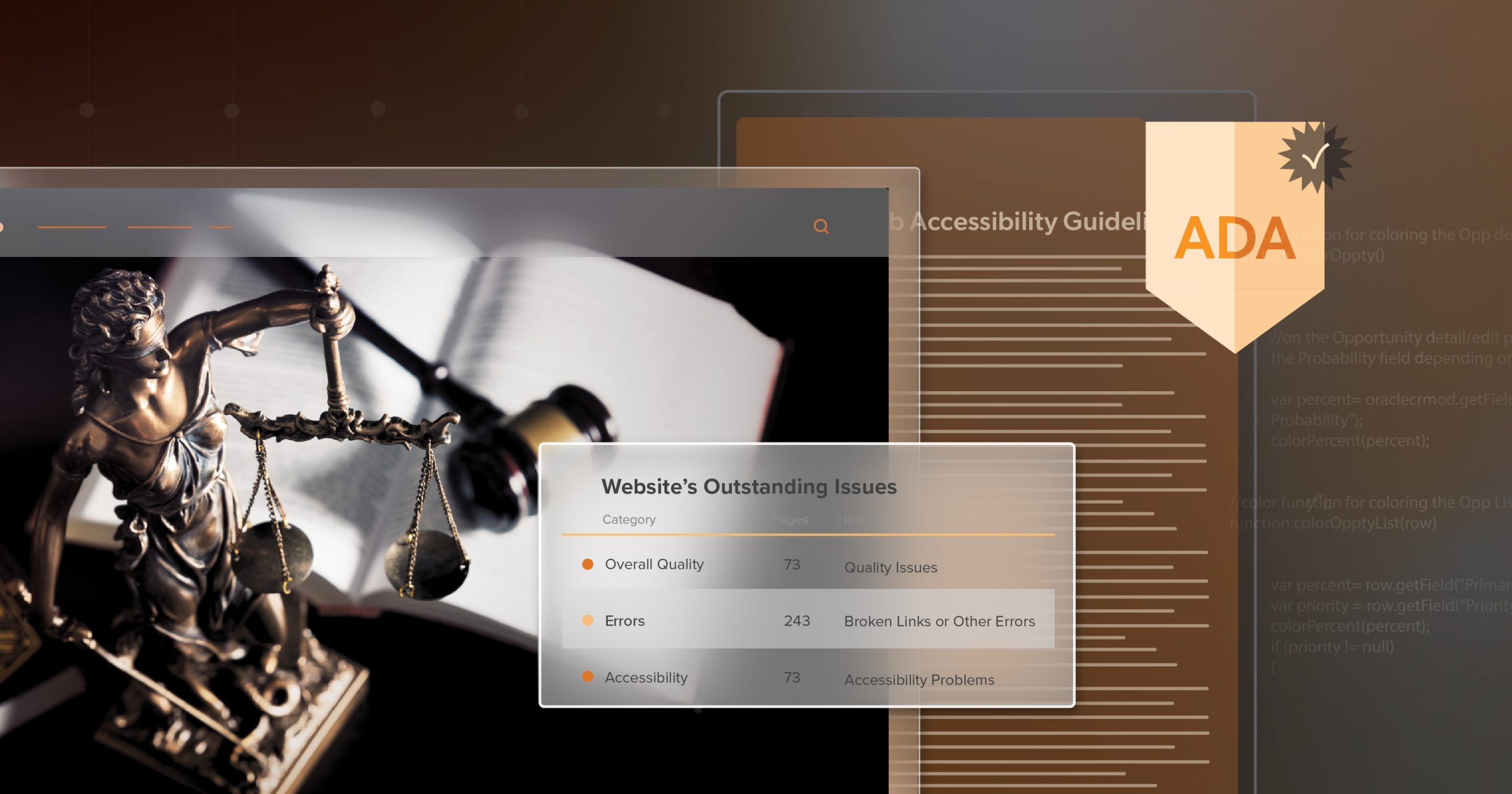
Accessibility laws don’t stop at websites. In the U.S., Section 508 requires federal agencies and contractors to make documents accessible. Courts increasingly reference WCAG in ADA-related cases, and states like California and Colorado explicitly include documents in their accessibility standards.
This means organizations that overlook document accessibility aren’t just leaving users behind—they’re exposing themselves to avoidable legal and financial risks. Settlements, remediation costs, and reputational fallout can far outweigh the effort it would have taken to build accessibility in from the beginning.
Strains on Operations and Budgets
Waiting to retrofit inaccessible files is like ignoring a small leak until the basement floods. By the time the problem surfaces, you’re dealing with archives of PDFs, Word files, and PowerPoints that all need fixing. That kind of scramble drains resources at the exact moment teams need them most.
By contrast, building accessibility into workflows from the start keeps projects moving smoothly and reduces long-term costs. It’s the difference between consistently maintaining a car and waiting for the engine to fail—one approach keeps you moving, the other leaves you stranded.
Damage to Trust and Reputation
Accessibility is also about values. Every time someone encounters an inaccessible document, it can feel like a closed door. On the flip side, organizations that consistently publish accessible files send a very different message: we thought of you, and you matter here.
That kind of trust sticks. Customers who feel included are more likely to stay loyal. Employees who see their organization invest in accessibility feel valued and supported. Communities notice when organizations lead with inclusion rather than scramble after being called out.
Habits That Make Documents Accessible
The encouraging part is that accessibility doesn’t hinge on massive overhauls. It comes down to steady, thoughtful habits that make communication easier for everyone.
- Start with what matters most. Prioritize high-impact files like benefits forms, contracts, or applications—where barriers are most costly.
- Keep it clear and legible. Use readable fonts at accessible sizes, and ensure strong color contrast. Don’t make users squint or guess.
- Guide readers with structure. Headings, bullet points, and logical reading order transform a wall of text into something navigable.
- Write links with meaning. Swap vague text like “click here” for specifics such as “Download the 2024 Annual Report.”
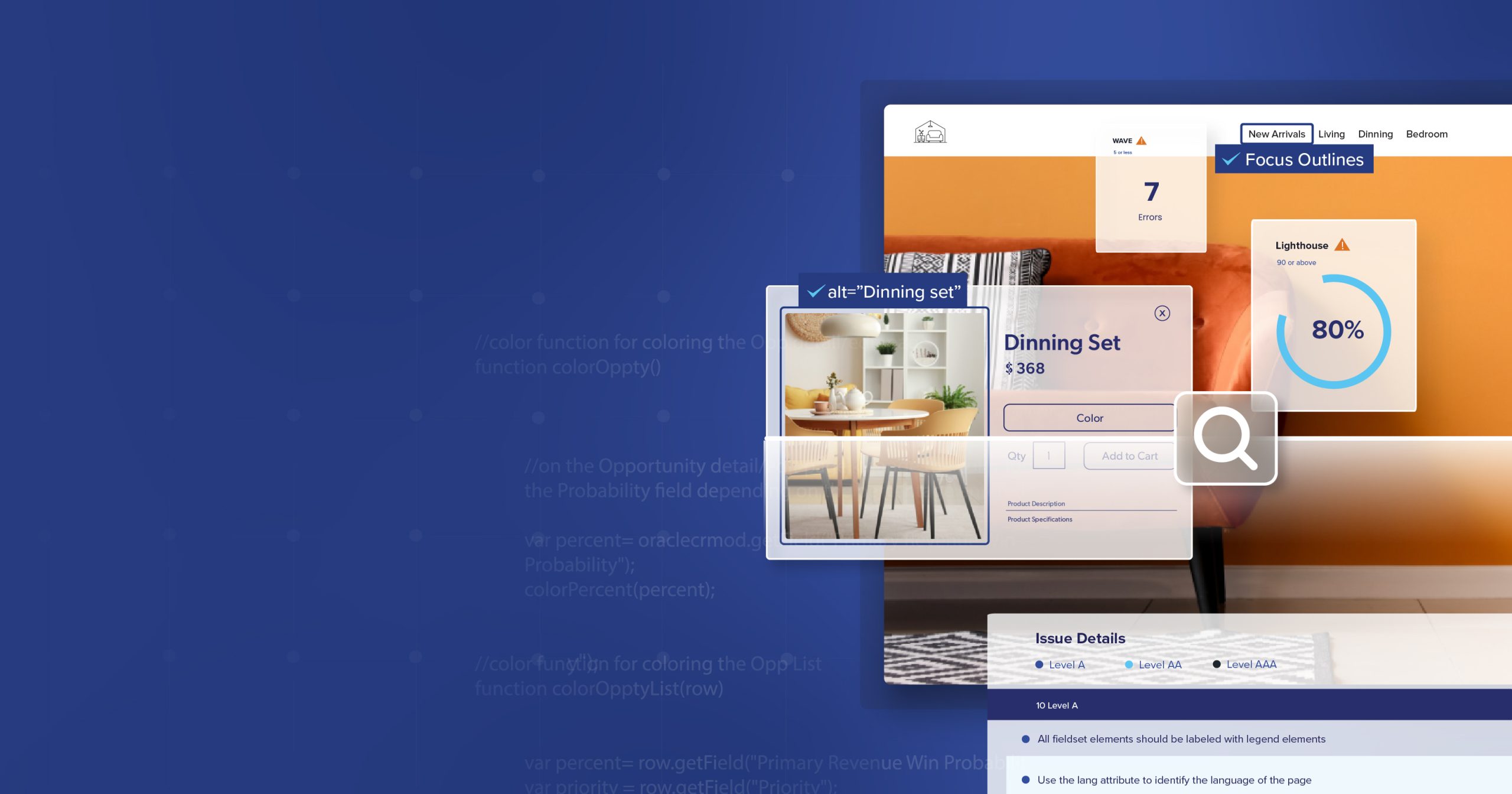
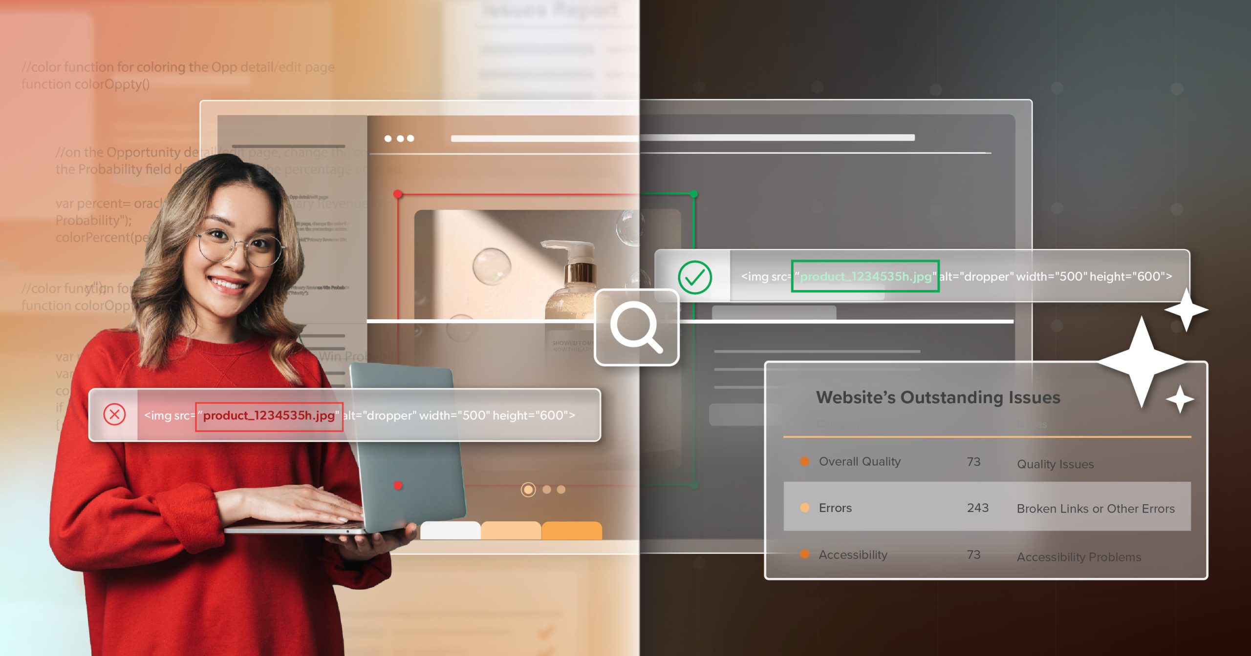
- Label charts and tables. A short title or alt text can make data accessible where it otherwise would be invisible.
- Double-check reading order. Confirm assistive technologies present content in the intended sequence.
- Use plain, approachable language. Accessibility and clarity overlap—what’s easier for one person usually helps everyone.
- Think accessibility early. Bake it into templates and workflows. What’s built right the first time doesn’t have to be rebuilt later.
- Build team confidence. Training, resources, and occasional outside expertise embed document accessibility into culture, not just checklists.
When these habits become routine, accessibility stops feeling like an “extra step.” It becomes part of what good communication looks like.
Building a Culture That Lasts
Accessibility isn’t a one-off project—it’s a mindset. Organizations that delay or treat it as optional often find themselves scrambling later, stuck between urgent deadlines and legal requirements.
Those that weave document accessibility into everyday work create a foundation for resilience and growth. They also discover a simple truth: when documents are accessible, they serve everyone better. Employees waste less time fixing broken files. Customers encounter fewer frustrations. Leaders gain the peace of mind that comes from knowing their communications reflect both compliance and care.
At its core, this work is about people. Every accessible document removes one more barrier. Each one tells the reader: we see you, we planned for you, and you belong here. That’s more than compliance. That’s care in action.
From Awareness to Action
Accessible documents reduce inefficiency, protect against legal risks, and strengthen reputations. But beyond the practical, they serve a human purpose: making sure vital information—job applications, financial aid forms, health policies—is available to everyone.
Document accessibility isn’t an afterthought. It’s the foundation of fair, effective communication.
If your organization is ready to turn awareness into action, schedule an ADA briefing with 216digital. We’ll help you build a strategy that makes accessibility part of your culture—so every file reflects not just compliance, but genuine inclusion.