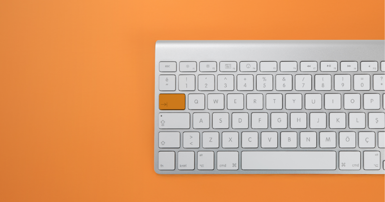
216digital.
Web Accessibility

Phase 1
Web Remediation for Lawsuit Settlement & Prevention


Phase 2
Real-World Accessibility


a11y.Radar
Ongoing Monitoring and Maintenance


Consultation & Training

Is Your Website Vulnerable to Frivolous Lawsuits?
Get a Free Web Accessibility Audit to Learn Where You Stand
Find Out Today!

Web Design & Development

Marketing

PPC Management
Google & Social Media Ads


Professional SEO
Increase Organic Search Strength

Interested in Marketing?
Speak to an Expert about marketing opportunities for your brand to cultivate support and growth online.
Contact Us

About

Blog

Contact Us
  • Progress Over Perfection: Steps Toward Digital Accessibility 

    In today’s digital world, creating websites and content that are accessible to everyone should be a top priority. But let’s face it — making your website completely accessible for every single user can feel like an overwhelming task. That’s where the concept of “progress over perfection” comes into play.

    Achieving digital accessibility isn’t a one-time fix. It’s an ongoing process of continuous improvement. If you aim for perfection from the start, you might get stuck, feel defeated, or even give up. But by focusing on making progress, even small steps, you can create a more inclusive online experience without the stress of reaching perfection right away.

    Let’s break down how you can start building a sustainable approach to digital accessibility with the right mindset, tools, and strategies.

    What Is Digital Accessibility?

    Before we dive into the “progress over perfection” mindset, let’s quickly talk about what digital accessibility really means. Simply put, it’s about making sure that all users, regardless of their abilities or disabilities, can access and use your website, apps, or digital content easily.

    This includes people who may be blind, deaf, have low vision, or have mobility challenges. It also covers people who have cognitive disabilities or those who just prefer to use assistive technology like screen readers, voice commands, or keyboard navigation.

    Digital accessibility can seem like a huge task at first, but it’s not about doing everything perfectly. It’s about making consistent improvements to ensure your site is usable by as many people as possible.

    The Problem with Perfectionism

    When you aim for perfection, the goal can feel so far out of reach that it becomes paralyzing. This is especially true with digital accessibility, where there are lots of technical guidelines and standards (like WCAG – Web Content Accessibility Guidelines) to follow. While these standards are great for ensuring accessibility, focusing on every little detail can slow you down.

    In reality, no website is perfect when it comes to accessibility. Users have different needs, and it’s impossible to design for every potential scenario at once. So, instead of feeling like you need to fix everything at the same time, shift your focus to continuous improvement. Every small step counts, and over time, those steps will add up to a more accessible and inclusive digital experience.

    Why Focus on Progress?

    The beauty of focusing on progress over perfection is that it’s achievable. It lets you start small, tackle the most pressing accessibility issues first, and then build on that foundation. As you implement changes, you’ll gradually improve the user experience, making it better for people with disabilities while also making your website more user-friendly for everyone.

    Here are some reasons why progress over perfection is the way to go for sustainable digital accessibility:

    1. You Don’t Get Stuck: Trying to achieve perfection can leave you frozen in place, unsure of where to start. By focusing on progress, you can tackle one problem at a time and move forward.
    2. It’s More Manageable: Rather than trying to fix everything at once, breaking down accessibility work into smaller tasks makes it more manageable and less overwhelming.
    3. You Can Build Momentum: When you make even small improvements, it creates a sense of accomplishment. This encourages you to keep making changes and adding new updates over time.
    4. It’s Realistic: Perfection doesn’t exist when it comes to accessibility. There will always be more to improve, so aiming for progress keeps you focused on what matters.

    Practical Tips for Achieving Digital Accessibility

    Now that we understand the importance of progress, let’s talk about some practical steps you can take to make real improvements to your site. You don’t need to do everything at once, but here’s how you can start moving toward a more accessible website today:

    Start with Low-Hanging Fruit

    When you’re just getting started, it’s helpful to identify and address the “low-hanging fruit” — the quick wins that will make the biggest impact with the least amount of effort. These might include:

    • Alt Text for Images: Add descriptive alt text to images so screen readers can convey the meaning of those images to users with visual impairments.
    • Keyboard Navigation: Make sure that all interactive elements (like forms, buttons, and links) can be accessed using only a keyboard.
    • Color Contrast: Ensure that text has enough contrast against the background so users with low vision can read it easily.

    By making these changes, you’re addressing immediate barriers that can make a huge difference in how accessible your website is for many users.

    Integrate Accessibility into Your Workflows

    To create long-term sustainability, accessibility shouldn’t be something you do only once or twice. It needs to be built into your everyday workflow. Whether you’re designing a new page, creating content, or updating a feature, think about accessibility from the start.

    Here are a few ways you can integrate accessibility into your routine:

    • Involve Accessibility from the Beginning: If you’re working on a new website or a redesign, include accessibility from the very start of the project. This way, accessibility considerations become part of the foundation.
    • Use Accessible Tools and Templates: Many website builders, content management systems (CMS), and templates have accessibility features built-in. Make sure you’re using those tools to save time and reduce errors.
    • Educate Your Team: Make sure everyone involved in content creation and site maintenance understands basic accessibility principles.

    Get Real Feedback from Users

    One of the best ways to improve accessibility is to hear directly from users. Real people with disabilities can give you valuable insight into how they experience your website and where the barriers lie. This is far more effective than guessing or relying solely on automated testing tools.

    You can:

    • Conduct User Testing: Recruit users with various disabilities to test your site and provide feedback. This can help you uncover issues you might have missed.
    • Engage with Your Audience: Ask for feedback through surveys or comments. Listen to your users, and if they point out areas for improvement, make a plan to address them.

    Use Tools for Continuous Monitoring

    To ensure your website stays accessible over time, use tools that can help you identify and fix problems as they arise. One such tool is a11y.Radar.

    A11y.Radar continuously scans your website for accessibility issues and provides you with actionable reports. This allows you to stay on top of accessibility improvements without needing to manually review your entire site. With regular scans, you can catch issues early and keep your site in good shape.

    It’s All About Consistent Improvement

    Remember, the goal of digital accessibility isn’t to be perfect; it’s to be inclusive. Every improvement you make is a step toward creating a better, more accessible experience for all your users. By focusing on progress over perfection, you’ll keep moving forward without getting stuck in the weeds.

    So, don’t be afraid to start small. Address the most pressing accessibility issues first, integrate accessibility into your workflows, engage with real users for feedback, and use tools to monitor your progress. Over time, you’ll create a website that’s not only accessible but sustainable in the long run — and that’s something to be proud of!

    If you’re ready to take the next step in your accessibility journey, schedule an ADA briefing with 216digital. Our experts can help you create a sustainable, actionable plan for achieving digital accessibility while mitigating risk. Let’s move forward together!

    Greg McNeil

    December 9, 2024
    Testing & Remediation, WCAG Compliance
    Accessibility, ADA Compliance, ADA Website Compliance, Web Accessibility Remediation, web development, Website Accessibility
  • Responsive Web Design: How It Relates to Digital Accessibility

    Users on mobile devices make up about two-thirds of all web traffic, so having a responsive web design is crucial. With assistive technology on mobile devices, such as Voiceover on iOS, getting better daily, users with disabilities are using mobile devices more than ever. In this article, we’ll explore how to ensure your mobile-friendly design is accessible to users with disabilities.

    What Is Responsive Web Design?

    Responsive web design is an approach to web development that ensures a site’s layout and content automatically adapt to different screen sizes and orientations. With RWD, a single website seamlessly adjusts its appearance and functionality, whether viewed on a desktop, tablet, or smartphone.

    The cornerstone of RWD lies in flexible grids, fluid images, and media queries that allow the design to respond to its environment.

    Why Is Responsive Web Design Important for Accessibility?

    Responsive web design is not just about aesthetics—it’s about usability. For users with disabilities, a responsive site can mean the difference between a smooth experience and complete frustration. Here’s how RWD contributes to digital accessibility:

    • Consistency Across Devices: Users who rely on assistive technologies, such as screen readers or magnifiers, benefit from consistent layouts and predictable navigation across devices.
    • Adaptability for Custom Settings: Responsive designs better accommodate user-specific settings, such as increased font size or high-contrast modes.
    • Ease of Interaction: RWD makes touch targets (like buttons) appropriately sized and spaced for mobile users, which is especially critical for people with motor impairments.
    • Improved Readability: Dynamic text resizing and responsive typography ensure readability for users with low vision.

    Responsive vs. Adaptive Web Design: Which Is Better for Accessibility?

    Although often used interchangeably, responsive and adaptive web design are distinct approaches.

    • Responsive Web Design (RWD): Using media queries, a single design adjusts fluidly to fit various screen sizes.
    • Adaptive Web Design (AWD): Multiple fixed layouts are created for specific screen sizes, and the appropriate layout is served based on the user’s device.

    When it comes to accessibility, RWD generally has the edge. Here’s why:

    • Device-Agnostic: RWD caters to an infinite range of screen sizes, while AWD is limited to the predefined breakpoints for which layouts are designed.
    • Consistency: RWD ensures a uniform experience, while AWD may cause discrepancies between layouts, confusing users who rely on assistive technologies.

    However, both approaches can support accessibility when implemented thoughtfully.

    Common Responsive Web Design Pitfalls That Hurt Accessibility

    Even well-intentioned responsive designs can fall short of accessibility standards. Here are some common mistakes and how to avoid them:

    Inconsistent Navigation

    When navigation menus change drastically between screen sizes, users may struggle to find what they need—especially those relying on screen readers or keyboard navigation.

    Solution: Use consistent and predictable navigation patterns across all breakpoints. Test to ensure screen readers announce menus accurately.

    Inadequate Focus Indicators

    Focus indicators are critical for users navigating with a keyboard, yet they often disappear or become less visible on smaller screens.

    Solution: Design focus states that are prominent across all devices.

    button:focus {  
      outline: 3px solid #0078d7;  
    }  

    Overly Small Touch Targets

    Tiny buttons or links on mobile devices can be difficult for users with motor impairments to tap accurately.

    Solution: Follow WCAG recommendations for touch target sizes (at least 44×44 pixels) and maintain adequate spacing.

    Ignoring User Settings

    Some responsive designs override user preferences, like zooming or high-contrast modes, which can render content inaccessible.

    Solution: Allow user overrides by avoiding !important in CSS styles and ensuring zoom functionality is not disabled.

    Best Practices for Accessible Responsive Web Design

    To build an inclusive, responsive website, focus on these foundational principles:

    Use Semantic HTML

    Start with a solid foundation by using semantic HTML elements like <header>, <nav>, and <main>. These provide structure and meaning, making your content easier to navigate with assistive technologies.

    Design Flexible Layouts

    Build layouts that adapt fluidly to different screen sizes. Use relative units like percentages or em instead of fixed units like pixels.

    .container {  
      width: 90%;  
      max-width: 1200px;  
      margin: 0 auto;  
    }   

    Implement Responsive Typography

    Readable text is crucial for accessibility. Use CSS techniques like clamp() to create scalable typography that adapts to the screen size:

    h1 {  
      font-size: clamp(1.5rem, 5vw, 2.5rem);  
    }  

    Test both manually and with automation, and invite feedback

    Whenever you complete development tasks or onboard new content or products, you should always use automated testing tools like WAVE and Google Lighthouse to ensure you do not introduce any new accessibility barriers. You should also regularly manually test your website using screen reading software. Ensure a link on your website invites user feedback if they encounter an accessibility barrier.

    Incorporate Media Queries Thoughtfully

    Media queries are the backbone of RWD. Use them to adjust layouts without sacrificing usability.

    @media (max-width: 768px) {  
      .nav {  
        display: none;  
      }  
      .mobile-menu {  
        display: block;  
      }  
    }   

    Leverage ARIA Sparingly

    Accessible Rich Internet Applications (ARIA) attributes can enhance accessibility but should not replace semantic HTML. For instance, use aria-expanded to indicate whether a collapsible menu is open or closed.

    <button aria-expanded="false" aria-controls="menu">Menu</button>  
    <div id= "menu" hidden>  
      <!-- Menu items -->  
    </div> 

    Optimize for Performance

    Slow-loading pages frustrate all users but can disproportionately affect those with disabilities. Compress images, minify CSS and JavaScript, and use responsive images to improve load times.

    Testing Responsiveness and Accessibility

    A responsive site isn’t automatically accessible—it needs testing. Here are some tools and methods to ensure your RWD supports digital accessibility:

    • Browser DevTools: Use responsive design modes to preview your site on various screen sizes.
    • Accessibility Testing Tools: Tools like Lighthouse can identify issues like missing alt text or insufficient contrast.
    • User Testing: Engage users with disabilities to test your site’s usability.
    • Mobile Testing: Use actual devices, not just simulators, to test responsiveness and accessibility together.

    Conclusion

    Many web owners focus specifically on the inclusivity of their desktop websites but do not specifically test their mobile views. With most traffic, including users with disabilities, using mobile devices, it’s more important than ever to ensure that all versions of your website, regardless of screen size, are accessible to everyone.

    If you’d like an expert evaluation of your mobile site’s accessibility, contact 216digital using the contact form below.

    Greg McNeil

    December 4, 2024
    How-to Guides
    Accessibility, ecommerce design, responsive web design, RWD, web development, Website Accessibility
  • Accessible Chatbots: Breaking Barriers in Support

    Nowadays, customers have come to expect support and product help on-demand, 24 hours a day, 7 days a week. It is only possible for some businesses to provide human assistance at all times – that’s where chatbots come in. These tools can be invaluable to users and business owners alike, but it’s essential to ensure that people with disabilities can gain access to the same support. Let’s explore the concept of accessible chatbots.

    Why Chatbot Accessibility Matters

    Imagine trying to resolve an urgent issue on a website, only to find the chatbot—your primary source of help—completely unusable. For many people with disabilities, this scenario is all too common.

    Accessible chatbots aren’t just about meeting legal requirements like ADA (Americans with Disabilities Act) compliance or adhering to  WCAG (Web Content Accessibility Guidelines) standards; they’re about creating a seamless experience for everyone. When designed thoughtfully, chatbots can be a powerful tool for inclusivity. But when accessibility is overlooked, they can alienate an entire segment of your audience.

    Common Barriers in AI Chatbots

    Incompatible with Screen Readers

    Many chatbots need more critical semantic HTML features like landmarks and incorrectly use HTML tags, causing a confusing or frustrating experience.

    Keyboard Navigation Failures

    Chatbots often lack keyboard support, requiring mouse clicks to open or interact. Users with disabilities rely on the ability to navigate content and functionality with alternative input methods like keyboards, voice commands, and gestures.

    Unclear or Missing Focus Indicators

    Focus indicators—the visual cues showing where a user is on a page—are often missing in chatbots. Without these, keyboard users may lose track of where they are in the conversation flow.

    Overly Complex or Jumbled Responses

    Chatbots tend to present information in long blocks of text or overly complicated formats. For users with cognitive disabilities, this can be overwhelming and hard to follow.

    Time Constraints

    Some chatbots automatically close after a period of inactivity, which can disadvantage users who need more time to read or type responses.

    Lack of Alternative Communication Options

    Chatbots often act as the sole method of contact, leaving users without alternative ways to reach support if they can’t use the chatbot.

    How to Build an Accessible Chatbot

    Making your chatbot accessible doesn’t have to be daunting. By following WCAG guidelines and implementing these best practices, you can create a more inclusive experience:

    Use Semantic HTML for Chatbot Elements

    Building an accessible chatbot does not require any specialized experience – you can apply the same general best practices to achieve accessible elements. Use the correct semantic HTML tags for each component you create, such as button or input elements.

    Here’s an example of an accessible chatbot button:

    <button aria-label="Open chatbot" id="chatbot-open-button">  
      Chat with us  
    </button>

    The aria-label ensures that screen readers convey the button’s purpose to users.

    Support Keyboard Navigation

    Your chatbot should be fully functional with just a keyboard. Test whether users can open, navigate, and interact with the chatbot using the Tab and arrow keys.

    For example, ensure focus moves logically through the chatbot interface:

    document.querySelector('#chatbot-input').focus();  

    Provide Descriptive ARIA Labels

    ARIA (Accessible Rich Internet Applications) roles and attributes can bridge gaps in accessibility, but they must be used carefully. Assign roles like aria-live to update users on dynamic content.

    <div role="alert" aria-live="polite" id="chatbot-messages">  
      Welcome! How can I assist you today?  
    </div>  

    Using aria-live ensures that screen readers announce new messages in real time.

    Design with Simplicity in Mind

    Avoid overwhelming users with large blocks of text. Break responses into smaller chunks and provide clear, concise answers.

    Allow for Adjustable Timing

    Let users control the session duration. If the chatbot times out, allow them to restart the session without losing previous messages.

    setTimeout(() => {  
      alert('The chatbot session has timed out. Click to resume.');  
    }, 300000);   

    Include Accessible Focus Indicators

    Make sure users can see which element is currently focused. Use CSS to style focus indicators:

    button:focus {  
      outline: 2px solid #005fcc;  
      outline-offset: 2px;  
    }  

    Provide Alternatives to Chatbots

    Not everyone can—or wants to—use a chatbot. Always include alternative ways to contact your business, like email or phone.

    Testing Chatbot Accessibility

    Testing is critical for identifying and fixing accessibility issues. Here are some methods to ensure your chatbot meets accessibility standards:

    Manual Testing with Screen Readers

    Test the chatbot using screen readers like NVDA or JAWS. Check if labels, navigation, and dynamic updates work as intended.

    Keyboard Navigation Tests

    Navigate the entire chatbot interface using only a keyboard. Make sure the focus moves logically, and that all interactions are possible.

    Automated Tools

    Use tools like Lighthouse to identify accessibility issues in your chatbot’s code.

    User Feedback

    Invite users with disabilities to test the chatbot and provide feedback. Their real-world experiences will highlight areas you may have missed.

    Meeting WCAG Standards for Chatbots

    The Web Content Accessibility Guidelines (WCAG) provide a roadmap for making chatbots more inclusive. Key criteria to consider include:

    • 1.3.1: Info and Relationships
    • Ensure that chatbot components are semantically structured and that relationships between elements are apparent.
    • 2.1.1: Keyboard Accessibility
    • All chatbot functions must be accessible via keyboard.
    • 2.4.7: Focus Visible
    • Ensure users can see where they are within the chatbot interface.
    • 4.1.2: Name, Role, Value
    • Use ARIA roles and labels to make interactive elements understandable to assistive technologies.

    Wrapping Up

    All the functionality on your website is helpful in some way to your users, or else you wouldn’t include it on your site. All functionality on your website should be accessible to everyone, especially chatbots.

    Remember to test your chatbot with screen readers, ensure keyboard compatibility, and always provide alternative ways to connect. Inclusive design benefits your business by reaching a broader audience and creating a better user experience for all.

    If you’re unsure if your chatbot is accessible to everyone, reach out to 216digital using the contact form below.

    Greg McNeil

    November 22, 2024
    How-to Guides
    Accessibility, Chatbots, web developers, web development, Website Accessibility
  • Skip Links: Improve Web Accessibility & Navigation

    More and more, digital accessibility has become a major talking point when browsing the web. One of the key components that improve accessibility for users with disabilities is something many users might not even notice: skip links.

    These simple yet powerful tools can make a huge difference in the web experience for individuals relying on keyboard-only interaction, screen readers, or other assistive technologies. In this article, we’ll explore the importance of skip links, their technical mechanics, and how you can implement them effectively on your website.

    What Are Skip Links and Why Are They Important?

    Skip links are navigational links that allow users to skip over repetitive content such as headers, navigation menus, or other elements they’ve already seen. For users relying on assistive technologies like screen readers, keyboard navigation, or switch devices, skip links enable them to jump directly to the main content of the page.

    When navigating a website using a keyboard (by pressing the Tab key), users typically encounter all of the page’s links and elements in a set order. This often means they have to cycle through the same menus, headers, and other repetitive content every time they visit a new page or reload an existing one. Skip links solve this problem by providing an easy way to bypass these elements, saving time and frustration for those who need alternative navigation methods.

    For example, imagine you’re using a screen reader to navigate a website. Without skip links, you might be forced to listen to the same navigation menu and header over and over again, even though you’re only trying to get to the main body of the page. Skip links allow you to bypass this content, going straight to the part of the page you want.

    The Key Benefits of Skip Links

    Improved Navigation for Keyboard-Only Users

    Many people with disabilities, including those with limited mobility or dexterity, use keyboards or alternative input devices to navigate the web. Skip links let users quickly navigate to the main content, bypassing headers, footers, and menus that they may have already accessed.

    Enhanced Experience for Screen Reader Users

    Screen readers announce every element on a webpage in the order they are tabbed through. Without skip links, users would have to hear the same menus and links repeatedly, making navigation time-consuming and tedious. Skip links streamline the experience by providing a shortcut to the main content.

    Better Usability for Assistive Technologies

    Skip links are a simple yet effective tool that benefits various assistive technologies, enhancing the overall usability of your website for a wide range of users.

    Increased Accessibility Compliance

    Many countries and regions have laws requiring websites to be accessible. For example, in the United States, the Americans with Disabilities Act (ADA) mandates that websites must be accessible to all users, including those with disabilities. Implementing skip links helps ensure your website is compliant with accessibility guidelines like Web Content Accessibility Guidelines (WCAG).

    How Do Skip Links Work?

    Skip links work by creating a link that, when activated, allows the user to bypass parts of the webpage and move directly to a more relevant section. These links are typically placed at the top of the page, visible only when the user navigates using the keyboard (by pressing the Tab key). The link itself usually says something like “Skip to main content,” “Skip to navigation,” or “Skip to footer,” depending on which section the user wants to bypass.

    The Technical Mechanics of Skip Links

    To create a skip link, you use basic HTML along with some helpful attributes to control the behavior and accessibility of the link. Here’s an overview of the technical aspects of skip links:

    HTML Structure with <a href> Tags

    The primary way to implement skip links is with the <a> (anchor) tag, which creates hyperlinks. These links should point to specific elements within the webpage, often with id attributes to mark the sections users can skip to.

    tabindex Attribute

    The tabindex attribute is used to control the tab order of elements. By default, links and form controls are included in the tab order. However, for skip links to work properly, they need to be made focusable before other content is tabbed through.

    aria-label and aria-hidden Attributes

    The aria-label attribute can be used to provide screen readers with a more descriptive label for the skip link. For example, you can use it to define a more readable label like “Skip to main content,” ensuring that screen readers announce the skip link’s purpose clearly. On the other hand, the aria-hidden attribute can be used to hide elements from assistive technologies when needed.

    A Simple Skip Link Example

    Here’s a simple HTML example of a skip link that allows users to skip directly to the main content of a webpage:

    <a href="#main-content" class="skip-link" tabindex="0" aria-label="Skip to main content">Skip to main content</a>
    <header>
    <nav> <!-- Navigation Links --> </nav>
    </header>
    <main id="main-content">
    <h1>Welcome to Our Website</h1>
    <p>This is the main content of the page...</p>
    </main>

    In this example:

    • The skip link (<a href="#main-content">) is placed at the top of the page and links to the main-content section identified by the id="main-content".
    • The tabindex="0" ensures that the skip link is focusable and can be reached when using the Tab key.
    • The aria-label="Skip to main content" helps screen reader users understand what the link does.

    Styling Skip Links

    While skip links are crucial for accessibility, they’re not always visually appealing by default. To make skip links blend in with your design, you’ll likely want to hide them until they’re needed and style them for better usability. Here’s how you can style skip links using CSS:

    .skip-link {
    position: absolute;
    top: -40px; /* Hide the link off-screen */
    left: 0;
    background-color: #000;
    color: #fff;
    padding: 10px;
    z-index: 100;
    }
    .skip-link:focus {
    top: 10px; /* Bring the link into view when focused */
    }

    In this example:

    • The .skip-link class hides the skip link off-screen with top: -40px until it’s needed.
    • When the link is focused (i.e., when the user tabs to it), it becomes visible by setting top: 10px.
    • You can customize the background color, text color, padding, and positioning to match your website’s design.

    JavaScript for Enhanced Skip Link Functionality

    In some cases, you may want to enhance the behavior of your skip link using JavaScript. For example, you might want to automatically focus the main content once the skip link is activated. Here’s how you can do that:

    document.querySelector('.skip-link').addEventListener('click', function(e) {
    e.preventDefault();
    document.querySelector('#main-content').focus();
    });

    This script listens for a click on the skip link and prevents the default action (i.e., jumping to the href target). Instead, it uses JavaScript to focus on the main content section, making it even easier for users to access.

    Testing Skip Links for Accessibility

    Once you’ve implemented skip links, it’s essential to test them to ensure they’re working as expected. Here are a few key tips for testing your skip links:

    1. Keyboard Navigation: Use the Tab key to cycle through the elements on your page. Ensure the skip link is the first item that can be focused and that it jumps you to the main content.
    2. Screen Reader Testing: Test your skip links with a screen reader (such as NVDA or VoiceOver) to ensure the skip links are announced correctly and work as expected.
    3. Cross-Browser Compatibility: Make sure your skip links work across different browsers and devices. Some older browsers might have quirks that affect the behavior of tabindex or CSS styling, so testing across multiple platforms is critical.
    4. Accessibility Tools: Use automated accessibility tools like Lighthouse to check for accessibility issues on your website. These tools can help identify missing or misused attributes related to skip links.

    Challenges with Skip Links

    While skip links are an essential tool for accessibility, there are some challenges you might encounter when implementing them:

    • Browser Inconsistencies: Different browsers and devices may render skip links or handle focus management differently. It’s important to test across various platforms to ensure consistent behavior.
    • Visibility and Styling: Skip links should be visible when needed but unobtrusive when not. Ensuring they are easily accessible but don’t clutter the design can require some careful styling.
    • Managing Focus Order: If your page has dynamic content (like modals or sticky headers), you may need to adjust the focus order or ensure that skip links still work as expected when these elements are present.

    Skip Ahead to Success

    Skip links are a simple but vital tool in improving the accessibility of your website. They help keyboard-only users, screen reader users, and others navigate your site more efficiently by skipping over repetitive content and jumping straight to the main sections of the page. By implementing skip links with proper HTML, CSS, and JavaScript, you can enhance the user experience for a wider audience, making your site more inclusive and accessible.

    If you’re ready to make your website ADA-compliant and accessible to everyone, schedule an ADA briefing with 216digital. Our team of experts will walk you through the process, address any questions, and help you create an inclusive, compliant, and user-friendly web experience. Don’t wait—take the first step toward a more accessible digital presence today.

    Greg McNeil

    November 21, 2024
    How-to Guides
    Accessibility, How-to, skip link, Web Accessibility, web developers, web development
  • Should Designers Hit Pause on Animation?

    Animation can bring a website to life, but have you ever considered how it impacts all users? While animations and gifs can make a site feel more dynamic, they can also cause some visitors discomfort—or worse—. Let’s explore why animations can be tricky from an accessibility standpoint and how you can design them to be both engaging and inclusive.

    Why Animation Can Be Problematic

    Animations aren’t just flashy extras—they can deeply affect how users experience your website, and not always in a good way.

    • Motion Sensitivity: Some people have vestibular disorders that make them sensitive to movement on screens. Animations like parallax scrolling or sliding elements can trigger dizziness, vertigo, or nausea.
    • Seizures: Flashing lights or strobing effects can be dangerous for users with photosensitive epilepsy. Even subtle flickers can cause issues.
    • Cognitive Overload: Busy or overly complex animations can overwhelm users with cognitive impairments, making it hard for them to focus or understand the content.
    • Assistive Technology Interference: Screen readers and other tools can struggle with animations that change content dynamically, leading to confusion.

    These challenges highlight why designers need to think critically about when and how they use animations.

    Does Your Design Really Need Animation?

    Not every project calls for animation. Before you add that fancy effect, ask yourself:

    • Does it serve a purpose?
    • Will it help users navigate or understand the site?
    • Could it distract or overwhelm someone?

    Animations should always have a clear function, like drawing attention to a call-to-action or giving feedback on an interaction. If the animation doesn’t improve usability, it might be best to skip it.

    Making Animations Accessible

    If you must use an animation, here are some tips to ensure it doesn’t cause issues for people with cognitive or visual impairments:

    1. Keep It Simple: Avoid overly elaborate or decorative effects. Subtle transitions or fades can be just as effective without being overwhelming.
    2. Mind the Timing: Speed matters. Too fast, and users might get lost; too slow, and they could grow impatient. Aim for a balance that feels natural.
    3. Give Users Control: All animations should have visual and accessible controls to pause and play the animation. Always respect the prefers-reduced-motion media query.
    4. Focus on Purpose: Every animation should add value. Whether it’s guiding users or making content clearer, make sure it serves a meaningful purpose.

    A Quick Fix with prefers-reduced-motion

    One of the easiest ways to address motion sensitivity is by using the prefers-reduced-motion media query. This CSS feature checks if a user has reduced motion enabled on their device and adjusts animations accordingly.

    Here’s how you can tone down animations for users who prefer less motion:

    @media (prefers-reduced-motion: reduce) {  
      .animated-element {  
        animation: none;  
        transition: none;  
      }  
    }  

    Want to simplify rather than completely disable? Try this:

    @media (prefers-reduced-motion: reduce) {  
      .fade-in {  
        animation: fade-in 0.5s linear;  
      }  
    }  
    @keyframes fade-in {  
      from { opacity: 0; }  
      to { opacity: 1; }  
    }  
    

    This approach keeps your design functional while reducing the risk of discomfort for sensitive users.

    What Does WCAG Say About Animation?

    The Web Content Accessibility Guidelines (WCAG) offer clear rules about animations. Two of the most relevant criteria are:

    • 2.3.1: Three Flashes or Below Threshold
    • Avoid animations that flash more than three times per second. It’s a crucial step in reducing the risk of seizures.
    • 2.3.3: Animation from Interactions
    • If animations are triggered by user actions, make sure they can be disabled without affecting functionality.

    Following these guidelines helps ensure your site is usable for everyone.

    Testing Your Animations

    Testing is an essential part of designing accessible animations. Here’s how to do it effectively:

    • Check Motion Settings: Turn on the “reduce motion” setting on your device (available on macOS, Windows, iOS, and Android) and see how your site responds.
    • Try Keyboard Navigation: Ensure animations don’t interfere with keyboard functionality. Can users still tab through links and buttons smoothly?
    • Use Automated Tools: Tools like Lighthouse can catch accessibility issues related to animations.
    • Gather Feedback: Get input from real users, especially those with disabilities. They’ll provide insights you might not have considered.

    Accessible Animation with JavaScript

    Sometimes, you’ll need JavaScript to handle animations. You can still make them accessible by pairing JavaScript with prefers-reduced-motion.

    Here’s a quick example:

    const reduceMotion = window.matchMedia('(prefers-reduced-motion: reduce)');  
    if (reduceMotion.matches) {  
      // Turn off animations for users who prefer reduced motion  
      document.querySelector('.animated-element').style.animation = 'none';  
    } else {  
      // Keep animations for everyone else  
      document.querySelector('.animated-element').classList.add('run-animation');  
    }   

    This snippet ensures your animations adapt to user preferences without requiring manual toggles.

    Wrapping It Up

    Animations can be a powerful tool for creating engaging, interactive websites—but they should never come at the expense of accessibility. By keeping animations simple, purposeful, and user-controlled, you can deliver a better experience for all your visitors.

    Don’t forget to test your designs with real users and tools, and make use of features like prefers-reduced-motion to accommodate different needs. Thoughtful design is inclusive design, and accessible animations are a small change that can make a big difference. If you’re unsure if the animations on your website are accessible or would like an expert partner to help you get started, reach out to 216digital using the contact form below.

    Bobby

    November 14, 2024
    How-to Guides
    Accessibility, animation, How-to, web developers, web development, Website Accessibility
  • Understanding Focus Outlines for Web Accessibility

    Have you ever tried navigating a website without a mouse, relying only on your keyboard? It might seem unusual, but for many people with motor disabilities or visual impairments, this is their everyday reality. Focus outlines—the visual markers that highlight where you are on a page—are essential tools that make this possible.

    Unfortunately, these outlines often get overlooked or even removed during web design, leaving a significant number of users struggling to navigate sites effectively. Let’s break down what focus outlines are, why they matter, and how you can implement them to make your website more inclusive.

    What Is a Focus Outline?

    A focus outline is a visual indicator, often a highlighted border or underline, that appears around a web element when it gains keyboard focus. This outline helps users understand which interactive element they are currently on, whether it’s a link, button, form field, or other focusable component. For example, when a user tabs through a webpage, the focus outline moves from one element to the next, providing a visual cue about their current location on the page.

    This feedback is essential for users who cannot use a mouse and instead navigate by pressing the “Tab” key to move forward and “Shift + Tab” to move backward. For those relying on screen readers, focus outlines further aid in understanding the structure of a page, confirming the position on the screen, and reducing the cognitive load required to navigate the web effectively.

    Why Focus Outlines Matter for Accessibility

    Focus outlines aren’t just nice to have—they’re a must-have for accessibility. According to the Web Content Accessibility Guidelines (WCAG), specifically criterion 2.4.7: Focus Visible, mandate that any keyboard-operable interface must have a visible focus indicator. This ensures that users relying on keyboard navigation always know where they are on the page.

    Who Benefits from Focus Outlines?

    For users with motor disabilities, such as those who have difficulty controlling fine motor movements or are unable to use a mouse, keyboard navigation is a primary means of interacting with digital content. The focus outline serves as a reliable marker of where they are on the page, making navigation smooth and efficient. People with low vision or visual impairments who use high-contrast settings also rely on focus outlines for an additional layer of navigation support, enabling them to visually follow along.

    Legal and Ethical Responsibilities

    Beyond enhancing the user experience, implementing visible focus outlines is a legal and ethical responsibility for organizations. Without them, websites may fail to meet accessibility standards, putting them at risk of non-compliance with the WCAG guidelines. For organizations, following WCAG isn’t just about adhering to regulations; it’s about creating an inclusive experience that all users can navigate.

    How to Create Accessible Focus Outlines

    Making focus outlines accessible and noticeable is all about ensuring they stand out. Here are some tips:

    • Use Sufficient Color Contrast: Choose colors that contrast well with both the element and the background.
    • Choose a Noticeable Style: Solid, dotted, or dashed lines can all work, as long as they’re easily visible.
    • Adjust Thickness: A thicker outline can be more eye-catching and easier to see.

    How to Style Focus States Using CSS

    Outlines can be solid, dotted, or dashed lines, as long as they are visible. Adjusting the thickness can also make the outline more noticeable.

    Example: Basic Focus Outline with CSS

    button:focus,
    a:focus {
      outline: 3px solid #007acc;
    }

    In this example, we’ve applied a 3-pixel solid blue outline to buttons and links when they’re focused. Before finalizing colors, use tools like the WebAIM Contrast Checker to ensure they meet the recommended contrast ratio of at least 3:1 for user interface components.

    Add Background Effects

    For a more custom look, consider adding a background color or shadow effect:

    button:focus {
      outline: none;
      box-shadow: 0 0 5px 2px rgba(0, 122, 204, 0.8);
    }

    This replaces the default outline with a subtle glow, making the focused element stand out without clashing with your design. Just remember to test these styles to ensure they’re visible to everyone, including users with visual impairments.

    Avoiding Common Mistakes with Focus Outlines

    One of the most common pitfalls in web design is removing focus outlines entirely. Designers sometimes find default focus outlines unattractive and may remove them without providing a suitable replacement. While this might make the site look cleaner, it creates significant accessibility barriers for users relying on keyboard navigation. WCAG guideline 2.4.7 requires focus indicators for compliance, so removing focus outlines can result in a failure to meet accessibility standards.

    If you’re tempted to hide the default outline, remember that it’s better to customize it than to remove it. Replacing the outline with a custom design can enhance the aesthetics of your website without sacrificing accessibility. Just ensure that your custom design maintains a strong visual presence and sufficient color contrast.

    Another common mistake is creating focus outlines that blend too closely with the background. This can happen when designers use colors that don’t contrast well with surrounding elements or backgrounds. Remember, users with low vision may struggle to differentiate between similar shades, so it’s essential to test the visibility of focus outlines across various screens and devices.

    Testing Focus Visibility

    Testing is a crucial step to ensure your focus outlines are effective:

    1. Navigate Your Site Using Only the Keyboard: Press the “Tab” key to move through interactive elements and observe the focus outline.
    2. Check Every Interactive Element: Ensure that links, buttons, form fields, and other focusable components have a visible focus state.
    3. Assess Visibility and Consistency: The focus outline should be easily noticeable and consistent across your site.
    4. Accessibility Tools: Tools like Google Lighthouse or WAVE can check WCAG compliance, including focus outlines.

    Make Focus Outlines a Priority

    Focus outlines aren’t just a design detail—they’re a vital part of creating an inclusive web experience. By ensuring your site has clear and consistent focus indicators, you can make your website more accessible for everyone. So, take action today to ensure your website is accessible. Your customers—and your bottom line—will thank you!

    For personalized guidance on making your website ADA compliant, reach out to 216digital for an ADA briefing. Our experts are here to help you navigate the complexities of web accessibility and secure your business against potential legal risks.

    Kayla Laganiere

    November 13, 2024
    How-to Guides
    Accessibility, focus outlines, How-to, web developers, web development, Website Accessibility
  • Why Touch Targets Impacts Accessibility

    Imagine this: a customer visits your website, excited to snag a deal on their holiday shopping list. They’re scrolling through your page on their phone, ready to click “add to cart,”—but then they hit a roadblock. The buttons are too small, links are crowded together, and navigating your site becomes a frustrating game of “tap and hope.” Now imagine if that customer has limited dexterity or relies on assistive technology. For them, those tiny buttons and cramped links aren’t just an inconvenience; they’re a barrier.

    Accessibility issues like these don’t just affect your users’ experience—they impact your bottom line and even your legal compliance. Making sure your site’s touch targets are easy to interact with is one of the simplest yet most impactful changes you can make. In this guide, we’ll cover why large, accessible touch targets matter, how they boost usability for everyone, and what steps you can take to ensure your site is welcoming to all.

    What Are Touch Targets and Why Are They Important?

    Touch targets are interactive elements—such as buttons, links, and form controls—that users engage with as they navigate your website. The size and spacing of these elements can make or break the experience, especially for users on mobile devices or those with physical limitations. If touch targets are too small or closely spaced, users may struggle to click or tap accurately, leading to frustration and a poor experience. This can be particularly challenging for older adults and individuals with limited dexterity.

    Making touch targets sufficiently large and spaced out allows everyone to navigate and interact with your site more easily, enhancing both usability and inclusivity. This is a foundational aspect of web accessibility that ensures your website works well for all.

    WCAG Guidelines: Key Standards for Touch Target Size

    To provide clear guidance on accessible touch target sizes, the Web Content Accessibility Guidelines (WCAG) have established several success criteria. WCAG 2.1 and the updated WCAG 2.2 outline standards to help developers make online content accessible, mainly through adequately sized touch targets.

    Success Criterion 2.5.5 (Target Size)

    In WCAG 2.1, Criterion 2.5.5 specifies that interactive elements should meet a minimum touch target size of 44×44 pixels, making it easier for users with limited motor skills or assistive technology to select the right element.

    Success Criterion 2.5.8 (Target Size – Enhanced)

    WCAG 2.2 expands on this with Criterion 2.5.8, recommending even larger touch targets when interactive elements are positioned close together. This helps users avoid accidentally tapping the wrong element, especially on mobile devices or when using screen readers.

    These guidelines establish a foundation for accessible design, giving developers clear targets to create user-friendly, inclusive sites that reduce errors and improve the overall user experience.

    Best Practices for Designing Accessible Touch Targets

    With WCAG standards in mind, you can take steps to create touch targets that enhance usability. Here are some essential practices for implementing accessible interactive elements:

    Use Adequate Padding and Margin

    Padding and margins around buttons and links help ensure they meet minimum size requirements while maintaining a clean visual layout. For example:

    button {
      padding: 12px 20px; /* Increases padding for larger touch target */
      font-size: 16px;
    }

    Ensure Minimum Width and Height

    Using min-width and min-height properties guarantees that buttons and other elements stay at least 44×44 pixels, even when the element content is smaller. This maintains accessibility across different screen sizes.

    button {
      min-width: 44px;
      min-height: 44px;
    }

    Space Out Interactive Elements

    Placing enough space between buttons and links prevents mis-taps and ensures usability for all users, especially those on mobile devices or using assistive technologies.

    button, a {
      margin: 10px;
    }

    Add ARIA Attributes for Enhanced Accessibility

    ARIA attributes (Accessible Rich Internet Applications) add context to interactive elements for users relying on assistive devices. For instance, using aria-expanded or aria-haspopup on a menu button helps screen reader users understand its function.

    <button aria-expanded="false" aria-haspopup="true">Menu</button>

    Responsive Design: Ensure Touch Target Size Across Devices

    Since many users rely on mobile devices for browsing, it’s essential to make touch targets easily accessible on smaller screens. Using responsive CSS ensures that touch targets adapt to various screen sizes:

    @media (max-width: 600px) {
      button {
        padding: 15px 25px; /* Larger padding on smaller screens */
      }
    }

    Testing Touch Target Accessibility

    Once you’ve optimized your touch targets, testing is essential to ensure they’re functional and accessible. Here are a few testing strategies to confirm usability:

    • Manual Testing: Test your site on various devices (desktop, tablet, mobile) to ensure touch targets are easy to access and use.
    • Accessibility Tools: Tools like Google Lighthouse or WAVE can check WCAG compliance, including touch target sizes.
    • User Testing: Feedback from real users, particularly those with disabilities, is invaluable for assessing how accessible and user-friendly your touch targets are.

    Wrapping Up

    Improving touch target accessibility is just one of many steps toward making your website genuinely inclusive and user-friendly. By focusing on accessible design, you not only enhance the experience for users with mobility challenges and those using assistive technologies but also build a site that’s welcoming and intuitive for everyone. Following WCAG guidelines, using best coding practices, and regular testing are essential—but navigating these standards alone can be overwhelming.

    If you’re ready to take accessibility seriously and want to ensure your site is fully ADA-compliant, consider scheduling an ADA briefing with 216digital. Our team of accessibility experts can help you identify potential compliance issues, create actionable solutions, and guide you through the process of building a more accessible and inclusive website. Reach out today to learn how we can help safeguard your site and open new opportunities with ADA compliance.

    Greg McNeil

    November 8, 2024
    How-to Guides
    Accessibility, How-to, touch targets, web developers, web development, Website Accessibility
  • How to Build Accessible React Applications

    Building an accessible React application means designing a site that everyone, including people with disabilities, can use and enjoy. Accessibility in web apps isn’t just a legal or ethical responsibility—it’s also a best practice that improves user experience for everyone. React, with its dynamic and component-based nature, offers much flexibility, but without careful planning, accessibility can fall through the cracks. This guide will walk you through critical practices to build a more accessible React app, covering essential tools, effective HTML and ARIA usage, keyboard accessibility, and screen reader management.

    Why Accessibility in React Matters

    An accessible React app does not create obstacles for people who rely on assistive technology like screen readers, keyboards, or other devices. According to Web Content Accessibility Guidelines (WCAG), making web content accessible means people of all abilities can navigate, understand, and interact with your content. With tools and techniques tailored for React, you can ensure that users with disabilities get the best experience possible.

    Setting Up an Accessibility-Friendly Development Environment

    Setting up your React environment to catch accessibility issues early is a powerful way to build accessible applications. A highly recommended tool for React is eslint-plugin-jsx-a11y, which catches JSX-specific accessibility issues directly in your code editor.

    Installing eslint-plugin-jsx-a11y

    Install the plugin:

    npm install eslint-plugin-jsx-a11y --save-dev

    Configure ESLint: Add the plugin to your ESLint configuration file.

    {
      "plugins": ["jsx-a11y"],
      "extends": [
        "eslint:recommended",
        "plugin:jsx-a11y/recommended"
      ]
    }

    This plugin identifies accessibility issues in JSX, such as missing ARIA roles, empty <alt> attributes on images, and improper keyboard handling.

    The Power of Semantic HTML in React

    When it comes to accessibility, semantic HTML is your best friend. Semantic elements like <button>, <header>, and <nav> are designed to convey meaning and functionality to both browsers and screen readers. This minimizes the need for ARIA roles and additional attributes, as semantic HTML elements come with built-in keyboard accessibility and screen reader support.

    Examples of Semantic HTML in React

    Using semantic elements directly in React makes components accessible by default. For example:

    import React from 'react';
    function AppHeader() {
      return (
        <header>
          <h1>Welcome to My Store</h1>
          <nav>
            <a href="#home">Home</a>
            <a href="#products">Products</a>
            <a href="#contact">Contact</a>
          </nav>
        </header>
      );
    }
    export default AppHeader;

    Avoid Using <div> and <span> for Interactive Elements

    Avoid using generic elements like <div> and <span> to create buttons or links, as these don’t include native keyboard or accessibility functionality. Instead, use <button> and <a> elements to ensure proper accessibility and functionality. For example:

    function IconButton() {
      return <button aria-label="Open settings" onClick={() => alert('Settings')}>⚙️</button>;
    }

    Enhancing Accessibility with ARIA Roles (But Use Them Wisely)

    ARIA (Accessible Rich Internet Applications) can make custom elements accessible when there’s no HTML equivalent. However, it’s essential to use ARIA roles to enhance existing semantic elements rather than replace them.

    Using aria-label for Accessibility

    Sometimes, buttons or icons need additional context for screen readers. The aria-label attribute provides descriptive text to communicate functionality.

    function IconButton() {
      return <button aria-label="Open settings" onClick={() => alert('Settings')}>⚙️</button>;
    }

    Dynamic Updates with aria-live

    React apps often have dynamic content. Use aria-live regions to notify screen readers about important changes.

    function AlertMessage({ message }) {
      return (
        <div aria-live="assertive">
          {message}
        </div>
      );
    }

    Keyboard Accessibility and Focus Management

    Keyboard accessibility ensures users can navigate your app without a mouse, which is crucial for many assistive technology users. In React, managing keyboard focus is straightforward with hooks like useRef and useEffect.

    Setting Focus with useRef and useEffect

    You can use useRef to target an element and useEffect to set focus when a component mounts. This is useful for elements like modals, which should receive focus when they appear.

    import React, { useRef, useEffect } from 'react';
    function Modal({ isOpen, onClose }) {
      const closeButtonRef = useRef(null);
      useEffect(() => {
        if (isOpen) {
          closeButtonRef.current.focus();
        }
      }, [isOpen]);
      return (
        isOpen && (
          <div role="dialog" aria-modal="true">
            <p>Modal content here</p>
            <button ref={closeButtonRef} onClick={onClose}>Close</button>
          </div>
        )
      );
    }

    In this example, the close button gains focus when the modal opens, making navigation intuitive for keyboard users.

    Avoiding Focus Traps

    Focus traps occur when users get “stuck” within an element, such as a modal, and can’t return to the main content. Ensure that focus can move freely between interactive elements and provide a way to close modals with the Escape key.

    Best Practices for Accessible Interactive Elements

    When building custom components, pay attention to how they’ll be used with a keyboard:

    Provide Clear Labels for Inputs

    Forms are essential in any application, and labeling form controls is critical for accessibility. Use labels effectively with inputs, either through <label> elements or aria-label attributes.

    function NameInput() {
      return (
        <label htmlFor="name">
          Name:
          <input type="text" id="name" aria-required="true" />
        </label>
      );
    }

    Accessible Modals

    For custom modal components, set the role= "dialog" and aria-modal= "true" attributes, which inform assistive technology that the content is a modal.

    Testing Focus

    After adding interactive elements, test that each one can be reached and activated using only the Tab, Enter, and Escape keys. This ensures full keyboard accessibility.

    Managing Screen Reader Navigation in SPAs

    Single Page Applications (SPAs) often update content dynamically without full page reloads, which can make it difficult for screen reader users to keep track of changes. When the main content area updates, shift focus to the new content or provide a way for screen readers to be alerted about the change.

    Example: Setting Focus on Page Updates

    import React, { useEffect, useRef } from 'react';
    function ContentArea({ content }) {
      const contentRef = useRef();
      useEffect(() => {
        contentRef.current.focus();
      }, [content]);
      return (
        <main tabIndex="-1" ref={contentRef}>
          {content}
        </main>
      );
    }

    Here, the main content area receives focus after each update, helping screen reader users navigate SPAs more easily.

    Testing Your React App for Accessibility

    Testing is crucial to ensure your React application meets accessibility standards. Here are some testing methods and tools:

    1. Manual Testing: Use keyboard-only navigation to interact with your app, checking that all elements are accessible and usable. Verify that custom elements respond to the Tab, Enter, and Escape keys.
    2. Screen Readers: Test with a screen reader like NVDA (for Windows) or VoiceOver (for macOS). Experience the app as a screen reader user to see how well content updates and ARIA roles are conveyed.
    3. Automated Tools: Tools like Google Lighthouse or WAVE identify many accessibility issues. They’re helpful for quickly checking common problems, although they don’t replace manual testing.

    Conclusion

    Building accessible React applications takes effort but is entirely achievable with the right techniques and tools. Start by setting up your development environment with eslint-plugin-jsx-a11y to catch common issues, and always prioritize semantic HTML elements for inherent accessibility. ARIA roles are powerful but should be used to enhance—not replace—standard HTML.

    Ensuring keyboard accessibility, managing focus in SPAs, and regularly testing for accessibility can make a world of difference for users. By following these practices, you’re not only meeting WCAG standards but also creating a better user experience for everyone.

    Need help?  Reach out to 216digital using the contact form below for a complimentary ADA briefing.

    Bobby

    November 6, 2024
    How-to Guides
    ARIA, How-to, React, web developers, web development
  • The Importance of Keyboard Accessibility & Why ARIA Widgets Don’t Work

    Keyboard accessibility is a fundamental part of creating an accessible web experience. For many people, including those with motor impairments, the ability to navigate a website using only a keyboard is essential. Unfortunately, not all website interactive elements are designed with keyboard users in mind. This is where ARIA (Accessible Rich Internet Applications) widgets often come into play—intended to improve accessibility but frequently falling short when misused.

    Understanding the principles of keyboard accessibility and the limitations of ARIA widgets can help website owners, developers, and content creators deliver a more inclusive user experience. Let’s explore the most common keyboard accessibility issues, why ARIA widgets often miss the mark, and how you can design your website to meet Web Content Accessibility Guidelines (WCAG) standards.

    Why Keyboard Accessibility Matters

    Keyboard accessibility ensures that all interactive elements on a website—like buttons, forms, links, and menus—are reachable and usable without needing a mouse. Many users, such as those with motor disabilities or vision impairments, rely on keyboards, screen readers, or other assistive devices to navigate web content.

    Without keyboard accessibility, people using assistive technology can encounter significant barriers, preventing them from completing tasks or navigating the site. For instance, a checkout form that only allows interaction through mouse clicks will stop a keyboard user in their tracks, impacting their ability to purchase a product or service.

    Common Barriers to Keyboard Accessibility

    Some of the most common obstacles that keyboard users face on websites include:

    Lack of Focus Indicators

    • Problem: Without visible focus indicators, keyboard users may not know where they are on the page. This becomes particularly frustrating when navigating forms or interactive menus.
    • Solution: Use CSS to style focus indicators and make them highly visible, such as by changing the border color, background, or outline. Here’s an example:
    button:focus, a:focus {
    	outline: 3px solid #005fcc;
    	background-color: #f0f8ff;
    }

    Improper Tab Order

    • Problem: Elements on a page need to logically match the visual layout. Without a logical tab order, users may be taken through an erratic sequence, which can lead to confusion and missed information.
    • Solution: Arrange your elements in HTML to follow the intended visual order and limit use of the tabindex attribute. By default, elements will follow the document’s source order, so it’s best to organize your code this way.

    Focus Traps

    • Problem: Focus traps occur when users can’t tab away from a particular element, like a popup or modal. Once they’re stuck, the rest of the page becomes inaccessible until they can close the focus-trapped section.
    • Solution: Ensure focus returns to the main content once the user dismisses the popup or modal, using JavaScript if necessary:
    // Example of returning focus after modal close
    document.getElementById("closeModalButton").addEventListener("click", function() {
      document.getElementById("mainContent").focus();
    });

    ARIA Widgets and Their Challenges

    ARIA (Accessible Rich Internet Applications) is a set of attributes that help improve the accessibility of web applications, particularly for screen readers. However, ARIA widgets—such as dropdowns, sliders, and modals—often don’t work as expected for keyboard users if not implemented carefully. ARIA can enhance accessibility, but it can’t “fix” poor coding practices or make non-native elements fully functional on its own.

    Why ARIA Widgets Often Fail

    ARIA widgets can be highly effective but only if they’re properly coded, tested, and consistently used with accessibility in mind. Here are some common pitfalls:

    Reliance on ARIA Without Semantic HTML

    ARIA is not a replacement for HTML5 elements; it’s meant to enhance them. Using ARIA on elements that don’t support native keyboard interactions (like <div> for a button) means the widget might lack inherent keyboard functionality.

    For example, instead of creating a clickable div with ARIA, use a <button> tag. Buttons come with native keyboard functionality and don’t require extra scripting or attributes to work as expected.

    Overuse of role and tabindex Attributes

    Misusing role attributes can disrupt how screen readers interact with elements. For instance, assigning a role= "button" to a div won’t make it work the same way as a real button.

    Similarly, improper use of tabindex can cause elements to jump around in an illogical order. Stick to the natural flow of the DOM, using tabindex= "0" only when absolutely necessary to keep the order in sync.

    JavaScript-Dependent Behavior

    ARIA widgets often rely on JavaScript to replicate native interactions, but these scripts must be meticulously coded and tested. A JavaScript error could render an entire widget inaccessible.

    Testing your scripts thoroughly with keyboard-only navigation is essential, especially for ARIA widgets. Missing key events like “Enter” or “Escape” can trap users in a widget or make it difficult to interact with.

    Best Practices for Creating Keyboard-Accessible Interactive Elements

    To avoid these pitfalls and ensure that your site is truly keyboard accessible, follow these best practices:

    Prioritize Native HTML Elements

    Whenever possible, use native HTML elements for interactivity (like <button>, <a>, <input>, and <select>). They come with built-in accessibility and keyboard support, reducing the need for complex ARIA attributes or custom JavaScript.

    Use ARIA Judiciously

    Use ARIA only when there’s no HTML equivalent, like custom dropdowns or sliders. And if you do need ARIA attributes, implement them carefully with an understanding of their purpose. For example, use aria-expanded to indicate the open or closed state of a dropdown menu:

    <button aria-expanded="false" aria-controls="menu">Menu</button>
    <ul id= "menu" hidden>
      <li><a href="#home">Home</a></li>
      <li><a href="#about">About</a></li>
    </ul>

    Enable Logical Focus Management

    Ensure that interactive elements maintain a logical and intuitive focus order. When creating modals or popups, use JavaScript to trap focus within the modal until it’s closed and then return focus to the last element interacted with:

    const modal = document.getElementById("modal");
    const lastFocus = document.activeElement;
    // Trap focus within modal
    modal.addEventListener("keydown", (e) => {
      if (e.key === "Tab") {
        // Logic to keep focus within modal
      }
    });
    // Restore focus after modal close
    modal.addEventListener("close", () => {
      lastFocus.focus();
    });

    Include Skip Links

    Skip links are simple yet effective. They allow keyboard users to jump directly to the main content, bypassing repetitive navigation menus. Add a skip link that appears when focused, like this:

    <a href="#mainContent" class="skip-link">Skip to main content</a>
    <main id="mainContent">
      <!-- Main content here -->
    </main>

    The Importance of Testing for Keyboard Accessibility

    Testing is critical to achieving real keyboard accessibility. Use keyboard-only navigation to interact with your site, ensuring that each element responds to the Tab, Enter, and Escape keys appropriately. Here are a few tips for testing:

    1. Turn Off Your Mouse: Try navigating your site using only the keyboard. See if you can reach every interactive element and complete all tasks.
    2. Use Assistive Technology Simulators: There are free screen readers (such as NVDA or VoiceOver) that let you experience your website as a keyboard-only user would.
    3. Run Accessibility Audits: Automated tools like Google Lighthouse or WAVE can catch many keyboard accessibility issues, but a manual review is still necessary.

    Conclusion

    Keyboard accessibility is a must for ensuring inclusivity on your website. By avoiding ARIA misuse and sticking to native HTML elements where possible, you’ll reduce barriers for keyboard users and create a smoother experience. Remember, ARIA attributes can enhance interactivity, but they aren’t a substitute for accessible design principles.

    Testing with keyboard-only navigation will confirm that your site meets WCAG standards and shows your commitment to creating a web experience that everyone can enjoy—just in time for all your visitors to get the most out of your content and promotions. Reach out to 216digital using the contact form below if you’re unsure if your website is keyboard navigable.

    Bobby

    October 29, 2024
    How-to Guides
    ARIA, How-to, keyboard accessibility, web developers, web development
  • A Case for Starting Accessibility Early in Development

    When you’re kicking off a new web project, it’s easy to focus on exciting features and visual design. But here’s something that often gets pushed aside until it’s almost too late: accessibility. The truth? Accessibility isn’t just a box to check off at the end of development; it’s a fundamental part of creating an inclusive, user-friendly experience from day one. To truly succeed, you need to start accessibility early.

    Think about it: no one wants to realize their new website or app needs major tweaks just to be usable for everyone. Starting accessibility early not only benefits people with disabilities but boosts usability for all your users, saves you money, and keeps you in line with standards like Web Content Accessibility Guidelines (WCAG). And who doesn’t want to avoid headaches later on?

    Let’s break down why embedding accessibility into your project from the very beginning is worth every bit of effort—and how to make it happen smoothly.

    Why Start Accessibility Planning from the Beginning?

    Making accessibility a priority from day one can feel like a big commitment, but here’s what you gain by choosing to start accessibility early:

    Avoid Costly Retrofits

    Fixing accessibility issues at the end of a project can mean reworking significant parts of your site—an expensive and time-consuming ordeal. Imagine designing your site, launching it, and then realizing it doesn’t meet accessibility standards. Adding features like keyboard navigation or fixing color contrast at that point can mean redoing large chunks of your design. Planning for these details early on keeps everything smoother (and kinder on your budget).

    Enhance User Experience for All

    When you start accessibility early, you set the stage for a user experience that is friendly and inclusive for everyone. Accessibility isn’t just for those with disabilities—it’s for everyone. Features like clear navigation, easy-to-read text, and well-labeled elements make browsing better for all users. Designing with accessibility in mind from the start ensures these benefits are baked in, rather than added later.

    Stay Compliant and Avoid Legal Issues

    Starting with WCAG standards and other accessibility guidelines from the get-go helps you avoid legal hiccups. These guidelines form the backbone of inclusive web design and ensure you’re in line with regulations like the Americans with Disabilities Act (ADA). Following these rules early on makes compliance one less thing to worry about.

    How to Integrate Accessibility into Each Stage of Development

    Accessibility can be woven into every phase of your project with just a bit of planning. Here are some actionable steps for developers and designers:

    Design with Accessibility in Mind

    From the beginning, designers play a critical role in accessibility by setting the structure and visual flow of a project. Here are a few accessibility best practices to incorporate during the design phase:

    Color Contrast and Readability

    Make sure your text is easy to read against its background. According to WCAG guidelines, regular text should have at least a 4.5:1 contrast ratio, while larger text should have a 3:1 contrast ratio. Testing tools like WebAIM’s Color Contrast Checker make this quick and easy to verify.

    Intuitive Layout and Navigation

    A clear, intuitive layout ensures all users can navigate your site. Place navigation elements consistently, keep forms simple, and use ample white space to make content easier to digest. These are just a few examples of how to start accessibility early in your design strategy.

    Descriptive Text for Buttons and Links

    Buttons and links should have descriptive text that tells the user exactly what will happen when they click. Instead of a vague “click here,” label it with “Learn More About Accessibility,” for example. Clear labels improve navigation for users and assistive technologies alike.

    Use the Right HTML Tags

    Developers can make a huge impact when they start accessibility early by using semantic HTML. Semantic HTML tags—like <header>, <main>, <nav>, and <footer>—convey the structure of your webpage to screen readers and other assistive devices, helping users navigate more effectively.

    Proper HTML Markup

    Use headings (<h1>, <h2>, etc.) in a logical order, and never skip heading levels. This creates a clear hierarchy for users relying on screen readers and assists everyone in navigating your content.

    Descriptive Alt Text for Images

    Screen readers rely on alternative text (alt text) to describe images to visually impaired users. Ensure every image with meaningful content has a description that conveys what’s in the image or its purpose. If the image is purely decorative, use an empty alt attribute (e.g., alt=" ") to signal to screen readers that it can be ignored.

    ARIA Attributes

    Accessible Rich Internet Applications (ARIA) roles and attributes provide additional context where HTML alone may fall short. For example, you can use aria-label to describe the function of a button or aria-live to notify screen readers of real-time changes, like alerts.

    Test for Accessibility as You Go

    Testing for accessibility throughout development lets you catch issues early before they become a headache to fix. Here’s how to implement regular accessibility checks:

    Automated Accessibility Tools

    Automated testing tools like Lighthouse and WAVE can detect many common accessibility issues, such as missing alt text or incorrect heading levels. However, keep in mind that while these tools are valuable, they’re not a complete solution.

    Manual Testing and Keyboard Navigation

    Not all accessibility features can be evaluated by automated tools, so manual testing is essential. Many users with disabilities rely on keyboards instead of a mouse, so test your site using keyboard navigation alone. Make sure users can access all interactive elements (like links, forms, and buttons) and follow a logical tab order.

    Screen Reader Testing

    Use screen readers like NVDA (for Windows) or VoiceOver (for Mac) to simulate how users with visual impairments experience your site. This will help you catch any missing descriptions, confusing elements, or awkward navigation.

    Get Feedback from Users with Disabilities

    Involving people with disabilities in testing phases offers invaluable insights. Real users bring unique perspectives that automated tools or simulated testing just can’t replicate.

    Plan for Inclusive Testing

    Recruit a diverse group of testers who use different assistive technologies, including screen readers, magnification software, and voice control. Their feedback can reveal practical challenges and usability issues you might not anticipate.

    Iterate Based on Feedback

    Make adjustments based on real-world experience and retest if needed. Accessibility is an ongoing process, and user feedback will help you understand where improvements are necessary.

    Regularly Check Your Site

    Keeping your site accessible isn’t a one-and-done task—it’s an ongoing process. Regular audits help ensure that your site or app stays up to date with accessibility standards as you make changes or add new features. These check-ups can catch any issues that might have been overlooked during development, or that pop up over time. But audits alone don’t cover everything; that’s where regular monitoring comes in.

    Services like a11y.Radar makes a big difference by providing continuous monitoring to help keep your website accessible. With automated checks and detailed reports, a11y.Radar alerts you to potential issues early on so you can fix them before they turn into bigger problems. Plus, it helps you stay aligned with current WCAG guidelines, which are always evolving.

    Combining regular audits with a monitoring service like a11y.Radar keeps your site running smoothly and ensures a user-friendly experience for everyone.

    Building a Culture of Accessibility

    Making accessibility a foundational part of your development culture is key to sustaining these practices long term. Here are some ideas to foster an accessibility-first mindset in your team:

    Educate and Train Your Team

    Provide training on accessibility guidelines and tools for all team members, from designers and developers to project managers and content creators. Workshops, webinars, and resources on WCAG standards and inclusive design can help create a shared understanding of accessibility’s importance.

    Keep Accessibility Resources Available

    Ensure your team has access to accessibility checklists, WCAG guidelines, and tool recommendations. Having these resources easily accessible means team members can refer to them at any stage of development.

    Regularly Review and Share Accessibility Wins

    Celebrate small successes, such as completing accessibility testing on a new feature or receiving positive feedback from an accessibility audit. Recognizing and sharing progress reinforces the importance of this work and motivates your team to continue prioritizing accessibility.

    Helpful Tools for Accessibility

    There are a variety of helpful tools for accessibility checks and improvements. Here are a few top options:

    • WebAIM’s Color Contrast Checker: Verifies that contrast meets WCAG standards for readability.
    • Lighthouse and WAVE: An open-source accessibility tool that runs quick checks on your web pages for WCAG compliance.
    • Screen Readers: Test with NVDA (Windows), VoiceOver (Mac), and TalkBack (Android) to experience your site from the perspective of visually impaired users.
    • ARIA Authoring Practices Guide: This guide provides information on implementing ARIA roles and attributes to enhance assistive technology compatibility.

    Ready to Make Accessibility Part of Your Game Plan?

    So, there you have it—starting accessibility early isn’t just a nice-to-have; it’s a win-win for everyone involved. By weaving accessibility into your project from day one, you’re not only sidestepping costly revisions but also crafting a better experience for all your users. Plus, you’re keeping things legally sound, which is always a good move.

    But we get it—navigating the world of WCAG guidelines and accessibility best practices can feel a bit like decoding a secret language. If you’re ready to start accessibility early in your web development process without complicating your project, let’s talk. Schedule an ADA briefing with us at 216digital, and we’ll guide you through your journey in plain English (no tech jargon). Let’s work together to make the digital world a more inclusive place—one accessible website at a time.

    Greg McNeil

    October 28, 2024
    Legal Compliance, The Benefits of Web Accessibility
    Accessibility, Accessibility testing, ADA Compliance, UX, web development
Previous Page
1 2 3 4 5
Next Page
216digital Scanning Tool

Audit Your Website for Free

Find Out if Your Website is WCAG & ADA Compliant


    216digital Logo

    Our team is full of expert professionals in Web Accessibility Remediation, eCommerce Design & Development, and Marketing – ready to help you reach your goals and thrive in a competitive marketplace. 

    216 Digital, Inc. BBB Business Review

    Get in Touch

    2208 E Enterprise Pkwy
    Twinsburg, OH 44087
    216.505.4400
    info@216digital.com

    Support

    Support Desk
    Acceptable Use Policy
    Accessibility Policy
    Privacy Policy

    Web Accessibility

    Settlement & Risk Mitigation
    WCAG 2.1/2.2 AA Compliance
    Monitoring Service by a11y.Radar

    Development & Marketing

    eCommerce Development
    PPC Marketing
    Professional SEO

    About

    About Us
    Contact

    Copyright 2024 216digital. All Rights Reserved.