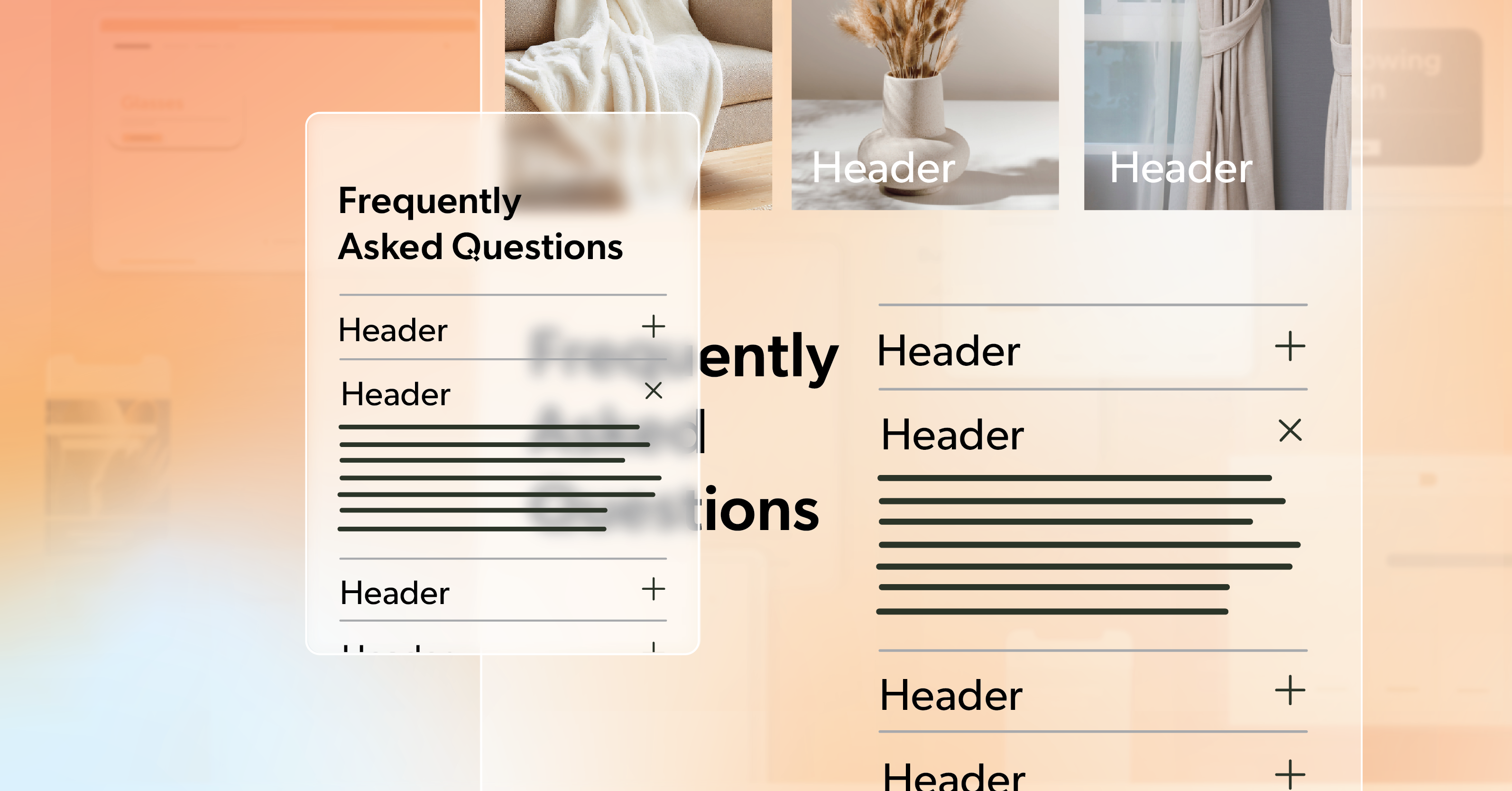
You’ve seen it before — those long, scroll-heavy pages packed with information. Even with great content, the layout can feel like a wall of text. It’s easy to lose your place. Harder still to stay focused.
That’s why accordions became so popular. They let you tuck sections away, helping people find what matters without forcing them to wade through everything else. They keep things clean, organized, and easier to digest.
But here’s the trade-off: an accordion that isn’t coded for accessibility can lock people out instead of inviting them in. Keyboard users can get stuck. Screen readers might skip entire sections or misreport whether content is open or closed. What looks tidy on the surface can be chaotic behind the scenes.
In this article, we’ll walk through how to build an accordion that’s not just functional but genuinely inclusive. By the end, you’ll understand what good accordion accessibility looks like — and how small development choices make a big difference for real users.
The Anatomy of an Accordion
At its core, an accordion is simple:
- A header or button people click or focus on.
- A content panel that expands or collapses to show details.
These pairs usually live inside a wrapper — maybe a <div> or a <ul> if you want to give screen readers a count of how many sections there are. Adding an aria-label to that wrapper can help clarify that this group of buttons belongs together.
Here’s a basic structure:
<ul aria-label="Accordion Control Group">
  <li>
    <button aria-controls="panel1" aria-expanded="false" id="accordion1">Section One</button>
    <div id="panel1" hidden>
      <p>Content for this section.</p>
    </div>
  </li>
</ul>
Think of this as the skeleton. Once you have a clear hierarchy, you can start layering in keyboard behavior and ARIA states. Structure isn’t decoration — it’s how assistive technologies understand your layout and read it back to users. That’s the foundation of solid accordion accessibility.
Keyboard Navigation: Where Real Accessibility Begins
The keyboard test is where most accordions fall apart. If you can’t open, close, and move through the component using only a keyboard, something’s missing.
A few simple rules make all the difference:
- Enter or Space should open and close sections.
- Tab should move forward through headings and visible content.
- Shift + Tab should move backward through that same flow.
When a section collapses, focus should jump back to the button that opened it — not vanish into the page. And every focusable element needs a visible indicator, whether that’s an outline or a subtle highlight.
For longer accordions, a “Skip accordion” link above the section is a small courtesy that goes a long way. It lets keyboard users move past the entire block when they don’t need it.
A good gut check? Set your mouse aside. If you can comfortably navigate the entire component using only your keyboard, your accordion accessibility is already miles ahead.
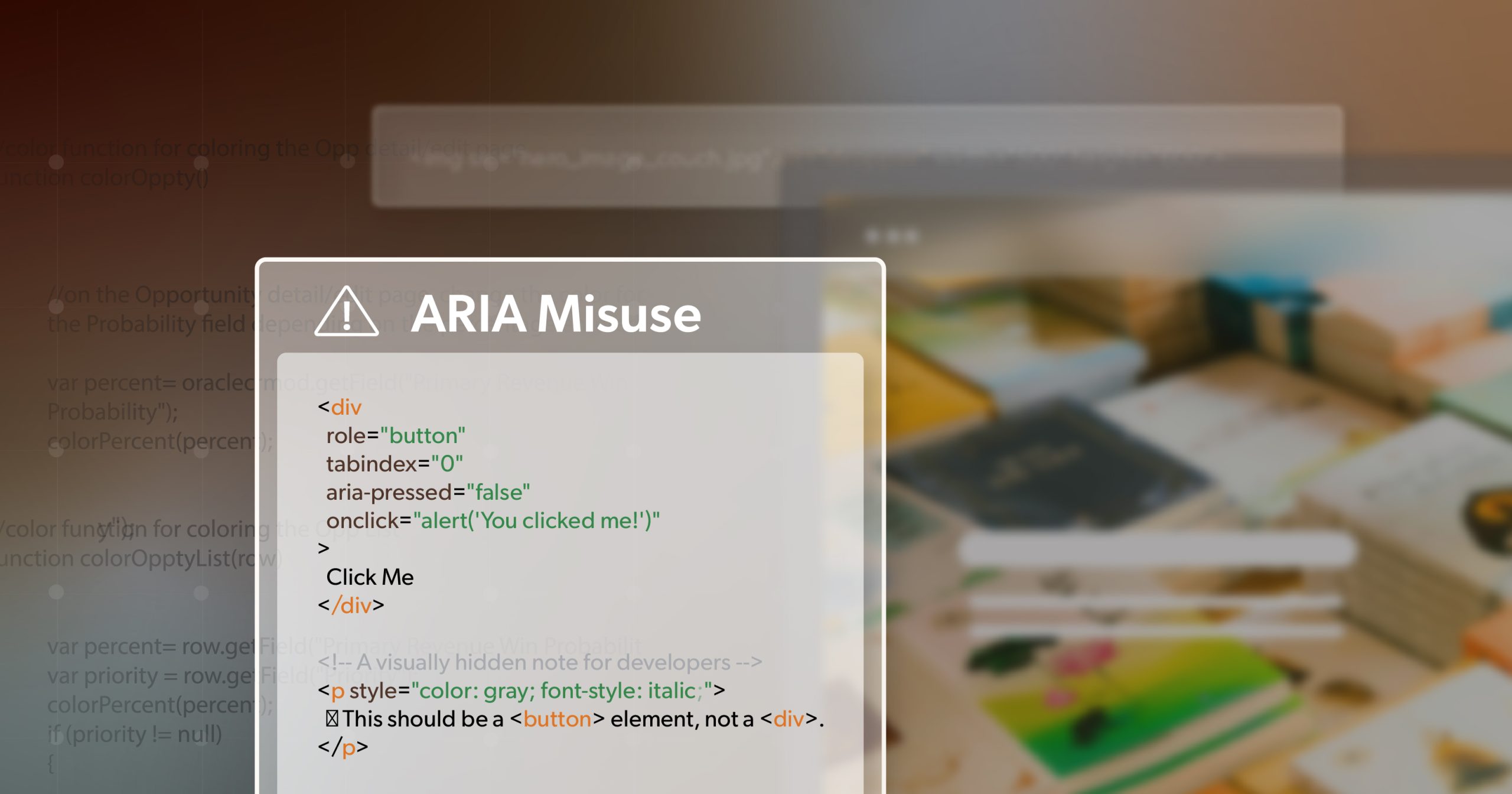
Semantic HTML: Let Meaning Do the Heavy Lifting
A lot of accessibility work is about using the right tools from the start. Semantic HTML gives browsers and assistive tech the information they need without extra code.
Here’s one solid pattern:
<h3>
  <button
    type="button"
    aria-expanded="false"
    aria-controls="panel1"
    id="accordion1-button">
    Billing Details
  </button>
</h3>
<div id="panel1" role="region" aria-labelledby="accordion1-button" hidden>
  <p>Your billing information goes here.</p>
</div>
This approach works because:
<button>is already accessible and keyboard-friendly.aria-controls connects the button to its panel.role="region"helps screen readers describe the area once it’s expanded.
If you add icons or arrows, hide them from screen readers with aria-hidden="true". They’re visual cues, not meaningful content.
When your markup already carries meaning, ARIA becomes a way to enhance — not patch — your accordion accessibility.
Getting ARIA Right
ARIA attributes are what make dynamic elements “talk” to assistive technology. Used well, they keep users informed about what’s changing on screen.
The essentials:
aria-expandedshows whether a section is open or closed.aria-controls links the button to the content it manages.aria-hidden keeps hidden content out of the accessibility tree.aria-labelledbyties the panel back to its header.
Your JavaScript should keep these in sync. When a section opens, switch aria-expanded to “true” and remove the hidden attribute. When it closes, set it back to “false” and hide the content again.
Add some visual feedback — an arrow that rotates or a smooth transition — so the interaction feels cohesive for everyone.
Good accordion accessibility doesn’t just meet a spec; it creates a consistent, predictable experience no matter how someone browses.
Native vs. Custom: Choosing the Right Path
If you’re building something simple, the native <details> and <summary> tags might do everything you need. They’re semantic, keyboard-ready, and require almost no JavaScript.
<details>
  <summary>Return Policy</summary>
  <p>Most items can be returned within 30 days.</p>
</details>
The downside? Styling can be limited, and behavior may vary slightly across screen readers — especially on iOS.
For more complex use cases, like multi-step forms or sections that animate open one at a time, a custom setup gives you full control. Just remember that every bit of custom logic means you’re also responsible for maintaining the accessibility that native elements give you for free.
Putting It All Together
Imagine a checkout form split into three collapsible sections: Personal Info, Billing, and Shipping.
Each section uses a button with aria-expanded and aria-controls. Each panel has role="region" and a unique ID. When users open a section, screen readers announce “Billing section expanded,” and focus moves smoothly to the first field.
If JavaScript fails, the content is still visible and usable. That’s resilience — and it’s a hallmark of good accordion accessibility.
When you build this way, you’re not adding “extra” accessibility. You’re writing cleaner, smarter code that works for everyone.
Testing What You’ve Built
No accessibility checklist is complete without testing.
Manual Testing
Use only your keyboard. Confirm that focus behaves as expected and hidden panels can’t be tabbed into.
Screen Reader Testing
Run through your accordion with NVDA, JAWS, or VoiceOver. Listen for clear announcements of “expanded” and “collapsed” states.
Automated Tools
Tools like Lighthouse or WAVE can flag broken ARIA references, missing labels, or overlapping IDs. Automated scans are helpful, but they’re not the finish line. Real users will always notice things an algorithm won’t. The goal isn’t perfection — it’s progress and empathy in practice.
Keep Expanding Accessibility
When built with care, accessible accordions do more than tidy up a layout — they make a site feel calmer, smarter, and easier to use. They’re a small reminder that good code and good experience go hand in hand.
Every time you improve an interactive element, you make the web a little more welcoming.
If you’re ready to take a closer look at your site’s accessibility — from accordions to forms, modals, and beyond — schedule an ADA briefing with 216digital. We’ll help you identify where your code stands today and how to make accessibility part of your workflow going forward.