Let’s start with a familiar scene.
A resident with low vision tries to pay a utility bill online. The button text fades into the background. They zoom in, squint, and finally give up. Across town, a veteran downloads a benefits form—but the PDF won’t open in their screen reader. They call, wait on hold, and eventually hear the same line everyone dreads: “Try again later.”
These moments rarely make headlines, but they happen every day. And they’re exactly what ADA Title II conformance is designed to prevent.
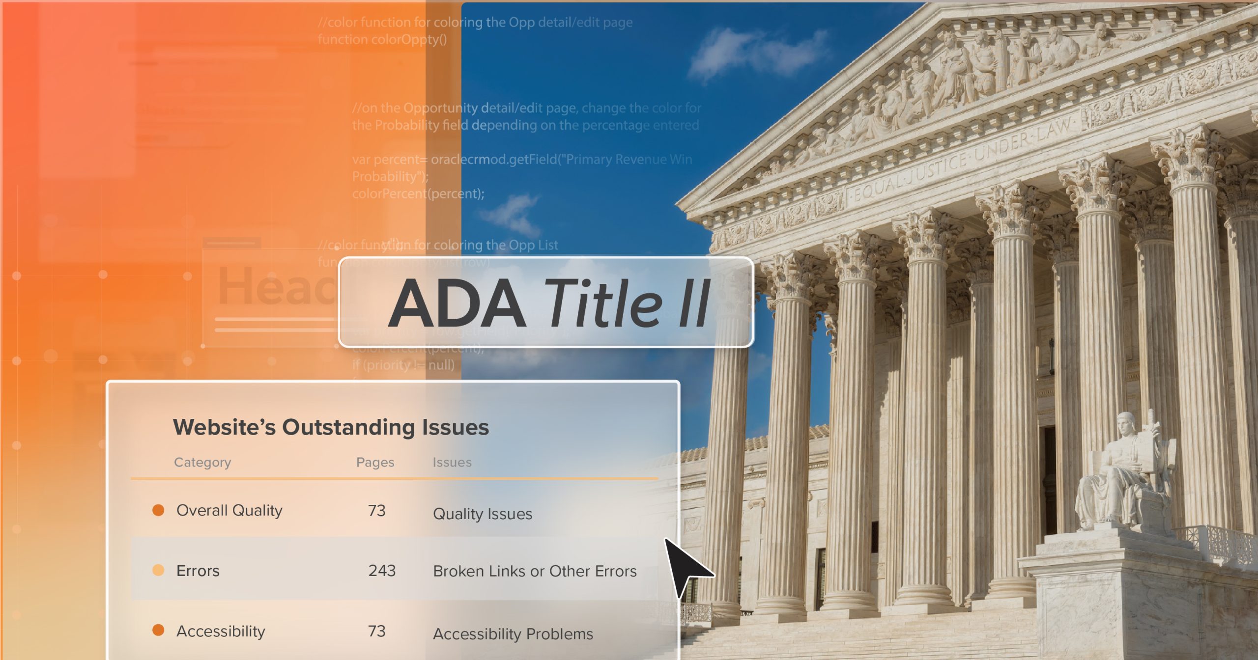
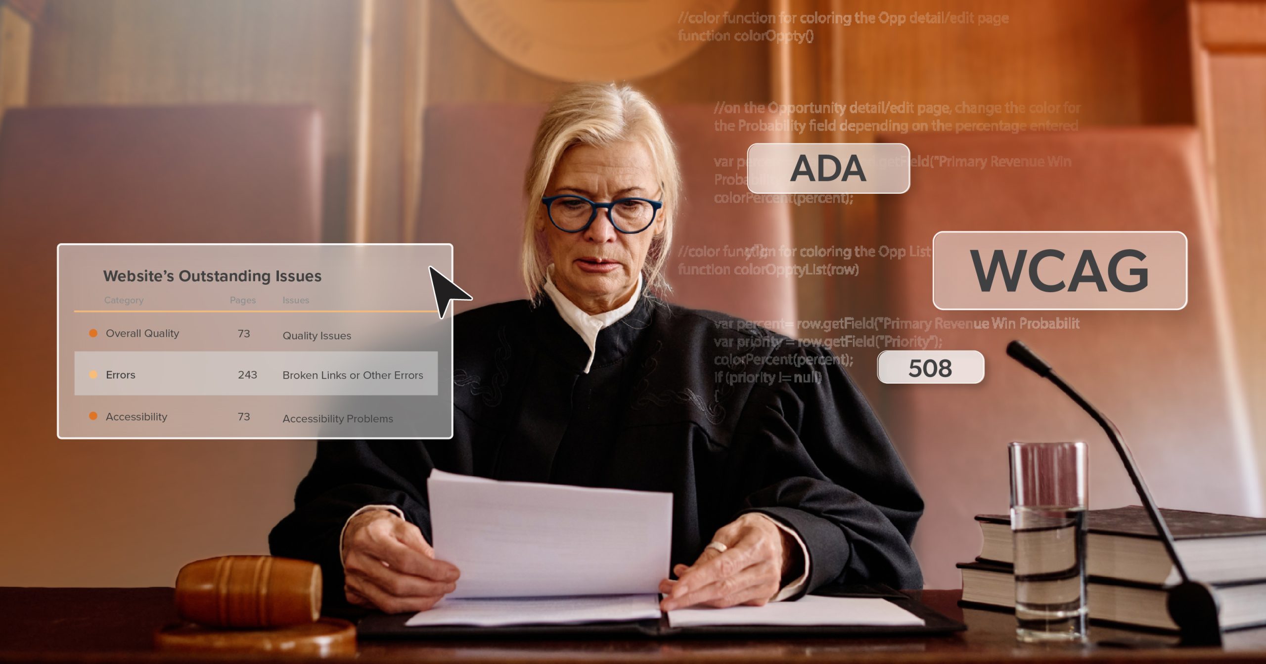
With new deadlines approaching, the clock is officially ticking. The Department of Justice has set clear expectations: every website, mobile app, and digital document must meet WCAG 2.1 Level AA standards to be considered accessible.
Still, even with those expectations in place, many agencies stumble—not from neglect, but from complexity. Outdated systems, legacy PDFs, limited budgets, and competing priorities all pull in different directions.
This guide outlines ten of the most common pitfalls local governments encounter—and how your team can avoid them before small issues grow into time-consuming, costly problems.
1 | Waiting Too Long to Begin ADA Title II Conformance
One of the most common mistakes is simply waiting. Waiting for next year’s budget, a redesign, or until “things calm down.” But accessibility work takes time—often months, sometimes years—especially when legacy systems or vendor-managed platforms are involved. Every delay widens the gap and makes remediation more expensive.
Start Small, but Start Now
Begin with a WCAG 2.1 AA audit that targets your highest-traffic, highest-risk pages—payment portals, permit applications, emergency alerts. Use the findings to build a phased plan: tackle quick fixes first, then move into deeper remediation like PDFs or interactive content.
Momentum matters more than perfection. Each resolved issue moves you closer to meaningful accessibility—and lasting ADA Title II conformance. But while hesitation can stall progress, so can taking the wrong kind of shortcut.
2 | Relying on Widgets or “Quick Fixes”
When deadlines loom, shortcuts start to look tempting. Accessibility widgets and overlays promise instant compliance, but the data tells a different story. Over 20% of ADA web lawsuits in 2024 involved sites using overlays, and many of those tools introduced new barriers for assistive technology users.
Treat Them as Temporary Support at Best
Widgets don’t repair flawed code—they mask it. Pair automated scans with manual testing to catch what machines miss. True accessibility isn’t something you install; it’s something you build, maintain, and test continuously. Even agencies that avoid quick fixes can still lose momentum when they misunderstand what an audit actually means.
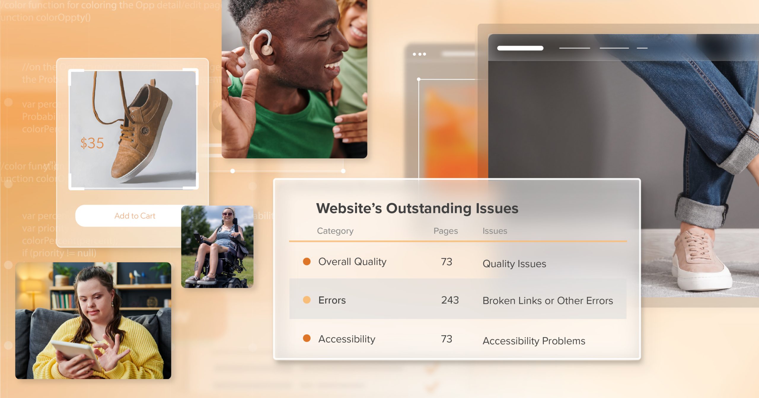
3 | Treating the Audit as the Finish Line
An accessibility audit is a starting point, not a success story. It reveals what’s broken but doesn’t fix it. Too often, agencies check the box once the report arrives, assuming the work is done. Six months later, those same issues remain—and the deadline looms closer.
Turn the Audit Into a Roadmap
Assign clear ownership, set realistic timelines, and track each fix to completion. The goal isn’t to admire the findings; it’s to act on them. An audit shines the light, but ADA Title II conformance only comes from follow-through. Once remediation begins, it’s also essential to remember that accessibility extends beyond the desktop experience.
4 | Overlooking Mobile Accessibility
For many residents, your mobile site or app is their primary touchpoint with local government. If that experience isn’t accessible, your services aren’t either. Yet mobile testing often gets pushed aside until the very end—when changes are most expensive to make.
Test Early and Test on Real Devices
WCAG 2.1 includes mobile-specific guidance on touch targets, gestures, and orientation. Make sure forms resize correctly and navigation works without a mouse. Accessibility should follow the user, not the screen size. And while mobile access is crucial, so are the documents that so many residents rely on for daily interactions.
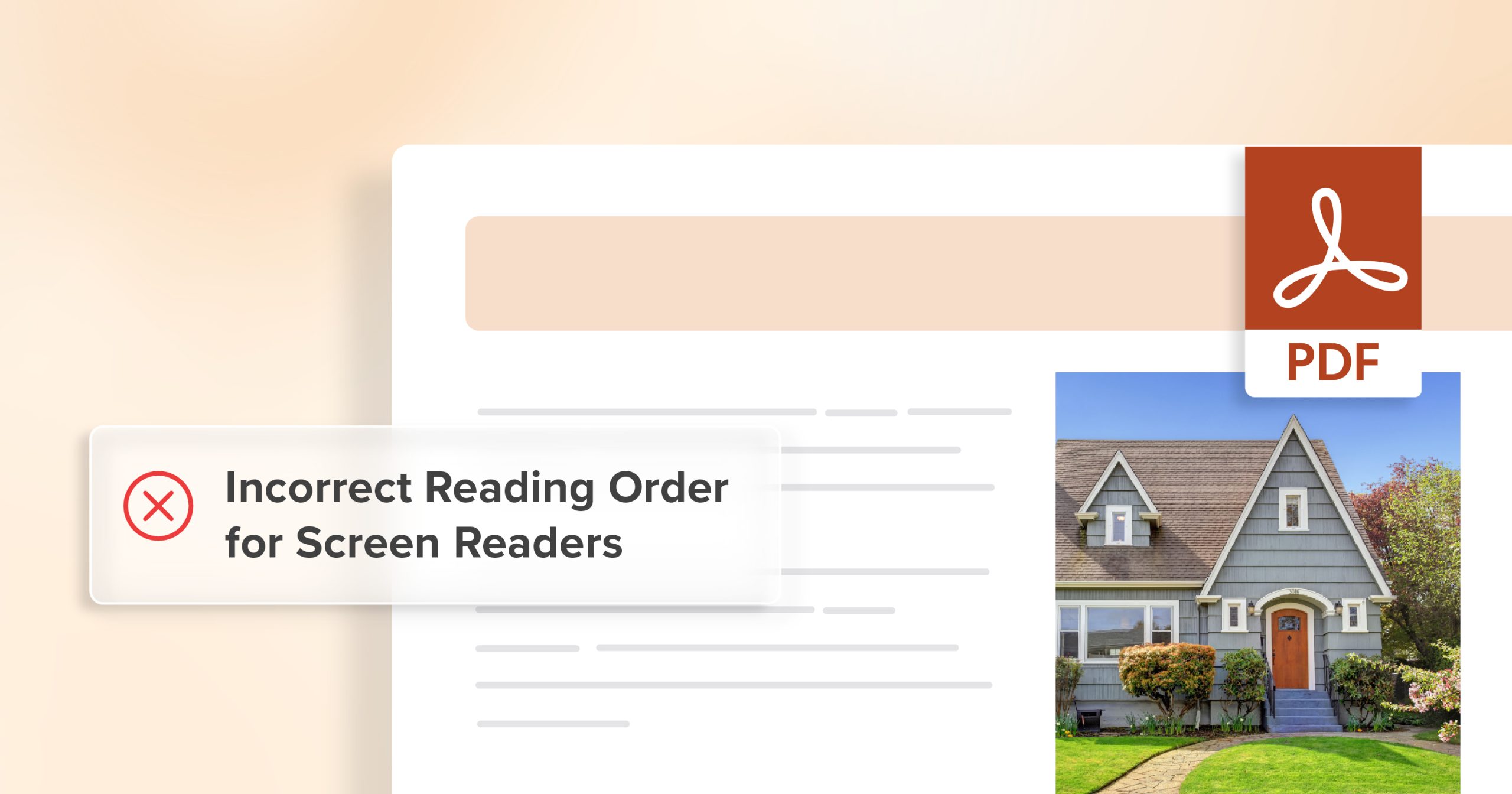
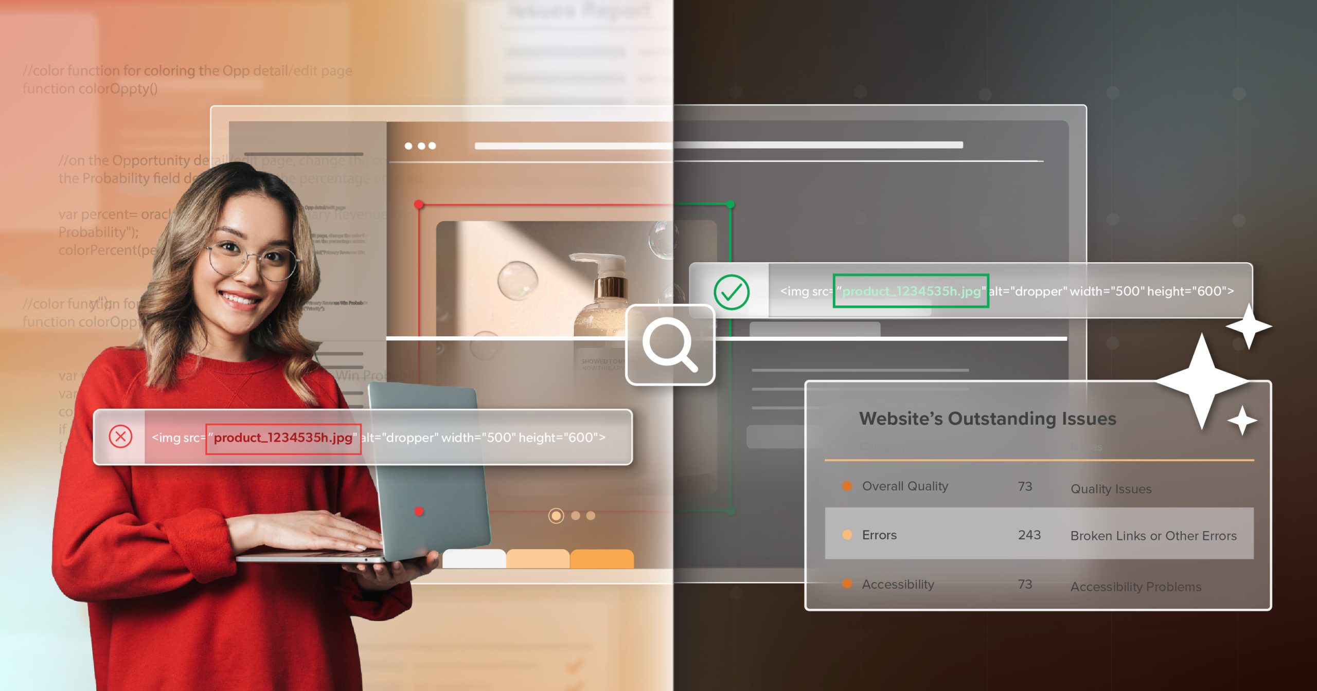
5 | Ignoring Accessibility in Digital Documents
Even when web pages pass compliance checks, PDFs and other downloadable materials often don’t. Forms, meeting agendas, and reports are some of the most common—and most problematic—files on public sites. The DOJ is clear: if a document provides public information or access to a service, it must be accessible.
Audit Your Digital Library
Start with frequently downloaded or required documents. Train staff to tag PDFs correctly or, when possible, convert them to HTML pages. Each accessible file removes another barrier and brings your agency closer to full ADA Title II conformance. Of course, even well-prepared teams can find their progress derailed by one common factor: vendors who don’t share the same standards.
6 | Not Holding Vendors Accountable
Even when third-party vendors manage your website, accessibility responsibility remains yours. Public agencies can’t outsource compliance. That’s why contracts matter as much as code.
Bake Accessibility Into Every Partnership
Specify WCAG 2.1 AA requirements, mandate assistive-technology testing, and require documentation at handoff. Accessibility clauses shouldn’t live in the fine print—they should be measurable deliverables written into the contract. Without vendor accountability, accessibility can erode quietly with each update. And even with vendor alignment, one final validation step ensures your work actually functions as intended.
7 | Skipping Manual and Assistive-Technology Testing
Automated tools are valuable, but they can’t replicate human experience. Navigation traps, mislabeled buttons, and confusing reading order often pass automated checks unnoticed.
Manual Testing Closes That Gap
Use screen readers, voice navigation, magnifiers, and keyboard-only controls to simulate how real people interact with your site. Better yet, invite users with disabilities to test and provide feedback. Their insights catch what automation never will—and validate genuine ADA Title II conformance. Still, even the most accessible site today can fall out of compliance tomorrow without ongoing monitoring.
8 | Neglecting Ongoing Monitoring
Accessibility isn’t a one-time project; it’s ongoing maintenance. A single CMS update or design tweak can reintroduce barriers.
Make Monitoring Routine
Schedule quarterly manual reviews and monthly automated scans. Keep a visible feedback form on your website so residents can report issues directly. Treat accessibility like preventative care: small, consistent checks that protect long-term health. But even with regular testing, the strongest defense is an informed team that knows how to prevent barriers before they happen.
9 | Underestimating Accessibility Training
Technology identifies issues, but people prevent them. Without training, the same mistakes—missing alt text, unlabeled forms, inaccessible PDFs—keep returning.
Invest in Continuous Education
Provide annual, role-specific training for content authors, developers, and procurement staff. Keep it practical: short sessions, clear checklists, and ongoing refreshers. When accessibility knowledge becomes second nature, compliance becomes culture. And when that culture takes root, it’s worth sharing it publicly.
10 | Failing to Publish a Public Accessibility Statement
A public accessibility statement isn’t a formality—it’s a promise. It tells residents, We’re committed, we’re listening, and we want your feedback.
Publish a Concise Statement
Reference your WCAG standard, list contact information for support, and update it at least once a year. This simple gesture builds transparency and trust—cornerstones of inclusive digital governance.
ADA Title II Conformance Is About People, Not Just Policy
Reaching ADA Title II conformance isn’t just about compliance—it’s about people. It’s about ensuring that every resident can access essential public services with independence and dignity.
When your platforms are accessible, seniors can pay their bills without help. Parents can find school updates easily. Veterans can apply for benefits confidently.
That’s not a technical milestone—it’s a civic one.
Start early. Build steadily. Keep accessibility alive through training, monitoring, and accountability. Compliance may be the mandate, but inclusion is the mission.
If your agency is ready to turn goals into measurable progress, schedule an ADA briefing with 216digital. We’ll help you navigate these ten pitfalls and build a roadmap for sustainable, equitable access for every resident you serve.