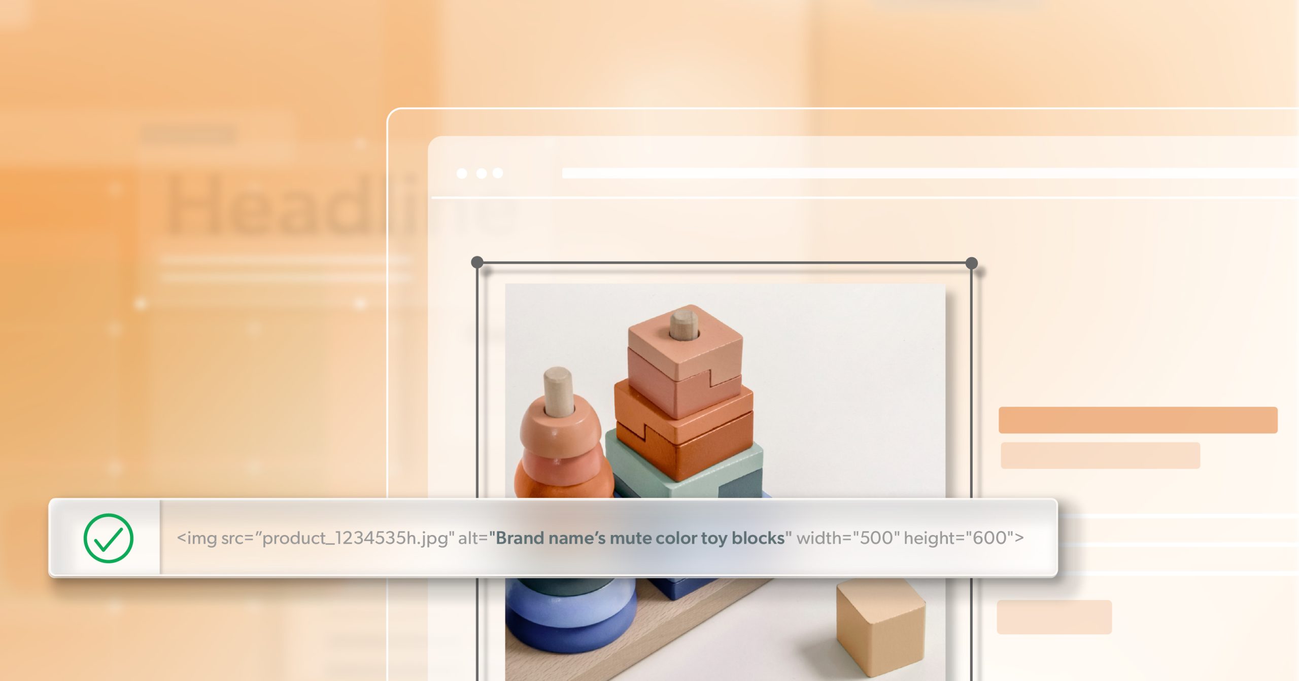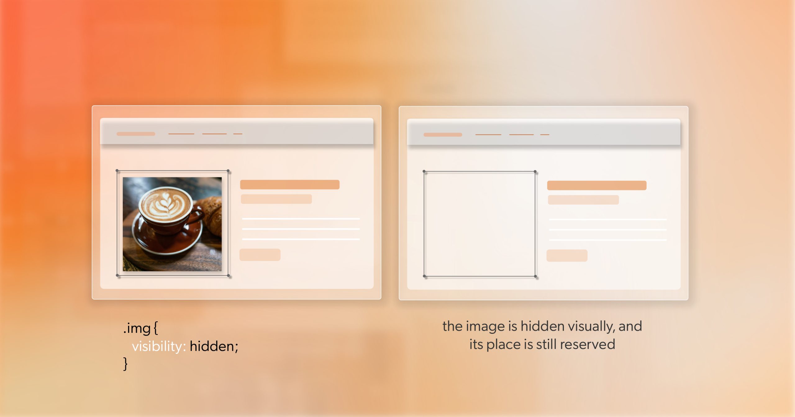
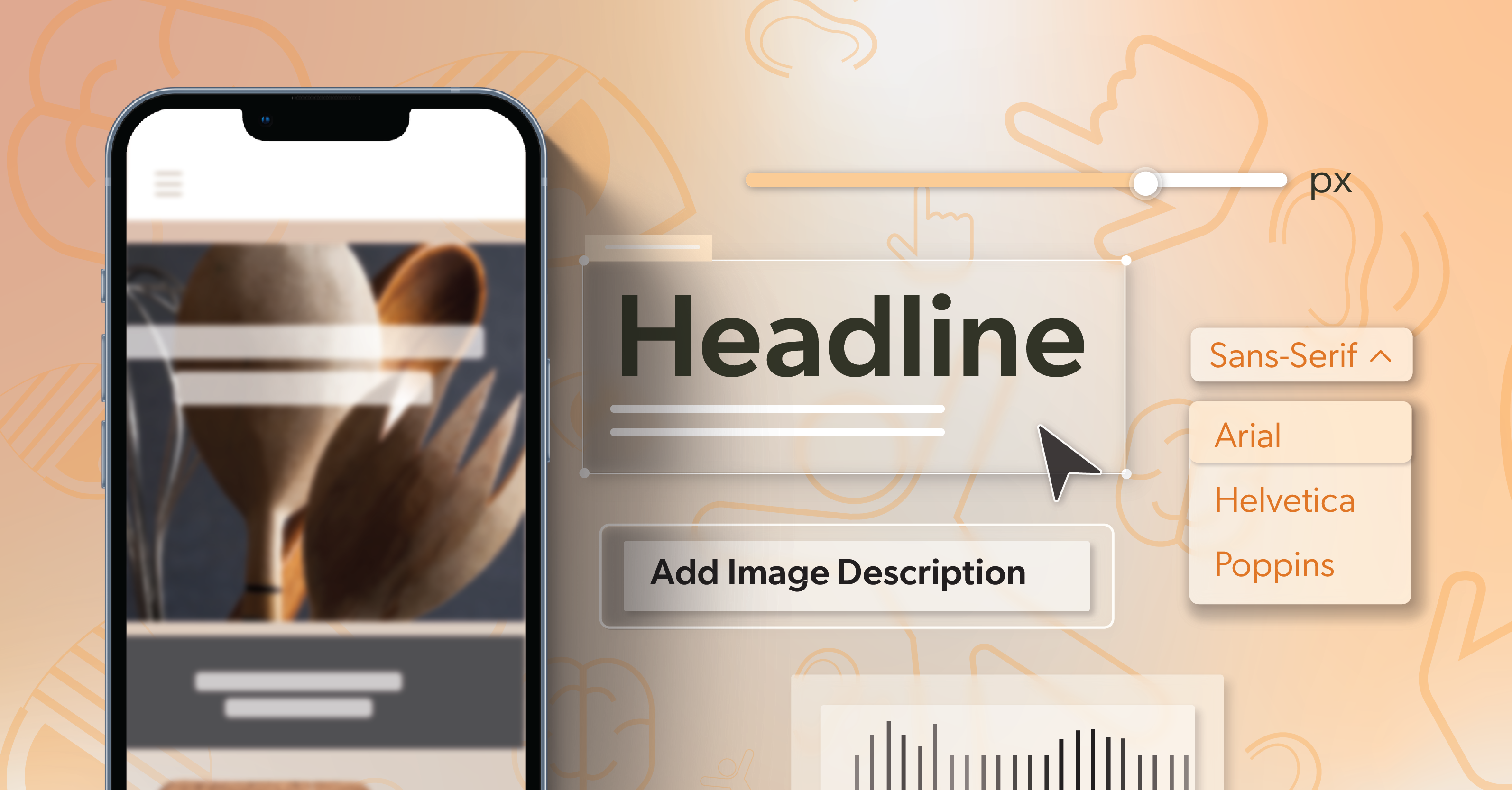
• How to Pick the Best Dyslexia-Friendly Fonts

    Most people expect reading online to be quick and easy. For many users, it is not. A line gets reread. Letters feel too close together. A full page of text feels like work rather than information.

    That experience is common for people with dyslexia, and it shows up across everyday web tasks. Dyslexia affects how written language is processed, not how capable someone is. And since the web still relies heavily on text, from forms and dashboards to product pages and help centers, typography carries more influence than teams often realize. However, while typography cannot remove dyslexia, design choices around text can significantly reduce effort and improve how easily users navigate written content.

    This article covers what dyslexia can look like in digital reading, what we do and do not know about dyslexia-friendly fonts, and how to make typography choices that improve readability without breaking brand consistency.


    Dyslexia and Digital Reading: What’s Actually Going On?

    Dyslexia is a language-based neurological difference. It affects how the brain decodes written language, including sequencing and the connection between sounds and symbols. It is not tied to intelligence, effort, or motivation. Many people with dyslexia are strong problem-solvers and strategic thinkers; they simply expend more mental energy to get through text that others process automatically.

    This experience is far from rare. According to the International Dyslexia Association, an estimated 15–20% of the population shows some symptoms of dyslexia. These can include slow or inaccurate reading, spelling difficulties, challenges with written expression, or mixing up similar letters and words. For most websites, that represents a meaningful portion of everyday users.

    For those with dyslexia, certain reading challenges often appear. Similar letters like b and d, or p and q, can be difficult to distinguish. Readers may lose their place in a paragraph when lines are tightly spaced or visually crowded. Characters such as O and 0, or l and I, can blur together. Over time, these small frictions accumulate and lead to fatigue, frustration, or disengagement.

    Digital interfaces can increase these challenges. Small font sizes, tight line spacing, low contrast, and dense layouts increase cognitive load. Responsive designs can further compress text on smaller screens, making tracking even harder. Typography cannot change how dyslexia works, but it can either add to the effort required to read or strip away barriers that make reading harder than it needs to be.


    What We Already Know About “Dyslexia-Friendly” Fonts

    There is no single typeface that works for every person with dyslexia. Research has not identified a universally effective dyslexic font that consistently improves reading speed or accuracy. What does come through, however, is that some fonts feel less tiring and easier to stay with, especially during longer reading sessions.

    That distinction is important. Dyslexia varies from person to person, and even modest improvements in comfort can affect whether someone completes a form, follows instructions, or keeps reading. For design and development teams, the goal is not to find the “right” font. It is to reduce friction wherever possible.

    This is reflected in the Web Content Accessibility Guidelines (WCAG). The guidelines do not require dyslexia-specific fonts. Instead, they focus on spacing, contrast, structure, and consistency. These factors create a more stable reading environment that often supports dyslexic users while improving usability for many others. Fonts are most effective when they are considered as part of that broader system, not treated as a standalone solution.


    How WCAG Supports Dyslexic Readers in Practice

    WCAG does not include criteria written specifically for dyslexia, and that is intentional. Instead of prescribing solutions, it sets expectations for how text should behave across different contexts and user needs. Those expectations shape readability, reduce cognitive strain, and create more stable reading environments. For people with dyslexia and other learning differences, that stability is often the difference between staying engaged and giving up.

    Several WCAG criteria influence the reading experience in ways teams directly control.

    Text Spacing (1.4.12)

    WCAG requires that line height, letter spacing, and paragraph spacing can be increased without breaking layouts. When spacing is flexible, text becomes easier to track and less visually demanding, especially during longer interactions.

    Contrast (Minimum) (1.4.3)

    Sufficient contrast between text and background keeps characters distinct. Poor contrast slows recognition and increases effort, turning simple reading tasks into work.

    Resize Text (1.4.4)

    Text must scale without loss of content or functionality. This allows readers to increase the size without relying on browser zoom or assistive tools, reducing strain and preserving layout integrity.

    Info and Relationships (1.3.1)

    Content structure must be communicated through proper headings, lists, and semantic markup. A clear hierarchy supports orientation, helping readers understand where they are and how information is organized.

    Use of Color (1.4.1)

    Color cannot be the only way meaning is conveyed. Removing color-only cues reduces the risk of missed information and improves clarity across different visual and cognitive needs.

    Reading Level (3.1.5)

    When content is complex, WCAG encourages clearer wording or alternatives. This reduces cognitive load and helps more users understand content without extra effort.

    Taken together, these criteria explain why font choice alone is not a solution. WCAG focuses on the conditions that allow typography to work: spacing, contrast, scaling, and structure. While it does not require a dyslexia-friendly font, it gives teams a framework for making type and layout decisions that support dyslexic readers as part of broader cognitive accessibility—without forcing a redesign or abandoning brand standards.


    Core Characteristics of Dyslexia-Friendly Typography

    When teams talk about dyslexia-friendly typography, it is easy to jump straight to font names. In practice, the bigger wins usually come from agreeing on the characteristics that make text easier to read—regardless of which typeface ends up in use. That shared understanding gives teams flexibility without reopening the same conversation every time.

    Clear letterforms matter more than personality.

    Sans-serif fonts tend to work well because they avoid decorative details that compete with the letter shapes themselves. When letters are clean and clearly formed, common look-alikes are easier to tell apart, especially during scanning or longer reads.

    Open shapes help readers move faster.

    Letters like c, e, and a benefit from open apertures rather than tight, closed forms. A slightly taller x-height also helps text hold up at everyday body sizes, particularly on mobile, where space is limited and zooming is not always practical.

    Steady stroke weight reduces effort.

    Typefaces with extreme thin-to-thick transitions can lose clarity depending on screen quality, lighting, or contrast. More even stroke weights tend to feel calmer and easier to read across devices.

    Spacing often does the heavy lifting.

    Letter spacing keeps characters from blurring together. Word spacing creates separation without breaking reading rhythm. Line spacing makes it easier to keep place from one line to the next. In many cases, adjusting spacing improves readability more than introducing a specialized dyslexia font.

    Examples of Dyslexia-Friendly Fonts and How to Use Them Wisely

    Many commonly available fonts already work well for dyslexic readers. Fonts such as Arial, Verdana, Tahoma, Open Sans, Roboto, Inter, Nunito Sans, and Atkinson Hyperlegible share familiar traits: open shapes, minimal ornamentation, and consistent spacing. The most useful way to evaluate them is not in isolation, but in real layouts—body text, forms, error messages—across the devices people actually use.

    Purpose-built dyslexia fonts can also play a role, especially in reading-heavy experiences. These fonts often exaggerate differences between similar letters or add visual weight to anchor characters more clearly. They tend to work best as an optional setting or reading mode, rather than a default that reshapes an entire brand.

    However, brand considerations still apply. Brand typefaces are often designed to make an impression, not to carry long instructions or dense content. A common, practical approach is to reserve branded fonts for headlines and short marketing moments, and rely on a more readable body font for functional text. When teams have clear rules for when readability takes priority, accessibility stops being a debate and starts becoming part of normal design decisions—including when offering a dyslexia-friendly font option makes sense.


    Layout Choices That Affect Reading Stability

    Fonts do not operate in isolation. Size, spacing, and structure determine whether text feels steady to read or slowly becomes harder to stay with.

    Body text needs room to breathe. If text is too small, too tight, or too wide, readers are more likely to lose their place or tire more quickly. The goal is not precision, but resilience—text that remains readable as pages get denser or screens get smaller.

    Spacing needs to hold up when users change it. Many people adjust letter spacing, word spacing, or zoom to reduce strain. When layouts cannot absorb those changes, readability drops even if the font itself is well chosen.

    Alignment and structure also shape how text is tracked. Left-aligned body copy provides a consistent starting edge. Distinct headings and shorter paragraphs make it easier to re-orient without rereading. These choices reduce effort, especially on longer pages.

    Taken together, these layout decisions often have more impact than changing fonts. When layout and spacing are stable, typography has room to do its job—even when font choices stay the same.


    Making Dyslexia-Friendly Typography Part of the System

    Typography becomes more reliable when it’s built into the system instead of handled one screen at a time. When font choices, spacing ranges, and basic text behaviors live inside a design system, teams avoid one-off fixes, and the reading experience stays more stable across forms, tables, cards, and other recurring components.

    Engineering patterns help carry that consistency forward. Shared tokens or variables keep typography decisions from drifting. When sizing and spacing scale cleanly across breakpoints, browser zoom, and user overrides, layouts hold together even as conditions change.

    Content follows the same logic. Clear writing and predictable structure support the same readers who rely on steady typography. When content and typography are reviewed together, teams have a better chance of producing patterns that hold up across the full product, not just on the surface.


    Letting Users Personalize the Reading Experience

    No single typography setup works for everyone, and many people adjust text in ways that make reading easier for them. When interfaces allow changes to size, spacing, or contrast—and stay stable when those changes happen—the experience tends to hold up better across long sessions and dense content.

    Many users already bring their own tools. Extensions like OpenDyslexic let people restyle text across the web, adjusting letterforms and spacing to reduce strain. This does not replace the need for accessible typography, but it does remind teams that personalization is already happening. The priority is ensuring the interface still works when text looks different from the default.

    Real feedback helps shape those decisions. Observing how dyslexic readers move through content often reveals patterns that automated checks miss—where fatigue sets in, where tracking becomes harder, or where spacing changes make a noticeable difference. Small variations in typography or layout can shift how comfortably people reach the end of a task.

    These decisions evolve over time. As design systems grow or brands change direction, typography may need to be revisited. Input from users, support teams, and real usage patterns can highlight where reading is still harder than it needs to be, even when everything appears to meet the standard on paper.


    Fonts as One Powerful Piece of a Larger Accessibility Story

    Typography will not remove dyslexia, but it can change how hard people have to work to stay with your content. There is no single font that solves this for everyone, and most teams do not need to rethink their brand to make progress. When font choices, spacing, and structure are handled with care, reading becomes less about getting through the page and more about staying engaged with it.

    At 216digital, we treat accessibility as part of how a site is built and maintained—not a separate layer added at the end. Typography, layout, interaction patterns, and content all influence how well people can move through your site, and they work best when they’re considered together.

    If you want support aligning those decisions with WCAG 2.1 and your long-term roadmap, our team is here to help. Schedule a complementary ADA Strategy Briefing to talk through your goals and learn what it takes to create and maintain an accessible experience that stands up under real use.

    Greg McNeil

    December 22, 2025
    How-to Guides
    Accessibility, cognitive disabilities, dyslexia, typography, Web Accessibility, Website Accessibility
  • Web Accessibility Tools Worth Using in 2025

    Web accessibility tools are becoming part of everyday work for many teams. Scanners run in the background, browser extensions sit ready during reviews, and screen readers are easier than ever to test with. The challenge is rarely whether to use these tools, but how to understand the results they produce. Some findings point to genuine barriers that can frustrate users. Others are technical alerts that look urgent but may have little impact on real interaction.

    Teams that use these tools effectively tend to treat them as different viewpoints on the same experience. Automated checks help reveal patterns. Screen readers and mobile readers show how people move through a page. Design and document tools shape the foundation long before anything reaches production. When each tool has a clear purpose, accessibility work feels more manageable and less like a moving target.

    What often helps is stepping back and looking at what these tools can actually tell you and what they cannot. That perspective makes it easier to choose the right mix, set realistic expectations, and build a workflow that supports long-term accessibility rather than one-off fixes.

    Understanding the Role of Web Accessibility Tools

    Accessibility tools tend to fall into a few core roles.

    Some focus on evaluation and diagnostics. These scan pages or whole sites for common Web Content Accessibility Guidelines (WCAG) issues, such as missing labels, low contrast, or heading structure problems. They are good at catching patterns and basic rules that lend themselves to automation.

    Others focus on assistive technology behavior. They help teams understand how a screen reader, keyboard navigation, or mobile reader interprets the page. These tools are closer to how people use the site in everyday life.

    Another group lives mainly in the design space. Contrast checkers and visual tools help refine palettes, typography, and layout while work is still in Figma, Sketch, or Adobe apps. Catching issues early often prevents expensive redesigns later.

    Finally, there are document and PDF tools. As organizations publish reports, forms, and guides, document accessibility has become much more important. These tools help repair structure, order, and tagging so content is usable outside the browser.

    There are limits, though. Automated tools miss subtle issues like confusing focus order, unclear instructions, or complex widget behavior. They cannot judge whether an interaction feels intuitive or whether a flow is simply exhausting to complete. Tools strengthen the workflow, but they do not replace thoughtful human evaluation or usability feedback from people with disabilities.

    With that in mind, let’s look at the tools that are shaping accessibility practice in 2025.

    A General Accessibility Evaluation Tool Where Most Teams Start

    Lighthouse

    Lighthouse remains a standard starting point for many teams. It is built into Chrome, free to use, and easy to run during development. A quick Lighthouse report gives you an accessibility score and a list of issues that can guide your next steps.

    Where Lighthouse helps most is prioritization. The report maps findings back to WCAG criteria and includes clear suggestions that point developers toward specific changes. It is especially useful for early checks on new features, quick reviews before a deploy, and tracking whether your accessibility score improves over time.

    There are tradeoffs. Because Lighthouse runs entirely through automation, it cannot assess keyboard paths, mobile gestures, or the experience a screen reader user actually has. Treat it as a baseline check, not a final sign-off.

    Screen Readers as Everyday Testing Tools

    Screen readers are often framed as tools “for users with disabilities.” That is true, but they should also be a standard part of developer and QA toolboxes. Listening to your site through a screen reader is one of the fastest ways to understand whether the experience is actually usable.

    JAWS

    JAWS continues to be widely used in professional environments, especially in enterprise and government. It is powerful, flexible, and works across many applications. Advanced scripting support allows teams to simulate complex workflows or tailor testing to specific systems.

    The tradeoff is cost and complexity. JAWS is a paid product, runs on Windows, and can feel intimidating at first. For teams that maintain high-traffic platforms or mission-critical services, however, it often becomes a core testing tool.

    NVDA

    NVDA has become a favorite among developers and accessibility testers for different reasons. It is open-source, free to use, and maintained by a strong community. It works well with major browsers and offers reliable feedback for many everyday scenarios.

    While it may lack some of the more advanced enterprise features of JAWS and can still require some practice to learn, NVDA provides an honest look at how many users navigate the web.

    Using both JAWS and NVDA gives teams a broader sense of how different setups behave and avoids relying on a single tool as a stand-in for all screen reader users.

    Color Contrast and Visual Design Tools That Support Usable Interfaces

    Visual design choices can quietly support or undermine accessibility. Contrast tools give teams a practical way to validate those choices before users are affected.

    Color Contrast Analyzer

    Color Contrast Analyzer is a widely used desktop tool for checking contrast on UI components, icons, and text over images. Designers and developers use it during reviews to confirm that colors meet WCAG thresholds.

    It relies on manual sampling, so it does not “understand” context or typography on its own. Even so, its precision makes it an everyday workhorse for UI and front-end teams.

    WebAIM Color Contrast Checker

    WebAIM’s online checker is popular for its simplicity. You enter foreground and background colors, and it immediately reports whether they pass for different text sizes and WCAG levels.

    It is not meant for full-page testing or design system governance. It shines when someone needs a quick answer during design, content editing, or code review.

    Adobe Color Contrast Tools

    Within the Adobe ecosystem, built-in contrast tools have become more important. Being able to test and adjust color values directly inside Creative Cloud apps helps designers bring accessible palettes into the development process from day one.

    These tools focus narrowly on color rather than broader criteria, which is often exactly what creative teams need while exploring options.

    Mobile Accessibility Tools for a Touch-First Web

    For many organizations, mobile traffic is now the primary way users interact with content. Mobile accessibility tools keep teams honest about how their experiences behave on actual devices.

    VoiceOver on iOS

    VoiceOver ships with iPhones and iPads and is straightforward to enable. It lets teams test gestures, focus behavior, dynamic content updates, and the clarity of labels on iOS.

    Developers quickly learn where touch targets are too small, where focus jumps in confusing ways, or where announcements do not align with what is on screen. There is a learning curve around gestures, and some apps introduce conflicts when they were not built with accessibility in mind, but the insight it provides is hard to replace.

    TalkBack on Android

    TalkBack serves a similar role in Android environments. It is deeply integrated into the OS and is used around the world on a huge variety of devices.

    Running TalkBack on your own app or site reveals how headings, landmarks, controls, and dynamic content behave on Android. Because the Android ecosystem is so diverse, testing here often surfaces issues that never appear on a single desktop configuration.

    As mobile usage continues to grow, teams that rely on VoiceOver and TalkBack gain a more accurate view of what users experience in everyday browsing.

    Browser Extensions That Keep Accessibility in the Daily Workflow

    WAVE Browser Extension

    The WAVE extension overlays accessibility feedback directly on the page. Errors, alerts, and structural details are displayed visually, which makes it easier to discuss issues with designers, developers, and content authors together.

    WAVE works particularly well for prototypes, single-page reviews, and quick checks during development. Since it evaluates one page at a time, it pairs nicely with full-site tools like SortSite rather than replacing them.

    Document and PDF Accessibility Tools That Are Easy to Overlook

    Many organizations rely on PDFs for policies, reports, and forms. If those documents are inaccessible, entire groups of users can be locked out, even if the website itself is in good shape.

    Adobe Acrobat Pro DC

    Acrobat Pro DC offers rich tools for editing tag structure, adjusting reading order, writing alt text, and labeling form fields. It allows teams to bring older documents closer to current accessibility expectations instead of rebuilding everything from scratch.

    The product is powerful and can feel overwhelming at first. Some basic training goes a long way. Once a team member becomes comfortable with Acrobat’s accessibility features, document remediation tends to move much faster and more consistently.

    As more content moves online in document form, this part of the toolkit has become hard to ignore.

    Building an Accessibility Toolkit That Lasts

    Building an accessibility toolkit that lasts is not about collecting every product available. It is about choosing the tools that give your team more clarity and less guesswork. Automated checks keep recurring problems in view. Screen reader and mobile testing show how interactions feel in everyday use. Design and document tools prevent rework before it starts. Over time, these habits strengthen the experience for everyone who depends on your site.

    At 216digital, we help teams build accessibility into their everyday workflow and shape strategies that align WCAG 2.1 compliance with real development timelines. If you want support creating a roadmap that strengthens usability, reduces risk, and fits the way your team already works, schedule a complementary ADA Strategy Briefing today.

    Greg McNeil

    December 17, 2025
    Testing & Remediation
    Accessibility, Accessibility testing, automated testing, evaluation tools, Web Accessibility, Web accessibility tools, Website Accessibility, Website Accessibility Tools
  • AI, Pro Se Plaintiffs, and the Rise of Web Accessibility Lawsuits

    Digital accessibility is no longer enforced only by regulators or a small group of plaintiff firms. AI tools now make it easy for individuals to prepare and file complaints on their own, and web accessibility lawsuits are following. Cases arrive faster, with less context, and often land on teams that are already stretched.

    The expectation itself has not changed. If a website has barriers that stop people from completing tasks, those barriers still matter, and courts continue to treat them as significant. What has changed is how quickly issues can be turned into legal action. Understanding how AI-generated complaints are assembled and why they are showing up more often helps teams respond with more control instead of reacting under pressure.


    The New Wave of Pro Se Plaintiffs Using AI

    A growing share of accessibility cases are now filed by individuals representing themselves. In legal terms, these filers are pro se plaintiffs. Pro se litigation has existed for a long time, but its role in Americans with Disabilities Act (ADA), enforcement has expanded quickly.

    In 2025, federal data shows a sharp rise in pro se ADA Title III filings, increasing about 40% over 2024 according to Seyfarth Shaw. This democratization of litigation means that anyone with access to a large language model and basic tools can generate a legally sufficient complaint, lowering the cost of entry that once required retaining an attorney.

    For organizations, the enforcement landscape looks different from what it did a few years ago. Complaints now come from a larger mix of people and can appear in higher volume. Some raise legitimate barriers. Others arrive with long lists of issues that do not reflect how the site actually behaves. Either way, they require time, money, and attention from teams that rarely have extra capacity.


    How AI-Generated ADA Complaints Are Built

    AI-assisted complaints tend to follow a common pattern. The details vary, but the steps are similar.

    Drafting the Complaint

    A plaintiff starts by describing what happened and where. That narrative becomes a prompt. The AI tool returns a complaint with legal framing, structure, and citations modeled on previous filings. AI tools like ChatGPT and similar large language models can draft these complaints in minutes, generating legal language and structured allegations automatically.

    Gathering “Evidence”

    Free and low-cost accessibility scanners are used to crawl key pages. They surface potential barriers related to the Web Content Accessibility Guidelines (WCAG) and compile reports and screenshots.. These tools do not detect every barrier, and they can mislabel or overstate issues, but the output looks technical and complete. Those reports are often attached as primary exhibits.

    Reusing Templates

    Complaints that seem effective or are shared online often become templates. Names, URLs, and dates are updated, while large sections of text stay the same. This makes it easy to file similar complaints against many organizations with only small edits.

    Filing Online

    Electronic court portals allow filings to be submitted from anywhere. There is no need to schedule time with counsel or navigate in-person paperwork to start a case.

    Taken together, these steps compress the process. Work that once took days or weeks can now happen in hours. For a small number of individuals, this efficiency makes high-volume filing possible. That is where many business owners feel the impact: not from a single complaint, but from the sense that they can be targeted repeatedly with little warning.


    Red Flags That Suggest AI Played a Major Role

    Courts and defense teams are starting to recognize patterns that often suggest heavy AI involvement. These signals do not automatically invalidate a case, but they can help teams decide what to verify first.

    Common signs include:

    Citations That Do Not Exist

    Some complaints reference cases that cannot be located in any legal database.

    Misstated Holdings

    The case is real, but the description of what the court decided is wrong or misleading.

    Compressed Timelines

    Lengthy, well-structured briefs appear very quickly, especially from non-lawyers who have limited experience with legal drafting.

    Generic Lists of Barriers

    The complaint lists issues that do not appear on the site, such as CAPTCHA problems when no CAPTCHA is used, or components that the interface does not rely on.

    Mismatch Between Writing and Presentation

    The legal documents read as if prepared by an experienced litigator, whereas the filer’s explanation in court or correspondence is far less sophisticated.

    Even when these patterns are present, judges still look at the underlying question: are there real barriers that prevent people from using the site? For organizations, the practical response is to separate signal from noise. That means confirming which issues are genuine, technical but low impact, or exist only because an automated tool misread the interface. Time and budget are better spent on changes that fix real problems than on chasing every line of AI-generated text.


    AI as Assistive Technology Does Not Change Legal Duties

    AI is also changing assistive technology. Screen readers and related tools now use AI to generate richer image descriptions, interpret layouts, and infer relationships between elements. For some users, these improvements make certain sites more usable than they were a few years ago.

    That progress does not change the legal standard. ADA enforcement focuses on whether the website or application itself is accessible. People are not required to rely on advanced or paid tools to get around avoidable barriers.

    If someone using a common screen reader, keyboard navigation, or magnification tool cannot complete a task because of missing labels, incorrect semantics, or inaccessible controls, the barrier still exists. AI support tools do not erase that responsibility.

    Courts are also starting to respond when AI is misused in filings. Some federal judges have sanctioned litigants for submitting materials that include fabricated cases or inaccurate citations, and in certain matters have restricted the use of AI in court filings altogether. These responses are still evolving, but they show that judges are paying attention to how AI is being applied in litigation.

    From a risk perspective, it helps to treat AI-powered assistive tools as a supplement. They may help some users, but they do not replace the need for accessible design and development. They also do not insulate an organization from complaints if basic tasks remain inaccessible.


    Where Web Accessibility Lawsuits Are Landing

    Early data from Useablenet’s 2025 mid-year report shows more than 2,000 digital accessibility cases filed in the first half of the year, with projections approaching 5,000 by year’s end. A growing share of these web accessibility lawsuits involve AI-generated or AI-assisted complaints.

    Most of these cases are not evenly spread across the web. They cluster in certain industries and patterns:

    • E-commerce and transactional experiences
      Close to 70% of cases involve e-commerce sites. Product discovery, cart, and checkout flows draw attention because they are easy to test and directly tied to revenue.
    • Mid-sized organizations
      Around 64% of cases involve companies with annual revenue of less than 25 million dollars. These organizations often have lean teams and limited internal legal support. That can make them appear more likely to settle quickly, which in turn can attract more filings.
    • Sites using widgets and overlays
      More than 20% of recent cases involve sites that installed an accessibility overlay. Complaints often point out that the overlay did not fix underlying issues in templates, components, or key flows.

    For executives and product leaders, the pattern is clear. AI is amplifying enforcement in environments where business-critical experiences are not fully accessible and where teams do not have a strong, documented accessibility program in place. The risk is not only the presence of barriers, but the combination of barriers and a filing landscape that now moves faster and at greater scale.


    Building an Accessibility Program That Holds Up

    In this environment, the most effective response is not to plan around individual cases, but to build a program that stands up to both user expectations and legal scrutiny.

    Core elements include:

    Anchor on WCAG 2.1 Level AA

    Courts and regulators continue to lean on this standard when they evaluate access. Using it as your baseline keeps internal expectations aligned with external review.

    Use Both Automated and Manual Testing

    Automated tools are useful for catching common issues early and monitoring regressions, but they do not see everything. Manual testing with screen readers, keyboard-only navigation, zoom, and voice tools gives a clearer picture of what people experience and highlights problems automation misses.

    Prioritize Templates and Critical Flows

    Start with navigation, search, account creation, forms, cart, and checkout. Improvements in these areas remove barriers that show up often in complaints and protect the journeys most tied to revenue and trust.

    Integrate Accessibility Into Existing Workflows

    Add practical checks into design reviews, code reviews, and QA. Keep them focused and repeatable so they fit into current processes. When accessibility is part of the way releases ship, it becomes harder for issues to build up unnoticed.

    Document What You Are Doing

    Keep records of audits, remediation work, training, vendor requirements, and standards for components and content. This documentation helps teams stay aligned and provides a concrete way to show effort if a demand letter or complaint arrives. Over time, this kind of documentation becomes one of the strongest defenses an organization can bring to the table when facing web accessibility lawsuits.

    For leadership, this approach places accessibility in the same category as security and privacy: an ongoing operational responsibility. It also creates a clearer position when responding to AI-assisted complaints that blend legitimate issues with errors or overreach.


    Responding When an AI-Generated Complaint Arrives

    When a complaint comes in, whether clearly AI-generated or not, the first goal is to reduce confusion and avoid unnecessary escalation.

    Helpful steps include:

    Validate the Issues

    Test the specific barriers named in the complaint. Sort them into groups: incorrect claims, technically accurate but low-impact issues, and serious barriers that block tasks. This makes remediation plans more realistic and gives legal teams better information.

    Review Citations and References

    Confirm that cited cases exist and that the summaries are accurate. Flag problems so counsel can address them with the court or opposing party.

    Avoid Rushed Surface Fixes

    Installing a new overlay or making untested changes can introduce new issues or send a signal that accessibility is being treated as a checkbox. Focus on changes that are tested, documented, and consistent with your broader standards.

    Feed Lessons Back Into the Program

    Use what you learn to update components, patterns, and checks. Close gaps in design systems and QA so similar issues are less likely to reappear.

    Handled this way, a complaint becomes part of an ongoing process rather than a series of disconnected emergencies.


    Reducing Risk in an Era of AI-Generated Web Accessibility Lawsuits

    The pace and shape of accessibility enforcement are changing, and no organization is fully prepared for the speed that AI has introduced into the process. Even teams that care about accessibility and make steady improvements can feel caught off guard when a complaint arrives that was drafted quickly and filed with little warning. You are not alone in that experience. Every industry is adjusting to a landscape where expectations remain familiar, but the mechanics are new.

    There is still uncertainty in how digital Title III claims will evolve, especially as AI lowers the barrier to filing. What organizations can control is how they operate. Maintain a steady accessibility practice, align with established standards, and document decisions and remediation. That combination does not eliminate risk, but it holds up far better than reactive changes made under pressure and gives you a stronger footing when facing web accessibility lawsuits driven by AI.

    If you need support building that foundation, we can help.

    At 216digital, we can help develop a strategy to integrate WCAG 2.1 compliance into your development roadmap on your terms. To learn more about how our experts can help you confidently create and maintain an accessible website that supports both your business goals and the needs of your users, schedule a complementary ADA Strategy Briefing today.

    Greg McNeil

    December 16, 2025
    Legal Compliance
    Accessibility, ADA Lawsuit, ADA Lawsuits, ADA Website Compliance, Web Accessibility, web accessibility lawsuits, Website Accessibility
  • How Accessibility Helps Your Site Thrive in AI Search

    Not surprisingly, organic traffic is becoming harder to predict, even when rankings remain steady. Search results are answering more questions directly, especially through AI Overviews, which means fewer users need to click through to individual pages. Gartner has suggested that traditional search volume could decline by around 25% by 2026, a pattern many teams already see reflected in their analytics.

    These shifts in AI search are happening fast, and staying visible now means doing more than waiting for users to show up. A big part of this shift is how clearly your site presents information as a reliable source. For organizations that rely on search visibility, this is a major change and puts new focus on something many teams have overlooked: web accessibility.

    From Blue Links to Answer Engines

    Search behavior is changing in ways that affect your visibility. Google’s AI Overviews now show up in over 60% of searches, according to Xponent 21, so many users get their answers at the top of the page before looking at links. People are also starting their research in new places. Adobe Analytics found a 4,700% year-over-year jump in traffic to U.S. retail sites from AI tools like ChatGPT and Perplexity by mid-2025. This shift helps explain why your analytics might feel unpredictable, even if your keyword rankings stay the same.

    Ranking still matters, but it no longer guarantees attention like it used to. Now, the key question is whether your page is clear and well-structured enough to be included in the answers users see first—often before they even think about visiting your site.

    AEO and GEO in the Age of AI Search

    Answer Engine Optimization centers on preparing content so that answer engines recognize it as a reliable source. It focuses on clarity, structure, and directness because these are the signals systems rely on when assembling summaries.

    Generative Engine Optimization is similar, but it focuses on large language models. When someone asks an AI assistant a question related to your work, GEO checks if the assistant can understand your content well enough to use it. Often, pages that are good for AEO are also good for GEO, since both rely on clear organization and predictable markup.

    Both frameworks share a practical requirement: information needs to be arranged in a way systems can understand without guesswork. Headings that follow a sensible hierarchy, concise explanations near the top of a section, and consistent semantic HTML help models determine how topics relate and which sections belong in the answer they produce.

    Why Accessibility Improves AI Search Discoverability

    This is also where accessibility carries more influence than many teams expect. WCAG-conformant sites already use patterns that support machine understanding: clear hierarchy, descriptive labels, consistent navigation, and stable markup. These fundamentals help people move through a site, and they help automated systems interpret its structure with greater confidence.

    The connection shows up in the data. A Semrush analysis of 10,000 websites found that WCAG-compliant sites gained 23% more organic traffic and ranked for 2 more keywords than non-compliant sites. Many teams see similar improvements when they strengthen accessibility. The site becomes easier to navigate, the content becomes easier to interpret, and systems can use that information with more accuracy.

    As AI Overviews, chat tools, and assistants become more important for finding information, accessible sites offer the clarity and consistency these systems need. The more predictable your site’s structure is, the more likely your content will be understood, trusted, and reused in modern search experiences.

    How AI Tools “Read” Your Pages More Like Assistive Tech

    AI systems do not see websites the way people do. They read the code. In many ways, they act like non-visual users, depending on HTML structure, headings, landmarks, labels, and text alternatives to understand meaning and relationships. Because of this, accessibility can influence AI search results more than many teams expect.

    Clear structural cues reduce uncertainty for machines:

    • Headings define topic boundaries and hierarchy.
    • Landmark regions separate main content from navigation and repeated interface elements.
    • Meaningful link text provides context when read out of sequence.
    • Alt text turns images into usable information.

    Accessibility research reinforces the value of this clarity. Sites without strong accessibility foundations can see an estimated 20 to 30% loss of traffic to AI-driven discovery tools.

    JavaScript-heavy builds introduce additional risk. Many AI crawlers rely on the initial HTML and may not execute client-side scripts consistently. When essential content only appears after rendering, it can be missed. Server-side rendering, static generation, and pre-rendering help ensure that core content is visible to both assistive technologies and AI systems.

    Accessibility Foundations That Improve AI Search Understanding

    Accessibility lays the groundwork for how both people and automated systems understand a page. These practices give AI tools a cleaner map of the page, so it is easier to tell what each section is about and how they connect. When these elements are in place, a site becomes easier to navigate and easier for models to interpret with confidence.

    Semantic Structure and Headings

    A single descriptive H1 supported by a clear H2 and H3 sequence helps define the outline of the page. This hierarchy shows how ideas fit together, where one topic ends, and another begins. For pages that answer common questions, using a question-style heading with a direct answer near the top can serve users well and support models that look for natural question-and-answer pairs.

    Alt Text for Multimodal AI

    Images and diagrams that carry meaning need short, accurate alt text so their purpose is clear. These descriptions help visitors who cannot see the image and help AI systems understand what each visual represents. As multimodal models continue to expand, consistent text alternatives remain an important signal.

    Clear Language and Section Hierarchy

    Straightforward phrasing and well-organized sections reduce effort for readers. They also reduce uncertainty for AI systems that rely on clean, focused paragraphs to interpret and summarize content. When each block stays centered on one idea and headings reflect the structure beneath them, both audiences can locate the information that matters most.

    Logical DOM Order and Keyboard Flow

    Logical source order supports keyboard navigation and creates a clear reading path for tools that may not execute every script. Grouping related elements together and keeping navigation patterns consistent helps preserve that clarity across pages. These patterns improve usability and reduce the risk of misclassification by crawlers.

    Stability and Performance for Crawlers

    Stable pages that load quickly benefit everyone. They reduce the likelihood of timeouts or partial content that can limit what models see. Many performance improvements that support accessibility—such as limiting layout shifts or relying on lighter scripts—also make the page easier for AI systems to access and analyze.

    Together, these foundations make the site more inclusive and easier for models to segment, interpret, and reuse content accurately across AI-driven experiences and AI Search results.

    Content Patterns That Help Your Site Earn AI Citations

    Once the structure is sound, content design determines whether a page becomes a cited source in AI Search and other modern discovery layers.

    Shape Sections Around Clear Questions and Direct Answers

    Pages that reflect natural-language questions paired with direct answers match with conversational prompts used in AI Search tools. Purposeful FAQ sections often perform well when they address specific user needs rather than serving as content dumping grounds.

    Use Lists When They Strengthen Understanding

    Lists and step-by-step formats break information into clean units that AI systems can reuse. They work especially well for processes, comparisons, and summaries.

    Write With Precision So Content Is Easy to Interpret

    AI systems favor content that is specific and free of vague claims. A warm, natural voice combined with concrete language improves comprehension for both people and machines.

    Expand Sections With Helpful Detail Instead of Extra Filler

    Pages that include definitions, context, and edge cases provide richer material for AI systems to evaluate and reference.

    Schema Markup Signals That Strengthen AI Search Interpretation

    Schema adds an extra layer of meaning that supports the work already done through accessible structure. It helps automated systems understand what type of content a page contains, how sections relate to each other, and when a page offers information that can answer specific questions. When used alongside well-defined headings and well-organized content, schema gives AI-driven tools a more complete picture of the page.

    Focus on the formats that add the most value.

    • Article schema works well for long-form guides that explain a topic in depth.
    • FAQ Page schema is helpful when a page includes genuine question-and-answer pairs that reflect actual user intent.
    • HowTo schema supports instructional content where each step has a purpose and appears in a consistent order.

    What matters most is alignment between the schema and the visible content. The structure described in the markup should match what someone sees on the screen. When the content within the schema reflects the real wording and the real sequence on the page, it becomes a strong confirmation signal for systems that depend on accuracy to generate reliable responses.

    Research from OpenAI, Google, and Bing shows that large language models benefit from pages that combine semantic HTML with structured data. Schema does not replace accessible code or strong writing, but it can reinforce the clarity already present. When the foundation is solid and the markup supports it, pages are easier for both people and automated systems to interpret and reuse.

    Practical Steps to Improve Accessibility and AI Search Performance

    You do not need a brand new site or a big replatform to prepare for what is coming. Teams that adapt well usually start small, with a few important templates, a focused audit, and clear patterns they can use again.

    Start With an Accessibility and Discovery Audit

    Begin with a short list of pages that already matter to your business. Core service pages, high-performing blog articles, and pages that answer common customer questions are the best place to start.

    Review these pages through two lenses. First, run automated accessibility checks to surface issues with headings, alt text, landmarks, and link clarity. Then, test how those same pages appear in AI-driven environments by searching real user questions in Google AI Overviews, ChatGPT, Perplexity, and Bing Copilot.

    This establishes a practical baseline for both accessibility and AI Search visibility.

    Repair Structure Before Adding Content

    Fix your heading order, make sure the DOM is logical, and clearly define navigation and main content areas. These steps reduce confusion for assistive technologies and help AI systems read your content more reliably.

    Shape Content Around Real Questions

    Add focused FAQs where they make sense. Use question-style subheads followed by clear answers early in each section. Break dense explanations into smaller units that are easier to extract and reuse.

    Use Schema to Reinforce Clarity

    Apply Article, FAQPage, or HowTo schema only when it accurately reflects the visible content. Schema works best as confirmation, not decoration.

    Monitor and Maintain

    Accessibility and AI readiness are not one-time efforts. Regular checks, shared patterns across teams, and ongoing monitoring help prevent regressions as content evolves.

    Accessibility as a Long-Term Strategy

    Search is changing, and teams everywhere are still learning how to work in an environment shaped by AI summaries, conversational queries, and systems that select only a handful of sources. There is no perfect playbook yet. Teams are still learning what long-term visibility will require as AI Search matures.

    What we do know is that accessibility helps. Clear structure, predictable markup, meaningful alternatives, and human-centered content give people a better experience, and they give machines the signals they need to interpret information with confidence. These fundamentals place your site on steady ground as AI Search continues to expand.At 216digital, we help teams build this foundation. We can work with you to create a strategy that brings WCAG 2.1 compliance into your development plans in a way that fits your goals and workflow. If you want to see how our experts can help you create and maintain an accessible website that meets your business goals and your users’ needs, schedule a free ADA Strategy Briefing today.

    Greg McNeil

    December 11, 2025
    Web Accessibility Remediation
    Accessibility, AI search, AI-driven accessibility, SEO, Web Accessibility, Website Accessibility
  • Too Many Cooks in the Website Accessibility Kitchen

    If you’ve ever been in a meeting where someone says, “We need to make the website accessible,” you’ve likely seen what happens next. People nod in agreement and add supportive comments like, We should, We will, or Absolutely.

    But once the meeting ends, something familiar happens. Everyone thinks someone else will take charge.

    It’s like a busy kitchen where skilled chefs come and go, each adding something or making adjustments, but no one is in charge of the recipe. Everyone means well and the ingredients are good, but the final dish never really comes together.

    This is what happens with website accessibility in many organizations. People care, but progress stalls because responsibility is spread out, priorities clash, and no one has the full overview.

    Most teams don’t struggle because they lack motivation. Many are making an effort by reading articles, joining webinars, updating components, and running audits when possible. The real problem is a lack of clear direction and coordination.

    This article explains why accessibility efforts stall when too many people are involved and shows how clearer roles and stronger teamwork turn that chaos into lasting progress.

    Why “Too Many Cooks” Happens in Digital Teams

    When you look at a typical digital team, the kitchen metaphor fits well. Many teams work on the website, but each faces different pressures, expectations, and ways of thinking.

    Compliance teams are focused on risk and timelines. Engineering worries about capacity and technical debt. UX and product teams juggle inclusivity with brand constraints and deadlines. Content and marketing are pushing toward launches, conversions, and SEO. Finance watches budgets and outcomes. Leadership wants clarity on scope, timelines, and how this fits into broader strategy.

    All of these concerns are valid and important. But each team works on its own schedule, uses its own language, and aims for different results.

    As a result, everyone assumes another team will take charge of website accessibility.

    Work moves from one department to another. Decisions are revisited again and again. A simple question like “Who owns this?” can turn into weeks of discussion.

    The Hidden Costs of Website Accessibility Gridlock

    When ownership is unclear, the effects are widespread, even if they aren’t obvious right away.

    Teams create accessibility debt when they layer new pages, features, and campaigns on top of old barriers. Costs rise the longer those issues sit unresolved—especially when a team keeps copying an inaccessible form instead of fixing the original.

    There are also legal and reputational risks. Barriers stay in production longer than planned, making complaints or legal action more likely. Even without lawsuits, trust fades when users keep running into the same problems.

    Revenue takes a hit, too. About 71% to 73% of users with disabilities will abandon a website immediately when barriers make it difficult to use or navigate. That means fewer completed purchases, booked appointments, and sign-ups, even though analytics rarely identify accessibility as the reason.

    Within teams, frustration grows. The unofficial “accessibility person,” usually someone who cares a lot, spends more time seeking approvals and alignment than doing real work. Projects slow down, and the word “accessibility” starts to remind people of stalled projects and extra work.

    Finally, organizations can get stuck in endless planning. Meetings repeat the same questions: What’s our goal? Who owns this? What can we do this quarter? All this back-and-forth has its own cost.

    The point isn’t to make anyone feel guilty. Almost every organization faces these issues. You’re not alone, and you’re not failing. You just don’t have clear ownership structures yet.

    Why Ownership Is Blurry (Even for Teams Who Care)

    This gridlock isn’t caused by a lack of effort. It’s caused by how website accessibility has historically been framed.

    For years, teams treated accessibility as a “last step” before launch, just another item on a checklist. When everyone pushes it to the end, no one owns it from the beginning.

    Leaders often give broad instructions like “Make this WCAG compliant,” but don’t define the scope, metrics, or roles. Each team thinks another group is better suited to lead. Everyone uses different terms: designers talk about usability, compliance teams focus on risk, and marketers care about conversions.

    In practice, this leads to vague tickets like “Fix accessibility issues,” QA findings without a clear owner, and stakeholders disagreeing on priorities because there’s no shared framework.

    This is where responsibility mapping becomes the turning point.

    From Chaos to a Kitchen Brigade: Making Roles Clear

    A great way to break the “too many cooks” cycle is to use accessibility responsibility mapping. The idea is simple: divide accessibility work into clear tasks, then assign who leads, who supports, and who should be consulted.

    It’s not about adding more bureaucracy. It’s about setting clearer expectations.

    The primary owner drives the accessibility task and ensures it is done correctly. Supporting roles contribute the guidance needed to shape the work. Other stakeholders stay involved through consultation or regular updates..

    Take headings, for example. UX or content defines structure. Design expresses hierarchy visually. Development implements correct HTML tags. QA verifies assistive technology behavior.

    Or consider forms: UX handles flow and labeling strategy; content writes the labels; developers programmatically associate everything; QA checks keyboard and screen reader behavior.

    With media, content teams plan captions or transcripts; platform owners ensure video players support accessible controls.

    Responsibility mapping doesn’t add more work. Instead, it spreads tasks to the people best suited for each part. Like a well-run kitchen team, everyone knows their role, but they’re all working toward the same goal.

    How to Put Responsibility Mapping Into Practice

    Getting started is easier than teams expect.

    First, bring together the right people: representatives from design, content, development, QA, and those who handle risk or strategy. Focus the conversation on ownership, not on debating every accessibility issue.

    Next, list the recurring tasks you handle today: components, content operations, media, core flows, and feature releases. For each one, assign a primary owner, supporting roles, and those who should be consulted or informed.

    Then embed this into your actual workflows. Include responsibility fields in ticket templates. Mark design system components with who is responsible for each part. Make it clear who writes and reviews alt text. Start small by applying your new mapping to one important section of the site, like checkout or registration, then refine and expand.

    Even small teams benefit. One person may wear multiple hats, but mapping helps distinguish when they’re acting as a designer, developer, or content author. Expectations become visible and realistic.

    Collaboration Patterns That Make Website Accessibility Easier

    Ownership alone isn’t enough. Teams also need habits that support clarity.

    Start by grounding conversations in real user journeys. Instead of diving into tools or checklists, walk through how someone books an appointment or completes a purchase with a screen reader.

    Catch issues early by building lightweight, recurring touchpoints into design, development, and QA—not at the end.

    Lean on your design system as a shared foundation. Centralize accessible components to prevent barriers from being reintroduced with every new page.

    Treat learning as part of the job. Hold quick internal demos, run short show-and-tells, and celebrate when someone removes a barrier. These small habits turn website accessibility from a burden into a shared craft.

    And don’t forget to celebrate small wins. They build momentum.

    ​

    Keeping the Menu Manageable: Sustainable Progress Over Perfection

    Teams often worry that starting accessibility means the work will never end. But setting priorities helps keep things manageable.

    Begin with the most important flows, like those related to revenue, registration, support, or high-traffic areas. Separate immediate fixes from short-term improvements and long-term changes. Create feedback loops with regular audits, user feedback, and post-release reviews.

    Most importantly, change your mindset: website accessibility is ongoing maintenance. Like performance, security, and SEO, it’s part of keeping the site healthy over time, not just a one-time emergency project.

    Consistent, steady movement beats big, unsustainable pushes every time.

    From Chaotic Kitchen to Well-Run Accessibility Program

    Accessibility efforts stall when there’s no clear leader. But things improve quickly when teams clarify roles, base decisions on real user experiences, and use frameworks that help them follow through.

    If you feel stuck in “too many cooks” mode, start small. Choose one important user flow and map out who owns accessibility at each step. Or gather a few teammates and assign roles for three to five key components.

    If your team has too much on its plate to keep accessibility top of mind, tools like a11y.Radar from 216digital can help. It offers ongoing monitoring, regular scans, and clear dashboards so accessibility stays visible without adding extra work. It quietly finds issues early, before they become rework, barriers, or legal risks, so teams can act on them instead of reacting later.

    You don’t have to choose between moving fast and being accessible. With the right structure, support, and tools, your digital team can work smoothly, and accessibility becomes a natural part of everything you deliver—not just another task to juggle.

    Greg McNeil

    December 9, 2025
    Web Accessibility Remediation
    Accessibility, Accessibility Remediation, Accessibility testing, Web Accessibility, Web Accessibility Remediation, Website Accessibility
  • Escape the Accessibility Audit Shopping Loop

    You probably know the pattern.

    A demand letter arrives, or leadership decides it is time to “do something” about accessibility. Your team sends out a few RFPs, collects quotes, and picks a vendor to run an accessibility audit. A long report lands in your inbox. There is a burst of activity… and then daily work takes over again.

    Months later, a redesign launches, a new feature goes live, or a new legal threat appears—and you are right back where you started. New quotes. New confusion. New pressure.

    That’s the accessibility audit shopping loop: chasing one-off audits that feel busy and expensive, but don’t actually create lasting accessibility or meaningful legal protection. It is not a sign that you are doing anything wrong. It’s a sign that the way our industry sells accessibility nudges you toward short-term reports rather than long-term results. You can absolutely break this pattern—but it requires rethinking what an “audit” is for, how you evaluate proposals, and how accessibility fits into your long-term digital strategy.

    Why a One-Off Accessibility Audit Falls Short

    An audit can be useful. It can show you where some of your biggest barriers are and help you start a serious conversation inside your organization. But when an accessibility audit is treated as a one-time project, it rarely delivers what people think they are buying.

    1. A Snapshot In a Moving World

    Your site isn’t still. New campaigns launch. Content changes. Forms get updated. Third-party tools are added. A report finished in March may be out of date by June.

    If your whole plan is “we will fix this report, and then we are done,” you are treating accessibility like a static task. In reality, it behaves more like security or performance. It needs regular attention.

    2. Reports Without a Real Path Forward

    Many teams receive thick PDFs packed with screenshots and WCAG citations. On paper, it looks impressive. In practice, it can be hard to use.

    Without clear priorities and practical examples, teams are left asking what to fix first, how long it will take, and who owns which changes. When those questions go unanswered, work pauses. Other projects win. Leadership starts to think accessibility is “too big” or “too costly,” when the real issue is that the report never turned into a plan.

    3. Gaps In Scope That Leave Risk Behind

    Some audits only look at a small set of pages. Others skip key journeys like checkout, registration, password reset, or account management. Some focus on desktop and treat mobile as optional. Many rely heavily on automated tools.

    On the surface, it may seem like you “covered the site.” But important user journeys and assistive technology use can remain untested. That means real people can still run into serious barriers, even while you hold a report that says you made progress.

    4. Little Connections To Real Users

    When the work is driven only by checklists, it is easy to miss how people with disabilities actually move through your site.

    A tool might say “Form field is labeled,” yet a screen reader user may still hear a confusing sequence of instructions. Keyboard users might tab through a page in a way that makes no sense. An audit that does not consider real user journeys and assistive technologies can help you pass more checks, but still leave key tasks painful or impossible.

    How to Read an Accessibility Audit Proposal

    Breaking the loop starts before you sign anything. The way you read proposals shapes what happens next. When a vendor sends a proposal for an accessibility audit, you should be able to see what they will look at, how they will test, and how your team will use the results.

    1. Look For a Clear, Meaningful Scope

    A strong proposal spells out which sites or apps are in scope, which user journeys will be tested from start to finish, which assistive technologies and browsers are included, and which standards they map findings to, such as WCAG 2.1 AA.

    If all you see is “X pages” or “Y templates,” ask how they chose them and whether those paths match your highest-risk flows, like sign-up, checkout, or account settings.

    2. Ask For Transparent Testing Methods

    You do not need to be an expert to ask good questions. How do you combine automated tools with manual testing? Do you test with real assistive technologies, such as screen readers and magnifiers? How do you check keyboard access, focus order, and error handling? Do you ever test with people who use assistive technology every day?

    You’re looking for a process that feels like real use, not just a tool report with a logo on top.

    3. Focus On What An Accessibility Audit Actually Delivers

    Do not stop at “You will receive a PDF.” Ask to see a sample. Look for a prioritized list of issues with clear severity levels, along with code or design examples that illustrate the problem and a better pattern. A simple remediation roadmap that points out where to begin—and options for retesting or spot-checks after fixes are in place—will help your team actually move from findings to fixes.

    If the deliverables section is vague, your team may struggle to turn findings into action later.

    4. Confirm Real, Relevant Expertise

    Ask who will do the work and what experience they have. Helpful signs include familiarity with your tech stack or platform, experience in your industry or with similar products, and a mix of skills: auditing, engineering, design, and lived experience with disability.

    You are choosing the judgment of people, not just the name on the proposal.

    Using Each Audit on Purpose

    The goal is not to stop buying audits. It is to stop buying them on autopilot.

    Pressure to “get an audit” usually shows up for a reason: legal wants evidence of progress, leadership wants to reduce risk, or product teams need clearer direction. Those are all valid needs—but they do not all require the same kind of work.

    Treat every new accessibility audit as a tool with a specific job. For example, you might use an audit to:

    • Validate a major redesign before or just after launch.
    • Take a focused look at a critical journey, like checkout or application submission.
    • Test how well your design system or component library holds up in real use.
    • Measure progress after a concentrated round of fixes.

    When you frame an audit around a clear question—“What do we need to know right now?”—it becomes one step in a longer accessibility journey instead of the entire plan. It also makes it easier to set expectations: an audit can confirm risks, reveal patterns, and guide priorities, but it cannot, by itself, keep a changing product accessible over time.

    Beyond the Accessibility Audit: Building Accessibility Into Everyday Work

    To truly escape the loop, audits have to sit inside a larger approach, not stand alone.

    1. Give Accessibility a Clear Home

    Start with ownership. Someone needs clear responsibility for coordinating accessibility efforts, even if the hands-on work is shared. That anchor role keeps priorities from getting lost when other projects get loud.

    2. Thread Accessibility Through Your Workflow

    Accessibility should show up at predictable points in your lifecycle, not just at the end:

    • Design and discovery: Bring in accessible patterns, color contrast, and interaction models early so you are not “fixing” basics right before launch.
    • Development and QA: Add simple accessibility checks to your definition of done and test plans, so issues are caught while code is still fresh.
    • Content and marketing: Give writers and editors straightforward guidance on headings, links, media, and documents so everyday updates stay aligned.

    Reusable, vetted components and patterns make this easier. When your design system embeds strong semantics, keyboard behavior, and clear focus states, every new feature starts on a stronger footing.

    3. Watch for Regressions Before Users Do

    Light monitoring—through tools like a11y.Radar, spot checks, or both—helps you catch problems between deeper reviews. Instead of waiting for complaints or legal notices to reveal a broken flow, you get early signals and can respond on your own terms.

    Over time, this turns accessibility from an emergency project into part of how you build and ship. The payoff is steady progress, fewer surprises, and better experiences for everyone who depends on your site.

    Stepping Off the Accessibility Audit Treadmill

    An audit still has a place in a healthy accessibility program. But it should not be the only move you make every time pressure rises.

    When you choose vendors based on clear methods and useful deliverables, question the idea that a single report will “make you compliant,” and build accessibility into daily work, you move from a cycle of panic and paper to a steady, durable program.

    At 216digital, we’re ready to help you transition from one-off accessibility audits to an ongoing, effective accessibility program. If you want to move beyond endless audit cycles and build accessibility into your digital products for good, contact us today to start your journey with expert support.

    Greg McNeil

    December 8, 2025
    Testing & Remediation
    Accessibility Audit, Accessibility testing, automated testing, manual audit, Web Accessibility, Website Accessibility
  • The When, Where & Why of Your Web Accessibility Audit

    When your team discusses accessibility, the same questions come up: When should we audit? Where should we focus? Why prioritize accessibility amid so many competing demands?

    Inside most organizations, it is not a lack of concern that slows things down. Designers, developers, product, and marketing all care about getting this right—but between deadlines, releases, and stakeholder requests, accessibility work often feels like something you will “get to” once things calm down. A web accessibility audit can either feel like one more demand on already stretched teams or like the moment things finally get some structure and direction.

    The difference is how you approach it.

    Used well, an audit is less about producing a thick report and more about answering a few practical questions: What should we look at first? Which issues really matter for real users and real risk? How do we apply what we learn to make better decisions release after release, rather than only reacting when something goes wrong?

    What a Web Accessibility Audit Really Looks Like in Practice

    At its simplest, an accessibility audit is a close look at your site, app, or digital product to identify barriers that prevent people with disabilities from using it. Most audits measure your experience against the Web Content Accessibility Guidelines—currently WCAG 2.2—at Levels A and AA. That gives everyone a shared frame of reference, from designers and engineers to legal and procurement.

    But the most useful audits don’t feel like abstract standards exercises. They feel grounded in real use.

    There is usually an automated pass to quickly identify common surface problems—missing alt text, color contrast issues, broken heading structures. Those tools are helpful, but they only see what they’re built to detect.

    Deeper value comes from manual testing—a person navigates your experience with a keyboard only, uses a screen reader, and checks whether form errors, focus order, dialog behavior, and dynamic content make sense.

    Sampling Your Product, Not Every Page

    Because modern sites are big and complex, most teams don’t audit every URL. Instead, they focus on a representative sample:

    • Core templates like homepage, category, product, content, and forms
    • Reusable components like navigation, modals, accordions, and filters
    • High-value journeys like sign-up, checkout, donation, or account management

    What comes out the other side is not just a list of failures. A strong web accessibility audit gives you a clear view of what’s getting in the way, who it affects, and how to fix it in terms your team can actually act on. Ideally, it also gives product owners something they can realistically schedule—not just react to.

    Why Web Accessibility Audits Are Taking Center Stage

    Legal Pressure Meets Day-to-Day Reality

    Even teams that have cared about accessibility for years are feeling the pressure sharpen. Expectations are rising—sometimes through regulation, sometimes through procurement language, and sometimes simply through customer awareness.

    Public-sector organizations now have firm WCAG-based timelines attached to their digital properties. In Europe, the European Accessibility Act is putting real dates on the calendar for accessible products and services. And even private companies not directly covered by those laws are seeing accessibility questions appear more frequently in RFPs, vendor questionnaires, and contract negotiations.

    A web accessibility audit changes those conversations. Instead of answering with intent and aspiration, you can answer with evidence: what has been tested, what has been found, and what is actively being improved.

    The Upside: UX, SEO, and Trust

    There is also a quieter upside that often matters just as much. Most accessibility improvements make experiences smoother for everyone. Cleaner structure, clearer labels, stronger focus behavior—these things reduce friction across the board. And the same semantic foundations that help screen readers also help search engines understand your content.

    For leadership teams, that combination—risk awareness, better experience, and brand credibility—is hard to ignore.

    Deciding Where to Look First

    One of the most overlooked parts of an audit is simply deciding where to begin. Not every surface deserves the same level of scrutiny on day one.

    Most teams start with the places where users and business meet:

    • Public marketing and product sites
    • Support centers and documentation
    • Logged-in dashboards and portals used by customers or employees

    Don’t Forget Documents, Media, and Third Parties

    From there, the scope often widens.

    Documents—PDFs, slide decks, forms, contracts—frequently play a bigger role in user journeys than teams expect. Video and audio content bring their own requirements around captions, transcripts, and controls. Embedded third-party tools like chat widgets, schedulers, and payment forms can introduce barriers your users will still associate with you, regardless of who built the tool.

    For organizations with design systems or shared component libraries, testing those patterns directly can be highly efficient. Fixing one modal or form pattern can improve accessibility across many screens.

    A thoughtful web accessibility audit is less about testing “everything” and more about testing the right things with intention.

    Getting the Timing Right

    The most effective audits tend to feel planned, not reactive.

    In an ideal world, audits happen before something big goes live: a new site, a redesign, a platform migration, a rebrand. When treated like performance or security testing, accessibility becomes part of the launch checklist rather than a post-launch surprise.

    In reality, many audits happen shortly after launch. And that can still be a strong move. While the project context is fresh and momentum is high, teams can identify hot spots, prioritize fixes, and show clear forward motion.

    For organizations with continuous release cycles, smaller-scoped audits tied to major features often work better than one giant annual review. For more traditional release schedules, annual or biannual audits create a steady rhythm—much like a regular security review.

    Moments That Should Trigger a Fresh Look

    There are also moments that naturally raise the stakes: an accessibility complaint, a new market with stricter rules, a framework upgrade, the rollout of a new third-party tool that touches checkout or login. Those moments often turn a “someday” audit into a “now” conversation.

    The difference between scrambling and steering, in many cases, is whether your web accessibility audit was already part of the plan.

    What Teams Experience During a Web Accessibility Audit

    For teams that haven’t gone through one before, audits can feel intimidating. In reality, the strongest ones feel collaborative.

    The audit process usually starts with discovery and scoping. Teams first discuss goals, constraints, timelines, typical traffic patterns, and the most important user experiences. Next, the team selects a representative sample based on this input. This sample guides automated and manual testing, ensuring the work is rooted in actual user scenarios.

    Once the sample is chosen, automated testing surfaces patterns and repetition, highlighting common accessibility problems. Manual evaluation follows: evaluators review how keyboard navigation, screen readers, error handling, and dynamic updates perform on the selected samples. This approach grounds the audit in real user interaction.

    From Findings to a Shared Roadmap

    The real shift happens during triage and prioritization. Instead of a flat list of issues, findings are grouped by severity, frequency, and risk. Teams start to see not just what’s broken, but where the biggest leverage lives.

    By the time reporting and handoff arrive, the best audits have already sparked shared understanding. The audit becomes not just a document, but a reference point for smarter decision-making.

    Who Should Lead the Work

    Many organizations choose an external partner for their first full audit. That outside perspective helps avoid blind spots, reduces the learning curve around WCAG and assistive technologies, and carries added weight in legal and procurement settings.

    At the same time, internal teams remain central. Designers, developers, content authors, and QA are the ones who turn findings into reality—into backlog items, component updates, and content standards that actually stick.

    Over time, the healthiest model is a blend: external audits for baseline and validation, internal ownership for day-to-day integration. Accessibility stops living in a report and starts living in the workflow.

    From One Audit to an Ongoing Practice

    A single web accessibility audit is not the destination; it is the baseline.

    You can use that baseline to:

    • Spot systemic issues (navigation patterns, color systems, form models)
    • Prioritize foundational fixes that unlock better experiences across the board.
    • Update your design system, component library, and content standards so improvements stick.

    From there, you connect audits to training and process change. Short, focused training sessions built around your actual findings land better than generic guidelines. Lightweight monitoring—linters, CI checks, and targeted automated scans—helps catch regressions early.

    The long-term shift is simple but powerful: instead of asking, “Are we accessible yet?” you begin asking, “How are we improving accessibility in this release?”

    Progress, not perfection, becomes the measure.

    Turning When, Where, and Why Into a Real Next Step

    For many teams, accessibility feels important but amorphous. An audit turns it into something concrete:

    • When it becomes tied to real releases and change moments
    • Where becomes focused on the experiences that matter most
    • Why becomes grounded in user trust, product quality, and organizational risk—not just compliance

    And this is exactly where teams often ask for support. Not because they lack commitment—but because they want help shaping the work to fit real constraints.

    At 216digital, we work with organizations every day to right-size their web accessibility audit strategy—scoping what matters most, timing it with roadmaps, and connecting findings to sustainable improvements rather than one-off fixes.

    If you want a low-pressure way to start that conversation, scheduling an ADA briefing with 216digital is often the easiest first step. It gives you space to talk through upcoming launches, regulatory exposure, team capacity, and what kind of audit approach actually makes sense right now.

    Accessibility is a long game. You do not have to untangle the “when, where, and why” on your own.

    Greg McNeil

    November 26, 2025
    Testing & Remediation
    Accessibility Audit, custom accessibility audits, manual audit, WCAG, Web Accessibility, Website Accessibility
  • Accessible WooCommerce Themes: Top Picks & What to Look For

    When you pick a WooCommerce theme, you are not just choosing a layout. You are choosing how easy your store is to navigate, how clearly information is announced, and how much work it will take to keep things compliant over time. If you’re comparing accessible WooCommerce themes, the real question is not “Which one looks nicest?” but “Which one gives my customers the smoothest, most predictable path from homepage to checkout?”

    Many teams choose under pressure: a redesign, a migration, or a branding push. It’s tempting to grab the first nice demo and plan to fix accessibility later. In practice, this creates more rework, more risk, and more frustration for users who rely on assistive technology.

    You can quickly bring accessibility into your theme decision. Add structure, make targeted checks, and know your priorities to move forward with confidence.

    Why Your Theme Choice Shapes More Than Just  Design 

    A WooCommerce theme controls more than colors and fonts. It ships with its own templates, layout decisions, and code patterns. That means it shapes:

    • How screen readers move through your pages
    • What paths do keyboard users take to reach menus, filters, and checkout?
    • How your store behaves on small screens and at high zoom
    • How easy it is to keep things maintainable as you grow

    Starting from one of the stronger accessible WooCommerce themes puts you ahead in several ways. You spend less time fixing basic issues, see fewer regressions when plugins update, and send a clear signal to customers that your store is built for them—not just for aesthetics. It can also reduce legal risk, because you are closer to what laws and guidelines expect when they reference the Web Content Accessibility Guidelines (WCAG) and the Americans with Disabilities Act (ADA).

    Accessibility is not only an ethical choice; it is a business one. Sites that are easier to use convert better, generate fewer support tickets, and are less likely to be named in a lawsuit. For many teams, “accessible by default” is simply a smarter way to protect brand, revenue, and reputation simultaneously.

    What “Accessible” Really Means in Practice

    Guidelines like WCAG exist to turn a big idea—“everyone should be able to use the web”—into concrete checks. Over the years, WCAG has evolved (2.0, 2.1, 2.2), and most legal frameworks point to at least Level AA as the baseline. Level AAA is more stringent and often not practical for full ecommerce flows, so most teams aim for AA and build from there.

    You do not have to memorize every success criterion, but it helps to know what a theme should support. Think of it through four simple lenses:

    • Perceivable: Text has strong contrast, scales well, and is not buried in images. Important images have alt text. Links are descriptive rather than repeating “Learn more” 10 times, so people know where they are going.
    • Operable: Menus, filters, dialogs, sliders, and forms work with a keyboard alone. Focus is always visible. Nothing traps people in a pop-up, mini-cart, or off-screen menu. Moving content can be paused or controlled instead of constantly sliding past.
    • Understandable: Labels and instructions are clear. Errors explain what went wrong and how to fix it. Navigation and headings follow predictable patterns from page to page, so shoppers do not have to constantly re-learn how your site works.
    • Robust: The HTML uses proper headings, landmarks, and controls. ARIA is applied thoughtfully, not sprinkled everywhere. The store works with screen readers, zoom, and narrow viewports, and does not fall apart when the browser or assistive tech changes.

    If a theme gives you a solid start on all four, you are in a much better place than a design-first theme that just happens to “look clean.”

    Common Problems You’ll See When You Test Themes

    One thing that often surprises teams: many themes that market themselves as “accessible” still have rough edges. Even themes promoted as accessible WooCommerce themes can struggle with basics when you look beyond the promo page.

    The most frequent trouble spots include:

    • Weak or missing keyboard navigation
      No skip links, no focus outline, menus that cannot be opened with a keyboard, or dropdowns that open on hover only. Sometimes you can tab into a menu but never back out cleanly.
    • Code issues behind the scenes
      Missing labels, misused landmarks, custom controls built from generic <div> elements, or error messages that never get announced. Cart updates might happen visually but remain invisible to screen readers.
    • Design choices that work visually, but not accessibly
      Low-contrast buttons on hero images, very small text, or links that are only distinguished by color. On a large monitor, these might look elegant; on a smaller laptop or with aging eyesight, they become a barrier.
    • E-commerce-specific gaps
      Product ratings hidden from assistive tech, price filters that only work with a mouse, or variation selectors that cannot be reached with the keyboard. Sometimes a “quick view” or slide-out cart steals focus and never gives it back.

    Seeing one of these issues is not a reason to abandon a theme right away. Seeing many of them together usually indicates that your time is better spent on a different starting point.

    WooCommerce Themes With Better Built-In Accessibility

    No theme is perfect out of the box, but some give you a better baseline than others. Below are themes that often get teams closer than most other accessible WooCommerce themes right out of the box. You should still test any version you plan to use, along with your plugin stack, but these tend to show stronger intent.

    Storefront

    Built by the WooCommerce team, Storefront is deliberately simple and stable. It includes skip links, workable keyboard navigation, and a product-focused layout. You will likely want to layer on your own design system, but the structural choices are solid, which is exactly what you want from a base theme.

    Neve

    Neve balances flexibility with fairly clean markup. It usually includes proper landmarks, readable typography, and skip-to-content links. When you change colors or layouts, re-run contrast checks and re-test menus and headers—especially any mega menus or sticky headers you introduce.

    Responsive

    Responsive tends to perform well with responsive layouts, spacing, and contrast-friendly presets. Skip links and keyboard navigation are present, though imported template kits should always be checked individually. Some ready-made layouts might be less robust than the core theme, so treat them as starting points, not guaranteed safe patterns.

    OceanWP

    Popular for performance and options, OceanWP supports skip links and keyboard-friendly dropdowns. Focus on visibility and contrast, as they can vary depending on configuration. Harden them early in your build and keep a close eye on badges, secondary buttons, and sale labels.

    Eimear and Monument Valley

    Eimear and Monument Valley are known for prioritizing accessibility in their design. Multiple skip links, structured navigation, and responsive templates are common strengths. Dynamic pieces like filters, accordions, or cart notices still need real-world testing, but you are starting from a posture that takes accessibility more seriously than most.

    The point of a shortlist is not to promise perfection; it is to avoid starting from a theme that fights you at every turn.

    How to Vet a Theme’s Accessibility Quickly 

    Once you have a few candidates, you can move beyond marketing pages and see how each one behaves in practice. Use this checklist when you are evaluating accessible WooCommerce themes in the wild:

    Do a Full Keyboard Tour

    From the browser’s address bar, tab through the header, navigation, product grid, product detail page, cart, and checkout. Make sure you can see focus at every step and that ESC closes any open menu or modal. If you lose track of focus or end up “stuck” in an element, note it as a real risk.

    Check Headings and Landmarks

    Look for one main heading per page and a logical order beneath it. Confirm that regions like navigation, main content, and footer are clearly defined and not duplicated in confusing ways. This is what screen reader users rely on to jump around the page.

    Test Forms and Messages

    Add something to the cart. Trigger a form error. Apply a coupon. Ask: Is the feedback clear both visually and for screen readers? Does anything important happen silently? Error messages that only appear as red text, with no programmatic link to the field, are a common pattern to flag.

    Zoom and Shrink

    View the site at 200% zoom and at a narrow mobile width. Nothing important should overlap, spill off-screen, or become unreachable. Pay special attention to sticky headers, floating chat widgets, and fixed promos that can hide content when zoomed.

    You can supplement this with quick automated checks (for example, running a browser extension or audit tool against the demo), but those should confirm your observations—not replace hands-on testing. If a theme passes this quick pass with only small issues, it is usually worth deeper evaluation.

    Fixing Gaps When Your Theme Is “Almost There”

    In most cases, you will end up choosing a theme that is “good, but not perfect.” That is normal. Once you have picked one of the more accessible WooCommerce themes, you will almost always still find gaps during real testing.

    A practical way to tighten things up:

    • Start with built-in controls.
      Use the theme’s and Site Editor’s options for color, typography, and spacing to fix contrast and legibility problems. This is usually the fastest way to bring large pieces of the site into alignment.
    • Strengthen focus
      Add CSS to make focus rings thick, high-contrast, and consistent across all interactive elements. If you can see it clearly from a distance, a customer is far less likely to get lost.
    • Swap custom elements for native ones.
      Replace “clickable divs” with actual buttons or links. Use real form fields for filters and variations. Native elements carry a lot of built-in accessibility that you do not have to re-create from scratch.
    • Improve complex widgets
      For menus, tabs, accordions, and sliders, follow established patterns and then test with a keyboard and a screen reader. Focus moves, aria-expanded states, and visible labels all need to line up.
    • Keep your plugin list lean.
      Every extra plugin is another chance to introduce inaccessible markup or conflicting scripts. Audit your plugin stack and remove anything you are not actively using.

    When you identify gaps, prioritize fixes based on where money moves: product lists, product details, cart, and checkout first. Document the patterns you fix and treat them as reusable building blocks. That prevents the same problems from creeping back in later.

    How to Maintain Accessibility After Launch

    Even a well-built store can drift out of alignment over time. New campaigns, landing pages, and plugins all add risk. Treat accessible WooCommerce themes as a foundation, not a finish line.

    Simple habits help:

    • Run quick keyboard checks after theme or plugin updates.
    • Keep short, clear guidelines for alt text, link text, and headings
    • Schedule light accessibility spot checks before major campaigns
    • Offer small refreshers for anyone who creates or edits content.
    • Add a short accessibility checklist to your release process so changes get a quick sanity check before going live.

    These steps do not require a full rebuild, but they do keep your store usable and reduce surprises.

    Your Theme Is the Start—Accessibility Is Ongoing

    Choosing a WooCommerce theme is one of the earliest—and most important—accessibility decisions you make. The right foundation can support better customer experiences, smoother growth, and lower risk. The wrong one can lock you into constant workarounds.

    You do not have to solve every detail up front, but you can put your store on a stronger path by choosing a theme with accessibility in mind, testing it as a real customer would, and making small, steady improvements as you go.

    If you would like a second set of expert eyes on your shortlist—or a clear picture of how your current theme holds up—schedule an ADA briefing with 216digital. We will review real storefront flows, call out the highest-impact fixes, and map out a practical path toward WCAG-aligned accessibility and better conversions.

    Greg McNeil

    November 25, 2025
    Legal Compliance, Web Accessibility Remediation
    Web Accessibility, web developers, web development, Website Accessibility, WooCommerce, WooCommerce themes, WordPress
  • What Is Your ADA Website Risk?

    You’ve likely read a headline about an ADA website lawsuit and instantly worried about your own site.

    You know these lawsuits are out there. You’ve heard about demand letters landing out of nowhere. But how close is that risk to your website? Is your site a likely target… or are you losing sleep over something you don’t have a clear way to measure?

    A lot of people who work on websites sit in that same uneasy space:

    • Worried a letter will show up right before a busy season or launch
    • Hearing mixed messages about what the ADA expects online
    • Unsure whether they’re focusing on the right problems—or missing something big

    Meanwhile, the numbers keep climbing. Digital accessibility lawsuits reached 4,187 cases in 2024. Current tracking puts 2025 on pace for roughly 4,975 cases—a jump of about 20%. These cases are not limited to major national brands. Retailers, hospitality, professional services, and local businesses of all sizes are in the mix.

    From our perspective as a team at 216digital, the hardest part for most teams is not a lack of care. It’s the uncertainty. It is difficult to plan when you don’t know your website’s risk of being targeted. That’s the gap the ADA Website Risk Profile is designed to address: giving website teams something more solid than instinct to work from.

    Making Sense of ADA Website Risk in a Shifting Landscape

    Part of that uncertainty comes from the legal “grey area” around how courts treat websites.

    A commonly cited example is Gil v. Winn-Dixie, in which a blind customer challenged a grocery chain because he could not use its website with a screen reader. Different courts treated the website differently and debated whether it counted as a “place of public accommodation” under the Americans with Disabilities Act (ADA). That back-and-forth created confusion and left room for aggressive litigation strategies. The end result: more questions than clear direction.

    However, while courts work through definitions, plaintiffs’ firms are not waiting. Specialized firms and recurring “tester” plaintiffs look for websites with obvious barriers. In some jurisdictions, tester standing is still recognized, and serial plaintiffs have filed hundreds or even thousands of cases over the last decade.

    Many organizations don’t think seriously about legal exposure until a demand letter shows up—often on a Friday afternoon when the team is already stretched thin. By that point, choices narrow and the pressure rises.

    How One Client’s Threat Changed Our Approach

    Our risk work started with one very real scare.

    In 2018, a long-time client contacted us after receiving an ADA noncompliance threat. This was an organization with a strong culture of inclusion and a site already built with accessibility in mind. They were trying to do the right thing. The letter still came.

    For our CEO, Greg McNeil, it was personal. It was about protecting a client who genuinely cared about access and still felt blindsided. That moment was the beginning of an effort to understand ADA website risk not as an abstract idea, but as something that shows up in real inboxes and real budgets.

    Over the years that followed, our team at 216digital:

    • Reviewed and analyzed nearly 25,000 digital ADA lawsuits
    • Tracked recurring red flags and the specific issues named in complaints
    • Studied how a small cluster of law firms and repeat plaintiffs select targets
    • Completed close to 1,000 remediation and response projects, from full-site WCAG work to urgent post–demand letter help

    That combination of pattern analysis and hands-on remediation is the foundation of the assessment our team offers today.

    What the ADA Website Risk Profile Actually Is

    The ADA Website Risk Profile is a complimentary, structured assessment that estimates the relative likelihood that a website will attract an ADA noncompliance claim, based on known lawsuit patterns.

    It is focused on ADA website risk—the chance of being targeted—rather than offering only a general snapshot of accessibility health.

    In practice, the assessment:

    • Evaluates technical and experiential issues that plaintiffs’ firms tend to flag
    • Uses patterns drawn from thousands of digital ADA lawsuits
    • Places a website into a relative risk level, such as lower, moderate, or higher
    • Connects the findings to practical, prioritized recommendations

    It does not replace a full Web Content Accessibility Guidelines (WCAG) audit or comprehensive accessibility testing, and it is not legal advice or a guarantee that a lawsuit will never arrive. Instead, it gives teams a realistic, pattern-informed view of how their site may look through the lens of current enforcement behavior.

    How the Assessment Works, Step By Step

    The process is designed to be understandable to people who work in strategy, design, development, and content—not just legal teams or accessibility specialists.

    Step 1: Baseline Review of Key Areas

    We start with a focused look at core templates and flows: the home page, key product or service pages, important forms, and journeys like checkout, booking, or account creation. This is not a line-by-line code audit. It mirrors the paths that testers and law firms usually follow when seeking barriers.

    Step 2: Mapping Findings to Known Red Flags

    Next, we map what we find against patterns that show up in complaints, including:

    • Common WCAG failures that are often cited in filings
    • Structural and UX issues that tend to raise attention, such as broken flows for keyboard or screen reader users
    • Contextual factors like industry, site complexity, heavy use of media, and certain third-party tools

    Step 3: Assigning a Relative Risk Level

    Using an internal database of past cases and ongoing tracking, we place the website into a relative risk level. The goal is not to label the site as “good” or “bad.” Instead, the aim is to show how it compares to others that have been targeted recently. This step is led by humans: our accessibility specialists and risk analysts review the findings together so the result reflects both technical reality and lawsuit behavior.

    Step 4: Turning Findings Into a Plan

    Finally, we translate the assessment into a clear set of next steps. These include immediate “must-fix” items that create a strong litigation hook. Medium-term improvements support both accessibility and user experience. Longer-term considerations can be folded into future redesigns or platform changes.

    What You Walk Away With

    The goal is not to hand over a dense document that no one reads. It is to support better decisions.

    First, there is a clear picture of where the site stands. Your ADA website risk level is explained in clear, practical language with phrases like, “Right now, your site looks a lot like others that have been targeted in the last two years,” or, “You are in a comparatively lower-risk group, with a handful of high-impact fixes to address.” That kind of framing can help you talk about risk with both leaders and technical teams.

    You also receive targeted recommendations ranked by impact:

    • A short list of urgent issues most likely to catch a plaintiff’s eye
    • A queue of improvements that support accessibility, usability, and risk reduction at the same time
    • Notes about third-party components—overlays, widgets, or plugins—that may be raising your exposure

    Equally important, there is time to talk through the results. Teams can review their assessment with our analysts, ask why certain items matter more than others, discuss constraints, and determine what is realistic for the next sprint or quarter. The aim is to move from general worry to a manageable set of priorities.

    Why This Matters Beyond “Avoiding a Lawsuit”

    It is easy to think about ADA website risk only in terms of avoiding a demand letter, but that view is too narrow.

    Fixing barriers usually improves the experience for everyone—customers with disabilities, older users, and people on mobile devices or slower connections. It often reduces friction in key journeys, lowers support volume, and strengthens trust in your brand.

    There is also a sharp difference between preparing and reacting. When a team reacts to a lawsuit, costs can include legal fees, settlements in the tens of thousands of dollars, and significant time pulled away from planned work. Preparing early with a clear view of risk tends to be calmer and more deliberate. It is also easier to fold into normal planning.

    Accessibility sits alongside privacy, security, and performance as a core part of website governance. Once you understand your ADA website risk, it becomes easier to decide how it fits into the wider risk picture.

    How the Risk Profile Fits Into Your Longer-Term Strategy

    For many organizations, the assessment is the beginning, not the end.

    A realistic path often looks like this: complete the complimentary assessment, fix the highest-risk issues, move into deeper testing of core user flows and templates, and add monitoring so new content and features do not reintroduce old problems.

    We know most teams are balancing product roadmaps, design refreshes, and seasonal campaigns. Our aim is to help you prioritize, not to hand you an impossible to-do list. Your ADA Website Risk Profile becomes one of the tools you use to make calmer, smarter decisions with the resources you already have.

    Whether you are planning a redesign or simply trying to get through your next busy season, a clear view of risk makes it easier to focus on what matters most.

    What to Do Next

    Here is the short version. ADA website lawsuits are not slowing down. The legal standards can be messy, but plaintiffs’ behavior follows patterns—and those patterns can be studied. Our team at 216digital has spent years analyzing those patterns and working with organizations on hundreds of remediation and response projects. The ADA Website Risk Profile turns that experience into a practical, complimentary assessment your team can actually use.

    If you help guide a website and are concerned about ADA website risk, two simple steps can move you forward:

    1. Request an ADA Website Risk Profile to get a clear snapshot of your site’s status.
    2. Schedule an ADA briefing with 216digital to talk through what those results mean for your roadmap, budget, and long-term accessibility goals.

    The briefing is a low-pressure chance to ask questions about risk, WCAG, lawsuit trends, and practical trade-offs—before a demand letter forces those decisions on you. Accessibility and legal risk do not have to be overwhelming. With a clear assessment, a focused plan, and an experienced partner walking alongside you, the work becomes manageable and genuinely achievable.

    Greg McNeil

    November 24, 2025
    Testing & Remediation
    ADA, ADA Compliance, ADA Lawsuit, risk mitigation, Web Accessibility, Website Accessibility
  • Accessible 404 Page: Turn Errors Into Wins

    You click a link with a clear goal in mind and, instead of the content you expect, you hit a 404 page. For a second or two, you wonder whether you mistyped the URL, the site is broken, or if the content has disappeared. In that short pause, trust gets shaky. This is also where web accessibility and UX come together in a very real way: either the page leaves people stuck, or it gently helps them move forward.

    That “not found” state is often seen as a throwaway screen, something the server shows when nothing else fits. With a bit of planning, this moment can be a calm, honest checkpoint. It explains what happened, offers clear next steps, and reassures people they’re still in the right place.

    In the sections ahead, we will unpack what a 404 really is, how to frame it as a recovery rather than a failure, which inclusive design patterns matter most, and how architecture and analytics can support that work. By building this foundation, we can see how each layer—technical, experiential, and strategic—interacts to create an error response that turns an obstacle into a small signal of care that feels intentional, helpful, and human.

    What a 404 Really Is — and Why It Happens

    At the technical level, a 404 response is straightforward: the server looked at the requested URL and could not find a matching resource. That might be because content moved, a slug changed during a redesign, a redirect rule was missed, or the link was simply typed incorrectly.

    The reality on most teams is a little more complicated. Content is added and removed over the years. Campaign landing pages go live for a season and then vanish. Migrations reshuffle URL patterns. Old PDFs and email templates keep sending people to paths that no longer exist. Over time, these small changes add up to a steady stream of “not found” visits.

    Each of these visits is more than a missing document. It is a broken step in a user journey. Someone who trusted your link now has to decide whether to keep going, try again, or leave. Search engines see this pattern too: a cluster of broken internal links or confusing responses can send negative signals over time.

    Treating that view as a recovery screen changes how you design. Instead of thinking, “The request failed,” you start asking, “How do we help this person take a meaningful next step?” This shift leads directly into the principles that guide effective 404 experiences.

    Principles Before Pixels: A High-Performing 404 page Experience

    Before you sketch a layout or write a clever line, it helps to agree on a few guiding ideas.

    1. Accessibility is Not Optional

    If parts of your experience are already hard to use, a broken link makes things worse. Folding the 404 template into your larger accessibility strategy ensures that the same care you give your main flows also applies in edge cases.

    2. Clarity First, Personality Second

    A bit of humor can soften the moment, but only after the page explains what went wrong and what the user can do now. Plain language always wins in high-friction states.

    3.Stay On-brand

    The 404 view should reuse the same typography, color system, and navigation patterns as the rest of the site. That continuity tells people they are still inside a trusted environment, even though something went wrong.

    4. Focus On Recovery, Not Apology

    A short, human message is important, but the screen’s real job is to provide useful paths forward and to gather enough data that you can keep improving the template over time.

    Designing with these principles in mind sets you up to turn the 404 view into a small but meaningful part of the overall experience instead of a forgotten corner. Now, let’s look at the specific accessibility must-haves that support such inclusive error states.

    Accessibility Must-Haves for an Accessible 404 page

    When someone lands on an error view, they are already a little off-balance. The job of an accessible 404 page is simple: make it clear what happened, make it easy to recover, and make sure that experience works for more than one way of browsing. This is where UX and web accessibility meet in a very practical way.

    A Clear Statement of What Happened

    Start with a direct, plain-language heading that names the situation: “Page not found” or “We can’t find that page.” The short text that follows should explain, in one or two sentences, what that means and what the person can do next. No jargon. No blame. Just context and next steps.

    A Layout That Still Feels Like “Your” Site

    Even in an error state, users should feel grounded. Keep the same basic frame as the rest of your site—header, footer, typography, and overall rhythm. Familiar structure helps people using assistive tech or high zoom recognise that they have not been dropped somewhere unsafe or unrelated.

    Recovery Paths That Are Easy to Spot and Use

    The main routes off the page—a primary button, a search field, a small set of helpful links—should be visible without hunting and usable for people who navigate in different ways. That means clear labels, sensible tab order, and enough spacing that links and buttons are easy to pick out at a glance.

    Text and Visuals That Hold Up Under Strain

    Treat this template as a first-class reading experience. Body copy should be large enough, well spaced, and set against backgrounds with solid contrast. Any illustrations should support the message, not compete with it. If the visuals are just there for tone, they should be easy to ignore for anyone focused on getting back on track.

    A Moment That Stays Stable, Not Jumpy

    When someone reaches your 404 page, they need a beat to understand where they are and decide what to do. Avoid sudden auto-redirects or timed jumps away from the screen. A stable state is kinder to screen-reader users, keyboard users, and anyone who simply reads at a different pace—and it aligns with the spirit of web accessibility as a whole.

    Page Anatomy: What to Include on Your 404 page

    Once the foundation is set, you can start thinking about the screen’s anatomy.

    Start with a headline and a brief empathy line. Something like, “We can’t find that page. Let’s get you back to something useful,” is honest and calm. It acknowledges the break without blaming the user or hiding behind technical jargon.

    Next, add primary recovery paths. Place a clear button to your home page or a key hub to make resetting easy. A search field gives control to people who know what they seek. Short lists of curated links—popular sections, current campaigns, most-read articles—offer quick options if visitors want to explore.

    Consider including a small, accessible feedback mechanism, such as a link that says, “Tell us if this link is broken.” When wired into your issue-tracking or analytics layer, this can reveal patterns that automation alone might miss.

    Visually, keep the layout simple and open. Maintain your main header and footer so orientation is never in doubt. If the user came from a specific area, such as “/blog/” or “/support/,” you can surface related links to those sections to respect their original intent. In every case, ask whether the design makes it obvious what to do next.

    Under the Hood: Technical Details That Support the Experience

    The best copy and layout will fall short if the underlying implementation is weak. Your 404 page should be backed by correct HTTP status codes so search engines and monitoring tools know what is happening. For permanently removed content, a 410 status may make more sense than a 404, but the visual template can remain the same.

    In client-side apps, routing logic needs extra care. When a user visits an unknown path, your router should render the error template and, when possible, coordinate with the server so that crawlers also receive the correct signal. Focus management, skip links, and semantic markup should be tested together so that the experience holds up for people using assistive technology. These technical details are small, but they add up to better web accessibility in the moments when users most need guidance.

    Caching and performance matter here as well. Configure your CDN so error responses are cached sensibly, and ensure the template itself loads quickly with minimal heavy scripting. People are already dealing with a disruption; they should not have to wait for the recovery tools to appear.

    Do not forget metadata. A clear title like “404 – Page not found” and well-structured meta tags make the state easier to recognise in analytics dashboards and open tabs. If your site serves multiple languages or regions, localise the copy and the key links so the experience feels considered, not generic.

    Analytics, Monitoring, and Continuous Cleanup

    A recovery view is not “done” once it ships. Logging and analytics should tell you how often people hit it, which paths send them there, and what they do next. Over time, this reveals where your architecture is working well and where it is quietly letting visitors down.

    Simple dashboards can highlight the most common missing URLs, the internal pages that generate the most errors, and the CTAs that lead to successful recovery versus quick exits. You can even test variations of copy or link groupings to see which version helps more journeys continue.

    Seen this way, the 404 page becomes a kind of listening post. It shows you where expectations and reality do not match—and gives you a place to respond with better structure, clearer navigation, and stronger web accessibility patterns.

    Governance: Building Habits That Reduce Future 404s

    Preventing needless errors is a shared responsibility. When content owners remove or rename pages, they should follow a simple checklist: update internal links, add redirects where appropriate, and document what has changed. Marketing teams should plan end-of-life steps for campaign URLs instead of letting them quietly break. Developers can integrate link checking into CI to catch internal broken links before launch.

    For design and UX teams, the error view should live inside the design system as a standard template with clear accessibility criteria. During QA, it should receive the same level of attention as a key landing page: keyboard-only walkthroughs, high-zoom checks, screen-reader tests, and mobile scenarios. These habits turn one fragile corner of the site into a dependable part of your service.

    Education is the final layer. When teams see the 404 state not as a failure but as a recoverable moment, they are more likely to invest in it. When they understand that good handling here is part of web accessibility, not just “nice to have” polish, they will keep it in scope during redesigns and migrations instead of leaving it behind.

    Not All Wrong Turns Are Dead Ends

    A missing resource will always create a small moment of friction, but what happens next is up to you. Treated with care, a well-designed 404 page becomes proof of how you handle the unexpected: calmly, clearly, and with respect for every visitor’s needs.

    When people land on a thoughtful, well-structured error template, they stay oriented, feel supported, and are more likely to continue their journey with your brand. You protect trust, learn from the patterns that brought them there, and strengthen both your UX and your web accessibility at the same time.

    If you would like a fresh perspective on how your own error and recovery states are working for users, the team at 216digital would be glad to help. An ADA briefing can surface quick wins, highlight deeper structural opportunities, and give your teams practical, actionable next steps.

    The next time someone takes a wrong turn on your site, they will not just see a dead end. They will see a clear map forward—and a quiet signal that someone on the other side of the screen has their back.

    Greg McNeil

    November 21, 2025
    How-to Guides
    404 page, How-to, Web Accessibility, web developers, web development, Website Accessibility
Previous Page
1 2 3 4 5 6 … 20
Next Page

Find Out if Your Website is WCAG & ADA Compliant


    By submitting this form, you consent to follow-up from 216 Digital by call, email, or text regarding your inquiry. Msg & data rates may apply. Reply STOP to opt out or HELP for help.

    216digital Logo

    Our team is full of professionals in Web Accessibility Remediation, eCommerce Design & Development, and Marketing – ready to help you reach your goals and thrive in a competitive marketplace. 

    216 Digital, Inc. BBB Business Review

    Get in Touch

    2208 E Enterprise Pkwy
    Twinsburg, OH 44087
    216.505.4400
    info@216digital.com

    Support

    Support Desk
    Acceptable Use Policy
    Accessibility Policy
    Privacy Policy

    Web Accessibility

    Settlement & Risk Mitigation
    ADA Title II & Section 508
    Monitoring Service by a11y.Radar

    Development & Marketing

    eCommerce Development
    PPC Marketing
    Professional SEO

    About

    About Us
    Contact

    Copyright © 2026 216digital. All Rights Reserved.