216digital.
Web Accessibility

Phase 1
Web Remediation for Lawsuit Settlement & Prevention


Phase 2
Real-World Accessibility


a11y.Radar
Ongoing Monitoring and Maintenance


Consultation & Training

Is Your Website Vulnerable to Frivolous Lawsuits?
Get a Free Web Accessibility Audit to Learn Where You Stand
Find Out Today!

Web Design & Development

Marketing

PPC Management
Google & Social Media Ads


Professional SEO
Increase Organic Search Strength

Interested in Marketing?
Speak to an Expert about marketing opportunities for your brand to cultivate support and growth online.
Contact Us

About

Blog

Contact Us
  • Responsive Web Design: How It Relates to Digital Accessibility

    Users on mobile devices make up about two-thirds of all web traffic, so having a responsive web design is crucial. With assistive technology on mobile devices, such as Voiceover on iOS, getting better daily, users with disabilities are using mobile devices more than ever. In this article, we’ll explore how to ensure your mobile-friendly design is accessible to users with disabilities.

    What Is Responsive Web Design?

    Responsive web design is an approach to web development that ensures a site’s layout and content automatically adapt to different screen sizes and orientations. With RWD, a single website seamlessly adjusts its appearance and functionality, whether viewed on a desktop, tablet, or smartphone.

    The cornerstone of RWD lies in flexible grids, fluid images, and media queries that allow the design to respond to its environment.

    Why Is Responsive Web Design Important for Accessibility?

    Responsive web design is not just about aesthetics—it’s about usability. For users with disabilities, a responsive site can mean the difference between a smooth experience and complete frustration. Here’s how RWD contributes to digital accessibility:

    • Consistency Across Devices: Users who rely on assistive technologies, such as screen readers or magnifiers, benefit from consistent layouts and predictable navigation across devices.
    • Adaptability for Custom Settings: Responsive designs better accommodate user-specific settings, such as increased font size or high-contrast modes.
    • Ease of Interaction: RWD makes touch targets (like buttons) appropriately sized and spaced for mobile users, which is especially critical for people with motor impairments.
    • Improved Readability: Dynamic text resizing and responsive typography ensure readability for users with low vision.

    Responsive vs. Adaptive Web Design: Which Is Better for Accessibility?

    Although often used interchangeably, responsive and adaptive web design are distinct approaches.

    • Responsive Web Design (RWD): Using media queries, a single design adjusts fluidly to fit various screen sizes.
    • Adaptive Web Design (AWD): Multiple fixed layouts are created for specific screen sizes, and the appropriate layout is served based on the user’s device.

    When it comes to accessibility, RWD generally has the edge. Here’s why:

    • Device-Agnostic: RWD caters to an infinite range of screen sizes, while AWD is limited to the predefined breakpoints for which layouts are designed.
    • Consistency: RWD ensures a uniform experience, while AWD may cause discrepancies between layouts, confusing users who rely on assistive technologies.

    However, both approaches can support accessibility when implemented thoughtfully.

    Common Responsive Web Design Pitfalls That Hurt Accessibility

    Even well-intentioned responsive designs can fall short of accessibility standards. Here are some common mistakes and how to avoid them:

    Inconsistent Navigation

    When navigation menus change drastically between screen sizes, users may struggle to find what they need—especially those relying on screen readers or keyboard navigation.

    Solution: Use consistent and predictable navigation patterns across all breakpoints. Test to ensure screen readers announce menus accurately.

    Inadequate Focus Indicators

    Focus indicators are critical for users navigating with a keyboard, yet they often disappear or become less visible on smaller screens.

    Solution: Design focus states that are prominent across all devices.

    button:focus {  
      outline: 3px solid #0078d7;  
    }  

    Overly Small Touch Targets

    Tiny buttons or links on mobile devices can be difficult for users with motor impairments to tap accurately.

    Solution: Follow WCAG recommendations for touch target sizes (at least 44×44 pixels) and maintain adequate spacing.

    Ignoring User Settings

    Some responsive designs override user preferences, like zooming or high-contrast modes, which can render content inaccessible.

    Solution: Allow user overrides by avoiding !important in CSS styles and ensuring zoom functionality is not disabled.

    Best Practices for Accessible Responsive Web Design

    To build an inclusive, responsive website, focus on these foundational principles:

    Use Semantic HTML

    Start with a solid foundation by using semantic HTML elements like <header>, <nav>, and <main>. These provide structure and meaning, making your content easier to navigate with assistive technologies.

    Design Flexible Layouts

    Build layouts that adapt fluidly to different screen sizes. Use relative units like percentages or em instead of fixed units like pixels.

    .container {  
      width: 90%;  
      max-width: 1200px;  
      margin: 0 auto;  
    }   

    Implement Responsive Typography

    Readable text is crucial for accessibility. Use CSS techniques like clamp() to create scalable typography that adapts to the screen size:

    h1 {  
      font-size: clamp(1.5rem, 5vw, 2.5rem);  
    }  

    Test both manually and with automation, and invite feedback

    Whenever you complete development tasks or onboard new content or products, you should always use automated testing tools like WAVE and Google Lighthouse to ensure you do not introduce any new accessibility barriers. You should also regularly manually test your website using screen reading software. Ensure a link on your website invites user feedback if they encounter an accessibility barrier.

    Incorporate Media Queries Thoughtfully

    Media queries are the backbone of RWD. Use them to adjust layouts without sacrificing usability.

    @media (max-width: 768px) {  
      .nav {  
        display: none;  
      }  
      .mobile-menu {  
        display: block;  
      }  
    }   

    Leverage ARIA Sparingly

    Accessible Rich Internet Applications (ARIA) attributes can enhance accessibility but should not replace semantic HTML. For instance, use aria-expanded to indicate whether a collapsible menu is open or closed.

    <button aria-expanded="false" aria-controls="menu">Menu</button>  
    <div id= "menu" hidden>  
      <!-- Menu items -->  
    </div> 

    Optimize for Performance

    Slow-loading pages frustrate all users but can disproportionately affect those with disabilities. Compress images, minify CSS and JavaScript, and use responsive images to improve load times.

    Testing Responsiveness and Accessibility

    A responsive site isn’t automatically accessible—it needs testing. Here are some tools and methods to ensure your RWD supports digital accessibility:

    • Browser DevTools: Use responsive design modes to preview your site on various screen sizes.
    • Accessibility Testing Tools: Tools like Lighthouse can identify issues like missing alt text or insufficient contrast.
    • User Testing: Engage users with disabilities to test your site’s usability.
    • Mobile Testing: Use actual devices, not just simulators, to test responsiveness and accessibility together.

    Conclusion

    Many web owners focus specifically on the inclusivity of their desktop websites but do not specifically test their mobile views. With most traffic, including users with disabilities, using mobile devices, it’s more important than ever to ensure that all versions of your website, regardless of screen size, are accessible to everyone.

    If you’d like an expert evaluation of your mobile site’s accessibility, contact 216digital using the contact form below.

    Greg McNeil

    December 4, 2024
    How-to Guides
    Accessibility, ecommerce design, responsive web design, RWD, web development, Website Accessibility
  • Marketing Meets the Age of eCommerce

    Marketing Meets the Age of eCommerce

    In 2017, Cyber Monday shoppers raked in a record-breaking $6.59 billion dollars. It was recorded as the largest online shopping day ever with sales increasing 16.8% over the year prior. It even topped Black Friday online sales by $1.5 billion, if you can believe it. With numbers climbing each year, it will be interesting to see what sales 2018 bring.

    Cyber Monday is the online equivalent to Black Friday shopping, without all of the chaos and waiting in line! It was birthed out of the ever-growing digital age, where millions of consumers have chosen to skip the 3 AM alarm and avoid the unruly mobs at major retail stores. Now with your computer, mobile phone or tablet, you can check out your favorite retail spots at your own convenience. The savings are usually just as good and you don’t even have to leave the comfort of your own home. This means no more cutting into your holiday and interrupting time with your friends and family. website marketing

    Capitalize on Cyber Monday

    If you are looking to take advantage of this growing trend, it is important to keep these tips in mind. Many people believe that most Cyber Monday shoppers already know what they want and are just waiting for sales to begin. This is not always the case. While it is common that most Black Friday and Cyber Monday shoppers form a game plan for where they are shopping, most consumers are visually driven. Don’t underestimate the ability to turn heads and draw attention, even on your website. Suggestive marketing and product placement work just as well in person as they do online, so keep cross-selling and suggestive selling products that are associated with one another. Dedicate an entire section to related products.

    Start your content campaign by optimizing your products. SEO is a crucial tool to have all year, not just during this weekend. Doing your keyword research is a habit that never goes out of style, especially right before sales are expected to spike. Content and descriptions rich with SEO keywords will help your products be easily discoverable by the search engines. Be sure to include Black Friday/ Cyber Monday related keywords in your content and use wording that creates a sense of urgency to your consumers, such as “for a limited time only” or “while supplies last.”

    Man Holding A Credit Card Over A Laptop.

    Also, plan a schedule for your sales to ensure the correct discounts are applied at the appropriate times. Remember it is important to be competitive to stand out among the competition. Consumers are looking for a minimum of 20% off the original price, but Thanksgiving weekend is the time to go big or go home. You need to get yourself noticed among the thousands of competitors out there.

    Social media is also a great way to capitalize on traffic. Not only is it a great way to gain exposure, but social media allows users to engage with your product. Your brand will get more visibility and others can engage with items, even users who aren’t shopping. This is extremely important as these are the users that come back in the future. Much of social media engagement depends on getting your name out there and developing a following.

    The Amazon Myth

    One thing to keep in mind is sales don’t always begin in the Amazon funnel. It is important to keep your Amazon storefront optimized accordingly, but don’t neglect regular search or PPC campaigns. Contrary to popular belief, most searches don’t begin with Amazon. A research study showed that 70% of searches begin as a query or a phrase in a search engine. If you are one of the consumers who aren’t sure what they want specifically or where to even find it, you would probably want to avoid Amazon initially. You would need to do your research first. Keywords that use phrases like “near me” are a great way to capitalize on that search. It makes more sense to ask a search engine than it does to start browsing blindly through products.

    Often times the funnel does direct you towards Amazon if your products are optimized correctly. In optimizing your products for SEO, you actually have the opportunity to capture both types of search queries by using similar keywords. Don’t neglect your organic optimization by just focusing on Amazon when you are trying to gain visibility. It is better to be safe and plan for both than to miss a channel entirely. ecommerce platforms

    Convenience Means Conversions

    The beauty of online shopping is the ease of the transaction. Keep all the technical aspects of your page optimized to encourage a positive user experience. Site speed is crucial, especially during the chaos of Black Friday and Cyber Monday. If your site speed is slow or appears to have a lag time, your customers may take their business to one of your many competitors. Timing is everything, especially this weekend. If you can ensure a smooth transaction during heavy traffic, it is much more likely that users will remember this experience. Always leave an impression to keep them coming back, even once the holidays pass.

    Greg McNeil

    November 28, 2018
    SEO
    Black Friday, Cyber Monday, Digital Marketing, ecommerce design, SEO
  • Black Friday Shopping: Is Your Online Business Ready?

    Black Friday Shopping: Is Your Online Business Ready?

    America’s favorite shopping season is right around the corner and with it a barrage of online bargain shoppers. Is your site ready to handle the Black Friday shopping rush? If the answer is anything but yes, you may want to consider a quick preparatory revamp. Why? Because the year-end holiday season is not only the best time to meet your annual sales goals, but a great time to capture new customers. Following Thanksgiving, Black Friday and the last two months of the year are prime for gift-giving; people are shopping for themselves, their family, and their friends. Not to mention, over the last eight years, Black Friday retail e-commerce spending alone went from $534 million USD to $1970 million USD  – and it’s only expected to rise again this year. Which means optimizing your site for online sales now can ensure your business is ready to roll this holiday season. So how can you prepare? The first step is to decide which holidays you want to run promotions on. Once you’ve determined that and set up a promotional calendar, you can move on to polishing your website and online holiday marketing strategy. To make it easier, we’ve compiled a checklist to help get you on your way.

    Getting Your Website in Gear

    Image of a person browsing an ecommerce platform
    1. Check Your Server Traffic Capacity. Black Friday weekend is sure to draw a lot of traffic to your site, especially if you are running promotional deals. So making sure your server can handle the influx of customers is likely to make both their and your experience easier.  Check your server capacity before the season starts at  LoadImpact.com or Blitz.io.
    2. Create Landing Pages for Your Black Friday Deals. If you plan on setting your customers up with some awesome deals, it’s important to make sure they know what they are and where to find them. Landing pages on your website specifically made for the Black Friday/Cyber Monday promotions can help alert your customers to all the seasonal discounts you have on offer. Going the extra mile and creating a banner for your deals to be displayed on every page, will also help ensure no one misses out!
    3. Make sure your website is mobile friendly. The share of mobile sales on Black Friday in 2013 went from 27%  to 48% in 2016. And with more and more customers turning to their phones for online shopping, having a site with responsive design is more important than ever. Don’t know whether your site is mobile ready? Check it out with Google’s Mobile-Friendly Test. And if you still can’t figure it out, let us take a look!
    4. Test and troubleshoot everything. Even with the best promotions, the holiday shopping season could still be a complete bust if your customers aren’t able to make purchases from your site.  Whether it’s a broken link or simply a slow loading page, it’s important to make sure you’ve tested the durability of your landing pages and made sure your promotional coupons are working fine.
    5. Make the checkout process as seamless as possible. Simplicity is key. Customers like it when they can make a purchase with the fewest clicks possible – and obvious clicks at that. So spend some time ensuring your website has a user friendly interface with clear add/delete item and checkout buttons. And if you need a little help, let us know.
    6. Have your Shipping and Returns Policy for the shopping season in fine print. To prevent any future misunderstandings or complaints, it’s best to have your holiday season shipping and returns policy listed on your website where customers can easily access or see it.
    7. Track EVERYTHING. To make sure you’re getting the results you want and your leads are converting into sales, keep a detailed track record of every change you’ve made to your site and how it has affected your conversions.  A great way to do this is through tracking your Google Analytics and Facebook Pixel data.

    Marketing Yourself Right

    Images of a persons Startup company Now that you have your website ready to go the next thing to tackle is your marketing strategy. To start, look at your past marketing data to see how your business performed during previous years. This will make it easier to plan a marketing strategy as you’ll have a better idea of what worked and what didn’t. Once you have that data, you can start to plan for the future holiday season. And the following tips will help you put your best foot forward!
    1. Research your customers. A good marketing strategy starts with great research. For example, do you know 100% who your customers are? Have you created buyer personas? If you haven’t, check your Google Analytics demographics to ensure that the personas you have in mind match the factual customer data retrieved by Google. This will help you market to not only your current customers, but all potential buyers as well. Still unsure? Take a look at this helpful B2B Buyer Persona Guide for a more in-depth look on how to make your customer-data work for you.
    2. Create a winning PPC Campaign. Pay-per-click is one of the best ways to reach targeted customers. If you have optimized your campaign with the right keywords, your ad should appear at the top of Google’s search results. However, if you did not have the time to get your SEO and keyword targeting in place, PPC can help! For example:
      1. Shopping Ads is one of the best ways to get your products in front of your customers, because its CPC is much lower when compared to a Text Ad, and it can get you better conversion rates. You can also target local customers with Google’s Zip Code Targeting.
      2. And if you are already running PPC campaigns, the holiday season is a good time to start a remarketing campaign. Reach your customers who are actively searching for your products, or are loyal to your business with remarketing campaigns.
    3. Utilize social media for customer insights. Your social media channels can be a treasure trove of information. Places like Facebook, Twitter, and Instagram are full of consumer opinions on products and services. And not just on products they currently use, but items they are interested in buying. Put this information to use by –
      1. Promoting your Black Friday deals on social media sites like Twitter or Facebook.
      2. Creating product hype and awareness by offering special discounts to  your followers.
      3. Closely monitoring comments or mentions on your social channels and responding to any customer queries and feedback promptly. You can even make use of social listening tools to listen to what people are saying online about your brand or products.
      4. Creating your own hashtags for the holiday season. You can stick to the regular hashtags of #BlackFriday and #CyberMonday, of course, but you can also create hashtags specific to your business. If you do, make sure you plug them on all your marketing channels- website, social media, and emails.
      5. Using Facebook Dynamic Shopping ads, which are a great way target customers who visited your website and added a product to their cart but never followed through with the purchase.
    4. Start an email campaign targeting current customers. When it comes to getting results, email marketing is still very effective. Triggered emails like those to customers that abandoned full online shopping carts, still tend to bring in more customers than many social media campaigns.  To get the most out of your email campaign –
      1. Categorize your email lists.  Segmenting your emails into specific customer lists based on products they’ve looked at or purchased is likely to get you more email open rates.
      2. Personalize! Include the name of the subscriber and offer specific promotions based on their location.
      3. Create and manage your email workflows in advance. This will ensure that every email is catered to the customer receiving it, and be less work for you in the long run.
      4. Leverage your current customer base through exclusive deals. Not only will this help build anticipation for future Black Friday deals, but it will show your loyal customers that there is  some advantage in following you.
      5. Create a countdown timer for your emails to promote urgency.

    In the End

    No one knows your customers as well as you do and any website adjustment or marketing campaign should be planned with them in mind. However, we hope these tips will help get you and your site on your way to holiday-ready! And if you still have questions, let us know!

    Sources

    Desktop retail spending on Thanksgiving Day, Black Friday and Cyber Monday in the United States from 2008 to 2016 Share of mobile online sales on Black Friday from 2013 to 2016 How to Create Detailed Buyer Personas for Your Business Get Local with ZIP Code targeting Effects of List Segmentation on Email Marketing Stats Why You Should Spend More on Google Shopping vs Text Ads

    Greg McNeil

    October 18, 2017
    Ecommerce Platforms, Google AdWords, Google Analytics, PPC, Responsive, SEO, Social Media Marketing
    Digital Marketing, ecommerce design, ecommerce website, PPC, responsive design, responsive web design, SEO
  • Do’s and Don’ts of e-Commerce Design

    Do’s and Don’ts of e-Commerce Design

    You can have the most interesting, ground-breaking product ever, but if your website lacks an effective design, your sales aren’t going to reach their full potential. Having an enticing e-Commerce storefront is more than simply having a product up for sale—customers believe their time is precious so merchants must quickly deliver a convincing sales pitch as well as provide customers an intuitive and effortless checkout process. But, how exactly do you do that? Here, we’ve listed the top 5 dos and don’ts for your e-Commerce web design.

    DO have multiple views of your product: Your customers will want to know exactly what your product looks like from every angle. Choosing images of your product that offer something new and different from each viewpoint will give your buyer an idea of what they are purchasing, and they will feel more confident in their decision to complete their order. If you are selling clothes, show them being worn by a model in order to give customers an idea of what the product looks like on a “real person” versus a mannequin.

    DON’T leave your customers with questions: Having quality product descriptions will help you sell your product tenfold. By providing overviews of your products that are honest without being negative, the option to see customer reviews, and the option of asking a staff member, you build trust in your site and the customer feels at ease.

    DO have a bold call to action: Your call to action is perhaps the most important part of your e-Commerce design. If your site doesn’t give customers a way to buy your product that is visible and enticing, your e-Commerce design isn’t doing its job. By creating a bold “Add to cart” or “Buy now” button, you’ll make it easier for your customers to find their way into your site’s checkout process. Remember, your visitors will look for the first reason to click away from your website. Don’t give them a reason to do so simply because they grow frustrated trying to complete their purchase.

    DON’T waste your customer’s time: Clicking in and out of pages can become tedious and cumbersome for consumers. If you want to retain more customers, implementing a “quick-view” feature that allows them to see a product’s complete details without having to navigate away from their current category or search results page is a great way to improve a customer’s experience. This will hold the customer’s attention longer and keep them from exiting your site.

    DO talk to your customers: Having conversations with customers can yield feedback which proves more valuable than some of the most robust analytics tools available. Opening up direct dialogues with your customer base unearths difficulties or frustrations they encounter that they may otherwise not express as well as helps to build your rapport. Giving customers the option to subscribe to a newsletter, review a product, or contact you with questions will help strengthen relationships with them and promote repeat business.

    DON’T create a complicated checkout process: The biggest eCommerce conversion killers are abandoned shopping carts, which happen for a number of reasons. If you want your customers to stay with you all the way through the checkout process, make it easy. Only include what you need in your shopping cart and make sure you are prepared for a streamlined multi-channel sales experience. Use a POS card reader that connects to your online store for offline sales for optimized transactions across all channels.

    Here at 216digital, we build websites and help online businesses grow. These are just a few of the tricks we have up our sleeves, and we want nothing more than to see your online business reach its full

    Greg McNeil

    March 3, 2015
    Uncategorized
    ecommerce design
  • The 9 Biggest Mistakes in Ecommerce Design

    The 9 Biggest Mistakes in Ecommerce Design

    The design of your ecommerce website is a critical piece to your marketing strategy and it’s what drives your brand identity on the web. Think about it: you’d put a lot of work into making your brick-and-mortar storefront look and feel just right to represent what your business is about, so why wouldn’t you do the same for your online storefront? It’s just like another layer of packaging to your product; it should highlight and emphasize the items you’re selling and make them more appealing to your customers.

    But there’s plenty of ways that design mistakes can be made, especially for new ecommerce sites and redesigns of older ones. I’ve compiled a list below that looks at some of the most common mistakes that I’ve come across in ecommerce design. They’re separated them into three categories: Usability, Layout, and Graphics.

    Capo Auction provides excellent photography of all of the items they offer in their monthly auctions.
    Capo Auction provides excellent photography of all of the items they offer in their monthly auctions.

    Graphics

    1. Bad photography. This is incredibly important, so I’m leading off with it. It’s pretty simple: bad photography can sink your site. Your customer is giving up a lot when they shop online. In a physical store, they can handle and touch the product, look at it from every angle, and compare items side by side. If you’re selling items that rely on their look or design, you need to make sure that your customers can see exactly what the item is about. Take pictures from multiple angles, show the tag or label, highlight details, show items in context, and don’t leave any question about what the item looks like. But that doesn’t mean to make your pictures look boring or clinical like an eBay auction. Create some emotion surrounding your product and show how desirable the lifestyle is that goes along with your product.

    2. Only one resolution for your images. This goes along with the tenants of responsive ecommerce design that I’ve gone into some depth on in another article. It’s a detail that often gets overlooked, though. In responsive ecommerce design, the site needs to scale to fit whatever size screen it’s being displayed on. Sometimes the images get overlooked and are not made adaptable. The larger an image is, the longer the load time (which is another item I’ll address below). There are plenty of plug-ins for your platform, along with CSS and new HTML5 tricks like the “picture” element that can serve the image up correctly no matter what device it’s on.

    3. Unclear Call-To-Action buttons. This goes for any size screen but is especially important in responsive design. If your button doesn’t stand out or can’t be found because it blends in to the background or is tucked off to the side, it won’t be very effective in converting customers. If it’s hard to use because it’s too small on a mobile screen, then it’ll frustrate visitors and they’ll quickly leave and drive up your bounce rate. Also, keep in mind that many more laptops are coming equipped with touch screens now. Make your buttons finger friendly and easy to see.

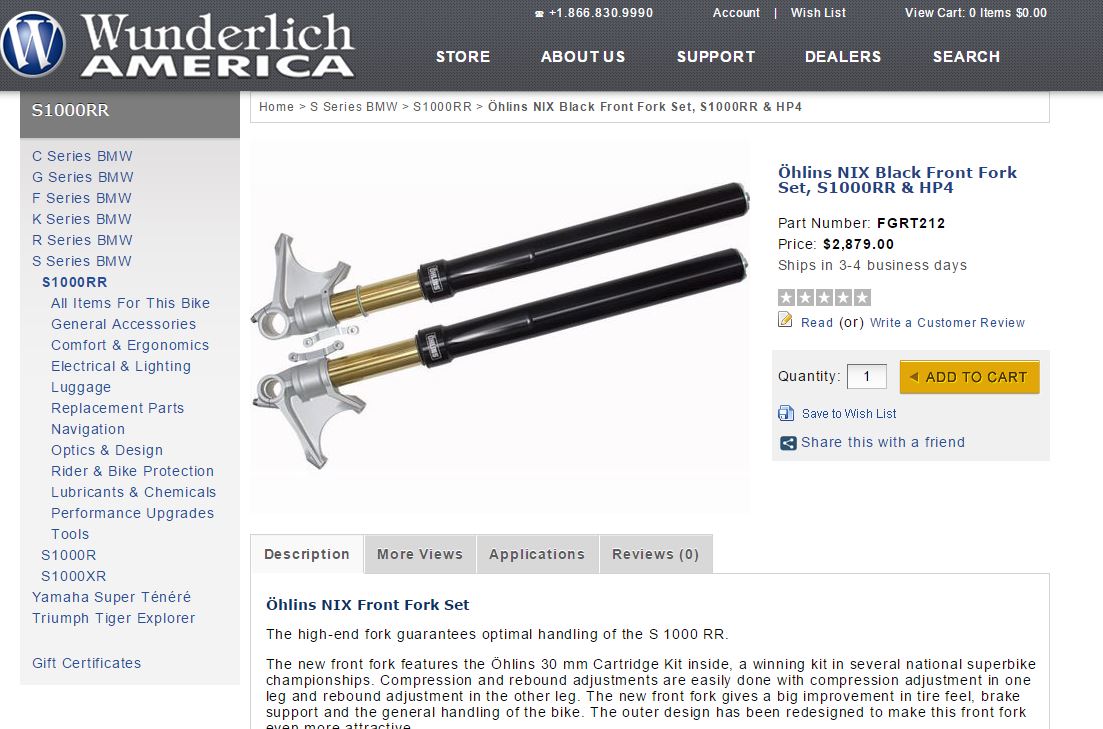
    Great example of a clean, concise layout, that displays the product well with a clear call to action on Wunderlich America's website.
    Great example of a clean, concise layout, that displays the product well with a clear call to action on Wunderlich America’s website.

    Layout

    1. Cut the clutter. You see it all the time on ecommerce sites – too much junk that distracts from the important things. If the advertising banner is the first place your eye is drawn rather than the product or company logo, there is a problem. Create a visual hierarchy with the elements on your home page. The places you want your visitors to go first or the places that are the most important need to stand out the most. Carry that design all the way down through the least important aspects of your site.

    2. Making your design too radical. You don’t need to reinvent the wheel, here. Being different in your ecommerce design just to be different is a recipe for disaster. There is a long (well, relatively long) history of web design convention that shouldn’t be ignored. Customers have expectations on how to add an item to their order, how to find your contact information, and how to sort categories. While you’re at it: practice consistency across your entire website. Keep colors the same across all your pages. It makes it difficult when you’re looking for a blue button on one page, and a pink one on the next, meanwhile the links have changed color. When you throw something brand new at your visitors, you give them a learning curve that makes them work harder just to spend their money with you.

    3. Non-responsive email. Everybody always forgets about the newsletters! Most newsletters are written and displayed as webpages and with the proliferation of mobile messaging, having a responsive design is important. If you’re customer can’t read your email or needs to zoom all around just to see what’s there they probably won’t read it and will stop opening them all together. Then it’s like you never converted them in the first place. Also, keep them light on information. Nobody wants a digest in their email; they want a flyer that they can glance at and get the information they need.

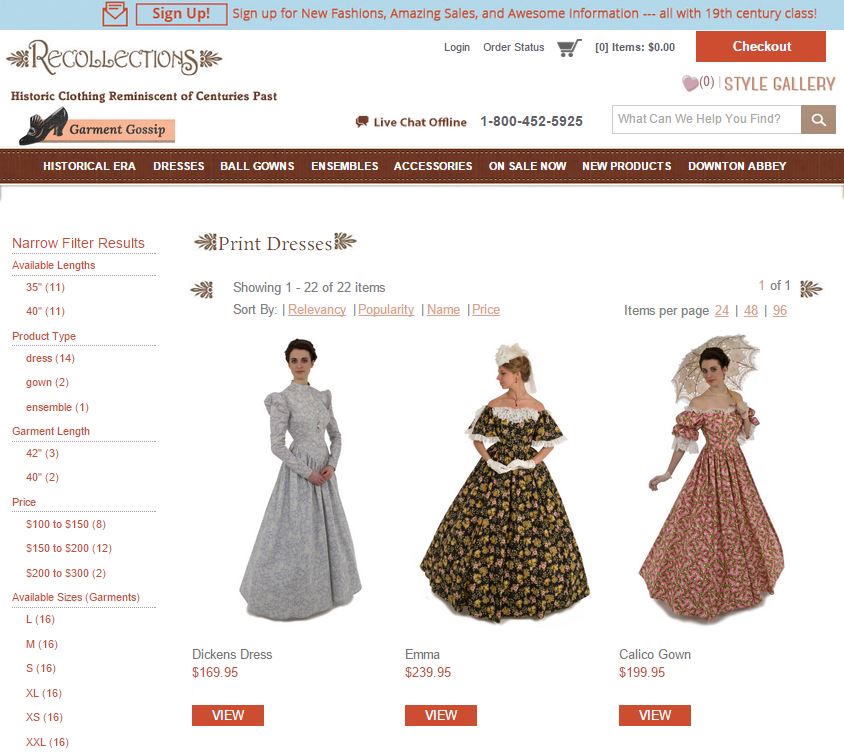
    Recollections does a great job making their website easy to navigate and to find their products.
    Recollections does a great job making their website easy to navigate and to find their products.

    Usability

    1. Slow loading mobile sites. Here it is again: responsive design! It’s a given that mobile users want their information quickly. Even though it may seem unrealistic for a signal that bounces around the world, a delay of just a few seconds can cause the visitor to abort the page and leave for somewhere else. Keep the pages lightweight on content. If they absolutely need more, see if you can separate it into another tab. Keep your graphics lightweight, too (See item 2 in Graphics). A good responsive design will only use the necessary resources to display the site correctly and will load much quicker.

    2. Products are hard to find. If a customer gets frustrated trying to find the specific item they want, they will leave and it may be very hard to recover that sale. Offering a quick and easy way to navigate through categories or direct to an item is a great way to make the customer experience effortless. There are plenty of other ways to do this too: have a (good) search bar, make sure your product SKUs are correctly categorized, and be sure that your products can be filtered at every step of the shopping process.

    3. Account requirement. You don’t need to sign-up for the newsletter or give all sorts of information when you make a purchase in person, right? Don’t require customers to create an account when shopping with your company either. Plus, what if they’re just comparison shopping and don’t want another newsletter in their email just because they wanted to look around. Account fatigue is real!

    Instead of requiring account creation, offer to save their shipping and billing information after the sale if they choose. Once the sale is complete, creating an account is no longer an impediment to the sale and the customer may be more likely to let you sign them up. There is now a perceived value because they get to keep in contact with a company that they have already invested with. Data collection is important in ecommerce, but making the sale is a far higher priority.

    Greg McNeil

    February 27, 2015
    Uncategorized
    ecommerce design
216digital Scanning Tool

Audit Your Website for Free

Find Out if Your Website is WCAG & ADA Compliant


    216digital Logo

    Our team is full of expert professionals in Web Accessibility Remediation, eCommerce Design & Development, and Marketing – ready to help you reach your goals and thrive in a competitive marketplace. 

    216 Digital, Inc. BBB Business Review

    Get in Touch

    2208 E Enterprise Pkwy
    Twinsburg, OH 44087
    216.505.4400
    info@216digital.com

    Support

    Support Desk
    Acceptable Use Policy
    Accessibility Policy
    Privacy Policy

    Web Accessibility

    Settlement & Risk Mitigation
    WCAG 2.1/2.2 AA Compliance
    Monitoring Service by a11y.Radar

    Development & Marketing

    eCommerce Development
    PPC Marketing
    Professional SEO

    About

    About Us
    Contact

    Copyright 2024 216digital. All Rights Reserved.