You’re ready to make your site accessible, but the “how” still feels scattered—too many opinions, not enough plain steps. You want a path that fits busy days, real budgets, and a team that’s already stretched. Maybe you’ve got a dozen tabs open and the same question lingering: “Where do we start?”
This guide gives you that grounding. We’ll explain why some public resources shifted (including ADA guidance documents) and what hasn’t changed about your responsibilities—then offer a calm, repeatable way to keep improving without the overwhelm.
Behind the Headlines: What Actually Changed
For years, website owners leaned on plain-English materials from the Department of Justice (DOJ) to turn legal text into everyday decisions. In March 2025, the DOJ withdrew a set of those materials—older how-to pages and pandemic-era Q&As. These ADA guidance documents weren’t binding law, but they acted like a friendly sidebar: “Are headings structured so screen readers can move around?” “Do forms have clear labels and announced errors?” “Do videos ship with captions by default?”
The intention was to “streamline.” The result, for many teams, was losing that quick translation layer. The ADA didn’t change. The shortcut explanations did.
What Are ADA Guidance Documents—and Why They Mattered Online
Guidance sits between regulations and real life. It doesn’t create new rules; it shows what good looks like. For web teams, that practicality was gold. It helped product leads, designers, developers, and content editors turn big goals into small, repeatable habits:
- Use semantic headings and landmarks so navigation is predictable.
- Ensure keyboard access works everywhere—and that focus is easy to see.
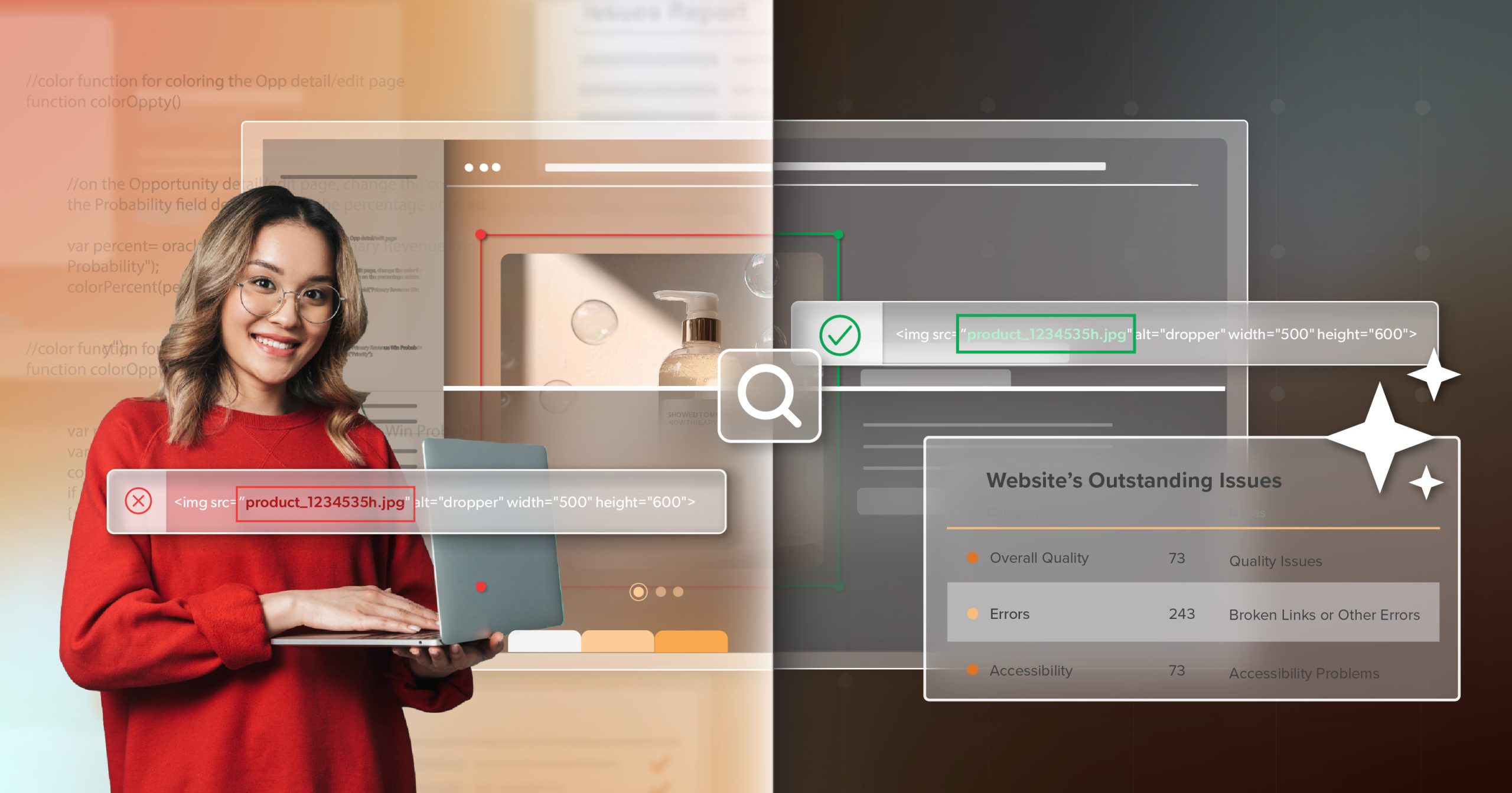
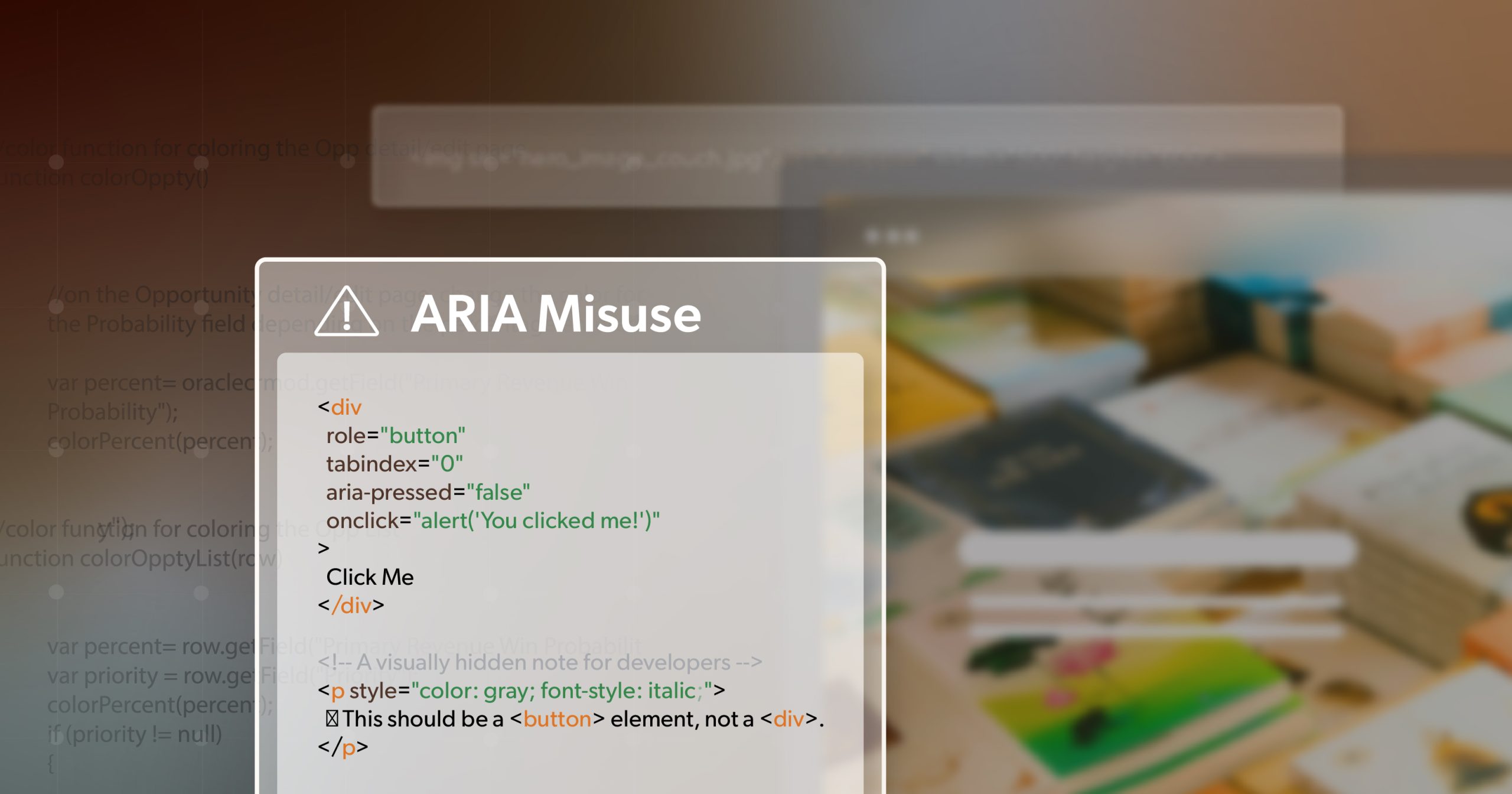
- Write meaningful alt text and descriptive link text.
- Tie error messages to the right fields and announce them clearly.
- Caption video and provide transcripts for audio.
In short: fewer guesses, fewer do-overs, fewer users getting stuck.
What This Means Day to Day
When the handy reference disappears, hesitation sneaks in. A button ships without an accessible name. Focus gets trapped in a modal. A hero banner looks great but misses contrast by a hair. A form works with a mouse but not a keyboard. None of these are headline news alone; together they slow someone’s day—or stop it. Without familiar ADA guidance documents, teams second-guess what’s “good enough,” and releases start to feel inconsistent.
But the baseline didn’t budge. The ADA still requires effective, equal access online. Courts still enforce it. And people still expect to complete tasks without extra hoops. The safest—and most respectful—move is to keep going, visibly and steadily.
Why Waiting for New Guidance Is Risky
It’s tempting to pause and hope for a new official playbook. Three reasons to keep moving instead:
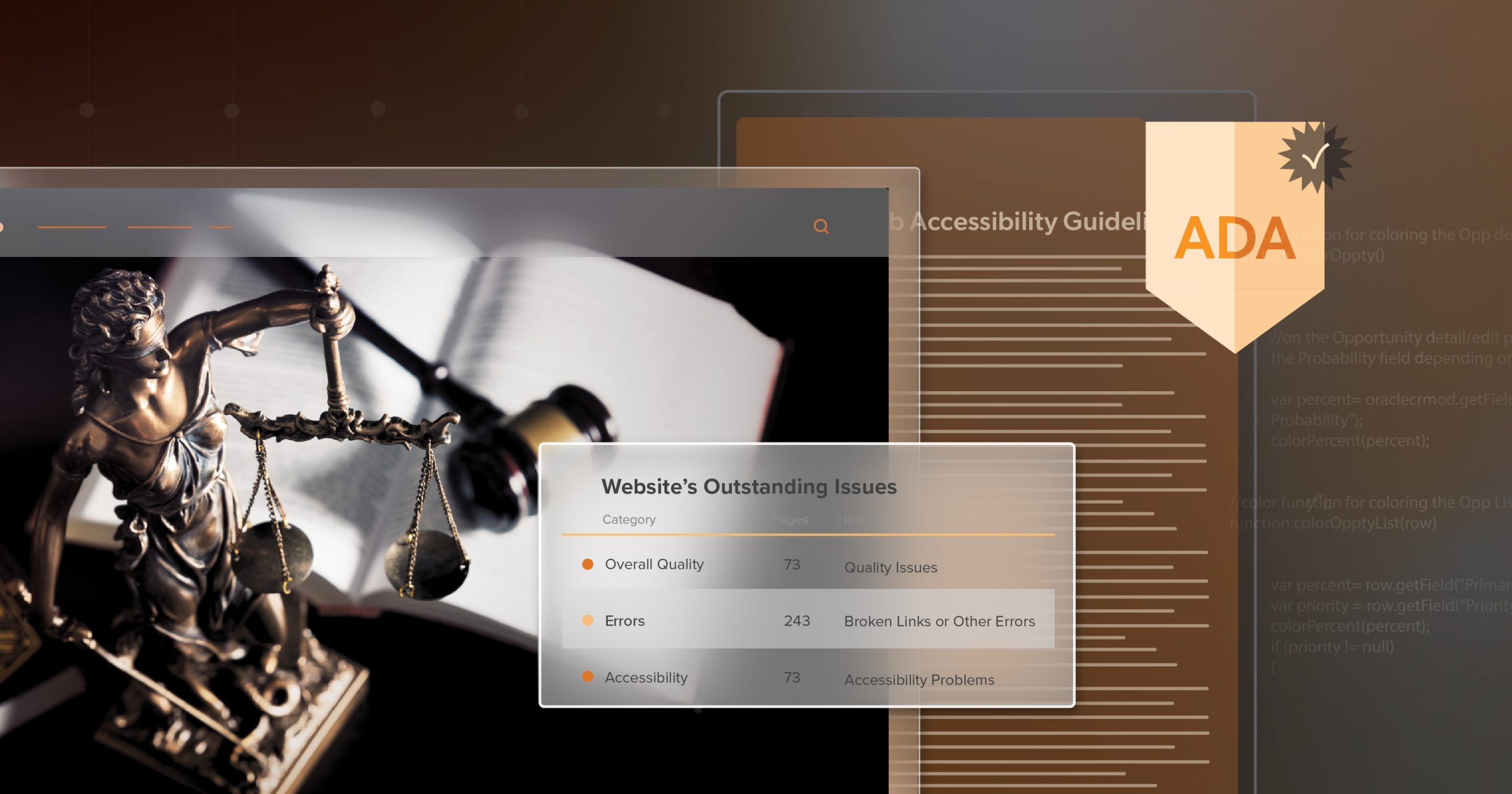
- Legal exposure. Courts across the U.S. recognize that inaccessible sites and apps can violate the ADA. That trend didn’t reverse.
- Reputation and trust. Accessibility issues show up in reviews and social posts; quiet fixes made early rarely do.
- Real people, real tasks. When login, checkout, or account recovery breaks for assistive-tech users, you’re not just risking a suit—you’re losing customers.
Silence—or withdrawn ADA guidance documents—is not a safety net.
What Web Compliance Looks Like Right Now
Even without those quick-reference pages, your backbone is solid:
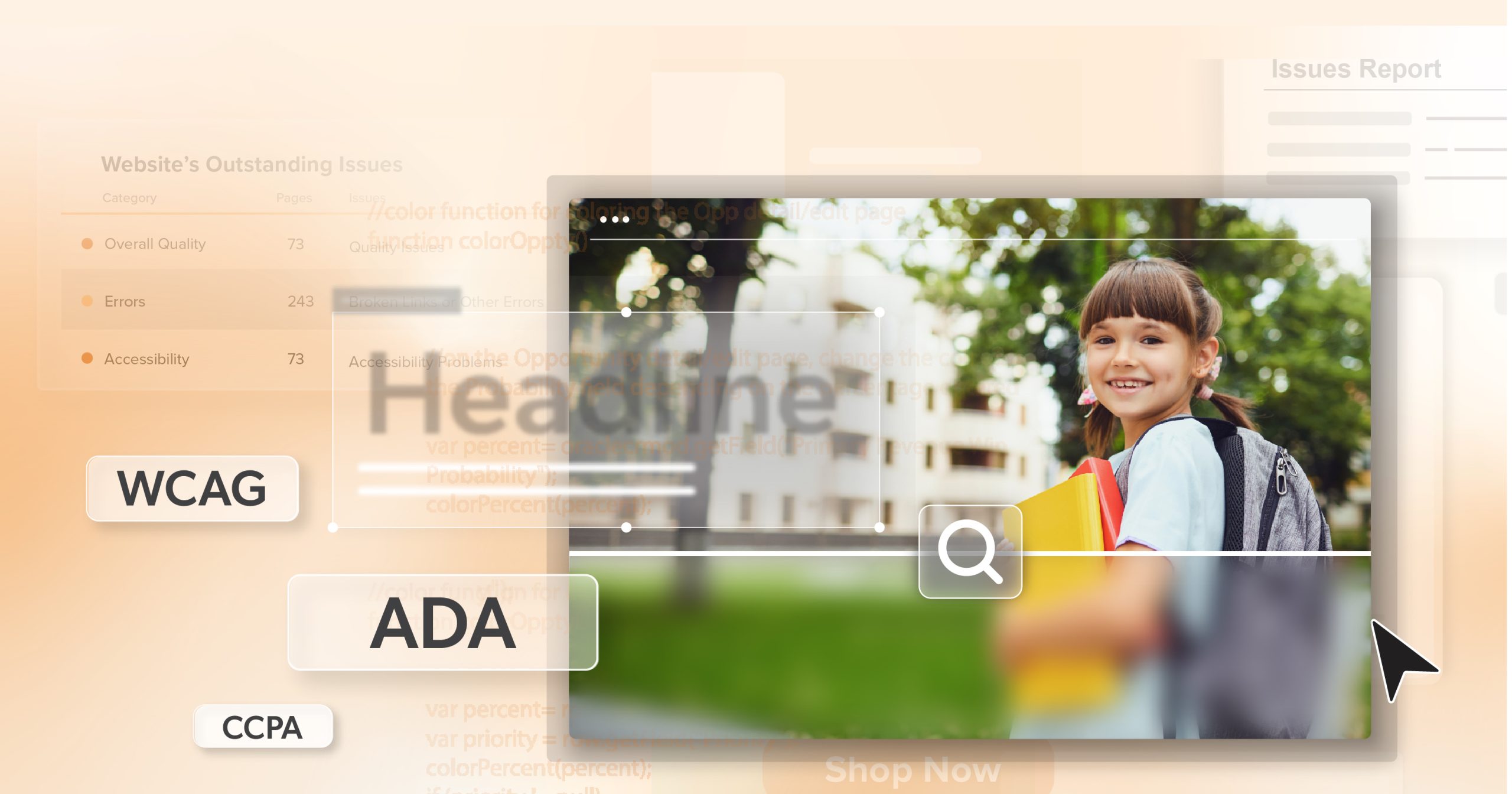
- Standards: Treat WCAG 2.1 Level AA as today’s target and map sensible upgrades toward WCAG 2.2. WCAG gives your team a shared, testable language for “accessibility.”
- Process: Fold accessibility into everyday work—requirements, design reviews, coding practices, content checks, QA, and release.
- Evidence: Keep lightweight notes on what you tested, what you fixed, and what’s queued. Perfect isn’t required; active, good-faith effort matters.
A Calm, Practical Web Plan (Built for Busy Teams)
Think “little and often,” not “big and never.” Small habits—kept—beat big intentions that stall.
1) A One-sentence North Star
“Everyone should be able to find, understand, and complete key tasks on our site—without special instructions.” When trade-offs get messy, let that sentence break the tie.
2) Make It Visible In Design
Bake contrast rules, focus styles, and ARIA patterns into your design system. Add a five-item gate to design reviews: contrast, text scaling, focus order, error visibility, and respect for motion/animation preferences. These guardrails prevent expensive rework later.
3) Test Every Release—Quickly And Consistently
- Run an automated scan for the easy wins (contrast flags, missing labels).
- Do a keyboard-only pass for navigation, focus order, skip links, menus, and modals.
- Add a screen-reader spot check (one core task in NVDA or VoiceOver) to confirm headings, landmarks, labels, and announcements make sense.
- Media check: captions/transcripts and no surprise auto-play.
- Ten focused minutes can save hours of cleanup.
4) Prioritize By User Impact
Fix blockers first—anything that keeps someone from starting, finishing, or recovering a task (focus traps, unlabeled inputs, errors that aren’t announced, inaccessible captchas). Then clean up the friction.
5) Write For Clarity
Descriptive link text beats “click here.” Headings should be meaningful and in order. Error messages should be specific and tied to their fields. Plain instructions help everyone, not just screen-reader users.
6) Train in Micro-moments
Skip the marathon. Rotate five-minute refreshers: writing alt text, managing focus in modals, structuring headings, testing keyboard paths. Small lessons stick because people can finish them.
7) Invite Feedback—And Close the Loop
Publish a simple accessibility statement with a real contact path. When someone reports an issue, acknowledge it, fix it, and thank them. That response builds trust and brings problems to you early.
8) Document Just Enough
Keep a rolling log (tickets or a short doc) noting checks, defects, fixes, and what’s next. It’s team memory, proof of progress, and a calmer conversation if you ever need to show your work.
Beyond Compliance: Better Web, Better Business
Compliance is the floor. Inclusion is the opportunity. The same choices that meet WCAG also reduce support friction and lift conversions: clearer forms, reliable focus, readable text, captions that help commuters and quiet-office viewers alike, motion that respects user settings. You don’t need fresh ADA guidance documents to make that case—the impact shows up in your analytics, your reviews, and the quiet relief of users who can simply get things done.
A Clear, Steady Path Forward
Here’s the bottom line: the ADA still stands, and the withdrawn ADA guidance documents didn’t change what “good” looks like online. Rebuild the convenience layer yourself—standards as guardrails, small checks each release, micro-training that sticks, open feedback, and just-enough documentation.
Start small. Keep going. Write down what works. That’s how you protect your brand, respect your users, and give your team a sustainable way to ship accessible experiences. And if a short, expert walkthrough would help you set that cadence, consider scheduling an ADA briefing with 216digital—calm, practical, and focused on your next few steps.