You’ve probably clicked a button that suddenly stopped everything — a pop-up asking, “Are you sure?”Or maybe you’ve seen a small info box appear off to the side — helpful, but never in the way. Both are dialogs, designed to grab attention in different ways.
Used well, dialogs create clarity and focus. Used poorly, they interrupt, confuse, and make people feel stuck.
The HTML <dialog> element makes these patterns easier to build than ever before. But accessibility isn’t built into the code — it comes from the decisions you make around it. The choice between a modal and a non-modal dialog affects more than layout. It shapes how people experience trust, control, and flow within your interface.
This guide looks at when to use each and how to design accessible dialogs that feel natural, respectful, and human-centered — helping everyone move forward with confidence.
Modals vs. Dialogs: Key Differences and Use Cases
Every dialog creates a moment — a small pause in the user’s flow. Some moments need all of a person’s attention; others just need to offer quiet support in the background. The real skill lies in knowing which one your design calls for.
What’s the Difference?
A modal dialog asks users to stop what they’re doing and make a choice before continuing. When opened with showModal(), it locks focus inside and disables the rest of the interface. That’s not a flaw — it’s intentional. Modals are meant to protect important steps: confirming a deletion, submitting a form, or saving something that can’t be undone.
A non-modal dialog, opened with show(), works alongside the main content. It might appear as a sidebar, filter panel, or help window — something that adds clarity without breaking the user’s rhythm. The rest of the page stays usable, giving people control over how and when to engage.
Both patterns have value. The difference isn’t technical — it’s about the kind of experience you want to create. Modals demand attention. Non-modals share it.
When to Use Each
| Modal Dialogs | Non-Modal Dialogs |
|---|---|
| Confirming destructive or irreversible actions | Providing optional settings or filters |
| Displaying critical warnings or alerts | Showing help text or guidance |
| Collecting essential information, like passwords or payments | Offering contextual tools that enhance workflow |
| Presenting legal or security confirmations | Sharing reference information while users continue working |
Advantages and Drawbacks
| Type | Advantages | Drawbacks |
|---|---|---|
| Modal Dialogs | • Keeps users focused on what matters most. • Prevents data loss or accidental actions. • Creates clear decision points. • Makes sure critical alerts are seen. | • Interrupts workflow and momentum. • Can frustrate or confuse if overused. • Requires careful focus handling for accessibility. |
| Non-Modal Dialogs | • Supports multitasking and flow. • Reduces cognitive strain by giving users control. • Feels less intrusive and more flexible. | • Important details might go unnoticed. • Not ideal for high-stakes actions. • Can clutter layouts if poorly managed. |
Choosing the Right Type
When deciding between the two, ask yourself:
Does this moment need to stop the user, or simply guide them?
- Use modals when you need someone to confirm, commit, or acknowledge something before moving on.
- Choose non-modals when the goal is to assist or inform without interrupting their process.
Both serve accessibility — just in different ways. A well-timed modal can prevent errors. A well-designed non-modal can preserve flow. The goal isn’t to eliminate interruptions altogether, but to make every one of them intentional.
Accessible dialog design starts with empathy. Think about how people move through your interface — how they regain focus, how they understand what just appeared, and how much control they still have. When you build from that mindset, you’re not just meeting standards. You’re respecting your users’ attention, time, and agency.
Building Accessible Dialogs: From Code to Experience
Creating accessible dialogs isn’t about adding extra layers of code — it’s about protecting clarity and ease of use. The HTML <dialog> element already gives you a strong starting point. What you do next determines whether the experience feels effortless or confusing.
Start with Solid HTML
HTML gives you two built-in paths:
showModal() creates a modal dialog.show() creates a non-modal dialog.
Both handle basic focus and background behavior automatically. From there, it’s all about refinement.
Always include a clear, labeled close button — and make sure it returns focus to the element that opened it.
<button id="close-dialog">Close</button>
<script>
  document.querySelector('#close-dialog')
    .addEventListener('click', () => myDialog.close());
</script>
It’s a small step, but it reinforces something bigger: giving users control — the foundation of every accessible experience.
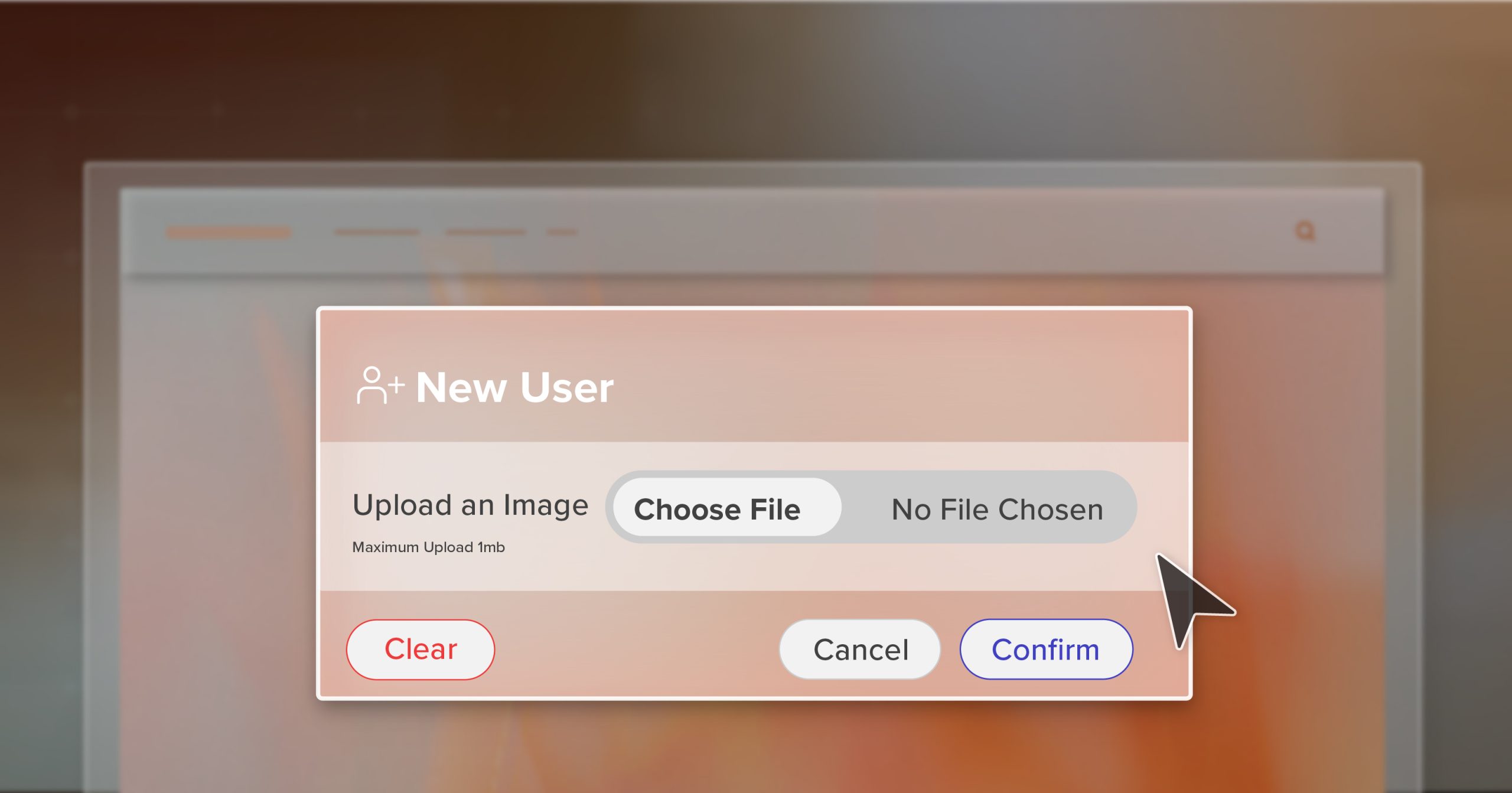
Label Everything Clearly
Assistive technology depends on structure that makes sense. Every dialog should announce what it is, why it’s there, and how to leave it.
<dialog aria-labelledby="dialog-title" aria-describedby="dialog-desc">
  <h2 id="dialog-title">Confirm Action</h2>
  <p id="dialog-desc">This will permanently delete the record.</p>
</dialog>
If it’s an urgent message, add role="alertdialog" so screen readers read it immediately. Otherwise, keep the default role and double-check that:
- The title and description are linked with
aria-labelledbyandaria-describedby. - The close button is labeled with text, not just an icon.
- Focus moves logically when the dialog opens and closes.
When these pieces work together, the dialog doesn’t just appear — it communicates clearly, with purpose and respect.
Keep Focus on Track
Focus is where accessibility either shines or breaks.
When a dialog opens, the user’s focus should land directly inside it. When it closes, focus should return to the element that triggered it.
dialog.addEventListener('close', () => trigger.focus());A few extra checks help keep that flow intact:
- Tab and Shift+Tab should only move through active elements inside the dialog.
- Escape should always close it.
- Every interactive element should have a visible focus indicator.
If you’ve ever been trapped inside a modal with no way out, you already know why this matters. Freedom of movement — even within a small overlay — is core to accessibility.
Prevent Background Scrolling
When a modal appears, the world behind it should stay still.
Allowing the background to scroll while a dialog is open can disorient users, especially those relying on visual context or assistive technology.
A simple CSS rule can make all the difference:
body.modal-open {
  overflow: hidden;
}
Toggle that class when opening and closing the dialog. It’s a subtle fix that steadies the visual environment and prevents confusion — small detail, meaningful improvement.
Design for Visual Calm
Accessibility isn’t only technical — it’s visual. A dialog should direct attention, not demand it.
Use gentle layering, thoughtful contrast, and spacing that feels natural.
dialog::backdrop {
  background-color: rgba(0, 0, 0, 0.65);
}
Follow WCAG contrast guidelines:
- 4.5:1 for normal text
- 3:1 for large text
Soft shadows, calm edges, and balanced spacing help users focus on content without feeling overwhelmed. A well-designed dialog doesn’t shout — it invites. It says, “Look here, when you’re ready.”
That’s what visual accessibility feels like — respectful, intentional, and human.
Best Practices for Accessible Dialogs
Accessibility isn’t just about getting the mechanics right — it’s about how the experience feels. These best practices go beyond compliance to help you design accessible dialogs that feel considerate, consistent, and calm.
1. Keep Users Oriented
People should always know where they are. On larger screens, let a touch of the background remain visible so the dialog feels connected to the page. On mobile, a full-width layout often works better for readability and touch targets.
It’s about maintaining orientation — helping users feel connected to where they are, not suddenly somewhere else. When context stays visible, confidence follows.
2. Offer Multiple Ways Out
A good dialog respects autonomy. There should never be a sense of being trapped.
Include a clearly labeled “Close” button, let the Escape key work naturally, and if clicking outside dismisses the dialog, make sure screen readers announce that it closed.
The best dialogs don’t just let people leave — they make that exit easy to find, every time.
3. Use Restraint with Motion
Animation should support, not distract. Avoid heavy fades, blurs, or large shifts that feel like the page vanished.
A dialog should feel like a step forward, not a teleport. Subtle transitions — a soft fade or gentle scale — help users stay oriented and avoid triggering motion sensitivity.
If it feels smooth and steady, you’re doing it right.
4. Test Like a Real User
Once the dialog looks good, use it the way your audience will.
- Try it with only a keyboard.
- Run it with NVDA or VoiceOver.
- Zoom in to 200% and see if anything disappears or becomes unreadable.
If something feels clunky or confusing, it is. Real testing turns assumptions into insight — and that’s where true accessibility takes shape.
5. Respect Timing and Intent
Never open modals automatically or stack several in a row. Give people time to think, act, and close things at their own pace.
Accessibility is as much about emotional comfort as it is about usability. Respecting timing and intent helps users feel calm and in control. That’s what good design does — it builds trust through patience.
Accessibility Beyond the Dialog
Dialogs and modals are moments of conversation between your site and your users. When they’re done right, they help people act confidently and stay in flow. When they’re not, they create friction and fatigue.
The best accessible dialogs are quiet — they guide without getting in the way. They respect focus, timing, and attention so users never have to think about accessibility; it’s already part of the experience.
At 216digital, we see accessibility as communication done right — designing in a way that includes everyone from the start. If your team is ready to move beyond checklists and create digital experiences that truly connect, schedule an ADA briefing with us today. Together, we’ll make accessibility a natural, lasting part of how your organization grows.