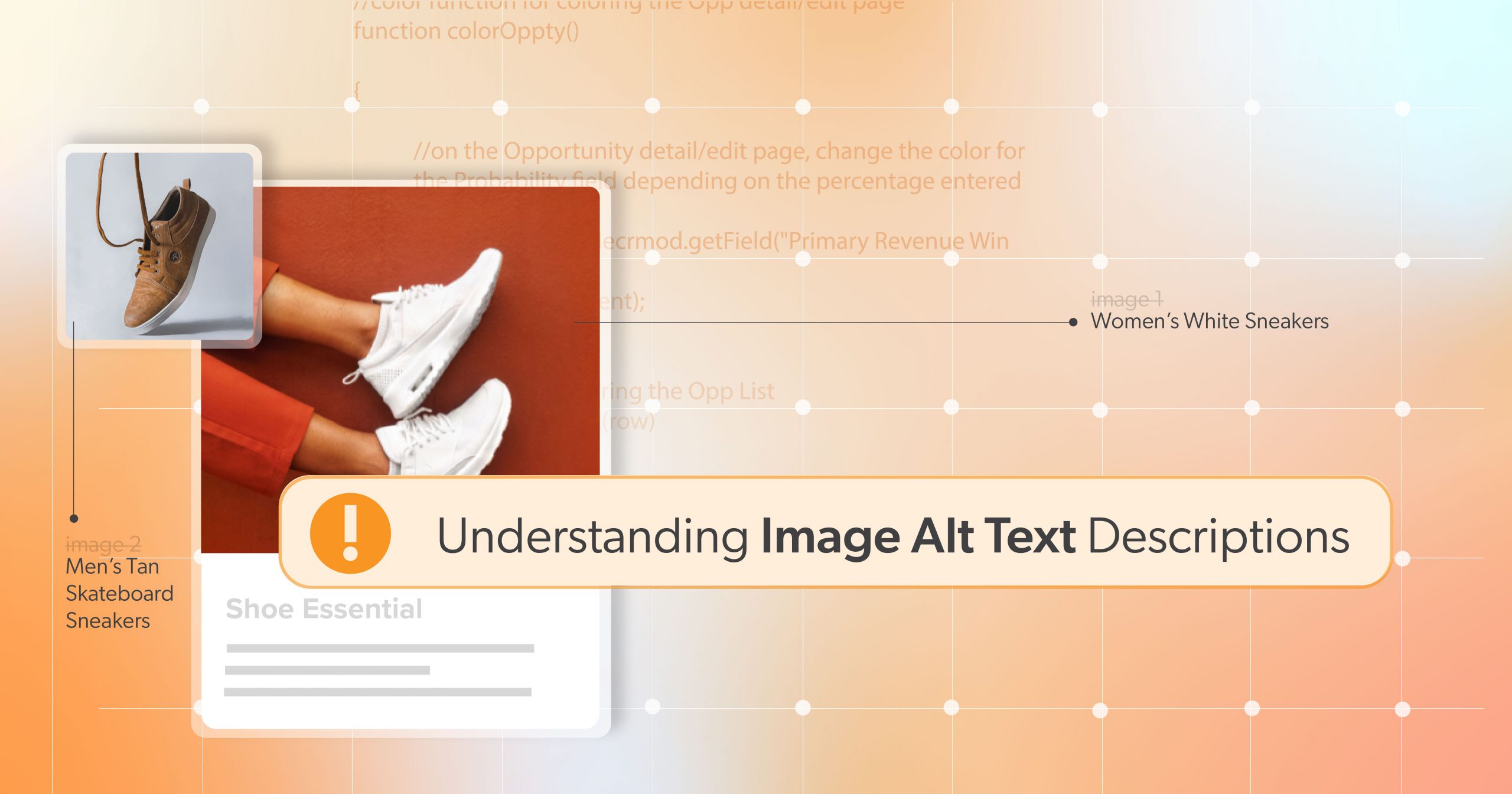
Images can bring a web page to life—but not all of them need to speak. When it comes to web accessibility, knowing which images are decorative and which are informative is key to creating a cleaner, smoother experience for people using screen readers and other assistive technologies. That’s where alternative text (alt text) comes in.
You probably already use alt text to describe important images. But what about the purely visual ones—those flourishes and background elements? If they don’t add value beyond appearance, they might be decorative images. This article helps you identify which images fall into that category and how to properly mark them, so screen reader users aren’t bogged down by unnecessary noise.
By focusing on even small improvements—like skipping redundant descriptions—you can build better, more respectful websites.
What Makes an Image “Decorative”?
Let’s start with the basics. According to WCAG 2.1 Success Criterion 1.1.1: Non-text Content, all meaningful non-text content must have a text alternative. But decorative images are an exception—they don’t need a description because they don’t carry meaning.
So, what exactly counts as decorative?
Common Decorative Image Types
- Borders, swirls, and flourishes that are strictly for looks
- Icons next to already-labeled buttons (like a phone icon next to the word “Call”)
- Stock photos that add mood or style but aren’t referenced in content
- Repetitive logos or design elements used as dividers or backgrounds
If removing the image doesn’t change the message or function of the page, you’re likely dealing with a decorative image.
Making the Right Call: Informative or Decorative?
It’s not always black and white. Here are a few quick questions to help:
- Does the image convey info that isn’t available in the text?
- Would a user miss out on something if the image was gone?
- Is the image part of an instructional step, chart, or link?
If you answer yes to any of these, the image is probably informative—and it needs descriptive alt text. If not, you may be safe to treat it as decorative.
For a more detailed approach, try W3C’s Alt Decision Tree. It’s a great tool, but don’t worry—no one expects you to follow it like a script. Trust your content instincts too.
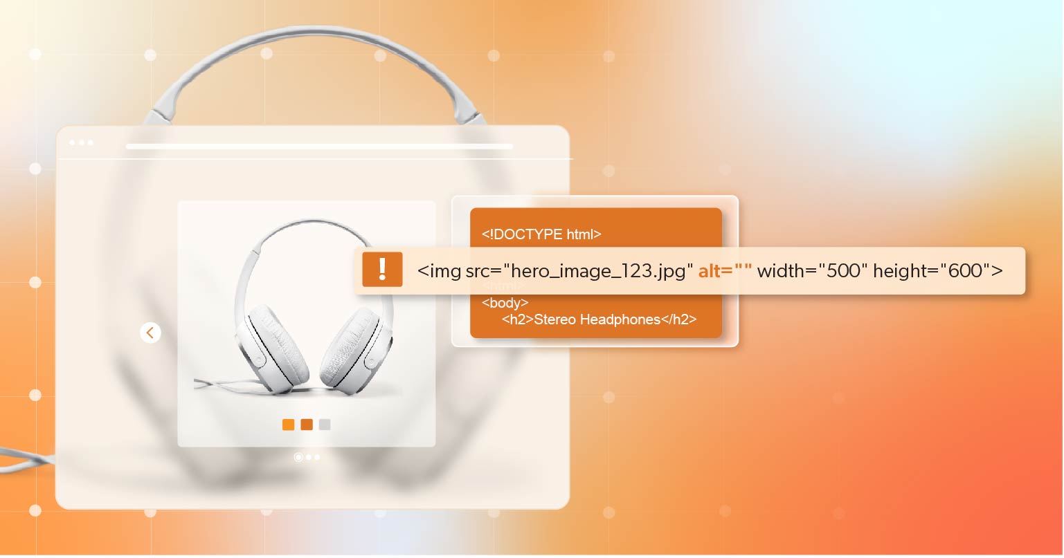
Common Mistake Alert: Don’t mark company logos, charts, or instructional images as decorative. If they carry meaning or serve a function, they need proper alt text.
How to Properly Mark Decorative Images in Code
Once you’ve determined that an image is decorative, here’s how to ensure assistive technologies skip over it.
Use an Empty Alt Attribute
This is the most common and widely supported method:
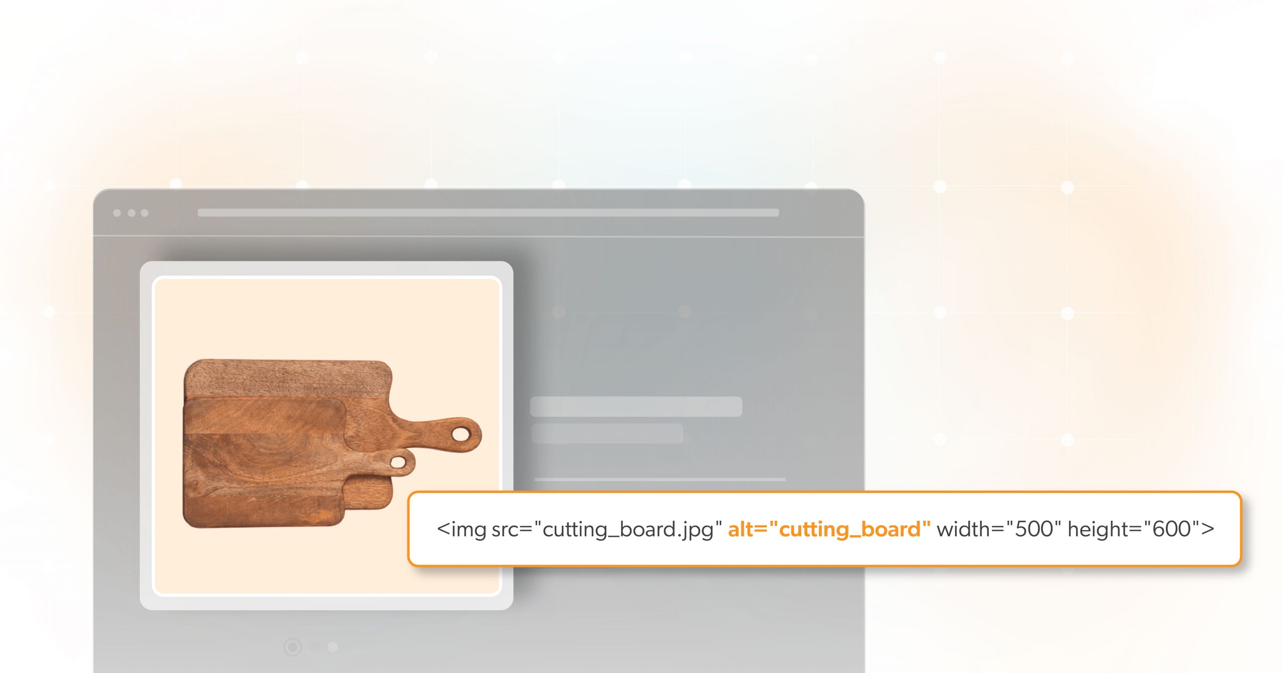
<img src="divider.png" alt="">Why does this work? A screen reader will completely ignore the image. This prevents confusion and keeps users focused on meaningful content.
But be careful: don’t skip the alt attribute altogether. Leaving it out may cause screen readers to read the file name—something like “divider-dot-p-n-g”—which is exactly the kind of noise we’re trying to eliminate.
Use role="presentation" or aria-hidden="true"
For SVGs, icons, or complex visual elements that can’t use alt="", try one of these:
<svg role="presentation">...</svg>
<img src="swirl.svg" aria-hidden="true">
What’s the Difference?
role= "presentation"tells assistive tech: this element is just for visuals.aria-hidden= "true"hides the element from all assistive tech completely.
Choose one—don’t combine them with an empty alt attribute. Using both can confuse the accessibility tree and cause unpredictable results.
Best Practices & Pitfalls to Avoid
To keep your decorative images accessible:
- Use only one method to mark an image as decorative
- Test your implementation using screen reader emulators, WAVE, or Lighthouse
- Avoid using the word “decorative” in the alt text—use an empty alt attribute instead.
- Always include the alt attribute, even if it’s empty.
- Be careful not to hide meaningful images by using
aria-hidden="true".
It’s also a good idea to review your CMS settings. Many platforms automatically insert images or fill alt text fields with file names. Stay alert!
Why It Matters: The Impact of Doing It Right
When you handle decorative images properly, you create a better user experience for everyone:
- Less noise for screen reader users, making it easier to navigate pages
- A clearer focus on important content and messages
- Reduced cognitive load, especially for users with visual or cognitive disabilities
- Cleaner code that’s easier to maintain and optimize
Bonus: It can even help with SEO by making your site more semantic and purposeful.
Real users have reported better experiences when extra, repetitive images are removed from their screen reader journey. It’s a small step with a big payoff.
Beyond Alt Text: Decorative Images Are Just One Part
Identifying and labeling decorative images is one part of a much larger accessibility picture. But it’s a foundational step.
Teams should regularly audit content—especially in environments where new images are often added, like blogs or e-commerce templates. Ask yourself: are new images truly meaningful, or just visual noise?
Also, remember: accessibility isn’t one person’s job. It’s a shared responsibility. Designers, devs, marketers, and content creators all play a role in making digital experiences more inclusive.
And if you’re using modern frameworks like React or Vue, be sure your components handle decorative images correctly and out of the box. A simple alt=”” on a reusable image tag can save a lot of friction.
Keep Image Accessibility Intentional
To recap: If an image is purely decorative, mark it so that screen readers skip over it. Use an empty alt="", or where needed, role= "presentation" or aria-hidden= "true". Don’t mix methods, and always test your work.
Improving how you handle decorative images might seem like a small detail, but it’s a powerful way to respect your users and refine your site’s accessibility. Thoughtful design isn’t just about how a site looks—it’s about how it feels to navigate.
Need a second pair of eyes on your accessibility implementation?
Schedule an ADA accessibility briefing with 216digital. Our experts can help you identify gaps, offer hands-on guidance, and take the guesswork out of inclusive design—so your digital experiences work better for everyone.