You click a link with a clear goal in mind and, instead of the content you expect, you hit a 404 page. For a second or two, you wonder whether you mistyped the URL, the site is broken, or if the content has disappeared. In that short pause, trust gets shaky. This is also where web accessibility and UX come together in a very real way: either the page leaves people stuck, or it gently helps them move forward.
That “not found” state is often seen as a throwaway screen, something the server shows when nothing else fits. With a bit of planning, this moment can be a calm, honest checkpoint. It explains what happened, offers clear next steps, and reassures people they’re still in the right place.
In the sections ahead, we will unpack what a 404 really is, how to frame it as a recovery rather than a failure, which inclusive design patterns matter most, and how architecture and analytics can support that work. By building this foundation, we can see how each layer—technical, experiential, and strategic—interacts to create an error response that turns an obstacle into a small signal of care that feels intentional, helpful, and human.
What a 404 Really Is — and Why It Happens
At the technical level, a 404 response is straightforward: the server looked at the requested URL and could not find a matching resource. That might be because content moved, a slug changed during a redesign, a redirect rule was missed, or the link was simply typed incorrectly.
The reality on most teams is a little more complicated. Content is added and removed over the years. Campaign landing pages go live for a season and then vanish. Migrations reshuffle URL patterns. Old PDFs and email templates keep sending people to paths that no longer exist. Over time, these small changes add up to a steady stream of “not found” visits.
Each of these visits is more than a missing document. It is a broken step in a user journey. Someone who trusted your link now has to decide whether to keep going, try again, or leave. Search engines see this pattern too: a cluster of broken internal links or confusing responses can send negative signals over time.
Treating that view as a recovery screen changes how you design. Instead of thinking, “The request failed,” you start asking, “How do we help this person take a meaningful next step?” This shift leads directly into the principles that guide effective 404 experiences.
Principles Before Pixels: A High-Performing 404 page Experience
Before you sketch a layout or write a clever line, it helps to agree on a few guiding ideas.
1. Accessibility is Not Optional
If parts of your experience are already hard to use, a broken link makes things worse. Folding the 404 template into your larger accessibility strategy ensures that the same care you give your main flows also applies in edge cases.
2. Clarity First, Personality Second
A bit of humor can soften the moment, but only after the page explains what went wrong and what the user can do now. Plain language always wins in high-friction states.
3.Stay On-brand
The 404 view should reuse the same typography, color system, and navigation patterns as the rest of the site. That continuity tells people they are still inside a trusted environment, even though something went wrong.
4. Focus On Recovery, Not Apology
A short, human message is important, but the screen’s real job is to provide useful paths forward and to gather enough data that you can keep improving the template over time.
Designing with these principles in mind sets you up to turn the 404 view into a small but meaningful part of the overall experience instead of a forgotten corner. Now, let’s look at the specific accessibility must-haves that support such inclusive error states.
Accessibility Must-Haves for an Accessible 404 page
When someone lands on an error view, they are already a little off-balance. The job of an accessible 404 page is simple: make it clear what happened, make it easy to recover, and make sure that experience works for more than one way of browsing. This is where UX and web accessibility meet in a very practical way.
A Clear Statement of What Happened
Start with a direct, plain-language heading that names the situation: “Page not found” or “We can’t find that page.” The short text that follows should explain, in one or two sentences, what that means and what the person can do next. No jargon. No blame. Just context and next steps.
A Layout That Still Feels Like “Your” Site
Even in an error state, users should feel grounded. Keep the same basic frame as the rest of your site—header, footer, typography, and overall rhythm. Familiar structure helps people using assistive tech or high zoom recognise that they have not been dropped somewhere unsafe or unrelated.
Recovery Paths That Are Easy to Spot and Use
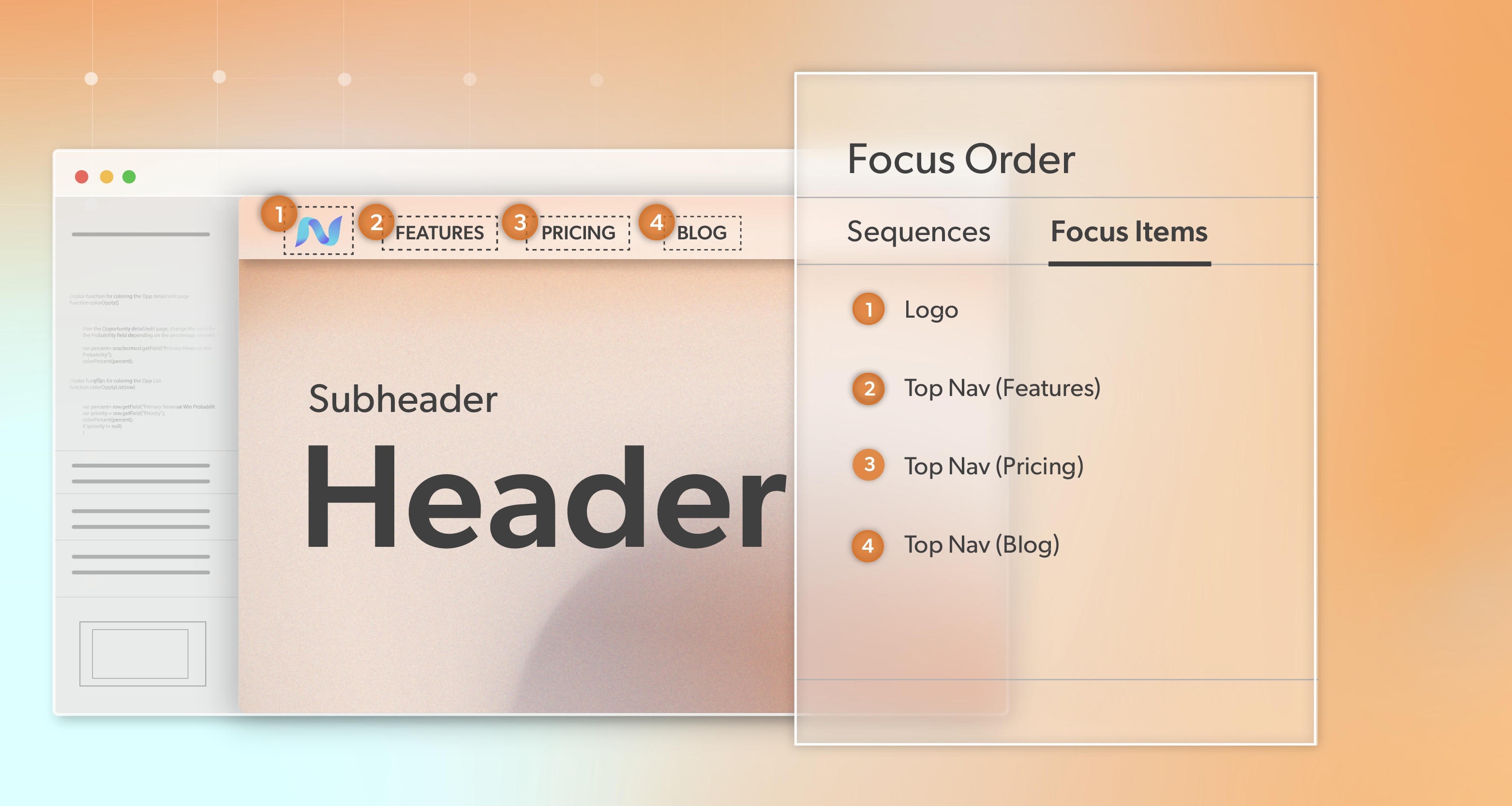
The main routes off the page—a primary button, a search field, a small set of helpful links—should be visible without hunting and usable for people who navigate in different ways. That means clear labels, sensible tab order, and enough spacing that links and buttons are easy to pick out at a glance.
Text and Visuals That Hold Up Under Strain
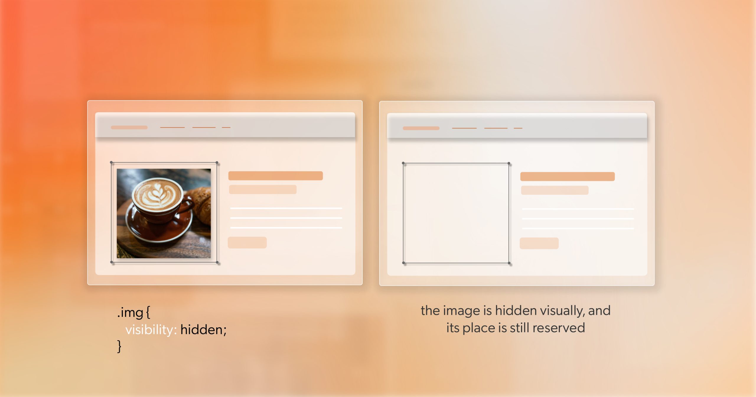
Treat this template as a first-class reading experience. Body copy should be large enough, well spaced, and set against backgrounds with solid contrast. Any illustrations should support the message, not compete with it. If the visuals are just there for tone, they should be easy to ignore for anyone focused on getting back on track.
A Moment That Stays Stable, Not Jumpy
When someone reaches your 404 page, they need a beat to understand where they are and decide what to do. Avoid sudden auto-redirects or timed jumps away from the screen. A stable state is kinder to screen-reader users, keyboard users, and anyone who simply reads at a different pace—and it aligns with the spirit of web accessibility as a whole.
Page Anatomy: What to Include on Your 404 page
Once the foundation is set, you can start thinking about the screen’s anatomy.
Start with a headline and a brief empathy line. Something like, “We can’t find that page. Let’s get you back to something useful,” is honest and calm. It acknowledges the break without blaming the user or hiding behind technical jargon.
Next, add primary recovery paths. Place a clear button to your home page or a key hub to make resetting easy. A search field gives control to people who know what they seek. Short lists of curated links—popular sections, current campaigns, most-read articles—offer quick options if visitors want to explore.
Consider including a small, accessible feedback mechanism, such as a link that says, “Tell us if this link is broken.” When wired into your issue-tracking or analytics layer, this can reveal patterns that automation alone might miss.
Visually, keep the layout simple and open. Maintain your main header and footer so orientation is never in doubt. If the user came from a specific area, such as “/blog/” or “/support/,” you can surface related links to those sections to respect their original intent. In every case, ask whether the design makes it obvious what to do next.
Under the Hood: Technical Details That Support the Experience
The best copy and layout will fall short if the underlying implementation is weak. Your 404 page should be backed by correct HTTP status codes so search engines and monitoring tools know what is happening. For permanently removed content, a 410 status may make more sense than a 404, but the visual template can remain the same.
In client-side apps, routing logic needs extra care. When a user visits an unknown path, your router should render the error template and, when possible, coordinate with the server so that crawlers also receive the correct signal. Focus management, skip links, and semantic markup should be tested together so that the experience holds up for people using assistive technology. These technical details are small, but they add up to better web accessibility in the moments when users most need guidance.
Caching and performance matter here as well. Configure your CDN so error responses are cached sensibly, and ensure the template itself loads quickly with minimal heavy scripting. People are already dealing with a disruption; they should not have to wait for the recovery tools to appear.
Do not forget metadata. A clear title like “404 – Page not found” and well-structured meta tags make the state easier to recognise in analytics dashboards and open tabs. If your site serves multiple languages or regions, localise the copy and the key links so the experience feels considered, not generic.
Analytics, Monitoring, and Continuous Cleanup
A recovery view is not “done” once it ships. Logging and analytics should tell you how often people hit it, which paths send them there, and what they do next. Over time, this reveals where your architecture is working well and where it is quietly letting visitors down.
Simple dashboards can highlight the most common missing URLs, the internal pages that generate the most errors, and the CTAs that lead to successful recovery versus quick exits. You can even test variations of copy or link groupings to see which version helps more journeys continue.
Seen this way, the 404 page becomes a kind of listening post. It shows you where expectations and reality do not match—and gives you a place to respond with better structure, clearer navigation, and stronger web accessibility patterns.
Governance: Building Habits That Reduce Future 404s
Preventing needless errors is a shared responsibility. When content owners remove or rename pages, they should follow a simple checklist: update internal links, add redirects where appropriate, and document what has changed. Marketing teams should plan end-of-life steps for campaign URLs instead of letting them quietly break. Developers can integrate link checking into CI to catch internal broken links before launch.
For design and UX teams, the error view should live inside the design system as a standard template with clear accessibility criteria. During QA, it should receive the same level of attention as a key landing page: keyboard-only walkthroughs, high-zoom checks, screen-reader tests, and mobile scenarios. These habits turn one fragile corner of the site into a dependable part of your service.
Education is the final layer. When teams see the 404 state not as a failure but as a recoverable moment, they are more likely to invest in it. When they understand that good handling here is part of web accessibility, not just “nice to have” polish, they will keep it in scope during redesigns and migrations instead of leaving it behind.
Not All Wrong Turns Are Dead Ends
A missing resource will always create a small moment of friction, but what happens next is up to you. Treated with care, a well-designed 404 page becomes proof of how you handle the unexpected: calmly, clearly, and with respect for every visitor’s needs.
When people land on a thoughtful, well-structured error template, they stay oriented, feel supported, and are more likely to continue their journey with your brand. You protect trust, learn from the patterns that brought them there, and strengthen both your UX and your web accessibility at the same time.
If you would like a fresh perspective on how your own error and recovery states are working for users, the team at 216digital would be glad to help. An ADA briefing can surface quick wins, highlight deeper structural opportunities, and give your teams practical, actionable next steps.
The next time someone takes a wrong turn on your site, they will not just see a dead end. They will see a clear map forward—and a quiet signal that someone on the other side of the screen has their back.