216digital.
Web Accessibility

Phase 1
Web Remediation for Lawsuit Settlement & Prevention


Phase 2
Real-World Accessibility


a11y.Radar
Ongoing Monitoring and Maintenance


Consultation & Training

Is Your Website Vulnerable to Frivolous Lawsuits?
Get a Free Web Accessibility Audit to Learn Where You Stand
Find Out Today!

Web Design & Development

Marketing

PPC Management
Google & Social Media Ads


Professional SEO
Increase Organic Search Strength

Interested in Marketing?
Speak to an Expert about marketing opportunities for your brand to cultivate support and growth online.
Contact Us

About

Blog

Contact Us
  • Alt Text or Image Description? Why Accessibility Comes First

    “Should you optimize for SEO or accessibility?” That’s the wrong question.

    Let’s be honest—there’s a lot of confusion floating around online, especially on social media, about the difference between alt text and image descriptions. Some folks say you should cram keywords into alt tags. Others say just describe the image “vaguely” for the algorithm. Neither approach helps real people—and they don’t help your brand either.

    This article clears things up. We’ll break down the key differences between alt text and image descriptions, explain how both support accessibility and SEO (yes, both!), and offer practical ways to use them well. The goal? Helping you create content that’s not just searchable, but actually usable—for everyone.

    Because putting accessibility first doesn’t mean you have to sacrifice SEO. In fact, it means building digital spaces that work better for all users, including search engines.

    What Is Alt Text?

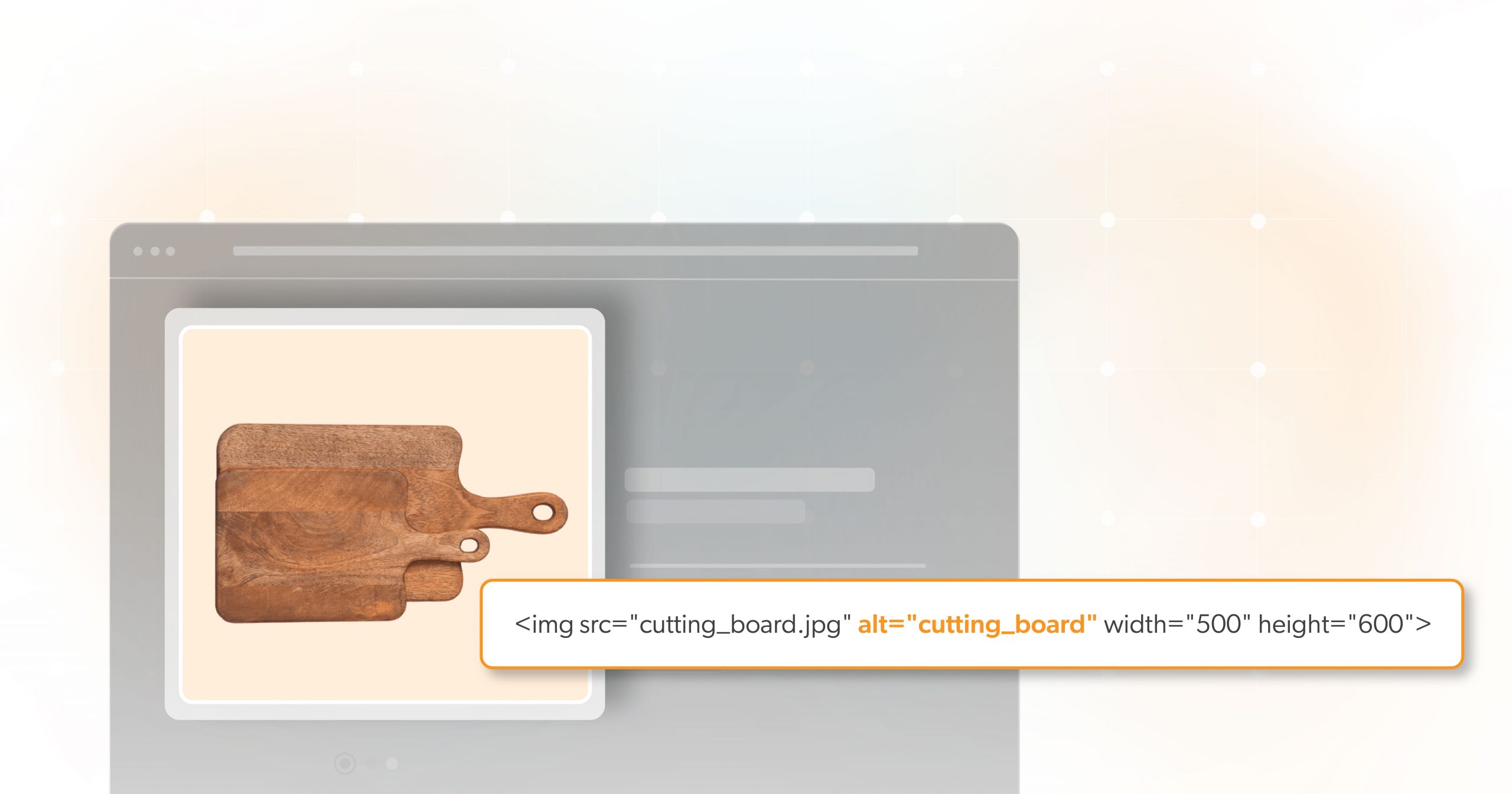
    Alt text—short for alternative text—is the text you add in HTML to describe an image. It looks something like this:

    <img src="pancakes.jpg" alt="Pancakes" />

    This little string of text has a few big jobs:

    • It shows up if an image doesn’t load.
    • It tells screen readers what the image is for users who can’t see it.
    • It can help with SEO if written well—but that’s not its main job.

    Alt text is usually short and direct. Think “Chocolate cake on a plate” or “Man typing on laptop.” It’s added when you upload images to your website, blog, or CMS.

    But here’s the catch: alt text can be too short. It doesn’t always provide enough detail, especially if you’re trying to convey mood, emotion, or complex ideas.

    That’s where image descriptions come in.

    What Are Image Descriptions?

    An image description is a fuller explanation of what an image shows. It’s like telling a story with words instead of just naming what’s in the picture.

    Here’s an example:

    Alt Text: “Pancakes”

    Image Description: “A tall stack of fluffy pancakes covered in golden syrup, powdered sugar, and slices of fresh strawberries and bananas on a white ceramic plate.”

    See the difference?

    Image descriptions give blind or visually impaired users a more complete picture of what everyone else sees. They may appear near the image in the caption, in surrounding content, or even inside ARIA labels for complex visuals like graphs or maps.

    In short: alt text gives a label. Image descriptions give life.

    Alt Tags vs. Image Descriptions: Key Differences

    Let’s break this down side by side:

    Alt TagsImage Descriptions
    Short, a few wordsFull sentences
    Placed in code (alt="")In visible content or metadata
    Helps screen readersHelps screen readers and gives more context
    SEO-friendlySEO-friendly
    Often auto-generatedOften auto-generated

    Think of alt tags as headlines. Image descriptions? They’re the full story.

    How Image Descriptions Support Both Accessibility and SEO

    Here’s the good news: you don’t have to choose between helping people and helping search engines. Done right, an image description does both.

    Let’s say you’re a restaurant. Here’s an example of an image description could look:

    “A stack of pancakes from Alexa’s Pancake House, topped with maple syrup, whipped cream, and sliced strawberries.”

    This gives a full visual for screen reader users and includes relevant keywords (like your business name) in a natural way.

    No stuffing. No tricks. Just useful, clear, descriptive writing.

    Tips

    • Keep your writing simple and honest.
    • Use your keyword (like image description) naturally—don’t overdo it.
    • Don’t sacrifice clarity for search performance. Do both.

    SEO Pitfalls That Undermine Accessibility

    Now let’s talk about what not to do.

    Some people think alt text is a great place to dump keywords. That’s a big accessibility mistake. Imagine using a screen reader and hearing:

    “Pizza, best pizza, NYC pizza, cheap pizza, pizza restaurant.”

    Helpful? Nope. Just frustrating.

    Here’s What to Avoid

    • Keyword packing in alt attributes.
    • Using phrases that don’t describe the actual image.
    • Ignoring image descriptions altogether.

    A Better Approach

    • Use short, honest alt text.
    • Add rich image descriptions nearby for complex images.
    • Use filenames, captions, and surrounding text to support SEO goals.

    Why Accessibility Must Come First

    Yes, SEO matters. But accessibility should always come first.

    Why?

    Because someone who is blind, low-vision, or has a cognitive disability deserves to understand your content just like everyone else. Accessibility means inclusion. It also means better design for all users—including those with slow connections, temporary impairments, or different learning needs.

    And let’s not forget: choosing accessibility shows what your brand stands for.

    It’s not just for websites either. Platforms like Instagram, Pinterest, and TikTok are full of visuals. People with disabilities use them every day. They deserve full, rich image descriptions too.

    Best Practices for Writing Accessible Image Descriptions

    Here’s how to get it right:

    1. Keep It Clear and Concise: Avoid long, rambling sentences. Use plain language.
    2. Be Contextual: What’s the purpose of the image? What matters in this moment?
    3. Use Natural Language: Don’t write like a robot. Imagine you’re explaining the image to a friend who can’t see it.
    4. Use Both When Needed: For things like infographics or charts, use a short alt tag and include a detailed image description nearby.
    5. Test with Screen Readers: Listen to how your image description sounds aloud. Would someone understand it without seeing the image?

    The Role of Content Creators, Developers, and Marketers

    Creating accessible content is a team effort.

    • Writers and Content Creators: Should know how to write clear image descriptions that include important context.
    • Developers and Designers: Need to code alt attributes properly and make sure screen readers work well on their platforms.
    • Marketers and SEO Pros: Can drive results while still being inclusive. Collaboration with accessibility experts is key.

    A Better Internet Starts with Better Habits

    Here’s the takeaway: You can do both. But accessibility has to come first.

    At 216digital, we believe digital accessibility isn’t optional—it’s part of building a better internet. Every well-written image description, every thoughtfully placed alt tag, every small decision adds up.

    Not sure if your site is truly accessible? Wondering what your legal obligations are under the ADA?

    We can help. Schedule an ADA Accessibility Briefing with our team. It’s your first step toward a more inclusive, compliant, and trustworthy online presence. Let’s build something better—together.

    Greg McNeil

    April 3, 2025
    How-to Guides
    Accessibility, Alt text, image description, SEO, WCAG, Web Accessibility
  • Alt Text: Why Marketing Copy Hurts Accessibility

    Have you ever hovered over an image on a webpage and noticed a small snippet of text appear? That text is called “alt text,” and it plays a powerful role in how people experience your site—especially those who rely on screen readers. Yet it often remains an afterthought. That’s a problem. When handled correctly, it not only helps visually impaired users understand your images, but it can also support your SEO goals. On the other hand, stuffing alt text with keywords or using it as hidden ad space can frustrate visitors and hurt your search rankings.

    In this article, you’ll learn why alternative text matters, how it benefits both accessibility and SEO, and how to write it in a clear, concise, and helpful way rather than a spammy or sales-focused one. Whether you’re a solo entrepreneur, a web developer, or part of a digital marketing team, these principles will help you craft alt text that meets user needs without alienating search engines—or your audience.

    Why Alt Text Matters

    Imagine you’re shopping for a laptop case online, and you can’t see the product images. Screen reader users rely on alt text to “hear” what’s happening in each image, from color to texture. If it is nothing more than “Get the best laptop case here,” that user is left with zero details about the product. They might simply leave for a site that offers the information they need. When you write alt text that clearly states “Black leather laptop case with a zipper and handle,” you empower all customers, including those with visual impairments, to make informed decisions.

    SEO Wins

    Search engines analyze alt text to better understand what each image represents. This can give your site a leg up in search rankings for relevant queries. However, algorithms have grown smart enough to recognize keyword-stuffed or spammy text. If your alt text reads like a desperate attempt to shoehorn “laptop case” 10 times, you might do more harm than good. Concise, descriptive text helps Google and other search engines match your site with the people who genuinely want to find your products.

    Common Alt Text Pitfalls

    Keyword Overuse

    It can be tempting to sneak in extra keywords to boost SEO. But endless repetition—like “car seat protector, seat protector for cars, vinyl seat protector”—makes the text clunky and unhelpful. Search algorithms can detect spammy patterns, and users who rely on screen readers will find the repetition tedious or confusing.

    Marketing Copy Disguised as Descriptions

    Some site owners treat alt text fields as free ad space, writing something like:

    “Our top-selling leather laptop case, now 20% off! Don’t miss this exclusive deal—buy today!“

    While it may read like a catchy tagline, it doesn’t describe the image. A screen reader user learns nothing about color, texture, or design. Plus, Google doesn’t benefit from vague promotional language and might even flag your page as low-quality.

    Empty or Missing Alt Text

    Perhaps the biggest mistake is neglecting alt text entirely. In that case, a screen reader user hears nothing—just empty space—making it impossible to engage with or understand the image. If a product image is critical to your sales, that’s a huge missed opportunity.

    Repeating “Image of”

    Screen readers already announce that an element is an image. If your alt text says “Image of a black laptop case,” it’s redundant. Jump straight to the essential details: “Black leather laptop case with a zipper and handle.”

    Writing Alt Text the Right Way

    Focus on Real Descriptions

    The primary function of alt text is to describe the image so someone can visualize it through words. For a black vinyl car seat protector, a simple yet complete phrase might be:

    “Black vinyl seat protector on the driver’s seat with a zippered pocket.”

    This gives useful details while remaining concise—no filler like “best seat protector,” no repeated keywords, and no promotional language.

    Keep It Concise Yet Informative

    Alt text generally doesn’t need to be more than one or two short sentences. Offer key details without overwhelming the user. For a laptop case, mentioning the color, material, and whether it has a handle or zipper is usually enough. Screen reader users just need the essentials to identify or comprehend the image.

    Context Is Important

    If the image has a functional role—like a button or a link—clarify that. For instance, if users click an image to add a product to their cart:

    “Add to cart button for black vinyl seat protector”

    This way, a screen reader announces the function, not just the object in the image.

    Skip Redundant Phrases

    Screen readers typically announce that an element is an image, so writing “Image of” or “Graphic showing” is unnecessary. Go straight into the description. It keeps your text short and saves valuable time for the user.

    The Real-World Impact of Bad Alt Text

    Frustrating Users

    When alt text is stuffed with marketing copy or random keywords, it becomes meaningless for users with visual impairments. They hear a repetitive sales pitch instead of valuable information. This frustration often leads them to abandon your site, which hurts your brand image—and your bottom line.

    Possible Legal Ramifications

    In an era of heightened focus on digital accessibility, businesses risk legal consequences by not meeting basic standards. Some organizations have faced lawsuits for failing to include alt text. While legal outcomes vary by location and industry, it’s best to be proactive.

    Lower Search Engine Rankings

    Search engines want to display content that offers value. If your alt text is obviously spammy or unhelpful, algorithms may penalize your pages or push them further down the results. A high bounce rate—where users leave quickly due to poor user experience—also signals to Google that your site isn’t meeting visitor needs.

    Practical Steps to Improve Your Alt Text

    Conduct an Alt Text Audit

    Start by reviewing your site for missing or poor-quality alt text. Tools like the WAVE Web Accessibility Evaluation Tool highlight potential issues. Many SEO platforms also include site audits that can reveal duplicated alternative text text or keyword stuffing.

    Leverage AI Judiciously

    AI can be a lifesaver if you have thousands of product images. Tools like Google Vision offer automated descriptions, but they’re not always accurate. AI might misidentify colors or add superfluous words, so always review automatically generated alt text for accuracy and clarity.

    Follow Recognized Guidelines

    The Web Content Accessibility Guidelines (WCAG) provide standardized advice on writing effective alternative. Aim to:

    • Describe the image’s important details.
    • Keep it concise.
    • Skip filler words like “picture of.”
    • Use empty alt text (alt=" ") for purely decorative images that don’t add information.

    Test with Real Users

    Whenever possible, invite screen reader users to test your site. No automated tool can replace real feedback from people who use assistive technology daily. They’ll quickly tell you if your alt text is too vague, too repetitive, or missing crucial details. Their firsthand insights can highlight any confusion or gaps.

    Best Practices at a Glance

    • Prioritize clarity: Let users know exactly what they’re “seeing” through your words.
    • Stick to relevant details: Think color, material, function, or context—not ad slogans.
    • Limit keywords: A single, well-placed keyword can assist SEO. Overuse can sabotage it.
    • Adapt to the image: Product angles differ, so describe each image’s unique perspective.
    • Check surrounding text: If “black laptop case” appears in the product name next to the image, you may not need to repeat it in the alt text.

    Conclusion

    In today’s competitive online environment, you can’t afford to overlook the importance of alt text. A single line of well-chosen words can be the difference between an inclusive, intuitive user experience and a site that feels incomplete to a significant segment of your audience. By writing concise, descriptive alt text—free from keyword stuffing and promotional fluff—you create a more welcoming website and help search engines better understand your content.

    If you’re ready to enhance your site’s accessibility while protecting its SEO standing, consider partnering with 216digital. We’ll help you fine-tune your alt text (and the rest of your site) so that every visitor, whether they see your images or hear them described, gets the information they need. Embracing accessibility and clarity isn’t just the right thing to do—it’s also a savvy move for your online presence.

    Greg McNeil

    March 28, 2025
    The Benefits of Web Accessibility
    Accessibility, Alt text, How-to, Image Alt Text, Marketing, SEO, WCAG, Website Accessibility
  • Why ‘Click Here’ Hurts Your Website’s Accessibility

    If you’ve spent any time browsing the web, you’ve probably come across links like “click here” or “read more.” While these phrases seem simple enough, they can actually be confusing or even frustrating—especially for people using screen readers to navigate a site. That’s where descriptive link text comes in. It’s essential for making websites more accessible to everyone, including those with disabilities. So, let’s dive into why using meaningful link text is so important and how you can write it to improve both web accessibility and overall user experience.

    What is Descriptive Link Text?

    Descriptive link text is just what it sounds like—clickable text that clearly explains what the link is for. Instead of generic phrases like “click here” or “read more,” a good descriptive link gives enough context so users know exactly where the link will take them. This is a win for all users but especially important for people with disabilities who rely on screen readers to navigate the web.

    Imagine trying to navigate a website where every link says “click here.” For someone using a screen reader, that’s a frustrating experience because they have no clue where any of those links will lead. Descriptive link text fixes that by making sure all users, no matter how they access the web, have a clear, easy-to-understand experience.

    Why “Click Here” and “Read More” Are Problematic

    Using generic phrases like “click here” or “read more” might seem harmless, but they can actually create confusion. When someone using a screen reader encounters a page full of links that all say “click here,” they’re left with no context about where the links go or what they do. It’s like being handed a bunch of blank signposts with no labels.

    Let’s take a look at an example:

    • Bad Link: Click here to read more.
    • Better Link: Learn more about our services.

    In the second example, the user knows exactly what they’re clicking on, which makes the experience more apparent and more helpful, especially for people using screen readers.

    Empty Links and Their Impact on Accessibility

    Another issue when it comes to web accessibility is empty links. An empty link is one that has no text or meaningful content for a screen reader to announce. For people using screen readers, these links are useless—they navigate to them but get no information about what they do. And for those using keyboard navigation, empty links can be frustrating roadblocks.

    To avoid this, always make sure your links contain text, or if you’re using an image as a link, ensure there’s alternative text (alt text) that clearly describes what the link does.

    How Descriptive Link Text Boosts Accessibility

    One of the best things about the web is its potential to be accessible to everyone. But if we don’t put some thought into how we design and label things like links, we end up excluding a lot of people. Descriptive link text makes websites more accessible and improves the overall user experience in a few key ways:

    • Clarity for Screen Reader Users: Screen readers read links out loud. If the link text is too vague, it isn’t very clear. Descriptive text helps users know exactly what to expect before they click.
    • Better Navigation: Clear, simple language helps everyone, especially users with cognitive disabilities or learning differences, by reducing the mental effort needed to figure out what a link does.
    • Faster Browsing: Descriptive links let users quickly scan a page and understand where each link will take them. This makes it easier for everyone to find what they’re looking for without guessing.

    WCAG Guidelines for Descriptive Links

    The Web Content Accessibility Guidelines (WCAG) provide a set of best practices for making the web usable by everyone. According to WCAG SC 2.4.4 Link Purpose, each link should make its purpose clear, either from the link text itself or from its surrounding context.

    Here are a few essential tips from WCAG on how to write compelling link text:

    • Be Concise and Relevant: Your link text should be short but informative. Don’t go overboard, but include enough detail so users know where they’re headed.
      • Example: Instead of “click here for more,” try “Learn more about accessible landmarks.“
    • Skip the Redundancies: You don’t need to add words like “link” or “website” to your link text. Screen readers already announce that it’s a link, so saying “click here to visit the website” is unnecessary. Just say, “Visit our website.“
    • Avoid Empty Links: Every link should have meaningful content. Empty links are confusing and serve no functional purpose for users navigating with keyboards or screen readers.

    Examples of Effective and Ineffective Link Text

    • Ineffective Link Text:
      • Click here
      • Read more
      • Learn more
      • Here
    • Effective Link Text:
      • Download the 2024 Annual Report
      • Explore our upcoming events.
      • Read more about creating accessible web links.

    In these examples, the goal is to make it crystal clear where the link will take the user, leaving no room for confusion.

    Best Practices for Writing Descriptive Link Text

    • Think About Context: Consider what the user needs to know about the link’s destination. This is especially important for screen reader users who may jump between links without reading the surrounding text. Make sure the link text alone provides enough information.
    • Keep It Short and Sweet: Your link text should be informative but not too long. For example, “Contact Us for Support” is much clearer than “Click here if you need to get in touch with our support team.“
    • Use Natural Phrasing: Don’t feel like you always need to add a “click here” to your sentence. Sometimes, the best link text is already part of your content. For instance, instead of “click here to learn more about our programs,” use the “learn more about our programs” link.
    • Avoid URLs as Links: Long URLs are difficult for screen readers to interpret, especially if they contain numbers and special characters. Instead of linking a URL directly, use descriptive text like “Visit 216digital’s a11y.Radar Monitoring Page.”
    • Alt Text for Image Links: If an image serves as a link, make sure the alt text conveys the purpose of the link. For example, if a shopping cart icon leads to the cart page, use alt text like “View Cart” rather than just “Cart.”

    Linking It All Together

    Incorporating descriptive link text is a small change that can have a significant impact on your website’s web accessibility. By ditching generic phrases, using clear and concise language, and following WCAG guidelines, you’ll make your site more navigable for everyone—especially users who rely on screen readers.

    Creating an inclusive web experience doesn’t have to be complicated, but it does take attention to detail. If you’re unsure whether your website’s accessibility measures, including your link text, are up to standard, it might be time to seek expert advice. At 216digital, we offer ADA briefings that help you identify areas for improvement and ensure your site meets accessibility requirements.

    Take the next step towards a more accessible web presence and schedule a complimentary ADA briefing with 216digital today. We’re here to guide you through the process and help you create a site that’s welcoming and usable for everyone.

    Greg McNeil

    October 14, 2024
    How-to Guides, Legal Compliance, WCAG Compliance
    Accessibility, Alt text, descriptive link text, WCAG, WCAG Compliance, Web Accessibility
  • 5 Common Image Alt Text Mistakes

    5 Common Image Alt Text Mistakes

    If you’re a website owner, developer, or content creator, you’ve probably heard about the importance of alt text for images. Alt text, short for alternative text, is crucial for web accessibility. It helps people with visual impairments understand what’s in the images on your site, using screen readers. It also has SEO benefits, helping search engines understand and index your images. However, writing good alt text isn’t always straightforward. Here are some common mistakes people make and how to avoid them.

    1.Some Images Should Use an Empty Alt Attribute

    One of the most common mistakes is thinking every image needs alt text. Not all images require detailed descriptions. Decorative images, like those used purely for design or spacing, should use an empty alt attribute (alt=””). This tells screen readers to skip these images, preventing unnecessary clutter for users.

    For instance, if you have a decorative border or a purely aesthetic icon, you don’t need to describe it. Including alt text for these elements can overwhelm users with information and make their browsing experience frustrating. Always ask yourself if the image conveys essential information. If not, it’s a good candidate for an empty alt attribute.

    2.Context Matters

    Context is everything when it comes to writing alt text. The same image might need different alt text depending on where and how it’s used. For example, a picture of a dog on a veterinary website might need different alt text than the same picture on a pet adoption site.

    Let’s say you have an image of a golden retriever. On a veterinary site, the alt text might be “Golden retriever receiving a check-up at the vet.” On a pet adoption site, it could be “Golden retriever available for adoption.” The context gives users the specific information they need based on where they are and what they’re looking for.

    3.Screen Readers and Search Engines Already Know That It’s an Image

    Another mistake is being redundant in alt text. Screen readers and search engines already know the element is an image, so you don’t need to start with “Image of…” or “Picture of…”. Jump straight into the description.

    Instead of saying, “Image of a woman using a laptop,” just say, “Woman using a laptop.” This makes your alt text more concise and easier for screen readers to process. Remember, simplicity and clarity are key.

    4.Write Alt Text as Simple Sentences

    Good alt text is clear and straightforward. Using simple sentences helps ensure that everyone can understand your descriptions, including those using screen readers. Avoid complex phrases and jargon that could confuse users.

    For example, if you have a photo of a sunset, instead of saying, “A stunningly beautiful sunset with hues of orange and pink casting a magnificent glow over the tranquil sea,” you could say, “Sunset over the sea with orange and pink colors.” Simple, right? It’s all about making the information as accessible as possible.

    5.Don’t Repeat Captions in Alt Text

    If your image already has a caption, don’t just copy and paste it into the alt text. Alt text and captions serve different purposes. Captions are visible to all users and often provide context or additional information, while alt text is specifically for those who can’t see the image.

    For instance, if you have a caption that says, “John Doe speaking at the annual tech conference,” the alt text could be “John Doe at a podium,” giving a brief description without repeating the same information. This way, you enhance the user’s understanding without redundancy.

    The Importance of Web Accessibility

    Web accessibility is about making the internet usable for everyone, including people with disabilities. Alt text plays a significant role in this effort. By providing descriptive alt text, you ensure that all users, regardless of their abilities, can access the information on your site.

    Accessible websites don’t just benefit those with disabilities. They can improve the overall user experience, increase your audience reach, and even boost your SEO. Search engines like Google use alt text to understand what images are about, which can help your site rank better in search results.

    Practical Tips for Writing Good Alt Text

    Here are some practical tips to help you write better alt text:

    1. Be Descriptive but Concise: Aim for a balance between being detailed and keeping it short. Generally, 125 characters is a good length to shoot for.
    2. Focus on What’s Important: Describe the most important aspects of the image. Think about what information the user needs to understand the image in the context of the content.
    3. Avoid Redundancy: As mentioned, don’t use phrases like “image of” or repeat the caption.
    4. Use Proper Grammar and Punctuation: Even though alt text might seem less formal, proper grammar and punctuation help with clarity.
    5. Think About the User’s Experience: Always consider how a user relying on a screen reader will interpret your alt text. Will it provide the necessary information in a clear and straightforward manner?

    Common Scenarios and Examples

    To make things clearer, let’s look at some common scenarios and examples of good alt text.

    Scenario 1: Product Images

    If you’re running an e-commerce site, your product images need good alt text. For a photo of a red dress, a good alt text might be “Red cocktail dress with ruffle sleeves.” This description is concise and gives potential buyers the information they need.

    Scenario 2: Infographics

    Infographics can be tricky because they often contain a lot of information. A good approach is to summarize the key points. For example, if your infographic shows the steps of a process, the alt text might be “Infographic showing 5 steps to start a blog: Choose a platform, Pick a domain, Set up hosting, Design your site, Publish content.”

    Scenario 3: Event Photos

    For event photos, focus on who, what, where, and when. An image from a company event might have alt text like “CEO Jane Smith speaking at the annual company meeting in June 2023.”

    Conclusion

    Writing effective alt text is an essential skill for anyone managing a website. It’s not just about ticking a box for accessibility; it’s about making your content accessible and useful for everyone. By avoiding common mistakes like over-describing, repeating captions, or using complex sentences, you can create a better experience for all users.

    Remember, the goal of alt text is to provide essential information to those who can’t see the image. Keep it simple, relevant, and in context, and you’ll be well on your way to making your website more accessible and inclusive. Web accessibility isn’t just a legal requirement; it’s a way to show that you care about all your users, making your site more welcoming to everyone.

    At 216digital, our expert team can assist you in developing a strategy to make this journey of WCAG 2.1 compliance as smooth as possible. Contact us today to schedule a complementary ADA Strategy Briefing so that you can confidently take this next step into digital accessibility.

    Greg McNeil

    July 15, 2024
    How-to Guides
    Accessibility, Alt text, digital accessibility, Image Alt Text, Website Accessibility
  • Does Your Image Need Alt Text to be Web Accessible?

    Does Your Image Need Alt Text to be Web Accessible?

    Images are the bread and butter for any website. You put a lot of time and effort into creating engaging visual content for your audiences. But that’s only half of the battle — making your content accessible to as many people as possible is the other half. 

    Despite the accelerated pace of the digital era, many businesses and organizations still lag behind in making their websites accessible to people with disabilities. This is partly due to the lack of awareness and/or technical knowledge of different web accessibility barriers and how to solve them. 

    What happens when your users have visual impairments? How do they receive and understand this visual information? 

    In this article, we answer one of the most commonly asked questions — does my image need alt text to be web accessible?

    Image Types And Alternative Text

    Before we analyze an image for web accessibility, we must first take a step back and think about its purpose. Is it to inform, evoke emotion, serve as a link, or just for visual appeal?

    To understand how to make the image accessible for users with assistive technologies (AT) like screen readers, ask:

    • “What is the message the image is trying to convey?”
    • “Is the message simple or complex, emotional or actionable?”

    An online tool like an image decision tree can help categorize your image. Or, think about if the image disappeared. Would you still understand the content’s meaning without it?

    If the answer is yes, the image is purely decorative. However, the image is necessary if the image provides the user with valuable information and context. 

    Once you determine what kind of image you are working with, there are some basic web accessibility guidelines to consider.

    Decorative Images

    There is a lot to consider when it comes to decorative images. If you find yourself saying, “But what about X? or “How about Y?” you might need to reevaluate your image as it might not be decorative. 

    One of the most challenging images to categorize tends to fall in the “emotional” or “mood” category since these images are more subjective. What one person considers decorative, another might consider informative. So, use your best judgment.

    Hiding Decorative Images

    While decorative images can enhance visual appeal, they don’t convey any meaningful information. If the image is decorative, then programmatically, the image needs to be hidden from assistive technology. 

    There are several ways to hide alternative text, including using empty or null alt (alt=””), using ARIA role=” presentation”, or implementing the image as a CSS background. This will signal the AT device to ignore this image as it is not vital to understanding the content. 

    However, it’s important to note that an empty or null alternative text attribute is not the same as a missing attribute. If the alternative text attribute is missing, the AT device might read the file name or surrounding content instead to provide the user with more information about the image. 

    While aria-hidden= “true” is an option, be cautious, as it will remove the entire element from the accessibility API.

    Informative Images

    If you decide your image is informative, there are a lot more things to consider. Visually impaired individuals often rely on screen readers to navigate the web. These devices read out textual content, but they can’t “see” images. To bridge this gap, we must have programmatically-discernible alternative text within the website’s HTML.

    Alt text is a brief description that conveys the essential information of an image. But having alternate text is not enough — it must also be meaningful. For example, the alt text for a picture of a woman baking might be” Woman baking” — does that convey the whole message? Instead, the alt text should be “Racheal Ray preparing chocolate chip cookies.”

    Of course, AT users will have to listen to your alternative text, so do not go overboard. While your descriptions should paint a vivid picture for the user, limiting the number of characters to only 150 is best practice. If you need to add more context to the image, you can use other, more descriptive methods to add more detail.

    To learn more about writing alt text, check out our blog post, Understanding Image Alt Text Descriptions.

    Charts, Graphs, and Other Complex Images

    Sometimes written copy is part of an image, such as in the case of charts, graphs, or diagrams. These images contain too much information to fit into an alt-text description. Instead, you need two parts to describe them. The first part is a short description to identify the image and, if required, the location of the long description. A long description is a textual representation of the essential information conveyed by the image.

    Description Containing Structured Information

    We can use the <figure> and <figcaption> to associate visible text with an image. When using <figure> and <figcaption>, the alt attribute can be more minimal, and the <figcaption> can be more expressive. 

    This approach provides a link next to the image that will send the user to a separate web page or a section containing a more detailed description of the image. However, the link text must clarify the destination and associate it with the image. The <figure> and <figcaption> elements can also be used for groups of images.

    To identify the complex image, we can also provide accessible names to the image programmatically using the aria-describedby attribute. AT devices will ignore the image’s alt text when these attributes are present and read the ARIA label instead without forcing the users to leave the page. However, this approach can only work if the long description is text-only and does not require structural information. 

    Meeting Image Accessibility Standards

    In an increasingly digital world, ensuring that every user, irrespective of their ability, can access and understand your content is paramount. Ignoring the significant segment of people with disabilities is not only a detriment to your brand’s inclusivity but also a missed opportunity for engagement and growth. 

    Partnering with 216digital takes the complexity out of the equation, providing expert guidance, tools, and techniques tailored to your needs. We understand that every aspect of your site requires thoughtful consideration, and we’re ready to assist you every step of the way. Don’t leave your web accessibility to chance; schedule a Complimentary ADA Strategy Briefing with our team today, and let us help you make your site truly accessible for everyone.

    Greg McNeil

    August 10, 2023
    How-to Guides, WCAG Compliance
    Accessibility, ADA Compliance, ADA Website Compliance, Alt text, Image Alt Text, Website Accessibility
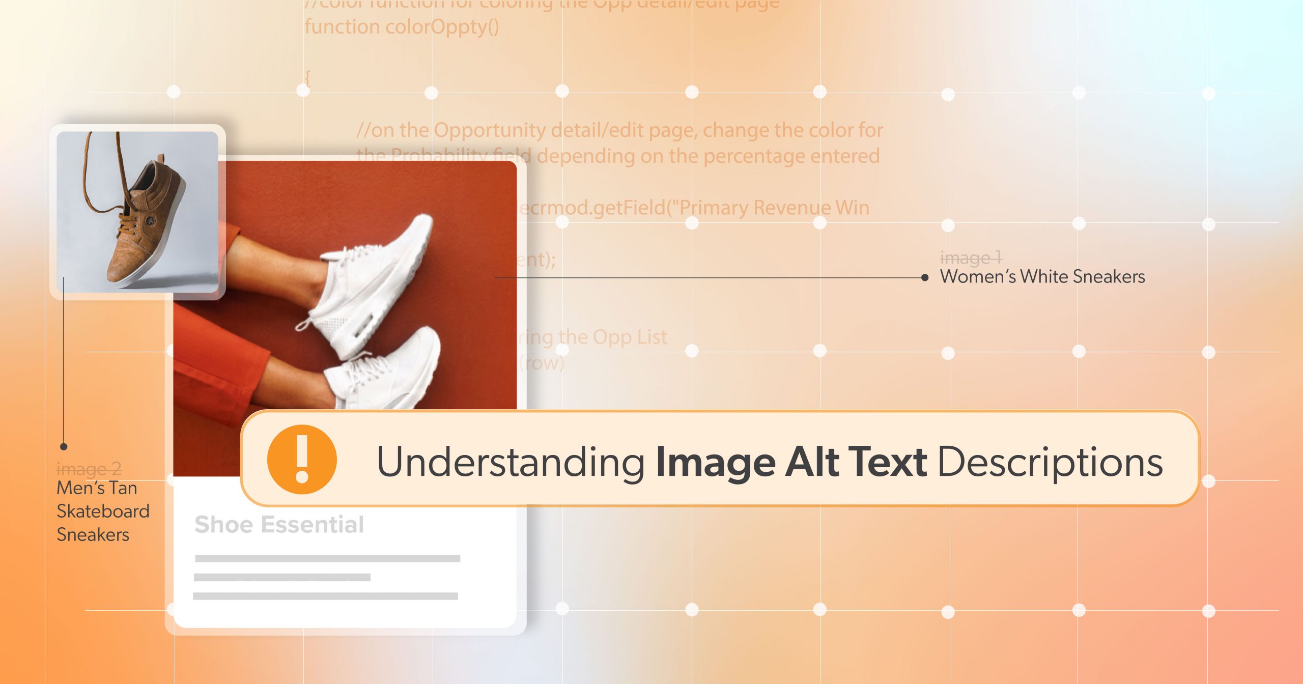
  • Understanding Image Alt Text Descriptions

    Understanding Image Alt Text Descriptions

    Even though digital transformation is progressing rapidly, many online businesses still lag behind in making their websites accessible to people with disabilities. This is partly due to a lack of awareness or technical knowledge of different accessibility issues and how to solve them. 

    In this article, we will cover one of the most common accessibility barriers — providing alternative text descriptions for images. When done correctly, alt text can paint a complete picture for people who cannot perceive images visually. Unfortunately, many content creators and developers forget to provide alt text or write something that doesn’t quite hit the mark. 

    So, what exactly is Image Alt Text, and how should you integrate it into your website?

    What is Alt Text?

    Image alt text, also called image alternative text descriptions, is the written copy that appears in place of an image on a website if the image fails to load on a user’s screen. This text can also help screen-reading tools describe images to visually impaired users and allows search engines to better crawl your website.

    Alt text should be brief but vivid enough to clarify the image’s content to someone listening to the description. This includes any information contained within graphs or charts. Well-written alt text doesn’t just describe a photo but also communicates its purpose and context. 

    But how do you add alt text to images?

    How to Add Alt Text to Your Images?

    Image Alt Text is the descriptive text that is included in a website’s foundational HTML code to describe an image on a webpage.  

    However, adding Alt Text to images varies slightly depending on your web-building platform. Generally, when you upload a photo, there should be an ‘Alt Text’ or ‘Alt Description’ field where you can input your description. 

    For HTML users, you can add Alt Text to an image by including the ‘alt’ attribute within the ‘img’ tag:

    <img src="example.jpg" alt="A description of the image">

    Suppose you use a Content Management System (CMS) like WordPress. In that case, there’s a designated field for image optimization where you can create and change the image’s alt text.

    When Should I Use Alt Text?

    According to the World Wide Web Consortium (W3C), all images must have a text alternative that describes their function or the information they represent. However, that doesn’t mean every image should be treated the same.

    Follow these rules when writing alt text:

    1. Images of Text

    Does the image contain text?

    If readable text is presented within an image, the text alternative must contain every word in the image. However, it’s essential to mention images with text should be avoided, except in the case of logos.

    2. Functional Images

    Is the image used in a link or a button, and would it be hard to understand the function if it wasn’t there?

    Suppose an image is used as a link or button. In that case, the alt text must describe the functionality and destination, if it doesn’t already from the text or graphical content. For instance, a button to “download in App Store” image link would have an alternative text description stating: “Click here to download the Bittrex app on the App Store.”

    3. Informative Images

    Does the image contribute meaning to the current page or context?

    Informative images are images or illustrations that convey vital information to the context of information surrounding them. The text alternative for these images should include the image’s essential information. The description should be colloquial as if you are explaining it to someone sitting next to you. For example, suppose an image is of a truck driving. In that case, the alternative text should state: “A truck driving over rough terrain”.

    However, complex images such as infographics or diagrams used to convey data or detailed information should have a complete text equivalent to the data or information provided in the infographic or chart.

    4. Decorative Images

    Is the image purely decorative or not intended for the user?

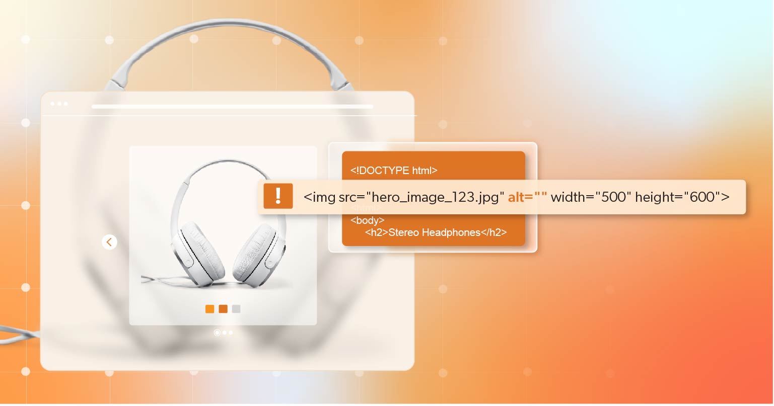
    If an image’s only purpose is to add visual decoration, it does not require alt text. However, the image must then be explicitly marked as presentational so that it is ignored by screen reading software. It must still have an alt attribute, so give it “null” alt text, which is an alt attribute with no value, as seen below:

    <img src=”../img.jpg” alt=”” />

    Need help with how to treat a specific image? The W3C has developed an alt text decision tree to help you determine the right approach depending on the image’s purpose.

    Image Alt Text Best Practices

    Ultimately, image alt text needs to be specific and representative of the topic it supports. Just adding alt text isn’t enough. It’s essential to ensure it’s effective. 

    Here are some best practices to follow:

    Describe an Image and Be Specific

    Alt Text should accurately represent the content and function of an image. Use both the image’s subject and context to guide you. For example, instead of writing “dog” for an image, use a more specific description such as “A golden retriever playing fetch in the park.”

    Avoid Redundancy

    It might seem like a helpful cue, but remember not to include phrases like “picture of” or “image of” in your alt text. Screen readers and Search Engines will know from the preceding HTML tag to announce the alt text as an image. Including these phrases in your description will only disrupt the user’s experience and waste valuable characters.

    Write for People, Not Search Engines

    Many content creators make the mistake of trying to stuff keywords into their site’s alt text. While it’s true that alt text can contribute to SEO, your priority should be accessibility and user experience. If you can naturally fold a keyword into your alt text, excellent. But don’t fall into the trap of treating alt text like an SEO tool.

    Review for Spelling Errors and Punctuation

    Like all website content, proper punctuation makes information easier to understand. Ensure that your alt text is free of mistakes for a professional and clear description.

    In addition, when hiding decorative images, you should be aware of spacing when using a null or empty alt text. If there is a space between the quotes, assistive technologies may still pick it up as alt text, confusing the user.

    Image Alt Text Example

    Alt text that doesn’t appropriately describe the image and its purpose could prove detrimental or puzzling to website users relying on assistive technology.

    Follow alt-text best practices, and you’ll get a feel for what needs to be said. A more detailed description may be beneficial. However, there are instances when it can be redundant. Consider the example below.

    Cleveland Ohio's Detroit-Superior Bridge at night

    Bad Alt Text

    <img src= "example.jpg" alt="a city's bridge at night">

    The line of alt text above is technically descriptive — but it does not describe the image in a meaningful way for the user. Yes, the photo above shows a city’s bridge, and it is night. But this is also a picture of Cleveland, Ohio — and the Detroit-Superior Bridge. These are essential specifics that your users might need to comprehend the image if it’s on, say, a blog post about Cleveland landmarks.

    Good Alt Text

    With context in mind, a better alt text for this image might be:

    <img src= "example.jpg" alt="Cleveland Ohio's Detroit-Superior Bridge at night">

    Why is Image Alt Text Important?

    We’ve already alluded to several reasons why image alt text is essential. However, understanding these reasons will help you write the best alt text possible for your users. Below we’ll look at the significant reasons image alt text is essential.

    Web Accessibility and User Experience

    Image alt tags allow screen reader users to understand what is happening on a webpage besides the written basic text. Images may be the only form of instruction for some websites or other digital assets. Without alt text, these users may miss out on the information conveyed through images, affecting their overall site experience. It is, therefore, a key component in meeting the  World Wide Web Consortium (WCAG) success criteria for image alternative text descriptions. 

    Ignoring these standards could lead to potential legal consequences due to non-compliance with the Americans with Disabilities Act  (ADA). Such non-compliance limits your website’s audience reach and could result in lawsuits or hefty fines. Hence, incorporating alt text in your website design is an inclusive practice and a legal imperative.

    Search Engine Optimization

    Search engines like Google, unable to visually understand images, rely on Alt Text to determine their content. This information helps them provide relevant results for image searches, significantly boosting your website’s visibility.

    However, while Alt Text can contribute to SEO, it should not be used to manipulate search rankings by overstuffing keywords. Google can penalize such practices, leading to a decrease in your overall SEO performance.

    Learn more about Web Accessibility and SEO Optimization: A Powerhouse Combination.

    Take the Next Steps Toward Accessibility

    In a digital era where inclusivity and accessibility are of utmost importance, alt text is a vital tool for website owners and developers. If, until now, you were not aware of the importance of image alt text, don’t stress! You can add these elements at any time to increase the accessibility of your website. 

    If you’d like to talk further about your web accessibility initiative, Schedule a Complimentary ADA Strategy Briefing with the experts at 216digital. We will help you take the steps towards web accessibility on your terms by developing a strategy to integrate WCAG 2.1 compliance into your development roadmap.

    Remember, alt text is not just an option—it’s an essential step in building a successful and accessible online presence.

    Greg McNeil

    July 10, 2023
    How-to Guides
    Accessibility, ADA Compliance, ADA non-compliance, ADA Website Compliance, Alt text, Image Alt Text, Website Accessibility, Website Accessibility Tools
216digital Scanning Tool

Audit Your Website for Free

Find Out if Your Website is WCAG & ADA Compliant


    216digital Logo

    Our team is full of expert professionals in Web Accessibility Remediation, eCommerce Design & Development, and Marketing – ready to help you reach your goals and thrive in a competitive marketplace. 

    216 Digital, Inc. BBB Business Review

    Get in Touch

    2208 E Enterprise Pkwy
    Twinsburg, OH 44087
    216.505.4400
    info@216digital.com

    Support

    Support Desk
    Acceptable Use Policy
    Accessibility Policy
    Privacy Policy

    Web Accessibility

    Settlement & Risk Mitigation
    WCAG 2.1/2.2 AA Compliance
    Monitoring Service by a11y.Radar

    Development & Marketing

    eCommerce Development
    PPC Marketing
    Professional SEO

    About

    About Us
    Contact

    Copyright 2024 216digital. All Rights Reserved.