AI is everywhere right now. It’s drafting blog posts, churning out social captions, even scanning websites for compliance issues. And if you’ve been keeping up with the hype, you’ve probably noticed one claim in particular: that AI can solve accessibility.
For a business moving at full speed, that promise sounds almost too good to pass up. Install a plugin, run a scan, check a box—done. But accessibility doesn’t work like that. These tools can point out some issues, sure, but they rarely fix the barriers that actually keep people with disabilities from using your site, your app, or your documents. The cracks stay hidden under a shiny patch.
And those cracks matter. Real people get shut out of digital spaces. Companies expose themselves to lawsuits and financial hits. And maybe most importantly, the bigger goal—building technology that works for everyone—keeps getting delayed.
This article takes a closer look at what AI tools really can (and can’t) do, and why waiting for automation to “catch up” is a risky bet. More than that, it gives you practical steps to start building accessibility into your digital strategy today—steps that create lasting, meaningful change.
AI Is Exciting—but Not a Magic Bullet
AI tools like AudioEye can scan sites, flag issues, and apply quick fixes in real time—like adding alt text, adjusting color contrast, or correcting heading levels. For busy teams, it feels like a shortcut to digital inclusion.
But here’s the reality check: research shows AI accessibility tools typically catch only 20–30% of issues. That leaves a massive gap—and it’s a gap with real consequences for users who can’t access your content, and for your legal risk.
What AI Accessibility Tools Miss
Most AI accessibility tools and overlays don’t actually fix your code. They act like a layer on top of your site, attempting to correct problems as the page loads. The underlying barriers remain in your codebase, breaking accessibility where it matters most.
Here are some of the common issues AI often misses or misinterprets:
- Missing headings that prevent screen reader users from navigating efficiently.
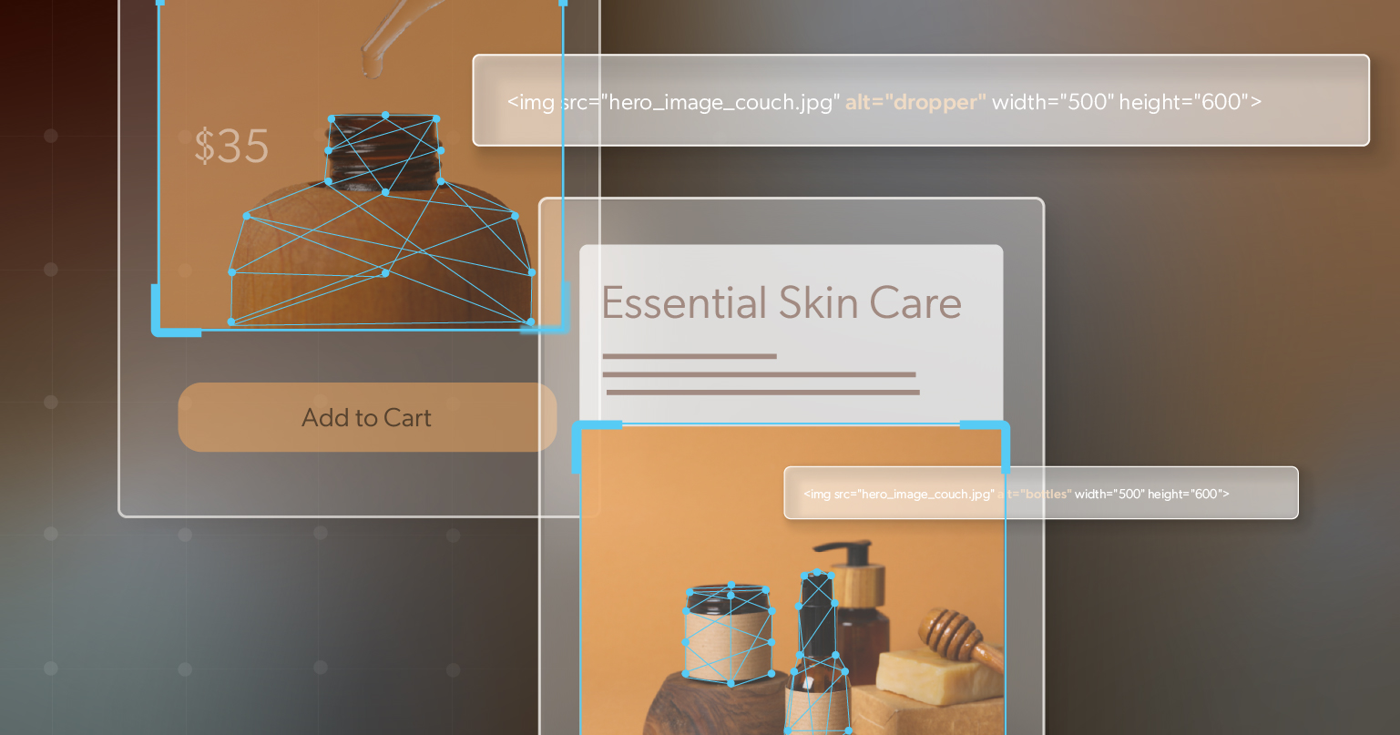
- Images with no alt text—or worse, incorrect auto-generated descriptions that mislead rather than help.
- Links with vague text like “click here” that don’t explain their purpose.
- Form fields with no labels, making it impossible for assistive tech users to complete them.
- Required fields that aren’t marked as required.
- Submit buttons with no clear labels, leaving users stuck at the finish line.
These aren’t minor hiccups—they’re major roadblocks. And they can’t be “patched over” by automation.
Even more importantly: AI doesn’t know how real people use your site. It doesn’t test whether your video player works with voice commands, whether your interactive map is navigable by keyboard, or whether your carousel is usable for someone with limited dexterity. Human judgment and lived experience are irreplaceable.
AI Might Improve—Eventually
Will AI accessibility tools improve? Absolutely. At some point, automation may be able to deliver more accurate fixes, faster and at scale. But that capability is years away—not weeks. Your users and your legal obligations can’t wait for that future to arrive.
Legal Risk: You’re Responsible Today
Accessibility laws don’t include a “wait until AI gets better” clause. The Americans with Disabilities Act (ADA), the European Accessibility Act (EAA), and Canada’s AODA all require accessible digital content right now.
And the lawsuits are growing: in 2024, more than 4,000 ADA Title III lawsuits were filed in the U.S. alone. By the end of 2025, experts expect nearly 5,000. In the first quarter of 2025, nearly 200 suits specifically targeted companies that relied on overlays or AI accessibility tools to claim compliance—claims that didn’t hold up in practice.
High-profile cases underscore the risk. In January 2025, the U.S. Federal Trade Commission fined accessiBe $1 million for deceptive claims that its AI product guaranteed WCAG compliance. The reality: it didn’t. And regulators, courts, and customers are paying attention.
Accessibility Pays: Beyond Risk Avoidance
Avoiding lawsuits matters, but accessibility is also an opportunity. About 20% of the global population lives with a disability. That’s one in five potential customers who may face barriers if your site isn’t accessible.
Accessibility also improves usability for everyone:
- Captions help not only people with hearing loss but also those in noisy environments.
- High contrast improves readability in bright light or for anyone with color sensitivity.
- Clear link text and consistent layouts make navigation easier and faster for all users.
These changes lead to stronger customer loyalty, better SEO, and a brand reputation for being inclusive and trustworthy. Accessibility isn’t just compliance—it’s good business.
How to Act Today—Practical Steps
If automation isn’t enough, what’s the path forward? The good news: it’s clear and manageable.
- Test manually: Explore your site with assistive technologies like screen readers or voice navigation. Even better, involve people with disabilities in your testing process. Their feedback reveals barriers no scan will catch.
- Use automation wisely: Scanners and overlays can still help identify issues like missing alt text or low contrast. Just remember: they’re helpers, not full solutions.
- Adopt a hybrid model: Combine automation with human-led testing and remediation. Let AI handle repetitive checks, and let experts ensure usability and compliance.
- Integrate accessibility into your process: Make it part of everyday workflows—design, development, content creation, and media production. Fixing accessibility at the source saves time, money, and stress.
Accessibility becomes much easier when it’s built into how your team works every day.
Looking Ahead
The future of AI accessibility tools is promising, but they’re not a replacement for human insight. Even as AI advances, accessibility will still require oversight, inclusive design, and empathy for how people actually use technology.
For now, the choice is clear: don’t wait. The risks are here today, but so are the opportunities to create better digital experiences. Even small improvements—like labeling form fields or ensuring captions—make a real difference.
By acting now, you reduce legal risk, improve usability, and position yourself to take advantage of AI when it’s truly ready.
Ready to get started? Schedule an ADA briefing with 216digital to see where your digital content may fall short. Learn which tools can help, what requires expert attention, and how to build accessibility into your roadmap. Clear guidance, no hype—just a realistic plan for moving forward with confidence.