Miva Retro ReadyTheme Customization: Tailored To Your Needs!
Miva users know that Miva is the ecommerce world’s best-kept secret. With Miva now offering responsive ReadyThemes free with every license, it’s easier than ever to put a functional, beautiful skin on your Miva store. In fact, most of our clients agree: Miva ReadyThemes really nail it after just a little customization.
Bee Bald Man Care Products sells skin care products for the head. Their products offer incredible value for bald and non-bald men alike. But men aren’t the only ones who love Bee Bald; women use their products, too. Bee Bald has a developed a great brand. Clearly, they needed a great website to match.
When Bee Bald came to us for a redesign, we knew that the Miva Retro ReadyTheme was perfect—well, nearly perfect. Bee Bald founder Dennis Fisher wanted to make a few changes to the theme. He had some ideas on how to optimize this theme for his business, and we were happy to help. The fact is, a pre-loaded theme is rarely a perfect fit for a business owner’s vision. Every business is unique, and themes are designed to please a wide user base. Bee Bald needed something unique. We agreed that Dennis had some great ideas to take his online store to the next level.
So how did we take the Bee Bald store to the next level? Let’s dive right in.
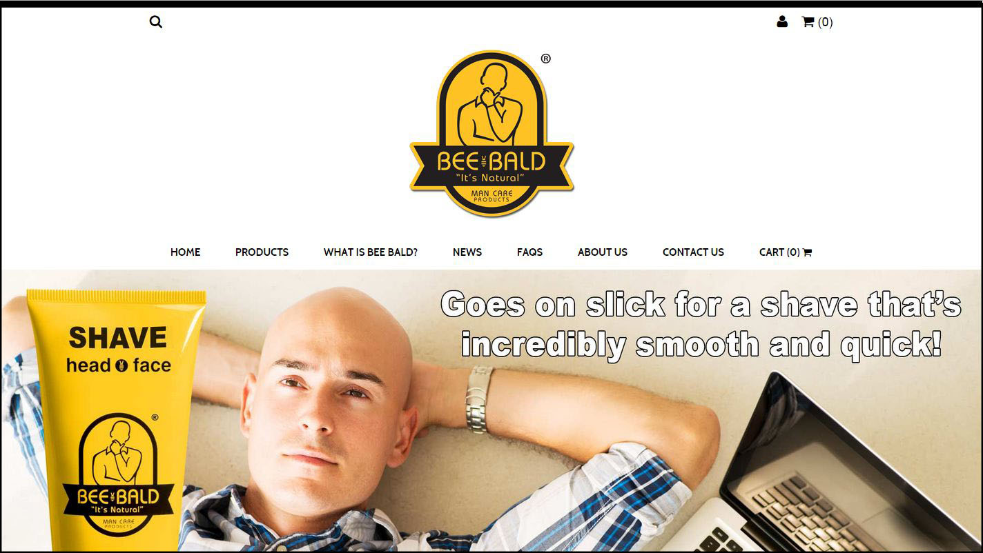
Dennis liked the Retro ReadyTheme overall. “As a template, it was great,” he says. “But it’s not all things to all people.” Specifically, he wasn’t happy with the theme’s homepage layout. The stock layout was functional and looked great, but that functionality didn’t quite fit his product line. We adjusted the homepage product offering template, replacing the stock configuration with a product carousel. We also tweaked the colors and the copy to match Dennis’s specifications.
As you can see, the resulting Bee Bald homepage looks stunning. Dennis has developed an amazingly cohesive brand—one that really sells his product to his niche. Clearly, Dennis’s design decisions were one key part of building that awesome brand. Honestly, we think a lot of marketers could take a cue from Dennis.
It’s obvious that a great ecommerce design appeals to online shoppers. However, a great design coupled to a cohesive brand also makes a great impression on other businesses. In Dennis’s case, as he hammered out relationships with distributors the old-fashioned way, his website turned into a stellar asset. Dennis could throw someone a link with confidence, knowing his website design would showcase the excellent quality of his product line.
Responsive Web Design: Critical In Today’s Ecommerce Market
Ouch. Looks like non-responsive design. (Original photo courtesy of Jan Vašek; modified by 216digital.)
Dennis was getting a lot of mobile traffic on his old site, but mobile users weren’t converting. Dennis thought that mobile users were leaving the site because it wasn’t resizing to the small screens of phones. We agreed—and the same is true for all non-responsive sites today. If you’re not serving pages optimized for mobile devices you’re losing sales.
For ecommerce store owners, mobile website design isn’t an option. It’s a necessity.
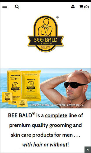
The Retro ReadyTheme is fully mobile responsive out of the box. However, when you add custom extensions to a responsive theme, you have to ensure that the customizations look great on mobile, too. Dennis needed a store locator module for his site. We integrated a powerful store locator module into the new Bee Bald site—but we knew that that alone wasn’t enough. We made sure the store locator module was fully mobile responsive and integrated into the look and feel of the theme. That way, customers could find a Bee Bald store on the go—and they wouldn’t be distracted by a clunky store locator experience.
Bee Bald looks great on mobile.
We believe it’s the little things that count, so we also tightened up the overall look of Dennis’s Retro ReadyTheme installation. These incremental changes added up to a great overall brand impression—on mobile and on desktop.
The Cleveland Connection: A Local B2B Partnership
photo by: Rick Harris
An entrepreneur often wears all the hats. When Dennis started gearing up for the launch of Bee Bald, he was learning about the ecommerce world from scratch. Since the technical aspect of ecommerce was so new to him, he realized only shortly before launch that he needed to make changes to the proposal he’d submitted to his developer. The developer was local to the Cleveland, OH area, but they weren’t quite prepared to deal with the nuances of changing a Miva project on the fly. While Dennis’s relationship with his original developer had showed initial promise, he began to realize it wasn’t till-death-do-us-part. He needed a dedicated Miva developer.
Enter 216digital. Justin Sims, our lead web developer, took over Dennis’s project. When we asked Dennis to reflect on his experience with us, we could hear the genuine appreciation in his voice. “Justin did a terrific job,” Dennis said. “He was accessible and responsive. He helped streamline the process.” Now that’s an aspect of responsive web design that you don’t hear about every day—responding right away to a client’s needs and concerns.
In the process of working with us, Dennis learned a lot about Miva. We didn’t keep any secrets from him. Dennis can now perform many store updates himself, meaning we’re billing him less. A lot of companies wouldn’t do that. Why give away the secrets that build value into your services? We simply don’t see it that way. Dennis is our client, and it was our job to build the best ecommerce tool we could for him. Dennis was equipped to learn Miva, and we were happy to teach him.
The Bottom Line
At 216digital, we have a passion for all things Cleveland. Cleveland beers, Cleveland sports teams, we’re 216 all the way. (That’s the area code around here, by the way.) It was exciting to help a Cleveland-area entrepreneur achieve his business goals.
Of course, our clients come from all over. If you aren’t from the Cleveland area, we’ll show you the Cleveland work ethic as we create a stellar ecommerce site for you. So, when you’re ready to start that next project, remember 216digital. With 15 years of experience as a Miva certified partner, we can make your Miva ReadyTheme nail it!
Best Ecommerce Platforms for 2015 – Pt. 2 – Shopify
If you search Google for “ecommerce platforms,” you’ll find a lot about WooCommerce, Shopify, Magento, and Bigcommerce. If you do a little digging, you might find Miva, a longstanding ecommerce platform that’s not as well-known. Each platform has its own selling points and drawbacks. For some businesses, hidden drawbacks to any given platform may eventually overshadow that platform’s selling points. In this in-depth series, we’re examining the benefits and drawbacks of 5 major ecommerce platforms. In Part 1, we talked about WooCommerce. In Part 2, we’ll look at Shopify. Let’s dive in!
Shopify:
Shopify is a major player in the ecommerce game. With 150,000 active stores, Shopify is responsible for an incredible amount of online commerce. Shopify offers a range of responsive themes, Paypal integration, blogging functionality, a CMS (content management system) and a fairly basic abandoned cart email integration. In that regard, Shopify is generally competitive among ecommerce platforms. However, Shopify has some serious drawbacks which entrepreneurs should consider before committing.
Watch out for those transaction fees!
The biggest problem with Shopify is its transaction fee schedule. This is tied to your choice of payment gateway. If you go with Shopify’s own gateway, Shopify Payments, you’ll be charged 1.8%-2.4% plus $0.30 on every transaction. The percentage charge depends on your plan tier. If you want to use Shopify Payments, you’re in luck. But if you want to integrate with a 3rd party payment gateway, you’ll pay two transaction fees every time you make a sale: one to your 3rd party, and one to Shopify itself. In this scenario, Shopify’s fee goes down to 0.5%-2.0%, depending on your plan tier. Keep in mind that you’re already paying Shopify for the software and hosting. If you’re considering Shopify, you should really crunch the numbers on your projected sales and margins and see how this all adds up.
Shopify’s discount functionality is also limited. The only discounts you can apply are percent off, dollars off, and free shipping. Clearly, these are the most common discount types; but what about scenarios where you need a different type of discount solution? Miva’s built-in discount functionality is far more robust. Without add-ons, Miva offers volume pricing, add-on products, basket discounts, buy product X and get product Y, product discounts, and two types of shipping discounts—entire order, or per-product.
Some developers have claimed that Shopify’s code is not lightweight. Shopify contains in-line javascript at the beginning of the page. Experts generally recommend using external javascript or putting it at the end of the page. Note that Miva in stock configuration has no in-line javascript at the beginning of the source code.
Shopify gives you two shipping methods out of the box. However, carrier-calculated shipping rates aren’t available in any plan below the $179/month tier. This puts smaller operations at a disadvantage. In Miva, shipping options are in no way tied to your website hosting setup.
Overall, Shopify provides a good value to startups and small online stores that don’t need unlimited functionality and have big enough margins to take the transaction fees. Shopify is feature-rich, and those features will work just fine for many smaller operations. However, the limitations we discussed could hamper a store that starts to take off. That’s a key question that entrepreneurs should ask themselves when considering an ecommerce platform: will this software still serve me well in 3 years? In 5 years? In 10 years? And in the case of Shopify, as business grows, how will those transaction fees add up over the years?
The Bottom Line
Shopify offers excellent functionality and features. However, its transaction fee schedule represents a serious drawback for businesses doing larger sales volumes. In this regard, Shopify is more suited to small operations that will stay small. For larger operations, or for fast-growing stores, Miva and Magento offer more freedom and flexibility and have no inherent transaction fees. Note, however, that they may be more expensive than Shopify to get off the ground.
Best Ecommerce Platforms for 2015 – Pt. 1 – WooCommerce
Google “eCommerce platforms,” and you’ll probably find a lot about WooCommerce, Shopify, Magento, and Bigcommerce. Dig a little deeper, and you might find a longstanding platform called Miva. Each of these platforms has its strengths and weaknesses. For some businesses, the weaknesses of any given platform may heavily outweigh that platform’s strengths. In this in-depth series, we’ll take a look at the benefits and drawbacks of 5 major eCommerce platforms. We’ll also look at what kind of business each platform is most suited for. As one of the Top WooCommerce Developers, we’ll be kicking things off with our analysis of the WooCommerce platform.
WooCommerce: Great For Startups With Small Budgets
WooCommerce is an online shopping cart plugin for WordPress. As such, WooCommerce can only run on WordPress installations. WordPress is the web’s most popular blogging platform and content management system, and it’s only gotten better in the last few years. With the WooCommerce plugin installed, it’s a great option for anyone just starting out in online selling.
The WooCommerce plugin itself is free, making it even more optimized for startups with low budgets. However, the free plugin lacks some extensions. Certain shipping options, payment gateways, extension of product fields, and other functions require add-ons. Some of these plugins are free, but most require a purchase. For more complex online stores, WooCommerce isn’t free at all, due to the number of plugins that must be licensed.
Because WooCommerce was developed by WooThemes, it allegedly runs best on one of their WordPress themes. Most of those aren’t free. Because the plugin is open-source, WooCommerce users do not have access to phone or social media support. However, users who purchase a WordPress template from WooThemes do have access to the company’s support forums.
For simple operations, and for entrepreneurs with simple requirements and zero budget, WooCommerce can’t be beat. However, for larger stores and established operations, WooCommerce can’t provide the full functionality and flexibility of Miva or Magento. Magento requires extensive 3rd party development to reach the level of functionality that larger ecommerce firms will require. Miva requires less development to get a new store to market, but it may still require some, depending on the new store’s business model. Though development costs more than plugins, larger stores see the value in having storefronts, checkout procedures, and product features optimized to their exact market needs. Because WooCommerce is WordPress-based, WooCommerce users depend on existing plugins to modify site functionality. In Miva and Magento, the possibilities are almost endless.
The Bottom Line:
WooCommerce is great for simple operations and low-budget startups. However, it doesn’t have the extensibility of larger and more expensive platforms like Miva and Magento. As such, it may not be suitable for low-budget startups with complex storefront needs. But for bloggers who already use WordPress and want to start a basic online store on the same domain as their blog, WooCommerce is perfect.
Miva Suivant ReadyTheme Customization: The Sky’s The Limit!
If you use the Miva shopping cart platform, or if you’re looking to start a Miva store, you’ve probably heard of Miva ReadyThemes. These themes offer beautiful, functional styling right out of the box. However, they look even better with a little customization. Here at 216digital, we regularly customize Miva ReadyThemes for our clients. One of our favorite recent projects was a redesign via ReadyTheme for D’Andre New York, a seller of fine shearling coats. In this post, we’ll talk about that project and explain the Miva Suivant ReadyTheme customization that we performed.
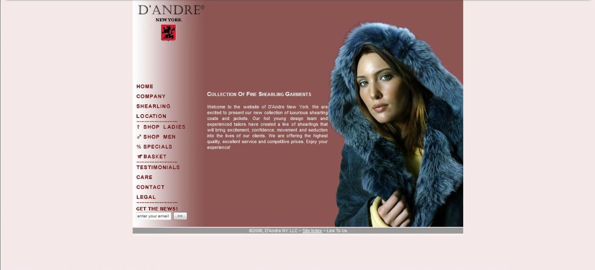
D’Andre New York: A Great Product Deserves a Great Website
D’Andre New York sells fine shearling coats. These jackets feature beautiful, understated styling. Since they’re made of real wool, the moisture-wicking property of the material gives the wearer natural climate control. That means shearling coats can be worn comfortably in summer or winter. With this natural flexibility and their finely-tailored lines, shearling jackets are the pinnacle of outerwear style. Of course, high quality comes with a price tag. Shearling jackets typically range in price from $1000 to $3000.
D’Andre New York’s target customer is affluent, style-conscious, and expects high quality. If the product itself delivers on all these—which it certainly does—then shouldn’t the website that sells the product display that same excellence? That was our reasoning, and Tatiana, owner of D’Andre, agreed. She wanted a redesign of her website, something that would showcase the beauty, durability, and value of her shearling products.
D’Andre’s Legacy Site
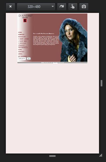
D’Andre New York’s old site had excellent functionality, and it had served the business well for years. However, the site was built in the days of low-resolution screens, and it looked a little small on today’s larger monitors. Worse, the site was built long before the mobile responsive revolution. It was awkward and cumbersome to use on a mobile device. With more and more customers shopping and purchasing products directly from their phones, D’Andre stood to lose out on potential business. With each sale worth a few thousand dollars, D’Andre needed to convert every prospect who came their way.
D’Andre New York’s legacy site in mobile simulation. Get ready to zoom and scroll!
It wasn’t just the resolution and lack of mobile responsiveness that worried us. D’Andre sells a fine product to an affluent market. We believed that D’Andre’s old site didn’t quite convey the level of luxury and comfort that wearers could expect from a shearling jacket. We thought the site ought to display the excellence that D’Andre’s shearling coats provide. Clearly, it was time for a redesign.
Miva Suivant ReadyTheme: Almost Ready To Rock And Roll
Miva ReadyThemes give Miva store owners beautiful, functional online stores right out of the box. But as with all cookie-cutter solutions, ReadyThemes leave a bit to be desired in the details. A little customization takes a Miva ReadyTheme to the next level. D’Andre New York had chosen the Miva Suivant ReadyTheme. We agreed that this theme was perfect for a retailer of fine shearling jackets. It just needed a few tweaks.
For starters, the Miva Suivant ReadyTheme has a large header. This isn’t necessarily a problem—except that by default, that header anchors to the top of the screen when the user scrolls. It’s not too noticeable on desktop, but on a mobile device, that pinned header eats up a lot of real estate. For every client using the Suivant ReadyTheme, we routinely recommend customizing the header. In D’Andre’s case, we changed the header so it wouldn’t stick to the top of the screen. We reasoned that users know where the header is. They know to scroll up if they need to use the navigation bar. This change significantly improved the user experience of D’Andre’s new website.
The header wasn’t the only tweak that the Suivant ReadyTheme needed. With the ongoing evolution of SEO (search engine optimization), Google now values good content more than ever, and many web users find value in useful, informative content. Blogs and magazines can display the entirety of a piece of content without compromising other organizational goals. However, in an ecommerce setting, selling product is critical. Too much content on a product or category page could keep the all-important buy buttons hidden from site visitors. Yet content is critical for SEO! What’s a webmaster to do?
For all our clients doing customized ReadyThemes, it’s a simple fix. We custom-code an option to display the first 150 characters or so of the content, followed by a “read more” button. This gives us the best of both worlds: 300+ word content for SEO purposes (and for those readers who want to educate themselves fully), and product imagery and buy buttons still displayed above the fold for users who are close to making a purchase. For D’Andre New York, this solution was a no-brainer.
Optimizing D’Andre’s Onsite Content
Speaking of content, it’s one of the most important components of branding. Content that doesn’t convey the right brand impression negatively affects marketing. In the case of D’Andre New York, we recognized at once that Tatiana’s great luxury brand needed content that created an opulent, luxurious impression. With Tatiana’s permission, our SEO content writing team began writing new copy for the D’Andre website.
Our process was simple. We researched other luxury brands, such as Rolex and Mercedes-Benz, to get a feel for the appropriate voice and tone. We settled on two points of focus for D’Andre. For Tatiana’s women’s collection, our content revolved around the word “elegance.” For the men’s collection, we chose the word “achievement.” These words matched D’Andre’s brand perfectly. With these two ideas in place, the rest of the content flowed. The result was a unique, memorable brand identity in all D’Andre’s onsite content.
Image Optimization: A Key Element In Ecommerce Marketing
Customers want to see what they’re buying. In the case of D’Andre’s fine shearling coats, customers want to see not only the overall look of the jacket, but also the elegant details of accents and trim. With D’Andre’s old site, product images looked small on larger screens, preventing customers from getting a complete picture of the jacket they were considering. Every product image on the site existed in two separate files: a tiny thumbnail version, and the full-sized version. Since the thumbnail had to be created manually in an image editor, and since both images had to be uploaded manually, the old system required double the work on catalog updates.
Enter the Miva Image Machine. This state-of-the art functionality dynamically creates multiple image sizes from one image file, eliminating the need to create thumbnail sizes manually and upload them separately. The Image Machine also allows alternative images. These show up as thumbnail images below the main image on a product page. Users can click on any of these alternative images and view the full-sized image in a popup. This allows store owners to provide multiple views of a product, giving customers a sense of what the product looks like from different angles.
The Bottom Line
We saw at once that Tatiana’s company offered a great product. We wanted to improve the overall value of her brand by optimizing the impression her company made on web visitors. With a little Miva Suivant ReadyTheme customization, Tatiana’s redesign was ready to go, clearly communicating the luxury and style that customers could expect from D’Andre New York.
It was a pleasure to work with Tatiana. Through deep market analysis and ongoing communication, we formed a partnership with her to improve the marketability of her brand. We think you’ll agree—the new D’Andre New York website looks beautiful, fully matching the luxury and elegance which D’Andre offers its customers.
If you’re considering a responsive Miva design for your ecommerce store, get in touch with us today. We specialize in Miva design and development, and all our work is fully mobile-responsive. Whether you need tweaks to a Miva ReadyTheme or a ground-up custom design, we’ll turn your vision into a reality. Drop us a line, and let’s start talking about your next big thing.
The 216digital team recently traveled to San Diego, California for MIVACON 2015! There were high expectations for the longest running ecommerce event of its kind and it absolutely delivered. We met with ecommerce experts, sat in on keynote presentations, and above all networked. With the abundance of information being shared, it can be hard to decipher the important information from the blah blah. Lucky for you we’ve taken the time to highlight 5 key takeaways, and spell out how they are going to affect your business.
1. The Death of Sebenza
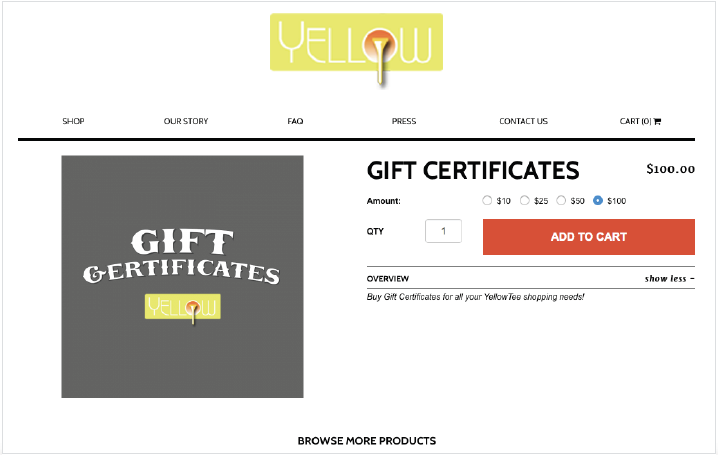
We’re very sorry for your loss, but if your Miva Store uses any Sebenza modules then you need to take immediate action. Sebenza will no longer support or update their modules including:
Gift Certificates
Coupons Reviews & Ratings Module
Points
Category Template Manager
Product Template Manager
Many older third party modules are now being replaced with built in Miva functionality. A great example of this is the new Miva 9.0003 update that including gift certificates!
2. Responsive Website Design is no longer a suggestion, it’s a must have
Effective April, 21st the Google Algorithm Update will include responsive (mobile friendly) design into their ranking system. Read up about the mobile-friendly label and responsive design standards. Future-Proofing: Why You Should Go to a Responsive Design
There are so many new pieces of functionality that are coming soon to your Miva store! For example, take a look inside the Miva 9.0003 update, where there was over 40 upgrades to Miva!
Miva 9.0003 Upgrade
Gift Certificates: With the option to create one time offers or bulk gift certificates. Even have gift certificates emailed directly to your client.
Multi- Add to Cart: Customers now have the ability to add multiple items to their cart all at once!
Developer Seats: Gives the developer the option to access and work on multiple online stores at once.
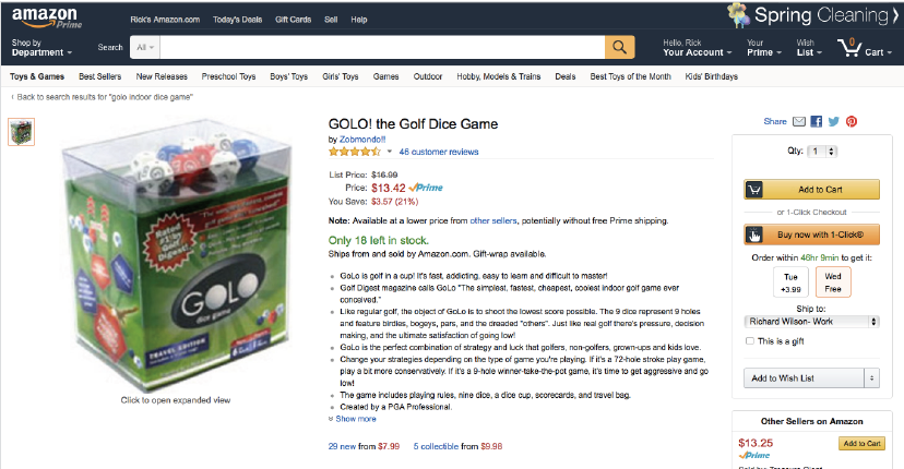
Marketplaces Modules – Amazon: Sell your products on ecommerce marketplaces like Amazon. Orders and inventory are synched and managed from within your Miva Merchant store.
Future Updates
Abandoned Basket Tools
Wish List
Faceted Navigation
Tell a Friend
Address Validation
Rich Text Editor
Customer Management Tool
And Much More
4. Content Marketing
Content marketing was definitely the buzzword amongst presentations at MIVACON15 but Ross Hudgens took content marketing beyond just talk. Here is the slide deck from his presentation
Main points include
Just because you’ve created great content doesn’t mean you’ve succeeded, and neither does just hitting publish
If you want your content to drive SEO, there needs to be a tie-in to links
Every piece of content you put out should include secondary KPIs
Infographics are great from engagement!
5. Conversion Optimization
Getting the most out of the traffic that is already coming to your website, there are a lot of small things that can make the difference.
Define yourself quickly and clearly
Then get them off your homepage
Cater to your visitors with account creation
Only display relevant information, no distractions
Clear call to action
Keep forms at the top of the page
Consolidate form fields at check-out
Now you don’t have the sun kissed – just back from California – look that we have, but you do have some of the knowledge. And that is arguably more valuable.
In case you haven’t heard, having a responsive website is going to be a bigger part of web design moving forward. The common practice in the past was for mobile versions of sites to be given their own subdomain. Essentially, you had two websites with duplicate information and you had twice as much work when you needed to change something. This doubles your development and maintenance costs. It also caused problems when your site was listed in search engines. Now, you could prevent a mobile version of your site from being crawled and listed as a duplicate in search results, then just serve up the mobile version of the site when a mobile browser was detected. However, Google prefers to know exactly what they are serving and a redirect like that is considered bad practice.
Sites with a “mobile version” also had their limitations. They could only support two screen resolutions: desktop and mobile. Using a tablet, you usually ended up with an over sized smartphone version of the site, or you could end up with a desktop version that was still too small. And if you used the built-in browser on your gaming system, all bets were off. It can be tremendously frustrating not only from the side of usability, but also from a design perspective. Good responsive design practice fixes all of this.
Google is trying to unify search results and they have been striving for a consistent user experience across all platforms. For the last few months, websites have been eligible for the “mobile-friendly” label within Google Search results if they use a responsive design. The criteria it uses are things like avoidance of flash and other uncommon software on mobile devices, legible text without zooming, automatic horizontal sizing which is scalable to whatever size screen, and “finger friendly” spacing of links.
This is all great for the end-user, but in the future it could have a big impact on you. Google has been experimenting with the mobile-friendly label in their Search ranking. Sites without a responsive design could be penalized and dropped down the list. It could literally undo the years of hard work on SEO and marketing just by adding a criteria that your site isn’t prepared for.
Luckily, we at 216digital are experts in responsive design and can quickly and efficiently create a responsive version of your website. If you’d like to read more about the mobile-friendly label and responsive design, Google has provided a few resources to help educate you further and we’ve linked them below.
Magento is the most popular shopping cart platform, with around a 26% market share. It’s also used by some of the biggest brands worldwide. But, popularity aside, there are three very strong reasons why you should consider Magento for use on your own ecommerce website.
1. A Flexible and Open Platform. When a piece of software is open source, that means anyone has access to the inner workings of the system. In the case of Magento, this means that there is a huge development community working behind the scenes, and they create all sorts of plug-in modules for it. This also means that help is everywhere and there are plenty of specialists that can modify Magento in nearly any way you need. You can even integrate it with other platforms like payment gateways, inventory and fulfillment platforms, and accounting software. 2. Purpose built. You could use another content management system (CMS) like WordPress. WordPress, after all, underpins nearly one-fifth of all websites served to browsers. But in order to run a store with WordPress, you need to add features with third-party plug-ins. Magento on the other hand comes pre-loaded with the features you need in a webstore. It can also be scaled to suit your needs. You can run a single store with thousands of SKU’s or you can even run multiple storefronts all from a single admin interface. I know that earlier I told you to disregard the popularity of the platform, but it should say something that everyone from small local webstores all the way to multi-national brands like Nike, Samsung, Lenovo, and Nestle find Magento perfect for their online commerce. 3. Optimized for High Performance. Magento is the fastest shopping cart platform available today. Small delays of just a few hundred milliseconds for each customer may seem like nothing, but multiplied over and over with thousands of customers, it can add up and bring a website to its knees. It’s also extremely SEO friendly and supports sitemaps, short URL’s, meta tags, and easily indexable product descriptions. Magento is also optimized for mobile shopping which makes up almost half of all online commerce. HTML5 capabilities and support for responsive design ensure that your site will be future proofed when Google starts to factor in mobile-friendliness in its search engine rankings.
This is just the tip of the iceberg of what Magento can do for your ecommerce store, though. Give us a call or use the form on our contact page to get in touch. We’ll set-up a consultation and run through the all the capabilities and options built into the Magento shopping cart and see what would work best for you.
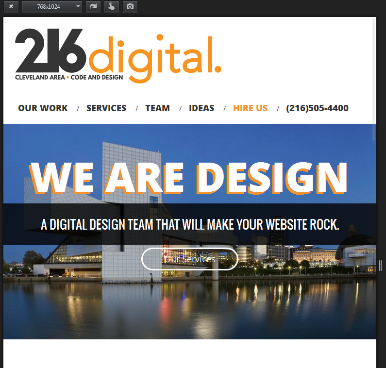
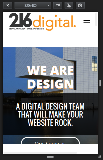
Implementing a responsive web design can have a tremendous impact on the overall custom experience your site offers. As consumers rely more and more on phones, tablets, and other mobile devices to stay informed, stay connected, and shop, it’s more critical than ever that your site utilizes a design that is easy to use on any device. Customers will look for every reason to exit out of your webpage, and if your website is difficult to navigate from a phone, they won’t stay long enough to buy anything and they won’t recommend it to their friends. That’s why making your website as user friendly as possible will work to your benefit, and 216digital is here to help you make it happen.
The mobile view a user experiences on 216digital’s site.
Here we’ve gathered together some reasons why you should seriously consider making your website responsive:
1. Make sure your customers don’t tap dance: One of the most frustrating parts of using a website that isn’t optimized for mobile devices is the tapping and zooming you have to do to get to the content you want. To make things as easy and enjoyable as possible for your customers, you’ll want to make sure that your website’s images and content are properly presented and don’t require the customer to manipulate their device in some awkward fashion in order to make use of it.
2. Make sure your website rankings don’t suffer: Google Webmasters recently released an article stating that “We see these [mobile friendly] labels as a first step in helping mobile users to have a better mobile web experience. We are also experimenting with using the mobile-friendly criteria as a ranking signal.” This means that your website could be hit hard in the coming years if it isn’t mobile friendly. Future-proof your website and don’t be left in the dust!
3. Always think of the customer: Responsive web design isn’t just for customers using smaller, handheld devices. It should also scale-up and conform to fit the screens of larger devices, like televisions, that customers might be using through their gaming systems or other peripherals. By keeping the quality of your customers’ experiences a priority, you’ll be sure to have a website that will respond to all of their needs, no matter the device they are using.
4. Leave the reading glasses at home: If your website isn’t optimized, many times the text is either much too large or way too small to be read easily. And, remember, your customers might be using a larger screen, like a TV, but sitting further away and still not able to read what’s on your site. The whole point of your website is to make it effortless for your customers to breeze through checkout when they decide to buy your product. So, if the site’s text is too small to read, that complication will not bode well for your bottom line. Making sure your text is readable is crucial to success.
The desktop view a user experiences on 216digital’s site.
216digital is here to simplify this whole process for you. Responsive web design is not only helpful, but in light of the ever-widening array of web-enabled devices available to consumers, it’s become absolutely essential. Nonetheless, it can also be time consuming and cumbersome to learn, which is difficult while trying to manage your online business. Let 216digital take responsive web design off your list of worries. Our team of expert designers knows exactly how to build your website to respond to whatever size screen your customers are using, so that you can entice them, no matter the device. Check out some of our work—we think you’ll like what you see.


