216digital.
Web Accessibility

Phase 1
Web Remediation for Lawsuit Settlement & Prevention


Phase 2
Real-World Accessibility


a11y.Radar
Ongoing Monitoring and Maintenance


Consultation & Training

Is Your Website Vulnerable to Frivolous Lawsuits?
Get a Free Web Accessibility Audit to Learn Where You Stand
Find Out Today!

Web Design & Development

Marketing

PPC Management
Google & Social Media Ads


Professional SEO
Increase Organic Search Strength

Interested in Marketing?
Speak to an Expert about marketing opportunities for your brand to cultivate support and growth online.
Contact Us

About

Blog

Contact Us
  • Google AMP Pages for Ecommerce – INFOGRAPHIC

    Google AMP Pages for Ecommerce – INFOGRAPHIC

    Fast-loading product pages could make or break your conversion rate.

    As an independent ecommerce retailer, you know how tough it is to compete with the big boys. Amazon can outsell us all, and they can afford fast-loading mobile functionality at scale. Luckily, independent e-retailers can optimize their experiences to compete—and it’s cheaper than you might think. With the increasing growth of mobile shopping, Google’s AMP project offers a unique opportunity for ecommerce stores to load product, category, and home pages instantly for on-the-go mobile customers. [clickToTweet tweet=”#AMP for #ecommerce means lightning-fast product, category, and home pages. @216_digital” quote=”#AMP for #ecommerce means lightning-fast product, category, and home pages. ” theme=”style1″] Accelerated Mobile Pages (AMP) is an open-source project that aims to kick the mobile web into high gear. AMP was originally intended for publishers, whose sites often load slowly on mobile due to multiple JavaScript queries for numerous ads. But AMP is great for ecommerce, too. Slow mobile load times can kill an ecommerce store. The first pages in the conversion funnel MUST load lightning-fast. You don’t want to blow the customer’s moment of expectation. AMP is the perfect solution. So what does AMP for ecommerce mean? Let’s break it down. amp-infographic2-04

    What is AMP?

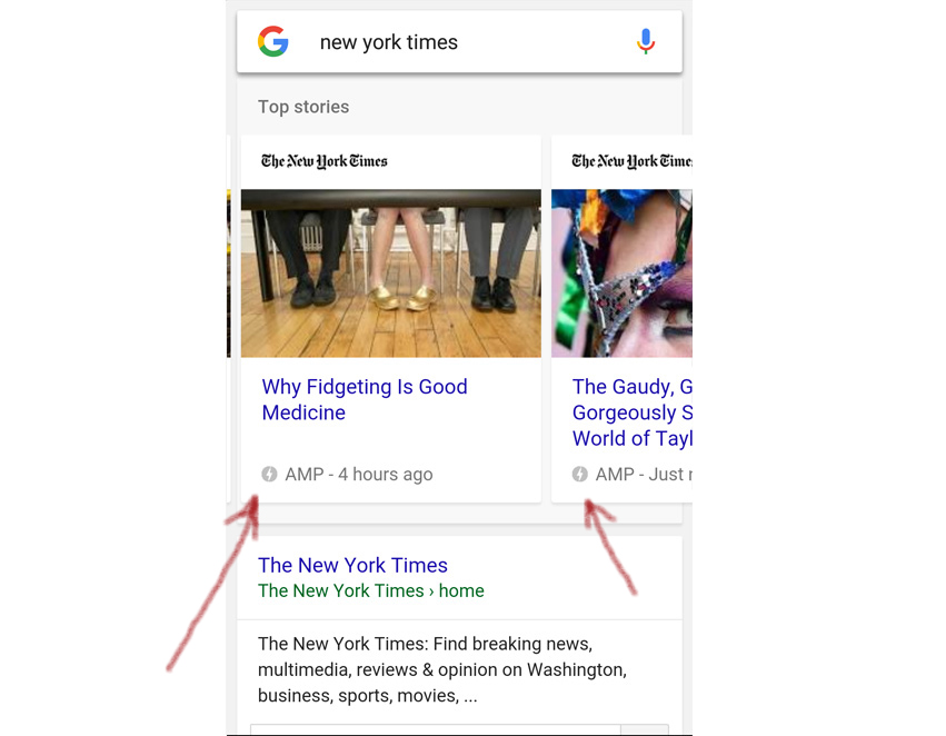
    AMP is an open web standard that cranks up page load on mobile. It uses a limited subset of HTML. It does not allow 3rd party JavaScript, only the AMP JavaScript library, which must be pulled from the AMP CDN (content delivery network). AMP pages are cached and served from a free Google CDN. This combination produces lightning-fast load times on mobile. amp-screenshot2-pencil In mobile search results, AMP pages appear in a carousel at the top of search. They are notated with the lightning bolt symbol and the word AMP. AMP results may also appear below the carousel. “AMP pages are highly distilled versions of the corresponding HTML page,” says 216digital developer Justin Sims. “They’re not as media-rich or as heavy as other pages.” [clickToTweet tweet=”#AcceleratedMobilePages are highly distilled versions of the corresponding HTML page. @216_digital” quote=”#AcceleratedMobilePages are highly distilled versions of the corresponding HTML page. ” theme=”style1″]

    Why is this important?

    As AMP picks up momentum, we fully expect it to become the new standard for mobile development in certain environments. Google reports that it has indexed 150 million AMP pages, and that 4 million new AMP pages are added every week. That’s a fast-growing trend. Since AMP represents a new competitive edge for those sites that use it, it’s critical to adopt this standard early.

    How do I get AMP on my ecommerce store?

    “With any large-scale, widely adopted platform, there will be easy 3rd party solutions implemented,” says 216digital developer Justin Sims. “WordPress and Magento already have premade AMP solutions. At the end of the day, though, there will be a huge difference in quality and effectiveness between manually developed amp pages and those generated through plugins.” In other words, AMP plugins will work for simple situations, but they may not offer the full control which more complex ecommerce stores require. In that case, an experienced developer can help you get the most out of AMP, either with or without a plugin. cta-ampdev-long

    How can I tell if AMP is doing its job?

    AMP supports A/B testing. That means you can gather real data on two or more versions of an AMP page to see what drives conversions and what doesn’t. As Search Engine Land reports, you’ll want to set up Analytics to monitor four dimensions of page performance. Ideally, you would compare these stats for AMP pages against non-AMP versions of the same products on your site. If you can’t do that, you can compare your AMP pages against different products that generally perform the same as your AMPed products. Here are the four dimensions to monitor: – Traffic – Engagement – Conversions – Revenue

    Is Google giving AMP pages a ranking boost?

    Not directly. “To clarify, this is not a ranking change for sites,” says the Google Webmaster Central blog. But think about this. Google DOES consider load speed and engagement/CTR (click through rate) metrics when ranking a page. As more and more users surf the web on mobile, mobile engagement data will make up a bigger slice of the overall engagement data for a page. And as knowledge of AMP spreads, users will likely prefer the results that are marked with the AMP lightning bolt, ⚡. Will Google give AMP pages a ranking boost? No. But users will. [clickToTweet tweet=”Will @google give #AcceleratedMobilePages a ranking boost? No. But users will. @216_digital” quote=”Will @Google give #AcceleratedMobilePages a ranking boost? No. But users will. ” theme=”style1″]

    What does Google Cache mean for onsite traffic?

    AMP pages are served off a free Google CDN, not off your server. For many of us, that may sound like a red flag. But wait. This is actually a win. Think of it like this: you give up increased traffic to your domain at the very top of the conversion funnel. In return, you get super-fast load times, and you’re still displaying your product and branding. The conversion funnel still leads to you. Google doesn’t get the money; you do. Even better, your domain-level bounce rate *could* go down. People are more likely to abandon your site because the product they landed on wasn’t what they wanted. Now, if they abandon your AMP product page, the bounce happens from Google’s AMP cache domain, NOT from your domain. Once you transition customers to your domain, which you should do at the add-to-cart stage, they are actually much closer to buying if you’ve offered them a value proposition that meets their needs. Plus you’ve already wowed them with a lightning-fast product page. To capitalize on the value which the speed of AMP offers, you need to optimize your onsite checkout for fast load time and seamless UX on mobile.

    Two versions of the same page? Isn’t that duplicate content?

    In this case, no. Will Critchlow explains on Distilled.net: “You should always link to the canonical version (which is the desktop version). That should have a rel=”amphtml” link to the AMP version (and the original AMP version and all cached versions should have a rel=”canonical” link back to the original).” In other words, proper AMP markup tells Google, “There are two versions of this page, the AMP version and the desktop version. The desktop version is the canonical (original) version.” Duplicate content issue solved!

    What pitfalls should I know about?

    A misconfigured AMP page shows an AMP error in Google SERPs. It’s important to hire a developer who understands AMP. Make an annotation in Analytics so you know when you published your AMP pages. If your stats take a dive, there might be something wrong.

    Do I need to AMP my entire ecommerce store?

    Luckily, no. AMP will only help your business when it’s applied to pages that might show up in SERPs or in social media feeds. In ecommerce, that means your homepage, some product pages, and major category pages. If you’re practicing content marketing with a blog, you could also apply AMP to your content marketing articles, since you want these to be discovered in SERPs and on social media. You do NOT need to AMP your cart or checkout pages, since these lie farther down the conversion funnel. The main purpose of AMP is to secure the customer’s commitment higher in the funnel, at the stage when many people abandon mobile pages because of slow load times. Note, however, that your checkout process MUST still be fast and painless. Cart abandonment is a real problem at checkout. AMP can’t help you with that. If you don’t optimize your checkout experience on mobile, all that AMPing will be in vain. We recommend trying AMP on a few select product and category pages, as well as your homepage. If you begin to see a higher conversion rate on your AMP pages, you can start rolling it out to more pages. The best part? You can move as fast or slow as you want in building out more AMP pages for your site. We recommend faster, though, especially for products which will have high demand this holiday season.

    AMP is so stripped down. What ecommerce functionality is left?

    Again, AMP is really only appropriate for use on homepages, category pages, and product pages. You can’t build every page of your purchase flow with AMP. But the fact that it doesn’t support the usual bells and whistles doesn’t matter. The goal is not to build the entire conversion funnel in AMP, but rather, to use AMP to serve up product pages—fast. AMP is well-suited to these 3 types of pages because it DOES support product carousels, though they have to be hand-coded in AMP markup. AMP also supports social sharing, with Twitter, Facebook, Pinterest, LinkedIn, and Google+ coming preconfigured. You can also manually configure any social network that isn’t preconfigured. A thumbnail carousel with large image display is still under development. See the GitHub thumbnail carousel documentation for more. AMP also allows you to display different content depending on whether a user is logged in or not. This has obvious applications in ecommerce.

    The Bottom Line

    The mobile ecommerce experience doesn’t have to be slow. AMP offers the perfect solution for slow-loading product, category, and homepages. If you’re interested in exploring the possibilities of AMP for ecommerce, get in touch today. Let’s start talking about your next big thing.

    Sources:

    https://econsultancy.com/blog/10936-site-speed-case-studies-tips-and-tools-for-improving-your-conversion-rate/ https://www.ampproject.org/how-it-works/ https://www.internetretailer.com/2016/08/04/handbook-holidays-mobile http://blog.custora.com/2016/01/2015-e-commerce-holidata-recap/ https://moz.com/search-ranking-factors https://engineering.pinterest.com/blog/building-faster-mobile-web-experience-amp http://trends.builtwith.com/widgets/Accelerated-Mobile-Pages https://webmasters.googleblog.com/2016/08/amp-your-content-preview-of-amped.html https://www.ampproject.org/docs/get_started/about-amp.html https://www.ampproject.org/docs/get_started/technical_overview.html http://searchengineland.com/mobile-marketing-amplification-content-performance-measurement-253336 https://amphtml.wordpress.com/2016/08/24/optimize-your-amp-pages-with-amp-experiment/amp/

    Greg McNeil

    September 14, 2016
    Responsive
  • Designing To Maximize Conversion Rate: 14 Designers Talk Ecommerce Strategy

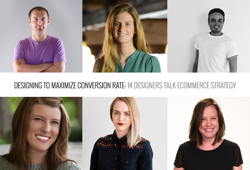
    Designing To Maximize Conversion Rate: 14 Designers Talk Ecommerce Strategy

    Ecommerce design is a unique beast in the web design world. Multiple factors–aesthetics, usability, brand message, and value proposition–must come together to create conversions.

    That’s hard.

    How can web designers serve their ecommerce clients better? How can designers work strategically, with conversion rate in mind? We asked 14 expert ecommerce designers to share their best tips through four questions. Here are the questions. Their insightful answers follow.

    1. Let’s face it, web-safe fonts don’t give us many options. How do you use Google Fonts to create great typography?

    2. Ecommerce store owners are always stressing about cart abandonment. How can web designers reduce cart abandonment for their clients?

    3. Category pages can be a bit of a no-man’s land as far as UX. What are your favorite techniques for sprucing them up?

    4. Let’s be honest—design clients don’t always know as much as we wish they did. If you could educate ecommerce clients on one thing, what would it be?

    1. Justin Metros –– Radiator Studios

    justin-metros-headshot-color_1024

    radiatorstudios.com | @radiatorstudios

    Let’s face it, web-safe fonts don’t give us many options. How do you use Google Fonts to create great typography?

    Typefaces communicate feeling and emotion through their glyphs. This emotion is what gives a visual design character and a sense of purpose. The ‘web-safe’ (default fonts installed on windows / OS X) are limited and leave much to be desired when compared to what is available elsewhere.

    [clickToTweet tweet=”Typefaces communicate feeling and emotion through their glyphs. #designthinking @radiatorstudios @216_digital” quote=”Typefaces communicate feeling and emotion through their glyphs. #designthinking”]

    If great typography is an art, then typefaces are your palette. The typeface is the design of the lettering. The font is the implementation of that typeface for use (for the web or in print). And learning how to pair typefaces and use fonts correctly is an important skill for every designer to have. Understanding the nature of typefaces and how they play together will make or break a design, regardless of the source of the font. There are plenty of great fundamental resources out there that can help train your eye on what to look for in typeface, its weight, its x-height, etc. I like this article from back in 2009 on Smashing because the fundamentals of typography have been consistent for a long time. Trends have changed, not concepts.

    Google Fonts are a great resource for designers, as many of their typefaces are wonderfully designed, and the fonts are optimized really nicely for the web. Google Fonts abstract away a lot of the complexity of implementing and managing font files for use on the web. As we know, different browsers / devices prefer different formats and Google Fonts makes this invisible to the designer. No more @font-face, just a one-line script and you’re good to go.

    As Google Fonts has grown, so have the number of beautiful combinations. There is no shortage of resources available for great google font pairings. A few of my favorites are http://fontpair.co/, http://hellohappy.org/beautiful-web-type/ and https://femmebot.github.io/google-type/

    Once the typefaces are chosen and the fonts are technically implemented, the fun is just getting started. It’s important to have legible design, especially in a responsive context. Use of modular scale for meaningful hierarchy is a good place to start to determine the relationships between headings, subheadings and paragraphs http://www.modularscale.com/. For more complex control, there are concepts like vertical rhythm which are a bit more involved to implement, but do a great job of maintaining consistency in your overall design. http://zellwk.com/blog/why-vertical-rhythms/ And also, for responsive design, using relative units (rems or ems) can help your hierarchy and rhythm flow and resize nicely across various screen sizes and devices.

    Ecommerce store owners are always stressing about cart abandonment. How can web designers reduce cart abandonment for their clients?

    Cart abandonment is always an issue when it comes to ecommerce. We’re out there fishing for customers on the web and an abandoned cart is the one that got away.

    [clickToTweet tweet=”Cart abandonment is always an issue when it comes to #ecommerce. #designthinking @radiatorstudios @216_digital” quote=”Cart abandonment is always an issue when it comes to #ecommerce. #designthinking”]

    Our first bit of advice is simple: relax. Many users add to cart with no intention to purchase. Sad but true, better to get over that early on and focus on customers that did have intent to purchase. Users who made it to checkout then hesitated. These are the ones we want to try and recover, and there are some good and not-so-good ways to approach this.

    The first step is to identify what you consider to be cart abandonment. We want this to be a meaningful metric. Adding to cart is not a good place to look, necessarily, as mentioned above. A better place to look is someone who added to cart, clicked checkout, and gave you some information—hopefully at least an email address, something we can respond to.

    Many ecommerce platforms have their own way of determining what defines an “abandoned cart,” and for custom implementations, it’s up for you to decide. Now we’re talking about what to do once we A) know a user made it to a point we consider a potential customer and B) our response to that.

    Sending out a friendly reminder can be very useful. Keep it light and simple. “Looks like you left something in your cart, we’re holding these items for you if you’d like to come back.” Try not to be pushy in your abandonment reminder emails. Use the tone and voice of your brand. It also helps to show what was in their cart to give them a reminder of what they almost bought. Take the time to apply your branding and design to these templates so that it is a direct reflection of your site.

    The timing of the cart abandonment email is also important. This is something I urge shop owners to experiment with. But we’ve found that 4-6 hours after abandonment is the sweet spot. And please don’t try and hammer them multiple times at 4hrs, 12hrs, 24hrs all in a row—that can have the reverse affect, and may actually deter people who don’t want to buy today but may have bought in the future. Knowing a site is going to blow up your inbox every time you browse is not a good look.

    Then there is abandonment prevention. Keeping users in the checkout flow through conversion. This is where the UX of the checkout flow really plays an important part.

    There are many great philosophical discussions around the web on what converts best, a one-page checkout, a multi-step checkout, etc. Regardless of your preference (or limitations your ecommerce platform), we have always believed it’s more about how information is presented to make the process seem as simple as possible. If you have a one-page checkout, don’t show every field at once, because it looks like a lot of work. Try using an accordion style so users can focus on one thing at a time—billing info, shipping info, payment info and review. For a multi-step checkout, keep it clean with a clear view of the steps involved so people can understand the process as a whole from the get-go.

    Having multiple payment options also helps. By having your preferred gateway plus another option (like PayPal, Apple Pay, etc.), you give users an opportunity to use a method that may require less work. They may have autofill for their PayPal, for example, which makes it easier for them to checkout.

    There will always be abandoned carts, but using beautiful cart abandonment reminder emails, proper timing of those emails, and having a clean checkout flow will help to reduce your drop-off rate.

    Category pages can be a bit of a no-man’s land as far as UX. What are your favorite techniques for sprucing them up?

    Category pages are as much a utility for the user to browse your catalog as they are an opportunity to tell your brand story.

    [clickToTweet tweet=”Category pages are a chance to tell your brand’s story. #designthinking for #ecommerce @radiatorstudios @216_digital” quote=”Category pages are a chance to tell your brand’s story. #designthinking for #ecommerce”]

    Having meaningful filtering that fits your brand is important. If you have thousands of products in dozens of collections, a faceted filter can help users find what they are looking for quickly. Amazon, albeit not the best design in the world, does faceted filtering very well, and that pattern fits because of the sheer size of the site.

    If your site has only a few collections with a couple dozen products each, try a simpler filtering UX like a dropdown for size or color, as well as a sort so users can re-arrange the category page by what’s new, best sellers, etc.

    Product grids don’t have to be boring, either. If applicable to your brand, try inserting some brand of lifestyle content into your category pages. Maybe after 4 rows of products there is a sales proposition or entry point to another similar collection. Done well, this can make a boring product grid turn into a brand experience.

    With the products themselves, above all else, try to have the best photography you can. And don’t try to cram 10 thumbnails into one row. Space them out and let the users see your thumbnails clearly. If a product is on sale, is new or is a best seller, try designing a little badge or icon that indicates this. Keep your typography clear and your pricing visible. If a product comes in multiple colors, try adding swatches to show that it comes in multiple colors. Whether that is appropriate depends of course on the nature of your catalog. Often times, it’s best to show each color way in the product grid so users don’t have to have an extra click to see it in another color.

    Also, keep your page length manageable. Infinite scrolling makes a lot of sense on sites like Instagram and Pinterest, but when you’re scrolling through products, clicking on them, and clicking back, infinite scroll can cause some headaches unless you put your user back to exactly where they were. Try 30-40 products per page with clear, easy to understand pagination. This helps to give users a sense of direction in your site.

    Last but not least, the header of your collection page is a great opportunity to design a banner that explains the collection, provides a lifestyle image, or adds some additional information about that collection.

    Let’s be honest—design clients don’t always know as much as we wish they did. If you could educate ecommerce clients on one thing, what would it be?

    Above all else, I would have to go with something higher level than educating on a particular topic and recommend establishing meaningful trust with your client. They came to you to help them solve a problem because they do not have the time or expertise to do so. They chose to work with you because they like your portfolio, your personality, your track record, etc. By building trust, you can work with your client more efficiently to help guide them through many of the moving parts of an ecommerce site. When the client trusts you, they will listen to you and your advice, and gives you the ability to educate them in all areas from UX, UI, design, content strategy, and marketing.

    2. Sarah Yeager –– Lead Web Designer, 216digital

    sarah-portrait-stylized-216

    Let’s face it, web-safe fonts don’t give us many options. How do you use Google fonts to create great typography?

    When designing for a website, everything comes down to brand message and legibility.

    [clickToTweet tweet=”In web design, everything comes down to brand message and legibility. #designthinking from @sarahmyeager @216_digital” quote=”In web design, everything comes down to brand message and legibility. #designthinking from @sarahmyeager”]

    Your first objective is for your audience to be able to read what you have to say. I get so frustrated when I come across a beautiful website design but I have to squint in order to read their content. A nice rounded sans-serif font like Open Sans is a great go-to for body copy.

    As far as brand message goes, what kind of story are you telling with your typographic choices? Find a font that reflects your brand and then find a great contrasting font. Some examples of contrasting fonts are condensed paired with expanded or italic paired with normal. The key is to find a font that carries contrast out elegantly while reflecting your overall message.

    Ecommerce store owners are always stressing about cart abandonment. How can web designers reduce cart abandonment for their clients?

    Take down a barrier to entry. Creating an account before they purchase items in their cart creates more time spent on not buying the item. Let them achieve their goal first and then invite them to create an account.

    [clickToTweet tweet=”Want to reduce #ecommerce cart abandonment? Take down a barrier to entry. #designthinking @sarahmyeager @216_digital” quote=”Want to reduce #ecommerce cart abandonment? Take down a barrier to entry. #designthinking @sarahmyeager”]

    Limit the amount of steps to achieve a purchase. The simpler the transaction, the faster it takes to purchase the item, the happier customer. This means, pair down the steps it takes to get from visitor to newly paid customer.

    Include trust builders. People are more likely to be hesitant to purchase from an ecommerce store that does not prove their value. Reassure that they are in good hands.

    Category pages can be a bit of a no-man’s land as far as UX. What are your favorite techniques for sprucing them up?

    As far as user experience goes, you want the user to find what they need as quickly as possible. Sometimes I play around with the number of categories that I feature on a page or highlight a larger section to show off featured products. Know your users’ analytics to see how they navigate or click around on the page and adjust accordingly.

    Let’s be honest—design clients don’t always know as much as we wish they did. If you could educate ecommerce clients on one thing, what would it be.

    Know that a designer’s role isn’t just to make things look pretty – it’s about telling your brand’s story, to achieve your business goals, and to create something elegantly functional.

    216-Design-CTA

    3. Carrie Cousins –– Designer, Writer, & Editor

    2-Carrie

    @carriecousins | about.me/carriecousins | carriecousins.com

    Let’s face it, web-safe fonts don’t give us many options. How do you use Google Fonts to create great typography?

    Google Fonts is a great tool because it opens up a world of typeface options to you for website design. I start with browsing typefaces, pick the pair that I like for a project, and insert the code. It’s easy and provides a great workflow option.

    Ecommerce store owners are always stressing about cart abandonment. How can web designers reduce cart abandonment for their clients?

    The first step is to reduce clicks. Make the site almost too easy to use. Why do I have to log in to view my cart? Poor UX is the reason I abandon the cart more often than not. It happens when something just does not work. If you aren’t sure how to structure your cart, look at some of the most successful ecommerce sites—Amazon, Nike, Gap—and note how flawless the process seems to be.

    Let’s be honest—design clients don’t always know as much as we wish they did. If you could educate ecommerce clients on one thing, what would it be?

    Go back to the basics: “Show, Don’t tell.” Use great pictures to sell online. If your imagery is not good, and I mean absolutely professional, I won’t shop on your site. Everything about your site needs to be clean, crisp and polished. There can’t be spacing or grammar mistakes. Handing over my credit card information is about more than what you are selling, it’s about trust in you as a business and in your interface.

    4. Dirkjan Vis –– Founder and Owner, Zietuwel.nl

    1-Dirkjan

    Zietuwel.nl | Ecommercenews.eu

    Let’s face it, web-safe fonts don’t give us many options. How do you use Google Fonts to create great typography?

    The way we see it, Google Fonts are very popular and commonly accepted. Ecommerce sites use them freely. Backup fonts are addressed, but that’s basically it. Fresh fonts are very popular these days!

    Ecommerce store owners are always stressing about cart abandonment. How can web designers reduce cart abandonment for their clients?

    There are a zillion reasons why carts are left abandoned. Many of these reasons are hard to fix. Think of shipping expenses, the use of shopping carts as a wish list, or comparing total expenses in two shopping carts on different stores. With that said, web designers see a lot of shopping carts! Thus they should be experts on the best experience. Many web designers limit themselves to just the styling, but web designing companies should have specialists in usability. Cart abandonment is one of the top priorities when concerning cart usability. The specialists should be in house if the agency wants to serve the bigger ecommerce companies.

    Category pages can be a bit of a no-man’s land as far as UX. What are your favorite techniques for sprucing them up?

    Category pages are often used as high performance SEO landing pages. They are often optimized for search traffic or for distributing search engine ‘juice’ to the right pages. With these priorities in mind, category pages are hard to master as a UX engineer. The conflicts of interest make these pages hard to optimize. Personally we do have some demands. For example, category pages often have many products. Will you use lazy-load, view more buttons, or split them in several pages?

    Another thing to think about is to give category pages extra user info. Often these pages only contain an overview of products, but category pages are ideal to publish some extra general information on about the kind of products. For example, if you show fishing products: show the intro of a blog about fishing, write about what kind of fishing your shop has expertise in and have nice images for eye candy and inspiration instead of just a plain grid of products.

    Let’s be honest—design clients don’t always know as much as we wish they did. If you could educate ecommerce clients on one thing, what would it be?

    Inspiration is king. Many ecommerce companies look at statistics. What works in SEO? What brings views and how to get the conversion percentage to a higher level? In the short term these two factors are always top of mind, but in the long term you should be working on inspiration. Without inspiration you cannot be a brand. Without a brand your company won’t become top of mind. Not being “top of mind” means you have to keep on spending money on marketing and on getting sales because customers will never come back by themselves.

    5. DJ Bradley –– UX Designer, Digital Telepathy

    3-DJ

    http://twitter.com/dtelepathy | http://dtelepathy.com

    Let’s face it, web-safe fonts don’t give us many options. How do you use Google Fonts to create great typography?

    There are over 650 Google Fonts available. These are an excellent source for web designers to create free, web-safe font combinations. I pair Google Fonts the same way I would pair any font combination. I tend to choose complementary fonts, like serifs and sans serifs, to create contrast. I also prefer sans serifs for paragraphs, due to their simplified letterforms that display clearer at various screen resolutions. There are great online resources like Typewolf for inspiration and font recommendations as well.

    Ecommerce store owners are always stressing about cart abandonment. How can web designers reduce cart abandonment for their clients?

    Looking at user analytics throughout the checkout process can give some insight into areas or pages where users seem to be dropping off. However, analytics won’t tell you the reason “why” users are dropping off in specific areas. This is where user-testing, interviews, and research can really help find those pain points and allow you as the web designer to design solutions to reduce that friction.

    Category pages can be a bit of a no-man’s land as far as UX. What are your favorite techniques for sprucing them up?

    To spruce category pages up, add a category specific header image with the category title as well as some form of “bread crumbs.” You can also add a “Featured” or “New” section at the top of each category page.

    Let’s be honest—design clients don’t always know as much as we wish they did. If you could educate ecommerce clients on one thing, what would it be?

    It has become crucial for ecommerce sites to have a great mobile experience. The amount of time spent on mobile devices as well as the number of people who own mobile devices continues to increase every year when compared to desktop. If you are not able to reach your user audience through mobile displays, you will miss out in comparison to competitors who are.

    6. Meg Quigg –– Designer, Groove

    4-Meg

    http://gotgroove.com/

    Let’s face it, web-safe fonts don’t give us many options. How do you use Google Fonts to create great typography?

    When approaching the design phase of a site, we incorporate our client’s existing brand standards and carefully select web-safe fonts that align with any current brand assets and fonts to ensure the web experience aligns with every brand touch point. Google Fonts are our preferred font library, but it’s easy for designers to fall into the rut of using their favorite 5 Google Fonts. To capture the essence of the brand and create a unique digital experience, we select fonts (style, sans-serif vs. serif, weight) based on several facets (e.g. the client’s brand mark/logo, target audience, industry trends, the brand’s personality and voice).

    Ecommerce store owners are always stressing about cart abandonment. How can web designers reduce cart abandonment for their clients?

    Many of our clients come to us with the issue of cart abandonment. When enhancing the user experience (UX) of a current or new site, our approach is to reduce the number of clicks to cart. We ask ourselves, “What does the buyer’s journey to conversion look like?” One way we do this is by implementing a one-page checkout with a reduced header and footer to eliminate any distractions that can cause cart abandonment. We ensure that all pertinent information has a place within the UX. We encourage store owners to show shipping costs and customer testimonials which add trust and assurance.

    Category pages can be a bit of a no-man’s land as far as UX. What are your favorite techniques for sprucing them up?

    We often add marketing banners that feature the storeowner’s various promotions/deals at the top of the page to entice the user to convert. We create and/or utilize high impact custom imagery that enhances the user experience and captures the brand’s essence. By including any other relative content, whether video or animation, we help differentiate from the standard category grid. These micro-conversions offer additional ways for users to experience and interact with the brand.

    Let’s be honest—design clients don’t always know as much as we wish they did. If you could educate ecommerce clients on one thing, what would it be? 


    Less is more. What we mean by that is, the buyer’s journey through the UX needs to be clear and concise. Our overall goal with an ecommerce design is to increase traffic, average order value, and conversion rate. Utilizing white space and page layout, we make sure content and imagery is displayed in an easily digestible format that drives users to conversion while maintaining the integrity of the brand.

    7. Ben Johnson –– Founder and Creative Director, Elegant Seagulls Inc.

    5-Ben

    www.elegantseagulls.com | Dribbble | Twitter

    Let’s face it, web-safe fonts don’t give us many options. How do you use Google Fonts to create great typography?

    Fonts are key to communicating a brand’s personality. Your design should work with almost any decent font pairing. The fonts really just elevate the overall design. Font size relationships and details can have just as much impact as the actual selected typography.

    Ecommerce store owners are always stressing about cart abandonment. How can web designers reduce cart abandonment for their clients?

    First look at data to see when and where the carts are being abandoned, then try to work backwards and adjust your design to better convert. Simple changes can often make a huge impact.

    Category pages can be a bit of a no-man’s land as far as UX. What are your favorite techniques for sprucing them up?

    Attention to detail on these pages is key. You want a simple seamless experience. The right balance of white space, subtle design elements, interaction and motion can elevate these pages.

    Let’s be honest—design clients don’t always know as much as we wish they did. If you could educate ecommerce clients on one thing, what would it be?

    Break the mold! There are a ton of best practices we can use as guideposts, but tell your own story. There needs to be a balance between users’ expectations and making something memorable.

    8. Martijn van der Does –– Managing Director, Wonderland

    6-Martijn

    wonderlandindustry.com

    Let’s face it, web-safe fonts don’t give us many options. How do you use Google Fonts to create great typography?

    When it comes to fonts, we’re a big fan of mixing a classic serif with a more relaxed sans serif—although the most important factor is ensuring the combination aligns with the brand we are designing for. We actually don’t really use Google Fonts. We find it quite limited and there’s not much space for creativity. However, if we were to use it, the process is all about making a selection that aesthetically complements the brand. There are also a lot of external articles about the best fonts Google has to offer.

    Ecommerce store owners are always stressing about cart abandonment. How can web designers reduce cart abandonment for their clients?

    It’s all about immersing yourself in each step your user takes and paying close attention to how they approach the cart/checkout process. Checking out should take a minimal amount of action from the user. The process should be as effortless as possible. From a web design point of view, we like ecommerce sites that play with hover interactions. For example, when hovering over your basket with the mouse you are given two clear options: view the bag or checkout. At this stage the user hasn’t even clicked their mouse and the option to checkout is already accessible.

    The checkout process itself should require as few steps as possible, we’d say no more than three. Also, be sure to guide your users through each one and indicate the subsequent steps at each stage. We also suggest indicating the progress of your customer throughout the process. Don’t force them to register with your site, either. If they’re interested enough, they’ll do it themselves.

    Check out our own checkout process at http://thewonderlandstore.com/ for inspiration!

    Category pages can be a bit of a no-man’s land as far as UX. What are your favorite techniques for sprucing them up?

    We love sites that use innovative interactions and animations to bring the content to life within each category. Spice things up and don’t be afraid to stand out—you want to create a site that people want to visit every day.

    Let’s be honest—design clients don’t always know as much as we wish they did. If you could educate ecommerce clients on one thing, what would it be?

    A lot of clients come to us and simply say, “We need a website.” Our standard response is to ask, “how do you know you need a website?” We like to start with our clients’ business goals and what they want to accomplish. It’s far more than just design.

    We want clients to realize how the role that strategy plays in achieving their goals. Design alone is rarely enough. Yes, you can have a fly website built with all the latest trends and techniques, but you need to innovate within your strategy if you really want to stand out. If users are faced with a pretty website but no clue how to approach it, they are likely to turn to competitors instead.

    9. Steve Krueger –– Co-Founder and Creative Director, The Jibe

    7-Steve

    http://thejibe.com/

    Let’s face it, web-safe fonts don’t give us many options. How do you use Google Fonts to create great typography?

    Google Fonts are a great resource for clients on a budget who still want the benefit of not having a site look like it was built in the 90s. While most Google Fonts have pairing recommendations, they’re not always the most complimentary. We’ve used http://fontpair.co/ in the past, which is a beautiful collection of user-contributed Google font pairings for any application.

    Ecommerce store owners are always stressing about cart abandonment. How can web designers reduce cart abandonment for their clients?

    You need to think like a user. Make the experience as engaging and simple to use as possible. Check out our helpful tips on how to reduce cart abandonment.

    Category pages can be a bit of a no-man’s land as far as UX. What are your favorite techniques for sprucing them up?

    You want to let your content shine but still be easily digestible and accessible. Don’t overpower the page with sidebars or alternative call-to-actions. Outlining content in a grid or by using a masonry style layout allows you to retain style while still providing links to category specific content.

    Let’s be honest—design clients don’t always know as much as we wish they did. If you could educate ecommerce clients on one thing, what would it be?

    Keep it simple and stay in the mindset of the client. It’s easy to want all the latest and greatest visual features, but if they are too overpowering and distracting, it will quickly deter your client to look elsewhere.

    10. Sarah Cottle –– Experience Designer, HomeAway

    8-Sarah

    http://sarahmakes.it/ | http://thesixbees.com/ | https://www.homeaway.com/

    Let’s face it, web-safe fonts don’t give us many options. How do you use Google Fonts to create great typography?

    Google Fonts have been a game changer for designers! With hundreds of font options, we can finally have great typography without sacrificing SEO. Before Google Fonts, designers would have to flatten non web-safe fonts into images, which of course are not “readable” by search engines. Google Fonts allow us to keep text as HTML helping keywords be found by search engines. With all the different font options available on Google Fonts, designers have been able to push the boundaries of typography. My current favorite font combination is Lora and Open Sans Condensed!

    Ecommerce store owners are always stressing about cart abandonment. How can web designers reduce cart abandonment for their clients?

    Getting your customers to hit that Place Order button is an ecommerce web designer’s main goal! Here are a few tips to help get the customer to purchase by reducing cart abandonment:

    1. Eliminate Distractions—Make sure your checkout process is simple, easy, and fast. Don’t have the user fill out unnecessary form fields—if the information isn’t vital for completing the transaction, don’t include it! Remove anything that is not relevant to the user completing their purchase.

    2. Allow Guest Checkout—Users already have online accounts for so many different products (banks, email, schools, etc.)—don’t frustrate them by forcing them to create an account with you just so they can purchase your products. Eliminate all roadblocks getting in the way of allowing your user to checkout.

    3. Design for Mobile—At the very least, your site should be responsive. More and more users are shopping directly from their mobile or tablet device. A responsive site allows your content to be shown easily on different devices. If your site isn’t responsive, you are missing out on a large audience of potential customers. Go a little further and audit your content and the behavior of your site to really cater for the mobile user. For example, BBD Dakota adjusted their ‘Buy Now’ button to stick to the bottom of the mobile device to users can easily add to cart no matter where they are on the product page.

    Category pages can be a bit of a no-man’s land as far as UX. What are your favorite techniques for sprucing them up?

    1. Display Extra Information on Hover—Don’t force your users to click on a product page to get additional information on your products. Why not let them have extra details appear on a hover while they remain on your category page? For example, on Nixon you can view different styles of the same watch while remaining on the category page. Even having simple hover that shows an alternate image of a product will go a long way in the user’s experience, like Cute+Broke Just remember to think through how you want this to behave on mobile devices as there is no hover—maybe using the tap behavior?

    2. Provide a Good Filtering Experience—Help your users explore your products by providing clear and commonsense filtering options while they shop. For example, make sure you have category-specific filters so users can filter within the chosen category (i.e. Having a “style” filter when a user is shopping a bathing suit category.) Another good practice for filtering is providing recommended/common filtering choices on top of the product list on the category page. I really like how 3 Sixteen shows the category filters at the top of the page.

    Let’s be honest—design clients don’t always know as much as we wish they did. If you could educate ecommerce clients on one thing, what would it be?

    I think it would be the importance of product photography. Don’t just take photos of your products with your camera phone and expect users to appreciate your products. Hire a professional! If a local photographer isn’t available, there are many online sites that allow you to ship your products to them and they will take great photos. Make sure you get different angles so your user can truly understand your product. Shooting on a white background will also make your designers lives a lot easier when they want to create promotional graphics with your photos.

    11. The Hezy Team

    10-Hezy

    http://hezy.org/

    Let’s face it, web-safe fonts don’t give us many options. How do you use Google Fonts to create great typography?

    We do not use only Google Fonts. Therefore, such problems do not exist. However, before using the font, you need to check out how it works in the environment and how it looks like on the website.

    Ecommerce store owners are always stressing about cart abandonment. How can web designers reduce cart abandonment for their clients? 

    We work with BASOVDESIGN BUREAU. They have an extensive experience in ecommerce. An individual approach to design makes it possible to reduce all the anxiety to a minimum. Abandoned carts are a worry not only the owners of sites, but to buyers as well. Using proven technologies helps ecommerce owners, clear and easy for understanding design solutions simplify the life of customers.

    Category pages can be a bit of a no-man’s land as far as UX. What are your favorite techniques for sprucing them up? 

    Ecommerce does not give a variety of options. And it’s not the best place for experiments. There are proven solutions that work. If there is a choice between an unusual artistic decor of the page and familiar and user-friendly page, preference goes to the latter, although there are exceptions. It already depends on the specifics of the site and type of activity.

    Let’s be honest—design clients don’t always know as much as we wish they did. If you could educate ecommerce clients on one thing, what would it be?

    Do not spoil it. Usually, the client is given a good ready-made solution. The goal is to use it. There is nothing to “overthink.” The client needs to understand that everything has a purpose. If the item is there, so it should be there and nowhere else, so it has some semantic or decorative role.

    12. Viacheslav Ponomarov and Yvette Mosiichuk –– UI/UX, SteelKiwi

    11-SteelKiwi

    http://steelkiwi.com/ | https://dribbble.com/steelkiwi | https://www.behance.net/steelkiwi

    Let’s face it, web-safe fonts don’t give us many options. How do you use Google Fonts to create great typography? 

    Google Fonts are great and they give us a lot of possible combinations to try. You can just check this resource to see how beautiful web type can be: http://hellohappy.org/beautiful-web-type/

    Ecommerce store owners are always stressing about cart abandonment. How can web designers reduce cart abandonment for their clients? 

    Ecommerce store users are unstable. They often need to check a lot of different resources to find the product which they want to buy. Often, they add some products to their cart on the website, forget about this and go away. If you don’t remind them about yourself, they could never return to your website. So, if you have an opportunity, always send them reminder emails (and ask for email during the checkout process, of course).

    Category pages can be a bit of a no-man’s land as far as UX. What are your favorite techniques for sprucing them up? 

    Make a clear call-to-action on category pages for the user to understand what actions are available to do. Always keep left-hand column navigation. Show feature banner and introduce the tastiest products, sale offers, and new arrivals.

    Also, mobile view is one of the biggest challenges for a category page. Now a lot of users use their smartphones for online shopping, so you need to think about them.

    Let’s be honest—design clients don’t always know as much as we wish they did. If you could educate ecommerce clients on one thing, what would it be? 

    If we could educate ecommerce clients to think about their customers, and not about their own preferences, it would be great.

    13. Ekrem Ates –– Product Designer, Hurriyet

    12-Ekrem

    dribbble.com/ekremates | be.net/ekremates | www.hurriyet.com.tr/

    Let’s face it, web-safe fonts don’t give us many options. How do you use Google Fonts to create great typography? 

    In years past, we didn’t have many font choices to use from Google Fonts. But nowadays, I believe there are plenty of good fonts. They come with various different styles. I try to use the most suitable fonts for each new project and I usually use Google Fonts in terms of saving the client from additional spending and making the product faster.

    I generally try to make a stylish combination by using two or at most three different fonts or font styles for visual diversity. I always keep in mind that readability is the key. So I test my font choices on many font sizes.

    Ecommerce store owners are always stressing about cart abandonment. How can web designers reduce cart abandonment for their clients? 

    Cart abandonment is a common problem these days and I recommend a few easy solutions to my clients about this issue. Do not distract users with meaningless popups or messy design. Give users clear and correct information. Nobody wants to be confused or cheated. Offer free advantages, such as free shipping or small gifts. In case of abandonment, remind them that they added products to their cart but did not buy them yet. Always optimize your site.

    Let’s be honest—design clients don’t always know as much as we wish they did. If you could educate ecommerce clients on one thing, what would it be? 

    I’ve worked in this field for a few years now. As a newbie, I was so upset when a client criticized my work badly or told me some illogical things about the process. Years have taught me one thing: that everyone can be persuaded. You just have to trust your knowledge and make them listen to you. But sometimes their know-it-all personalities are a big obstacle for us.

    14. James-Lee Rudd (Designer) & Marilena Rudd (Web Developer) –– Hoohaa Design

    13-HooHaa

    www.hoohaadesign.co.uk | @HoohaaDesign

    Let’s face it, web-safe fonts don’t give us many options. How do you use Google Fonts to create great typography?

    We use a combination of Google Fonts, Typekit, and also purchased fonts if the project requires it, where they are hosted on the server and used via Font-face. We try not to limit ourselves with typography as we are a design studio first and foremost. We like to have as much freedom and creativity as possible.

    Google Fonts collection has improved over the years with a greater diversity. We try to limit a site’s use to no more than 2 complimentary typefaces.

    Ecommerce store owners are always stressing about cart abandonment. How can web designers reduce cart abandonment for their clients?

    We always strive to streamline and simplify the checkout process for users with as few steps as possible, simple instructions and clarity of delivery costs. We always make the next step in the process have the greatest hierarchy and dominate in tone or color, with as little distraction as possible.

    Category pages can be a bit of a no-man’s land as far as UX. What are your favorite techniques for sprucing them up?

    When products are listed on a page, we have found that section dividers work well. Within the parameters of the dividers, we have the design freedom to create something that is in-tune with the site’s design and tailored to be clear and informative. Imagery can be used to great effect, particularly to show the context of a product in use. Image-based category dividers define product ranges and help bring them alive.

    Let’s be honest—design clients don’t always know as much as we wish they did. If you could educate ecommerce clients on one thing, what would it be?

    Content is key. Content and product ranges need to be defined before the design process. Otherwise, the design is compromised and as designers, we are flying blind, hoping that the site we design will work with the unknown content and imagery supplied at the final stages. Content needs to come before the design process can begin. Product descriptions need to have consistent sections, dimensions, descriptions and specifications. Photography as content is hugely important. It needs to be a true reflection of the product and consistent in style and tone. Professional photography is a must.

    Greg McNeil

    June 14, 2016
    Ecommerce Platforms
  • B2B Ecommerce Trends: 9 Experts Discuss the Big Shift that’s Coming to B2B

    B2B Ecommerce Trends: 9 Experts Discuss the Big Shift that’s Coming to B2B

    Whether it’s in the blogosphere, at conferences, or on social media, we’re hearing a lot about the growth of B2B ecommerce this year. B2B sales are moving from the phone line to online, and that has profound implications for both the B2B industry and the ecommerce solutions industry. To facilitate this discussion and help educate professionals in the B2B and ecommerce services industry, we interviewed 9 experts on the emerging trends in B2B ecommerce. We asked some pointed questions, and we got an array of intelligent, informative answers. We hope this article will help B2B ecommerce developers, designers, and industry professionals. Here are the questions we asked:

    1. How might an ecommerce model streamline the world of B2B sales?

    2. What types of innovation would you like to see in B2B ecommerce functionality?

    3. Where does a professional sales staff fit into a B2B ecommerce business plan?

    4. How can B2B ecommerce managers encourage their customer base to transition from phone orders to web orders?

    1. Bill Osteraas – Vice President, Channel Development, Four51

    Bill Osteraas

    How might an ecommerce model streamline the world of B2B sales?

    There are huge benefits when it comes to an ecommerce solution – one of them being automation. By integrating your ecommerce solution with your ERP, CRM, analytics, and other current softwares, you are streamlining your processes and removing the manual steps that used to take place. This cuts down on costs, reduces order errors, and frees up your personnel to work on larger issues. In fact, we’ve seen companies like Turtle Wax go from a 6% order error rate to less than 1% after implementing a B2B ecommerce solution. Additionally, you remove the 9-5 barrier by allowing customers to order 24x7x365. [clickToTweet tweet=”By integrating your ecommerce solution with ERP, CRM, & analytics, you streamline processes. @Four51inc @216_digital” quote=”By integrating your ecommerce solution with ERP, CRM, & analytics, you streamline processes. “]

    What types of innovation would you like to see in B2B ecommerce functionality?

    We face this topic with a different approach: flexibility over features. Many ecommerce softwares are rigid and companies must have a “you get what you get and you don’t have a fit” mindset. With an API-first platform, you open up the possibilities for your users immensely. Not only can they utilize the features already available, but they can customize them completely to their business. Integrations become easier than ever, allowing businesses to personalize their platform to their specific processes.

    Where does a professional sales staff fit into a B2B ecommerce business plan?

    Many people have proclaimed that B2B ecommerce will replaces sales reps. However, ecommerce will free up employees from monotonous, administrative tasks and allow them to have a greater impact on the company with consultative selling or working closer with customers. It’s important to have at least one employee dedicated to your ecommerce solution, especially as ecommerce becomes the main go-to-market strategy for many businesses. Adding or upgrading your online channel requires a company-wide digital transformation, which includes all employees.

    How can B2B ecommerce managers encourage their customer base to transition from phone orders to web orders?

    Luckily, many customers will naturally transition to web orders, as they have grown accustomed to it in their own personal lives. Many are already using their web devices to search for products – according to Forrester, 74% of B2B buyers are researching at least half of their business purchases online. For those who don’t naturally transition, set the right expectations. Tell them why it’s good for them – for example, faster fulfillment time, automatic delivery updates, and the ability to order anytime, anywhere and from any device.

    ABOUT THE AUTHOR

    Bill Osteraas is the Vice President of Channel Development at Four51. Four51 offers OrderCloud, a customizable, flexible B2B ecommerce platform that’s entirely cloud-based. Bill has 20 years of experience helping customers with complex ecommerce solutions. Find Four51 online, on Facebook, or on Twitter.

    2. Marcel Nanning – Founder, B2BMarketeers

    Marcel Nanning

    How might an ecommerce model streamline the world of B2B sales?

    Ecommerce is a serious channel in B2B sales these days, and it’s still growing. I have seen customers generating 10% extra revenue the first year a B2B shop opened. That is 10% extra business they would not have had without the shop. It is exciting to see how it is used in different applications. You see some companies selling complex products online, while other companies choose just to sell parts or maintenance products with their website. There is also a difference in how customers and potential customers are served. Some companies use a B2B ecommerce channel just to take in new orders from existing customers. Others try to sell products to the whole world. B2B ecommerce is a way to increase sales, find new markets, and serve customers fast and easy. It is also a field to be further explored. Every case is different—there is no ecommerce template that fits all B2B companies.

    What types of innovation would you like to see in B2B ecommerce functionality?

    All the B2C innovations will be useful for B2B shops. I think we will see lots of innovations with big data and connectivity. Lots of new possibilities emerge if data is connected to the shop. If a B2B machine company uses sensors to measure the lifetime of certain parts, it could give the owner of the machine a signal if it needs to be replaced. The company could also set up the order in a shop, with some complementary products or services like a mechanic to install the product. The customer just has to approve the order and wait for the product + mechanic to arrive. Everybody wins. That’s just one example of the range of innovations that is going to take place. Also important: we will see more shops in professional services markets. Services, like consultancy, will be productized and sold through online shops as well.

    Where does a professional sales staff fit into a B2B ecommerce business plan?

    Sales provides all the input for the ecommerce activities. And good B2B salespeople with deep knowledge of products and markets will always be important in sales and marketing. Call it sales, call it marketing; it is about adding value, making the connection, and being of importance to the customer.

    How can B2B ecommerce managers encourage their customer base to transition from phone orders to web orders?

    By helping them experience the fun and ease of it. And by giving them an essential role in the process. Most importantly, include them in the B2B ecommerce projects from the start. [clickToTweet tweet=”Include your customer base in your #B2B #ecommerce project from the start. @b2bmarketeers @216_digital” quote=”Include your customer base in your B2B ecommerce project from the start. “]

    ABOUT THE AUTHOR

    Marcel Nanning is founder and editor of the digital magazine b2bmarketeers.nl, one of the biggest b2b marketing blogs in the Netherlands. He is also Campaign Manager at GAC Business Solutions, a Microsoft partner in The Netherlands. GAC Business Solutions serves customers all over the world with smart Business Software solutions for ERP, CRM, Office 365 and B2C/B2B e-commerce. You can connect with Marcel on LinkedIn.

    3. Tim Peter – Founder, Tim Peter & Associates

    tim peter

    How might an ecommerce model streamline the world of B2B sales?

    It really depends on your product or service. If you’re offering a subscription-based SaaS tool that customers can configure on their own or aftermarket parts for your products, you can easily lower your costs and streamline your customer’s purchase journey by offering self-service purchasing. I’ve seen Fortune 100 companies sell components and, in some cases, complete systems online, generating hundreds of millions of dollars in annual revenue by focusing more clearly on understanding that customer journey and where ecommerce activities actually improve the process. I recommend B2B marketers look at their process in terms of “tracks,” helping customers follow the most appropriate track for their particular purchase path: “fast track” (i.e., heavily ecommerce focused) for self-service or simpler purchases; a “standard” track, featuring some hybrid of person-to-person, for the typical purchase path; and a bespoke or advanced track for more complex, customized solutions, perhaps using a product configurator or something similar to start the conversation and show what’s possible—and to generate leads.

    Where does a professional sales staff fit into a B2B ecommerce business plan?

    It’s really important to remember that B2B sales often are much more complex than B2C transactions for a variety of reasons. First, unless you’re selling to SMB (and even then…) you’re likely dealing with multiple stakeholders within the organization. B2B offerings often feature complex and customized implementations. And, they’re often at least one step removed from the actual end-user of the product. [clickToTweet tweet=”#B2B #ecommerce sales are much more complex than B2C transactions for a variety of reasons. @tcpeter @216_digital” quote=”B2B ecommerce sales are often much more complex than B2C transactions for a variety of reasons. “] If these cases apply to your business, your sales staff plays a key role in addressing objections among those stakeholders, walking prospects through each step in the process, and helping stakeholders realize the benefits their customers will see from your product or service. In these situations, it’s really about finding the right place in the customer journey to hand-off to a sales professional who can close the deal and assist prospects with—or, where appropriate, upsell prospects to—your more customized services.

    ABOUT THE AUTHOR

    Tim Peter is the founder of Tim Peter & Associates, LLC, an internet marketing, ecommerce, and consulting firm. Before launching his own company in 2011, Tim worked in the luxury hotel and resort industry, where he helped companies achieve more than $2 billion in online revenue. He has written extensively in the digital marketing industry, and his blog, Tim Peter Thinks, has a large monthly readership. Connect with Tim on Facebook, Twitter, and LinkedIn.

    4. Melissa Buening – Director of Marketing, Apruve, Inc.

    Melissa Buening

    How might an ecommerce model streamline the world of B2B sales?

    An ecommerce model can streamline the world of B2B sales by reducing the total cost to serve and sell to customers. It can help with reducing the time it takes to find products, improving order accuracy, reducing payment friction, and reducing customer service questions. Ecommerce also allows customers to order products on their own schedule, make repeat purchases, and go paperless.

    What types of innovation would you like to see in B2B ecommerce functionality?

    We would like to see B2B ecommerce sites better enable buyers to apply for credit and pay on terms in an online way. Much of this process is still being handled offline with a phone, a fax machine, and a traditional A/R process, which is inefficient and costly. [clickToTweet tweet=”#B2B #ecommerce sites should enable buyers to apply for credit and pay on terms online. @apruve @216_digital” quote=”B2B ecommerce sites should enable buyers to apply for credit and pay on terms online. “]

    Where does a professional sales staff fit into a B2B ecommerce business plan?

    A professional sales staff can fit into a B2B ecommerce business plan through new customer acquisition, customer retention, answering specific product questions, and ongoing customer support. B2B sellers can continue to commission a sales rep for orders no matter how they come in. Sales people can spend more time selling and less time processing transactions, which should lead to an increase in sales attributed to each sales person.

    How can B2B ecommerce managers encourage their customer base to transition from phone orders to web orders?

    B2B ecommerce managers can simply outline the benefits to their customers. Most people say they want to order online (75% according to Forrester), so it shouldn’t be overly difficult for most companies to convince their customers. Another option would be to build incentives for their customers to move online, such as better payment terms, discounts, or online-only product specials.

    ABOUT THE AUTHOR

    Melissa Buening is the Director of Marketing at Apruve, Inc. Apruve allows B2B ecommerce businesses to stop acting like a bank toward their customers. Invoices created in Apruve are paid within 24 hours, and the company also offers credit approval, financing, and account setup. You can connect with Apruve on Twitter.

    5. Chris Guerra – Chief Marketing Officer, Blue Acorn

    Chris Guerra

    How might an ecommerce model streamline the world of B2B sales?

    The B2B sales process is extremely antiquated. In many cases buyers are still using paper and fax machines. Ecommerce provides a 24/7 mechanism for buyers to learn, build purchase orders and easily reorder items. No longer does a buyer need to wait for a sales rep to get back to them. Buyers have an “on-demand” experience. [clickToTweet tweet=”In #B2B #ecommerce, buyers have an ‘on-demand’ experience. @blueacorn @216_digital” quote=”In #B2B #ecommerce, buyers have an ‘on-demand’ experience. “]

    What types of innovation would you like to see in B2B ecommerce functionality?

    Once companies take the first step to establish a B2B presence online they will quickly learn how valuable the analytics beyond purchase data are. From understanding what categories, product and content buyers are interacting with it helps build a deeper profile and understanding of buyer interests. This data can empower sales reps or be used to personalize the buying experience.

    Where does a professional sales staff fit into a B2B ecommerce business plan?

    Ecommerce will never replace “relationships”. However, it can help build them. Sales staff can use the ecommerce site during various stages of the buying process whether it is to build lookbooks, bookmark items, or propose purchase orders. Again, the analytics allow for a smarter sales rep making calls more targeted and productive.

    How can B2B ecommerce managers encourage their customer base to transition from phone orders to web orders?

    B2B ecommerce managers should explore features like loyalty point, promotional pricing, exclusive content. Building strong “My Account” functionality and treating it like a repository for orders, communication and contact information can turn what is typically a boring portion of a website into the highest trafficked destination.

    ABOUT THE AUTHOR

    Chris Guerra, chief marketing officer, joined Blue Acorn in 2012. Chris has over 10 years of experience working with IR500 merchants. Extensive knowledge in replatforming, digital marketing, ecommerce operations, and financial planning has led Chris to hold several leadership positions throughout his career. Connect with Chris on Twitter.

    6. Dr. Sam Bayer – CEO & Cofounder, Corevist

    dr sam bayer

    How might an ecommerce model streamline the world of B2B sales?

    How has ecommerce streamlined the buying of books, clothing, jewelry, electronic equipment and beauty products? It has removed the need to walk to a store, speak to a person or do either only when businesses are open. B2B ecommerce will have the exact same benefits. Only the impact on the economy will be much larger because the flow of B2B products around the world far exceeds the volume of B2C sales.

    What types of innovation would you like to see in B2B ecommerce functionality?

    We don’t need any more innovation in B2B ecommerce functionality than we already have. We already have way more than the vast majority of B2B companies can take advantage of. The real innovation that we need is to figure out a way to make B2B ecommerce websites quicker to implement and more affordable. Frankly, the vast majority of B2B ecommerce transactions are still phone/fax and email. FAXES in 2016! Corevist is focused on disrupting the B2B ecommerce technology space by innovating on the adoption of these projects without sacrificing functionality. [clickToTweet tweet=”We need to make #B2B #ecommerce websites quicker to implement and more affordable. @CorevistInc @216_digital” quote=”We need to make B2B ecommerce websites quicker to implement and more affordable. “]

    Where does a professional sales staff fit into a B2B ecommerce business plan?

    Either on the bus or they become extinct. If your value as a saleperson is delivering information that is easily available on a website and accessible via a smartphone, than your days are numbered. Salespeople need to reinvent themselves to not sell products but to help their customers become more successful from a business perspective. Websites will replace transactions but it’s a lot harder for them to offer advice. That’s where salespeople should evolve.

    How can B2B ecommerce managers encourage their customer base to transition from phone orders to web orders?

    By making it easier to do business on the website than it is by speaking to a human being for routine transactions. You can promote by offering discounts to kickstart traffic on the website, but at the end of the day, if life isn’t better for your customers on the website, they won’t use.

    ABOUT THE AUTHOR

    Dr. Sam Bayer received his PhD in chemistry at age 23. Career highlights include connecting IBM to a new market segment (laboratory information management systems), introducing the first B2B ecommerce website for SAP® manufacturers, and launching Corevist, which focuses on the convergence of cloud-delivered services and the consumerization of B2B ecommerce. Connect with Dr. Bayer on Twitter.

    7. Brian Massey – Cofounder, Conversion Sciences

    Brian Massey Headshot

    How might an ecommerce model streamline the world of B2B sales?

    You can easily streamline your B2B sales by NOT implementing a B2B ecommerce model. Your competitors will take care of the orders for you! [clickToTweet tweet=”Streamline sales by NOT implementing #B2B ecommerce model. Competition will handle the orders! @bmassey @216_digital” quote=”You can easily streamline your B2B sales by NOT implementing a B2B ecommerce model. Your competitors will take care of the orders for you!”] In a recent Conversion Sciences webinar, Jeff Philipp noted research showing: 1. 74% of B2B buyers perfer to buy through a website 2. 93% of B2B buyers prefer to execute a buy the moment they find what they are looking for. A B2B ecommerce site can be expected to increase customer satisfaction and loyalty while reducing the cost of selling. This means higher margins and more repeat business, a powerful combination.

    What types of innovation would you like to see in B2B ecommerce functionality?

    Unfortunately, the ecommerce innovation that B2B companies lack is having an ecommerce offering. According to Forrester’s Peter Sheldon, only 25% of all B2B companies sell online today. This is an opportunity. However, there are some challenges unique to B2B ecommerce. Blue Fish Development Group CEO Jeff Philipp summarized thirteen of them on our webinar. Here are seven of the most common: 1. Highly complex, customizable products 2. Importance of delivery dates and ordering backlog 3. Complicate pricing formulas 4. Complex sales tax issues 5. Multiple buyer accounts and multiple locations 6. Shipping options can be complex 7. Integration with backend systems Watch the on-demand Lab Coat Lessons webinar for all thirteen.

    Where does a professional sales staff fit into a B2B ecommerce business plan?

    Without proper project management, sales can be an obstacle to B2B ecommerce efforts. They may see the site as a threat. In truth, a B2B ecommerce site works well as a sales support platform. The site may actually increase phone calls for visitors that prefer the interaction of a sales person. It is not unusual for the B2B ecommerce site to be the choice of returning customers, while the sales team continues to excel at landing new customers’ first orders.

    How can B2B ecommerce managers encourage their customer base to transition from phone orders to web orders?

    In the words of Peter Sheldon, “Buyers are way ahead of the sellers.” Making the ecommerce site known to phone callers will be all that it takes to get customers to switch. A larger and larger portion of new customers will be looking for the ecommerce site first. In almost every industry, the fastest-growing segment of online traffic is mobile. All a business has to do is stop telling them they can’t order via the web and offer them a great online solution.

    ABOUT THE AUTHOR

    Brian Massey founded the website optimization company Conversion Sciences in 2007. He is a bestselling author (“Your Customer Creation Equation: Unexpected Website Formulas of The Conversion Scientist”), computer programmer, and entrepreneur. He has written for Search Engine Land, Marketing Land, the Content Marketing Institute, and others. Connect with Brian on Twitter.

    8. Elan Sherbill – Corporate Blogger, cleverbridge

    elan sherbill

    How might an ecommerce model streamline the world of B2B sales?

    Even simple payment functionality goes a long way toward improving B2B customer experiences. Offering business buyers the ability to research and then pay for their items entirely online saves time and money for both sellers and buyers. The biggest boon for sellers is that digital shopping experiences increase overall revenue and let sellers focus on building better products. [clickToTweet tweet=”#Ecommerce increases overall #B2B revenue so sellers focus on building better products. @cleverbridge @216_digital” quote=”Digital shopping experiences increases overall revenue and lets them focus on building better products.”]

    What types of innovation would you like to see in B2B ecommerce functionality?

    There needs to be a bigger focus on global markets. Most organizations are so focused on their existing customer base that they ignore millions of dollars from cross-border shoppers who are simply not afforded the chance to buy from them. This is because these organizations do not offer localized customer experiences that make it possible for international buyers to conveniently pay for goods or services online. If businesses truly want to leverage digital shopping experiences for B2B buyers, they have to make sure they are offering all customers products in local currencies, at prices the local market can bear. It also means providing customers the option to use preferred local payment methods and ensuring that the entire customer experience complies with local regulations so far as issues like taxation, privacy and security are concerned.

    Where does a professional sales staff fit into a B2B ecommerce business plan?

    With digital B2B customer experiences, sales teams are going to have to pivot from order takers to expert consultants. The shopping experience is going to be increasingly self-managed on the buyer’s end. That doesn’t mean you abandon loyal employees. Digital shopping removes a lot of the face-to-face touchpoints between customers and businesses, so you still need a highly trained sales staff who understand their customers’ pain points and who helps them understand how to drive better business outcomes with the tools they sell.

    How can B2B ecommerce managers encourage their customer base to transition from phone orders to web orders?

    I honestly don’t think it’s going to take much encouragement. Every B2B customer is also an individual consumer who shops online at least once a month (if not more frequently), and they have high expectations for digital customer experiences. Business buyers want to be able to pay for their orders as conveniently as they do when they’re shopping on Amazon. And it’s not just about the payments. B2B customers want to self-manage all their customer account information, including upgrading and downgrading plans, adding and removing licenses, or updating payment information. Think about your own shopping preferences. You don’t like taking time out of your busy schedule to make a phone call to renew your order when you could easily accomplish the same thing with a few clicks or swipes. And neither do your customers.

    ABOUT THE AUTHOR

    Elan Sherbill is a corporate blogger at cleverbridge—a global subscription billing provider that helps companies build long-term customer relationships and grow recurring revenue streams. You can connect with him on Twitter or LinkedIn.

    9. Gareth Daine – Co-Founder, Content Sleuth

    gareth

    How might an ecommerce model streamline the world of B2B sales?

    Well, according to Forbes, the B2B ecommerce market will be worth $1.7 trillion by 2020, so, I’m not sure it’s a case of ecommerce streamlining B2B sales, as it appears it’s already in full swing. Look at Alibaba as a B2B ecommerce marketplace. While it’s had its fair share of problems and controversy, it’s hugely successful. Look at Littlewoods (the Shop Direct Group), who used to run catalogue services, but now are solely based online. The benefits to the business are huge. They save overheads in many areas, can automate a lot of the process, and it allows them to funnel those investments into expanding the model. Whenever anyone comes to purchase products and services, whether businesses or not, usually, their first port of call is the Internet. This presents huge opportunities for B2B businesses, as providing their products and services via an online (usually account locked) platform, like Magento, for example, allows them to offer the convenience of online ordering and user account management, as well as features such as re-ordering, back-ordering and such. Customers find these types of conveniences extremely helpful, and it helps them speed up their ordering, dispatching and delivery processes, helping them save time and money.

    What types of innovation would you like to see in B2B ecommerce functionality?

    I would love to see some solid innovation in drop shipping functionality and connections with marketplaces like eBay, Amazon and Alibaba. A sort of Software as a Service (SaaS) model would be great, where companies can sign up, and the service provider would handle the rest. Could be big money in something like that, especially if they linked in with suppliers, and provided checks. [clickToTweet tweet=”We need innovations in #B2B drop shipping functionality & integrations w/major markets. @contentsleuth @216_digital” quote=”I would love to see some solid innovation in drop shipping functionality and connections with marketplaces like eBay, Amazon and Alibaba. “]

    Where does a professional sales staff fit into a B2B ecommerce business plan?

    Obviously, digital marketing and social media are key, but professional sales staff of the old-school variety still have their place. Contacting current and prospective companies to offer a streamlined service, perhaps offering discounted prices for onboarding on to the online platform.

    How can B2B ecommerce managers encourage their customer base to transition from phone orders to web orders?

    As mentioned above, offering discount pricing for online orders and account management, web only incentives to entice customers to use the online model, a great user experience by making it simple, fast and straightforward to use. Take the headaches out of the process by automating as much as possible. There are many benefits, including re-ordering previous orders, backordering, easy account management, fast ordering, etc.

    ABOUT THE AUTHOR

    Gareth is a seasoned software engineer with over 19 years’ experience in the industry. He specializes in ecommerce design and development. He is also the co-founder of Content Sleuth, a new social media automation tool for content marketers. You can find Content Sleuth on Twitter, or read their in-depth, actionable tips for social media marketing.

    Greg McNeil

    May 26, 2016
    Ecommerce Platforms
  • Google’s New Search Quality Rating System: What Does It Mean for Ecommerce?

    Google’s New Search Quality Rating System: What Does It Mean for Ecommerce?

    On 11/19/15, Google posted an update to their search quality rating guidelines. In the post, you’ll find a link to a PDF which provides instructions to Google’s search results raters. These are human users who rate the quality of results that Google returns for search queries. Google’s PDF does not provide direct advice on best practices for SEO—that’s simply not its intent. However, by reading Google’s instructions to its human raters, we can understand SEO best practices in a new way. In this post, we’ll comb the Google document for new information that’s relevant to ecommerce store owners. A large portion of the document deals with mobile search results. While much of this information is not new, it’s great to have it all in one place, straight from the source. However, there are a few points to be made.

    User Intent Behind Queries

    Image of Binoculars Google classifies search types based on user intent. This is a great way to approach the keywords you’re trying to rank for. What is the user intent behind the keyword? It should always match what users will find on the page which you’ve optimized for that keyword. It’s a fairly obvious point, but it’s worth making. For example, if you’re a paid stock photo site trying to rank for the keyword “free stock photos” so you can persuade users to buy stock photos when they searched for free photos, the intent of your landing page does not respect the user intent behind the keyword. This practice is fundamentally deceptive. Just don’t do it. As Google’s instructions to raters show, Google continues to refine its ability to match user intent to honest search results. If you’re a brick-and-mortar business, you should pay special attention to “Visit-in-Person” search intent—that is, local searches on mobile in which the user is looking for a nearby brick-and-mortar location. For example, a music store with both a physical retail location and an ecommerce store should prepare its online presence for Visit-in-Person search intent. As well as a fully functional, mobile-responsive online store, this business should have a fully populated Google Business page with accurate location, contact information, and hours. Incomplete or inaccurate information could stop mobile users from finding the brick-and-mortar location they’re looking for. You’ll find this information in section 12.7.4 of the PDF.

    Google Is Getting Better at Understanding User Intent

    Image Link In that same section, you’ll find a discussion of ambiguous queries that could be the name of a restaurant (Visit-in-Person intent) or the name of a spice (purely informational query). In writing web copy for your site, you should be precise, leaving no room for semantic ambiguity, while also writing naturally. Be informative, clear, and natural. This will allow Google’s powerful Semantic Search to match precise contextual results to keywords that display ambiguous intent when examined out of context. Take note here: fundamentally, Google is getting better at divining user intent behind queries. That means that SEO efforts will gradually move away from technical precision (e.g., including exact-match keywords in copy at a recommended density) and towards excellent, well-written copy that matches user intent. Good content marketing is fast becoming the most effective road to good SEO. We expect that trend to continue.

    Special Content Result Boxes

    Special Content Result Boxes Image In Google’s PDF, you’ll also find a discussion of “Special Content Result Blocks” (section 12.8.2). If you haven’t noticed, this feature has started appearing at the top of SERPs when the query has a definite answer for which no entity can claim copyright. As the document makes clear, SCRBs only appear when the user has asked Google a specific question—for example, “how much does a gallon of water weigh?” In our screengrab, the SCRB appeared with a URL to a landing page—but not all SCRBs have landing pages associated with them.

    Content Strategy

    chess-433071_1280 For ecommerce stores, that means checking content strategy very carefully. If some of your content strategy involves trying to rank for questions with definite, non-negotiable answers related to your niche, you should trim those topics from your content strategy. Google is so sophisticated at this point, it’s starting to give us answers directly, without sending us to 3rd party sites for the answers. That means content strategists must narrow the focus to topics on which they can provide fresh, useful information which Google can’t get elsewhere or prepare from aggregate data.

    Give Users Fresh Content When That’s What They Want

    For ecommerce stores associated with a niche that evolves regularly, that means publishing fresh, accurate content on news within your niche. If users google “boston marathon” and your business is associated with the marathon, you should publish timely content about the next marathon. That’s what users are likely searching for.

    The Bottom Line

    Google is always tweaking things. This causes some stress in the SEO community—but it shouldn’t. Google is trying to create a better experience for users. Keeping up with Google’s constant algorithm refinement helps us all to create better experiences for our users. For ecommerce store owners, happy users mean satisfied customers. There’s really nothing to lose.

    Greg McNeil

    November 20, 2015
    Content Marketing, Ecommerce Platforms, Google Analytics, PPC, SEO
  • Social Media Buy Buttons: The Next Revolution In Mobile Commerce

    Social Media Buy Buttons: The Next Revolution In Mobile Commerce

    When the mobile revolution hit, everyone had to get a mobile-responsive website. That’s still critical, by the way. If you don’t have a responsive site, you’re losing mobile customers. But now mobile ecommerce is changing again. Buy buttons are coming to the major social media platforms—and to Google.

    What does this mean for brands and digital marketers? There isn’t one single answer. Brands that use Pinterest will need a different strategy than brands that primarily use Twitter, for example. In this post, we’ll take a quick overview of each platform’s buy button functionality. And we’ll tell you what it means for brands that thrive on that platform.

    Courtesy of StockMonkeys. Licensed under CC 2.0. Modified by 216digital.
    Courtesy of StockMonkeys. Licensed under CC 2.0. Modified by 216digital.

    Pinterest: Visual Shopping

    Pinterest is unique among social platforms. Its underlying philosophy is brilliant: to capitalize on our voracious appetite for visual beauty—and to enable our love of stashing things for later use. But as users have long complained, Pinterest didn’t offer an easy tie-in to purchase the items you had pinned.

    That has changed.

    As Pinterest announced on their blog, buyable pins are coming to Pinterest. Initially, only big brands—Macy’s, Neiman Marcus, and Nordstrom—will have access to buyable pin integration. However, Pinterest plans to roll out the function to many more brands, particularly those using Shopify, Demandware, Bigcommerce, or Magento as their ecommerce platform.

    Initially, the Pinterest buy button will be available only on iOs mobile devices. However, it is coming to Android and desktop soon.

    For small-to-midsize ecommerce retailers whose primary social market is on Pinterest, this means two things. One, waiting (unfortunately) until the buyable pin integration is available more widely; and two, preparing a good marketing strategy now. Once buyable pins are dropped in your lap, you should be ready to go.

    Pinterest Buy Button Strategy

    Think about what the Pinterest buy button will do: it will enable instant purchasing of a product—when the user is still feeling love at first sight. In a sense, the Pinterest buy button will accelerate the Pinterest shopping experience, cutting out the delay that can change intent-to-buy into a lost sale.

    That means putting your best foot forward on buyable pins—your best foot in every area: most attractive products, best photography, products priced best for your market, and highest margins for you. These are the products you should prepare first for buyable pins.

    Courtesy of Kooroshication. Licensed under CC 3.0. Modified by 216digital.
    Courtesy of Kooroshication. Licensed under CC 3.0. Modified by 216digital.

    Twitter: Products Can Now Go Viral

    The Twitter buy button will appear directly in a tweet—that’s right, a regular tweet that can be favorited and retweeted. That means unprecedented viral potential for actual product listings. Of course, this functionality only enables virality at the platform level. Most likely, only truly innovative and astounding products will see significant viral lift from the Twitter buy button.

    Still, the Twitter buy button is attractive for many reasons. For one thing, Twitter isn’t starting with a few major brands. The buy button is now available to all ecommerce store owners in the US who use Bigcommerce, Demandware, or Shopify as their ecommerce platform. By our count, that’s over 173,000 online stores. In this blog post, Twitter advises ecommerce store owners to contact their ecommerce platform representatives to discuss implementing the buy button functionality.

    Twitter Buy Button Strategy

    If you’ve used Twitter’s advertising function, you know that the targeting options are highly granular. As well as choosing from hundreds of interests, you can target users who follow certain Twitter accounts, users who watch certain TV shows, and much, much more.

    Couple all of this with the coming of Twitter buy buttons, and you have a whole new level of ecommerce targeting precision. That means when you go to promote a buy button tweet through a Twitter ad, you should come to the table with complete, detailed, and accurate information for the market demographic that wants your product. If you match product to demographic well, you should see a high conversion rate.

    Instagram Buy Buttons For Visual Shopping

    Instagram previously displayed concern over advertising on its platform: would ads disrupt the seamless visual flow of the Instagram experience? Instagram decided the answer was no—as long as the advertising format was considered within the context of the Instagram experience as a whole. Now Instagram is rolling out its own version of the social buy button.  According to the platform’s official blog, Instagram’s buy button functionality will provide “an advertising experience that feels native to the platform.”

    If you’re concerned about targeting options for the Instagram buy button, you shouldn’t be. According to that same blog post from Instagram, the platform will work with Facebook, enabling advertisers “to reach people on Instagram based on demographics and interests… We want to leverage the best of Facebook’s infrastructure for buying, managing and measuring the success of ads on Instagram.” This sounds like a great partnership, and advertisers who are familiar with Facebook’s high-powered targeting options should find it easy to add Instagram advertising to their repertoire.

    Courtesy of StockMonkeys. Licensed under CC 2.0. Modified by 216digital.
    Courtesy of StockMonkeys. Licensed under CC 2.0. Modified by 216digital.

    Google Buy Buttons: BIG Changes Are Coming To Online Shopping

    As Google announced on the Adwords blog, the search giant will start adding buy buttons to “I-want-to-buy” paid search results on mobile. For ecommerce retailers, that means mobile consumers can purchase from your store without ever visiting it. Google will transmit all the purchase data to participating retailers.

    For consumers, this sounds like a great way to streamline the mobile purchasing experience. But what will it mean for ecommerce retailers? That’s a bit unclear. In the same blog post, Google says, “While Google hosts the product page and provides purchase protection for customers, retailers own the customer communication and can offer customers the option to receive marketing and promotional messages.”

    How will this work? That remains unclear. Allowing customers to opt in to your newsletter is one of the greatest assets to your checkout process as an ecommerce retailer. Will Google collect this data, giving consumers that option? Will Google funnel this data to you in a useable format? It’s too soon to say. As usual, Google’s blog post on the subject is incredibly vague.

    Facebook Buy Buttons: Not Quite Yet!

    If you were ramping up for the launch of the Facebook buy button, you may have to wait a little longer. As the New York Times reports, Sheryl Sandberg, Facebook’s COO, said, “We are working on this, but it’s not the most important thing we’re working on.”

    How will the Facebook buy button affect ecommerce when it does arrive? Clearly, it will work hand-in-hand with Facebook’s sophisticated ad targeting capabilities. That should give merchants the ability to promote a product post directly to the audience that’s most likely to buy the product. For niches whose primary social platform is Facebook, this will be a godsend.

    However, not all products may see success with this form of promotion. For example, products with many options, like clothing and tech, might appear too streamlined in an in-line product listing in Newsfeed. Without all the options readily available, consumers might think, “that looks nice, but is it exactly right for me?” Doubtless, Facebook will address this problem; but for now, it remains a valid question.

    The Bottom Line

    What’s your ecommerce market? At 216digital, we’ve specialized in ecommerce consulting for over 15 years. We know the digital marketing landscape backwards and forwards, and we make informed recommendations to our clients every day. If you have questions about social media buy buttons in your market niche, get in touch. We’re happy to advise you.

    Greg McNeil

    October 28, 2015
    Content Marketing, Ecommerce Platforms, Social Media Marketing
  • Choosing The Right Ecommerce Platform – Pt. 5 of 5 – Miva

    Choosing The Right Ecommerce Platform – Pt. 5 of 5 – Miva

    Welcome to Part 5 in our in-depth analysis of major ecommerce platforms. In the previous four posts, we discussed WooCommerce, Shopify, Magento, and Bigcommerce. We examined the inherent pros and cons of each platform. In Part 5, we’ll talk about the ecommerce dark horse: Miva Merchant—or simply Miva, as it’s now called. Let’s get started.

    How Does Miva Stack Up?

    First, let’s talk about what Miva isn’t. Because Miva is so functional and expandable, it’s not for the entrepreneur on a shoestring budget. The old saying, “you get what you pay for,” holds true in ecommerce platforms as in everything else. While Miva isn’t free by any means, it provides great value and—if managed intelligently—great ROI. With a small but devoted development community and none of the inherent limitations we examined in Shopify and Bigcommerce, Miva customization is limited only by store owners’ imaginations.

    [clickToTweet tweet=”Because @miva is a subscription service, PCI compliance comes built in. @216_Digital #ecommerce #saas” quote=”Because Miva is a subscription service, PCI compliance comes built in.”]

    Also, note that like Magento, Miva isn’t for DIYers who don’t know code and can’t hire a developer. An entrepreneur considering WooCommerce likely isn’t in the market for Miva. Miva runs on a proprietary script, and major modifications are best left to professional web developers. However, just about every modification you can imagine is possible; and because Miva is a subscription service (unlike Magento), key functionality like PCI compliance comes built in, giving you one less thing to check off your list after signing up.

    For code-savvy entrepreneurs (or those with plenty of development budget), Miva and Magento might look like neck-and-neck contenders at first. However, as G2Crowd reports, Magento doesn’t stack up too well against Miva. While Magento offers a free platform with added robust functionality at a development price, Miva offers a subscription platform plus added functionality at a lower total cost. Since Miva comes with more functionality out of the box, Miva development is simply not as expensive as Magento development. And while you’ll have to outsource Magento support to your 3rd party developer, Miva support is included in every subscription—even at the boutique pricing tier. That means you don’t have to pay $20,000/year to get someone on the phone. As Miva puts it on their website, they offer an enterprise-quality ecommerce solution without the enterprise-level price tag.

    Miva: The Ecommerce World’s Best-Kept Secret

    Don't tell, but Miva is awesome! - Photo courtesy of Steven Depolo. Licensed under CC 2.0, modified by 216digital.
    Don’t tell, but Miva is awesome! – Photo courtesy of Steven Depolo. Licensed under CC 2.0.

    Now, Miva isn’t as well-known as some of the big ecommerce players. But why should it be? Where Miva’s competitors win new customers with a glitzy marketing machine, Miva is arguably the ecommerce world’s best-kept secret. Remember, marketing is expensive, and businesses pass expenses to their customers. If you sign up with a marketing-heavy service, you’re paying for the marketing that convinced you as well as future marketing to net new customers. Ecommerce owners who choose Miva do so for quality and reliability, not for the feel-good experience of working with a great salesman.

    Miva has always maintained a transparent relationship with its users. Miva executives can be found posting in Miva forums and responding to reviews on 3rd party blogs. While Miva script is proprietary and customizations require involvement from the development community, the culture of Miva has an open-source feel. Among Miva users and developers alike, the saying is, “if the solution doesn’t exist yet, it can be created.”

    Let’s put it this way: if you google “best ecommerce platforms,” you may not see many mentions of Miva. But that’s a testament to the other companies’ focus—marketing. Miva has a dedicated community of longtime clients and experienced developers. If you search for Miva reviews, you’ll find many testimonials from store owners who’ve been using Miva for a decade or more. Most say they would never switch.

    Miva isn’t super aggressive in pursuing the low-budget startup—and for good reason. The shoestring budget can’t afford the quality that Miva provides, and the uneducated entrepreneur will take the sales pitches of the big companies anyway. Miva’s strategy focuses more on providing the very best ecommerce platform possible to those who can pay for it. Where Shopify’s average customer does $10k/year in sales, Miva’s average customer does $500k/year. These average customers are both small businesses, but as Miva president Rick Wilson explains in this post, “it’s a different kind of small.”

    Further, the average lifespan of a Miva store is 8 years. For Miva’s competition, that average store lifespan is 2.5 years. We think that says it all.

    The Bottom Line

    As in all things ecommerce, there’s no right answer to the platform question. That answer depends on your market’s growth potential, the functionality you need, your budget, your projected yearly sales, and more. For larger small businesses that need limitless functionality without the handicap of transaction fees and limited access to development tools, Miva and Magento remain excellent choices.

    As a Miva developer, 216digital offers responsive design as well as custom Miva modules, tools, and systems. We also develop for Magento. If you’re considering Miva or Magento for your online store, get in touch today. Let’s start talking about your next big thing.

    Greg McNeil

    August 24, 2015
    Ecommerce Platforms, Magento, Miva
  • Choosing The Right Ecommerce Platform – Pt. 4 of 5 – Bigcommerce

    Choosing The Right Ecommerce Platform – Pt. 4 of 5 – Bigcommerce

    In the early days, like everything else, design was a male-dominated profession. Today, women designers are changing the face of design with incredible innovation. At 216digital, we’re design connoisseurs. We thrive on innovative design thinking. We keep a pulse on the design industry, and we take note when someone creates something amazing. In this blog post, we wanted to talk about our favorite women designers and their work.

    You’ll see an incredible amount of innovation in these designers’ portfolios. In the disciplines of graphic design, illustration, typography, and more, these 26 designers are pushing the boundaries of convention and creating new visual expressions.

    We’ve organized our favorite designers into several specialty areas. But let’s be clear—these designers aren’t ranked in any kind of order. They’re all great, and no two are alike.

    Let’s get started!

    I. Graphic Design

    II. Branding Design

    III. Web Design

    IV. Illustration and Photography

    V. Typography, Calligraphy, and Typeface Design

    VI. Art and Art Direction

    I. Graphic Design

    1. Jiani Lu

    jiani-lu-portrait

    Jiani Lu practices groundbreaking graphic design in Taipei, Taiwan. Her work integrates all aspects of visual communication—imagery, graphic elements, and typography—with a new kind of flair that we haven’t seen before.

    Shown: To My Future Self. Used by permission of Jiani Lu.
    Shown: To My Future Self. Used by permission of Jiani Lu.

    Jiani is a Canadian designer working in multiple disciplines. She has won awards from AIGA, Graphis, Adobe, and others.

    https://twitter.com/Jaicca

    http://jianimakesthings.tumblr.com/

    https://www.instagram.com/jianilu/

    2. Fanny Öhlund

    fanny-ohlund-portrait

    Fanny Öhlund is forging a career in cutting-edge design. Her work features beautiful graphics and typography integrated into a unique whole. She has done work in print design, album cover design, branding, and more.

    fanny-ohlund-ahpi
    Shown: Áhpi album cover. Used by permission of Fanny Öhlund.

    Fanny’s sense of pattern, contrast, and color is truly beautiful. For this writer, her work is often more than the sum of its parts. For more of Fanny’s work, see her website or Behance page.

    www.behance.net/fohlund

    www.instagram.com/fohlund/

    www.pinterest.com/garconette

    3. Teresa Sdralevich

    teresa-sdralevich-portrait

    Teresa Sdralevich has forged a remarkable career in illustration, poster design, and cover design. Her work utilizes large blocks of color and bold typography. She often engages social, political, and cultural issues, and her approach draws the most out of a simple collection of elements.

    Book cover: Vota Larry, by Janet Tashjian. Used by permission of Teresa Sdralevich.
    Book cover: Vota Larry, by Janet Tashjian. Used by permission of Teresa Sdralevich.

    Teresa was born in Milan in 1969. She currently lives and works in Brussels, where she practices silkscreen printing in a collaborative space shared with other artists.

    https://www.facebook.com/Teresa-Sdralevich-433513896776490/

    4. Fanette Mellier

    Best Ecommerce Platforms for 2015 – Pt. 4 – Bigcommerce

    Welcome to Part 4 of our series on ecommerce platforms. In the previous installments, we examined WooCommerce, Shopify, and Magento. We discussed the inherent pros and cons of each platform. We concluded that WooCommerce is an excellent basic option. We also mentioned that Shopify’s transaction fee schedule could hurt high-growth businesses. In looking at Magento, we concluded that almost every business model would need custom development to fully utilize Magento’s functionality. In Part 4, we’ll look at another big ecommerce name: Bigcommerce. Let’s jump right in!

    Bigcommerce:

    Bigcommerce is growing fast. The Revolution Fund invested $40 million in Bigcommerce in 2013. SoftBank Capital and others pitched in $50 million in 2014, bringing the company’s net worth to $500 million. With something like 90,000 online stores running on the platform, Bigcommerce has big market share. Its features are quite competitive, though customer complaints suggest a lack of adequate support.

    Industry insiders agree that Bigcommerce has one thing down pat: they’re a marketing powerhouse. An aggressive campaign has netted them tens of thousands of new users. When Magento pulled the plug on Magento Go, their SaaS (software as a service) version, they sent approximately 10,000 customers to Bigcommerce. However, big things develop their own kinds of problems. When a company’s goal is to eat up an entire market, other considerations can fall by the wayside. Though ecommerce beginners may not realize it, Bigcommerce has some serious shortcomings that limit its adaptability.

    While Bigcommerce boasts tons of bells and whistles, it doesn’t give users some crucial features. As this thread in the Miva Merchant community forums explains, Bigcommerce doesn’t allow for template logic. In other words, you can’t add code to create a conditional statement like, “for this family of products, include a download link to the manufacturer’s docmuntation.” This is a serious shortcoming—and one with no workaround. Further, because of Bigcommerce’s API, you can’t integrate 3rd party functionality into the platform. This stands in stark contrast to Miva and Magento, which offer vibrant development communities and total freedom to develop custom 3rd party integrations.

    Photo courtesy of Mark Sebastian. Licensed under CC 2.0. Modified by 216digital.
    Photo courtesy of Mark Sebastian. Licensed under CC 2.0. Modified by 216digital.

    [clickToTweet tweet=”Unlike #miva and #magento, #bigcommerce can’t do template logic. @216_Digital” quote=”Unlike Miva and Magento, Bigcommerce can’t do template logic.”]

    That’s not the only thing we worry about when we look at Bigcommerce. In the development area, user FTP access is limited to a few folders. Worse, Bigcommerce doesn’t provide any database access. That means if you want to change anything in those areas, you’re out of luck. Some developers complain that Bigcommerce’s code is too hefty, potentially dragging down SEO results. Finally, as with Shopify, you can only host a Bigcommerce store on Bigcommerce servers.

    The Bottom Line

    For a certain segment of the ecommerce market, Bigcommerce will work just fine. Ecommerce store owners who don’t need certain functionality and have no development background will love Bigcommerce. It works, it looks great, it provides a lot of power out of the box, it’s easy to use, and hosting is included. The trouble is getting functionality that’s not provided in the software itself. For store owners who want limitless custom functionality, Miva and Magento are lightyears ahead of Bigcommerce.

    Stay tuned. In Part 5 of 5 in our series, we take an in-depth look at Miva. Mellier has built a remarkable career in graphic design, typography, and print design. Her work uses simple geometric shapes arranged in strategic placement. Her strong eye for color transforms her minimal geometry into vibrant, cohesive works.

    Fanette completed her education at the Graduate School of Decorative Arts in Strasbourg. She learned from masters such as Pierre Di Sciullo and Pierre Bernard. With this background, she has contributed significantly to the world of typography and intellectual communication.

    https://www.facebook.com/fanettemelliergraphiste/

    5. Anna Kuts

    anna-kuts-portrait

    Anna Kuts is a graphic designer, photographer, and calligrapher from Kharkiv, Ukraine. Her work marries a strong emphasis on texture with a nuanced approach to color. She is passionate about logo design in particular. She often combines unique textures with clear vector elements, and the results are beautiful.

    Print
    Kharkov Guitar Quartet Poster. Used by permission of Anna Kuts.

    We see a little Soviet Constructivist influence in this poster, but the overall effect is unmistakably contemporary. The piece contains excellent contrast, and the overall look is quite balanced.

    https://www.pinterest.com/anya_kuts/

    https://dribbble.com/Kuts

    https://www.instagram.com/kustec007/

    6. Mercedes Bazan

    mercedes-bazan-portrait

    Mercedes Bazan specializes in UI, UX, and editorial design. She lives in Buenos Aires, Argentina. Her work features strong graphic elements, complex alignments, and refreshing color palettes. Her editorial designs in the magazine field are fresh, contemporary, and surprising.

    Shown: Nikola Tesla Pressbook. Used by permission of Mercedes Bazan.
    Shown: Nikola Tesla Pressbook. Used by permission of Mercedes Bazan.

    For more of Mercedes’ work, see her profile on Behance, or follow her on social media.

    https://www.instagram.com/mechibaz/

    https://twitter.com/mechibaz

    7. Cristina Pagnoncelli

    cristina-pagnoncelli-portrait

    Cristina Pagnoncelli’s work utilizes great typography, balanced composition, and a clear sense of cohesiveness. Cristina shows an ability to weave seemingly unrelated elements into a total composition. Her use of type and lettering is particularly inspiring. Facebook asked her to create 10 letterings inspired by American cities. Now Facebook users can use these letterings on their photos.

    Shown: Orlando lettering. Used by permission of Cristina Pagnoncelli.
    Shown: Orlando lettering. Used by permission of Cristina Pagnoncelli.

    With her sister, Raquel Pagnoncelli, she runs Des Figure, a communication studio. Cristina’s work shows an intuitive understanding of diverse graphic disciplines. She is one to watch.

    https://www.pinterest.com/crispagnoncelli/

    https://twitter.com/CrisPagnoncelli

    8. Sue Doeksen

    sue-doeksen-portrait

    Sue Doeksen is a graphic designer based in Amsterdam. She often focuses on bold color, eye-popping texture, and a fun approach to high-concept design. Her work is thoroughly contemporary, yet it knows its roots in great European design.

    Shown: Landmark Pins. Used by permission of Sue Doeksen.
    Shown: Landmark Pins. Used by permission of Sue Doeksen.

    Sue describes herself as a “visual adventurer.” This approach shows in all her work. Sue’s designs are not static works; they seem to transform themselves as you look at them—even those that aren’t animated. Sue has collaborated multiple times with fellow Dutch designer Marta Veludo (see below).

    9. Marta Veludo

    marta-veludo-portrait

    Marta Veludo is an Amsterdam-based graphic designer, artist, and visual thinker. She works in a wide variety of design fields, including art direction, graphic design, brand communication, and set design. Her work regularly features playful colors and visual relationships.

    Shown: D & R Wedding Invitation. Used by permission of Marta Veludo.
    Shown: D & R Wedding Invitation. Used by permission of Marta Veludo.

    Marta’s work is truly unmistakable. She marries a quirky eye to a strong sense of formalism. The result is a dynamic visual language that is contemporary, yet knows its history. She has collaborated multiple times with fellow Dutch designer Sue Doeksen (see above).

    https://twitter.com/whiteponey

    https://www.facebook.com/martaveludostudio/

    https://www.instagram.com/martaveludo/

    10. Nora Demeczky


    nora-demeczky-portrait

    Along with Enikő Deri (see below), Nora Demeczky runs De-Form, a design agency based in Budapest. Her work features a strong graphic impact and carefully-constructed balance across a cohesive whole. She achieves a great balance between form and content.

    Shown: mome+ 1.0. Used by permission of De Form.
    Shown: mome+ 1.0. Used by permission of De Form.

    http://nora-demeczky.tumblr.com/

    11. Enikő Deri

    eniko-deri-portrait

    Enikő Deri runs De Form, a Hungarian design agency, along with Nora Demeczky (see above). Her work often features dramatic use of geometry in strict black-and-white. Her shapes and organization are incredibly fresh, and the overall effect she creates is mesmerizing.

    Shown: Albert. Used by permission of De Form.
    Shown: Albert. Used by permission of De Form.

    II. Branding Design

    12. Kelsy Stromski

    Photograph by Kyle Caldwell.
    Photograph by Kyle Caldwell.

    Kelsy Stromski founded Refinery 43 to design cohesive visual identities for her clients. She has designed unique branding for interior design studios, personal brands, nonprofits, food products, and more. Her design expertise is highly fluid and adaptable.

    Shown: Bouchard Family Farms Ployes pancake mix packaging. Used by permission of Kelsy Stromski.
    Shown: Bouchard Family Farms Ployes pancake mix packaging. Used by permission of Kelsy Stromski.

    Kelsy’s work is firmly grounded in a thorough knowledge of her clients. She combines this knowledge with a deep understanding of the intended audience for the brand. The result is highly-targeted branding.

    https://www.facebook.com/Refinery43

    https://www.instagram.com/refinery43/

    https://www.pinterest.com/Refinery43/

    13. Ipek Eris

    ipek-eris-portrait

    Ipek Eris is a freelance designer working in the fields of branding, logo design, and corporate identity. She has lived in Kenya, France, Germany, and England. This experience has given her an eclectic visual sense, and it shows in her work.

    Shown: Rumeli70 Pharmacy branding package. Used by permission of Ipek Eris.
    Shown: Rumeli70 Pharmacy branding package. Used by permission of Ipek Eris.

    Ipek’s work shows a keen awareness of her client’s needs, married to a great visual sense. She establishes unity between separate elements by repeating motifs with variation.

    https://www.facebook.com/ipekerisdesign/

    https://www.instagram.com/ipekerisdesign/

    III. Web Design

    14. Sarah Yeager


    sarah-portrait-stylized-216

    We didn’t have to look far to find this designer. Sarah Yeager works for us! And while you may chuckle at the fact that we included our own designer in this list, wait till you see her work. It’s why we hired her.

    Shown: MatVacay app design.
    Shown: MatVacay app design.
    Shown: Textbookly.com website.
    Shown: Textbookly.com website.
    Shown: Sarah’s award-winning design of EmpoweRING, a piece of jewelry that lets the wearer send a distress signal to emergency contacts if he or she is in danger.
    Shown: Sarah’s award-winning design of EmpoweRING, a piece of jewelry that lets the wearer send a distress signal to emergency contacts if he or she is in danger.
    Shown: #BrainCandies branding for WedoWE.
    Shown: #BrainCandies branding for WedoWE.

    Sarah received a Bachelor of Fine Arts in Visual Communication Design from Kent State University. Aside from her design education, Sarah’s wide range of interests also informs her design process. She has worked in entrepreneurship, videography, photography, and painting. She finds these experiences invaluable as she designs websites, logos, and creatives for our clients.

    https://twitter.com/sarahmyeager

    https://www.facebook.com/sarahyeagerdesign

    IV. Illustration and Photography

    15. Lola Dupré

    Shown: John French with Hasselblad, paper collage on panel, 18x12.5 inches. Used by permission of Lola Dupré.
    Shown: John French with Hasselblad, paper collage on panel, 18×12.5 inches. Used by permission of Lola Dupré.

    Lola Dupré has created an incredible illustration style. Working exclusively with paper and scissors, she makes surreal, distorted images, often using the human body as her subject. In enlarging some parts of her source image, she criticizes cultural assumptions about gender and beauty. Her work is beautiful, disturbing, and unmistakable.

    https://www.facebook.com/dupre.lola/

    https://twitter.com/loladupre

    16. Nina Geometrieva

    nina-geometrieva-portrait

    Nina Geometrieva is a rising star in photography, graphic design, and branding. She brings a strong sense of geometry to her design as well as her photojournalism. For this writer, her most incredible work is the stunning photoshoot of Tokyo which she produced with Damjan Cvetkov-Dimitrov—including the capsule hotel photos which you’ve probably seen somewhere on the internet already.

    Shown: Tōkyō desu. Used by permission of Nina Geometrieva.
    Shown: Tōkyō desu. Used by permission of Nina Geometrieva.

    Nina and Damjan documented their Tokyo trip in this Medium post. Check it out for more incredible animated GIFs.

    https://www.instagram.com/geometrieva/

    https://www.facebook.com/geometrieva

    17. Nadzeya Makeyeva

    nadzeya-portrait

    Nadzeya Makeyeva is an illustrator and designer based in Minsk, Belarus. Her work features ingenious use of texture and line, and each piece seems to create and inhabit its own world. Check out her Psilocybin Rabbit:

    Shown: Psilocybin Rabbit. Used by permission of Nadzeya Makeyeva.
    Shown: Psilocybin Rabbit. Used by permission of Nadzeya Makeyeva.

    Nadzeya attended College of Arts #26 in Minsk. She has worked as a concept artist, illustrator, designer, and UI/UX designer, at multiple firms and as a freelancer. Her work shows a remarkable fluidity and ability to adapt to different purposes, styles, and materials.

    https://www.facebook.com/nadzeya.makeyeva.illustrations

    https://www.instagram.com/tonnel/

    18. Vicki Turner

    Vick-Turner-portrait

    Vicki Turner is a British designer and illustrator with a strong eye for color, shape, and line. Her work features incredible geometric representations of common shapes. Vicki has developed her own consistent style, almost an iconographic language which is easily understood by anyone.

    Shown: Misty Morning Commute, shortlisted for the AOI & TFL Prize for Illustration. Used by permission of Vicki Turner.
    Shown: Misty Morning Commute, shortlisted for the AOI & TFL Prize for Illustration. Used by permission of Vicki Turner.

    Vicki has worked with non-profits, startups, and everything in between. She brings a problem-solving mindset to the client relationship, and she offers insight on product and branding. She is also the founder of Feist Forest, a boutique builder of fine wooden tables for creatives.

    https://twitter.com/vickimturner

    https://www.pinterest.com/vickimturner/

    https://www.instagram.com/vickimturner/

    19. Erin Zingré

    erin-zingre-ern1_800px

    Erin Zingré started her illustration career in style, at age 4, with a preschool drawing of the Headless Horseman, a Guillotine, and Death Himself. As she puts it, this drawing still captures the essence of her work: “kinda cute, kinda creepy, and altogether not-quite-right.” It’s a beautiful kind of not-quite-right.

    Shown: Coloring Book for Grownups. Used by permission of Erin Zingré.
    Shown: Coloring Book for Grownups. Used by permission of Erin Zingré.

    Erin is a multidisciplinary designer now working out of Seattle. She is not taking freelance work at this time, due to her work designing at Amazon. With this talent, it’s no surprise she’s been snatched up.

    https://www.instagram.com/ernzinger/

    https://www.behance.net/erinzingre

    http://erinzingre.tumblr.com/

    20. Anna Grosh

    anna-grosh-portrait

    Anna Grosh is a Siberian designer working in San Francisco, CA. She specializes in illustration, typography and lettering, and design. Her illustration shows a nuanced touch and a powerful expression of emotion.

    Shown Circus D'Hiver Bouglion poster. Used by permission of Anna Grosh.
    Shown Circus D’Hiver Bouglion poster. Used by permission of Anna Grosh.

    Anna also excels at highly ornamented work and calligraphy. In the digital age, it’s refreshing to see a human touch and detailed hand work. Anna is one to watch.

    V. Typography, Calligraphy, and Typeface Design

    21. Marian Bantjes

    marian-bantjes-twitter

    Marian Bantjes has forged a remarkable career. Her work spans graphic design, typography, calligraphy, and lettering, and it has won her international acclaim. In the following piece, which she created for AGI’s annual special project, she used dirt and sand from around the world to create a Coexistence poster. Note the obsessive attention to detail—and the transience: she didn’t glue the sand down, and she wiped the poster away after photographing it.

    Shown: AGI: Coexistence. Used by permission of Marian Bantjes.
    Shown: AGI: Coexistence. Used by permission of Marian Bantjes.

    Marian worked as a book typesetter from 1984-1994. From 1994-2003, she ran Digitopolis, a graphic design studio which she cofounded. From 2003 to the present, she has pursued freelance work in design, art, and lettering.

    https://twitter.com/bantjes

    https://www.instagram.com/bantjes/

    22. Laura Pol

    laura-pol-portrait2

    Laura Pol is a designer, photographer, and videographer based in Venice, CA. As a designer, she has created a wide variety of logos, both type-based and graphic, in which she integrates clean typography with an overall aesthetic. She has also created several fonts, which are available for free (donation suggested) on her website.

    Shown: Tyde Font sample. Used by permission of Laura Pol.
    Shown: Tyde Font sample. Used by permission of Laura Pol.

    Typography and typeface design aren’t Laura’s only pursuits. She has also collaborated on editorial designs, art direction, branding, and more.

    https://twitter.com/laura_pol

    https://www.instagram.com/laurapol/

    https://www.pinterest.com/laurapol415/

    23. Lisa Pan

    lisa-pan-1

    Lisa Pan (Pan, Yi) is a graphic designer based in Taipei, Taiwan. She has developed an incredible illustration style, and she also excels at creating beautiful typography. She often combines lettering with illustrative work. Her pieces are truly jaw-dropping.

    Shown: Typoholic Zoology Collection. Used by permission of Lisa Pan.
    Shown: Typoholic Zoology Collection. Used by permission of Lisa Pan.

    Lisa shows an incredible ability to adapt her illustration style and her typographic sense to any project. Her work also shows a great balance between complex and simple textures.

    https://www.behance.net/Lisa_Pan


    VI. Art and Art Direction

    24. Louise Mertens

    louisemertens-portrait

    Louise Mertens received bachelor’s and master’s degrees in graphic design at Sint-Lucas Antwerpen. While in school, she interned at Mirror Mirror. After an internship at Sagmeister and Walsh, she launched Louise Mertens Studio in 2014. She now specializes in art and art direction, with a strong emphasis on collage. In the work below, she achieves a dynamic unity from several competing elements.

    Above: Jiyu 4. Used by permission of Louise Mertens.
    Shown: Jiyu 4. Used by permission of Louise Mertens.

    Louise’s use of color and her carefully-combined textures are unmistakable. As she says on her website, she is “inspired by the female body, the mysterious, and the incomprehensible.” She has developed a truly unique style.

    https://www.facebook.com/mertenslouise

    https://twitter.com/mertenslouise

    https://www.instagram.com/louise_mertens/

    25. Marta Gawin

    marta-gawin-portrait

    Marta Gawin practices design in Katowice, Poland. She specializes in editorial, poster, exhibition, and visual identity design. Her work features strong contrast between graphic elements, plus incredible typography.

    Shown: JazzArt Festival 2015. Used by permission of Marta Gawin.
    Shown: JazzArt Festival 2015. Used by permission of Marta Gawin.

    Marta earned her MA in Graphic Design from the Academy of Fine Arts, Katowice, in 2011. She works as a freelancer now, and she is regularly hired by both commercial organizations and cultural institutions. Her work is high-concept, with a heavy emphasis on unique content.

    https://www.behance.net/martagawin

    https://vimeo.com/48397655

    26. Candy Chang

    candy-chang-sidewalk

    Candy Chang takes her background in urban planning, her expressive sense, and her training in design and combines them to create beautiful public art installations. Among many incredible works, she created the Before I Die phenomenon—a black wall stenciled with the phrase, “Before I die _____”.

    Shown: Before I Die. Used by permission of Candy Chang.
    Shown: Before I Die. Used by permission of Candy Chang.

    This is a participatory public artwork which invites passersby to share their deepest longings in public. The original Before I Die wall in New Orleans gained international attention, and now there are over 1,000 Before I Die walls in 70 countries around the globe.

    https://twitter.com/candychang

    https://www.instagram.com/candychangland/

    https://www.facebook.com/candychangland

    The Bottom Line

    Design is changing faster than ever. New trends are always emerging, and in our opinion, things just keep getting better and better. These 26 women are pushing design to new places we’ve never seen before. This is truly a golden age of design, whether in web, branding, typography, illustration, or photography.

    From 216digital, a hearty THANK YOU to these designers for their willingness to share their work. Keep at it!

    Greg McNeil

    August 17, 2015
    Ecommerce Platforms, SEO
  • Choosing The Right Ecommerce Platform – Pt. 3 of 5 – Magento

    Choosing The Right Ecommerce Platform – Pt. 3 of 5 – Magento

    Best Ecommerce Platforms for 2015 – Pt. 3 – Magento

    Welcome to Part 3 of our ecommerce platform comparison series! In Parts 1 and 2, we examined WooCommerce and Shopify. We discussed each platform’s strengths as well as its weaknesses. We concluded that WooCommerce is excellent for basic, low-budget ecommerce startups. We also noted that Shopify’s transaction fees could seriously hamper business models that forecast high growth rates. In Part 3, we’ll examine one of the biggest players in ecommerce: Magento. Let’s get started!

    Magento:

    Magento occupies a unique place in the ecommerce software market. The platform is available in two major divisions. The Community Edition, or CE, is a free, open-source download with a vibrant user and developer community. It’s a robust framework, but it requires thorough knowledge of code to get it running (and keep it running).

    Magento Enterprise is a subscription-based service aimed at high-volume online retailers. Enterprise prices start at around $18,000/year and may range up to $70,000/year. Note that a custom quote for the Enterprise version can only be obtained from the Magento Enterprise sales team.

    Magento Maintenance: Sold Separately

    This guy can't help you update your Magento installation. You'll have to do it yourself. Photo courtesy of Pedro Ribeiro Simões. Modified by 216digital.
    This guy can’t help you update your Magento installation. You’ll have to do it yourself. Photo courtesy of Pedro Ribeiro Simões. Modified by 216digital.

    While Magento CE is free, maintaining a Magento CE store isn’t free. It will cost you, either in time (if you’re already a professional developer) or in money (if you’re not). Since the software is open-source and hosted on your server, Magento doesn’t help you with upgrading its software, fixing problems, or keeping your backend architecture in good shape. If you don’t have the time or expertise to do all this yourself, you’ll need to hire a developer, potentially on a recurring basis.

    However, you get what you pay for. Businesses that can afford ongoing professional web development will find great value in Magento. The platform is powerful, scalable, and ready to integrate with countless 3rd parties.

    How Big Is Big Enough For Magento?

    That’s a great question. Some sources say Magento provides value for stores doing $500,000/year and above in gross sales. However, some developers who work with Magento don’t recommend it for stores doing under $1 million/year in online sales. Needless to say, Magento is not for the bedroom entrepreneur with a laptop and a dream. For startups on shoestring budgets, WooCommerce for WordPress may be a more reasonable solution—as long as WooCommerce’s fairly basic functionality is sufficient for the business model.

    Support is part of the ongoing development cost associated with Magento. Magento itself does not offer phone or email support for its CE users. Magento forums are available, with a large community of users and developers posting regularly. However, as with any online forum, it’s “buyer beware” with regard to the quality of any given answer. In this regard, hiring an experienced development team is a great solution for firms that can afford it.

    Because Magento is free and open-source, it doesn’t come with PCI compliance out of the box. You’ll need to work with a 3rd party solution to achieve PCI compliance. However, Magento’s $0 price tag comes with benefits, too. Unlike Shopify, Magento doesn’t charge transaction fees—though of course, you’ll still pay transaction fees with your 3rd party payment gateway. Lastly, as a free product, Magento CE offers another advantage over more “user-friendly” platforms: it has no inherent restrictions in bandwidth or number of products.

    The Bottom Line

    For larger firms with the development budget to get the custom store they need, Miva and Magento are the most powerful options. A Magento license is free, while Miva is an SaaS (software as a service) subscription. However, Miva may be cheaper in the long run, since more features come bundled into that subscription and won’t require custom development.

    Ready for more? In the next post, we look at Bigcommerce.

    Greg McNeil

    August 10, 2015
    Ecommerce Platforms, Magento
  • Miva Customization: Retro ReadyTheme

    Miva Customization: Retro ReadyTheme

    Miva Retro ReadyTheme Customization: Tailored To Your Needs!

    Miva users know that Miva is the ecommerce world’s best-kept secret. With Miva now offering responsive ReadyThemes free with every license, it’s easier than ever to put a functional, beautiful skin on your Miva store. In fact, most of our clients agree: Miva ReadyThemes really nail it after just a little customization. Bee Bald Man Care Products sells skin care products for the head. Their products offer incredible value for bald and non-bald men alike. But men aren’t the only ones who love Bee Bald; women use their products, too. Bee Bald has a developed a great brand. Clearly, they needed a great website to match. When Bee Bald came to us for a redesign, we knew that the Miva Retro ReadyTheme was perfect—well, nearly perfect. Bee Bald founder Dennis Fisher wanted to make a few changes to the theme. He had some ideas on how to optimize this theme for his business, and we were happy to help. The fact is, a pre-loaded theme is rarely a perfect fit for a business owner’s vision. Every business is unique, and themes are designed to please a wide user base. Bee Bald needed something unique. We agreed that Dennis had some great ideas to take his online store to the next level. So how did we take the Bee Bald store to the next level? Let’s dive right in.

    Miva Retro ReadyTheme Customization: Homepage Layout

    Dennis liked the Retro ReadyTheme overall. “As a template, it was great,” he says. “But it’s not all things to all people.” Specifically, he wasn’t happy with the theme’s homepage layout. The stock layout was functional and looked great, but that functionality didn’t quite fit his product line. We adjusted the homepage product offering template, replacing the stock configuration with a product carousel. We also tweaked the colors and the copy to match Dennis’s specifications. As you can see, the resulting Bee Bald homepage looks stunning. Dennis has developed an amazingly cohesive brand—one that really sells his product to his niche. Clearly, Dennis’s design decisions were one key part of building that awesome brand. Honestly, we think a lot of marketers could take a cue from Dennis. It’s obvious that a great ecommerce design appeals to online shoppers. However, a great design coupled to a cohesive brand also makes a great impression on other businesses. In Dennis’s case, as he hammered out relationships with distributors the old-fashioned way, his website turned into a stellar asset. Dennis could throw someone a link with confidence, knowing his website design would showcase the excellent quality of his product line.

    Responsive Web Design: Critical In Today’s Ecommerce Market

    Ouch. Looks like non-responsive design. (Original photo courtesy of Jan Vašek; modified by 216digital.)
    Ouch. Looks like non-responsive design. (Original photo courtesy of Jan Vašek; modified by 216digital.)
    Dennis was getting a lot of mobile traffic on his old site, but mobile users weren’t converting. Dennis thought that mobile users were leaving the site because it wasn’t resizing to the small screens of phones. We agreed—and the same is true for all non-responsive sites today. If you’re not serving pages optimized for mobile devices you’re losing sales. For ecommerce store owners, mobile website design isn’t an option. It’s a necessity. The Retro ReadyTheme is fully mobile responsive out of the box. However, when you add custom extensions to a responsive theme, you have to ensure that the customizations look great on mobile, too. Dennis needed a store locator module for his site. We integrated a powerful store locator module into the new Bee Bald site—but we knew that that alone wasn’t enough. We made sure the store locator module was fully mobile responsive and integrated into the look and feel of the theme. That way, customers could find a Bee Bald store on the go—and they wouldn’t be distracted by a clunky store locator experience.
    Bee Bald looks great on mobile.
    Bee Bald looks great on mobile.
    We believe it’s the little things that count, so we also tightened up the overall look of Dennis’s Retro ReadyTheme installation. These incremental changes added up to a great overall brand impression—on mobile and on desktop.

    The Cleveland Connection: A Local B2B Partnership

    photo by: Rick Harris 1
    photo by: Rick Harris
    An entrepreneur often wears all the hats. When Dennis started gearing up for the launch of Bee Bald, he was learning about the ecommerce world from scratch. Since the technical aspect of ecommerce was so new to him, he realized only shortly before launch that he needed to make changes to the proposal he’d submitted to his developer. The developer was local to the Cleveland, OH area, but they weren’t quite prepared to deal with the nuances of changing a Miva project on the fly. While Dennis’s relationship with his original developer had showed initial promise, he began to realize it wasn’t till-death-do-us-part. He needed a dedicated Miva developer. Enter 216digital. Justin Sims, our lead web developer, took over Dennis’s project. When we asked Dennis to reflect on his experience with us, we could hear the genuine appreciation in his voice. “Justin did a terrific job,” Dennis said. “He was accessible and responsive. He helped streamline the process.”  Now that’s an aspect of responsive web design that you don’t hear about every day—responding right away to a client’s needs and concerns. In the process of working with us, Dennis learned a lot about Miva. We didn’t keep any secrets from him. Dennis can now perform many store updates himself, meaning we’re billing him less. A lot of companies wouldn’t do that. Why give away the secrets that build value into your services? We simply don’t see it that way. Dennis is our client, and it was our job to build the best ecommerce tool we could for him. Dennis was equipped to learn Miva, and we were happy to teach him.

    The Bottom Line

    At 216digital, we have a passion for all things Cleveland. Cleveland beers, Cleveland sports teams, we’re 216 all the way. (That’s the area code around here, by the way.) It was exciting to help a Cleveland-area entrepreneur achieve his business goals. Of course, our clients come from all over. If you aren’t from the Cleveland area, we’ll show you the Cleveland work ethic as we create a stellar ecommerce site for you. So, when you’re ready to start that next project, remember 216digital. With 15 years of experience as a Miva certified partner, we can make your Miva ReadyTheme nail it!

    Greg McNeil

    August 5, 2015
    Ecommerce Platforms, Miva, Responsive
  • Choosing The Right Ecommerce Platform – Pt. 2 of 5 – Shopify

    Choosing The Right Ecommerce Platform – Pt. 2 of 5 – Shopify

    Best Ecommerce Platforms for 2015 – Pt. 2 – Shopify

    If you search Google for “ecommerce platforms,” you’ll find a lot about WooCommerce, Shopify, Magento, and Bigcommerce. If you do a little digging, you might find Miva, a longstanding ecommerce platform that’s not as well-known. Each platform has its own selling points and drawbacks. For some businesses, hidden drawbacks to any given platform may eventually overshadow that platform’s selling points. In this in-depth series, we’re examining the benefits and drawbacks of 5 major ecommerce platforms. In Part 1, we talked about WooCommerce. In Part 2, we’ll look at Shopify. Let’s dive in!

    Shopify:

    Shopify is a major player in the ecommerce game. With 150,000 active stores, Shopify is responsible for an incredible amount of online commerce. Shopify offers a range of responsive themes, Paypal integration, blogging functionality, a CMS (content management system) and a fairly basic abandoned cart email integration. In that regard, Shopify is generally competitive among ecommerce platforms. However, Shopify has some serious drawbacks which entrepreneurs should consider before committing.

    Watch out for those transaction fees!
    Watch out for those transaction fees!

    The biggest problem with Shopify is its transaction fee schedule. This is tied to your choice of payment gateway. If you go with Shopify’s own gateway, Shopify Payments, you’ll be charged 1.8%-2.4% plus $0.30 on every transaction. The percentage charge depends on your plan tier. If you want to use Shopify Payments, you’re in luck. But if you want to integrate with a 3rd party payment gateway, you’ll pay two transaction fees every time you make a sale: one to your 3rd party, and one to Shopify itself. In this scenario, Shopify’s fee goes down to 0.5%-2.0%, depending on your plan tier. Keep in mind that you’re already paying Shopify for the software and hosting. If you’re considering Shopify, you should really crunch the numbers on your projected sales and margins and see how this all adds up.

    Shopify’s discount functionality is also limited. The only discounts you can apply are percent off, dollars off, and free shipping. Clearly, these are the most common discount types; but what about scenarios where you need a different type of discount solution? Miva’s built-in discount functionality is far more robust. Without add-ons, Miva offers volume pricing, add-on products, basket discounts, buy product X and get product Y, product discounts, and two types of shipping discounts—entire order, or per-product.

    Some developers have claimed that Shopify’s code is not lightweight. Shopify contains in-line javascript at the beginning of the page. Experts generally recommend using external javascript or putting it at the end of the page. Note that Miva in stock configuration has no in-line javascript at the beginning of the source code.
    Shopify gives you two shipping methods out of the box. However, carrier-calculated shipping rates aren’t available in any plan below the $179/month tier. This puts smaller operations at a disadvantage. In Miva, shipping options are in no way tied to your website hosting setup.

    Overall, Shopify provides a good value to startups and small online stores that don’t need unlimited functionality and have big enough margins to take the transaction fees. Shopify is feature-rich, and those features will work just fine for many smaller operations. However, the limitations we discussed could hamper a store that starts to take off. That’s a key question that entrepreneurs should ask themselves when considering an ecommerce platform: will this software still serve me well in 3 years? In 5 years? In 10 years? And in the case of Shopify, as business grows, how will those transaction fees add up over the years?

    The Bottom Line

    Shopify offers excellent functionality and features. However, its transaction fee schedule represents a serious drawback for businesses doing larger sales volumes. In this regard, Shopify is more suited to small operations that will stay small. For larger operations, or for fast-growing stores, Miva and Magento offer more freedom and flexibility and have no inherent transaction fees. Note, however, that they may be more expensive than Shopify to get off the ground.

    Greg McNeil

    August 3, 2015
    Ecommerce Platforms
Previous Page
1 2 3
Next Page
216digital Scanning Tool

Audit Your Website for Free

Find Out if Your Website is WCAG & ADA Compliant


    216digital Logo

    Our team is full of expert professionals in Web Accessibility Remediation, eCommerce Design & Development, and Marketing – ready to help you reach your goals and thrive in a competitive marketplace. 

    216 Digital, Inc. BBB Business Review

    Get in Touch

    2208 E Enterprise Pkwy
    Twinsburg, OH 44087
    216.505.4400
    info@216digital.com

    Support

    Support Desk
    Acceptable Use Policy
    Accessibility Policy
    Privacy Policy

    Web Accessibility

    Settlement & Risk Mitigation
    WCAG 2.1/2.2 AA Compliance
    Monitoring Service by a11y.Radar

    Development & Marketing

    eCommerce Development
    PPC Marketing
    Professional SEO

    About

    About Us
    Contact

    Copyright 2024 216digital. All Rights Reserved.