Social media is where we show up—for birthdays, announcements, encouragement, jokes, check-ins, and every little update in between. It’s where we stay connected to the people and communities that matter to us.
But what happens when someone can’t fully experience that connection because of how a post was made?
If your content isn’t accessible, you could be leaving people out—often without realizing it. And we’re not just talking about small numbers. Over a billion people worldwide live with some form of disability. Millions of users on social platforms are trying to engage just like anyone else every day.
Social media accessibility is about noticing those barriers and learning how to remove them. The changes you need to make aren’t overwhelming. In fact, they’re surprisingly simple. With just a few thoughtful tweaks, your posts can reach more people, read more clearly, and connect more deeply. Let’s break it down together.
Speak Clearly: Write for Real People
Most of us scroll fast, scan quickly, and move on. So let’s keep things simple—for everyone.
- Use everyday language. Aim for short, clear sentences that sound like how people actually talk. It helps readers and screen reader users alike.
- Capitalize your hashtags. Writing them in #camelCase or #PascalCase (like this: #SocialMediaMatters) helps screen readers pronounce the words correctly.
- Go easy on the emojis. A heart here and there? Great. But avoid long emoji strings, and always place them at the end of a sentence so they don’t disrupt the flow.
- Skip formatting tricks. Don’t use dots, dashes, or weird spacing to line up your text. It may look cute visually, but it makes a mess for screen readers and mobile users.
- Use meaningful links. “Click here” doesn’t tell someone what they’re about to open. Try something like “See our full video recap” instead.
These small writing changes are one of the easiest ways to improve social media accessibility without altering your brand’s voice.
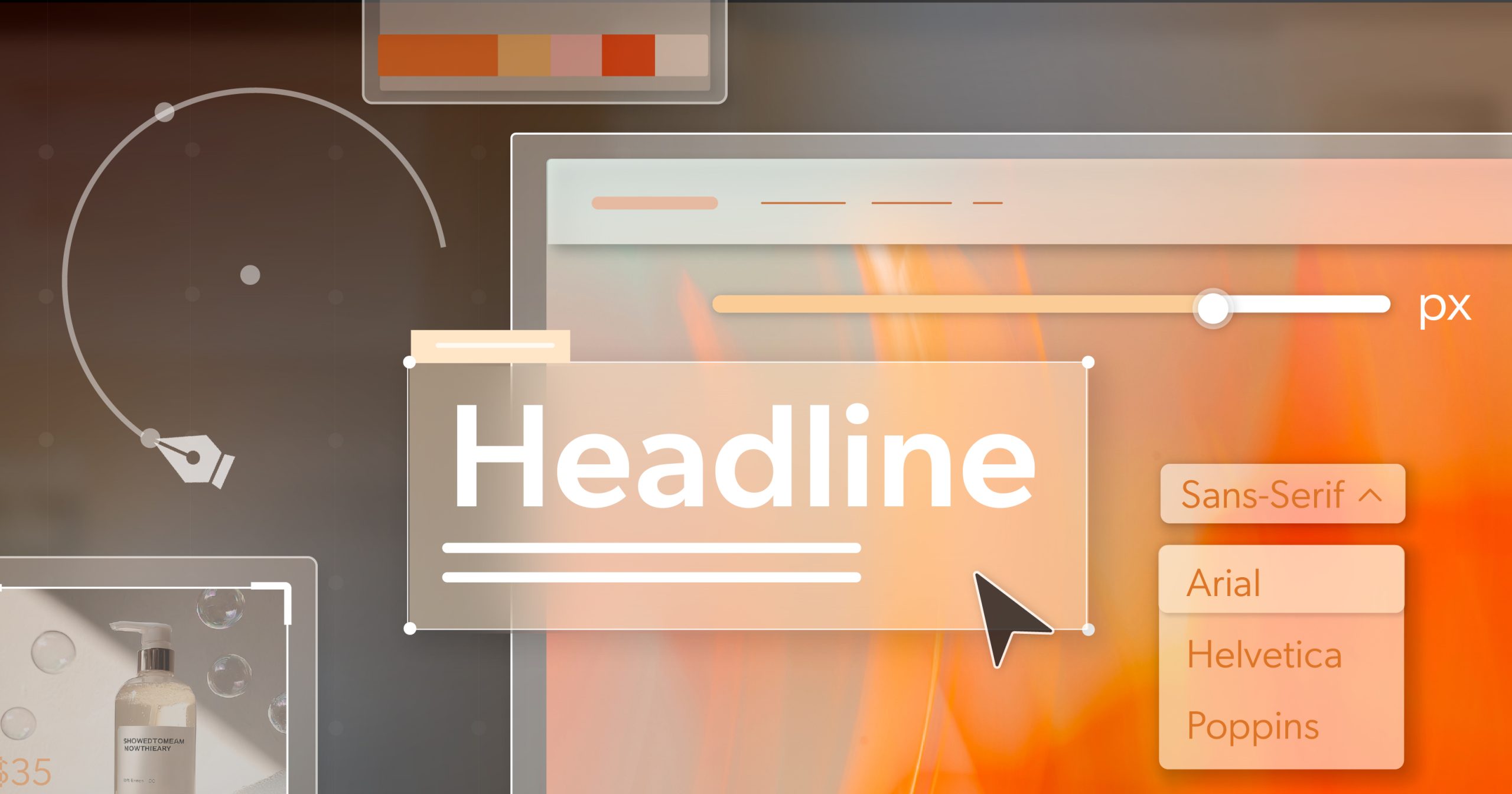
Make Your Visuals Speak—To Everyone
Photos, memes, and infographics carry so much meaning in a post—but only if people can access them. Here’s how to make your visuals work for all users.
- Add alt text to all images. Skip phrases like “image of” and go straight to the point: what’s important in the picture?
- Check your contrast. Text over images or colored backgrounds should meet at least a 4.5:1 contrast ratio. This makes sure everyone—including those with low vision—can read it.
- Avoid putting text inside images. If you do, repeat that text in the caption or alt text.
- Use GIFs with caution. Make sure they’re slow-looping and avoid flickering, which can trigger seizures or migraines.
Caption Everything: Videos and Audio
Whether it’s a behind-the-scenes clip, a podcast preview, or a quick update from your phone, make sure your media includes everyone.
- Always include captions for videos. Even auto-generated ones need human editing to fix errors and add sound context.
- Include transcripts for longer audio or video content like interviews or behind-the-scenes clips.
- Write short video descriptions. These help users understand the purpose or story of the video before they watch.
- Avoid flashy content. Anything that flashes more than 3 times per second could be dangerous. Keep it slow and simple.
- Let users control playback. Don’t autoplay media. Give people the power to start and stop it on their own.
Your Pre-Post Accessibility Checklist
Before you tap “share,” take 30 seconds to run through this:
- Is the writing clear, casual, and easy to follow?
- Are your hashtags capitalized properly?
- Did you add alt text or a description for every image or video?
- Are emojis minimal and placed at the end?
- Do your links say what they lead to?
- Did you check your text/background contrast?
- Are captions accurate and reviewed?
- No autoplay or flashing content?
Running this quick check every time is a great habit to support consistent social media accessibility across all your posts.
Why It’s Worth It
Making your posts accessible isn’t just about compliance—it’s about connection. When more people can engage, more people feel seen. And that leads to better conversations, stronger communities, and yes—better performance, too.
- You’ll reach more people. Simple as that. Accessible posts invite more users in.
- Try it yourself. Use VoiceOver (on iPhones) or TalkBack (on Android) to hear how your post sounds to a screen reader.
- Watch the metrics. Posts with solid alt text, good contrast, and proper captions often get more clicks, longer watch times, and stronger engagement.
Free Tools to Help You Out
No need to figure it all out alone. These tools make social media accessibility easier:
- Contrast Checkers: WebAIM, Accessible Colors,
- Caption Helpers: YouTube Studio (for editing auto-captions)
- Assistive Testing: VoiceOver (iOS), TalkBack (Android), NVDA (PC)
- Accessibility Guidelines: WCAG 2.1 or 2.2
Social Media Accessibility Is About People, Not Just Posts
Accessibility isn’t about being perfect—it’s about being aware. Social media accessibility helps make sure the stories you share, the moments you celebrate, and the content you create are open to everyone who wants to be part of it.
It shows you care. It builds trust. And it reflects the kind of brand or team that people want to follow.
Want to take it a step further? Before your next campaign, schedule an ADA briefing with 216digital. We’ll help you build inclusive strategies that work—for everyone.