AI is changing the way we create. From blog posts and product descriptions to social media graphics, work that once took hours can now be done in seconds. This speed is powerful—but it also carries risk. In the rush to publish, it’s easy to miss a crucial question: Is this content accessible?
The Web Content Accessibility Guidelines (WCAG) apply to everything online—whether written by a person, coded by a developer, or created by an AI tool. That means AI-generated content is not exempt. If you’re using AI to scale your digital strategy, accessibility must remain part of the foundation.
This guide explains how WCAG applies to AI-driven workflows and offers a simple checklist to help you review AI-written text, visuals, and layouts. The goal: to help you publish faster without leaving inclusion behind.
Why AI-Generated Content Creates Accessibility Risks
AI tools can be incredible productivity boosters. But they are not accessibility tools. A common mistake is assuming that if something looks polished, it must be usable for everyone. In reality, accessibility requires more.
AI-generated content often misses the real-world needs of diverse users. For example, it might:
- Write vague alt text like “image of a person” instead of describing the purpose.
- Suggest design elements with poor color contrast.
- Use bold text instead of proper heading tags like
<h2>or<h3>.
If left unchecked, these issues can shut people out, frustrate customers, and even create legal risk. The takeaway is simple: AI-generated content is not automatically compliant with WCAG. It needs human oversight.
WCAG Still Applies—No Matter Who (or What) Creates the Content
WCAG, developed by the W3C, is the global standard for digital accessibility. It’s built around four principles:
- Perceivable: Users must be able to perceive the information (like adding alt text for images).
- Operable: Content should be easy to navigate and interact with (keyboard accessibility matters).
- Understandable: Information should be clear and predictable.
- Robust: Content must work with assistive technologies now and in the future.
These rules apply equally to all content, whether it’s human-created or AI-generated content. In the United States, the Americans with Disabilities Act (ADA) has fueled thousands of lawsuits over inaccessible websites and apps. Courts often turn to WCAG as the standard for compliance—and they aren’t alone. Many countries, including those in the European Union and Canada, also rely on WCAG as the foundation of their digital accessibility laws.
That means WCAG isn’t just a best practice—it’s often the measuring stick for legal compliance. Regardless of whether content was written by a human or generated by AI, if it excludes people with disabilities, it can be litigated upon. The risk is real: inaccessible content can damage your brand, frustrate customers, and create costly legal battles.
The AI Accessibility Checklist
This checklist will help you review AI-generated content before publishing. Each step ties directly to WCAG principles, making accessibility practical and manageable.
For AI-Written Text
- Use clear language: Choose plain, everyday words instead of jargon or long, complex phrasing.
- Ensure proper headings: Use semantic HTML like
<h2>and<h3>so screen readers and assistive tech can navigate. Avoid using bold text as a replacement. - Write descriptive links: Swap vague text like “click here” for something meaningful, such as “Download our accessibility guide.”
- Keep a consistent flow: Break up large blocks of text into shorter paragraphs, bullets, or numbered lists so readers can follow easily.
- Format for scanning: People often skim. Use headings, bullets, and white space to make sure they can still understand the main points at a glance.
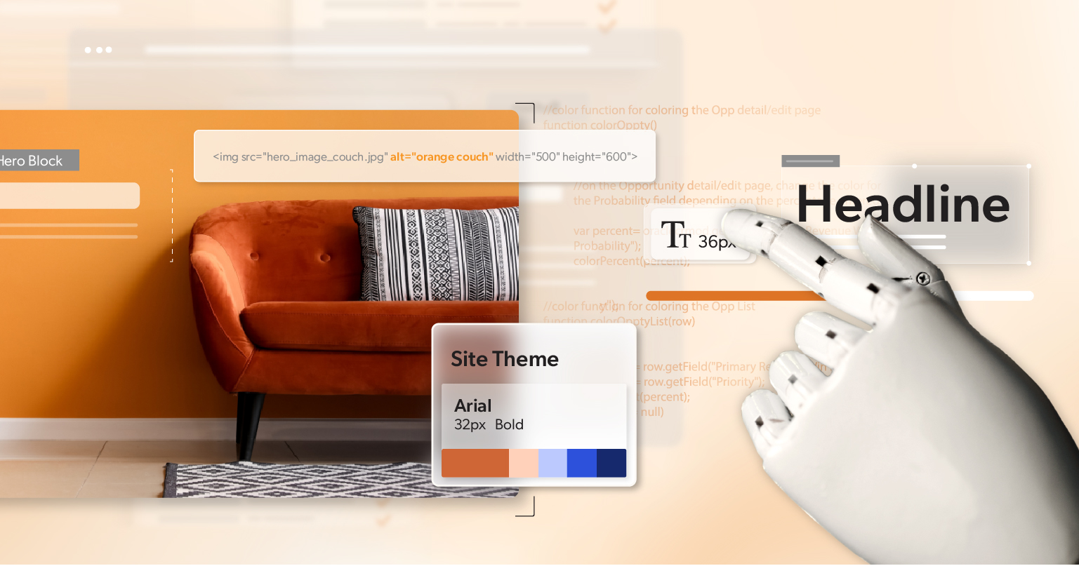
For AI-Generated Images and Visuals
- Provide meaningful alt text: Describe the purpose of the image, not just what it looks like. For example, instead of “photo of a person,” write “Customer smiling while using our product.”
- Avoid text inside images: Important words should always appear as live text so they can be read by screen readers and resized.
- Check contrast: Make sure text and background colors meet at least a 4.5:1 ratio so words are readable by people with low vision.
- Don’t rely on color alone: Use shapes, labels, or patterns in addition to color to communicate meaning. This helps users who are colorblind.
For AI-Generated Multimedia
- Add synchronized captions for videos: Captions must match the audio in both timing and content.
- Provide transcripts for audio files: A text version allows people who can’t hear—or who prefer to read—to still access the information.
- Include audio descriptions: When visuals add meaning that isn’t spoken, narrate those details so blind users don’t miss them.
For AI-Generated Layouts, Code, or Documents
- Ensure keyboard accessibility: Test navigation using only Tab, Shift+Tab, and Enter keys. All interactive elements should be reachable.
- Create accessible PDFs: Include proper headings, a logical reading order, alt text for images, and searchable text.
- Support text resizing: Content should still work when zoomed to 200% without breaking the layout.
- Apply ARIA correctly: ARIA landmarks and roles can help when HTML alone isn’t enough, but they should never replace semantic tags.
Testing Your Output
- Manual review: Always look at the content yourself. Automated tools can’t replace human judgment.
- Assistive tech testing: Try screen readers, keyboard-only navigation, or voice input tools to see how real users will experience it.
- Automated scans: Use tools like WAVE, or Lighthouse to quickly flag common issues, then verify the results manually.
Running through this checklist regularly will catch most accessibility gaps before content reaches your audience.
Building Accessibility Into Your AI Workflow
The best way to make accessibility stick is to build it into the workflow, not tack it on at the end. Here are some ways to do that:
- Use accessible prompts: When you ask AI to create content, guide it with instructions like “Write at an 8th-grade level with clear headings and descriptive link text.” This increases the chance that the draft will already meet accessibility standards.
- Start with strong templates: Use page layouts, design systems, or document templates that are already set up with accessibility in mind. This reduces the risk of introducing barriers later.
- Assign responsibility: Make accessibility review part of someone’s role in the publishing process so it doesn’t get skipped.
- Iterate with feedback: If you notice that AI keeps generating inaccessible elements—like vague alt text or poor contrast—update your prompts or workflow so those issues don’t repeat.
- Set clear standards: Document rules for headings, alt text, link labels, color use, and formatting. Apply these rules consistently so everyone on your team is aligned.
By treating accessibility as a normal part of the process, AI-generated content becomes an asset to inclusion instead of a risk factor.
Accessibility Isn’t Optional—Even with AI
AI may be changing how quickly we create, but accessibility is what ensures that work actually connects with people. WCAG provides the framework, but it’s people—teams like yours—who make sure the digital world is usable for everyone.
The risks of overlooking accessibility are real, from frustrated customers to lawsuits. But the rewards are greater: trust, inclusivity, and a digital presence that welcomes all. The good news is you don’t need to slow down to get it right. With the right checklist and habits built into your workflow, accessibility becomes part of how you publish—not an afterthought.
At 216digital, we help businesses bring accessibility into every stage of content creation—including AI-generated content. If you’re unsure where you stand, consider scheduling a personalized ADA briefing with our team.
It’s a practical next step toward a digital experience that truly works for everyone.