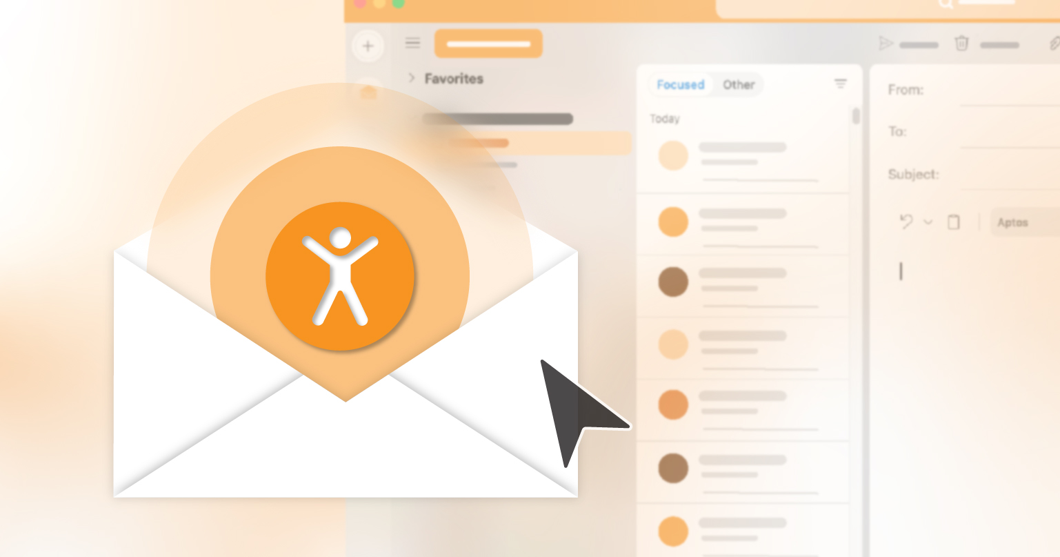
You spend hours testing subject lines, analyzing open rates, and crafting the perfect call to action. But if your emails are not accessible, you may be unintentionally excluding millions of potential readers. More than one billion people around the world live with some form of disability, and many rely on assistive technologies such as screen readers, magnifiers, or keyboard navigation to interact with digital content. This is why email accessibility should be at the center of every campaign you send.
This is where email accessibility makes a difference. Accessible emails do not only support people with disabilities; they also improve reach, engagement, and usability for everyone. You can think of accessibility as a safety net during your quality assurance process, one that helps make sure your hard work actually reaches its audience. The encouraging part is that small and thoughtful changes can create a big impact.
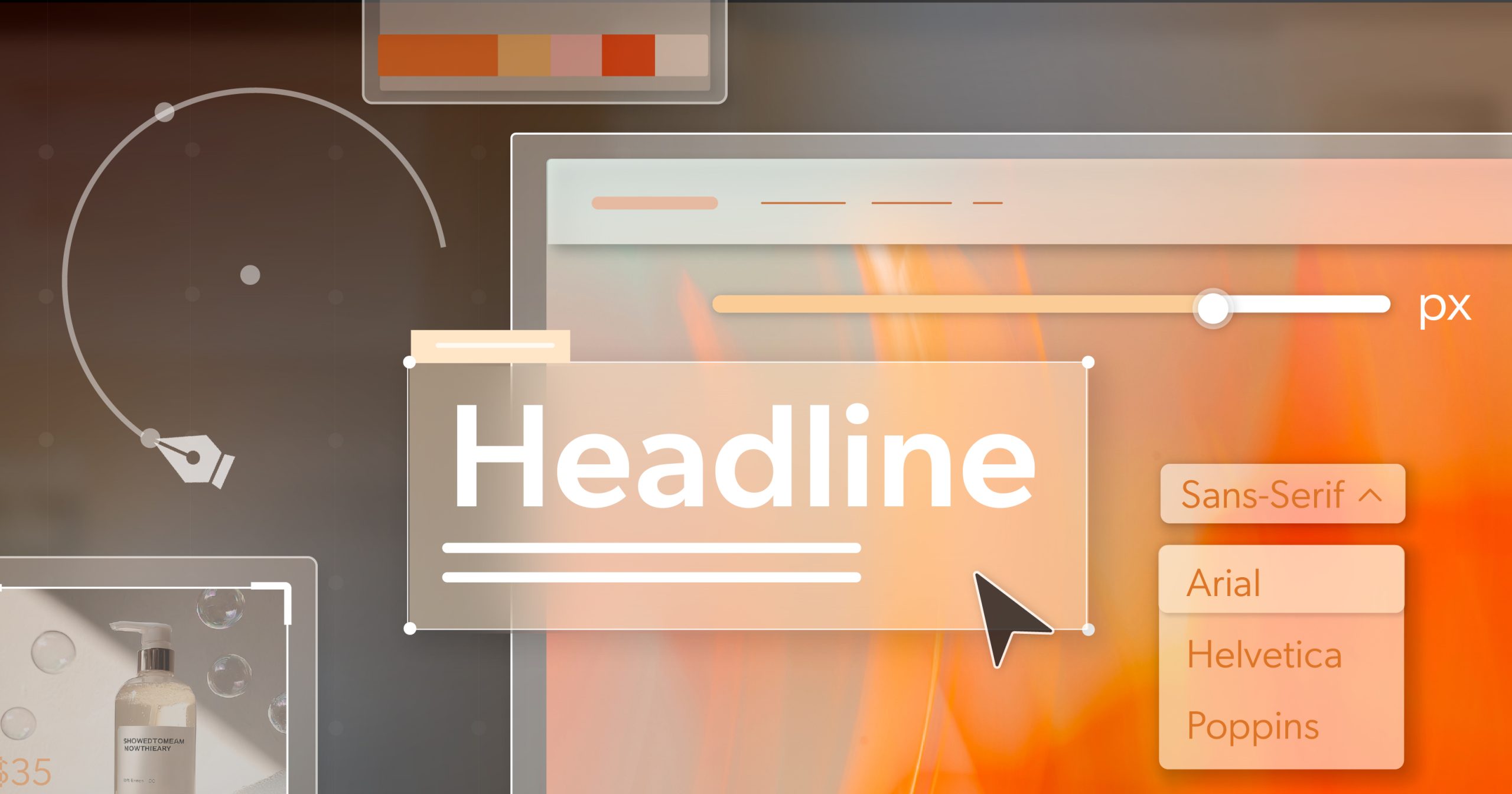
Structure and Layout: Design for Navigation, Not Just Aesthetics
Attractive design may catch the eye, but structure is what allows readers to move through your message with ease. Using semantic heading tags such as <h1>, <h2>, and <h3> helps organize your content in a way that screen reader users can understand. Headings should flow in a logical order without skipping levels. Relying on bold text or font size alone to show importance does not provide the same clarity.
Tables are another common issue. They should be avoided for layout purposes whenever possible because screen readers can misinterpret them. If a table must be used for structure, adding role="presentation" tells assistive technology that it is decorative rather than data.
It is also important to test your emails using only the Tab key. If you cannot reach every link, button, and input field by tabbing through the message, your subscribers will face the same problem.
Image Accessibility: More Than Just Pretty Pictures
Images are powerful in marketing emails, but without the right preparation, they can create barriers. Every image should include descriptive alt text that explains its purpose. If the image is decorative and does not add meaning, use empty alt text so that screen readers can skip it.
Critical information, such as discount codes or calls to action, should never exist only within an image. Live text ensures that the message still appears even if images are turned off in the inbox. A good test is to disable images and see whether the email still conveys your intended message.
Animations also require care. Flashing or strobing content can cause serious discomfort or even seizures for some readers. Autoplaying GIFs may distract from your main message. Whenever possible, give users the ability to pause or stop moving elements.
Links and Calls to Action: Clear, Clickable, Inclusive
Calls to action are where engagement happens, and they must be designed with clarity in mind. Instead of vague text such as “Click here,” choose phrases like “Read the full guide” or “Shop the new collection.” Screen reader users often move through an email by jumping between links, so each one needs to make sense on its own.
Links should always be visually distinct. Underlining them is the best practice since relying on color alone is not effective for people with color blindness. Buttons and links should also be large enough to tap easily on a mobile device. A minimum size of about 44 by 44 pixels provides enough room for users with limited dexterity. Spacing links apart reduces the chance of misclicks. These adjustments not only improve email accessibility but also increase click-through rates by making the experience smoother for everyone.
Copywriting and Readability: Make Every Word Count
Email accessibility applies to words as much as to code or design. Short and direct sentences help readers understand quickly. Breaking your content into smaller paragraphs with clear subheadings makes the email less overwhelming.
Avoid heavy jargon or insider language that may confuse people. Simple words in everyday language travel further and faster. Writing in an active voice also helps keep your copy engaging.
Do not forget the basics of text styling. Font sizes should be at least 14 points, which is especially important for people with low vision or anyone reading on a small screen. Text should be left-aligned only, since centered or justified alignment slows down reading speed and can reduce comprehension.
Multimedia Content: Do Not Skip the Captions
Many email campaigns now include video, audio, or GIFs. These can make content more dynamic, but they bring accessibility challenges that need attention. Any video or audio clip should come with captions or transcripts. Captions are essential for people who are deaf or hard of hearing, but they also help people who are in noisy environments or those who are somewhere quiet and cannot turn on the sound.
Animated GIFs should avoid flashing sequences or rapid loops. If movement is key to your message, include a description of it in the email copy or offer a static fallback image. Multimedia can be powerful, but it should never come at the expense of accessibility.
A Pre-Send Accessibility Checklist
Before you hit send, it helps to run through a quick accessibility check. Try navigating the email with only your keyboard. Make sure every image includes descriptive alt text or an empty alt attribute if it is decorative. Look at your link text and ask if it clearly describes the action or destination. Turn images off and check if the message still makes sense. Confirm that your color contrast is strong enough to read comfortably. Review your animations to see if they are subtle and under control. Lastly, read the text on both desktop and mobile screens to confirm that the font size is easy to read.
These checks only take a moment, but they can prevent frustration and lost engagement.
Accessibility Is a Long Game, but Every Email Helps
No email will ever be perfectly accessible. The goal is not perfection but progress. Each improvement you make expands your reach, improves engagement, and builds trust with your audience.
Email accessibility is not only about legal compliance. It is also about creating meaningful connections. By removing barriers, you ensure that your message reaches as many people as possible and resonates more deeply with them. Making email accessibility part of your long-term strategy strengthens both your brand reputation and the experience of every subscriber.
The next time you prepare a campaign, add accessibility to your checklist. Treat it as part of your workflow, not an extra chore. An inaccessible email is never as effective as it could be.
If you need a clear plan for accessible digital communication, schedule an ADA briefing with 216digital. We will walk you through practical steps to make your email campaigns and your digital presence more inclusive, more effective, and better prepared for the future.