Most teams watch views, watch time, and subscribers like hawks. But there is another number that matters, even if you never see it in analytics. How many people tried to watch your video and left because it was hard to follow?
That question sits at the heart of YouTube accessibility.
YouTube is one of the biggest marketing channels most brands rely on. It powers product explainers, support content, training, webinars, and the videos embedded on your website. When the video is hard to use, that friction follows your brand.
Now, YouTube does a few things well out of the box. The player is responsive, the controls are built in, and keyboard shortcuts are already there. Screen reader support is strong, too. Still, the creator side matters most. Captions, transcripts, audio description, visual design, structure, and testing are all handled by your team. None of this needs to be complicated, and it scales well once it’s part of your workflow.
Start With a Plan for YouTube Accessibility
If accessibility starts after the upload, it usually turns into cleanup work. Cleanup is slower. It costs more. It also leads to compromises, like leaving a confusing visual in place because the edit timeline is already locked.
Planning earlier changes the whole experience. When you build accessibility into the script and storyboard, you can:
- Read on-screen text out loud as you write it.
- Explain charts and visuals in the same moment they appear.
- Avoid abrupt effects that some viewers may not handle.
- Save time by choosing caption and transcript steps up front.
Set a Baseline and Assign Ownership
A simple shift helps. Treat accessibility checkpoints like production milestones. Put them beside script approval, rough cut, and final cut. When a team does this, rework drops fast, especially for repeat formats like weekly updates or a recurring demo series.
It also helps define a baseline for each video type. A solid default for prerecorded content often includes accurate captions, a transcript viewers can access outside the player, and narration that explains important visuals. Then you layer in needs by format. Tutorials often need stronger descriptive narration. Short marketing clips need careful contrast and motion choices. Webinars and livestreams need reliable audio and a caption plan.
This is also about roles. Every script needs a clear owner. Captions deserve someone who reviews them thoughtfully. Contrast and motion checks should fall to a named reviewer. And the final accessibility pass needs an accountable person before anything goes live. Without that clarity, tasks slip—not from a lack of care, but from uncertainty about who handles the final step.
Tip: build a short “definition of done” for a video. If the checklist lives in the same place as your content calendar or project tickets, it gets used.
Captions That Hold Up Under Review for YouTube Accessibility
Captions are often treated like a marketing feature. They increase overall watch time. Search performance benefits. And viewers stay engaged, even in public settings. All true. But captions also carry a basic promise to Deaf and hard-of-hearing viewers. The promise is simple. The words matter, and you should be able to access them.
Standards matter here, too. Web Content Accessibility Guidelines (WCAG) includes caption requirements for prerecorded and live video. Auto-captions are rarely enough on their own. Names get dropped. Product terms get mangled. Key phrases come back as nonsense. If your content includes instructions, legal details, or health and safety steps, “close enough” captions can become a serious problem.
Choose a Workflow You Can Repeat
Your workflow can still be practical. In YouTube Studio, most teams choose one approach and stick with it:
- Upload a caption file, like SRT or VTT, created in an editor or third-party tool.
- Start with auto-captions, then edit and correct them.
- Type captions in YouTube’s editor for shorter videos.
What matters is consistency. Pick a standard and apply it. Many teams upload edited caption files for major videos and review auto-captions for low-risk clips. That can work, as long as “reviewed” means a real check.
A quick quality checklist helps:
- Accuracy: capture what is said, plus key sound cues when they change meaning
- Timing: captions should appear with the speech, not late or early
- Readability: short chunks, correct punctuation, and speaker labels when needed
- Placement: do not cover critical visuals if you can avoid it
Two caption details teams often miss:
- Numbers and units: “15” vs “50” is not a small error in a demo or training video.
- Proper nouns: product names, locations, and people’s names are where auto-captions tend to drift.
Livestreams Need a Follow-Up Step
Livestreams add pressure because content is happening in real time. Live captioning can still be useful, but it depends heavily on audio quality. Use a strong mic. Reduce background noise. Speak clearly. Then, when the livestream becomes an archived video, upload corrected captions. That keeps the recording usable long after the event ends.
Transcripts and Chapters for YouTube Accessibility
Captions are not the same as transcripts. Captions are synced to the video. Transcripts live outside the player. They let people scan, search, and jump to what they need.
It helps to separate three things:
- Captions: synced text that follows audio
- Transcripts: full text of spoken content, not tied to exact timing
- Descriptive transcripts: transcripts that also include important visual info
Transcripts support more than disability access. They also help people who learn better by reading. For anyone who wants to revisit a specific tutorial step, a transcript makes it easy to review without rewatching the entire video. And when a user needs to search for a key phrase, the text lets them jump directly to the right section.
Chapters Make Long Videos Easier to Navigate
Chapters matter for the same reason. Long videos are easier to use when viewers can jump straight to what they need. For tutorials, webinars, and explainers, add timestamps and clear chapter titles. Skip vague labels like “Step 3.” Use names that match what a person is trying to do, like “Turn on captions in YouTube Studio” or “Fix timing and speaker labels.”
A simple way to level up chapters is to write them like help-center headings. If the title sounds useful on a support page, it will likely be useful in a video, too.
Bring Transcripts Onto Your Website
If you embed videos on your website, do not hide the transcript behind extra clicks. Put the transcript on the page, or link to it right next to the player. This helps users decide if the video is worth watching. It also helps your site’s content, as the page now includes the same information in an easy-to-scan format.
Audio Description for YouTube Accessibility
Many teams assume audio description means a big budget and a separate production track. Sometimes it does. Often, it does not.
The real question is whether the video includes meaningful visual details that are not shared in the audio. When a chart appears without explanation, that creates a gap. On-screen instructions that happen without being spoken create the same problem. And when important text is shown visually but never read aloud, that is another gap.
Descriptive Narration Works Well for Demos
In a talking-head video where the speaker explains everything, extra description may not be needed. But tutorials and demos are different. They rely on what the viewer sees. That is where descriptive narration becomes a strong option. The presenter can name what they are clicking, what changed on screen, and what the viewer should look for next.
A helpful habit in demos is to replace vague phrases with concrete ones. Instead of “click this,” say “select Settings,” or “open the Captions tab,” or “choose English from the language menu.” That supports more viewers than you might expect, including people watching on small screens.
Some teams also publish a second version, clearly labeled, like “with audio description,” when visuals are dense and constant. That approach can work well for training content, data-heavy explainers, or detailed product walkthroughs.
Whether you use narration or a described version, keep descriptions concise and focused. Describe what changes the meaning. Place it in natural pauses. Keep the tone neutral and consistent with the video’s style.
Visual Design Choices for YouTube Accessibility
Video design can either support understanding or fight against it. Many accessibility issues show up in the same places, again and again. Thumbnails. On-screen text. Contrast. Motion.
Contrast is a clear example. WCAG guidance uses targets like 4.5:1 for normal text and 3:1 for large text. Apply that mindset to thumbnails, titles, lower thirds, and callouts. If you need to place text over video footage, add a background block to keep it readable. Small text, thin fonts, and low contrast do not just look “clean.” They disappear for many viewers.
Tip: if it is important enough to show, it is important enough to leave up long enough to read. Fast overlays are a common source of missed information.
Reduce Flashing and Overly Fast Motion
Motion is another common trap. Fast flashing edits and strobe-like overlays can create real harm for some people. Avoid rapid flashing effects. Keep motion smooth. If an edit feels intense, it probably is. Review the sequence before publishing.
Do Not Rely on Color Alone
Also, do not rely solely on color to convey meaning. If a chart uses red and green, add labels. If an overlay uses color to mark “good” and “bad,” add shapes or text. And if something important appears visually, say it out loud too. That single habit supports many people at once.
Embedding and Ongoing Checks for YouTube Accessibility
The standard YouTube embed gives you a lot. Player controls are built in. Keyboard operation is supported. The player adapts across screen sizes. Those are strong foundations.
But your website still needs to do its part. An embedded video should not sit alone. Give it context:
- A descriptive heading before the player
- A short summary of what the video covers
- A transcript on the page, or a clear link to it nearby
Avoid auto-play when possible, especially with sound. Auto-play can overwhelm users and can make it harder for screen reader users to orient themselves on the page.
Quick Checks to Add to QA
Testing does not need to be complex. Build a few checks into QA:
- Can you reach and operate the player with only a keyboard?
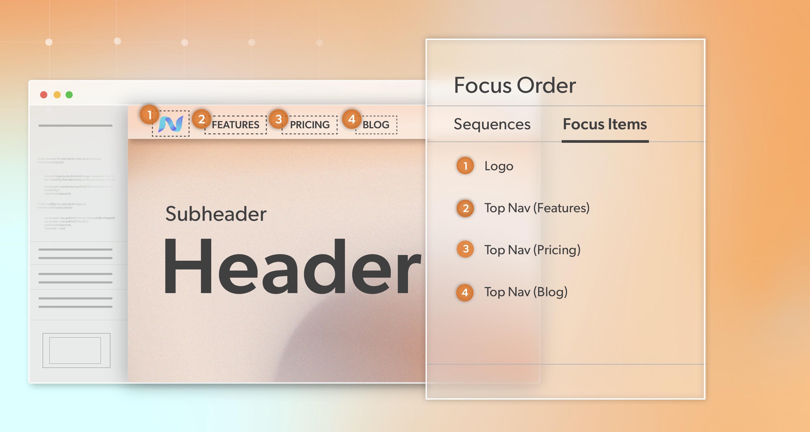
- Does focus move in and out of the player in a predictable way?
- Are captions available and working in the embedded view?
- If you provide a described version, is it easy to find and understand?
Hit Play on YouTube Accessibility
Creating accessible YouTube content is not about chasing perfection or rebuilding your process from scratch. It is about making intentional choices that let more people engage with your videos, whether they are watching, listening, reading, or browsing. When captions are accurate, visuals are clear, and narration carries meaning, your content works harder and reaches further.
At 216digital, we help teams turn accessibility from a checklist into a sustainable strategy. We work with you to integrate WCAG 2.1 accessibility requirements into your video and web development roadmap, tailored to your tools, timelines, and business goals. From reviewing existing video content to building repeatable workflows for captions, transcripts, and embedded media, our focus is on progress you can maintain.
If you want guidance on strengthening your YouTube accessibility practices and aligning them with your digital accessibility goals, schedule a complimentary ADA Strategy Briefing with our team. We’ll help you make a plan that fits your team and your release cycles—on your terms.