Most organizations recognize the value of accessibility and discuss it regularly, sometimes with real urgency. The real challenge comes after the meeting is over.
A design issue is spotted. Someone points it out during a review. Engineering gets a ticket. Weeks later, support hears about the same problem from a customer. The issue is clear and inconvenient, but no one truly owns it.
Without clear ownership, accessibility becomes a recurring issue rather than a matter of regular maintenance. Teams fix what they can, when they can. But as priorities change and deadlines approach, accessibility work gets pushed aside until the next complaint, audit, or legal question arises.
Breaking that cycle is not about another checklist or tool. It is an accountability problem.
When Everyone Owns Accessibility, No One Can Prove It
Saying that “everyone owns accessibility” sounds like teamwork, but in reality, it usually leads to two common results.
First, accessibility becomes reactive. Work happens in short bursts, triggered by audits, complaints, or tight deadlines. Teams fix what is visible, ship, and move on. Without a steady cadence or shared baseline, accessibility becomes something teams return to under pressure, not something the product reliably carries.
Second, teams struggle to defend their accessibility work. It is not that the work is not happening, but no one is tracking it in a way that shows continuity. People make decisions in meetings, personal preferences, or old tickets that no longer reflect the product. When leadership, legal, or procurement asks about accessibility, teams end up giving scattered answers.
Simple questions stall conversations:
- Who defines what “meets the bar” at the component level?
- Where do accessibility standards live for this product today?
- Who has the authority to stop drift, not just respond after something breaks?
When there are not clear answers to these questions, accessibility becomes a set of good intentions spread across teams. People are trying, but there is no real alignment. This leads to recurring gaps as the product changes.
Those gaps rarely stay contained.
Why Repeat Lawsuits Keep Happening
If accessibility were a one-time fix, lawsuits would be spread out, mostly hitting first-time targets, and then taper off as organizations corrected course. That is not what 2024 showed. UsableNet found that 41% of accessibility lawsuits were against organizations that had already faced noncompliance claims. That pattern points to a maintenance problem, not just an awareness issue.
It underscores a tough truth: “we fixed it” is not the same as “we maintain it.” Accessibility has to hold up beyond the initial remediation sprint. It needs to survive redesigns, plugin updates, content pushes, and everyday product changes. Without ownership, it rarely does.
What Users Experience Is Consistency
Users do not see your internal efforts. They notice whether your product is reliable.
When accessibility lacks an owner, reliability becomes inconsistent. Things work as expected in one place, then fall apart in another. Keyboard navigation breaks. Headings lose structure. Error messages come and go, leaving users unsure what will happen next.
These are not rare problems. They are common signs of fragmented decision-making. Teams fix issues in their own areas, but without strong shared patterns, the user experience is not consistent across releases.
Clear ownership changes this. It makes accessibility a repeatable process instead of an improvised one.
How Good Intentions Still Lead to Fragmented Accessibility
Fragmentation often begins with reasonable actions that are never linked together.
Design teams keep a checklist, but they do not connect it to engineering acceptance criteria. Engineers fix issues, but they do not push those fixes back into shared components. Content teams try their best, but they do not have consistent guidelines to prevent common errors. Support hears about barriers, but they cannot turn that feedback into prioritized work.
As a result, accessibility becomes a set of incomplete systems.
Teams sometimes leave a few standards in a document untouched. They label tickets with “make this accessible” without defining what done looks like. Designers let the library drift when accessibility is treated as optional. QA testers apply different checks depending on who is testing and how much time they have.
Over time, the organization ends up fixing the same issues again and again. This is not due to failure, but because the work is not built into shared patterns.
What Ownership Looks Like in Practice
Ownership does not mean one person is responsible for every fix. That approach fails quickly.
Ownership means someone is accountable for making sure accessibility keeps progressing and has the authority to connect work across teams so it does not fall behind.
In practice, strong owners usually do four things well.
They turn expectations into practical standards. Instead of relying on vague statements like “be accessible,” teams define clear requirements for components and user journeys. For example:
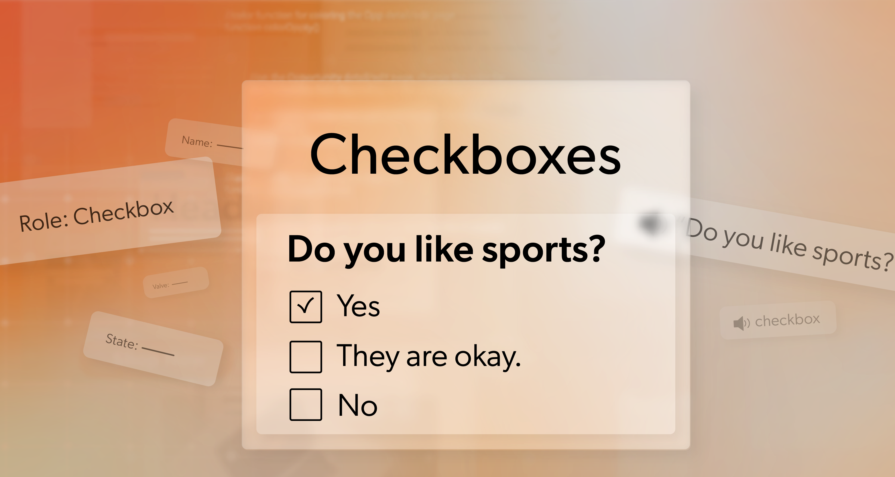
- Which keyboard interactions must menus and dialogs support?
- How should forms handle and surface errors?
- Where are specific content-structure requirements expected on high-traffic templates?
Checkpoints align with how teams already work.
Teams build accessibility into design reviews, code reviews, QA cycles, and content sign-offs. By doing that, they catch issues early, when the fixes are simpler and far less costly.
Clear documentation keeps knowledge from scattering.
They document patterns, decisions, and known issues so teams keep accessibility knowledge shared and accessible instead of letting it sit with one person or disappear across scattered files.
Sustainable practices anchor long-term accessibility.
They treat training, time, and support as essential. Vendors are given clear expectations, not used as a shortcut to avoid responsibility.
This approach matches W3C guidance on planning and managing accessibility, which stresses assigning responsibilities and building follow-through into the process, rather than treating accessibility as a one-time effort.
The Legal Direction Reinforces Maintenance
A few years ago, many teams treated accessibility as a project: audit, fix, and move on. That approach no longer fits current compliance expectations, especially in the public sector.
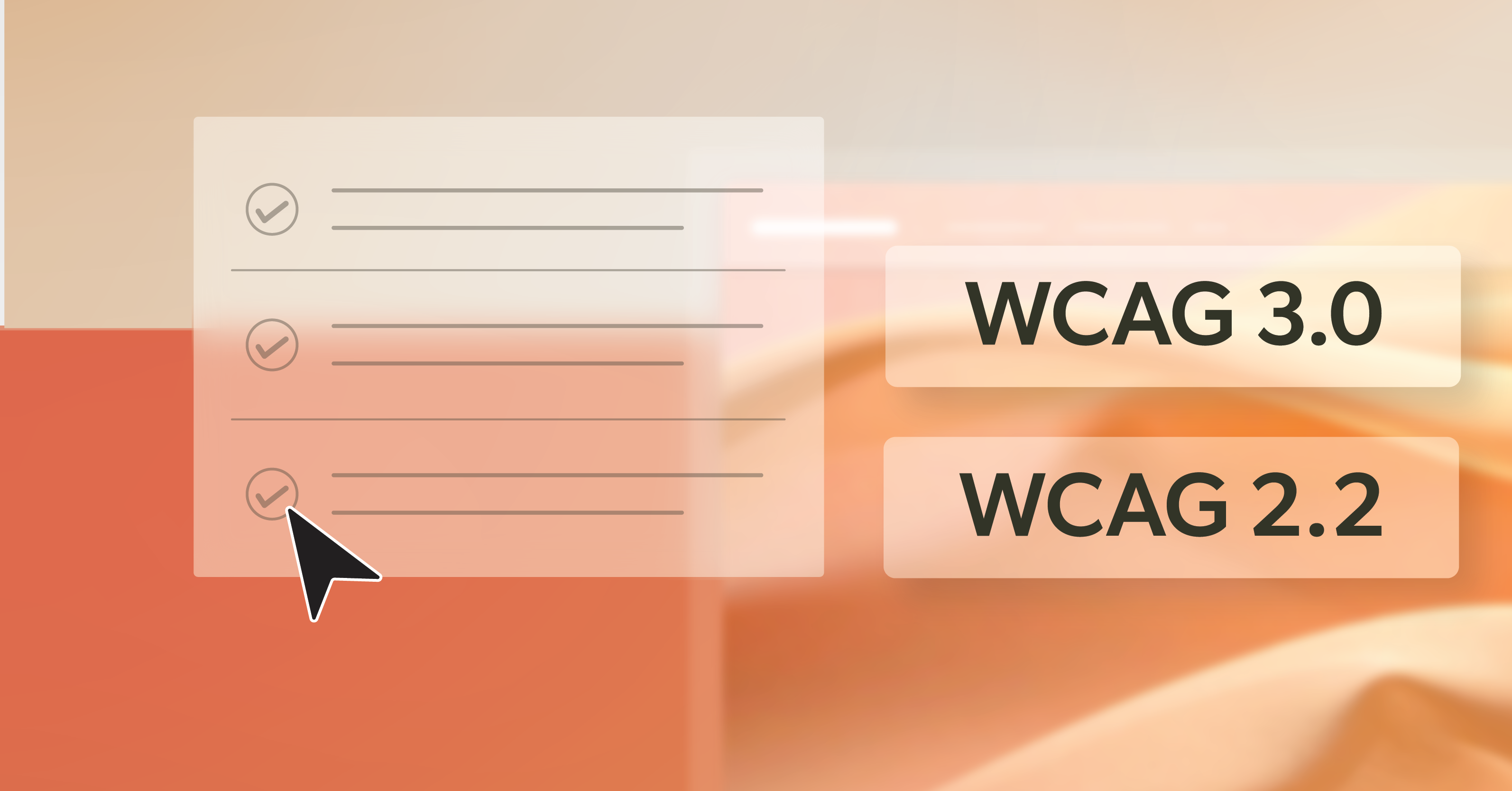
For state and local governments under Title II of the ADA, the DOJ’s 2024 rule sets WCAG 2.1 Level AA as the technical standard for web content and mobile apps, with compliance deadlines beginning in April 2026 for larger entities and in April 2027 for smaller jurisdictions.
There may be different rules and processes, but the direction is the same. Accessibility is something to maintain. Ownership helps make this expectation manageable, even after deadlines pass and work continues to evolve.
Making Ownership Practical Instead of Aspirational
Most organizations already have someone who is the unofficial go-to person for accessibility. People turn to them when an issue comes up or a question is raised. The first step is to make this role official.
Start by doing three things.
- Name the owner formally. When the role stays informal, teams push it aside for whatever feels more urgent.
- Define scope realistically. The owner is not expected to fix everything alone. Their value is in coordinating, setting standards, and ensuring continuity.
- Protect time to lead, not just react. An owner who is always reacting to problems cannot build a system that prevents them.
Next, create a short roadmap based on what you already know, such as audit findings, support trends, and recurring issues. Start by focusing on high-impact user journeys and templates that change frequently.
Early successes matter because they show that accessibility can improve reliability without slowing teams down.
Conclusion: Accessibility Needs Backbone
Accessibility does not happen by accident. Without ownership, efforts remain scattered and reactive. With ownership, accessibility becomes a repeatable, measurable part of the team’s process.
Clear ownership does not mean one person carries the entire load. It puts someone in charge of coordinating decisions, enforcing consistent standards, and resolving accessibility issues before they turn into a crisis.
If your team is still unsure where accessibility should live, or if the people carrying it are stretched thin, 216digital can help. An ADA Strategy Briefing gives you a clear view of where responsibility sits today, where risk tends to build, and what it takes to move toward sustainable, development-led accessibility that your teams can maintain over time.