Web Content Accessibility Guidelines (WCAG) provide a shared language for evaluating digital accessibility. WCAG 2.1 Level AA is the most widely accepted benchmark for audits today, and it gives teams a clear way to identify barriers that affect people with disabilities.
But the presence of a standard alone does not guarantee a useful outcome.
Many teams audit against WCAG and still walk away unsure what to do next. The report may confirm that issues exist, but it does not always make it clear which ones matter most, how they affect real use, or how to move from findings to fixes without derailing existing work.
Using WCAG well means treating it as a framework, not a checklist. A meaningful audit uses WCAG to identify barriers, then interprets those barriers through real interaction. It looks at how people move through the site, where they get blocked, and which issues create the most friction or risk.
A WCAG Audit should not leave your team with a document to archive. It should give you direction that your team can act on.
This article looks at what a WCAG audit should actually tell you, so you can tell the difference between a report that gets filed away and one that helps your team make progress.
Defining the Scope: What a Meaningful WCAG Audit Should Cover
Accessibility issues rarely live on a single page. They show up in the places where users try to get something done. That is why scope matters so much.
A strong WCAG Audit goes beyond the homepage and a small page sample. It focuses on the paths people rely on most.
That typically includes login and account access, checkout or registration flows, high-impact forms, and areas with complex components like filters, modals, or carousels. These are the places where barriers are most likely to stop progress.
Scope should also account for responsive behavior. A flow that works on desktop but breaks on mobile is still a broken experience.
The audit should clearly state which WCAG version and level are being used, what content types are included, and what is explicitly out of scope. This is not a formality. It prevents confusion later and helps teams plan ahead.
How Testing Is Approached in a WCAG Audit
Most teams have seen scan results before. What they need from an audit is testing that reflects how the site behaves during use, especially in the flows that matter.
A strong audit looks beyond surface-level scans and focuses on how people actually use the site. That means testing key user journeys, not just isolated pages. Login flows, checkout, forms, account access, and other critical interactions should be part of the scope from the start.
Automated and Manual Testing Work Together
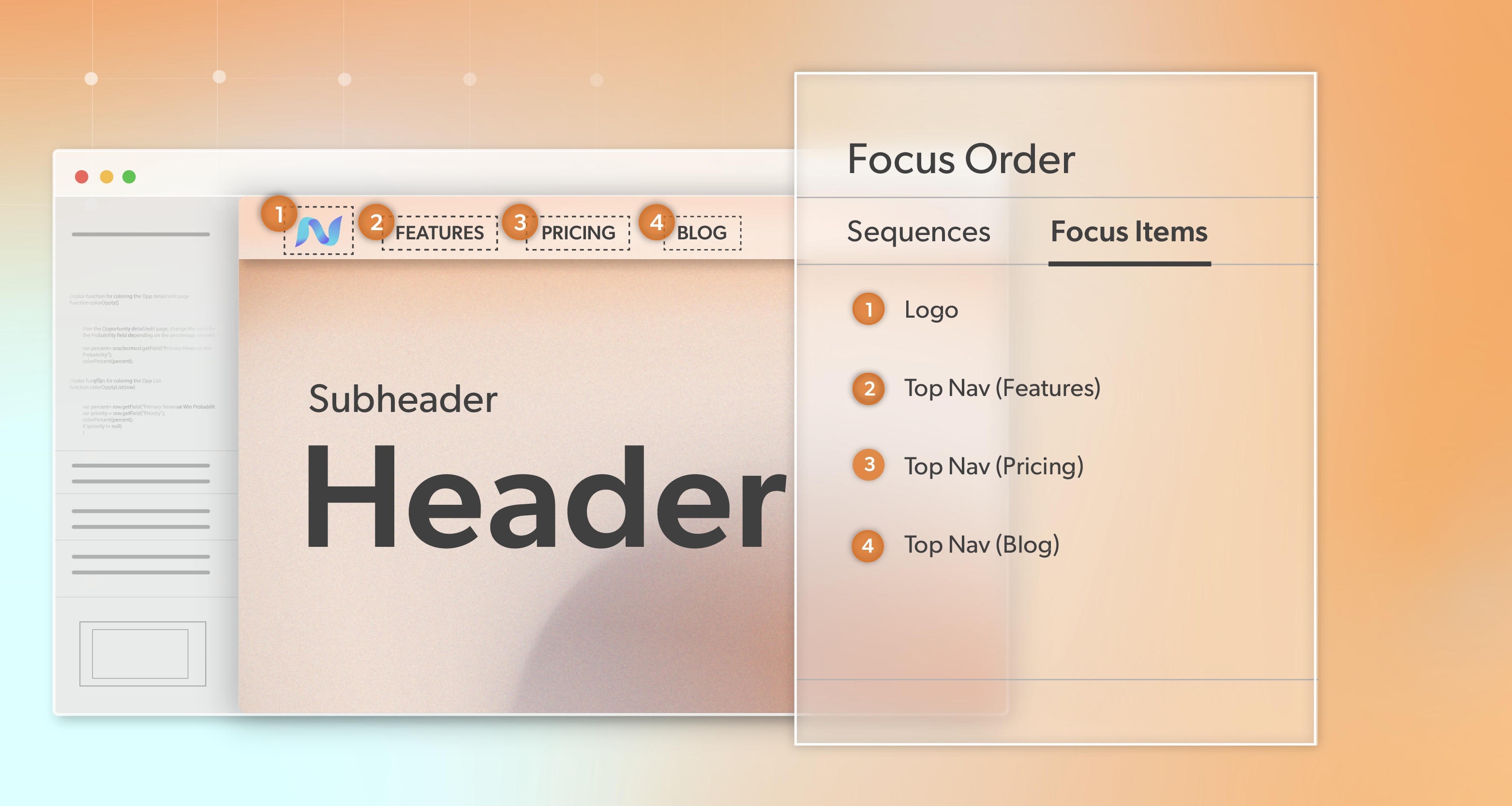
Automation plays a role, but it is only the starting point. Automated tools are useful for catching patterns like missing labels or contrast failures at scale. They cannot fully evaluate keyboard behavior, focus order, screen reader output, or how dynamic components behave during real interaction.
That is why manual testing matters. Human review confirms whether users can move through key flows using a keyboard, whether focus is visible and predictable, and whether assistive technologies announce content in a way that makes sense. This is often where the most disruptive barriers appear.
Real Environments Should Be Part of the Picture
You should also expect clarity around what environments were tested. Not every detail needs to be exhaustive, but the audit should make it clear that testing included real browsers, real devices, and real interaction patterns.
That level of detail builds confidence in the results. It also makes future validation easier, especially after fixes ship.
Understanding WCAG References Without Getting Lost
Most audit reports include success criteria numbers. Those references can feel dense at first, but they are useful once you know what they are doing.
WCAG is organized around four core principles.
- Perceivable
- Operable
- Understandable
- Robust
Those principles are reflected in the numbering you see in audit findings. WCAG findings often reference specific success criteria using numbered labels, and that structure helps with traceability and research.
For example, a reference to 2.1.1 points to the Operable principle and the requirement that all functionality be available from a keyboard. When many issues begin with the same first number, it often signals a broader category of barriers.
If a large portion of findings start with 2, teams are often dealing with Operable issues like keyboard access, focus management, or navigation flow. If they start with 1, the barriers may relate more to visual presentation or non-text content.
This context helps teams spot patterns early and understand where to focus. It also helps frame accessibility work around user experience instead of isolated fixes.
How a WCAG Audit Turns Issues Into Action
This is where audits either earn their value or lose it. Identifying accessibility problems is only useful if teams can understand them quickly and decide what to do next without getting overwhelmed.
Issues Should Be Clear Enough to Fix Without Follow-Up
Describe each barrier in a way that lets developers fix it without a long clarification thread, and in a way that helps non-engineers understand why it matters.
When issues lack location detail or rely on generic guidance, teams end up doing detective work. That slows progress and increases the chance that fixes address symptoms instead of the underlying barrier.
Here is what a usable issue write-up should include.
| Issue element | What it answers | Why it matters |
|---|---|---|
| Description | What is wrong in the interface | Prevents misinterpretation |
| Location | Where it happens | Speeds up debugging |
| WCAG mapping | Which criterion applies | Supports traceability |
| Evidence | Screenshot or code note | Confirms accuracy |
| Steps to reproduce | How to verify and re-test | Enables validation |
| Impact | Who is affected and how | Guides prioritization |
| Recommendation | How to fix it | Turns issues into tickets |
Severity and Frequency Should Guide What Gets Fixed First
Not every issue carries the same weight, and a good audit makes that clear. Severity should reflect user impact, not just whether a technical standard was violated.
| Severity | What it usually means | Common example |
|---|---|---|
| Critical | Blocks a key task | Keyboard trap during checkout |
| High | Major usability failure | Required form fields not labeled |
| Medium | Friction that adds up | Repeated unclear link text |
| Low | Minor issues | Redundant label on a low-traffic page |
Two patterns tend to show up in almost every audit.
The most harm usually comes from a small number of blocking issues. A report may list hundreds of medium findings, but just a few critical ones can stop people from completing the actions the site is meant to support. A single keyboard trap in checkout or a form error that fails to announce itself can halt users before they finish the site’s primary task.
Second, large issue counts often point to shared components or templates. When the same problem appears across many pages, fixing the underlying pattern once can improve accessibility across the site far more efficiently than addressing each instance in isolation.
When severity and frequency are considered together, teams can focus on what reduces risk and improves usability. The audit stops feeling like a list of problems and starts functioning as a practical plan teams can follow.
Accessibility Beyond the Checklist
Meeting WCAG criteria is important, but technical alignment alone does not guarantee a usable experience.
Teams run into this often. A site can pass certain checks and still feel confusing or difficult to navigate. Focus order may follow the DOM, but it feels chaotic. Labels may exist, but fail to provide useful context when read aloud.
A strong WCAG Audit explains not just what fails, but how those failures affect people using assistive technology. That perspective helps teams design fixes that improve usability, not just conformance.
This approach also supports risk reduction. Many accessibility-related legal actions stem from barriers that prevent people from completing core tasks. Audits that connect findings to user experience help organizations focus on what matters most.
Reporting, Tracking, and Measuring Progress
A report is only helpful if people can use it.
Leadership needs a high-level summary of themes, priorities, and risks. Development teams need detailed findings grouped by component or template. Designers and content teams need examples and guidance they can apply in their work without guesswork.
A good audit also creates a baseline. It documents what was tested, what was found, and what needs to be addressed. That record supports follow-up validation and demonstrates ongoing effort.
Accessibility is not a one-time event. Teams benefit most when audits are treated as part of a cycle that includes improvements, validation, and monitoring.
Turning a WCAG Audit into Real Risk Mitigation
A WCAG Audit should give you insight and direction, not just a compliance score. The most valuable audits help you understand what barriers matter most, which issues pose the biggest risk for your users and your organization, and how to reduce that risk in a measurable way.
At 216digital, we specialize in ADA risk mitigation and ongoing support. Rather than treating audits as stand-alone checklists, we help teams interpret findings, connect those findings to user impact, and turn them into prioritized fixes that reduce exposure to accessibility-related legal risk and improve the experience for people with disabilities. That means working with you to sequence fixes, support implementation where needed, and make accessibility progress part of your product workflow.
If your team has an audit report and you’re unsure how to move from findings to meaningful action, we invite you to schedule a complimentary ADA Strategy Briefing. In this session, we’ll help you understand your current risk profile, clarify priorities rooted in the audit, and develop a strategy to integrate WCAG 2.1 compliance into your development roadmap on your terms.
Accessibility isn’t a one-off project. It is ongoing work that pays dividends in usability, audience reach, brand trust, and reduced legal exposure. When you’re ready to make your audit actionable and strategic, we’re here to help.