Every holiday season, online retailers face the same challenge: how to keep up with surging traffic without losing customers to friction. Between November and December, nearly one-fifth of all retail sales happen online—meaning even the smallest accessibility barriers—an unreadable button, a missing label, a poorly designed modal—can quietly chip away at revenue.
But there’s more at stake than missed sales. Accessibility now sits at the intersection of ethics, law, and business strategy. Making your digital experiences usable for everyone isn’t just compliance—it’s a mark of respect for your customers and a driver of measurable growth.
Accessible holiday marketing is how smart teams turn inclusion into performance. It creates digital spaces that welcome all shoppers, reduce drop-offs, and reinforce brand trust at the busiest—and most competitive—time of year. Think of it as rolling out a digital welcome mat, trimmed in garland, for every customer who stops by your virtual store.
Accessibility: An Ethical Imperative and a Business Advantage
Accessibility began as an ethical conversation about fairness and inclusion. Today, it’s also a legal and financial necessity.
Under the Americans with Disabilities Act (ADA) and related global laws, websites are expected to provide equal access to all users. The Department of Justice has affirmed that digital properties—especially those tied to commerce—fall under these requirements. Noncompliance can lead to lawsuits, settlements, and, more importantly, reputational damage that no brand wants under its tree.
Yet beyond risk, the business upside is clear. One in four U.S. adults reports living with a disability, representing a purchasing power that exceeds $1 trillion globally. Accessibility doesn’t shrink your audience—it expands it.
And 80% of consumers say a company’s experience matters as much as its products. In that sense, accessibility isn’t just the right thing to do—it’s the smarter way to compete. During the holidays, it’s also the easiest way to make sure no shopper gets left out in the cold.
Where to Start: Building an Accessible Holiday Marketing Framework
Accessibility shouldn’t be treated as an afterthought in the rush to wrap up year-end campaigns. Instead, build it into your existing production cycle. Here’s how to start unwrapping quick wins.
Step 1: Define What Success Looks Like
Don’t bolt accessibility on at the end. Bake accessible holiday marketing into the same workflow you use for performance and SEO.
- Checkout completion rates: If shoppers abandon forms mid-purchase, that’s a red flag. Accessibility gaps here are like dropping presents halfway up the chimney.
- Cart error rates: – Test both keyboard and screen reader sessions. If errors spike, navigation might need a tune-up.
- Promo email click-throughs: Compare results with images off. If engagement plummets, you’re leaning too heavily on visuals.
- Video completion rates: Captioned videos often earn longer watch times, proof that accessibility can shine brighter than any seasonal campaign light.
Assign an owner for each KPI and add an accessibility review before code freeze—because nothing ruins the holiday rush like last-minute fixes.
Step 2: Reduce Friction in the Core Shopping Flows
The most impactful changes often live in the most familiar places: product discovery, product pages, and checkout.
Product Discovery
- Keyboard navigation: Every filter, dropdown, and toggle should be usable without a mouse. No one wants to wrestle with a website like tangled lights.
- Visible focus states: Highlight where users are on the page with clear outlines—think of it as a guiding star through your interface.
- Logical tab order: Keep navigation smooth and intuitive; users shouldn’t feel like they’re lost in the wrapping paper.
- Clear labeling: Add ARIA labels and visible names to controls so everyone knows what each button does.
Good navigation is like a perfectly organized gift list—clear, predictable, and satisfying to check off.
Product Pages
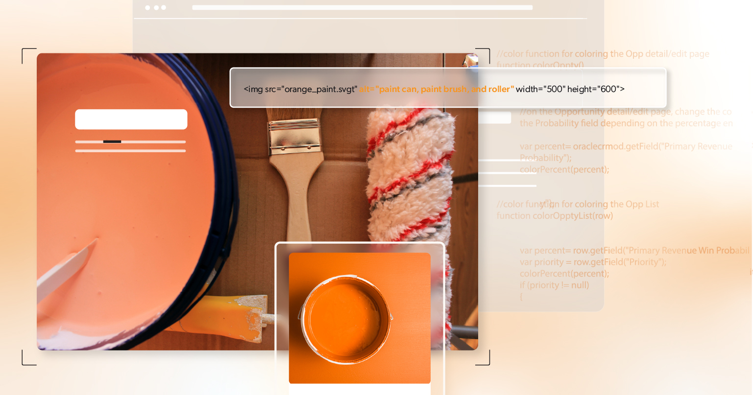
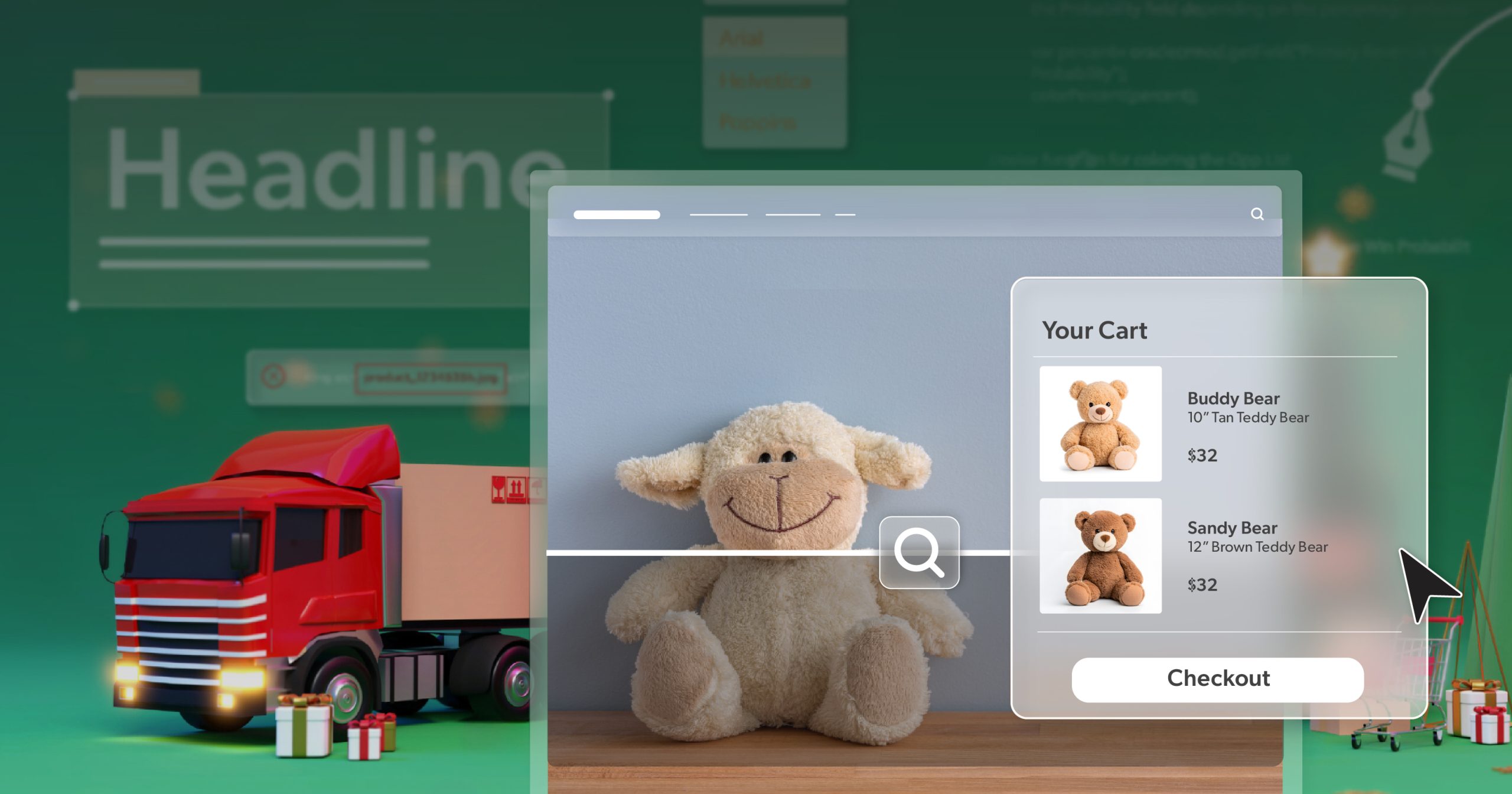
- Descriptive alt text: Replace “red shirt” with “close-up of red cotton t-shirt with crew neckline.” Paint a picture worth a thousand words—and conversions.
- Text-based selectors: Pair swatches with visible text for color and size. Don’t make users guess whether “cranberry” means red or pink.
- Live region announcements: Notify assistive technologies when stock, price, or promotions change. No one likes a surprise sellout mid-cart.
Clarity here means fewer returns—and happier unboxings.
Checkout
Checkout is where good design proves its worth.
- Label everything clearly: Every field should say exactly what it wants — “Email address,” “Zip code,” not “Field 1.” When users can fill out a form without guessing, they finish faster.
- Put errors where they happen: If someone types their card number wrong, the message should appear right there, not two scrolls away. Nobody wants to play “Where’s Waldo?” in the middle of a purchase.
- Skip the impossible CAPTCHA: If you must verify humans, use a simple checkbox or a one-line logic question.
- Keep focus steady: When a payment pop-up opens, the cursor shouldn’t vanish. Trap focus inside the modal and return users to the right spot when it closes.
- Do a keyboard-only run-through: It takes five minutes. If you can buy something with just the Tab key, you’re in good shape.
It’s not glamorous work, but it’s what turns a holiday shopper into a paying customer.
Step 3: Design an Accessible Holiday Marketing Campaign
Color, Contrast, and Motion
- Contrast ratios: Keep text clear—even against festive reds, greens, or snowy whites. 4.5:1 is the magic number.
- Motion reduction: Add a “pause animation” option for sparkling banners or falling snow. Not everyone enjoys a blizzard of motion.
- Test on multiple screens: Preview your site in bright daylight or cozy lamplight—holiday shoppers browse everywhere.
Accessibility ensures your creativity glows without overwhelming.
Email Accessibility Best Practices
Holiday emails do a lot of heavy lifting, so make them easy to read even when half the inbox blocks your images.
- Use real text for the important stuff. If your subject line says “50% Off,” that shouldn’t vanish the moment images are turned off.
- Write links that make sense out of context. “Unwrap Today’s Deals” works better than “Click here” — and it keeps your brand voice intact.
- Keep the structure simple. Short paragraphs, real headings, and logical flow help screen readers — and people reading on their phones at the kitchen table.
- Underline your links. It’s not old-fashioned; it’s functional. Some users can’t rely on color alone to spot a link.
Think of your holiday campaign like a greeting card — clean, clear, and worth opening.
Video and Social Content
- Closed captions: Accurate, human-checked captions help everyone follow along, from office multitaskers to late-night shoppers.
- Transcripts: Perfect for anyone scrolling during family movie night with the volume low.
- Hashtags and emojis: Use camel case (#MerryAndBright) and keep emojis at the end of posts.
- Alt text: Describe visuals on social posts so every viewer can feel part of the moment.
Small accessibility touches here make your brand feel thoughtful—like that handwritten tag on a gift.
Step 4: Test Early and Often
Automated Checks
- Integrate tools: Add accessibility scans to your CI/CD pipeline so errors get fixed faster than you can say “ugly sweater.”
- Catch recurring issues: Run tests regularly to stop regressions before launch.
- Treat failures seriously: Missing alt text should be a showstopper, not a “we’ll fix it next year.”
Manual Spot Checks
- Keyboard audits: Tab through product → cart → checkout. If you can’t complete it, neither can Santa’s helpers.
- Screen reader reviews: Listen to how your site reads aloud—clarity here is worth its weight in gold tinsel.
- Record findings: Short video clips make debugging faster than long lists of notes.
Pre-Launch Governance
- Accessibility sign-off: Make it part of your “naughty or nice” launch checklist.
- Track waivers: If something’s postponed, record a fix date to stay accountable.
- Align with performance metrics: Accessibility deserves a seat at the same table as SEO and load time.
Step 5: Expand Accessibility Across the Journey
Accessibility shouldn’t stop at checkout—it should carry through every touchpoint.
Landing Pages and Paid Ads
- Avoid autoplay: Let users control media playback; not everyone wants surprise carols.
- Write clear CTAs: Use straightforward text like “Explore Holiday Offers” instead of “Learn More.”
- Add multiple cues: Combine color, text, and icons so everyone can understand your visuals.
- Keep it fast: Optimize load times. Accessibility and speed go hand in hand.
Retention and Loyalty
- Organize gift guides: Use clear headings and a logical structure for quick navigation.
- Make wishlists keyboard-friendly: Ensure “Add to Wishlist” works with both mouse and keyboard.
- Announce updates: When something’s back in stock, let assistive tech announce it too.
Accessible holiday marketing builds trust—and trust keeps customers coming back long after the decorations come down.
Step 6: Equip Customer Support to Handle Accessibility
- Multiple contact options: Offer phone, chat, and email—because not everyone writes letters to the North Pole.
- Accessible chat tools: Check focus order and make sure screen readers can announce new messages.
- Transparent status: Display service hours and response times to prevent frustration.
- Proactive communication: Post banners if known issues exist, and provide alternative paths to complete purchases.
- Train support teams: Teach staff how to gather details about accessibility problems. The more context they collect, the faster fixes arrive.
Support should feel like a helping hand, not a closed door.
Step 7: Measure, Learn, Improve
- Segment analytics: Compare behavior by input method—keyboard, mouse, or touch—to spot friction points.
- Correlate updates: Link accessibility fixes to conversion data; seeing the lift is like watching sales lights twinkle in real time.
- Weekly check-ins: A 15-minute accessibility stand-up keeps everyone aligned during peak traffic.
- Post-season reflection: Capture what worked and what needs improvement before the next holiday rush.
Accessibility improvement is the one gift that keeps on giving.
Quick-Start Accessible Holiday MarketingChecklist
This Week
- Tab-test PDP → Cart → Checkout to ensure a clear path to purchase.
- Update alt text for the top 100 SKUs with product details and purpose.
- Caption all holiday videos—think of it as wrapping each message neatly.
This Month
- Automate accessibility scans so no error sneaks into the new year.
- Refine email templates with an accessible, mobile-friendly design.
- Test campaigns with images off—your message should still shine.
Before Code Freeze
- Perform a manual screen reader review of top pages.
- Publish an accessibility contact channel so feedback doesn’t get lost in the snow.
From Cart to Claus: Keeping Every Shopper Included
Accessibility has moral weight—it ensures equal participation in the digital marketplace. It has legal weight—it aligns with ADA and WCAG standards. And it has business weight—it strengthens loyalty, protects brand trust, and captures a broader audience.
Accessible holiday marketing ties all three together like a perfectly wrapped gift. It makes the web fairer, the experience smoother, and the business stronger.
For teams wanting to check their list twice, an ADA briefing with 216digital helps identify high-ROI accessibility improvements before peak traffic. Our experts help teams unwrap the quick wins—and keep the momentum into the new year.
After all, inclusion isn’t just a seasonal sentiment—it’s how lasting customer relationships begin.