216digital.
Web Accessibility

Phase 1
Web Remediation for Lawsuit Settlement & Prevention


Phase 2
Real-World Accessibility


a11y.Radar
Ongoing Monitoring and Maintenance


Consultation & Training

Is Your Website Vulnerable to Frivolous Lawsuits?
Get a Free Web Accessibility Audit to Learn Where You Stand
Find Out Today!

Web Design & Development

Marketing

PPC Management
Google & Social Media Ads


Professional SEO
Increase Organic Search Strength

Interested in Marketing?
Speak to an Expert about marketing opportunities for your brand to cultivate support and growth online.
Contact Us

About

Blog

Contact Us
  • Creating Accessible Data for Charts and Graphs

    Data drives decisions. A clear and easy-to-understand chart can speak volumes whether you’re showing sales figures, survey results, or scientific findings. However, not everyone interprets visual elements the same way. People with low vision, color blindness, or who rely on screen readers may face serious barriers if your charts aren’t designed with accessibility in mind.

    Beyond inclusivity, legal standards exist like the Americans with Disabilities Act (ADA) and the Web Content Accessibility Guidelines (WCAG). In this post, we’ll explore why accessible data visualizations matter, review common accessibility mistakes, and share practical techniques you can use to ensure that all visitors can understand your charts and graphs.

    Designing for Visual Accessibility

    Color Contrast in Charts and Visualizations

    Color contrast plays a crucial role in readability, especially for users with visual impairments. According to WCAG SC 1.4.3: Contrast (Minimum, the standard text should have a contrast ratio of at least 4.5:1, while large text (18pt or 14pt bold) requires a minimum of 3:1. These guidelines also apply to key chart elements, including labels, axes, and text within visualizations, ensuring that information remains clear and accessible to all users.

    To check your color choices, use tools like WebAIM’s Contrast Checker or Chrome DevTools’ built-in accessibility features. If your text lacks sufficient contrast, consider adjusting to darker text on lighter backgrounds or using bolder, larger fonts. Prioritizing accessible data in your visualizations not only enhances clarity but also improves the user experience for a wider audience.

    Avoiding Color-Only Differentiation

    When a chart relies on color alone to show differences in categories—like red for “loss” and green for “gain”—users with color blindness might not be able to tell them apart. WCAG SC 1.4.1 (Use of Color) emphasizes that color can’t be the only method used to communicate information.

    To fix this, you can:

    • Use patterns or textures in bar charts or pie slices.
    • Add direct labels or annotations next to the data points.
    • Include icons or distinct shapes to differentiate data series.

    Scalability and Zoom Support

    Many people need to zoom in to read small text or fine details. According to WCAG SC 1.4.4(Resize Text), users should be able to zoom up to 200% without losing content or functionality. Test how your charts scale on both desktop and mobile screens. This may involve using scalable vector graphics (SVG) or ensuring your chart library supports responsive resizing.

    Providing Text Alternatives and Descriptive Labeling

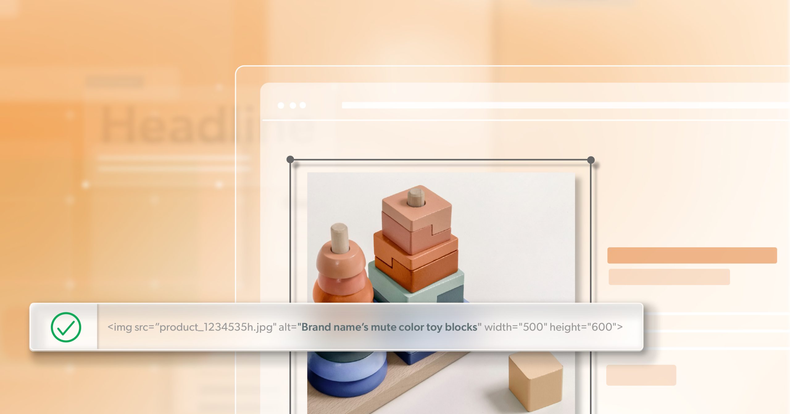
    Alt Text for Simple Charts

    For simpler charts—like a basic bar chart comparing two or three items—brief alt text can be enough. This alt text should include the following:

    • The overall trend or purpose of the chart (e.g., “A bar chart comparing monthly sales in January and February…”).
    • Key numbers or comparisons (if they’re crucial to understanding the data).

    Avoid including every detail if it’s not necessary. Alt text is meant to be concise yet informative.

    Breaking Down Complex Data with Text Summaries

    If your chart is more detailed—perhaps showing multiple data series or a longer timeline—alt text alone won’t cover it. In that case, it’s better to provide a text summary that covers the main insights:

    • Describe what the chart is measuring (“Average temperature trends across five cities…”).
    • Highlight any interesting data points or outliers (“City A had a significantly higher temperature in July…”).
    • Provide overall conclusions that help readers understand key takeaways.

    Using ARIA for More Detailed Descriptions

    If a simple alt text or summary doesn’t do your data justice, you can use aria-describedby to link your chart to a more extended description elsewhere on the page. This approach ensures screen reader users have access to more in-depth data without crowding the main alt text.

    When writing these extended descriptions:

    • Keep your text organized with headings or bullet points.
    • Clearly label each section so users know what information they’re accessing.
    • Make sure screen readers can announce the description properly by placing it in a logical spot on the page or using hidden text if necessary.

    Structuring Data Tables for Screen Readers

    Another highly accessible way to present data is through tables. If you can’t convey the full meaning of a chart in alt text, consider adding a well-structured HTML table. Be sure to:

    • Use <th> elements for headers.
    • Include a <caption> that describes the table’s purpose.
    • Provide a summary if the table is complex.

    For example:

    <table>
      <caption>Monthly Sales for Q1</caption>
      <thead>
        <tr>
          <th scope="col">Month</th>
          <th scope="col">Sales ($)</th>
        </tr>
      </thead>
      <tbody>
        <tr>
          <th scope="row">January</th>
          <td>10,000</td>
        </tr>
        <tr>
          <th scope="row">February</th>
          <td>12,000</td>
        </tr>
        <tr>
          <th scope="row">March</th>
          <td>9,500</td>
        </tr>
      </tbody>
    </table>

    Well-coded tables help screen readers identify the rows, columns, and header relationships.

    Making Interactive Charts and Graphs Accessible

    Keyboard Navigation and Focus Management

    If your chart is interactive—allowing filters, tooltips, or zoom functions—it’s crucial that all features are accessible by keyboard alone. This means:

    • Users should be able to tab through each interactive element.
    • The focus order should make sense, moving in a logical sequence.
    • Dropdowns, sliders, or filters must also be operable without a mouse.

    By implementing these best practices, you can guarantee accessible data interactions for all users, including those who rely on keyboard navigation.

    Ensuring Tooltips and Popups are Accessible

    A big challenge is making sure that tooltips triggered by hovering can also be triggered by keyboard actions, like pressing the Enter or Space keys. Also, make sure each tooltip has an accessible name and description so screen readers can announce it properly. WAI-ARIA attributes like role= "tooltip" and aria-hidden= "false" (when the tooltip is visible) can help.

    Using Semantic HTML and ARIA Roles

    Use semantic HTML elements like <svg> for vector graphics where possible. If you’re using <canvas> or more complex libraries, add proper ARIA roles and states so screen readers know how to interpret them. Clear focus indicators are also important so users can see where they are when tabbing through interactive features.

    Choosing Static vs. Interactive Charts

    Interactive charts can be powerful, but they’re not always the best choice for every audience. Sometimes, a well-labeled static chart is more accessible data and easier to understand. If you have users who need data quickly and without extra steps, offering both a static image and an interactive version can meet multiple needs.

    Selecting and Adapting Chart Types for Accessibility

    Accessible Bar Charts

    Bar charts are among the easiest to make accessible, as long as you:

    • Clearly label each bar.
    • Use more than color to differentiate bars—consider patterns or direct labeling.
    • Provide a descriptive axis label so users know what each bar represents.

    Accessible Line Graphs

    Line graphs can be tricky for those with low vision. To improve accessibility:

    • Use different line styles (solid, dashed, dotted) to distinguish multiple data sets.
    • Add shape markers at each data point so color-blind users can still tell them apart.
    • Make sure your axes and legends are clear, with sufficient contrast.

    Accessible Pie Charts

    Pie charts can be confusing when there are too many slices. Limit your chart to a small number of slices and label each piece directly. Also, add patterns or textures if you use color coding. If your data is too complex, think about using a different format, like a table or bar chart.

    Handling Complex Data Visualizations

    If your data is large or contains many variables, consider breaking it down into smaller charts. This approach, called “small multiples,” allows users to compare data across several simpler charts rather than one overwhelming visualization. Include thorough text explanations and summaries to give context and help users understand the bigger picture.

    Advanced Accessibility Techniques for Charts and Data Displays

    Providing Multiple Data Views

    Not everyone can interpret data in the same way, so offering a toggle between a chart view and a table view can be extremely helpful. For example, you could have a button labeled “Show Data as Table” that, when clicked, reveals an accessible HTML table with the same information.

    Supporting Screen Readers with Data Annotations

    For charts that update in real-time—like stock price tickers—add announcements with ARIA live regions if something significant changes. This way, screen reader users will be notified when new data appears, but be careful not to overload them with constant updates.

    Making Dynamic and Real-Time Data Accessible

    Real-time data can be challenging because it often changes so frequently. Focus on essential changes and clearly label them. If you’re running live dashboards or analytics that refresh, allow users to control the refresh rate or pause the updates. This helps users keep track of what’s changed without confusion.

    Testing and Validating Chart Accessibility

    Manual Testing with Assistive Technologies

    Always test your charts using real assistive tools such as:

    • Screen readers like  NVDA, JAWS, or VoiceOver.
    • Keyboard-only navigation for all interactive elements.

    This hands-on testing helps you catch issues that automated checkers might miss, like poor focus order or unannounced chart labels.

    Automated Testing Tools

    Tools like WAVE Accessibility Checker and Lighthouse’s Accessibility Audit in Chrome can highlight potential problems. However, automated tools can only find about 30% of accessibility issues, so don’t rely on them alone.

    User Testing and Real-World Validation

    Finally, the best way to confirm that your data visualizations are truly accessible is to test them with actual users who rely on assistive technology. Gather feedback and be prepared to iterate on your design. Accessibility is an ongoing process that benefits greatly from real-world input.

    Creating Data-Driven Experiences for All Users

    Inclusive data visualizations aren’t just a courtesy—they’re the key to truly understanding and acting on the information that drives our businesses, classrooms, and communities. By deliberately designing charts and graphs that everyone can parse, you’re ensuring your message resonates with the widest possible audience. You’re also upholding the principles of equality, transparency, and innovation that propel the web forward.

    Start your journey toward full web accessibility today—reach out to 216digital using the form below! Our team of accessibility experts is ready to assess your site and provide tailored solutions to ensure that all visitors can easily access your content.Don’t let accessible data remain an afterthought—take the first step toward a more inclusive online presence now.

    Greg McNeil

    February 12, 2025
    How-to Guides
    Accessibility, Accessible Data, How-to, Web Accessibility, web developers, web development, Website Accessibility
  • How to Write and Design Accessible Links

    Links are the building blocks of web navigation. They are the portals that connect users to information, resources, and actions across the internet. Whether you’re browsing a blog, shopping online, or reading an article, links play a crucial role in how you experience the web.

    For a link to be truly effective, it needs to meet fundamental user expectations. Links should be predictable, accessible, and functional across all devices and interaction methods, from mouse and keyboard to touchscreens and screen readers. When creating accessible links, there are three core aspects to keep in mind:

    1. Writing links that are meaningful and user-friendly.
    2. Designing links for visibility and interaction.
    3. Coding links for accessibility, SEO, and device compatibility.

    In this article, we’ll dive into each of these aspects to help you design and write accessible links that ensure a seamless experience for all users.

    1. Writing Links: Clarity and Context Matter

    Anchor text is the clickable part of a link, and it should always provide clear, meaningful context. Users rely on anchor text to understand where the link will take them. Generic phrases like “Click Here” or “Read More” do not give enough information about the content that the link points to, making it harder for users to make decisions.

    Examples of poor vs. good link text:

    • ❌ “Click here to learn about accessibility.”
    • ✅ “Learn about web accessibility best practices.”

    By being specific and descriptive, you create accessible links that users can easily understand and navigate.

    Structuring Links for Scannability

    Research shows that users often scan pages rather than reading them word for word. This means that the structure of your links matters. To make your links easy to scan, follow these tips:

    • Place important keywords at the beginning of the anchor text.
    • Avoid linking entire sentences—focus on the most relevant words.
    • Use consistent phrasing across similar links.

    For instance, if you’re linking to multiple articles about web accessibility, keep the format and phrasing consistent across all of them. This will make it easier for users to predict what each link offers, improving accessibility.

    Handling Email and Phone Links Correctly

    Links that direct users to email addresses or phone numbers need to be formatted correctly. The proper way to link email and phone numbers is as follows:

    • Email: mailto:hello@example.com
    • Phone: tel:+1234567890

    It’s also important to note that displaying contact information directly on the page, rather than relying solely on links, is more user-friendly. For example, showing your email address and phone number on your page is helpful for users who might have trouble interacting with links. For mobile users, providing an easy tap-to-call experience can improve usability.

    Linking to Downloadable Files

    When linking to downloadable files, it’s essential to set proper expectations for users. Make sure you provide information about:

    • The file format (e.g., PDF, DOCX, ZIP).
    • The file size (e.g., “PDF, 2MB”).
    • Contextual information about what the file contains (e.g., “Download our 2024 SEO Guide (PDF, 5MB)”).

    Examples of misleading vs. helpful download links:

    • ❌ “Click here to download the file.”
    • ✅ “Download our 2024 SEO Guide (PDF, 5MB).”

    By providing clear details about what users are downloading, you create accessible links that prevent confusion.

    2. Designing Links: Visibility and Usability

    To ensure your links are visible and easy to recognize, they should look like links. The most common indicator is underlined text.

    • Color contrast: Ensure a minimum contrast ratio of 4.5:1 between text and background for normal text, and 3:1 for underlined text.
    • Avoid relying on hover-only indicators, such as a color change without underlining, as they are not accessible to all users.

    By following these design principles, you make your links more visible, helping users navigate your site easily.

    Interactive States: Hover, Focus, and Active

    Links should provide clear visual feedback when users interact with them. This helps users understand what is clickable and what is not.

    For hover effects, consider changing the color, underlining the text, or using an animation. For focus states, which are essential for keyboard users, make sure the link is outlined with high contrast, such as:

    outline: 2px solid #005fcc;

    This ensures that all users, including those with limited mobility or visual impairments, can interact with your accessible links.

    Clickable Area and Spacing

    On touch devices, links need to be large enough to tap comfortably. The recommended minimum tap target size is 44×44 pixels.

    Additionally, make sure links are spaced out enough so that users can tap or click them without accidentally selecting the wrong one. This is especially important on mobile devices, where smaller screens can lead to accidental taps.

    Should Links Open in a New Tab?

    By default, links should open in the same tab to avoid disorienting users. However, there are situations where opening a link in a new tab is appropriate:

    • External links to other websites.
    • Downloadable files.
    • Preventing users from losing unsaved progress (e.g., in a form).

    If a link opens in a new tab, always notify users beforehand. This can be done by adding a phrase like “Opens in a new tab” next to the link:

    <a href="example.com" target="_blank" rel="noopener">Example (Opens in a new tab)</a>

    Coding Links: Best Practices for Developers

    Semantic HTML: The <a> Tag Is Essential

    When coding links, always use the correct HTML element: the <a> tag. This element provides the necessary structure for links to be accessible.

    Correct usage:

    <a href="example.com">Visit Example</a>

    Incorrect usage (breaks keyboard accessibility):

    <div onclick="window.location='example.com'">Visit Example</div>

    Using <a> ensures that all users, including those using screen readers or keyboard navigation, can interact with your accessible links.

    Internal Links and Page Anchors

    In-page links (or jump links) allow users to navigate directly to different sections of a page. To ensure proper accessibility, use anchor tags with corresponding id attributes.

    Example of an in-page link:

    <a href="#section">Jump to Section</a>
    <h2 id="section">Section Title</h2>
    To ensure keyboard focus follows the jump, use tabindex="-1":
    <h2 id="section" tabindex="-1">Section Title</h2>

    Using ARIA for Accessible Link Labels

    If you’re using icons for links (such as social media buttons), it’s important to make sure they have accessible names. You can achieve this by using ARIA labels.

    Example with ARIA:

    <a href="https://twitter.com" aria-label="Visit us on Twitter. Opens External Webpage">
      <i class="fab fa-twitter"></i>
    </a>

    Alternatively, include visible text along with the icon:

    <a href="https://twitter.com">
      <i class="fab fa-twitter"></i> Twitter
    </a>

    Managing External Links Securely

    When opening external links in new tabs, always use rel="noopener noreferrer" to prevent security risks:

    <a href="https://example.com" target="_blank" rel="noopener noreferrer">Visit Example</a>

    This practice helps keep your site secure and protects users’ privacy.

    Testing and Improving Links

    Manual Accessibility Testing

    To ensure your links are accessible, perform manual testing:

    • Keyboard navigation: Can you tab to every link?
    • Screen readers: Does every link make sense without visual context?
    • Test the color contrast using tools like the WebAIM Contrast Checker.

    Automated Testing Tools

    You can also use automated tools to check for accessibility issues:

    • Google Lighthouse: Checks for accessibility issues, including link problems.
    • WAVE and a11y.Radar: Other helpful tools for automated accessibility testing.

    A Link is a Promise, Not a Surprise

    Every link you create is a promise to your users. By following best practices for writing, designing, and coding accessible links, you help guide users seamlessly to their next destination without frustration. Accessible links improve navigation, accessibility, and the overall user experience for everyone.

    To ensure your website is fully accessible, consider auditing your links using the strategies outlined in this article. Want to take the next step? Schedule an ADA compliance briefing with 216digital to assess your site’s accessibility and learn how to improve it.

    Greg McNeil

    February 11, 2025
    How-to Guides
    Accessibility, descriptive link text, How-to, Links, Web Accessible Links, Website Accessibility
  • accessiBe’s AI Claims Fall Short—FTC Proposes $1M Fine

    In a significant move underscoring the importance of truthful marketing in digital accessibility, the Federal Trade Commission (FTC) has proposed a $1 million fine against accessiBe, a company known for its AI-driven web accessibility tool, accessWidget. The FTC alleges that accessiBe misrepresented the capabilities of its product, claiming it could render any website fully compliant with the Web Content Accessibility Guidelines (WCAG), which set the standard for web accessibility.

    FTC’s Allegations Against accessiBe

    According to the FTC’s complaint, accessiBe advertised that its accessWidget could make websites fully WCAG-compliant through a simple integration process. The company asserted that by adding a single line of code, websites would immediately comply with 30% of WCAG requirements, with the remaining 70% addressed by the AI within 48 hours. However, the FTC found these claims deceptive, stating that the accessiBe widget failed to make essential website components—such as menus, headings, tables, images, and recordings—conformant with WCAG standards.

    Furthermore, the FTC highlighted that accessiBe engaged in misleading marketing practices by presenting paid endorsements as independent reviews, violating transparency norms. The proposed settlement includes the $1 million fine and mandates that accessiBe cease making unsubstantiated claims about its product’s capabilities and disclose any material connections with endorsers.

    Legal Challenges Faced by accessiBe

    This FTC action is not the first legal challenge for accessiBe. The company has faced criticism and legal scrutiny over its accessibility solutions. In 2024, a class-action lawsuit was filed against accessiBe, alleging breach of contract and other claims related to the efficacy of its products.

    Limitations of AI in Web Accessibility

    The situation with accessiBe brings to light the broader limitations of relying solely on AI for web accessibility. While AI tools can assist in identifying and addressing certain accessibility issues, they often lack the contextual understanding necessary to handle complex web elements. For instance, AI might misinterpret images, provide insufficient alternative text descriptions, or overlook interactive components crucial to the user experience. These shortcomings can result in websites that remain inaccessible to individuals with disabilities, despite the implementation of AI solutions.

    Moreover, AI-driven tools may struggle with context-specific issues and ethical considerations, necessitating human intervention to ensure comprehensive accessibility testing. For example, AI might not fully understand the context of certain content, leading to false positives or negatives.

    For more information on automated testing, please read our article “Website Accessibility: Are Overlays Just Hiding the Problem?“

    Best Practices for Achieving True Compliance

    Achieving genuine web accessibility compliance requires a multifaceted approach that combines automated tools with human expertise. While AI can be a valuable asset in identifying potential issues, it should not be relied upon exclusively. Manual audits conducted by accessibility experts are essential to address nuanced and context-specific barriers that AI might miss.

    Incorporating user testing, particularly involving individuals with disabilities, can provide invaluable insights into real-world accessibility challenges. This collaborative approach ensures that websites comply with technical standards and are genuinely usable for all individuals.

    Partnering with Experts for Comprehensive Accessibility Solutions

    Businesses aiming for authentic accessibility compliance should seek partnerships with organizations that offer a blend of automated tools and expert human evaluation. For instance, 216digital provides comprehensive accessibility services encompassing AI-driven assessments, manual audits, and user testing. By collaborating with such partners, companies can ensure that their digital platforms comply with legal standards and are accessible to all users.

    Conclusion

    The FTC’s proposed fine against accessiBe is a stark reminder of the importance of transparency and honesty in marketing accessibility solutions. While AI offers promising tools to achieve web accessibility, it is not a standalone solution. A comprehensive approach integrating AI capabilities with human expertise and manual audits is essential for proper compliance and inclusivity. Businesses must remain vigilant and committed to genuine accessibility efforts, ensuring their digital content is accessible to all individuals, regardless of ability.

    Ready for a solution that truly works? Schedule a free ADA briefing with 216digital. Simply fill out the contact form below, and let’s take the next step toward making your site accessible for all. We’ll help you avoid the pitfalls that landed accessiBe in trouble and guide you toward long-lasting, legally sound solutions.

    Greg McNeil

    February 10, 2025
    Legal Compliance
    accessiBe, Accessibility, ADA Compliance, Ai and Overlay Widgets, Website Accessibility
  • Love at First Click: Why an Accessible Websites Win Hearts (and Customers)

    Have you ever visited a website and felt a spark right away? That feeling often comes from a page that’s simple to explore, easy to read, and welcoming to everyone. When people sense they can find what they need without stress, they’re more likely to stick around. This positive reaction is what we might call “love at first click.” It’s that warm feeling you get when a website greets you with open arms.

    A big part of this charm comes from making sure your site can be used by people of all abilities. When we talk about “accessible websites,” we mean sites that include features to help everyone use them. For example, some visitors rely on screen readers because they have vision impairments. Others might need larger fonts to see text clearly. Still, others need clear directions or simple labels to understand a page. By building accessible websites, you open your online doors to more users. In turn, they will feel more connected to your business.

    Below, we’ll explore how you can create a website that leaves visitors with a smile. We’ll also talk about why doing so can make a big difference for your brand.

    The Power of First Impressions

    Have you ever landed on a page that was too cluttered or confusing? If the text was tiny and the menus were hidden, you might have closed it right away. That first impression can make or break a new relationship with a customer. In a crowded online world, you want your site to stand out for the right reasons.

    Clear menus, bold and readable fonts, and good color contrast can turn a casual visitor into a loyal fan. People often decide in seconds if they feel comfortable on a page. If your site is set up to welcome everyone, you’ll leave a powerful impression that lasts.

    What Does Accessibility Mean?

    When we say a website is accessible, we mean it’s been designed so people with various needs can use it. This includes people who are blind, have limited vision, have trouble hearing, or have difficulties using their hands and arms. It also includes people with cognitive conditions, such as dyslexia.

    Accessible websites often have features like:

    1. Clear Navigation: Simple menus and page structures help everyone find what they want.
    2. Readable Fonts: Text that’s large enough and easy to understand prevents eye strain.
    3. Alternative Text for Images (Alt Text): Short descriptions for images tell screen readers what’s being shown.
    4. Keyboard-Friendly Setup: Some users can’t use a mouse, so they rely on tabs and arrow keys to move around.

    These steps may seem small, but they make a major impact. Imagine a person who depends on a screen reader. If your site has alt text, that user will hear each image described. They’ll feel included, which can lead to trust and loyalty.

    Why Accessible Websites Matter for Everyone

    An accessible website doesn’t help only those with special requirements. In many ways, it’s helpful to all your visitors. Large fonts and clear color contrast work well for people browsing on mobile phones under bright sunlight. Captions on videos help anyone who’s watching a video in a quiet office or a noisy bus. Good design choices make your site easier to use for everyone, no matter the setting.

    When people sense that they can read and click through your site without trouble, they’re more likely to stay. They’ll also be more eager to return. This leads to deeper connections and can spark positive word-of-mouth. Users often share good finds with friends, and you’ll notice more traffic over time.

    Building Trust and Loyalty

    We all want to feel valued and respected. When you design your site with inclusion in mind, you send a message that every visitor matters. That message builds trust. Visitors know you’ve thought about their needs and comfort. As a result, they’re more likely to explore your products or services.

    Imagine receiving a warm welcome at a local shop. You’d want to come back, right? Websites aren’t that different. When customers feel good about how a site treats them, they’ll remember it. This memory makes them more inclined to buy, share, and stay loyal.

    Reaching a Larger Audience

    A smart business plan often involves finding ways to expand. One way to do this is to include more people. When you make sure your website has features like keyboard navigation and alt text, more visitors can join in. This means you can reach many potential customers who might otherwise pass over your site.

    Word spreads quickly online. If someone who needs those features finds your site useful, they’ll likely tell friends or family in similar situations. Word-of-mouth can travel fast in certain communities, giving your site a good chance to grow. By meeting a need that many sites overlook, you can stand out in a busy online space.

    Boosting Your SEO

    Search engines like Google pay attention to how a site is organized. When you add descriptive headings, alt text, and clear layouts, you help search engines understand your content. This can lead to better rankings.

    For example, alt text serves as an extra description of your images. Search engines pick up on these details, which can help your site appear in image search results. Many tools that help with accessibility, such as proper heading structure, also help search engines crawl and index your pages. This can boost your spot in search results, bringing even more people to your site.

    Protecting Against Legal Risks

    Being open to as many users as possible can also help reduce possible legal troubles. Laws like the Americans with Disabilities Act (ADA) focus on making goods and services open to everyone. Websites are part of that. If a site is built with no thought for accessibility, it could face complaints or lawsuits.

    Improving your site for people with special requirements lowers that risk. Even if legal matters are not your main concern, it’s good to be prepared. When you keep your site in line with best practices, you are making a solid long-term investment.

    Tips for Making Your Website Accessible

    Below are a few steps you can take to make your site more inviting:

    1. Use Large, Clear Fonts: Aim for fonts that are at least 16px so people don’t strain their eyes.
    2. Check Color Contrast: Text should stand out against the background. There are many free tools to help you pick suitable color combinations.
    3. Provide Captions on Videos: Add subtitles or transcripts for video or audio content.
    4. Add Alt Text for Images: Write brief descriptions that explain what each image shows.
    5. Ensure Keyboard Navigation: Test your site by using only the keyboard to move around. If you can’t reach certain links or content, others might not be able to either.
    6. Keep Forms Simple: Use clear labels that tell people exactly what to type.
    7. Organize Content with Headings: H1, H2, and H3 headings help screen readers know how the page is structured.

    You don’t need to make all these changes at once. Even small improvements can have a big impact on the user experience.

    Your Path to a Great First Click

    Picture your website as an online shop or office. You’d want it to feel inviting and arranged so visitors can find what they want. You’d also want it to reflect your brand values. Making small, mindful changes for accessibility can create that “wow” factor as soon as a new visitor arrives.

    Think of the times you felt relaxed and confident navigating a new website. Chances are, someone took great care in building that site’s design and layout. With the right approach, your site can leave the same positive impression.

    The Ongoing Journey

    Improving accessibility can feel like a long process, but think of it as a journey that grows along with your business. Every time you introduce a new feature or post fresh content, do a quick check for accessibility. When you add a video, include captions. If you upload a new image, write a short alt text so everyone knows what it’s about.

    These little efforts add up in a big way over time. Your visitors will notice the extra care, which makes them more likely to stick around, trust you, and come back often. Tools like Accessibility Radar (a11y.Radar) can help you stay on top of accessibility by monitoring your site and flagging potential issues before they become barriers. By making accessibility a priority, you’ll create a stronger, more welcoming online presence for everyone.

    Win Hearts with an Accessible Website

    In today’s digital world, the first click can mean everything. Accessible websites welcome visitors and help them feel at home. That friendly first impression can turn casual visitors into loyal customers.

    When you invest in clear navigation, larger fonts, and alt text for images, you’re making your site open to all. This not only grows your audience but also fosters respect and trust. Plus, you’ll enjoy better search rankings and reduce the chances of legal issues.

    If you’ve been thinking about ways to boost engagement and win hearts online, begin by checking how people of different abilities experience your website. You might be surprised at the improvements you can make right now. By showing that you care about every visitor, you’ll inspire the kind of warm feelings that lead to “love at first click.” And that’s a win for everyone—especially your business.

    Ready to create accessible websites everyone will love? Schedule an ADA briefing with 216digital using the contact form below!

    Greg McNeil

    February 7, 2025
    The Benefits of Web Accessibility
    Accessibility, accessible websites, Benefits of Web Accessibility, Website Accessibility
  • Accessibility Barriers: The Problem with Placeholders

    Form design might seem simple at first. You add text fields, maybe a dropdown or two, and call it a day. But when it comes to guiding users, many designers rely on placeholders to show instructions or examples inside the input fields. On the surface, this seems like a neat way to save space and keep the layout clean. However, those same placeholders can create big usability and accessibility issues.

    If you’ve been counting on placeholders to label your form fields, it might be time to rethink your approach. In this article, we’ll explore why placeholders cause problems, especially for people with disabilities, and how you can design forms that are clearer and easier for everyone to use.

    Why Placeholders Cause Problems in Forms

    1. They Disappear When Users Start Typing

    Picture this: a user clicks on a field that says “Enter your phone number,” the moment they begin typing, that instruction vanishes. If they suddenly forget the exact format or details required, they have to either clear the field to see the placeholder again or guess what was there in the first place. This can be annoying in simple fields, but it becomes a real headache in longer or more complex forms. Each additional step or moment of confusion can lead to higher drop-off rates and reduced accuracy.

    2. Not All Browsers Support Them

    Although modern browsers generally display placeholders, some older or less common browsers may not. When these browsers skip placeholders altogether, the user has zero guidance or instruction for the field. If your form is already barebones—meaning you’ve omitted labels or separate hint text—people on unsupported browsers are left to figure it out on their own. This can be especially problematic when international or low-tech audiences may rely on older systems.

    3. Once Filled, Fields Lose Context

    After a user inputs data into a field, the purpose of that field may not be obvious. This is especially true for details like phone numbers, ZIP codes, or other specialized information. Without visible labels, users who step away from their screens or return later might forget the exact context for each field and whether it requires a specific format (e.g., whether to include country codes or parentheses for phone numbers).

    4. Reviewing Answers Becomes a Hassle

    Many people like to review their answers before hitting the Submit button. However, if placeholder text disappears once the user types something in, they can’t quickly verify whether their entry meets the field’s requirements. This can lead to overlooked mistakes—like mixing up month and day in date fields or forgetting to include a state abbreviation in an address.

    5. Fixing Errors Gets Confusing

    When a form returns an error message, it often refers to a specific label or hint. Without a visible label, a user might only see a generic error message like “Invalid entry” without knowing how to fix it. They’re left guessing whether they must add a certain number of characters, switch from text to numbers, or follow a specific pattern. This guesswork can be frustrating and lead to abandoned forms.

    6. Some Browsers Hide Placeholders When the Field Is Focused

    In certain older browsers, clicking or tabbing into an input field removes the placeholder immediately. Suppose a user didn’t fully absorb the instructions beforehand. In that case, they’ll have to navigate out of the field and back in, or potentially delete any typed text, to see the placeholder again. It’s a minor issue but yet another piece of friction.

    7. They Can Be Mistaken for an Actual Answer

    Placeholder text usually has a lighter contrast to differentiate it from actual user input, but the difference can be subtle. Some users might assume the placeholder is pre-filled data and skip the field altogether. Or they might try to erase the text, only to realize it’s a placeholder, not a typed entry.

    8. Low Contrast Makes Them Hard to Read

    One frequent design choice is to make placeholders light gray. This aesthetic might look sleek but can be challenging to read for people with visual impairments or even those using a device in bright sunlight. Low contrast is a direct accessibility barrier and may violate the  Web Content Accessibility Guidelines (WCAG) guidelines, which recommend sufficient contrast between text and background.

    9. Some Screen Readers Don’t Read Placeholder Text

    Screen reader support for placeholders is inconsistent. Some devices or assistive tools ignore placeholders entirely, leaving users no context. If you rely on placeholders to communicate critical instructions, this group of users may miss out on the information they need.

    10. Smaller Clickable Area Without Labels

    When you have a label element associated with a form field, clicking the label sets focus on that field. This feature is handy, especially for people with motor impairments who benefit from a larger clickable target. Without a proper label, users might have to click precisely on the field, which can be more complicated.

    11. Placeholder Text Gets Cut Off

    Long placeholder text often doesn’t fit in the space provided, so it gets truncated. If the most crucial part of the instruction is at the end—like a date format or suffix—it may not be visible. Mobile users, in particular, have limited screen space, making it even more likely that critical instructions get chopped.

    12. Some Browsers Don’t Translate Placeholders

    If you depend on browser-based translation (like Google Translate in Chrome), remember that these tools don’t always translate placeholder text. International users might see fields with instructions in a language they don’t understand, putting them at a disadvantage.

    13. Auto-Complete Can Mess Things Up

    Browsers often auto-fill fields such as name or email based on saved user information. When that happens, the placeholder text is never shown. If the user doesn’t recall the exact format needed—like whether the phone number should include a dash or parentheses—they might submit the wrong thing without even realizing it.

    14. High Contrast Mode Makes Placeholders Look Like User Input

    High Contrast Mode in Windows can shift placeholder text to the same color as regular text. In that situation, a placeholder might appear identical to actual input, confusing users who think the field is already filled in or assume it’s a default value.

    What You Should Do Instead

    Rather than relying on placeholders, consider these best practices:

    Use a Visible Label

    Make sure every form field has a label that stays on the screen. Labels tell users—sighted, low vision, or blind—what the field is for. They also help screen reader users navigate more easily.

    Put Hint Text Below the Label

    If you need to offer more guidance, place this text below or next to the label. This way, the hint stays visible all the time. It won’t disappear once someone starts typing.

    Provide Clear Formatting Instructions

    Instead of relying on placeholders, add clear examples outside the input field. For instance, you could show “MM/DD/YYYY” under the “Date of Birth” label. Users can see the format without losing the prompt.

    Test for Accessibility

    Test your forms with screen readers and try them in high-contrast mode. Check that the labels are clear, that hint text stands out, and that the form works well even if placeholders don’t show up at all. Tools like WAVE or Google Lighthouse can help identify accessibility barriers.

    Consider Better UX Patterns

    Inline validation, tooltips, or progressive disclosure can guide users in a more reliable way. These methods let users see error messages or instructions at just the right time, without losing any important label text.

    Clear Forms, Better Experiences

    Using placeholders might seem like a clean and modern design choice, but it often causes more trouble than it’s worth. From disappearing instructions to accessibility issues, placeholders can leave users frustrated and unsure. Instead of relying on placeholders, give each field a clear label and keep helpful guidance visible. By doing so, you’ll create a smoother, more inclusive experience for everyone who visits your site.

    Need help making sure your forms are user-friendly and accessible? 216digital specializes in improving digital experiences for all users. Reach out to us today to learn how we can help you design better, more inclusive forms—no placeholders needed.

    Greg McNeil

    February 6, 2025
    How-to Guides
    Accessibility, How-to, Web Accessibility Remediation, web developers, web development, Website Accessibility
  • The Accessibility Lawsuit Trend No One’s Talking About

    In 2025, the world of digital accessibility is more complicated and urgent than ever. Lawsuits over website accessibility are on the rise, and they are changing in ways many businesses haven’t prepared for. In the past, companies would run automated scans and assume they were safe. But a troubling new trend has emerged. Plaintiffs are now basing their legal cases on problems that only show up through manual audits. If your website is relying on automated checks alone, you could be at serious legal risk. This article explains why this shift is happening, how automated scans fall short, and what you can do right now to stay ahead.

    Why Automated Scans Are No Longer Enough

    Over the years, many accessibility lawsuits pointed to errors found by automated tools. These tools check for missing alt text on images, low color contrast, and other basic issues. But today, plaintiffs’ lawyers and accessibility consultants are using manual audits to find deeper barriers. They test how a site really works for someone with a disability. They check if a keyboard-only user can reach all parts of a form, or if a screen reader can make sense of the menu. These tests go beyond surface-level coding problems.

    Now, many businesses find themselves sued even though they passed automated scans. Plaintiffs’ experts show detailed reports from manual audits to prove real-life barriers. Lawyers and judges are giving more weight to these reports, which show that a site may look fine to the naked eye but still fail to support people with disabilities. If businesses don’t adjust, they could face serious legal costs and brand damage.

    The Problem with Automated Scans

    Automated scans still have their place. They’re great for catching low-hanging fruit like missing alt attributes or basic color contrast issues. However, they’re just one piece of the accessibility puzzle. Here are a few examples:

    Contextual Understanding

    Tools can’t interpret how a page flows from one element to another or whether a user’s journey makes sense. For instance, an automated tool might confirm that a button has a label. But it won’t confirm if that label makes sense in context—for example, “Click Here” might be flagged as accessible by an automated tool but provides zero context to screen readers.

    Dynamic Interactive Elements

    If your site has pop-ups, carousels, or complex menus, automated scans might not catch when these elements create focus issues. A user relying on keyboard navigation might get stuck or lose track of where they are on the page.

    Human Navigation Patterns

    Real users might try multiple paths to accomplish tasks, like making a purchase or filling out a form. Automated tools generally test code in a linear fashion, missing real-world usage patterns.

    Advanced ARIA Techniques

    ARIA can help screen readers identify custom elements (like drop-downs, tabs, or modals). However, it must be implemented correctly. An automated tool might only check if ARIA attributes exist, not if they are used correctly.

    Recent Case Examples Where Automated Scans Failed

    Several businesses have learned this lesson the hard way. Although you might read about them in publications like The Wall Street Journal, three notable examples include:

    Kramer Knives

    A small business specializing in handcrafted knives faced a lawsuit from a visually impaired plaintiff. Kramer Knives believed they were compliant because an automated scan showed few errors. However, manual testing uncovered keyboard navigation issues and unclear labels, resulting in legal action.

    Electric Bike Technologies

    This e-commerce business was sued for alleged inaccessibility after a plaintiff discovered barriers during manual testing. The automated scans the company had relied on were insufficient, as they didn’t catch certain interactive elements that weren’t accessible to screen readers.

    Extract Labs

    This CBD and cannabinoid products seller thought their high automated score meant they were safe. However, manual audits found significant barriers—like form fields that weren’t properly labeled and pop-up modals that trapped keyboard focus—leading to a lawsuit.

    In each instance, the businesses thought they were protected. But what they missed—those deeper, functional issues—still made their sites inaccessible to real users and vulnerable in court.

    How This Shift Could Activate a Wave of Accessibility Lawsuits in 2025

    More Lawsuits, More Targets

    Since manual audits reveal issues that automated scans ignore, it’s easier than ever for plaintiffs to build a strong legal case. E-commerce stores, healthcare websites, and travel booking sites are especially vulnerable. Their complex forms and interactive features may pass an automated check but fail real-world testing.

    The Rise of Copycat Lawsuits

    Accessibility lawsuits now follow a pattern. According to recent statistics, 41% of federal court lawsuits in 2024 targeted businesses that had already been sued before. Plaintiffs’ law firms reuse winning strategies again and again. Once they find a successful argument, they apply it to many businesses across different industries. Small businesses without in-house accessibility knowledge become prime targets. They often settle quickly to avoid higher legal costs, which makes them even more attractive to plaintiffs. These copycat lawsuits can destroy a business’s reputation and finances.

    What Website Owners Need to Do Now

    Going Beyond Automated Scans

    It’s clear that if your only strategy is running an automated scan, you’re leaving yourself wide open. You need a multi-layered approach that combines automated scanning with manual audits for a complete look at your site. Manual audits test your website in the same way real users do. 

    Testers try to navigate using only a keyboard, or with a screen reader, or with special settings to assist low vision. This approach catches hidden barriers that an automated check will never see. If possible, individuals with disabilities should be involved in testing. Their feedback is invaluable because it reflects real-world challenges that neither a tool nor a developer might anticipate.

    Creating a Proactive Accessibility Strategy

    If you want to stay off a plaintiff’s radar, or at least have a strong defense if sued, take these steps:

    Conduct a Full Accessibility Audit

    Start with an initial assessment that combines automated tools and manual audits. Identify all major barriers to accessibility on your site.

    Remediate the Issues

    Fix the problems uncovered by your audit. This might involve updating code, redesigning certain elements for better contrast and clarity, or rethinking how your site’s navigation is structured.

    Implement Ongoing Monitoring

    Accessibility isn’t a “set it and forget it” project. Every time you add a new product, page, or feature, you could introduce new barriers. Schedule periodic reviews, both automated and manual or sign up for monitoring services like Accessibility Radar (a11y.Radar).

    Train Your Team

    Developers, designers, content writers—everyone on your team should know the basics of accessibility. Make sure they understand how to write alt text, use headings properly, and maintain keyboard-friendly navigation.

    How 216digital Can Help

    If you’re feeling overwhelmed, you’re not alone. It’s a big task to ensure your website is fully accessible, especially if you’re new to web accessibility. At 216digital, we focus on making accessibility practical and achievable for businesses of all sizes.

    Our experts will test your website the way actual users do. We don’t just point out problems. We help you fix them for the long run. Whether your site needs design tweaks, code adjustments, or content changes, we’ll guide you every step of the way.

    We don’t stop there. Accessibility standards change, and we stay on top of new guidelines. We provide ongoing support to make sure your site remains accessible. By combining automated scans with manual audits, our team delivers a full view of your accessibility status.

    Take Action Today

    Many business owners don’t think about website accessibility until they get served a lawsuit. By then, it may be too late. The better plan is to act now. Start with a thorough assessment and fix any barriers before a plaintiff turns them into a legal case. If you wait, you could face serious penalties, legal fees, and harm to your brand.

    To stay protected, schedule a free accessibility risk assessment with 216digital. Our team will show you how manual audits can spot hidden barriers, and we’ll guide you on how to fix them. Avoid the growing wave of lawsuits by making your site accessible today. After all, equal access is not just a legal issue—it’s the right thing to do for your customers and your business.

    Remember: automated scans are no longer enough. By embracing manual audits, you can protect your business, serve your customers better, and stay on the right side of the law. Don’t wait until you become the next lawsuit headline. Act now and secure your place as a leader in digital accessibility.

    Greg McNeil

    February 5, 2025
    Legal Compliance
    2025, Accessibility, Accessibility Audit, Accessibility testing, ADA Lawsuit, manual audit, Manual Testing, Web Accessibility
  • Why No ARIA Is Better Than Bad ARIA

    It’s tempting to think of ARIA (Accessible Rich Internet Applications) as the one-stop solution for all your accessibility needs. After all, ARIA exists to help developers create web content that works better for people who use assistive technology, like screen readers. But here’s the catch: if you misuse ARIA—or in places where it isn’t needed—you can end up making your site less accessible, not more.

    This post will explain why semantic HTML should always be your go-to approach, when and why ARIA is beneficial, the most common ARIA mistakes, and best practices for getting it right. By the end, you’ll see how “less is more” often applies to ARIA and why sticking to native elements can save you—and your users—a lot of trouble.

    What Is ARIA (and Why Does It Matter)?

    ARIA stands for Web Accessibility Initiative – Accessible Rich Internet Applications. Created by the World Wide Web Consortium (W3C), ARIA provides a set of roles, states, and properties that help assistive technologies (like screen readers) understand the meaning and function of different elements on a webpage. It’s beneficial for complex or dynamic interfaces that native HTML elements don’t fully cover—such as custom sliders or tab interfaces.

    However, the real power of ARIA depends on how it’s used. Applying ARIA roles in the wrong places or mislabeling states can lead to confusion and errors. Users relying on screen readers might hear incorrect information about what’s on the page or even miss out on essential controls. If you’re not cautious, you could do more harm than good.

    Why Semantic HTML Should Be Your First Choice

    Before jumping into ARIA, remember that semantic HTML is the foundation of accessible web design. Native elements, like <header>, <nav>, <button>, and <footer>, come with many built-in features that screen readers and other assistive tools already understand.

    What is Semantic HTML?

    It refers to HTML elements that clearly describe their meaning. For instance, a <nav> element signals that it contains navigation links. A <button> says, “I’m something clickable!” to both users and screen readers.

    Why Does it Matter?

    When you use semantic elements, you’re using markup that browsers and screen readers know how to interpret. This often means you don’t need ARIA at all—because everything is already handled for you.

    Real-world Example

    If you need a button, just use <button> instead of a <div> with role= "button". Screen readers automatically identify a <button> as a button, while a <div> is just a generic container. Adding a role= "button" to that <div> can work, but it’s extra code and is often less reliable than using a <button> in the first place.

    By relying on these built-in elements, your code is simpler and more intuitive. You’re also less likely to cause confusion when you mix ARIA roles with native roles.

    When (and Why) ARIA Is Actually Needed

    So, if semantic HTML is so powerful, why do we have ARIA at all?

    Filling the Gaps

    HTML is great, but it’s not perfect. Some interactive elements—like complex sliders, tab panels, or sortable tables—aren’t natively supported (or are only partially supported) by standard HTML tags. ARIA helps fill in these gaps by providing additional metadata.

    Roles, States, and Properties

    ARIA is split into three main categories: roles (what is this thing?), states (what is its current condition?), and properties (how does it behave?). These allow screen readers to give users a clearer picture of what’s happening on the page.

    Example: Tabs and sliders

    If you’re building a tab interface from scratch, you might rely on a series of <div> elements. You’d need ARIA attributes like role= "tablist", role= "tab“, and role= "tabpanel", plus properties like aria-selected= "true" or aria-hidden= "true" to show which tab is active.

    Ultimately, ARIA becomes crucial when the default HTML elements don’t cover the level of interactivity or complexity you need. That might be a custom widget or a specialized interface that doesn’t map neatly to existing HTML tags.

    The Most Common ARIA Mistakes (and Why They’re a Problem)

    Misusing Roles

    Sometimes, developers add ARIA roles to elements out of habit, without stopping to see if the native element would have worked better. If you set role= "button" on a <div>, you must also manually manage keyboard interactions and focus states. If you don’t, assistive technology users may be unable to click or navigate to this “button” effectively.

    Example

    <!-- Not so good -->
    <div role="button" tabindex="0" onclick="doSomething()">
      Click me
    </div>
    
    <!-- Better -->
    <button onclick="doSomething()">Click me</button>

    Using a <button> means you get keyboard focus, click events, and screen reader recognition by default—no extra ARIA or scripting needed.

    Redundant or Conflicting Roles

    Many elements come with built-in roles. A <nav> element is understood as “navigation,” and a <ul> is understood as a list. If you add role= "navigation" to a <nav>, you’re restating something already known. In some cases, overriding a native role with a custom role can even interfere with how assistive technologies interpret the element.

    Example

    <!-- Not so good -->
    <nav role="navigation">
      <!-- Navigation links here -->
    </nav>
    
    <!-- Better -->
    <nav>
      <!-- Navigation links here -->
    </nav>

    Here, adding role= "navigation" is unnecessary and could create confusion in some tools.

    Incorrect State Management

    ARIA states, like aria-expanded or aria-checked, must accurately reflect the element’s real condition. If your dropdown menu is closed but you have aria-expanded= “true”, a screen reader user will hear that the menu is open—even though it isn’t. This mismatch can be very disorienting.

    Example

    <!-- Not so good: says it's expanded when it's actually closed -->
    <button aria-expanded="true" onclick="toggleMenu()">Menu</button>
    
    <!-- Better: toggle the value dynamically with JavaScript -->
    <button aria-expanded="false" onclick="toggleMenu()">Menu</button>

    Make sure your script updates aria-expanded to reflect the actual state of the menu (true when open, false when closed).

    ARIA Overload

    Adding too many ARIA attributes can clutter the information that screen readers must process. For instance, overusing aria-live regions can cause screen readers to constantly read out changes that might not be important. This can frustrate users and cause them to miss critical content.

    Example

    <!-- Not so good: multiple live regions announcing frequent updates -->
    <div aria-live="polite">Update 1</div>
    <div aria-live="polite">Update 2</div>
    <div aria-live="polite">Update 3</div>
    
    <!-- Better: only announce genuinely important changes -->
    <div aria-live="polite" id="importantUpdates"></div>
    

    If you really need to announce multiple updates, try grouping them or letting users opt-in.

    Misusing aria-hidden

    aria-hidden= "true" tells screen readers to ignore an element. If you add this attribute to interactive content—like a button, form field, or link—you’re effectively locking out users who rely on assistive tech.

    Important: Hiding something visually is not always the same as hiding it from screen readers. Don’t use aria-hidden if the content is still necessary for some users.

    Example

    <!-- Not so good: Interactive element is hidden from screen readers -->
    <button aria-hidden="true" onclick="doSomething()">Buy Now</button>
    
    <!-- Better: If you need to hide it visually for some reason, do so with CSS,
         but keep it accessible to screen readers. -->
    <button class="visually-hidden" onclick="doSomething()">Buy Now</button>

    (“Visually hidden” classes typically hide elements from sighted users but keep them available to assistive tech.)

    Why “No ARIA” is Often the Best Choice

    The golden rule is this: bad ARIA is worse than no ARIA at all. Why? Because at least with no ARIA, the user experience reverts to the default behaviors of native HTML, which assistive technologies are designed to understand. But if you add incorrect ARIA roles or states, you can mislead screen readers entirely.

    In many cases, the standard HTML element does everything you need. By default, a <button> is keyboard-accessible, announces itself as a button, and can have an accessible label. Adding role= "button" to a <div> only means more overhead for you and possibly less clarity for users.

    Best Practices for Using ARIA the Right Way

    Use Native HTML First

    Always check whether you can use a built-in HTML element. This approach is simpler to code, more reliable, and better for accessibility out of the gate.

    Example

    Instead of:

    <div role="button" tabindex="0">Submit</div>

    Use:

    <button>Submit</button>

    No extra attributes, no confusion—just a straightforward button.

    Be Precise with Roles and States

    If you must use ARIA, choose the exact role that matches the purpose of your element. Also, keep an eye on the current state—like aria-expanded, aria-checked, or aria-selected—and update it only when something changes.

    Example

    <button aria-expanded="false" aria-controls="menu" onclick="toggleMenu()">Menu</button>
    <ul id= "menu" hidden>
      <li>Home</li>
      <li>Services</li>
      <li>Contact</li>
    </ul>

    In this example, setting aria-expanded= "false" on the button shows it’s not expanded. When the user clicks, you can switch that to true in your JavaScript.

    Don’t Add ARIA Where It’s Not Needed

    If an element already serves a clear function, adding a role that duplicates it is just noise for screen readers.

    Example

    <!-- Not so good -->
    <ul role="list">
      <li>Item 1</li>
      <li>Item 2</li>
    </ul>
    
    <!-- Better -->
    <ul>
      <li>Item 1</li>
      <li>Item 2</li>
    </ul>

    A <ul> is already recognized as a list by assistive technology.

    Test with Real Assistive Tech

    Tools like automated accessibility checkers are helpful, but they can’t catch everything. The best way to confirm your site’s accessibility is to test it with screen readers (like NVDA, JAWS, or VoiceOver) and try navigating entirely with a keyboard. If you can, get feedback from people who actually use these tools every day—they can point out mistakes or obstacles you might miss otherwise.

    Conclusion

    Using ARIA incorrectly can do more harm than good. In fact, it can make websites less accessible and confusing for users who rely on screen readers. The first step to building an accessible website is to stick with semantic HTML wherever possible. If you need ARIA—especially for complex custom widgets—be sure to use it carefully, accurately reflecting each element’s true roles and states. Then, test your work with real users and assistive technologies to make sure you’re making things better, not worse.

    Following these guidelines helps create a smoother experience for every visitor, including those using assistive technology. Remember: if you can solve your problem with native HTML, do that first. If not, ARIA can be a fantastic tool—just be sure you’re using it correctly.

    Need Help with Web Accessibility?

    Making a website accessible can be tricky, especially when it comes to knowing how and when to use ARIA. 216digital specializes in web accessibility, from ARIA best practices to full WCAG compliance. If you’re ready to take the next step toward a more inclusive web experience, reach out to us today! Let’s work together to ensure your site remains welcoming—and functional—for every user.

    Greg McNeil

    February 4, 2025
    How-to Guides
    Accessibility, ARIA, How-to, WCAG, Web Accessibility, web developers, web development
  • Is Your Website an Accessibility Heartbreaker?

    Imagine this: You’re on a first date. The atmosphere is warm, the conversation flows easily, and everything feels right. That’s the power of a great first impression. Now, imagine the opposite—a cold, awkward encounter where nothing seems to click. Not exactly the love story you were hoping for, right?

    Well, your website’s first impression works the same way. An accessible website makes users feel welcomed, valued, and engaged—just like a great first date. It’s the kind of experience that keeps them coming back for more. But, if your website isn’t accessible, it can be a huge turnoff. Users will get frustrated, bounce off your site faster than a bad date, and you’ll lose valuable business opportunities. Worse yet, accessibility issues can even lead to legal risks. No one wants that heartbreak.

    In this article, we’re going to talk about common accessibility mistakes that could break users’ hearts and, more importantly, how to fix them. Let’s make sure your website is a love story in the making!

    Common Accessibility Heartbreakers (Mistakes to Avoid)

    Just like a bad date can ruin your chances for a second one, these accessibility mistakes can send users running for the door. Let’s fix these issues before they break anyone’s heart.

    1. The Ghosted Visitor: No Keyboard Navigation

    Imagine trying to navigate a website without a mouse. For many users with mobility impairments, the keyboard is their only way of interacting with your site. If they can’t use the Tab key to move through links, buttons, or form fields, they’re essentially locked out.

    Fix

    Make sure all interactive elements are accessible via keyboard. This includes buttons, links, form fields, and menus. Also, don’t forget about the :focus state to show users where they are on the page. And, please—no keyboard traps! These occur when users can’t escape pop-ups or dropdowns using their keyboard. No one wants to be stuck on a bad date (or website)!

    2. The Mixed Signals: Low Contrast & Illegible Fonts

    Ever tried reading a text message with tiny, light-colored text against a white background? Not easy, right? Now, imagine the same thing on your website. Low contrast and hard-to-read fonts create accessibility barriers, especially for users with visual impairments or color blindness.

    Fix

    Follow the Web Content Accessibility Guidelines (WCAG) contrast ratios—4.5:1 for normal text and 3:1 for large text. Choose fonts that are easy on the eyes (think: no overly decorative or script fonts). Also, give your text some breathing room by adjusting the spacing between letters, words, and lines. A little space goes a long way in readability!

    3. The Silent Treatment: Missing Alt Text & Screen Reader Issues

    When you don’t provide alt text for images, it’s like leaving a text on read. Users who rely on screen readers won’t be able to understand what the image is about, and that can make them feel left out. Also, if your graphics aren’t properly described, you’re leaving users in the dark.

    Fix

    Make sure all informative images have descriptive alt text. If an image is purely decorative, use alt=”” so it doesn’t clutter the screen reader’s output. And don’t forget about interactive elements like buttons or icons—be sure to give them proper ARIA labels or text descriptions.

    4. The Disappearing Act: Poor Focus Indicators

    Just like you wouldn’t want your date to disappear mid-conversation, you don’t want users to lose track of where they are on your website. When focus indicators are missing, especially when navigating via keyboard, it becomes frustrating and confusing.

    Fix

    Ensure focus styles are visible and easy to spot. For example, use outline: 2px solid #color; for a visible focus state. Never remove focus outlines with CSS (outline: none; is a dealbreaker!). Make sure to test your site by navigating with the Tab key yourself, so you know exactly what your users will experience.

    5. The Confusing Relationship: Inconsistent Heading Structure

    Headings are like road signs—they guide users (and screen readers) through your content. If your heading structure is all over the place, it’s like showing up to dinner only to realize your date is more lost than the dessert menu.

    Fix

    Stick to a consistent heading structure. Use <h1> for the main page title, followed by <h2> for section headers, and <h3> for subsections. Avoid using headings just for styling purposes—use CSS for that! Keep headings concise and meaningful to help users (and screen readers) navigate through your content.

    6. The Commitment Issues: Unlabeled Form Fields

    Form fields without labels are like trying to have a conversation without saying anything meaningful. For users who rely on screen readers or voice input, unlabeled fields are confusing and make the experience feel like a dead end.

    Fix

    Clearly label all form fields using <label> elements. If a visible label isn’t possible, use aria-label or aria-labelledby. And when users make mistakes on a form, don’t just say “Invalid input.” Offer helpful error messages with guidance on how to fix the issue.

    7. The Unwanted Surprise: Auto-Playing Content

    Auto-playing videos or audio are the equivalent of a surprise PDA—some people just aren’t into it. For users with cognitive disabilities, or those using screen readers, auto-playing content can be disorienting and disruptive.

    Fix

    Give users control over media playback. Allow them to pause, stop, or mute the content. If you must have autoplay, make sure the audio is muted by default. Also, provide captions and transcripts for multimedia content to make it accessible to everyone.

    Winning Hearts: Making Your Website More Accessible

    Creating an accessible website isn’t just about fixing the mistakes we’ve talked about; it’s about going the extra mile to make sure everyone feels welcome. Here are a few tips to help you win hearts and minds:

    • Run an accessibility audit using tools like Lighthouse or WAVE. These tools help you spot potential issues and offer suggestions for improvement.
    • Get feedback from real users with disabilities. There’s no better way to find out what works and what doesn’t than by talking to the people who need accessibility features most.
    • Follow WCAG guidelines and keep accessibility in mind with every design and development decision. It should be a priority, not an afterthought.
    • Make accessibility a long-term commitment. It’s not a one-time fix; it’s an ongoing process. Keep testing and improving to ensure that your site is always inclusive and user-friendly.

    Don’t Let Your Website Be a Heartbreaker

    At its core, accessibility isn’t just about compliance—it’s about creating an inclusive, welcoming experience that keeps users engaged and happy. When your website prioritizes accessibility, you’re showing every visitor that they are valued, respected, and included. And that’s the kind of love story worth telling.

    So, is your website ready to sweep visitors off their feet? Let’s make sure it is. Schedule an ADA briefing with 216digital today to ensure your site is accessible, user-friendly, and legally compliant. Because when it comes to accessibility, the best love story is one where no one gets left out!

    Greg McNeil

    February 3, 2025
    The Benefits of Web Accessibility, WCAG Compliance
    Accessibility, ADA Compliance, ADA Website Compliance, WCAG, Website Accessibility
  • WCAG 2.1 and 2.2 Level AA Compliance Checklist

    Making a website that works well for all visitors is very important. Whether people are using a screen reader, a keyboard instead of a mouse, or just browsing on a small phone, they should be able to enjoy your site without trouble. That’s where guidelines like WCAG 2.1 and WCAG 2.2 come into play. They help you figure out how to design and develop your website to be welcoming to everyone. This post will explore why these standards matter and provide a handy checklist to help you meet Level AA compliance.

    What Are WCAG 2.1 and WCAG 2.2?

    WCAG stands for Web Content Accessibility Guidelines. These guidelines are created by the World Wide Web Consortium (W3C), a group that works to improve the Internet. The goal is to help developers, designers, and website owners make web pages that people of all abilities can use.

    • WCAG 2.1 focuses on areas like mobile accessibility, helping people with low vision, and simplifying things for those with cognitive or learning differences.
    • WCAG 2.2 builds on 2.1, adding more ways to ensure websites are user-friendly across various assistive tools and devices.

    When you aim for Level AA under these guidelines, you cover a wide range of barriers that many people face online. This level is a popular target because it helps most users get a smooth experience while staying realistic in terms of time and cost for website owners.

    Why Accessibility Is Key

    In the United States, many people look for websites they can use easily, even if they have different skills or use different devices. By following WCAG 2.1 and WCAG 2.2, you’re making sure your site can be seen, understood, and operated by everyone who lands on your pages. These guidelines improve the overall usability of your site, which can lead to happier visitors, more return traffic, and a stronger online presence.

    Some people think accessibility features only help those with disabilities, but that isn’t the full story. For example, captions on videos help viewers in noisy places, and clear headings make pages easier to scan for everyone. In other words, these improvements can boost your site’s performance for all visitors, not just a few.

    The Four Principles of WCAG

    Both WCAG 2.1 and WCAG 2.2 focus on four main principles, often known as POUR:

    Perceivable

    People should be able to sense and process the information on your site. This includes making text large enough to read and providing text alternatives for images or audio.

    Operable

    Your site should be easy to interact with. This means visitors can use a keyboard instead of a mouse or stop and pause moving content if they need more time.

    Understandable

    Content should be simple to read and organized in a clear way. Consistent layouts and obvious labels help people find what they’re looking for.

    Robust

    A robust site works well across different devices and assistive technologies. Proper HTML structure and well-labeled elements are examples of ways to keep your site solid and flexible.

    A Checklist for WCAG 2.1 and 2.2 Level AA Compliance

    Below is a practical checklist to guide you. This list is not exhaustive, but it covers many key points to keep in mind when aiming for WCAG 2.2 Level AA.

    1. Perceivable

    1. Text Alternatives for Media
      • Add alt text to images that share important information. This lets screen readers describe images to users who can’t see them.
      • Provide transcripts or captions for audio and video content so people who are deaf or hard of hearing can follow along.
    2. Color Contrast and Text Size
      • Ensure your text stands out against the background. A ratio of at least 4.5:1 is recommended for normal text and 3:1 for larger text.
      • Make sure text can be resized up to 200% without losing functionality or clarity.
    3. Responsive and Flexible Layout
      • Design pages to work well on phones, tablets, and desktop screens.
      • Don’t rely on just color to convey meaning. For example, if you have error messages in red, also include an icon or text label that says “Error.”

    2. Operable

    1. Keyboard Navigation
      • Test your site using only a keyboard. You should be able to reach every link, button, and form field.
      • Make sure there are no “keyboard traps” where you can’t move forward or backward in a form or menu.
    2. Focus Indicators
      • Provide a visible outline or highlight for the element in focus. This helps users see where they are on the page as they tab through it.
    3. Timing and Movement Controls
      • If your site has slideshows, videos, or any moving parts, allow users to pause or stop them. This is especially important for people who need more time to read or interact.
    4. Bypass Blocks
      • Include a “Skip to main content” link so users don’t have to tab through large menus every time.
      • Break your site into clear sections with headings or landmarks.

    3. Understandable

    1. Clear, Simple Language
      • Aim for short sentences and paragraphs. Organize content with headings, bullet points, or numbered lists.
      • Provide definitions or explanations for any unusual terms or abbreviations.
    2. Consistent Navigation
      • Keep your menu and site structure similar across all pages. A consistent layout helps visitors learn and predict where things are.
    3. Helpful Error Messages
      • If a visitor makes an error on a form (like entering an invalid email), explain the problem and how they can fix it.
      • Use clear wording for buttons. For example, instead of “Submit,” try something like “Send Message” if that’s what’s happening.

    4. Robust

    1. Semantic HTML and ARIA
      • Use proper HTML tags like <h1> for main titles and <h2> for subheadings. This helps screen readers and other tools understand your content’s structure.
      • If you have dynamic content like pop-up menus, consider using ARIA (Accessible Rich Internet Applications) labels to clarify these features.
    2. Test with Assistive Tools
      • Try out screen readers like NVDA (Windows) or VoiceOver (Mac) on your site.
      • Check how your site behaves with magnifiers or voice control software.
    3. WCAG 2.2 Highlights
      • Accessible Authentication: Try using a password manager or simpler login methods so you won’t have to memorize codes every time you log in.
      • Target Size: Interactive elements, like buttons and links, should be large enough (at least 24×24 CSS pixels) to tap comfortably. This is especially crucial for mobile devices.
      • Drag-and-Drop Options: If your website uses drag-and-drop features, provide keyboard-friendly ways to do the same task.

    Testing Your Site

    Even if you follow all these guidelines, it’s wise to test your site thoroughly. Here are a few suggestions:

    • Automated Scanners: Tools like WAVE and Lighthouse can point out possible issues and give you quick fixes.
    • Manual Checks: Use your site with a keyboard to see if you can tab through elements correctly. Also, turn off your monitor or close your eyes and see if you can rely solely on a screen reader to navigate.
    • User Feedback: Ask real users to test your site. They can share their experiences and spot issues you might have missed.

    Making Accessibility Part of Your Routine

    Accessibility can feel like a big job at first, but it becomes easier when you build it into your normal process. Start small by fixing one area at a time—maybe improve the color contrast first, then add captions to videos, and so on. As you learn more about WCAG 2.1 and WCAG 2.2, you’ll discover that these changes often benefit everyone who uses your website.

    Regularly updating and testing your site is also a good idea. Technology changes quickly, and new devices and browsers appear all the time. Staying up to date with best practices means your site will remain friendly and easy to use.

    Conclusion

    Following WCAG 2.1 and WCAG 2.2 Level AA guidelines is a great way to make your website more welcoming. This checklist helps you cover the basics—like text alternatives, keyboard navigation, and clear instructions—but it’s just the beginning. As you keep learning and improving, you’ll find more ways to create a site that everyone can navigate and enjoy.

    Whether you’re a small business owner, a blogger, or a large company, making an accessible website helps you connect with more people and makes every visitor feel welcome. Check out these WCAG 2.2 tips and see how they can transform your site into a space everyone can enjoy!

    Greg McNeil

    January 30, 2025
    WCAG Compliance
    Accessibility, WCAG, WCAG 2.1, WCAG 2.2, WCAG Compliance, WCAG conformance, Web Accessibility, Website Accessibility
  • What Are Accessibility Statements and Why Use Them?

    When was the last time you walked into a store and felt completely welcomed? Maybe there was a helpful sign at the entrance or a staff member who greeted you with a smile. Online, a similar sense of welcome can come from something called accessibility statements. These statements show people that everyone is invited to enjoy a website, app, or digital content. In this article, we’ll explore why accessibility statements are so important, what they include, and how you can make your online content—like marketing emails—more accessible.

    Why Accessibility Statements Matter

    At their core, accessibility statements are a way for organizations to say, “We care about everyone’s experience.” They let people know that your website or digital content tries to meet standards for accessibility. When you create accessibility statements, you show a commitment to making sure people with different needs can use your services. This helps build trust, especially for those who might worry about facing barriers online.

    Here’s the cool part: accessibility statements encourage transparency. They explain what an organization has done to make things accessible, where there might still be challenges, and how users can ask for help. This open, honest style helps everyone feel more confident. People who use assistive technology—like screen readers—find these statements comforting because they know the site owners are aware of accessibility needs. It’s like having a friendly store greeter online.

    The Main Ingredients of a Good Accessibility Statement

    You might be wondering: What should accessibility statements include? While there isn’t a one-size-fits-all template, here are some common parts:

    Purpose and Commitment

    Clearly, say that you’re dedicated to making your website or content accessible to everyone. This is the “hello” handshake of your statement.

    Standards and Guidelines

    Mention which rules or guidelines you follow, like the Web Content Accessibility Guidelines (WCAG). This shows people you’re serious about meeting global standards.

    Areas of Success

    List the parts of your website or content that already meet accessibility standards. This helps people know where they can expect a smooth experience.

    Areas Needing Improvement

    Nobody’s perfect! Let visitors know if there are certain parts of your site that you’re still working on. Honesty goes a long way in building trust.

    Contact Information

    Provide an easy way for people to reach out if they find something that isn’t accessible or if they have questions. An email address or contact form is often enough.

    By including these elements in your accessibility statements, you show you’re doing more than just talking about inclusion—you’re taking tangible steps to make it happen.

    Building Trust and Confidence

    When organizations publish accessibility statements, they send a clear message: “We value you.” This is especially meaningful for people who have experienced barriers. Imagine if every time you tried to open a door, it was locked, or the handle was too high. That’s what using an inaccessible website can feel like. By stating your commitment, you give users hope and reassurance that they’re not forgotten.

    Also, having a solid accessibility approach can help you follow the law. In some places, regulations require that websites meet certain accessibility standards. An accessibility statement can show you’re aware of these rules and are taking action. Plus, it’s simply the right thing to do—like offering a ramp for a wheelchair user, or providing large-print menus at a restaurant.

    Making Marketing Emails Accessible

    Let’s switch gears for a moment. While we focus a lot on websites, marketing emails are just as important. In fact, if your emails aren’t accessible, you might lose customers or readers—fast! But don’t panic. It’s not as hard as it sounds. Just as accessibility statements make a promise of inclusion, accessible emails extend that promise right into people’s inboxes.

    Here are some steps to make your emails friendlier to all:

    Use Clear Subject Lines

    Keep your subject lines short and to the point. Screen readers usually announce them right away, so clarity helps everyone.

    Include Alt Text for Images

    When you add images, use alt text to describe them. If someone can’t see the picture, the alt text tells them what’s there. For example, if you have a picture of a happy dog with a party hat, you can say, “Happy dog wearing a birthday hat.”

    Check Your Color Contrast

    Make sure the text and background colors are easy to read. High contrast helps people with low vision or color blindness. For tips, check out W3C’s contrast guidelines (opens in a new window).

    Use Descriptive Links

    Instead of saying, “Click here,” try “Learn more about our new product.” This way, users with screen readers know where the link goes.

    Use Headers and Simple Formatting

    Break up your email content with headers or bulleted lists. This makes it easier for screen readers to move through the email. And honestly, it looks nicer for everyone.

    For more detailed help, you might explore additional resources on email accessibility. These guides dive deeper into coding tips and best practices.

    Keeping Things Technical but Simple

    You might hear terms like “ARIA labels” or “semantic HTML.” Don’t let these scare you. “ARIA labels” help screen readers understand what a button or link does. “Semantic HTML” means using tags like <header> and <main> so assistive technologies know what each part of a page is.

    For emails, focus on including alt text for images, using good color contrast, and providing meaningful link text. If you do want to explore more advanced techniques, you can find lots of resources online that explain them step by step. Just remember to breathe, keep it simple, and maybe have a snack handy while you learn—everyone needs a cookie break now and then!

    Continuing Your Accessibility Journey

    By creating accessibility statements and ensuring your marketing emails follow best practices, you make inclusion a top priority. But don’t stop there! Keep testing your site and emails. Ask for feedback from people who use assistive technology. Over time, you’ll learn what works best and be able to improve.

    Sometimes, you might discover that something you thought was accessible actually needs fixing. That’s normal. Accessibility isn’t a single task—it’s an ongoing journey. Each update moves you closer to a space where every visitor or customer feels welcome.

    The Final Click: Making Web Access a Reality

    In the end, accessibility statements aren’t just documents—they’re promises that you care about all users, including those from marginalized communities. They show you’re transparent, ready to comply with legal standards, and excited to keep learning. These statements can spark real trust and encourage people of all abilities to engage with your brand or organization.

    Adding accessible marketing emails to your strategy is the icing on the cake (or the chocolate chips in the cookie, if you prefer). It proves that you aren’t just talking the talk—you’re walking the walk in every channel. By sharing your accessibility goals, explaining your methods, and welcoming feedback, you create an online environment where everyone feels included.

    So go forth and write that accessibility statement. Tweak those emails. Invite people in with open arms. Your users, customers, and future fans will thank you. And if you’re ready to get started, 216digital is here to help! Just fill out the contact form below, and let us know your goals or questions. Together, we’ll create an online space that makes everyone feel invited, included, and inspired.

    Greg McNeil

    January 29, 2025
    Legal Compliance
    Accessibility, Accessibility Statment, Benefits of Web Accessibility, Web Accessibility, Website Accessibility
Previous Page
1 … 3 4 5 6 7 … 16
Next Page
216digital Scanning Tool

Audit Your Website for Free

Find Out if Your Website is WCAG & ADA Compliant


    216digital Logo

    Our team is full of expert professionals in Web Accessibility Remediation, eCommerce Design & Development, and Marketing – ready to help you reach your goals and thrive in a competitive marketplace. 

    216 Digital, Inc. BBB Business Review

    Get in Touch

    2208 E Enterprise Pkwy
    Twinsburg, OH 44087
    216.505.4400
    info@216digital.com

    Support

    Support Desk
    Acceptable Use Policy
    Accessibility Policy
    Privacy Policy

    Web Accessibility

    Settlement & Risk Mitigation
    WCAG 2.1/2.2 AA Compliance
    Monitoring Service by a11y.Radar

    Development & Marketing

    eCommerce Development
    PPC Marketing
    Professional SEO

    About

    About Us
    Contact

    Copyright 2024 216digital. All Rights Reserved.