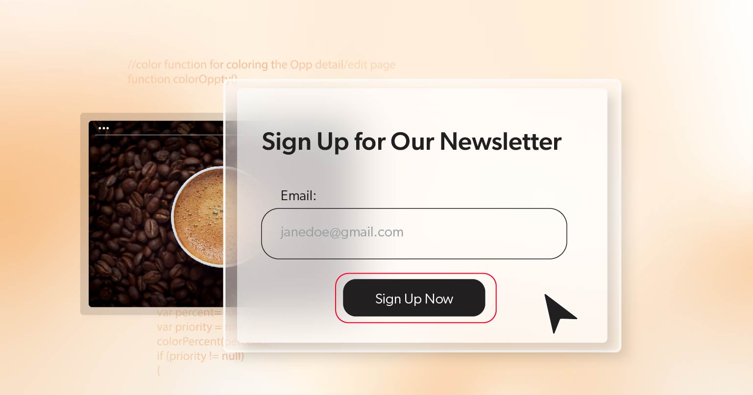
In today’s digital world, ensuring your content forms are accessible is more important than ever. Whether you’re a website owner, a developer, or a content creator, ensuring that everyone can use your forms is key to providing a great user experience. This article will dive into why accessible content forms matter, how to ensure your forms meet accessibility standards and tips for creating inclusive digital spaces. Let’s explore how you can make your forms better for everyone!
Why Should Content Forms Be Accessible?
Accessible content forms are crucial for several reasons:
- Inclusivity: Everyone should have equal access to information and the ability to participate in discussions. By making your forms accessible, you’re ensuring that users with disabilities can join in the conversation just as easily as anyone else.
- Legal Compliance: In the United States, there are legal requirements for digital accessibility under laws like the Americans with Disabilities Act (ADA). Making your forms accessible helps you stay compliant and avoid potential legal issues.
- Broader Audience: Accessible forms reach a wider audience. More people can engage with your content when your forms are easy to navigate and use, leading to increased traffic and a better community experience.
The Importance of Accessible Forms
Accessible forms are not just about following the law—they’re about creating a better, more inclusive online environment. Here’s why it matters:
- Improves User Experience: Accessible forms provide a smoother experience for all users. Features like clear navigation, readable text, and proper color contrast benefit everyone, not just those with disabilities.
- Enhances SEO: Search engines favor well-structured websites that are easy to navigate. By making your forms accessible, you improve your SEO, leading to higher search rankings and more visibility.
- Fosters Community: An inclusive forum encourages participation from a diverse group. When users feel they can easily engage with your content, they are more likely to become active members of your website.
How to Create Accessible Digital Forms
Creating an accessible digital forum involves several key steps. Here’s a breakdown to help you get started:
1. Understand the WCAG Guidelines
The Web Content Accessibility Guidelines (WCAG) are standards designed to make web content more accessible. They provide a framework for creating content that is usable by everyone, including people with disabilities. The guidelines are organized into four principles:
- Perceivable: Information must be presented in a way that all users can perceive, such as providing text alternatives for images.
- Operable: Users must be able to navigate and interact with your site using tools like keyboard navigation and screen readers.
- Understandable: Content must be easy to read and understand, with clear instructions and a consistent layout.
- Robust: Your content should work well across various devices and browsers, ensuring compatibility with assistive technologies.
2. Ensure Text Readability
Text readability is vital for all users, especially those with visual impairments or dyslexia. Here’s how you can improve it:
- Use Clear Fonts: Choose fonts that are easy to read. Avoid overly decorative fonts and ensure your text size is large enough to read comfortably.
- Provide Text Alternatives (WCAG 1.1.1): Include alt text for images, charts, and other non-text content. This helps users who rely on screen readers understand what’s in the visuals.
3. Implement Keyboard Navigation
Many users with disabilities rely on keyboards rather than mice. Make sure your forms are fully navigable using keyboard shortcuts:
- Focus Order (WCAG 2.4.3) : Ensure that users can tab through all interactive elements in a logical order.
- Keyboard Shortcuts (WCAG 2.1.1): Implement keyboard shortcuts for common actions to improve efficiency.
4. Use Descriptive Links and Buttons
Links and buttons should be easily identifiable and descriptive:
- Meaningful Link Text (WCAG 2.4.4): Avoid vague link text like “click here.” Instead, use descriptive text that tells users where the link will take them, such as “Read more about our forum guidelines.”
- Button Labels (WCAG 3.3.2) : Ensure buttons have clear labels that describe their action, like “Submit” or “Cancel.”
5. Ensure Color Contrast and Visual Elements
Good color contrast and visual elements are essential for readability:
- Contrast Ratios (WCAG 1.4.3): Use high contrast between text and background colors. Use tools like the WCAG Contrast Checker to verify that your button colors meet accessibility standards.
- Visual Cues (WCAG 1.3.3): Use visual indicators, such as icons or patterns, in addition to color to convey information. This helps users who are colorblind or have low vision.
6. Test with Real Users
Testing is crucial to ensure your forum is truly accessible:
- User Testing: Involve real users with disabilities in your testing process. Their feedback can help you identify and address accessibility issues you might not have considered.
- Automated Tools: Automated accessibility testing tools such as WAVE or Lighthouse to catch common issues. But remember that these tools can’t catch everything.
7. Stay Updated with Accessibility Trends
Digital accessibility is an evolving field. Stay informed about the latest updates and best practices:
- Ongoing Training: Regularly train your development team on accessibility best practices.
- Community Resources: Participate in accessibility forms and follow industry news to keep up with new developments.
Wrapping Up
Creating accessible web content forms is more than just meeting compliance standards—it’s about fostering a welcoming and inclusive digital space for everyone. By adhering to WCAG guidelines, enhancing text readability, ensuring keyboard navigation, and conducting regular accessibility tests, you can build a forum that all users can navigate and enjoy.
To take your commitment to accessibility to the next level, schedule a complimentary ADA strategy briefing with 216digital. Our team of experts will help develop a strategy to integrate WCAG 2.1 compliance into your development roadmap on your terms.Start integrating these practices today to build a more inclusive and user-friendly forum for everyone. Reach out today to start making a difference!

