
Color can be a tricky subject for an online business. It’s not just about how they look or your brand. Your color choices, and the relationships between them, can impact the user’s experience. For example, suppose your website’s colors don’t have enough contrast. As a result, portions of your site may be hard to read and navigate for people with visual impairments. So, what is color contrast, and how does it affect web accessibility?
What is Color Contrast?
Color contrast refers to the difference in brightness between two colors. When two colors have high contrast, they are easy to distinguish. On the other hand, when two colors have low contrast, they can be hard to tell apart.
Contrast is measured by a ratio, a numerical value ranging from 1:1 (no contrast) to 21:1 (maximum contrast). For example, white(#FFFFFF) and black(#000000) have the highest possible contrast ratio of 21:1. In contrast, white(#FFFFFF) and pure green(#00FF00) have a ratio of just 1.4:1.
When two colors overlap, such as text on a background, the benefits of a high contrast ratio become clear. For instance, reading black text on a white background is much easier than reading pure green text on a white background.
Why Does Color Contrast Matter for Web Accessibility?
For many people with visual impairments, color contrast can decide the readability and perception of content on a website. Unfortunately, many types of visual impairment can make reading text with low color contrast difficult.
For example, low contrast can cause problems for those who are color-blind. If two colors have the same brightness level, they can be almost impossible to tell apart. Similarly, users with low vision may require a high contrast to make the text more readable.
Therefore, if your website does not prioritize color contrast, you will risk cutting off a large portion of users from your online services or products.
Color Contrast and Web Accessibility
The Americans with Disabilities Act (ADA) is a civil rights law prohibiting discrimination against individuals with disabilities. The law requires reasonable accommodations to ensure that people with disabilities have the same opportunities as everyone else.
However, the ADA is not explicit about the criteria for the web or how to implement web accessibility. Instead, the courts and the Department of Justice (DOJ) rely on the Web Content Accessibility Guidelines (WCAG) as the international standard for web accessibility.
Under the ADA, WCAG is almost universally cited in lawsuits and settlements, showing that WCAG is essential to ADA compliance.
WCAG 2.1 Contrast Ratio
The Web Content Accessibility Guidelines (WCAG) 2.1 provides guidelines for color contrast that all websites should follow, including font size, weight, and color contrast.
Contrast Minimum
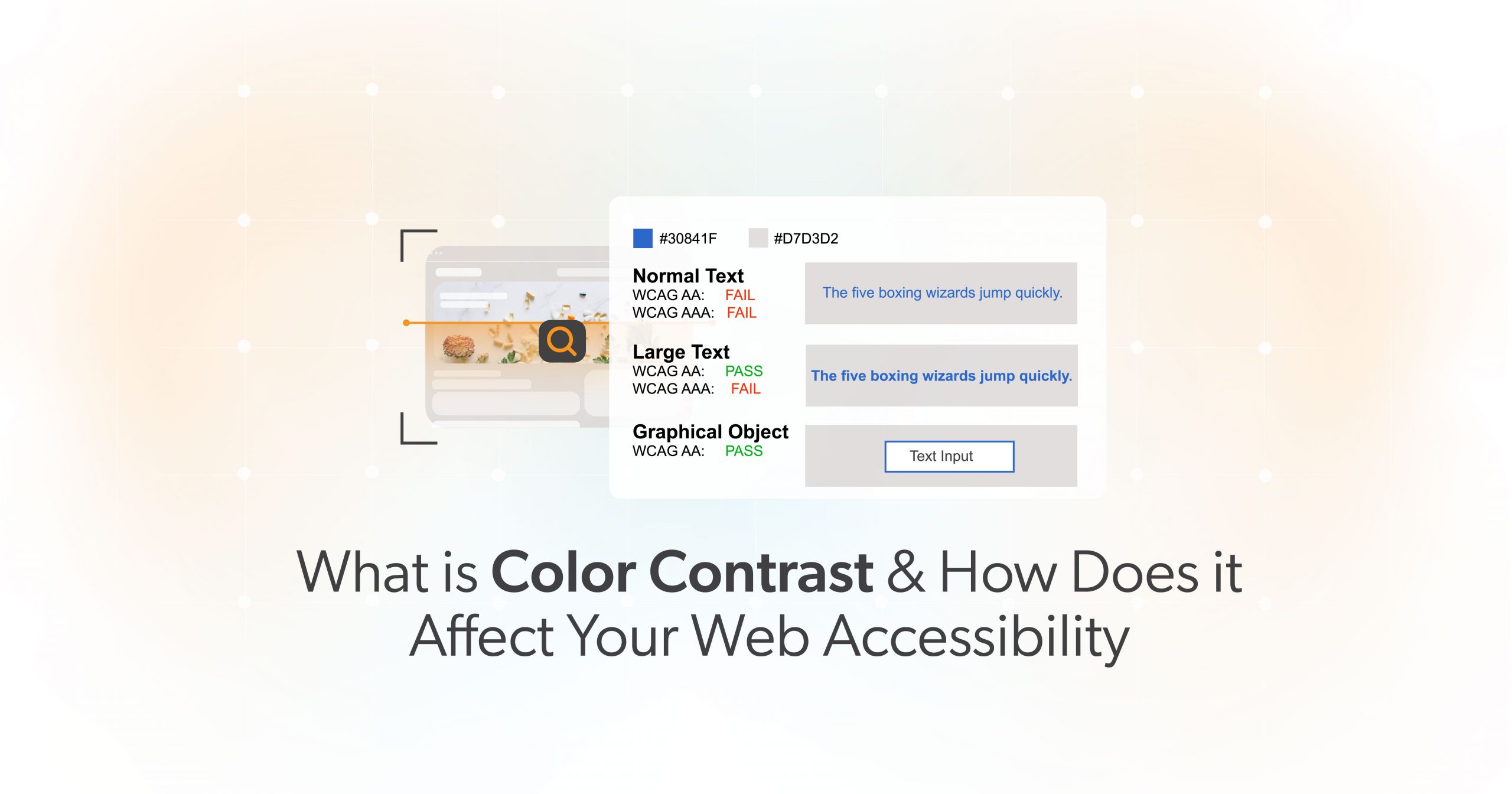
According to WCAG Success Criterion 1.4.3: Contrast (Minimum), the visual presentation of text and images of text must have at least a contrast ratio of 4.5:1.
However, there are three exceptions to the WCAG’s 4.5:1 contrast requirement:
- Large Text: Since large text is easier to read, the contrast requirement is reduced to 3:1. However, WCAG defines large text as 18pt or 14pt bold and larger.
- Incidental: Text or images of text that are part of a user interface component, pure decoration, not visible, or part of an image containing other significant content have no contrast requirement.
- Logotypes: Logos or brand names with text do not have contrast requirements.
Resize Text
On the other hand, WCAG Success Criterion 1.4.4: Resize Text requires that text can be resized up to 200% without assistive technology or loss of content and functionality. However, there is an exception for captions and images of text.
Images do not scale as well as text because they tend to pixelate. Therefore WCAG highly suggests using text wherever possible. It is also tricky to change foreground and background contrast or the colors of an image, which are necessary for some users.
Color Contrast and Litigation
WCAG’s 1.4.3 and 1.4.4 must be met to achieve real-world accessibility. However, there is some flexibility and nuance regarding these guidelines in litigation.
Generally speaking, color contrast does not tend to appear in ADA web accessibility lawsuits. Color-blind and low-vision users can use assistive technology to enhance contrast.
Since these tools are available, and most business owners are averse to altering their brand’s colors, we focus on barriers that assistive technology cannot resolve. We do not recommend making edits surrounding color contrast to fulfill the requirements of a non-compliance lawsuit. That said, working color contrast best practices into your design workflows is always encouraged.
However, WCAG 1.4.4 does appear in complaints and creates a bona fide access barrier if violated. All websites must be able to be zoomed to 200% while leaving a significant operable region of the page.
How Can I Make My Website More Accessible?
Plenty of design considerations go into website accessibility — from the layout of content to the use of images, typography, and even color.
However, your choice of color is one of the first things people notice about your brand. And if you implement it wrong, it can impact the user experience for all visitors — not just those with visual impairments. By following the WCAG 2.1 guidelines and considering factors like font size and weight, you can create a website accessible to everyone.
Are you ready to make sure your website is accessible? Then, schedule an ADA Strategy Briefing with the web accessibility experts at 216digital.