216digital.
Web Accessibility

ADA Risk Mitigation
Prevent and Respond to ADA Lawsuits


WCAG & Section 508
Conform with Local and International Requirements


a11y.Radar
Ongoing Monitoring and Maintenance


Consultation & Training

Is Your Website Vulnerable to Frivolous Lawsuits?
Get a Free Web Accessibility Audit to Learn Where You Stand
Find Out Today!

Web Design & Development

Marketing

PPC Management
Google & Social Media Ads


Professional SEO
Increase Organic Search Strength

Interested in Marketing?
Speak to an Expert about marketing opportunities for your brand to cultivate support and growth online.
Contact Us

About

Blog

Contact Us
  • Are Your Navigation Menus Really Accessible?

    Are Your Navigation Menus Really Accessible?

    Navigation menus sit at the heart of every website. They guide visitors, shape first impressions, and quietly influence how people experience your content. When they’re designed well, users glide through your site without a second thought. But when they’re not—especially for those using assistive technology—they can become invisible walls.

    Here’s the encouraging part: most accessibility issues in navigation menus aren’t complicated bugs. They’re small implementation gaps—an unlabeled toggle, a missing focus state, or an overzealous ARIA role. Once you know what to look for, these problems are simple to fix. A few mindful adjustments can turn a confusing experience into one that feels natural and dependable for everyone.

    Let’s look at some of the most common pitfalls—and how to create navigation menus that are clear, responsive, and genuinely inclusive.

    When Icons Don’t Tell the Whole Story

    Hamburger and grid icons are practically universal now, but they often leave assistive technology users guessing. If the icon has no accessible label—or if it always says “Menu” even after opening—someone using a screen reader won’t know what just happened. They can open the menu but might never find their way to close it again.

    A simple solution makes all the difference. Use a real <button> instead of a <div>, and include a label that changes dynamically:

    <button aria-expanded="false" aria-controls="nav-menu" aria-label="Open main menu">
      <svg>...</svg>
    </button>

    When the menu opens, toggle both the aria-expanded value and the label text so it says “Close main menu.” Keep the visible and programmatic labels consistent, and test it with a screen reader—you should hear “collapsed” when closed and “expanded” when open. That small update transforms an ambiguous icon into an accessible, reliable control.

    When ARIA Does More Harm Than Good

    ARIA is powerful—but it’s easy to get carried away. Adding role="menu" or swapping links for clickable <div>s often seems helpful but can actually break keyboard navigation. What once felt intuitive suddenly becomes disorienting.

    For most global navigation menus, semantic HTML is your best ally. Let the browser and assistive technology do the heavy lifting:

    <nav aria-label="Main navigation">
      <ul>
        <li><a href="/shop">Shop</a></li>
        <li><a href="/about">About</a></li>
      </ul>
    </nav>

    Reserve ARIA menu roles for true application-style widgets—not your site’s primary navigation. And if you’re stacking attributes like role, aria-expanded, and aria-owns on every element, take a step back. Clean markup almost always leads to cleaner accessibility.

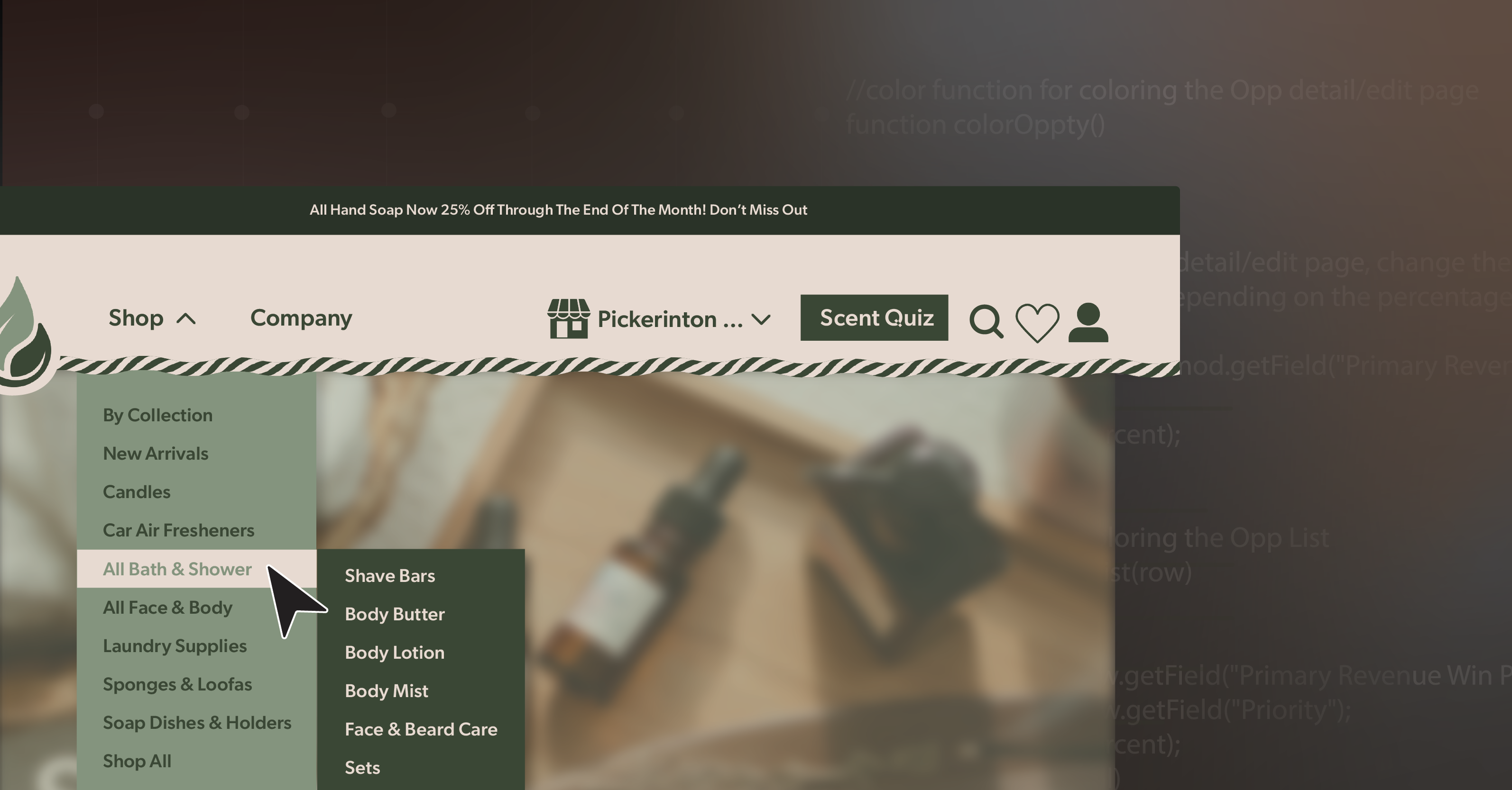
    When Submenus Don’t Communicate Clearly

    Expandable submenus can streamline navigation beautifully—unless they leave users guessing what just changed. If the menu opens visually but nothing is announced, or if keyboard focus jumps unpredictably, it can feel like losing your place mid-sentence.

    The fix is all about clear communication and focus management. Each expandable section should use a labeled <button> with aria-expanded and aria-controls. When the submenu opens, move focus into it; when it collapses, return focus to the button. Keep the tab order logical, steady, and consistent from top to bottom.

    You don’t need fancy transitions or animations to make it feel polished. Reliable, predictable focus behavior builds confidence faster than any design flourish ever could.

    When Focus Bleeds Through the Overlay

    Full-screen or overlay-style navigation menus look modern, but without careful handling, they can trap or confuse users. If keyboard focus slips to content behind the overlay—or if pressing Escape does nothing—you’ve suddenly turned a convenience into a barrier.

    To prevent that, treat your open menu as a modal. Use aria-modal="true" or temporarily set background elements to inert so they can’t receive focus. Keep keyboard focus inside the open menu, and when it closes, send focus back to the toggle button. Include Escape key support, for instance:

    if (event.key === 'Escape') {
      closeMenu();
      toggleButton.focus();
    }

    This might seem small, but it’s the kind of polish that separates a functional menu from a professional one. Every interaction should have a clear start and finish—no guesswork required.

    When Hover-Only Menus Leave Users Behind

    Hover-only submenus often look sleek but behave unpredictably. Move your pointer a little too far, and the menu vanishes. Keyboard users can’t open them at all. WCAG flags this under guideline 1.4.13 (Content on Hover or Focus), and it’s one of the easiest ways to unintentionally exclude users.

    The better pattern is to use buttons instead of hover triggers, so the same content can be opened with a click or a keypress. Add a slight delay before closing or a “grace zone” so menus don’t disappear the instant a cursor slips away. Support the Escape key for dismissal.

    Improving hover behavior doesn’t just make your navigation menus more accessible—it creates a smoother, more forgiving experience for everyone, from stylus users to touchscreen visitors.

    When Small Targets Cause Big Frustrations

    Tiny icons and tightly packed links might look minimalist, but they’re not friendly to real-world use. On mobile screens—or for anyone with limited dexterity—they can turn simple navigation into a precision test.

    Aim for tap targets that are at least 24×24 pixels, or use padding to achieve the same result. Stick to flexible units like em or rem so spacing adapts naturally to user settings. And always test your navigation menus at 320px width and 200% zoom. They should remain readable, functional, and scroll-free.

    If you can comfortably use your site one-handed on your phone, chances are others can too.

    When Users Can’t Find Their Bearings

    Good wayfinding is subtle but essential. Without clear navigation landmarks or skip links, screen reader users can’t easily tell which menu they’re in—or how to bypass repeated links.

    Make orientation effortless. Label every <nav> region descriptively:

    <nav aria-label="Primary navigation">
    <nav aria-label="Footer links">

    Include a “Skip to main content” link that becomes visible on focus:

    <a href="#main-content" class="skip-link">Skip to main content</a>

    Consistency matters just as much as code. Keep link names and order uniform across your site so users can build reliable patterns as they move from page to page.

    Building Navigation That Truly Guides

    Accessible navigation isn’t just about compliance—it’s about creating confidence. When every visitor, regardless of ability, can explore your site without hesitation, you’ve built something far more meaningful than a working menu—you’ve built trust.

    Each small improvement—a descriptive label, a focus fix, a skip link—adds up to an experience that feels intentional and human. Accessibility isn’t about limitation; it’s about refinement.

    If you’d like an expert review of your site’s navigation structure—or want to chart a practical roadmap toward WCAG compliance—schedule an ADA briefing with 216digital. We’ll help you evaluate your navigation menus, identify quick wins, and design sustainable improvements that keep accessibility woven into every future update.

    Greg McNeil

    October 27, 2025
    How-to Guides
    Accessibility, Keyboard Navigation, navigation menu, Web Accessibility, Website Accessibility
  • Why Your Navigation Menu Needs Accessibility

    When you visit a website, one of the first things you probably notice is the navigation menu. It’s usually at the top or on the side of the page, guiding you to different parts of the site. Think of it as the roadmap to all the good stuff a website has to offer. But what happens if that roadmap isn’t clear? This is where accessible navigation menus come into play.

    Let’s dive into what a web navigation menu is, common accessibility challenges, why they matter, and how you can make yours more accessible!

    What is a Website Navigation Menu & Structure?

    A navigation menu is a list of links or buttons usually found at the top or side of a website. These links guide users to different sections of the site, like the homepage, about page, blog, or contact page. Think of it as a roadmap that helps visitors get where they want to go without wandering aimlessly.

    The structure of a navigation menu can vary from simple to complex, depending on the size and type of website. Most websites use one or more of these types of menus:

    • Horizontal Menus: Commonly found at the top of a webpage.
    • Vertical Menus: Often located on the left or right side of a webpage.
    • Dropdown Menus: This appears when you hover over or click a menu item.
    • Hamburger Menus: Those three stacked lines you see on mobile websites or apps.

    The structure needs to be clear and intuitive so users can find what they’re looking for quickly and easily. For example, if you’re on an online store’s website, you’d expect to find “Products” in the main menu, not buried under “About Us.”

    When the navigation is well-organized, visitors can explore your site and enjoy their experience. But if it’s confusing or hard to use, people might leave — and that’s not good for any website.

    Common Accessibility Challenges with Navigation Menus

    Creating a navigation menu might seem simple, but there are a few common accessibility challenges that can make it tricky for some users to navigate. Here are a few examples:

    • Keyboard Navigation: Not everyone uses a mouse. Some people rely on a keyboard or other assistive devices to move around a website. If your menu isn’t keyboard-friendly, it can be impossible for these users to access parts of your site.
    • Screen Readers: Screen readers are tools that help people with visual impairments by reading the text on the screen out loud. If your menu isn’t designed with screen readers in mind, it might not make sense to the user.
    • Color Contrast: If the text in your menu doesn’t have enough contrast with the background, it can be hard for people with visual impairments to read. For example, light gray text on a white background might look sleek, but it’s not easy for everyone to see.
    • Dropdown Menus: Dropdown menus are those extra links that appear when you hover over a main menu item. They can be challenging for screen readers and keyboard users if not properly coded.

    Why Are Accessible Navigation Menus Important?

    Accessible navigation menus aren’t just about being kind or doing the right thing—they’re also good for business. When your site is accessible, it’s usable by everyone, including people with disabilities. This means you’re not excluding potential customers or visitors, which can lead to a better return on investment (ROI).

    Additionally, accessibility is a legal requirement under the Americans with Disabilities Act (ADA) in the United States. Websites that don’t comply with these guidelines can face lawsuits, which can be costly and damage your brand’s reputation.

    Simply put, investing in web accessibility isn’t just good ethics—it’s good business.

    Features of an Accessible Navigation Menu

    To make sure your navigation menu is accessible, you should include several features. These features align with Web Content Accessibility Guidelines (WCAG), the go-to standards for web accessibility.

    1. Keyboard Accessibility (WCAG 2.1.1 – Keyboard Accessible):

    Keyboard accessibility is one of the most critical aspects of web accessibility. Some users may not be able to use a mouse due to motor disabilities, repetitive strain injuries, or personal preference. For these users, navigating a website entirely via the keyboard is essential. Here’s how you can make your navigation menu keyboard-friendly:

    • Tab Order: Ensure that users can navigate through all menu items using the Tab key. The order should be logical and follow the visual flow of the website.
    • Enter and Arrow Keys: When a menu item has a dropdown, users should be able to expand or collapse it using the Enter or Arrow keys. Once expanded, users should be able to navigate through the submenu items using the Arrow keys.
    • Focus Management: Users should always know where they are on the page. Make sure that when a user opens a dropdown, the focus shifts to the first item in that dropdown.

    Here’s an example of how you can make a simple navigation menu keyboard accessible:

    <nav>
      <ul>
        <li><a href="#home" tabindex="0">Home</a></li>
        <li><a href="#about" tabindex="0">About</a></li>
        <li><a href="#services" tabindex="0">Services</a></li>
        <li><a href="#contact" tabindex="0">Contact</a></li>
      </ul>
    </nav>


    2. Visible Focus Indicator (WCAG 2.4.7 – Focus Visible):

    Focus indicators show users where they are on a webpage when they navigate using a keyboard. Without a visible focus indicator, users can get lost, particularly if they are relying solely on the keyboard. The WCAG guidelines require that the focus indicator be clearly visible when users navigate through menu items.

    Styling Focus Indicators

    Customize the default focus style to make it more visible. You can use CSS to create a more prominent outline or make a background change. For example:

    a:focus {
      outline: 3px solid #ff9800; /* Orange border for focused links */
      background-color: #f0f0f0; /* Light gray background for contrast */
    }


    Accessible Color Choices

    Ensure that the color of the focus indicator has enough contrast with the background to be easily noticeable.

    3. ARIA Roles and Attributes (WCAG 4.1.2 – Name, Role, Value):

    ARIA (Accessible Rich Internet Applications) roles and attributes provide extra information to assistive technologies like screen readers, helping users understand the purpose and state of navigation elements. This is especially important for menus that have complex structures, such as dropdowns.

    ARIA Roles

    Use roles like role= “navigation” to indicate the navigation region and role= “menu” or role= “menuitem” to define menus and items within them. For example:

    <nav role="navigation" aria-label="Main Navigation">
      <ul role="menubar">
        <li role="none"><a href="#home" role="menuitem">Home</a></li>
        <li role="none"><a href="#about" role="menuitem">About</a></li>
        <!-- Other menu items -->
      </ul>
    </nav>

    ARIA Attributes for State

    Use aria-expanded to indicate if a dropdown is expanded or collapsed. This helps users who rely on screen readers understand whether they can interact further with the menu item.

    <button aria-expanded="false" aria-controls="submenu">Services</button>
    <ul id="submenu" role="menu">
      <li role="none"><a href="#design" role="menuitem">Design</a></li>
      <li role="none"><a href="#development" role="menuitem">Development</a></li>
    </ul>

    When the button is clicked to expand the menu, JavaScript should change aria-expanded= “true”.

    4. Color Contrast (WCAG 1.4.3 – Contrast (Minimum)):

    Ensuring sufficient color contrast is vital for users with visual impairments, including color blindness. The contrast ratio between the text and its background should be at least 4.5:1 for normal text and 3:1 for large text.

    • Choosing Accessible Colors: Use online tools like the WebAIM Contrast Checker to ensure your menu items meet the WCAG color contrast standards.
    • Avoid Low-Contrast Hover States: While hover effects can be helpful, make sure they don’t reduce the text’s visibility. For example, avoid light text on light backgrounds.

    5. Responsive and Mobile-Friendly Design (WCAG 1.4.10 – Reflow):

    Navigation menus must be accessible across different devices and screen sizes. This is especially important given the widespread use of mobile devices.

    • Responsive Design Techniques: Ensure that the menu collapses into a mobile-friendly version, like a hamburger menu, without losing accessibility features.
    • Mobile Screen Readers: Make sure mobile screen readers can read and navigate the menu. Test with VoiceOver on iOS and TalkBack on Android to ensure compatibility.

    6. Skip Navigation Links (WCAG 2.4.1 – Bypass Blocks):

    A “Skip to Content” link allows users to bypass repetitive navigation links and go straight to the main content. This is crucial for users who rely on keyboard navigation.

    <a href=”#maincontent” class=”skip-link”>Skip to Content</a>

    When the page loads, users can press Tab to immediately focus on this link, skipping the menu altogether.

    7. Clear and Descriptive Labels (WCAG 3.3.2 – Labels or Instructions):

    Menu items should be labeled clearly to describe what users can expect when they click on them. This reduces confusion and ensures all users, including those with cognitive disabilities, can easily navigate the site.

    • Avoid Vague Labels: Instead of “Explore,” use something like “Our Services” to make it clearer what users will find.

    Tips for Creating an Effective Accessibility Navigation Menu

    Creating an accessible navigation menu isn’t just about meeting the guidelines—it’s about creating a better experience for everyone. Here are some tips to help:

    1. Keep it Simple: A clear and straightforward menu structure is easier for all users to navigate.
    2. Use Clear Labels: Avoid jargon and use common terms. For example, instead of “Explore Our Solutions,” just use “Services.”
    3. Include Skip Links: A “Skip to content” link allows keyboard users to skip repetitive navigation links.
    4. Test with Real Users: Get feedback from people with different disabilities to understand how accessible your menu really is.
    5. Provide Descriptive Anchor Text: Use anchor text that tells users where they’re going. For example, use “About Us” instead of “Click Here.”

    Testing for an Accessible Menu

    Once you’ve built your navigation menu, you need to test it for accessibility. Here are a few ways to do that:

    • Keyboard Navigation: Try navigating your site using only the keyboard. Can you access all the menu items? Are dropdowns easy to use?
    • Screen Readers: Use a screen reader like NVDA (NonVisual Desktop Access) or JAWS (Job Access With Speech) to navigate your site. Does the menu make sense when read aloud?
    • Color Contrast Tools: Use color contrast checkers to make sure your text stands out against the background.
    • Real User Testing: Consider asking users with disabilities to test your site and provide feedback on the navigation menu. This real-world input can be invaluable.

    Conclusion

    Creating a web-accessible navigation menu isn’t just about checking a box; it’s about making your website easy for everyone to use. When you improve accessibility, you also boost user experience and even your ROI. By learning about the best practices and challenges of accessible navigation menus, you can make your website more welcoming to all visitors.

    Remember, accessibility is not a one-time fix. It’s important to regularly test and update your navigation menu to keep it user-friendly. If you want to take the next step in making your website more inclusive, consider scheduling an ADA compliance briefing with 216digital. Our team can help you ensure your site is accessible to everyone.

    Greg McNeil

    August 30, 2024
    How-to Guides
    digital accessibility, How-to, navigation menu, Web Accessibility, web development
216digital Scanning Tool

Audit Your Website for Free

Find Out if Your Website is WCAG & ADA Compliant


    216digital Logo

    Our team is full of expert professionals in Web Accessibility Remediation, eCommerce Design & Development, and Marketing – ready to help you reach your goals and thrive in a competitive marketplace. 

    216 Digital, Inc. BBB Business Review

    Get in Touch

    2208 E Enterprise Pkwy
    Twinsburg, OH 44087
    216.505.4400
    info@216digital.com

    Support

    Support Desk
    Acceptable Use Policy
    Accessibility Policy
    Privacy Policy

    Web Accessibility

    Settlement & Risk Mitigation
    WCAG 2.1/2.2 AA Compliance
    Monitoring Service by a11y.Radar

    Development & Marketing

    eCommerce Development
    PPC Marketing
    Professional SEO

    About

    About Us
    Contact

    Copyright 2024 216digital. All Rights Reserved.