
Design, page layout, and navigation all play a big role in making a website accessible. But the smaller details—like font—are just as important. Designing accessible content isn’t just about picking an easy-to-read font. Even with accessible fonts, people with low vision, cognitive, language, and learning disabilities might still have trouble reading due to factors like font spacing, size, and contrast —to name a few.
Let’s go over what makes a font accessible and how you can choose the right one for your website.
WCAG and Accessible Fonts
Websites are considered ADA-compliant when they follow the Web Content Accessibility Guidelines (WCAG). These guidelines make web content more accessible for people with disabilities. Fonts play a big role in this—they need to be clear, readable, and usable by everyone, including those with visual impairments or cognitive disabilities.
WCAG includes many sections that focus on content visibility and design, helping website owners and designers pick fonts that are accessible. Here are the key WCAG sections that relate to fonts:
- Presenting Web Content in Different Ways: Fonts should be easy to read when resized or presented with different styles or spacing.
- Making Web Content Easy to See or Hear: Consider a font’s family, size, spacing, and color to make sure the content is easy to see.
We’ll dive deeper into these principles and explain how they relate to specific font styles and families.
The Importance of Using Accessible Fonts
Using accessible fonts on your website is really important for people with disabilities, making sure they can easily read your content. But it’s not just for them—everyone benefits from easy-to-read fonts. Many people skim through text rather than reading every word, especially if they’re distracted, stressed, or juggling multiple tasks. That’s why a clear, easy-to-read font can be a big help.
Plus, accessible fonts can actually boost your site’s search engine ranking. How readable your text is plays a big role in how search engines like Google rank your website. Sites that are easy to read often get a higher ranking.
For more details on how accessibility and SEO go hand in hand, check out our guide on SEO and web accessibility.
So, What Makes a Font Accessible?
Choosing the right font isn’t one-size-fits-all, but some key things like size and color really do matter. Here are a few WCAG guidelines to help you pick fonts that meet ADA requirements.
Spacing
Spacing is a big deal when it comes to making sure your website is accessible. Good spacing helps keep your letters, words, and lines clear and easy to read without overlapping.
According to WCAG’s Success Criterion 1.4.12, you should also think about how text can be adjusted. Some people with disabilities or those using assistive technology might need to change text size or spacing to make reading easier. For instance, individuals with dyslexia might find that increased spacing between letters and lines helps them read better. It’s important that when users adjust text in their browsers, the words don’t disappear or overlap.
Use Sufficient Text Spacing
To make text readable, here’s what you should keep in mind for spacing:
- Line Height: Make it at least 1.5 times the font size.
- Paragraph Spacing: Set it to at least 2 times the font size.
- Letter Spacing: Add at least 0.12 times the font size.
- Word Spacing: Ensure it’s at least 0.16 times the font size.
To figure out the best spacing for your font, use the Google Fonts Type Tester. It’s a handy tool that helps you see how different fonts look with various spacings so you can pick what works best for your project.
Color Contrast
You might think that black text on a white background is easy to read, but it’s not always that simple. Just like text with too little contrast can blend into the background, text with too much contrast can strain your eyes and cause visual fatigue.
For instance, compare these two color combos:
- Light gray text on a white background (low contrast, hard to read).
- Black text on a white background (high contrast, easy to read).
Whenever possible, go for the second option to make your text easier to read.
WCAG offers tips on making your text readable for everyone, including those with vision impairments. They recommend using a contrast ratio of at least 4.5:1 for regular text and 3:1 for larger text. If you want to meet WCAG 2.1 Level AAA, which is the highest level of accessibility, you’ll need a contrast ratio of 7:1 between your text and background.
And remember, don’t rely on color alone to convey important information—always use other ways to ensure your content is accessible to everyone.
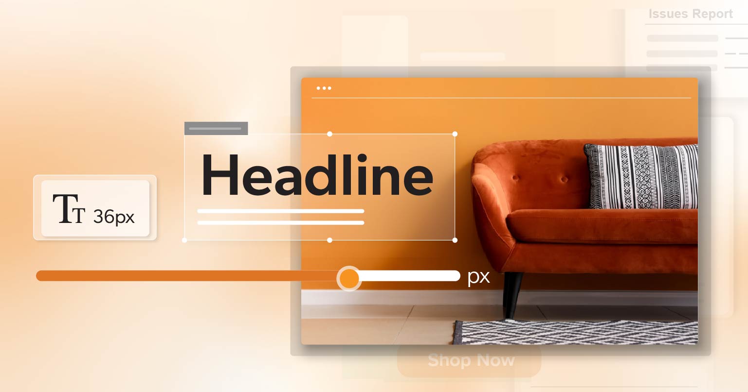
Size
WCAG does not have a specific minimum font size, but they do suggest that your text should be resizable up to 200% without losing content or functionality. This means your text should still be readable, and your layout should still work when someone zooms in. For instance, if your website text is 16px, users should be able to resize it to 32px without breaking the page layout.
This is especially important for people with visual impairments who may need to enlarge text to read it comfortably.
Text with Graphics
Some web designers use text within images instead of regular text blocks, but this can be a problem for accessibility. Regular text can be easily adjusted in size, spacing, and color to keep it readable. On the other hand, text in images doesn’t adapt well. It can get pixelated and hard to read when you zoom in, which is a big issue for people with visual disabilities.
According to WCAG 1.4.5, you should be using text instead of images of text whenever possible. For example, instead of putting text on a banner image, create a text element directly on your website. This way, screen readers can read the text, and users can adjust its size as needed.
How to Choose an Accessible Font Family
If you want to make your text easier to read, here are some tips to help with accessibility:
- Pick Simple and Clear Fonts: Use fonts that are easy to read and familiar. Steer clear of fancy scripts or handwriting styles.
- Avoid Confusing Characters: Choose fonts where letters and numbers are distinct. You don’t want “O” and “0” or “l” and “I” to look too similar.
- Limit Font Variations: Stick to one, two, or at most three different fonts. Too many variations can be overwhelming.
- Consider Spacing: Make sure there’s plenty of space around your text. Avoid making text too close together or overlapping.
- Check Color Contrast: Use tools like the WCAG Contrast Checker to verify that your text color stands out well against the background. Good contrast helps make reading easier.
- Avoid Tiny Text and Crowded Blocks: Don’t use very small font sizes or cram too much text into one space. It can be hard to read if the text is too small or packed too closely.
Examples of Accessible Fonts
Choosing the right font for your website and other digital projects can make a big difference. While there are many unique fonts out there, the most familiar ones are popular for good reasons. They are often the easiest to read and recognize.
Here are a few fonts known for their accessibility:
- Arial: This font is easy to read because it has wide letter spacing, clear distinctions between similar letters, and a high x-height (the height of lowercase letters). Arial works well with assistive technologies and screen magnifiers.
- Verdana: Like Arial, Verdana is designed for readability. It has a large x-height, bold outlines, and wide spacing between characters, making it clear and accessible for both people and assistive tech.
- Helvetica: Known for its bold outlines and generous character spacing, Helvetica is another great choice for accessibility. Its design helps people with visual impairments read more easily and is compatible with various assistive technologies.
- Times New Roman: This classic font is widely used because of its simple and clear design. It’s easy to read and understand, making it a reliable choice for many types of content.
- Tahoma: Tahoma is similar to Times New Roman but with a modern twist. Its clean design and good character spacing make it quick and easy to read.
Remember, there’s no one-size-fits-all answer when it comes to the most accessible font. It’s important to consider the specific needs of your audience when choosing a font.
Key Takeaways
Whether you’re designing infographics, videos, slideshows, or blog posts, choosing an accessible font is a simple yet powerful way to make your content more accessible. By following WCAG guidelines and selecting fonts that prioritize readability and legibility, you can create a more inclusive and user-friendly experience for all visitors. Remember, accessibility benefits everyone, and taking these steps can make a significant difference.
So, next time you’re designing a website or creating digital content, keep these tips in mind. Your audience will thank you, and you’ll be contributing to a more accessible and inclusive web.
Happy designing!