216digital.
Web Accessibility

ADA Risk Mitigation
Prevent and Respond to ADA Lawsuits


WCAG & Section 508
Conform with Local and International Requirements


a11y.Radar
Ongoing Monitoring and Maintenance


Consultation & Training

Is Your Website Vulnerable to Frivolous Lawsuits?
Get a Free Web Accessibility Audit to Learn Where You Stand
Find Out Today!

Web Design & Development

Marketing

PPC Management
Google & Social Media Ads


Professional SEO
Increase Organic Search Strength

Interested in Marketing?
Speak to an Expert about marketing opportunities for your brand to cultivate support and growth online.
Contact Us

About

Blog

Contact Us
  • Can User-Generated Content Trigger an ADA Demand Letter?

    Reviews. Comments. Community posts. Q&A threads. Uploaded photos. Customer-submitted listings.

    If your website includes user-generated content (UGC), you already know one truth: your content changes faster than any single QA pass can keep up with. And that’s where a very real business concern kicks in:

    It’s the same question behind a lot of ADA demand letters and accessibility complaints: if someone else posts it, does it still fall on you?

    Short answer: It can.

    A longer (and more useful) answer: UGC usually isn’t the only reason a business gets an ADA demand letter, but it can absolutely strengthen a complaint—especially when it blocks participation, creates barriers on high-traffic pages, or shows up inside key buying or support experiences.

    Before we go further: this article is informational, not legal advice. If you receive a demand letter or legal threat, it’s smart to involve qualified counsel.

    Now let’s unpack the real issue behind the question: the risk depends on where UGC appears, how it’s created, and what control your platform gives you.

    What User-Generated Content Is and Where It Shows Up

    User-generated content is anything your users create instead of your internal team. That includes reviews, comments, forum posts, Q&A answers, uploaded photos, listings, profiles, and all the little pieces people add to your site as they interact with it.

    But here’s the part that catches most teams off guard:

    UGC isn’t one thing. And it definitely doesn’t behave the same everywhere it appears.

    Some UGC sits inside clean templates and barely shifts. Some shows up as long, free-form posts with images and embeds. And some becomes full pages that search engines crawl and customers rely on. Each of those patterns carries a different level of accessibility exposure.

    Light UGC Explained

    Light UGC is the easiest to keep stable. Think short reviews, star ratings, or a simple comment thread. These usually live inside structured components, so the content itself doesn’t wander too far.

    What does wander?

    The widgets around it.

    A star-rating tool that doesn’t work with a keyboard, a comment form missing labels, or a “load more” button with no name—all of that can cause more trouble than the content itself ever would.

    Rich UGC and Accessibility

    Rich UGC gives users more room to shape the experience. That includes long posts, formatted text, uploaded images, embedded videos, and external links.

    Freedom is great for expression. It’s less great for predictability.

    One user uploads an image with text baked in. Another pastes an embed that traps keyboard focus. Someone else writes a long post using bold text as fake headings. Suddenly, your page has structure on the surface but not in the markup where assistive tech looks for it.

    Structural UGC and Exposure

    Structural UGC is where things move from “content” to “actual pages.” These are profiles, listings, job posts, directory entries, marketplace items—anything that functions like a standalone page and attracts search traffic.

    This is the kind of UGC that matters most for accessibility risk because it doesn’t sit quietly in a small section. It becomes part of the paths people use to make choices, complete tasks, or decide whether your product fits their needs.

    When structural user-generated content is inconsistent or hard to navigate, the impact shows up fast.

    Where User-Generated Content Lives (and Why Placement Matters)

    The biggest shift in risk isn’t the content—it’s where the content lands.

    A slightly messy review on a low-traffic page may not change much. But that same review sitting inside a product page with heavy purchase intent? Different story. And the same is true across the site.

    UGC becomes more consequential when it appears in places like:

    • Product pages with reviews, photos, or Q&A
    • Service pages with before/after uploads
    • Location or listing pages that customers rely on to compare options
    • Support threads and community answers that function as your “real” FAQ
    • Profiles or listings that act like landing pages and show up in search results

    All of these are places where people come to decide something. If the UGC in those areas is inaccessible—or if the tools that publish it create predictable failures—that can turn into a barrier for someone trying to participate or complete a task.

    Here’s the part most businesses miss:

    The risk isn’t just the content users post. It’s the system your platform uses to collect it, shape it, and display it.

    The templates, editors, upload flows, moderation tools, and UI patterns are where most preventable accessibility issues start. When those pieces aren’t designed with accessibility in mind, even simple UGC can become part of a complaint.

    And once UGC becomes part of the user journey, it becomes part of the accessibility equation—especially when an ADA demand letter points to barriers on real pages people depend on.

    How User-Generated Content Factors Into Website Accessibility Complaints

    At a high level, here’s what matters:

    ADA Title III focuses on equal access and non-discrimination for goods and services offered by businesses open to the public.

    Even though the ADA doesn’t spell out one single required web standard for private businesses, accessibility claims often point to Web Content Accessibility Guidelines (WCAG) as the measuring stick in practice. WCAG evaluates pages as they are delivered to users—meaning all visible content, including UGC, can contribute to non-conformance.

    And this is where UGC gets tricky.

    Responsibility for UGC Accessibility Issues

    If the content is on your domain, inside your customer journey, and presented as part of your experience, then it functions like part of the service you’re offering.

    That doesn’t mean every single user mistake equals an automatic lawsuit. But it does mean the experience can become a valid complaint when barriers prevent people from completing tasks or participating fully.

    How WCAG Evaluates UGC on Pages

    WCAG conformance is evaluated based on what’s actually on the page. That includes:

    • Content
    • UI components
    • Third-party widgets
    • User-generated content

    WCAG also recognizes the concept of partial conformance when certain issues are truly outside the author’s control. But partial conformance is not a shield you hide behind—it’s a disclosure approach, and a sign you should reduce what’s out of your control wherever possible.

    A useful comparison: the DOJ’s Title II website accessibility factsheet for public entities highlights that third-party content can still be part of a covered service when it’s baked into the experience. Title II and Title III are different, but the principle is instructive:

    If people rely on it to access the service, it needs to be accessible.

    So yes—UGC can increase risk. But it doesn’t do it randomly. It does it in predictable ways tied to control and foreseeability.

    How User-Generated Content Can Create Accessibility Barriers

    Let’s break this into a simple framework you can actually use.

    Barriers From Inaccessible UGC Tools

    This is the category that gets businesses into trouble fastest—because it’s not “user behavior.” It’s your platform UI.

    Examples:

    • Review/comment forms are missing labels
    • Error messages that aren’t programmatically connected to fields
    • Star-rating widgets that can’t be used with a keyboard
    • Upload buttons with no accessible name (“button button”)
    • No status updates during upload (screen reader users stuck guessing)
    • Rich text editors that trap focus or don’t announce controls properly
    • Captcha or anti-spam tools that block assistive tech users

    If someone can’t post, submit, edit, or participate because the controls aren’t accessible, that’s a strong accessibility barrier. And it’s directly attributable to the business experience—not the user’s content.

    If your UGC system prevents participation, that can absolutely support an ADA demand letter.

    Foreseeable Accessibility Failures

    This is where many businesses accidentally create “accessibility debt” at scale.

    Examples of foreseeable failures from UGC:

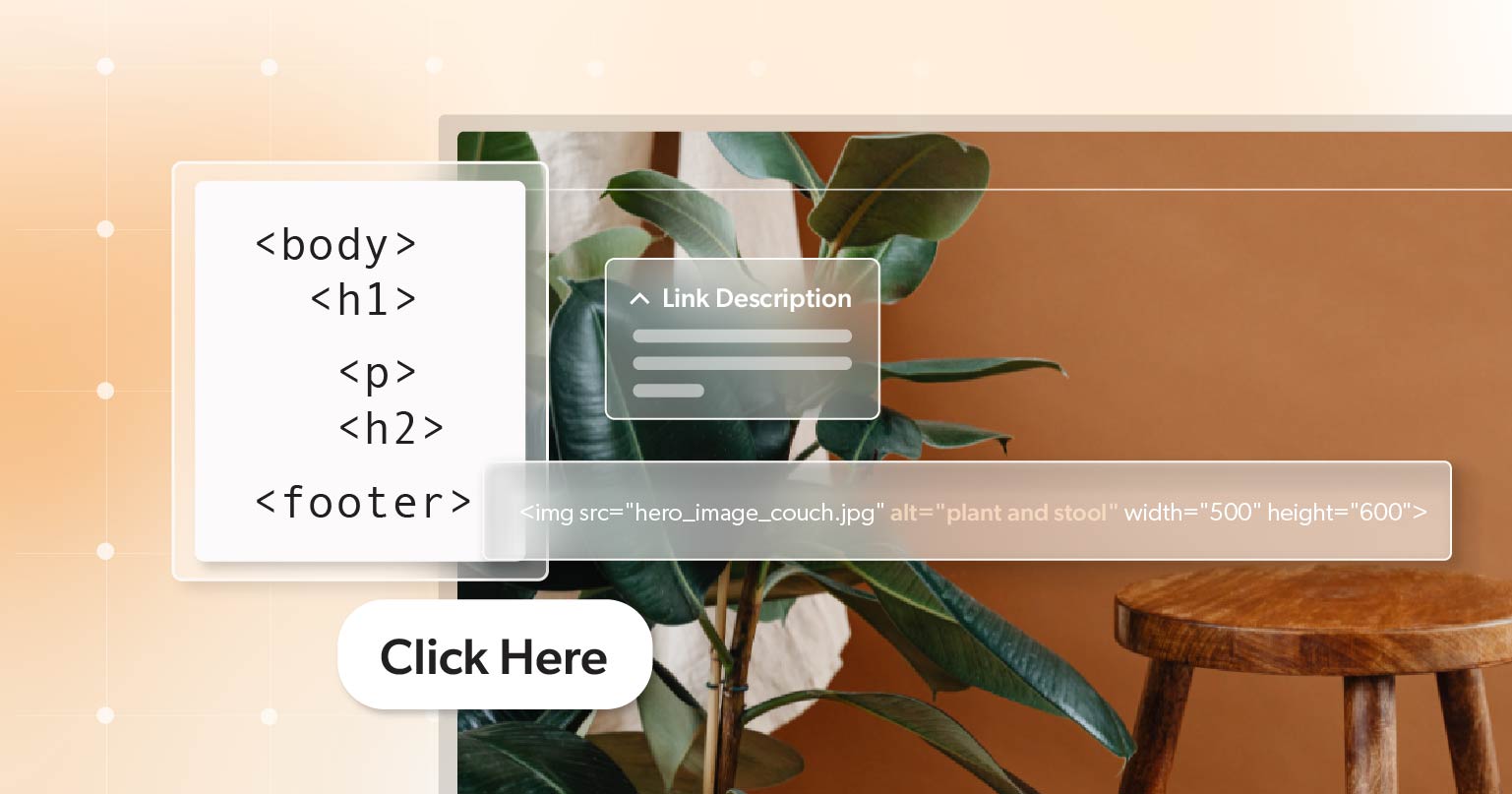
    • Users upload images without providing any alt text.
    • Links labeled only as “click here,” offering no context.
    • Flyers or announcements as images with all the text baked in.
    • Users choose font colors or backgrounds that create contrast failures.
    • Visual formatting—like bold text—to imitate headings instead of using proper structure.
    • Using emojis as bullet points or even headings without adding a text equivalent.

    If a system consistently produces inaccessible pages, it’s hard to argue the issue is “random user behavior.”

    Platform defaults shape outcomes.

    And if the outcome repeatedly blocks access, that’s a foreseeable risk—exactly the kind of pattern that shows up in accessibility complaints.

    When User-Generated Content Stops Key Tasks

    Sometimes, the UGC isn’t “broken” in an obvious way. It’s just in the wrong place.

    When the content shows up in the same high-value areas—product pages, listings, community answers, support information—the stakes rise fast. These are the pages people rely on to make choices, compare options, understand requirements, and get support.

    Even if your official content is accessible, the user journey is what counts.

    If UGC becomes the deciding factor, someone needs to:

    • Choose a product
    • Confirm compatibility
    • Understand sizing or ingredients
    • Access instructions
    • Troubleshoot an issue
    • Get help without calling

    …and if that UGC is inaccessible, it can become part of the access barrier.

    How to Make User-Generated Content Accessible by Design

    This is where accessibility becomes realistic. Because the goal is not to make every user into an expert.

    The goal is to build a system where the easiest path is also the most accessible path.

    Build Accessible UGC Submission Tools

    Treat your UGC publishing experience like a product, not an afterthought.

    At minimum:

    • Every input has a clear label.
    • Keyboard-only users can complete the flow.
    • Focus order is logical
    • Errors are clear, specific, and programmatically tied to fields.
    • Buttons announce what they do.
    • Upload state changes are announced (progress, success, failure)

    If your creation tools fail, the experience fails—no matter how good your main site is.

    Prompt Users for Necessary Details

    For image uploads, use an alt text prompt that’s friendly and short. For example:

    • A required/optional alt text field depending on context
    • A helper line like: “Describe what matters in this photo.”
    • A checkbox: “This image is decorative” (when appropriate)

    This single prompt eliminates a huge portion of predictable failures.

    And yes—this is your responsibility. Because you control the workflow.

    Limit Risky Formatting Options

    This one surprises people, but it’s important:

    If users can style content however they want, your site can become non-conforming instantly.

    Practical guardrails:

    • Limit text colors and backgrounds to approved combinations.
    • Block low-contrast combinations automatically.
    • Provide headings/lists as structured tools, not “fake formatting.”
    • Prevent users from creating “headings” by just increasing font size.

    If a page can be made inaccessible through user styling, that’s a platform design decision—not a user obligation.

    Managing Rich Media Accessibility

    If users upload video or audio:

    • Prompt for captions and/or transcripts
    • Offer a “pending accessibility” state
    • Add a follow-up workflow to complete accessibility after posting.
    • Provide a clear way to edit and add accessibility later.

    Even a basic process here reduces risk dramatically.

    Maintaining Accessible User-Generated Content Over Time

    Even with solid guardrails, user-generated content keeps moving. New posts show up, trends change, and older content stays live in the places people rely on. So the goal isn’t “fix it once.” It’s keeping the system steady.

    Check the templates that carry the most weight

    Pick a small set of UGC-heavy templates—product pages, listings, support threads, community Q&A—and review them on a regular cadence. If a component update breaks keyboard flow, labels, or focus, you want to catch it before it spreads.

    Give your team a simple playbook.

    Moderators and content teams don’t need to learn WCAG. They just need a short list of patterns to flag, like missing alt text, image-based announcements, unclear link text, or embeds that don’t work with a keyboard.

    Make reporting and fixes easy.

    Add a straightforward way to report accessibility issues, and route those reports to someone who can act. When something needs remediation, start with the least disruptive fix—add text equivalents, correct formatting, or adjust the template so the issue doesn’t keep reappearing.

    At the end of the day, WCAG looks at what’s on the page as delivered. If UGC lives in the experience, it’s part of what users have to work with—so it needs ongoing care.

    Making User-Generated Content a Strength, Not a Liability

    User-generated content will always shift and surprise you a little, and that’s fine. What matters is knowing your site can handle those shifts without creating new barriers every time someone posts a review or uploads a photo. When the basics are solid—the tools, the guardrails, the way you spot issues—you don’t have to brace for impact. Things stay steady.

    If you want help looking at the parts of your site where UGC and accessibility meet, 216digital can walk through those areas with you and point out what will actually make a difference. When you’re ready, schedule an ADA briefing with 216digital and put a clear, manageable plan in place so accessibility stays reliable as your UGC grows.

    Greg McNeil

    January 21, 2026
    Legal Compliance
    Accessibility, Content Creators, Content Writing, Demand Letters, Legal compliance, User-Generated Content, WCAG, Website Accessibility
  • Can Google and AI Really Find Your Content?

    Can Google and AI Really Find Your Content?

    When you hit “publish,” you picture your post showing up where it should—front and center on Google, or clearly summarized by an AI assistant. But here’s the catch: search engines and AI tools can’t understand what you don’t clearly show them.

    Accessible content plays a much bigger role in that than most people realize. The same structure that helps a screen reader follow your page also helps algorithms interpret it correctly. Accessibility and discoverability are really two sides of the same coin—both depend on clarity.

    But how exactly does accessibility connect to visibility—and why does it matter for both people and technology?

    Accessibility, SEO, and AI: A Shared Language

    Accessibility and visibility have always shared the same foundation: clarity. And now, that connection is stronger than ever.

    Search engines and AI models like Google’s Gemini, ChatGPT, and Claude rely on structured, machine-readable data to interpret and represent your content. They don’t see pages the way humans do—they read the code underneath. Every accessible feature you include becomes a signal that helps them understand and surface your work correctly.

    How Accessibility Practices Strengthen Visibility

    Alt text, structured headings, transcripts, and accessible PDFs aren’t just ethical—they’re strategic. Each one sends clear indicators to both search engines and large language models (LLMs):

    • Alt text clarifies image content.
    • Headings establish hierarchy and keyword context.
    • Transcripts add searchable text for videos or podcasts.
    • Accessible PDFs transform otherwise invisible documents into readable, indexable content.

    A recent Semrush study found that sites with higher accessibility scores consistently outperform competitors in organic traffic, keyword rankings, and authority. It’s no coincidence. Accessibility helps both humans and algorithms find, understand, and trust your content.

    When your pages are built with clarity—logical structure, proper markup, and meaningful descriptions—search bots and AI tools can crawl, index, and summarize your work with greater accuracy. That’s the foundation of discoverability in today’s web.

    And as search itself evolves, that foundation is becoming even more important.

    Dynamics of Modern Search: Accessibility in the Age of AI Overviews

    Search is no longer just about blue links and keyword matches. With Google’s AI Overviews and multimodal experiences, results now blend text, visuals, and summaries that answer questions before users even click.

    In this new landscape, accessible content keeps your work visible and correctly represented. The same structural cues that support assistive technology—headings, alt text, transcripts, and semantic HTML—also help AI systems parse meaning and determine relevance.

    A Closer Look at What Modern Search Values

    Even as AI changes the way we search, Google’s message to creators stays consistent: clarity, structure, and usefulness always come first.

    • Create unique, helpful content for people first. Quality and clarity come before keywords.
    • Provide a good page experience. Fast load times, readable layouts, and intuitive navigation still matter.
    • Ensure your content is accessible to crawlers. Avoid blocking bots, broken links, or inaccessible markup.
    • Use structured data responsibly. Make sure what users see aligns with what’s coded behind the scenes.
    • Support multimodal search. Pair meaningful text with relevant visuals, videos, and transcripts.

    In short, the same elements that make your website inclusive also make it understandable to machines. Accessibility gives your content context, precision, and resilience in a constantly changing search environment—ensuring it’s not just found, but found correctly.

    So, how can you put these principles into practice and build accessibility into your daily workflow?

    Practical Habits That Drive Accessibility—and Discovery

    Accessibility and visibility meet in the details. Every choice you make—how you organize headings, describe visuals, or structure content—helps both humans and algorithms understand what you’ve built. These small, consistent habits make your content easier to use, easier to find, and easier for AI systems to summarize accurately.

    Structured Headings: The SEO and AI Shortcut to Accessible Content

    Headings do more than label sections—they define your content’s hierarchy. For readers, they make scanning and navigation simple. For search engines and AI, they reveal how ideas relate and which ones matter most.

    To use headings effectively:

    • Use one <h1> for your page title.
    • Follow with nested <h2>, <h3>, and so on in logical order.
    • Avoid skipping levels or using headings purely for styling.

    This hierarchy matters. Screen readers rely on it to help users navigate, and algorithms depend on it to interpret structure. When headings are clear and consistent, everyone—people, crawlers, and AI systems—can follow your logic from top to bottom.

    Alt Text: Giving Images a Voice

    Images tell part of your story, but machines can’t see them without your help. Alt text gives visuals meaning and purpose.

    For people using screen readers, alt text describes what’s on the page. For AI and search engines, it provides metadata that connects visuals with your topic and keywords.

    When writing alt text:

    • Focus on the image’s intent, not just its appearance.
    • Keep it concise and specific—around 125 characters works well.
    • Skip “image of” or “photo of”; assistive tools already convey that context.

    Strong alt text makes your images accessible, searchable, and easier for AI systems to interpret accurately—an essential ingredient of accessible content.

    Transcripts and Captions: Turning Sound into Searchable Context

    Audio and video bring stories to life—but unless they’re transcribed or captioned, much of their value remains invisible to search engines and AI tools.

    Transcripts and captions convert spoken words into readable, searchable text. That means users who are Deaf or hard of hearing can follow along, while algorithms gain structured language to index and summarize.

    Best practices include:

    • Providing full transcripts for podcasts, webinars, and interviews.
    • Adding accurate captions to videos instead of relying on auto-generated ones.
    • Including speaker names or brief context when needed for clarity.

    Captions also increase engagement—many people watch videos muted, especially on mobile. Transcripts give your content a second life, helping AI represent it more accurately in search summaries.

    Clean HTML: The Foundation of Accessible Content

    Behind every web page is code—and its quality determines how easily both humans and systems can make sense of it. Semantic HTML means using the right element for the right job:

    • <button> for actions
    • <a> for links
    • <nav> for navigation
    • <section> or <article> for grouped content

    A logical structure creates predictability for users navigating with keyboards or assistive tech. It also gives AI and search engines a clear map of what’s interactive, what’s content, and what’s context.

    Clean markup isn’t just good development—it’s what keeps your content readable, indexable, and adaptable as search technology evolves. Of course, creating accessible content is only half the work. The real proof comes when you test how it performs for actual users.

    How to Check Your Site for Accessibility

    Even a well-structured site deserves a reality check. After you’ve refined your headings, tightened your HTML, and written meaningful alt text, it’s worth asking—does it all work the way you expect? In other words, does the experience result in accessible content in practice, not just in theory?

    Accessibility isn’t something you set and forget. It’s a process of validation, one that ensures your effort translates into real usability for real people. Testing is where structure meets experience—and where your site proves that clarity isn’t just technical, but tangible.

    Ways to Evaluate Your Site’s Accessibility in Practice

    The best way to understand accessibility is to experience it from different perspectives.

    • Run automated scans with tools like WAVE, or Lighthouse to flag quick fixes such as missing alt text, skipped headings, or low contrast.
    • Listen to your pages through screen readers like NVDA, JAWS, or VoiceOver to understand how content flows for non-visual users.
    • Navigate by keyboard only, confirming that menus, buttons, and links behave predictably.
    • Watch your videos and audio with captions on—do they read naturally, or feel disjointed?
    • Review your PDFs and downloads to ensure they’re tagged, readable, and properly ordered.
    • Seek real feedback from people with disabilities. No automated tool can replace human experience.

    The goal isn’t perfection—it’s awareness. Each check brings you closer to a site that performs gracefully for everyone, including the algorithms interpreting it behind the scenes.

    From Clarity to Discovery: The Role of Accessibility in AI Search

    So, can Google and AI really find your content?
    Only if you make it findable.

    Accessibility bridges human understanding and machine interpretation. When your content is clear, structured, and built for everyone, it becomes truly discoverable—by people, by search engines, and by the next generation of AI.

    If you’re ready to take the next step toward lasting visibility and compliance, consider scheduling an ADA briefing with 216digital. Our accessibility team helps organizations evaluate, plan, and remediate their websites to meet ADA and WCAG standards—strengthening both compliance and visibility through a more inclusive digital experience.

    Greg McNeil

    October 9, 2025
    The Benefits of Web Accessibility
    Accessibility, Benefits of Web Accessibility, Content Writing, Digital Marketing, Marketing, videos and audio content, Website Accessibility
  • Say More with Accessible Web Content

    Say More with Accessible Web Content

    We spend a lot of time tuning headlines and chasing algorithms. But the work that truly moves the needle is simpler: say what you mean so more people can use it. Clear content builds trust, lowers support requests, and makes your message easier to find. That’s the power of accessible web content—it helps people first, and performance follows.

    Content isn’t a “design extra” in accessibility. Writers, editors, marketers, and developers shape how people understand a page. This article offers practical, jargon-light techniques you can apply right now. They align with WCAG, but they’re written for real teams on real deadlines, with real audiences who just want answers that make sense.

    Plain Language Is the Heart of Accessible Web Content

    Plain language is not “dumbing it down.” It’s respect. Many public-facing teams aim for an elementary reading level; professional material often targets a middle-school level. And when you’re busy, simple always wins—whether you’re a novice or an expert scanning on a phone between meetings.

    Try this:

    • Use a readability tool (Hemingway, Grammarly) to check grade level.
    • Swap jargon for everyday words. “The site adjusts to your screen” beats “utilizes responsive design principles.”
    • Prefer active voice: “Change your password every three months,” not “It is recommended…”
    • Lead with the point, then add detail.
    • Keep one idea per paragraph. Use person-first, inclusive language when you reference people with disabilities.

    Short sentences steady the pace. A few longer ones add rhythm and nuance. Together, they make meaning land without strain.

    Make Your Page Easy to Scan—By People and Tools

    Titles, URLs, and headings are how busy readers—and assistive tech—map a page. If the map is messy, the journey is slow.

    Best practices:

    • Write unique, descriptive titles. Put the most important words first and, when it fits, match the H1.
    • Use readable URLs (/web-design-services, not ?id=47289).
    • Use one H1. Nest headings in order (H2 → H3) like chapters and subchapters.

    Screen reader users often navigate by headings. A logical outline turns scanning into understanding. Clear structure makes pages easier to skim, and it makes accessible web content faster to find, reuse, and maintain.

    Links and Images That Strengthen Accessible Web Content

    “Click here” makes people guess. It also fails when a screen reader pulls out a list of links with no surrounding context.

    Instead:

    • Write link text that stands on its own: “Download the accessibility guide.”
    • Make labels unique so users know which link goes where.

    Effective Alt Text

    Alt text explains an image’s purpose when images don’t load or when a user can’t see them.

    Guidelines:

    • Be concise—under ~125 characters—and capture what the image means to the page.
    • Decorative images should be skipped with empty alt text (alt="").
    • For complex visuals (charts, infographics), add a short alt summary and provide a fuller explanation nearby.

    These small choices help everyone—search engines, skimmers, and people using assistive tech—get the same story.

    Accessible Audio and Video for Every Situation

    Not everyone can turn on sound. Some people prefer reading. Others are in a noisy shop or a quiet office. Without captions or transcripts, they miss your message.

    Do this:

    • Provide accurate, synchronized captions. Add speaker labels when voices change.
    • Offer transcripts with timestamps and descriptions of meaningful sounds or visuals.
    • Edit auto-generated captions. They’re a starting point, not a finish line.

    Captions and transcripts travel well across devices and contexts, turning media into content that’s flexible, shareable, and dependable—another pillar of accessible web content.

    Guidance That Doesn’t Assume Vision or Memory

    Task-heavy pages—forms, checkouts, dashboards—depend on clear instructions. Plain direction removes guesswork and stress.

    Practical moves:

    • Use direct, concrete prompts: “Enter your full name and email address.”
    • State rules up front: “Password must be at least 8 characters.”
    • Write helpful errors that explain what went wrong and how to fix it: “Enter a valid email, like name@example.com.”
    • Don’t rely on color, location, or shape alone. If you say “the green button on the right,” also name the button.

    The goal is guidance that stands on its own—no color key, no guessing, no hidden requirements.

    Formatting That Keeps Accessible Web Content Readable

    Good layout choices help everyone. They also keep cognitive load low.

    Recommendations:

    • Left-align text. Full justification can create rivers of space that are harder to read.
    • Choose legible sans-serif fonts at a comfortable size (around 16px / 12pt or larger).
    • Give text room to breathe with generous line spacing and white space.
    • Keep paragraphs short (3–4 sentences). Use lists for steps and grouped ideas.
    • Verify pages remain readable and usable when zoomed to 200%.
    • Ensure sufficient color contrast (aim for at least 4.5:1 for normal text). Don’t rely on color alone for meaning.

    These choices signal care. They tell readers, “We made room for you here.”

    Why These Techniques Matter

    WCAG 2.2 (W3C’s current recommendation) gives teams a shared yardstick. The POUR framework—Perceivable, Operable, Understandable, Robust—turns good writing habits and clean structure into checks you can actually verify. Here’s how that plays out in day-to-day work:

    • Perceivable: Make meaning available beyond sight alone. 1.1.1 Non-text Content asks for useful alt text; 1.4.3 Contrast (Minimum) expects readable color contrast. Together they ensure images and text still communicate when visuals fail or vision varies.
    • Operable: People must be able to find and use things. 2.4.6 Headings and Labels rewards clear, descriptive headings; keyboard-friendly navigation pushes toward predictable movement through a page.
    • Understandable: Content should read cleanly and behave as expected. 3.3.1 Error Identification favors messages that say what went wrong and how to fix it—perfect for forms and flows.
    • Robust: Code should work with current and future tech. 4.1.2 Name, Role, Value is where semantic HTML shines, helping assistive technologies reliably understand controls and their states.

    You don’t need to memorize the spec. Use POUR as a short, practical lens while you write and review: if a decision helps someone perceive, operate, understand, or reliably use the page, you’re moving in the right direction—and you’ll have the checkpoints to prove it. It’s not meant to slow you down; it’s there to turn good intentions into repeatable habits that make accessible web content easier to ship.

    Ensure Your Words Work—Not Just Look Right

    Use tools to catch patterns. Use people to confirm meaning.

    Helpful tools:

    • Accessibility checkers (like WAVE or Google Lighthouse) surface common issues early.
    • Readability and contrast tools help you tune language and color choices.

    Manual checks:

    • Try a screen reader (NVDA on Windows, VoiceOver on macOS).
    • Navigate with a keyboard only. Can you reach and use every control?
    • When possible, invite feedback from people with diverse abilities.

    Make it repeatable:

    • Keep a short pre-publish checklist: heading order, meaningful links, alt text added, language attribute set, clear form labels and errors.
    • Schedule content accessibility reviews so improvements stick. This is how you keep accessible web content strong as pages, teams, and priorities change.

    Accessible Content Is Good Content—Let’s Get You There

    You don’t have to fix everything at once—just make the next thing better. A clearer title here, a stronger alt text there, a caption polished before it goes live. Small improvements stack up fast, and your audience feels the difference.

    As you roll out a new product, kick off a seasonal sale, or hit publish on a blog, take a gentle pause: Does the page read easily? Do the links explain themselves? Will someone using a screen reader get the same story as everyone else? That quiet check-in becomes a habit, and that habit becomes consistency—without slowing your team down. Over time, those small, steady choices turn into a recognizable voice: thoughtful, trustworthy, and human.

    If you’d like a partner to help keep that momentum, 216digital is here. We can share simple checklists, coach your team, and set up light-touch reviews so every release ships with confidence. Schedule an ADA briefing with us, and let’s make the next launch your clearest one yet—then repeat it with every product, sale, and post.

    Greg McNeil

    September 19, 2025
    How-to Guides
    Accessibility, Content Creators, Content Writing, How-to, Web Accessibility, Website Accessibility
  • WCAG Tips Every Content Creator Should Know

    When you’re creating content for the web, accessibility might not always be the first thing on your mind. You’re busy crafting engaging stories, writing catchy headlines, or finding the perfect image. But here’s the deal: ignoring accessibility can limit your audience and potentially land you in legal trouble. That’s where Web Content Accessibility Guidelines (WCAG) comes in—and yes, it’s easier than you think.

    Let’s break down what WCAG is, why it matters for content creators, and how you can make your content shine for everyone.

    What is WCAG, and Why Should You Care?

    WCAG stands for Web Content Accessibility Guidelines, but don’t let the formal name intimidate you. These guidelines are essentially a roadmap for making websites, apps, and digital content usable for everyone—whether someone has a disability or not. Developed by the World Wide Web Consortium (W3C), WCAG focuses on four key principles: making content perceivable, operable, understandable, and robust (POUR). Think of it as a checklist to ensure your site is accessible to as many people as possible.

    It’s all about ensuring that everyone, regardless of their abilities, can engage with your website. Sounds important, right? It is.

    And it’s not just for developers! WCAG applies to everyone involved in building a website, including content creators. Accessible content expands your reach, enhances the user experience, boosts your site’s SEO, and helps you avoid potential legal pitfalls. In short, accessibility isn’t a chore—it’s a win-win.

    The Benefits of Accessible Content

    Expand Your Audience Reach

    Did you know that 28.7% of adults in the U.S.—that’s over 61 million people—live with a disability? Globally, this number jumps to over 1 billion people, or 16% of the world’s population. Aligning your content with WCAG opens the door to a massive audience that often faces barriers online. Accessible content ensures these users can interact with your brand just as easily as anyone else.

    Boost SEO

    Accessible content improves your website’s visibility. For example, alternative text for images helps search engines understand your visuals, while properly structured headings and clear navigation improve crawlability. Research shows that websites meeting accessibility standards often rank higher in search engine results, giving you an edge over competitors who overlook these guidelines.

    Enhance User Experience

    Accessibility benefits everyone—not just those with disabilities. A study by Forrester Research found that improving user experience can increase conversion rates by up to 200%. Features like video captions, clear navigation, and legible fonts make it easier for users of all abilities to engage with your content.

    Avoid Legal Risks

    Lawsuits related to digital accessibility are on the rise. In the U.S., 4,605 web accessibility lawsuits were filed under the ADA in 2023—a nearly 13% increase from the previous year. Following WCAG not only protects your brand from potential litigation but also demonstrates your commitment to inclusivity.

    Practical WCAG Tips for Content Creators

    Making your content accessible doesn’t require a complete overhaul. Small, thoughtful changes can make a huge difference. Let’s dive into some practical tips for content creators, with expanded advice to make each step actionable.

    Use Proper Headings

    Headings aren’t just for organizing your thoughts—they’re essential for accessibility. Structured headings (H1, H2, H3, etc.) create a clear hierarchy that helps all users, including those using screen readers, navigate your content easily.

    • Start with a single H1 as the main title of your page.
    • Use H2 for main sections and H3 for subsections. Avoid skipping levels (e.g., going from H1 directly to H3).
    • Write headings that are concise but descriptive. For example, “Tips for Accessible Content” is better than “Tips.”

    Properly structured headings also improve SEO by signaling the importance of your content to search engines.

    Add Alternative Text for Images

    Alternative text (alt text) describes the content of an image for users who can’t see it. This helps screen reader users and also boosts SEO by making your images searchable.

    • Be specific and relevant. Instead of “Picture of a cake,” use “A three-tiered chocolate cake with white icing and red roses.”
    • Avoid saying “Image of” or “Picture of”—screen readers already indicate it’s an image.
    • If an image is decorative and doesn’t convey critical information, use a null alt attribute (alt=" ") so screen readers can skip it.

    Alt text should fit naturally into your content, adding context without overloading users with unnecessary details.

    Color Contrast

    Color contrast is vital for users with visual impairments, such as color blindness or low vision. Text that blends into the background is difficult to read, even for users without disabilities.

    • Use a contrast ratio of at least 4.5:1 for regular text and 3:1 for large text (as per WCAG SC 1.4.3).
    • Avoid using color alone to convey meaning. For instance, instead of relying on red text to indicate an error, include a descriptive message like “Please enter a valid email address.”
    • Test your designs with online contrast checkers to ensure compliance.

    Strong contrast not only aids accessibility but also improves readability and engagement for all users.

    Choose Accessible Fonts

    The typeface you use plays a significant role in how accessible your content is. Some fonts are more legible than others, particularly for users with visual impairments or learning disabilities.

    • Opt for sans-serif fonts like Arial, Verdana, or Tahoma, which are easier to read on screens.
    • Ensure your font size is large enough—typically at least 16px for body text.
    • Avoid excessive italics or decorative fonts that may be hard to read.

    Accessible fonts contribute to a cleaner, more professional appearance that benefits all users.

    Write Descriptive Links

    Vague link text like “Click here” or “Learn more” can be confusing for screen reader users. Instead, use descriptive link text that tells users where the link will take them.

    • Good example: “Read our guide on WCAG compliance for content creators.”
    • Bad example: “Click here.”
    • Ensure links make sense out of context. Some users navigate sites by jumping between links, so each one should provide value on its own.

    Descriptive links also make your content easier to scan and improve your site’s SEO.

    Create Accessible Tables

    Tables are useful for presenting data but can become a nightmare for accessibility if not designed properly.

    • Use headers (<th> tags) for column or row titles. This helps screen readers understand the table structure.
    • Avoid merging cells or using tables for layout purposes—this confuses assistive technologies.
    • Include captions to explain the table’s purpose. For example, “Table showing monthly website traffic for 2023.”

    Accessible tables ensure your data is comprehensible for all users, not just those using traditional browsers.

    Caption Your Videos

    Video captions aren’t just helpful for people who are deaf or hard of hearing—they’re valuable for anyone in a noisy or quiet environment.

    • Include both closed captions (user-controlled) and open captions (always visible).
    • Ensure captions are synced accurately with the dialogue or sounds.
    • For additional accessibility, provide a transcript that includes all spoken words, sound effects, and meaningful visual elements.

    Well-captioned videos increase engagement, improve retention, and align with WCAG guidelines.

    Use Plain Language

    Accessible content isn’t just about design—it’s also about the words you choose. Writing in plain language ensures your content is easy to understand for a broad audience, including users with cognitive disabilities.

    • Break complex ideas into smaller, simpler sentences.
    • Define jargon or technical terms the first time they appear.
    • Use bullet points and lists to organize information clearly.

    Plain language isn’t dumbing down your content; it’s making it more approachable and impactful.

    Monitor Accessibility Regularly

    Creating accessible content isn’t a one-and-done task. Websites are dynamic, with new pages, updates, and features being added constantly. This means your accessibility efforts need regular check-ins to ensure compliance with WCAG standards. Neglecting this can leave you vulnerable to accessibility gaps, which not only alienate users but could also lead to legal risks.

    Thankfully, tools like a11y.Radar make monitoring accessibility easier and more effective. This specialized service continuously scans your site for issues, giving you a clear, actionable picture of your site’s compliance status.

    Final Thoughts

    Accessibility doesn’t have to be overwhelming, and you don’t have to tackle it alone. With WCAG as your guide and the right support, you can create content that reaches more people, performs better in search engines, and provides an exceptional user experience. But ensuring accessibility is more than a one-time effort—it’s an ongoing process.

    That’s where we come in.

    At 216digital, we specialize in making web accessibility simple and actionable for content creators just like you. Whether you’re new to WCAG or need help fine-tuning your content strategy, our ADA briefing is the perfect place to start.

    Schedule your ADA briefing today, and let us show you how to make your content accessible, impactful, and compliant—all while reaching a broader audience and safeguarding your business. Accessibility is an opportunity, and together, we can help you unlock it.

    Greg McNeil

    November 26, 2024
    WCAG Compliance
    Accessibility, Content Creators, Content Writing, SEO, WCAG, WCAG Compliance, Web Accessibility
  • How to Make Your Blog Accessible to All Readers

    How to Make Your Blog Accessible to All Readers

    Creating a blog that’s accessible to everyone isn’t just good for your readers—it’s also a win for your website’s success. When we talk about web accessibility, we mean making sure that people of all abilities can access and understand your content. This includes individuals with disabilities who may use assistive technologies like screen readers. And there’s an added bonus: making your blog accessible can also improve your SEO (Search Engine Optimization), boosting your site’s visibility in search engines.

    In this guide, we’ll explore several steps to ensure your blog is accessible to everyone, with a focus on improving usability and optimizing it for search engines. Whether you’re a website owner, developer, or content creator, these practical tips will help you reach a wider audience and provide a better experience for all users.

    How Accessible Content Helps SEO

    Let’s start with the big question: How does making your blog accessible help with SEO? Search engines, like Google, favor websites that provide a better user experience, and accessibility plays a big role in this.

    When your blog is accessible, it’s easier for search engines to understand the content. Things like descriptive image alt text, structured headings, and meaningful links all give search engines more information about what’s on your page. This helps your content rank higher in search results. And since more people (including those with disabilities) can interact with your site, you’ll have a broader audience—another positive signal for SEO.

    By making your blog accessible, you’ll not only help people who rely on assistive technology, but you’ll also make your content easier to find for everyone. It’s a win-win!

    Use Headings to Convey Meaning and Structure

    One of the easiest ways to make your blog more accessible is by using headings properly. Headings help break up your content and make it easier to follow. But they’re more than just big, bold text—they’re essential for screen readers to understand the structure of a page (per WCAG 1.3.1).

    When you use headings (H1, H2, H3, etc.), you’re telling both readers and search engines what’s important on the page. Your main title should be an H1, and any subtopics should be in descending order of importance using H2s and H3s. For example, in this article, “Use Headings to Convey Meaning and Structure” is an H2 because it’s a main section, while smaller points could be H3s.

    Headings allow users to skim your blog and quickly find the information they’re looking for. This is especially helpful for readers using assistive technology, as screen readers rely on heading tags to navigate a webpage.

    Keep Content Clear and Concise

    Nobody likes wading through long, complicated paragraphs. Most people scan online content rather than reading it word-for-word. That’s why it’s important to keep your writing clear, concise, and easy to digest (per WCAG 3.1.5).

    Simple, straightforward language isn’t just good for accessibility—it’s good for your readers in general. If someone lands on your blog and can quickly understand the point you’re making, they’re more likely to stick around.

    This is especially true for people with cognitive disabilities who may have difficulty processing complex information. Break up your text into short paragraphs, use bullet points or numbered lists where appropriate, and avoid using jargon unless absolutely necessary.

    Remember: the clearer your content, the more accessible it is to everyone.

    Describe Your Images

    Images add visual interest to your blog posts, but they can create barriers if not handled properly. For people who are blind or have low vision, images need to be described in a way that makes sense with the content (per WCAG 1.1.1).

    That’s where alt text comes in. Alt text is a short description of an image that is read aloud by screen readers. It should be clear and concise, describing the image’s purpose in the context of your blog post. For example, if you have a picture of a dog in a blog about pet care, your alt text might say “Golden retriever lying on grass” rather than just “dog.”

    Good alt text is essential for both accessibility and SEO. Search engines can’t “see” images, but they can read alt text. By describing your images accurately, you’re helping both users and search engines understand your content better.

    Make Link Text Meaningful

    “Click here” is a common phrase you’ll see in blogs, but it’s not very helpful for accessibility or SEO. Instead, make your link text descriptive and relevant to the page it’s pointing to (per WCAG 2.4.4).

    For instance, instead of writing “Click here for more information,” you could write “Learn more about web accessibility.” This is more meaningful for readers and screen readers alike because it gives them an idea of what they’ll find when they click the link.

    Meaningful link text also helps with SEO because it gives search engines more context about the linked content. It’s another small tweak that can make a big difference in accessibility and search visibility.

    Check the Comment Form—Is It Labeled Properly?

    If you allow comments on your blog, it’s important to make sure your comment form is accessible. Many standard comment forms aren’t labeled properly, which can be a problem for people using screen readers (per WCAG 1.3.1).

    Check that each field (like “Name,” “Email,” and “Comment”) has a label that screen readers can read aloud. This will make it easier for everyone to interact with your blog, and it shows that you care about your entire audience’s experience.

    If you’re using a popular blogging platform like WordPress, there are plugins that can help ensure your forms are accessible. But it’s always a good idea to double-check that everything is labeled correctly.

    Use Flexible Font Sizes

    Another way to make your blog accessible is by using flexible font sizes. Not everyone has perfect vision, and some users may need to increase the font size to read your content comfortably (per WCAG 1.4.4).

    Make sure your blog’s text can be resized without breaking the layout or making the page hard to navigate. You can do this by using relative units like “em” or percentages instead of fixed pixel sizes. This way, readers can adjust the font size according to their preferences.

    In addition, choose fonts that are easy to read. Avoid overly decorative fonts and make sure there’s enough contrast between your text and background.

    Put Your Blogroll on the Right-Hand Side

    Placing your blogroll or navigation bar on the right-hand side of the page can improve accessibility. Many users with screen readers or keyboard navigation tools scan content from left to right. By placing the most important content (your actual blog post) on the left side and your blogroll or other navigation elements on the right, you make it easier for people to access what they came for (per WCAG 2.4.3).

    It’s a small change, but it can significantly enhance the usability of your blog for people using assistive technology.

    Conclusion

    Making your blog accessible isn’t just about being inclusive—it also helps with SEO and makes your site easier to use. By using clear headings, adding alt text to images, writing simply, and making sure your site is easy to navigate, you’ll make your blog better for everyone.

    Accessibility can be simple. With a few easy updates, you can make your blog a welcoming place for everyone, including people with disabilities. Not only will this improve your SEO and grow your audience, but it will also make your site more user-friendly.

    If you’re unsure where to start or want to make sure you’re on the right track, schedule an ADA briefing with 216digital. We’re here to help you make your blog accessible and successful!

    Greg McNeil

    September 5, 2024
    How-to Guides
    Content Writing, digital accessibility, How-to, SEO, Web Accessibility
  • Content Writing: Taking Miva Design To The Next Level

    Content Writing: Taking Miva Design To The Next Level

    Completing The Miva Design Picture with SEO Content Writing

    So you have a killer Miva design for your online store. You’re ready to sell your great niche products to a hungry market. You’ve heard about SEO (search engine optimization). You don’t know quite how to do it, but you hope to pop up on the first page of Google someday. You keep checking, but your competitors are bumping you down to the 4th, 5th, even the 6th page of search results. What’s going on? Why aren’t your niche customers flocking to your great Miva design?

    Miva Design: A Skeleton In Need of Flesh and Blood

    Don’t let me confuse you: mobile responsive design is critical to the success of any online store, but it’s only part of the picture. Think of a great Miva design as the skeleton on which you’ll hang the healthy, athletic body you’re building. One critical component of that body is your store’s products. Okay, you’ve got that covered. But the final element—and the most difficult to master—is engaging, well-written content.

    The doomsday predictions on increasing web use and decreasing literacy have turned out wrong. If anything, the web has all of us reading more than ever. It’s not how much we read that’s changing—but what we read, and how we read it. Tapping into this knowledge and using it strategically in your content writing is critical to engaging your customers—which, by the way, is critical in SEO.

    People search the web for everything imaginable. As this article from Search Engine Land explains, people use Google not only to find specific websites, to get information, and to buy things, but also to delve deeper into a topic for which they have only basic knowledge.

    Engaging, Useful Content: The New SEO Rocket Fuel

    How can content improve your business’s SEO? That depends on what you’re selling. Take a step back and look at your market. Most markets that can support online stores also have knowledge and entertainment angles that businesses can leverage into blog posts.
    Think about it: the only transaction you make without needing further information is your regular grocery shopping. You always get the same kind of toothpaste. You buy whatever toilet paper is on sale. This kind of market—which sells simple, cheap commodities that everyone needs—doesn’t have much of a content angle to it. But niche markets, which sell specialty products to a base of avid enthusiasts, are another story entirely!
    Let’s look at it from the user’s perspective. (By the way, that’s the first rule in content writing!) Say you’re a car enthusiast. You just bought a car for customizing, and you’re joining a passionate community who modify this make of car. You’ve customized other cars, but you know very little about the specifics of this model. You want to learn about common modifications, inherent design strengths and weaknesses, and possible pitfalls before you start taking things apart. You google something like, “X model powertrain customization.” You find a great blog post at SomeKindOfCar.com/blog that explains not only the basic characteristics of the stock powertrain in your car, but some of the most popular mods to the powertrain. The post has a few links in it leading to the aftermarket car parts you’ll need for these mods. You buy the parts, noticing that the online store lives at the same URL—SomeKindOfCar.com.
    Guess what? The folks at SomeKindOfCar.com just sold you the exact parts you wanted, using SEO-guided content writing.

    Leveraging Content Writing for SEO

    Writing great content to improve your business’s SEO takes more than an ear for language and a deep knowledge of your products. A good SEO content writer couples three things together: the artistic ability to write with power and precision, the technical knowledge of the subject matter, and a strategic SEO vision derived from detailed keyword analytics tools.

    Good SEO writing isn’t just search engine food. It isn’t a poetry contest, either. It hangs squarely between best technical practices, informative coverage, and engaging style.

    That’s a demanding list to hit. Many businesses can cover one or two of these requirements in-house, but not all three. If you can’t hit all three of these with your existing staff, consider outsourcing your writing to a dedicated SEO content writing team.

    At 216digital, our content writing team researches every client’s market for topics, style, and voice. We analyze our clients’ existing writing on landing pages and blog posts (if a blog exists). We formulate recommendations for improving landing page copy, and we watch these changes jack that page up in Google search. Through consistent communication, we nail down a blog voice for each client. Then we crank out informative, well-written posts day after day—all of it strategically informed by our extensive suite of keyword analytics tools.

    If you’re ready to watch your site leap through page rank, get in touch with our SEO content writing team today. We’d love to start talking about your next big thing.

    Greg McNeil

    June 12, 2015
    SEO
    Content Writing, Digital Marketing, Miva Design, SEO

Find Out if Your Website is WCAG & ADA Compliant


    By submitting this form, you consent to follow-up from 216 Digital by call, email, or text regarding your inquiry. Msg & data rates may apply. Reply STOP to opt out or HELP for help.

    216digital Logo

    Our team is full of professionals in Web Accessibility Remediation, eCommerce Design & Development, and Marketing – ready to help you reach your goals and thrive in a competitive marketplace. 

    216 Digital, Inc. BBB Business Review

    Get in Touch

    2208 E Enterprise Pkwy
    Twinsburg, OH 44087
    216.505.4400
    info@216digital.com

    Support

    Support Desk
    Acceptable Use Policy
    Accessibility Policy
    Privacy Policy

    Web Accessibility

    Settlement & Risk Mitigation
    WCAG 2.1/2.2 AA Compliance
    Monitoring Service by a11y.Radar

    Development & Marketing

    eCommerce Development
    PPC Marketing
    Professional SEO

    About

    About Us
    Contact

    Copyright © 2026 216digital. All Rights Reserved.