216digital.
Web Accessibility

ADA Risk Mitigation
Prevent and Respond to ADA Lawsuits


WCAG & Section 508
Conform with Local and International Requirements


a11y.Radar
Ongoing Monitoring and Maintenance


Consultation & Training

Is Your Website Vulnerable to Frivolous Lawsuits?
Get a Free Web Accessibility Audit to Learn Where You Stand
Find Out Today!

Web Design & Development

Marketing

PPC Management
Google & Social Media Ads


Professional SEO
Increase Organic Search Strength

Interested in Marketing?
Speak to an Expert about marketing opportunities for your brand to cultivate support and growth online.
Contact Us

About

Blog

Contact Us
  • How to Implement Truly Accessible SVG Graphics

    How to Implement Truly Accessible SVG Graphics

    SVGs are everywhere—icons, logos, data visualizations, animated illustrations. They’re crisp on any screen, tiny in file size, and easy to style. But here’s the catch: an SVG is only as accessible as you make it. If you don’t give it a name, if you rely on color alone, or if you forget keyboard support, your “perfect” vector can become a roadblock.

    This guide gives developers and designers practical steps to build accessible SVG graphics that meet WCAG, work with assistive tech, and still look great.

    Understanding SVG Accessibility Fundamentals

    SVG (Scalable Vector Graphics) is an XML-based format. Because it’s text-based, you can label it semantically, control it with CSS and JavaScript, and scale it cleanly for magnifiers and high-DPI displays. The benefit? You can transform a standard image into an accessible SVG that supports users with low vision, screen readers, or alternative input devices.

    Why SVGs Can Be Great for Accessibility

    • Scales cleanly: No blur when a user zooms to 200%+.
    • Semantic hooks: You can add <title>, <desc>, and ARIA attributes.
    • Keyboard-friendly: With the correct markup, interactive SVGs can be fully operable.

    But none of that happens by default. You need to choose the correct pattern and add the right attributes. That’s how you turn a scalable vector into an accessible SVG.

    Decorative vs. Informative SVGs: Know the Difference

    Decorative SVGs

    Remove these visual flourishes (background shapes, dividers) from the accessibility tree so screen readers don’t announce them.

    <svg aria-hidden="true" focusable="false" width="200" height="50" viewBox="0 0 200 50">
      <!-- purely decorative -->
    </svg>
    • aria-hidden= "true" hides it from assistive tech.
    • focusable= "false" helps older browsers avoid focusing it.

    Informative SVGs

    These convey meaning (icons that label actions, logos that identify brands, charts that show data). They must have an accessible name and sometimes a longer description.

    Common mistakes to avoid:

    • No accessible name (the icon is silent to screen readers).
    • Meaning conveyed by color only (fails WCAG 1.4.1).
    • Interactive graphics that aren’t keyboard operable.

    Choosing the Right Pattern: Inline vs. External

    Inline SVG (Best for Control and Accessibility)

    Inline SVG gives you full control: you can add <title>, <desc>, role, and tie everything together with aria-labelledby.

    When to use it: Complex icons, logos with text equivalents, charts, or anything interactive.

    <svg role="img" aria-labelledby="downloadTitle downloadDesc" viewBox="0 0 24 24">
      <title id="downloadTitle">Download</title>
      <desc id="downloadDesc">Arrow pointing into a tray indicating a download action</desc>
      <!-- paths go here -->
    </svg>

    Tip: aria-labelledby lets you explicitly control the accessible name. Screen readers will read the title and then the description when useful.

    External SVG via <img src="...">

    Use it for simple, non-interactive icons and reusable logos.

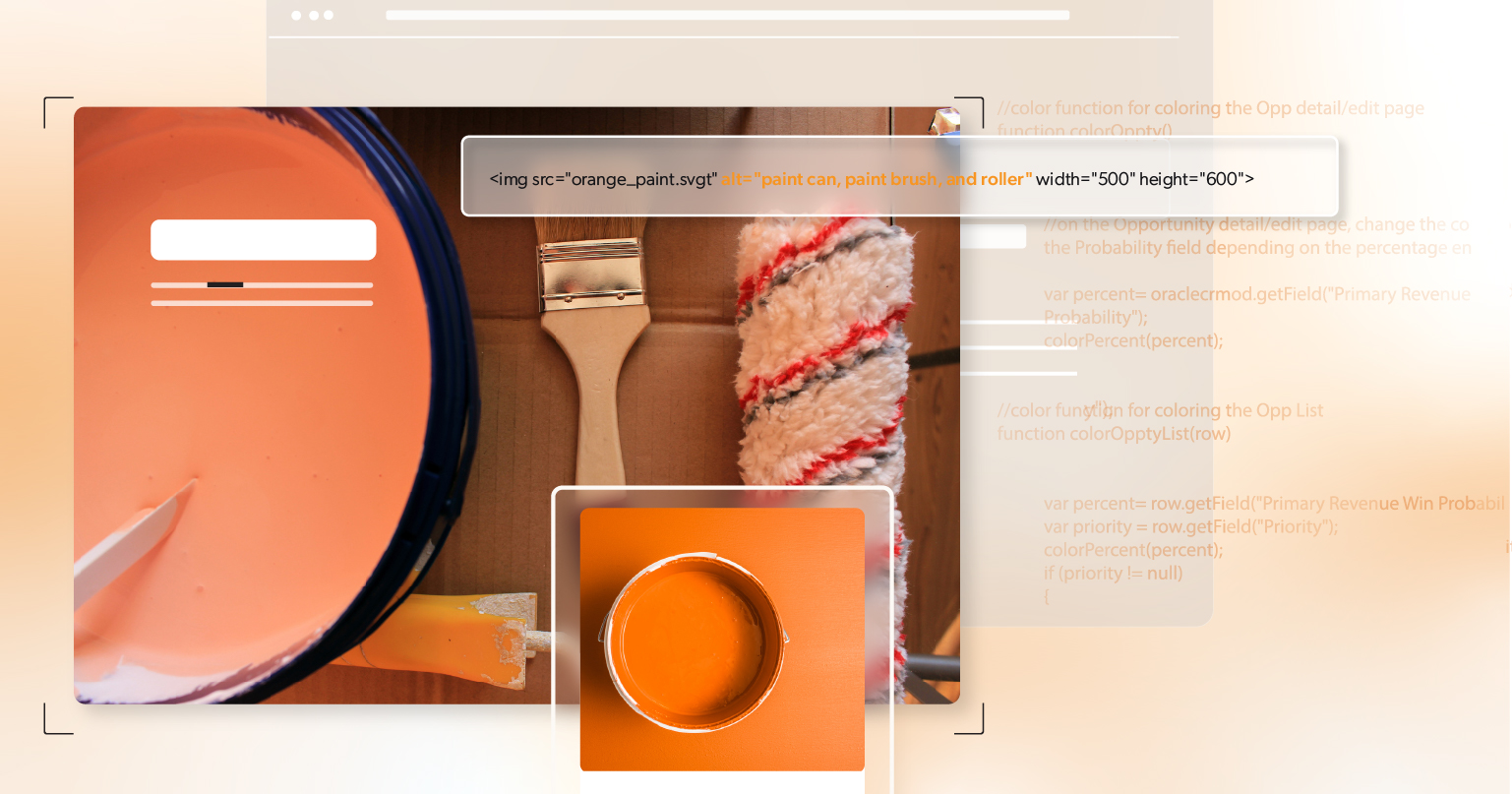
    <img src="/icons/lock.svg" alt="Locked">
    • Use meaningful alt text.
    • If you need a long description (e.g., describing a complex chart), place that adjacent in the DOM and reference it in the surrounding text. You can also wrap the image in a <figure> with a <figcaption> for richer context.

    Note: If you rely on <title>/<desc> inside the SVG file itself, those must be authored in the file, not the HTML. You can’t inject them from outside.

    Best Practices for Accessible SVGs

    Add Accessible Text

    • Short label? Use <title> (or alt if using <img>).
    • Extra context? Use <desc>, or point to adjacent text with aria-describedby.
    <figure>
      <svg role="img" aria-labelledby="logoTitle" viewBox="0 0 100 24">
        <title id="logoTitle">Acme Tools logo</title>
        <!-- logo paths -->
      </svg>
      <figcaption class="sr-only">Acme Tools, established 1984</figcaption>
    </figure>

    A common pattern for longer descriptions is to reference hidden explanatory text:

    <p id="chartLongDesc" class="sr-only">
      2025 sales by quarter: Q1 1.2M, Q2 1.5M, Q3 1.4M, Q4 1.8M—Q4 is highest.
    </p>
    <svg role="img" aria-labelledby="chartTitle" viewBox="0 0 600 400">
      <title id="chartTitle">2025 Sales by Quarter (Bar Chart)</title>
      <!-- bars -->
    </svg>

    Screen reader–only utility:

    .sr-only {
      position:absolute !important;
      width:1px;height:1px;
      padding:0;margin:-1px;
      overflow:hidden;clip:rect(0,0,0,0);
      white-space:nowrap;border:0;
    }

    Contrast & Readability

    Text inside SVGs follows WCAG text contrast:

    • Normal text: 4.5:1 minimum
    • Large text (18pt/24px regular or 14pt/18.66px bold): 3:1
    • Non-text elements (lines, icons, bars): 3:1 (WCAG 1.4.11).
    • Keep text readable at zoom levels users commonly use. Consider vector-effect= "non-scaling-stroke" if thin strokes get too thin when scaled.

    Don’t Use Color Alone

    Color-only encodings (e.g., red vs. green) aren’t enough. Add:

    • Patterns or textures on bars/lines.
    • Labels or icons with different shapes.
    • Legends with clear text.
    <pattern id="diagonalHatch" patternUnits="userSpaceOnUse" width="8" height="8">
      <path d="M0,8 l8,-8 M-2,2 l4,-4 M6,10 l4,-4" stroke="currentColor" stroke-width="1"/>
    </pattern>
    <rect x="10" y="10" width="50" height="200" fill="url(#diagonalHatch)"/>

    Focus and Keyboard Navigation

    • Non-interactive SVGs should not be focusable: tabindex= "-1" and/or focusable= "false".
    • Interactive controls should use native HTML elements for the focus/keyboard model. Wrap the SVG in a <button> or <a> rather than adding click handlers to the <svg> itself.
    <button type="button" aria-pressed="false">
      <svg aria-hidden="true" focusable="false" width="20" height="20">
        <!-- icon paths -->
      </svg>
      <span class="sr-only">Mute audio</span>
    </button>

    Provide visible focus styles for WCAG 2.4.7 (e.g., clear outline around the button).

    Use ARIA Thoughtfully

    • Favor semantics you already get from HTML (<button>, <a>, <figure>, <img>).
    • When you do label an inline <svg> as an image, role= "img" plus an accessible name (via <title> or aria-labelledby) is usually enough.
    • Avoid piling on roles like graphics-document unless you know the support landscape you’re targeting and have tested it. Over-ARIA can confuse screen readers.

    Inherit Color Responsively

    For icons that should match text color and adapt to themes, use currentColor:

    <svg role="img" aria-labelledby="checkTitle" width="20" height="20">
      <title id="checkTitle">Success</title>
      <path d="..." fill="currentColor"/>
    </svg>
    

    Now your icon inherits color from CSS—great for dark mode.

    Sprite Systems (<use>) and Symbols

    When using a sprite:

    <svg class="icon" role="img" aria-labelledby="searchTitle">
      <title id="searchTitle">Search</title>
      <use href="#icon-search"></use>
    </svg>

    Important: Don’t rely on titles inside <symbol>—screen readers often skip them when you reference them with <use>. Add the label at the point of use or wrap the icon in a labeled control.

    Testing SVG Accessibility: Don’t Skip This Step

    Quick Checklist

    • Does the SVG have a clear, accessible name?
    • Is extra context available via <desc> or aria-describedby if needed?
    • Are decorative elements hidden?
    • If interactive: Is it reachable by keyboard? Operable with Enter/Space?
    • Is the tab order logical?
    • Do text and key shapes meet contrast requirements?
    • Do animations honor prefers-reduced-motion?

    Tools & Methods

    • Screen readers: VoiceOver (macOS/iOS), NVDA or JAWS (Windows), TalkBack (Android).
    • Keyboard only: Tab, Shift+Tab, Enter, Space, Arrow keys.
    • Zoom to 200% and 400% to check readability and hit target sizes.

    Common Pitfalls (and Easy Fixes)

    Using SVG as a CSS Background for Meaningful Content

    Background images can’t have alt text. If it conveys meaning, embed it inline or with <img> and provide an accessible name.

    Forgetting to Label Icons

    A lock icon without a label is silent. Add <title> to the <svg> or use <img alt= "Locked">.

    Overwriting Contrast With Themes

    Dark mode CSS might drop your contrast below 3:1 for shapes or 4.5:1 for text—Re-test after theme changes.

    Unlabeled Charts

    A beautiful chart that’s unlabeled is unusable. Provide a title, a short summary, and a link or reference to the underlying data table.

    Interactive SVG Shapes Without Semantics

    Don’t attach click handlers to <path> or <g> and call it done. Wrap the icon in a <button> or <a> and use proper ARIA (e.g., aria-pressed) where appropriate.

    Practical Patterns You Can Copy

    Informative Standalone Icon (Inline SVG)

    <svg role="img" aria-labelledby="infoTitle infoDesc" viewBox="0 0 24 24">
      <title id="infoTitle">Information</title>
      <desc id="infoDesc">Circle with a lowercase “i” inside</desc>
      <!-- paths -->
    </svg>

    Decorative Icon Inside a Button (Button Provides the Name)

    <button type="button">
      <svg aria-hidden="true" focusable="false" width="20" height="20"><!-- icon --></svg>
      Save
    </button>

    Chart With Long Description and Data Table

    <figure>
      <p id="salesDesc" class="sr-only">
        Bar chart showing quarterly sales for 2025: Q1 1.2M, Q2 1.5M, Q3 1.4M, Q4 1.8M.
      </p>
      <svg role="img" aria-labelledby="salesTitle" viewBox="0 0 640 400">
        <title id="salesTitle">2025 Quarterly Sales</title>
        <!-- bars -->
      </svg>
      <figcaption>Summary of 2025 sales; see table below for details.</figcaption>
    </figure>
    <table>
      <caption class="sr-only">Detailed sales data for 2025</caption>
    <thead><tr><th>Quarter</th><th>Sales</th></tr></thead>
      <tbody>
        <tr><td>Q1</td><td>$1.2M</td></tr>
        <tr><td>Q2</td><td>$1.5M</td></tr>
        <tr><td>Q3</td><td>$1.4M</td></tr>
        <tr><td>Q4</td><td>$1.8M</td></tr>
      </tbody>
    </table>

    Accessibility for Motion and States

    If your SVGs animate, respect user preferences:

    @media (prefers-reduced-motion: reduce) {
      svg .spin { animation: none; }
    }

    For toggles (like mute/unmute), update both the visual state (icon changes) and the accessible state (aria-pressed, live text updates).

    Accessible Design is Intentional Design

    Accessible SVGs aren’t just about tags and attributes—they’re about clear communication. When you provide an accessible name, avoid color-only meaning, ensure keyboard operation, and include descriptions where needed, you open your visuals to many more people—without sacrificing design or performance.

    Start small and build the habit:

    • Label every meaningful icon.
    • Hide true decoration.
    • Test with a screen reader and the keyboard.
    • Re-check contrast after style changes.

    Accessibility is a practice, not a checkbox. The pay-off is real: better UX, fewer support issues, and stronger compliance.

    Need a Second Set of Eyes?

    If you want help reviewing your site’s SVGs, charts, and icon systems, schedule an ADA briefing with 216digital. We’ll give you actionable feedback, prioritize fixes, and help you ship accessible SVG patterns that scale across your design system.

    Greg McNeil

    August 14, 2025
    How-to Guides
    Accessibility, accessible code, How-to, SVG, Web Accessibility, web developers, web development, Website Accessibility
  • How to Make Mega Menus More Accessible

    A mega menu is typically a large, two-dimensional panel that appears when a user interacts with a top-level navigation item. It’s often used by eCommerce stores or websites with many different product categories or content sections. Because it can display a wide variety of links in a single view, a mega menu helps visitors explore your site quickly—no endless drilling down into submenus.

    But here’s the catch: while mega menus make navigation simpler for many users, they can also create barriers for some. For example, hover-triggered mega menus might be useless for someone relying on a keyboard. Or, if the menu isn’t properly labeled, a screen reader user might get stuck in a confusing loop of unlabeled links.

    These barriers matter because web accessibility is not just about following rules—it’s about ensuring everyone can use your site. If you leave people out, you risk alienating customers who want to purchase your products or read your content. So, let’s dive into some common accessibility issues and how to fix them.

    Overcoming Common Accessibility Challenges

    Improving Hover Functionality

    Most mega menus open when you hover your mouse over the navigation item. However, hover-based menus can cause big problems for keyboard users (or anyone who can’t use a mouse).

    • Inaccessible for Keyboard Users: People who navigate with the keyboard use the Tab key to move from link to link. If a menu only opens on hover, these users can’t open the submenu.
    • Overly Sensitive Interactions: Sometimes, mega menus can pop open or shut at the slightest movement of your mouse. This makes them frustrating to use for everyone.
    • The “Diagonal Problem”: If you move the mouse at an angle, you can sometimes trigger submenus you didn’t intend to open.

    Best Practice: Use a click to open the submenus instead of relying on hover. This way, both mouse and keyboard users have a more predictable experience. A click is a clearer signal of intention, reducing accidental openings or closings.

    Making Menus Easy to Close

    A menu that’s hard to dismiss can trap users, especially if it covers a large portion of the screen. On the other hand, a menu that closes too quickly can frustrate users who accidentally hover away for a split second.

    Solutions:

    1. Escape Key Support: Let users close the menu by pressing the Escape key. This is a standard expectation in many UI patterns and helps keyboard users exit quickly.
    2. Delayed Closing: If you decide to keep some hover functionality, add a slight delay before the submenu disappears. This grace period prevents the menu from closing by mistake if a user’s pointer drifts outside the panel for a moment.

    Enhancing Keyboard Accessibility

    Logical Keyboard Navigation

    Keyboard navigation is a critical part of web accessibility. You want the user’s Tab key presses to move in a clear, intuitive order:

    1. First Tab: Highlight the first top-level navigation item.
    2. Enter Key: If the focused top-level item has a submenu, pressing Enter opens that submenu. Pressing Enter again on any submenu item activates the link.
    3. Tab Within a Submenu: Moves focus to the next item in the submenu.
    4. Escape Key: Closes the submenu and returns focus to the parent menu item.
    5. Shift + Tab: Moves backward through the items, letting users navigate in reverse.

    This logical flow ensures that people who rely on the keyboard won’t get lost or stuck.

    Providing Clear Focus Indicators

    When users press Tab, they should be able to see exactly which menu item is highlighted. This means using visible focus indicators:

    • A change in background color, an underline, or a bold outline helps users quickly spot the focused item.
    • Make sure the color contrast meets accessibility guidelines. Avoid using color alone—some users might not see color differences clearly. An underline or border is a more reliable visual cue.

    Optimizing Screen Reader Support with ARIA

    Choosing the Right ARIA Roles

    Using role= "menu" for all navigation is a common mistake introduced in development. This role should only be used if your navigation behaves like a desktop application menu. For most website mega menus, it’s better to use simpler roles.

    Recommended roles and attributes:

    • role= "navigation": Declares that this section is a navigation landmark, which helps screen reader users quickly find or skip it.
    • role= "menuitem": If you have interactive items that function like menu items (though for basic links, standard <a> elements might be enough).
    • aria-haspopup= "true": Indicates that a button or link has a submenu.
    • aria-expanded= "false": Tells screen readers if a section is closed. Switch it to true when the submenu opens.

    Labeling and Describing Elements Properly

    Screen readers need helpful labels to convey what the link or button does. If your button opens a “Products” submenu, label it clearly:

    • Use aria-label= "Products Menu" or aria-labelledby=" [ID_of_label]" to associate a descriptive label with the menu.
    • Provide descriptive link text. Instead of “Click here,” use something like “View our latest products.” This helps all users know exactly where the link leads.

    Implementing Accessible Mega Menus with HTML, CSS, and JavaScript

    Using Semantic HTML for Proper Structure

    Below is a simple example showing how to structure an accessible mega menu:

    <nav aria-label= "Main Menu">
      <ul>
        <li><a href="#">Home</a></li>
        <li>
          <button aria-expanded="false" aria-haspopup="true">Products</button>
          <ul>
            <li><a href="#">Product 1</a></li>
            <li><a href="#">Product 2</a></li>
          </ul>
        </li>
      </ul>
    </nav>

    Here’s why this works:

    • <nav aria-label= "Main Menu">: The <nav> element is a semantic way to mark the navigation area. The aria-label helps screen readers identify it.
    • <button> vs. <a>: Using a button for expandable menus is more accessible because it’s an interactive element by default and can easily handle the aria-expanded state.
    • aria-expanded: Indicates whether the submenu is open or closed (true or false).

    Styling Menus for Visibility & Interaction

    Accessible styling goes beyond making things “look nice.” It ensures that focus states are clear. For instance:

    nav button:focus {
      outline: 2px solid #005ea2;
      background-color: #f1f1f1;
    }
    nav ul ul {
      display: none;
    }
    nav button[aria-expanded="true"] + ul {
      display: block;
    }
    • The outline property and background-color change help users see the focused button.
    • By default, submenus are hidden (display: none).
    • When aria-expanded= "true", the submenu appears (display: block).

    Enhancing Usability with JavaScript

    A small amount of JavaScript can make your menus more accessible. Here’s how you can toggle the aria-expanded attribute:

    document.querySelectorAll('nav button[aria-haspopup]').forEach(button => {
      button.addEventListener('click', () => {
        const expanded = button.getAttribute('aria-expanded') === 'true';
        button.setAttribute('aria-expanded', !expanded);
      });
    });
    • This code finds every button with aria-haspopup.
    • When clicked, it checks if aria-expanded is currently true, then toggles it.
    • This prevents menus from randomly opening on hover and gives users control.

    Accessible Navigation Is an Ongoing Commitment

    Building an accessible mega menu isn’t a one-and-done project. It takes careful planning, coding, and constant testing to make sure all users can move through your site with ease. However, the payoff is huge: better usability for everyone, including people with temporary or permanent disabilities, and compliance with accessibility standards like WCAG.

    Remember, accessibility benefits everyone. Even a user with a short-term injury or someone on a small mobile device can benefit from keyboard-friendly and screen-reader-friendly menus. By making small changes to HTML, CSS, ARIA attributes, and JavaScript, you can open up your site to a larger audience and provide a smoother experience for all.

    If you need expert guidance on web accessibility or want a thorough audit of your online store, 216digital can help. We specialize in creating inclusive, user-friendly experiences that keep your customers coming back and keep your website on the cutting edge of accessibility best practices. Don’t let your mega menus become mega barriers—start making them accessible today!

    Greg McNeil

    March 11, 2025
    How-to Guides
    Accessibility, accessible code, How-to, mega menu, web developers, web development, Website Accessibility
  • Writing Code for Web Accessibility: A Guide for Developers

    Coding often feels like speaking a secret language—it’s complex, intricate, and incredibly rewarding. Including web accessibility in your workflow isn’t about reinventing the wheel; it’s about refining your craft to ensure your work reaches everyone. Accessible code builds on the practices you already know, with small adjustments that make a significant impact. In this guide, we’ll explore actionable steps to help you create accessible, user-friendly websites that leave no user behind.

    What Is Accessible Code?

    Accessible code ensures everyone can interact with your website, regardless of ability. Following standards like the Web Content Accessibility Guidelines (WCAG) helps create an inclusive space for all users. By integrating accessibility, you’re not just meeting legal requirements but building a better, more welcoming web experience.

    Accessibility encompasses several aspects, including:

    • Visual Accessibility: Making visual content perceivable by users with visual impairments, often through tools like screen readers.
    • Interactive Usability: Ensuring interactive elements work seamlessly with keyboards, touchscreens, or voice commands.
    • Content Clarity: Structuring information logically to assist users with cognitive impairments.
    • Compatibility: Writing robust code that works with assistive technologies and adapts to future updates.

    The Four Golden Rules of Accessibility: POUR

    The foundation of accessible code is rooted in WCAG’s four guiding principles: Perceivable, Operable, Understandable, and Robust (POUR). These principles ensure your website is usable for everyone. Let’s break them down:

    • Perceivable: Users must be able to see or hear content.
      • Provide text alternatives for non-text content like images (e.g., alt text).
      • Use captions and transcripts for multimedia content.
    • Operable: Interactive elements must be usable with any input device.
      • Ensure keyboard navigation works for all features.
      • Include features like skip-to-content links to improve navigation.
    • Understandable: Content and interfaces should be easy to comprehend.
      • Label forms clearly and provide concise instructions.
      • Write meaningful error messages that guide users in resolving issues.
    • Robust: Code should be compatible with a wide range of assistive technologies.
      • Use valid, semantic HTML to ensure content is interpretable.
      • Test compatibility with assistive technologies like screen readers.

    Adhering to these principles ensures compliance with accessibility standards while enhancing usability for everyone.

    Best Practices for Writing Accessible Code

    Here’s how to apply accessibility principles to your code:

    1. Use Semantic HTML

    Semantic HTML provides structure and meaning to your content. Elements like <header>, <nav>, <main>, and <footer> improve navigation for screen readers and other assistive technologies.

    Instead of:

    <div onclick="doSomething()">Click me</div>

    Use:

    <button onclick="doSomething()">Click me</button>

    Semantic tags enhance usability and reduce the need for ARIA roles, ensuring better compatibility.

    2. Make Forms Accessible

    Forms are a common source of frustration for users with disabilities. Pair input fields with <label> tags to provide clear context:

    <label for="email">Email:</label>
    <input type="email" id="email" name="email">

    For added guidance, use aria-describedby for hints:

    <p id= "emailHint"> We'll never share your email.</p>
    <input type="email" id="email" aria-describedby="emailHint">

    Additionally:

    • Group related fields with <fieldset> and <legend>.
    • Include real-time error validation with accessible alerts.

    3. Ensure Keyboard Navigation

    Interactive elements should be operable using a keyboard. Use logical HTML structures and the tabindex attribute sparingly to create a natural focus order.

    Example:

    <button tabindex="0">Focus me</button>

    Avoid negative tabindex values unless necessary, as they can disrupt navigation.

    4. Add Alt Text to Images

    Alt text makes images accessible to screen readers. Describe the content succinctly:

    <img src= "puppy.jpg" alt= "A golden retriever puppy playing with a ball">

    If an image is decorative, use an empty alt attribute (alt= "") to skip it for screen readers.

    5. Mind Your Colors

    Color contrast impacts readability. Use tools like Contrast Checker to verify that text is legible. Avoid using color as the sole means of conveying information. For example:

    <span style="color: red;">Required field</span>

    Should also include:

    <span class="required" aria-label="Required field">*</span>

    6. Use ARIA Wisely

    Accessible Rich Internet Applications (ARIA) roles can enhance functionality but should be used sparingly. Stick to semantic HTML whenever possible. Common ARIA roles include:

    • role= "alert" for dynamic notifications.
    • aria-expanded for collapsible menus.
    • aria-live for real-time updates.

    7. Don’t Forget Multimedia

    Provide captions for videos and transcripts for audio content. Respect user preferences for reduced motion by using the prefers-reduced-motion media query:

    @media (prefers-reduced-motion: reduce) {
      animation: none;
    }

    Testing Your Accessible Code

    Even the best code needs testing. Use these methods:

    • Automated Testing: Tools like Google Lighthouse or WAVE can identify common issues.
    • Manual Testing: Navigate your site using only a keyboard or a screen reader (e.g., NVDA, VoiceOver).
    • User Testing: Get feedback from users with disabilities to uncover real-world issues.

    Testing should be an ongoing part of your development process to catch and fix issues early.

    Challenges Developers Face—and How to Overcome Them

    Challenge: Understanding WCAG Guidelines Can Be Intimidating

    Solution: Start with the essentials. Focus on foundational elements like semantic HTML, alt text, and keyboard navigation. Once these are second nature, dive deeper into more complex guidelines—one step at a time.

    Challenge: Debugging ARIA Roles Can Be Tricky

    Solution: ARIA can feel like uncharted territory, but tools like ARIA Authoring Practices and automated testing tools (e.g., Google Lighthouse or WAVE) make it manageable. Stick to semantic HTML where possible to minimize the need for custom roles.

    Challenge: Maintaining Accessibility During Updates

    Solution: Accessibility isn’t a one-and-done task; it’s an ongoing commitment. Make accessibility checks part of your QA process and leverage tools like WAVE to identify issues after every update. Document accessibility practices in your team’s workflow to keep everyone aligned.

    Challenge: Balancing Deadlines with Accessibility Goals

    Solution: Tight deadlines can pressure teams to deprioritize accessibility. Combat this by integrating accessibility from the start of a project rather than treating it as an add-on. Small, consistent efforts save time in the long run and prevent last-minute fixes.

    By acknowledging these challenges and embracing practical solutions, developers can turn obstacles into opportunities to create better, more inclusive websites.

    Keep Learning and Building Accessible Code

    Web accessibility is a continuous journey—and an exciting one. As developers, we thrive on solving problems and improving our craft, and accessibility is no different. By staying updated with trusted resources like WebAIM, MDN Web Docs, and the A11y Project, you can keep sharpening your skills and pushing the boundaries of what’s possible. Engage with communities, take courses, and embrace every opportunity to learn. Every small step you take makes the web a more inclusive place for everyone.

    Writing accessible code is about thoughtful, inclusive choices that enhance user experiences. Start with the basics, make accessibility an integral part of your workflow, and let learning drive your improvements. The impact of your efforts extends far beyond compliance; it creates meaningful connections and opens your work to all users, regardless of ability.

    Ready to take your commitment further? Schedule an ADA briefing with 216digital. Our team specializes in tailored web accessibility solutions, helping you mitigate risks and create a more inclusive online presence. Let’s build a better web—together.

    Greg McNeil

    January 9, 2025
    How-to Guides
    accessible code, ADA Compliance, How-to, WCAG, web developers, web development
216digital Scanning Tool

Audit Your Website for Free

Find Out if Your Website is WCAG & ADA Compliant


    216digital Logo

    Our team is full of expert professionals in Web Accessibility Remediation, eCommerce Design & Development, and Marketing – ready to help you reach your goals and thrive in a competitive marketplace. 

    216 Digital, Inc. BBB Business Review

    Get in Touch

    2208 E Enterprise Pkwy
    Twinsburg, OH 44087
    216.505.4400
    info@216digital.com

    Support

    Support Desk
    Acceptable Use Policy
    Accessibility Policy
    Privacy Policy

    Web Accessibility

    Settlement & Risk Mitigation
    WCAG 2.1/2.2 AA Compliance
    Monitoring Service by a11y.Radar

    Development & Marketing

    eCommerce Development
    PPC Marketing
    Professional SEO

    About

    About Us
    Contact

    Copyright 2024 216digital. All Rights Reserved.