Selena Gomez’s Rare Beauty fragrance bottle did more than launch a scent—it made a statement. Co-created with a hand therapist, the rounded bottle sits comfortably in the hand, and its spray requires little effort to use. It’s beautiful, it’s practical, and it’s proof that accessibility doesn’t weaken design—it strengthens it, setting a new standard for what good design looks like.
That’s the essence of inclusive brand design. When thoughtfulness meets elegance, accessibility doesn’t water down your brand—it elevates it. And in 2025, customers expect that same level of intention in every part of the experience, including digital spaces.
The Business Case for Inclusive Brand Design
Rare Beauty shows how inclusive brand design that removes barriers builds loyalty—not just among people with disabilities but among their families, friends, and communities. Today’s consumer base—especially Millennials and Gen Z—cares about values as much as products. They expect brands to reflect social responsibility in ways that are tangible.
When accessibility becomes part of your brand’s DNA, you send a clear message: you belong here. That emotional connection pays off in loyalty, repeat business, and word-of-mouth advocacy.
The Market Opportunity
And that loyalty doesn’t exist in a vacuum—it ties directly to spending power. Globally, more than 1.3 billion people live with a disability. When you factor in families and support networks, the purchasing power of this community reaches $13 trillion annually. This is not a niche—it’s one of the most influential markets in the world.
Rare Beauty’s own growth underscores the opportunity. By 2023, it had generated $350 million in sales, fueled in part by its reputation for accessibility and inclusivity. Inclusive brand design isn’t a side initiative anymore—it’s a driver of brand strength.
The Digital Disconnect in Inclusive Brand Design
But here’s where many brands stumble. They may create a product that’s thoughtful and inclusive, but their digital storefront doesn’t measure up. Maybe the packaging is easy to open, but the checkout can’t be navigated with a screen reader. Perhaps the store welcomes everyone, but the app’s colors make it unusable for many. These gaps aren’t just inconvenient—they’re exclusionary.
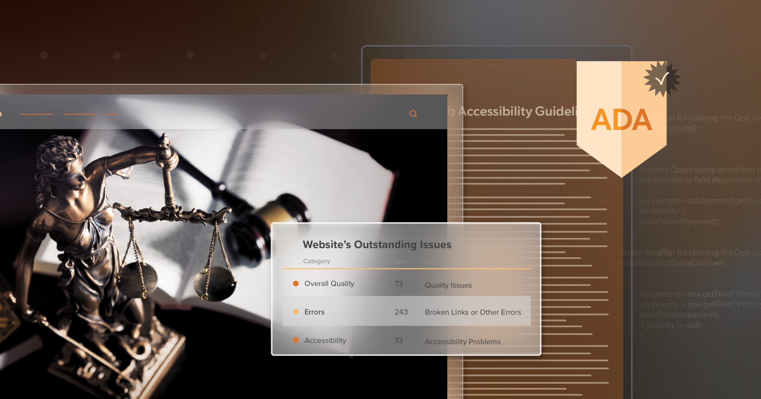
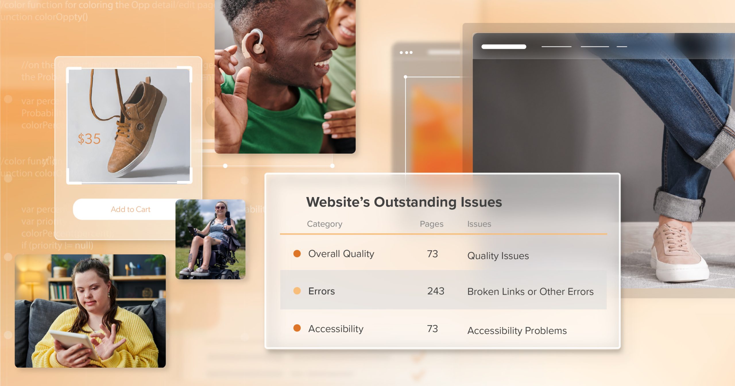
The Reality in Numbers
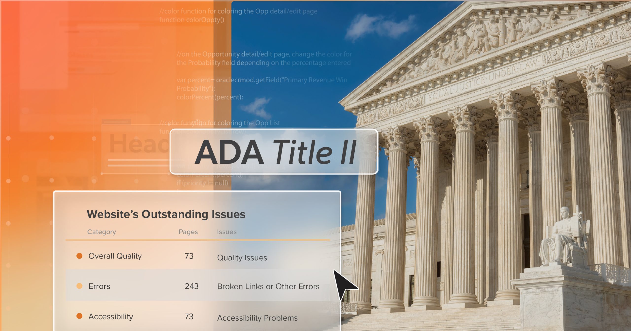
And customers feel these gaps every day—the numbers confirm it. WebAIM’s research across one million homepages found nearly 51 million accessibility errors—an average of 51 per site. More than 94% of homepages had at least one WCAG violation. Meanwhile, nine out of ten users say they’ve personally encountered accessibility barriers while browsing. And the impact is immediate: 70% of disabled shoppers abandon websites that are too difficult to use.
The Unfinished Promise
Behind those numbers are people who want to engage with a brand and can’t. That’s what makes digital inaccessibility more than a technical issue—it’s an unfinished promise. A brand may succeed in making products inclusive, but if its digital presence doesn’t reflect that same care, customers notice. It’s not just a broken experience—it costs brands sales, trust, and reputation.
The Benefits of Embracing Digital Accessibility
The good news is, every barrier you remove creates an opportunity. Where inaccessible design closes doors, inclusive brand design opens them—to new customers, stronger relationships, and measurable business gains.
Reach More Customers, Build More Trust
When brands invest in accessibility, they close that gap. They prove their values go deeper than marketing copy, and customers reward that consistency with loyalty and advocacy. Accessibility, in practice, becomes one of the clearest signals of integrity.
Boost Search Visibility
And the benefits don’t stop with customers. Accessibility improvements often strengthen a site’s technical foundation, which search engines reward. Clear structures, descriptive alt text, and intuitive navigation make it easier for Google to crawl and index content. A study by Semrush and Accessibility Checker found that 73% of sites improving accessibility saw organic traffic increase, averaging 12% growth.
Better Experiences for Everyone
Accessibility also lifts usability across the board. Captions help both deaf viewers and commuters watching in noisy environments. Strong color contrast helps those with low vision and anyone outdoors in bright light. Larger tap targets assist users with motor limitations and people juggling a phone in one hand. When accessibility is built in, everyone benefits.
Efficiency and ROI Gains
And inside the business, accessibility creates efficiency. Cleaner, structured code reduces development rework. Streamlined flows cut down on support tickets. Easier checkouts lift conversion rates. The ROI is striking: Forrester estimates that every $1 invested in accessibility can return up to $100 in benefits. It’s proof that accessibility doesn’t just pay off in trust—it pays off in operations too.
Five Building Blocks for Inclusive Brand Design Online
Recognizing the benefits of accessibility is just the beginning. The real progress comes from knowing how to put those values into practice. Accessibility doesn’t just appear—it’s the result of clear priorities and consistent habits.
These five building blocks give you a practical, everyday path forward:
1. Start with the Standards
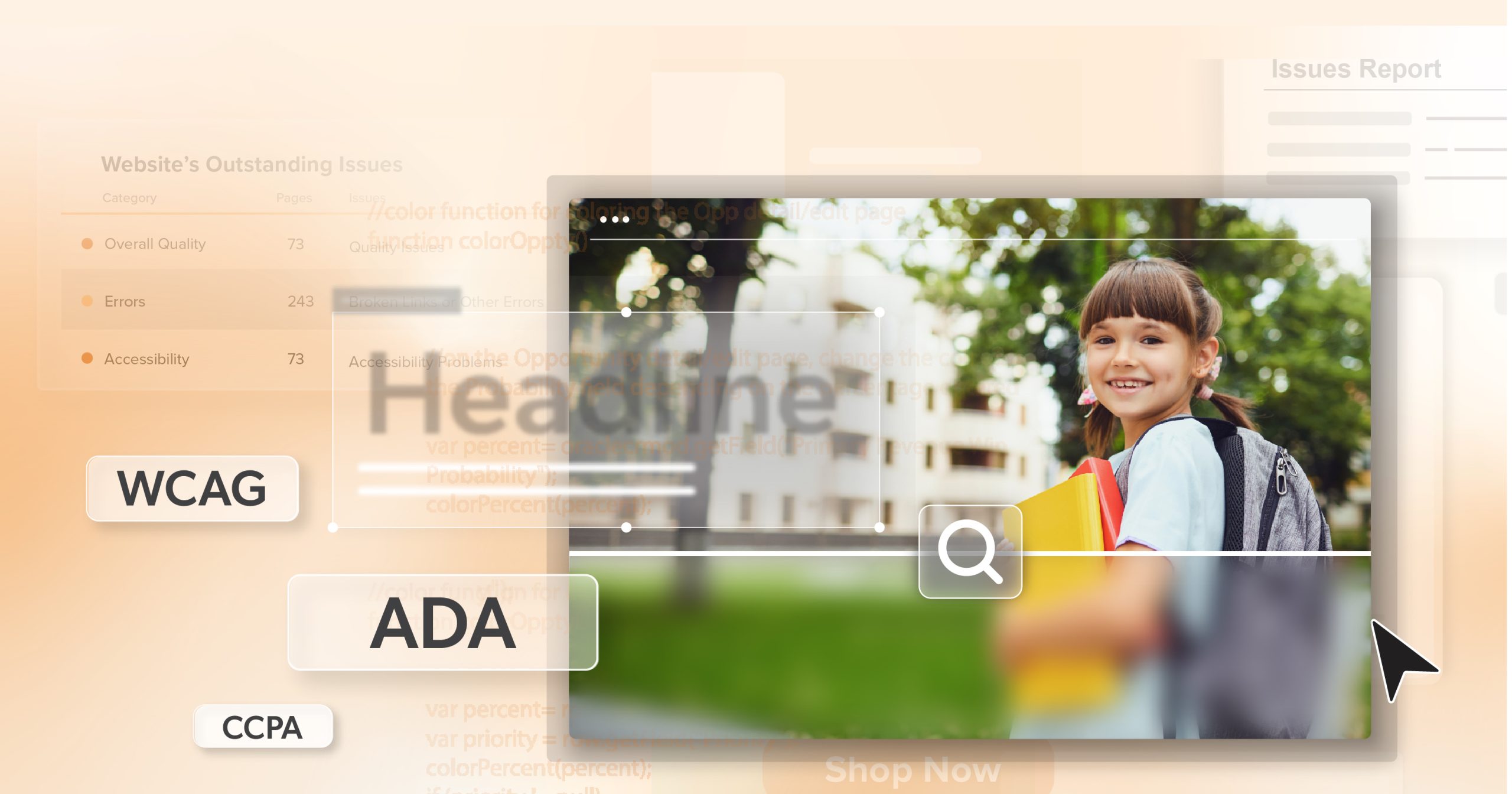
Start with WCAG 2.1/2.2 Level AA. These guidelines are practical blueprints for creating experiences that are perceivable, operable, understandable, and robust.
2. Audit, Prioritize, and Iterate
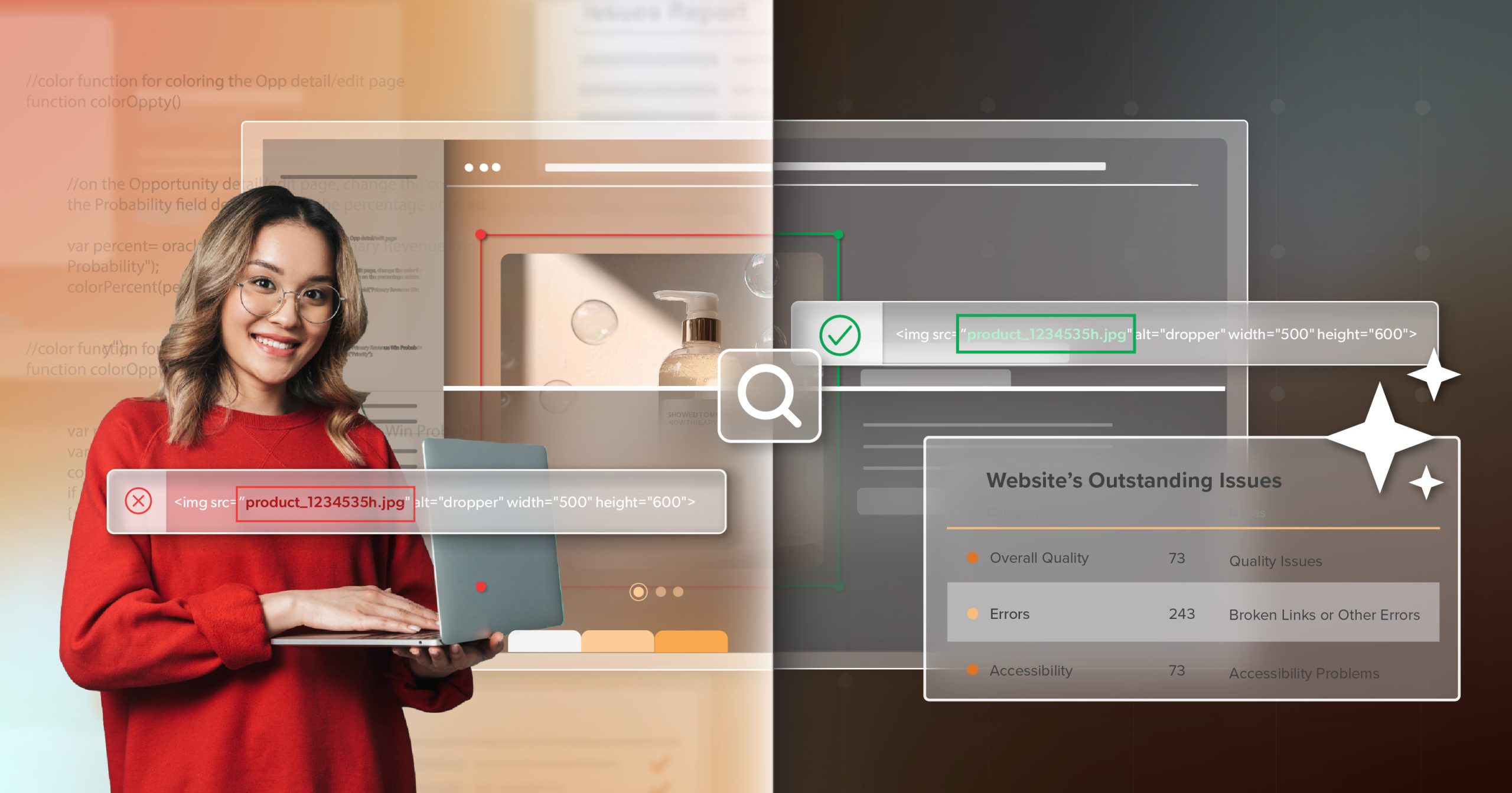
Run an accessibility audit to map where you stand. Fix the highest-impact issues first—navigation, forms, alt text, and color contrast. Take it step by step; progress compounds quickly.
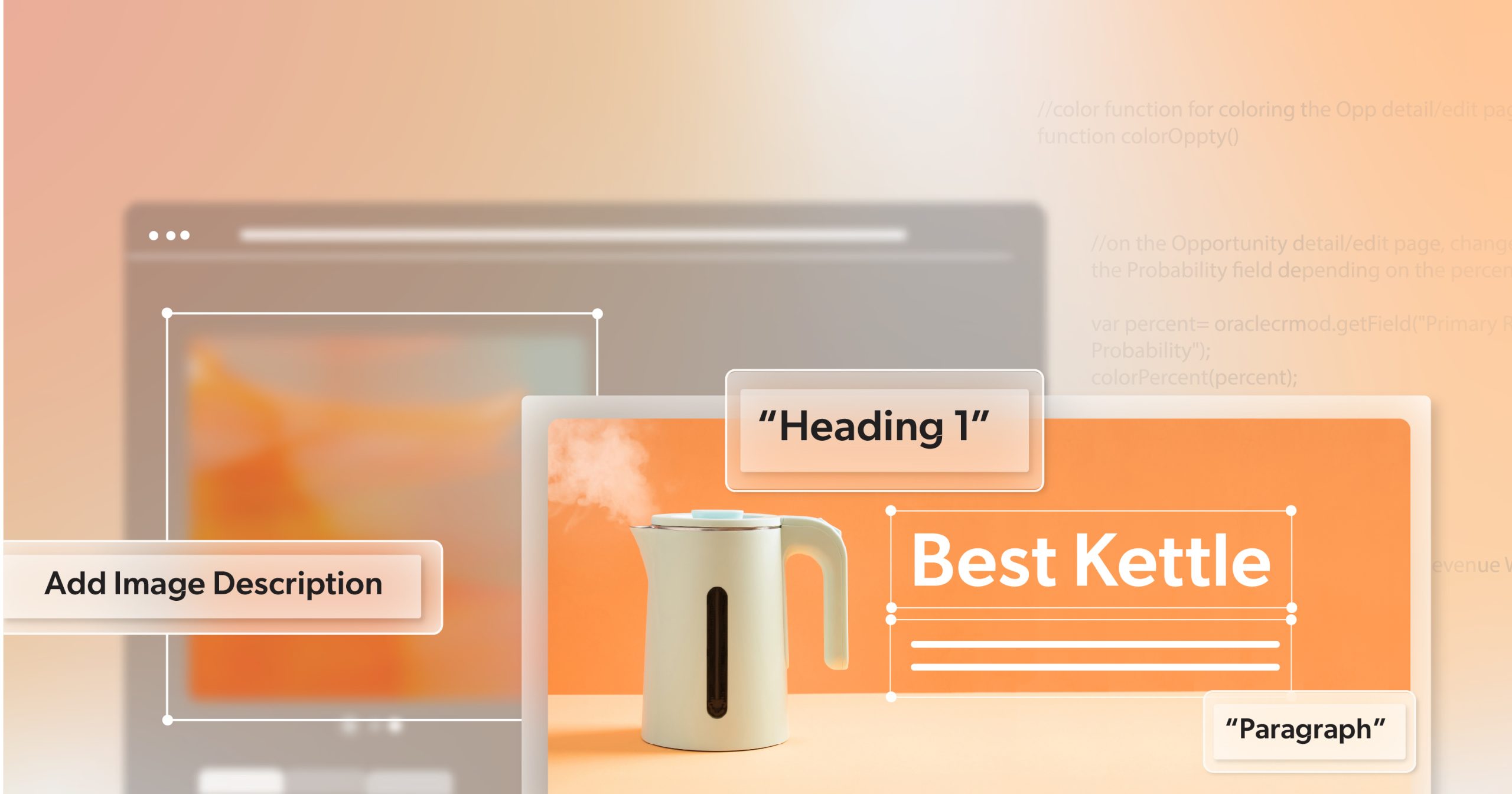
3. Design and Develop for Accessibility
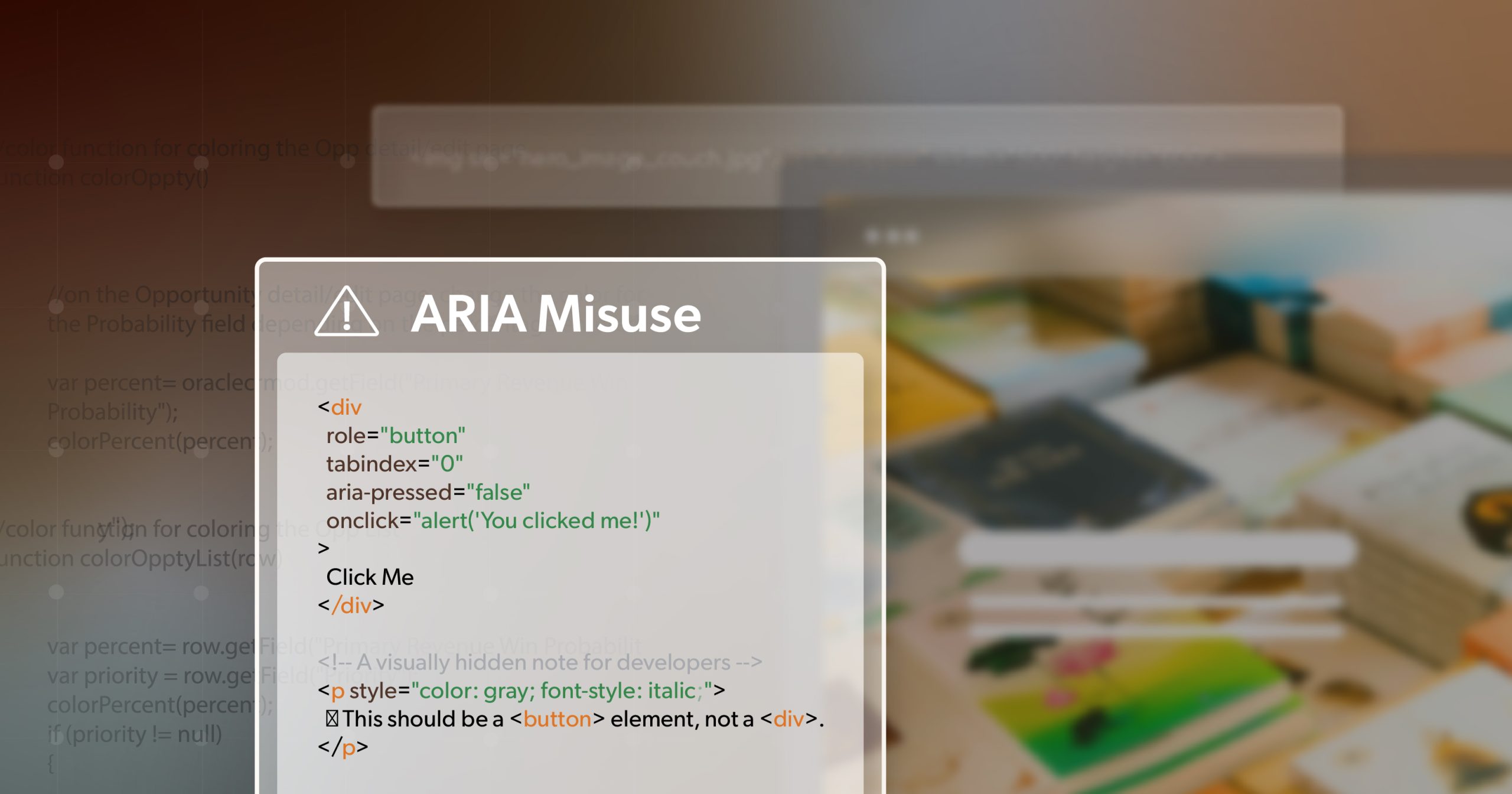
Accessibility isn’t something you tack on at the end—it’s built in. Use semantic HTML. Structure headings clearly. Write meaningful alt text. Provide captions and transcripts. Ensure your site works fully by keyboard and with screen readers.
4. Blend Automation with Human Testing
Automated tools catch a lot, but only about 30% of real-world barriers. Human testing, especially with assistive technology users, surfaces the rest. Together, they give you both coverage and authenticity.
5. Create a Culture, Not a Checklist
Most importantly, make accessibility part of the way your brand works, not just a task on the to-do list. Train teams across design, development, and content. Build accessible components into your design systems. Encourage accountability so accessibility becomes second nature, woven into your culture.
A Chance to Lead With Inclusion
Every interaction online tells people something about your brand. When your digital spaces aren’t accessible, that message can be louder than you think—even if it wasn’t your intent. Customers notice when barriers are in the way, and they remember which brands make it simple to connect.
Accessibility isn’t just a box to check anymore—it’s what separates brands that feel relevant from those that feel outdated. With 88% of websites still missing the mark on compliance, the chance to stand out is wide open. Choosing accessibility is more than compliance; it’s a clear sign that your values extend from the products you offer to the way people experience your brand online.
At 216digital, we help make accessibility part of your everyday design process, not something tacked on at the end. If you’re ready to create an inclusive and dependable online presence, schedule an ADA briefing with us today. Let’s make sure your online spaces reflect the same care and integrity as the products you’re proud to share with the world.