Newsletters are still one of the most personal ways to reach people online. They share updates, spark interest, and keep relationships going—all right there in your reader’s inbox. Once the design looks polished and the list is ready, it’s easy to feel like the work is done.
But even the best-looking email can fall short for someone using a screen reader. A missing heading tag, a jumbled reading order, or an unlabeled image can make a message that feels seamless to one person confusing to another.
Email accessibility often gets left behind—not because people don’t care, but because it’s easy to think of it as something separate from web accessibility. In truth, it’s all connected. The same principles that make your website inclusive—clear structure, descriptive alt text, and meaningful markup—apply just as much to your emails.
An accessible email isn’t a bonus feature. It’s a sign of good communication: thoughtful, professional, and built for everyone.
The steps below show how to bring accessibility into your process naturally, without slowing your team down or changing the way you already design and send.
Start with a Strong Foundation
Every accessible email starts with clean, well-structured HTML. A simple one- or two-column layout works best. Multi-column or grid-heavy designs may look great on desktop but can become confusing when read aloud or viewed on mobile.
Keep your code organized so it flows naturally from top to bottom, left to right. When your layout collapses for smaller screens, content should still read in a logical order.
Use semantic markup to structure content:
<h1>,<h2>, and<h3>tags for headings<p>tags for paragraphs- Avoid using styled
<div>elements to imitate headings or sections
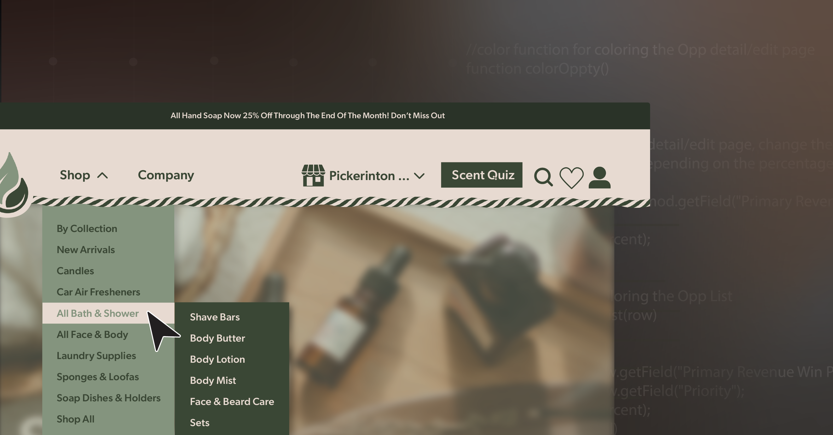
If you rely on tables for layout, apply role="presentation" so assistive technologies don’t interpret them as data tables. And try to keep navigation minimal—five or six identical header links can feel repetitive for someone navigating by keyboard or screen reader.
Finally, test your message with images turned off. Many email clients block images by default, so make sure your message still makes sense when visuals are missing.
Make Links and Buttons Clear and Consistent
Screen reader users often jump between links to navigate quickly. That’s why each link should make sense on its own.
Instead of vague prompts like “Click here” or “Learn more,” use language that describes the action:
- “Download our June 2025 Report”
- “View featured products”
- “Register for our next webinar”
For buttons, stick to properly coded <a> tags styled with CSS. If you’re using nonstandard elements, include role="button" and test keyboard functionality. Avoid relying on image-based buttons without text alternatives or ARIA labels.
A few more details to keep in mind:
- When a link opens a page, make sure focus lands in a logical place—at the top or at a key heading, not mid-page.
- Treat unsubscribe and preference links as essential navigation elements. They should be easy to find, clearly labeled, and fully accessible.
Communicate Without Relying on Vision
Images, icons, and videos make emails engaging, but they shouldn’t be the only way you communicate.
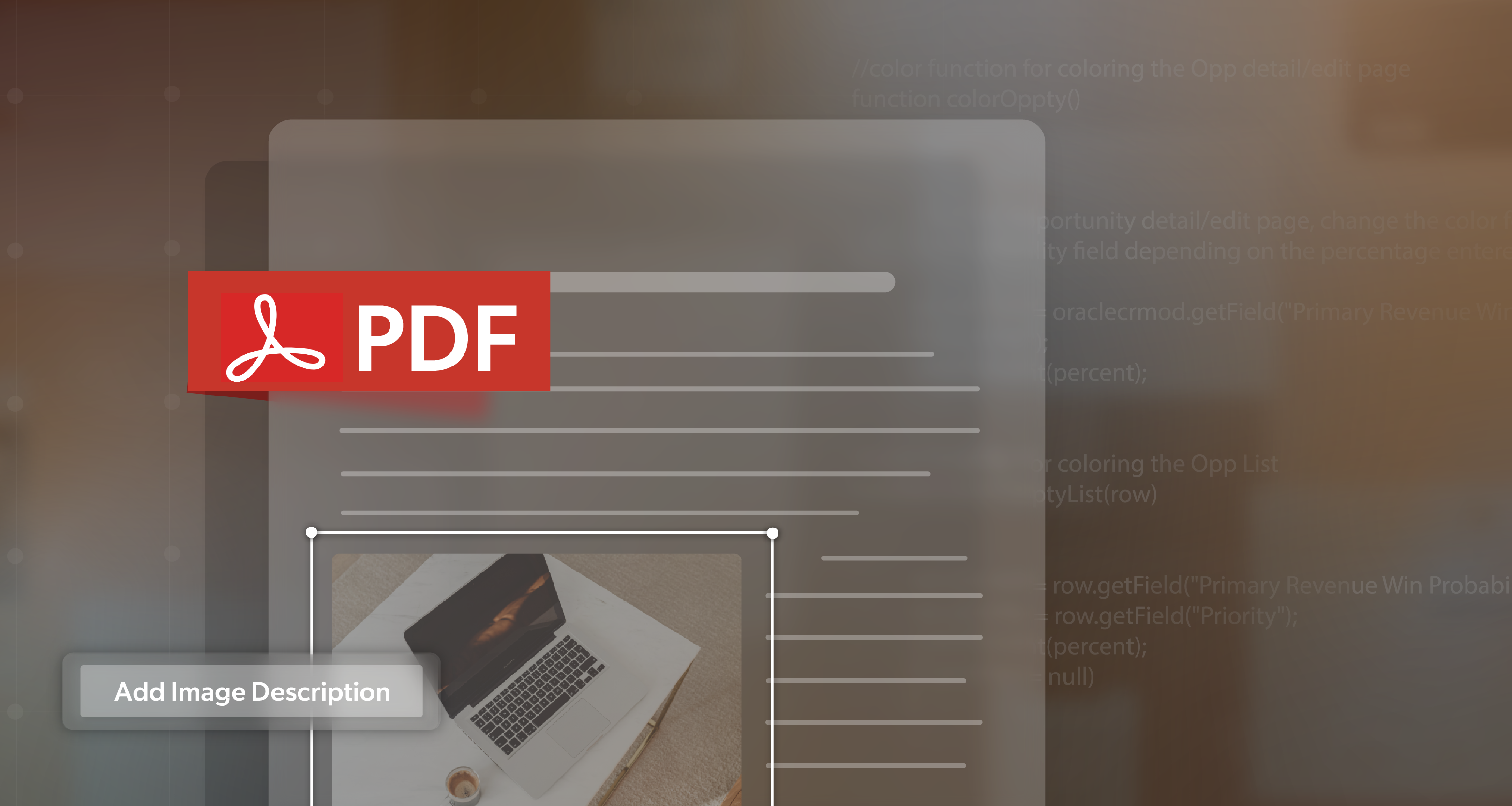
- Add descriptive alt text to every meaningful image.
- Example:
<img src="banner.jpg" alt="50% off sale ends July 31">
- Example:
- For decorative visuals, use empty
alt text (alt="")so screen readers skip them. - Never put important text—like “Register Now” or event details—inside an image unless that information also appears as live text.
If your email includes video or audio, make sure there are captions, transcripts, and accessible controls. Avoid autoplaying media; it can disrupt assistive technology users.
And once again—preview your message with images blocked. It’s one of the simplest ways to catch email accessibility issues before you hit send.
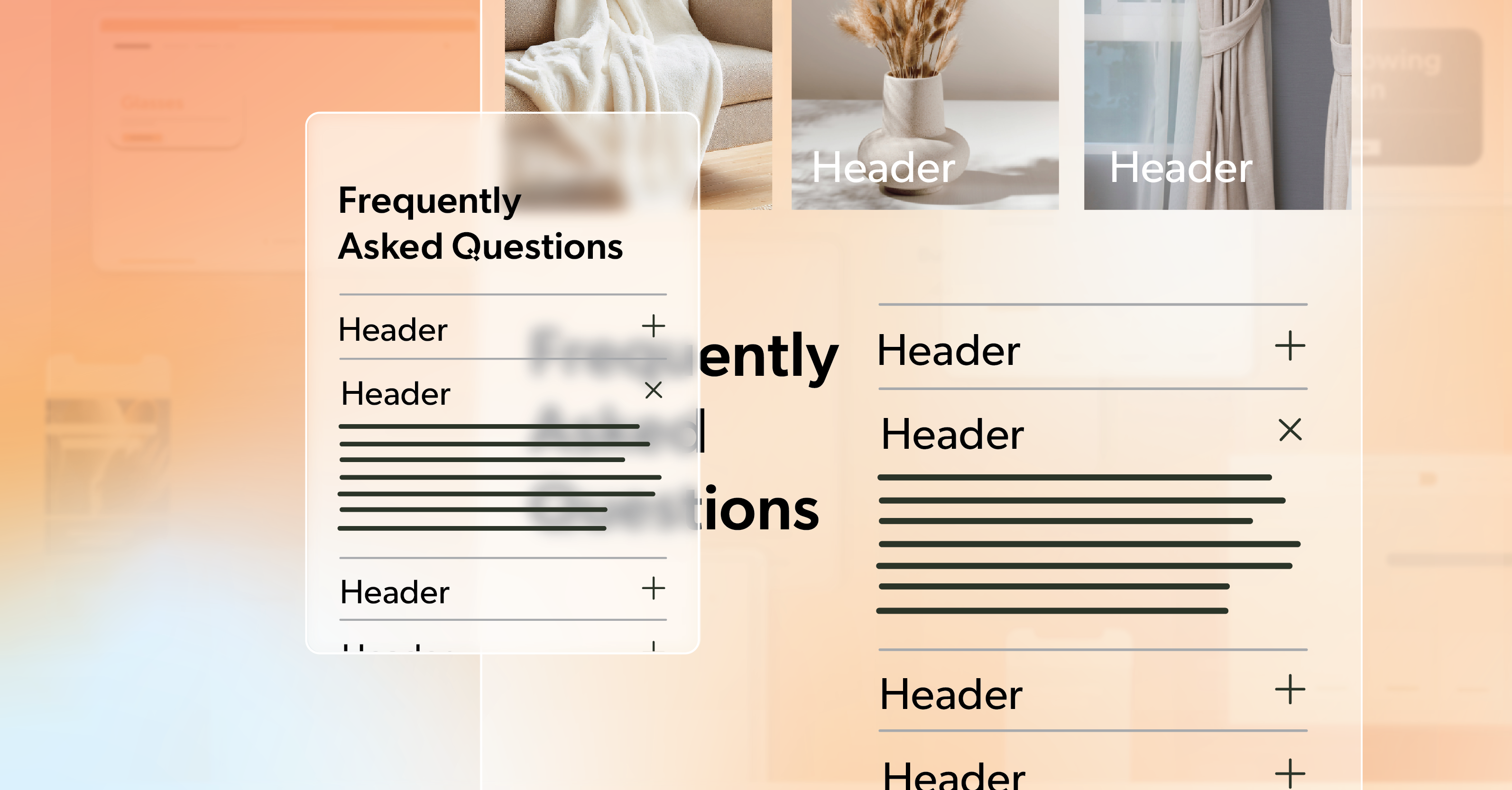
Keep Tables Simple and Purposeful
Tables are sometimes necessary, but they can quickly complicate email accessibility if used carelessly. Before adding one, ask: Could this be a list instead?
If you truly need a data table:
- Use
<th>tags for headers - Identify rows and columns properly
- Avoid merged or nested cells, which confuse screen readers
When a table is only for layout, mark it with role="presentation". In most cases, modern spacing and stacking techniques can replace layout tables without losing visual balance.
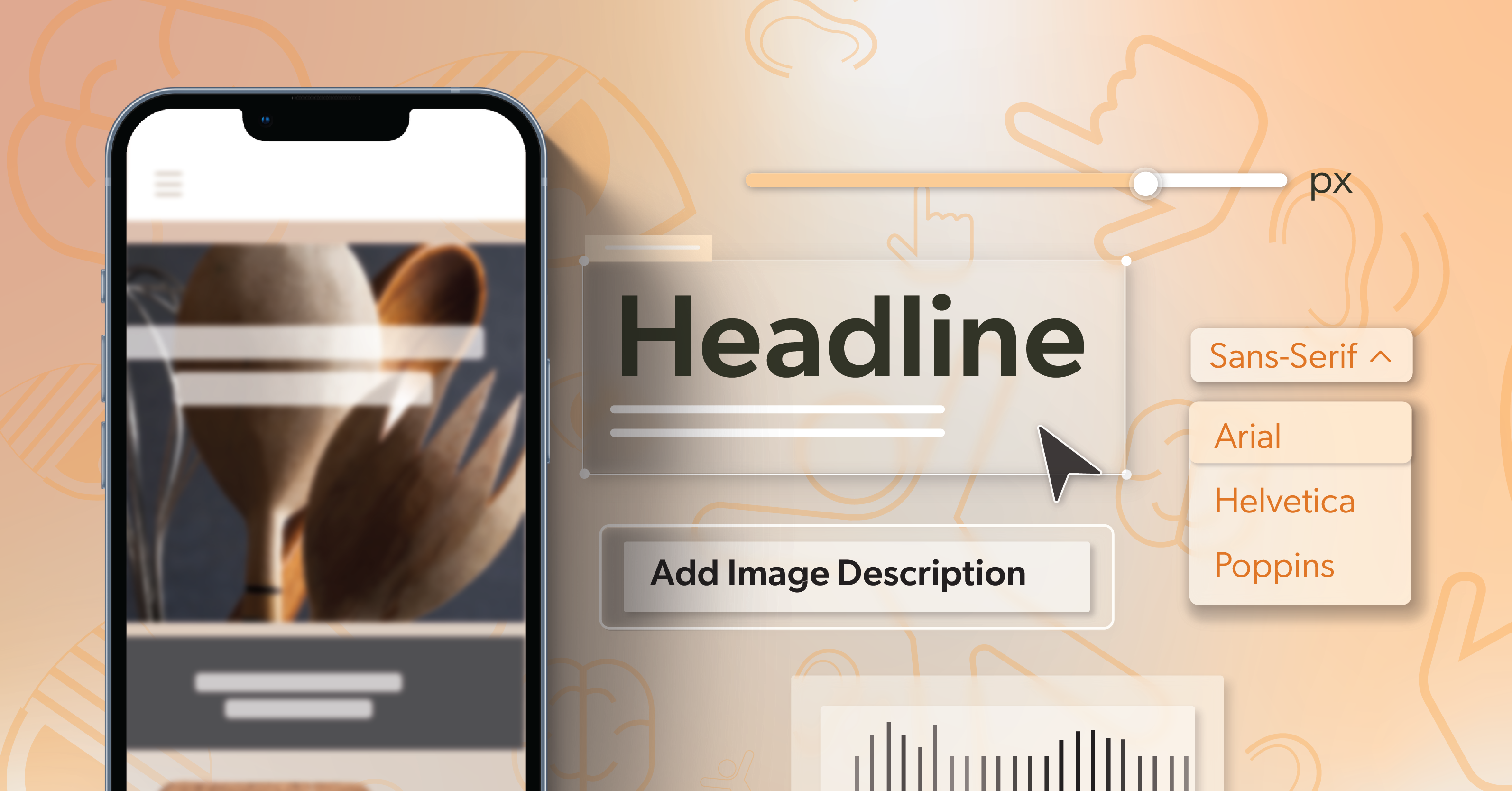
Prioritize Readability in Typography and Contrast
Readable text helps everyone—not just users with disabilities.
- Choose simple, widely supported fonts like Arial, Helvetica, or Calibri.
- Set body text at 14–16 pixels with line spacing around 1.4–1.5 for comfort.
- Left-align paragraphs rather than centering or justifying them.
- Maintain color contrast ratios of at least 4.5:1 for body text.
Avoid using color alone to convey meaning. Pair color cues with icons, labels, or underlines. Use emoji and symbols sparingly—they can sound awkward when read aloud by screen readers.
Leave breathing room between sections, and test your email in dark mode to confirm text and background colors remain readable. These small checks can make a big difference in overall legibility.
Reduce Friction with URLs and Attachments
Accessibility isn’t just about visuals—it’s about ease of use.
- Replace long, exposed URLs with descriptive links.
- If you must include a raw link, place it on its own line for clarity.
- Ensure attachments like PDFs are tagged and labeled
- Summarize key information within the email body when possible, so users don’t need to download a separate file.
Always include a plain-text version of your email for users relying on text-only clients or low-bandwidth connections.
Even your subject line and preview text play a role in accessibility. These are the first things a screen reader announces, so be specific:
Instead of “July Newsletter,” try “July Updates: Accessibility Toolkit and Webinar Dates.”
Test as a Natural Part of Your Process
Testing shouldn’t feel like a separate task—it should be part of your regular workflow for email accessibility.
Before sending, confirm that:
- Headings follow a logical hierarchy
- All images include alt text
- Links are descriptive
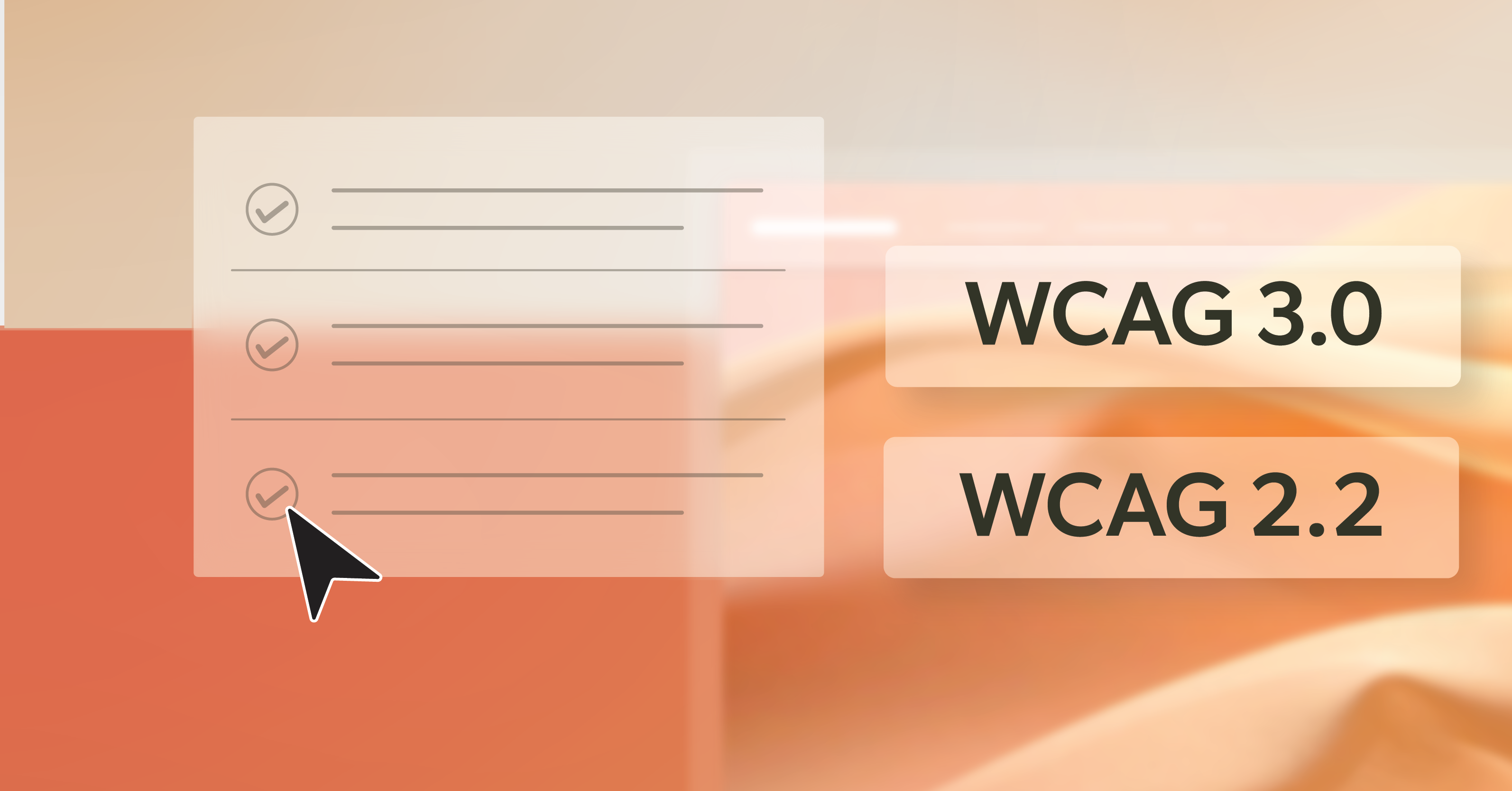
- Contrast meets WCAG standards
- The message reads naturally with images turned off
Check how your email performs in multiple clients—Outlook, Gmail, Apple Mail—and on different devices. Then, try it with a screen reader like NVDA, JAWS, or VoiceOver. Notice whether headings make sense, focus moves predictably, and buttons behave correctly.
Other valuable tests:
- Navigate using only your keyboard
- Zoom in to 200% and ensure the layout still holds together
- Ask teammates or testers who use assistive tech for feedback
Automated tools can flag issues like missing alt text or low contrast, but human review ensures quality. Once testing becomes routine, email accessibility starts to feel natural—not like an extra step, but part of how you craft great communication.
Email Accessibility: The Message Everyone Can Read
Accessibility works best when it’s built in, not added at the last step. When your structure is clear, headings are properly marked, alt text is descriptive, and links communicate purpose, your message feels effortless—no matter how someone reads it.
That’s what email accessibility really delivers: communication that’s consistent, inclusive, and easy for everyone to engage with. It’s not extra work; it’s smarter work that helps your team create better results with less rework and greater reach.
If you’re ready to strengthen that process, 216digital can help. Schedule an ADA briefing, and we’ll walk through your templates, review your workflow, and show you how to make email accessibility a seamless part of every campaign you send.