
We spend a lot of time tuning headlines and chasing algorithms. But the work that truly moves the needle is simpler: say what you mean so more people can use it. Clear content builds trust, lowers support requests, and makes your message easier to find. That’s the power of accessible web content—it helps people first, and performance follows.
Content isn’t a “design extra” in accessibility. Writers, editors, marketers, and developers shape how people understand a page. This article offers practical, jargon-light techniques you can apply right now. They align with WCAG, but they’re written for real teams on real deadlines, with real audiences who just want answers that make sense.
Plain Language Is the Heart of Accessible Web Content
Plain language is not “dumbing it down.” It’s respect. Many public-facing teams aim for an elementary reading level; professional material often targets a middle-school level. And when you’re busy, simple always wins—whether you’re a novice or an expert scanning on a phone between meetings.
Try this:
- Use a readability tool (Hemingway, Grammarly) to check grade level.
- Swap jargon for everyday words. “The site adjusts to your screen” beats “utilizes responsive design principles.”
- Prefer active voice: “Change your password every three months,” not “It is recommended…”
- Lead with the point, then add detail.
- Keep one idea per paragraph. Use person-first, inclusive language when you reference people with disabilities.
Short sentences steady the pace. A few longer ones add rhythm and nuance. Together, they make meaning land without strain.
Make Your Page Easy to Scan—By People and Tools
Titles, URLs, and headings are how busy readers—and assistive tech—map a page. If the map is messy, the journey is slow.
Best practices:
- Write unique, descriptive titles. Put the most important words first and, when it fits, match the H1.
- Use readable URLs (
/web-design-services, not ?id=47289). - Use one H1. Nest headings in order (H2 → H3) like chapters and subchapters.
Screen reader users often navigate by headings. A logical outline turns scanning into understanding. Clear structure makes pages easier to skim, and it makes accessible web content faster to find, reuse, and maintain.
Links and Images That Strengthen Accessible Web Content
“Click here” makes people guess. It also fails when a screen reader pulls out a list of links with no surrounding context.
Instead:
- Write link text that stands on its own: “Download the accessibility guide.”
- Make labels unique so users know which link goes where.
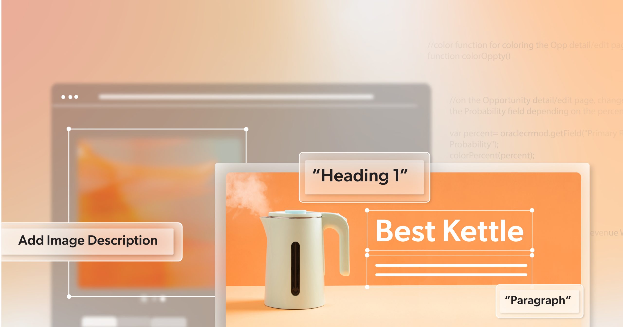
Effective Alt Text
Alt text explains an image’s purpose when images don’t load or when a user can’t see them.
Guidelines:
- Be concise—under ~125 characters—and capture what the image means to the page.
- Decorative images should be skipped with empty alt text (
alt=""). - For complex visuals (charts, infographics), add a short alt summary and provide a fuller explanation nearby.
These small choices help everyone—search engines, skimmers, and people using assistive tech—get the same story.
Accessible Audio and Video for Every Situation
Not everyone can turn on sound. Some people prefer reading. Others are in a noisy shop or a quiet office. Without captions or transcripts, they miss your message.
Do this:
- Provide accurate, synchronized captions. Add speaker labels when voices change.
- Offer transcripts with timestamps and descriptions of meaningful sounds or visuals.
- Edit auto-generated captions. They’re a starting point, not a finish line.
Captions and transcripts travel well across devices and contexts, turning media into content that’s flexible, shareable, and dependable—another pillar of accessible web content.
Guidance That Doesn’t Assume Vision or Memory
Task-heavy pages—forms, checkouts, dashboards—depend on clear instructions. Plain direction removes guesswork and stress.
Practical moves:
- Use direct, concrete prompts: “Enter your full name and email address.”
- State rules up front: “Password must be at least 8 characters.”
- Write helpful errors that explain what went wrong and how to fix it: “Enter a valid email, like name@example.com.”
- Don’t rely on color, location, or shape alone. If you say “the green button on the right,” also name the button.
The goal is guidance that stands on its own—no color key, no guessing, no hidden requirements.
Formatting That Keeps Accessible Web Content Readable
Good layout choices help everyone. They also keep cognitive load low.
Recommendations:
- Left-align text. Full justification can create rivers of space that are harder to read.
- Choose legible sans-serif fonts at a comfortable size (around 16px / 12pt or larger).
- Give text room to breathe with generous line spacing and white space.
- Keep paragraphs short (3–4 sentences). Use lists for steps and grouped ideas.
- Verify pages remain readable and usable when zoomed to 200%.
- Ensure sufficient color contrast (aim for at least 4.5:1 for normal text). Don’t rely on color alone for meaning.
These choices signal care. They tell readers, “We made room for you here.”
Why These Techniques Matter
WCAG 2.2 (W3C’s current recommendation) gives teams a shared yardstick. The POUR framework—Perceivable, Operable, Understandable, Robust—turns good writing habits and clean structure into checks you can actually verify. Here’s how that plays out in day-to-day work:
- Perceivable: Make meaning available beyond sight alone. 1.1.1 Non-text Content asks for useful alt text; 1.4.3 Contrast (Minimum) expects readable color contrast. Together they ensure images and text still communicate when visuals fail or vision varies.
- Operable: People must be able to find and use things. 2.4.6 Headings and Labels rewards clear, descriptive headings; keyboard-friendly navigation pushes toward predictable movement through a page.
- Understandable: Content should read cleanly and behave as expected. 3.3.1 Error Identification favors messages that say what went wrong and how to fix it—perfect for forms and flows.
- Robust: Code should work with current and future tech. 4.1.2 Name, Role, Value is where semantic HTML shines, helping assistive technologies reliably understand controls and their states.
You don’t need to memorize the spec. Use POUR as a short, practical lens while you write and review: if a decision helps someone perceive, operate, understand, or reliably use the page, you’re moving in the right direction—and you’ll have the checkpoints to prove it. It’s not meant to slow you down; it’s there to turn good intentions into repeatable habits that make accessible web content easier to ship.
Ensure Your Words Work—Not Just Look Right
Use tools to catch patterns. Use people to confirm meaning.
Helpful tools:
- Accessibility checkers (like WAVE or Google Lighthouse) surface common issues early.
- Readability and contrast tools help you tune language and color choices.
Manual checks:
- Try a screen reader (NVDA on Windows, VoiceOver on macOS).
- Navigate with a keyboard only. Can you reach and use every control?
- When possible, invite feedback from people with diverse abilities.
Make it repeatable:
- Keep a short pre-publish checklist: heading order, meaningful links, alt text added, language attribute set, clear form labels and errors.
- Schedule content accessibility reviews so improvements stick. This is how you keep accessible web content strong as pages, teams, and priorities change.
Accessible Content Is Good Content—Let’s Get You There
You don’t have to fix everything at once—just make the next thing better. A clearer title here, a stronger alt text there, a caption polished before it goes live. Small improvements stack up fast, and your audience feels the difference.
As you roll out a new product, kick off a seasonal sale, or hit publish on a blog, take a gentle pause: Does the page read easily? Do the links explain themselves? Will someone using a screen reader get the same story as everyone else? That quiet check-in becomes a habit, and that habit becomes consistency—without slowing your team down. Over time, those small, steady choices turn into a recognizable voice: thoughtful, trustworthy, and human.
If you’d like a partner to help keep that momentum, 216digital is here. We can share simple checklists, coach your team, and set up light-touch reviews so every release ships with confidence. Schedule an ADA briefing with us, and let’s make the next launch your clearest one yet—then repeat it with every product, sale, and post.