Visuals drive e-commerce—they shape how customers understand, compare, and connect with products. But for users relying on screen readers or other assistive technologies, those visuals only work when paired with accurate alt text and accessible labels. Without them, key product details disappear, leaving users unable to engage or buy.
Accessibility also drives measurable results. Research shows that 71% of users with disabilities leave sites that present barriers, while inclusive design reduces bounce rates and builds trust. Search engines benefit, too—HubSpot reported a 779% increase in image traffic after optimizing alt attributes. And with nearly 15% of the global population living with a disability, accessible images open your storefront to a wider audience that can browse and buy without friction.
When done well, accessibility becomes more than a technical fix—it’s a competitive advantage. It improves visibility, trust, and conversion, all while making your brand easier for everyone to experience.
This guide explores what that looks like in practice—how to make product media accessible, where teams most often slip, and how to integrate accessibility into your daily workflow.
What Makes a Product Media Accessible
High-quality product media isn’t just about presentation—it’s about communication. Every image should help shoppers understand your product, evaluate their options, and make confident decisions.
In accessible design, that means ensuring every photo, color variant, and product angle can be understood not only visually, but also through assistive technology.
Below are the key principles that make product media both effective and accessible.
1. Clear and Descriptive Alt Text
Alt text gives images meaning. Without it, assistive technologies have nothing to announce—and essential product details disappear. Descriptive alt text ensures that shoppers who rely on screen readers can access the same information as anyone else.
When written thoughtfully, alt text also supports SEO, helping search engines understand what’s being shown and improving how your products appear in image searches.
If you’re coding manually, add the alt attribute directly to your <img> tag:
<img src="example.jpg" alt="A description of the image">Keep descriptions concise but specific, focusing on what’s visually relevant to the shopper.
For those using a CMS like Shopify, WordPress, or Magento, you can add this text in the Alt Text or Alt Description field during upload. Many platforms support bulk editing—an efficient way to replace missing or generic alt text and ensure consistency across your catalog.
When Product Media Need Alt Text (and When They Don’t)
Product photos are the foundation of any e-commerce experience. They convey material, color, and quality—all the details a shopper depends on. Because of that, almost every product media needs alt text.
The only exception is when an image adds no new visual information—for instance, when showing the same product from another angle without revealing new features or details.
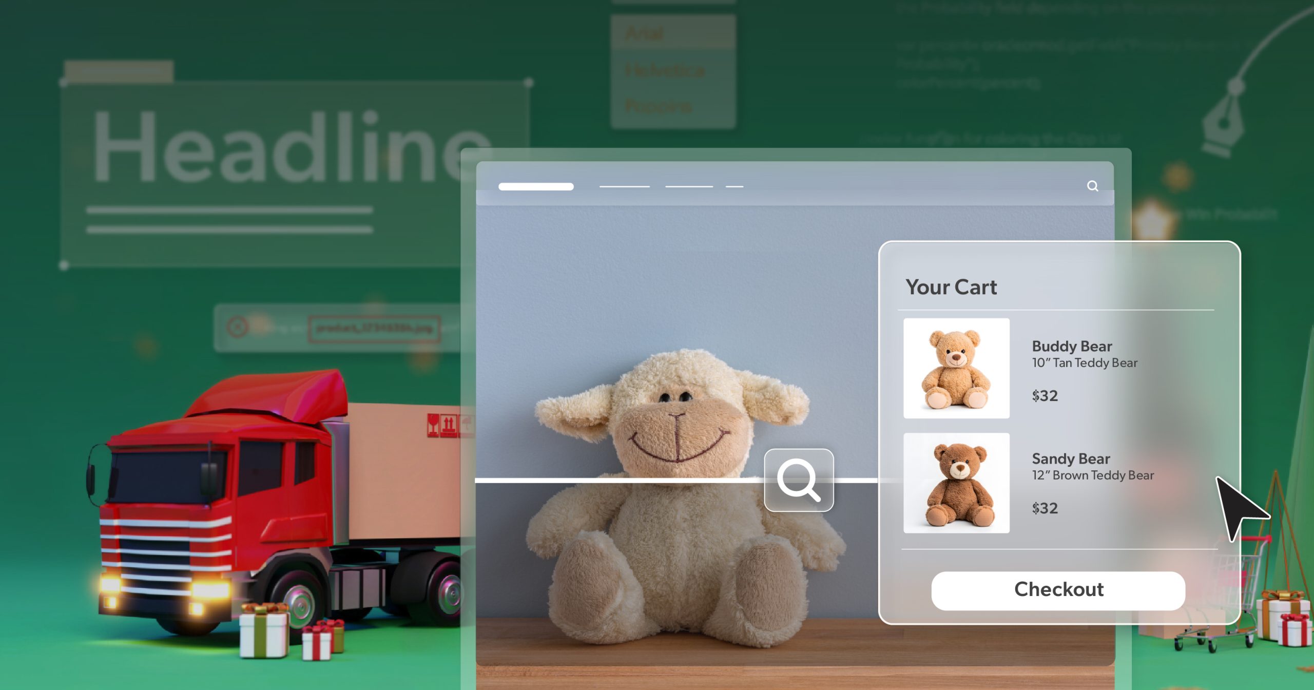
Redundant Product Views
Multiple images of the same item are common: front, back, side, or top-down shots. These angles help sighted users but can become repetitive when read aloud by screen readers.
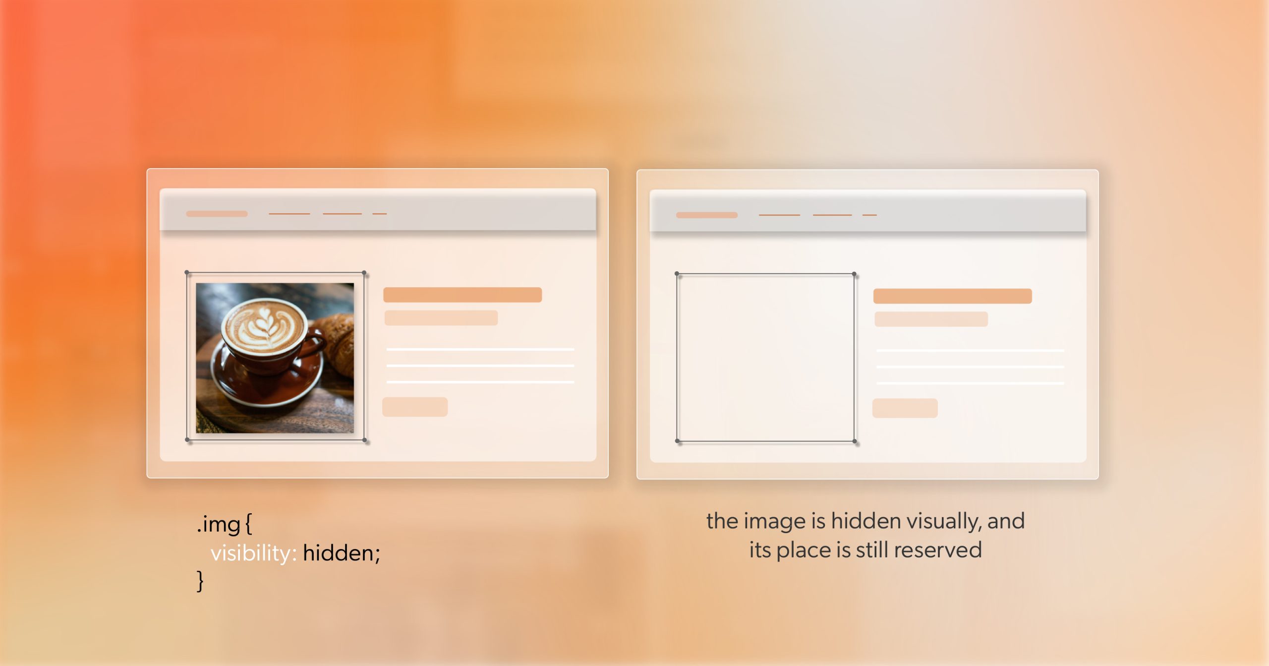
If each image shows the same product with no meaningful change, you can mark the duplicates as decorative with an empty alt attribute:
<img src="product-side.jpg" alt="">This signals assistive technologies to skip the image without disrupting the experience. Just ensure that at least one image—usually the primary product photo—has full, descriptive alt text.
Does Your Image Need Alt Text?
If an image adds context or new information that could influence a shopper’s decision, it must have its own alt text.
Ask: Would this image help someone understand or evaluate the product differently? If so, describe it.
Examples include:
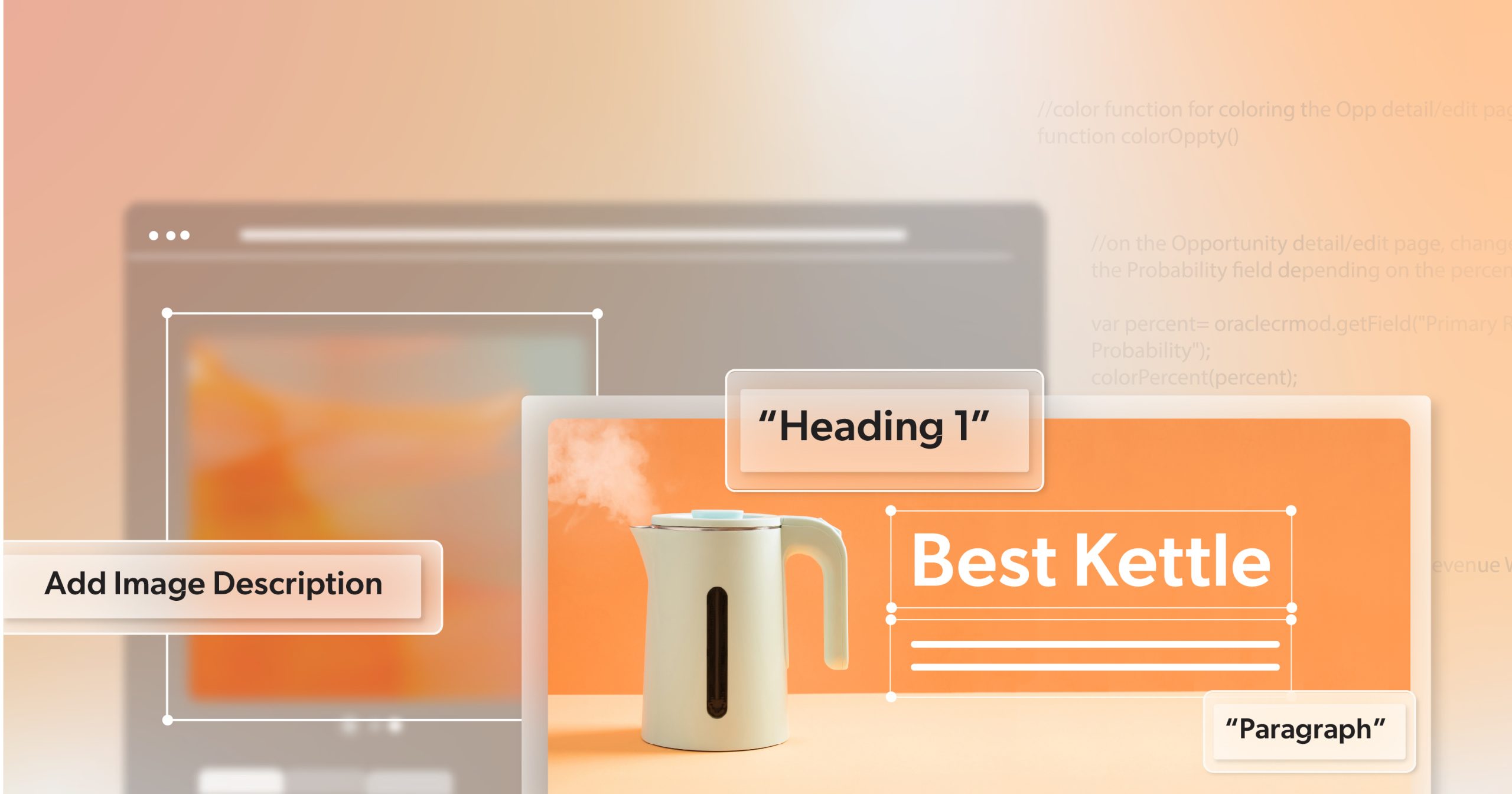
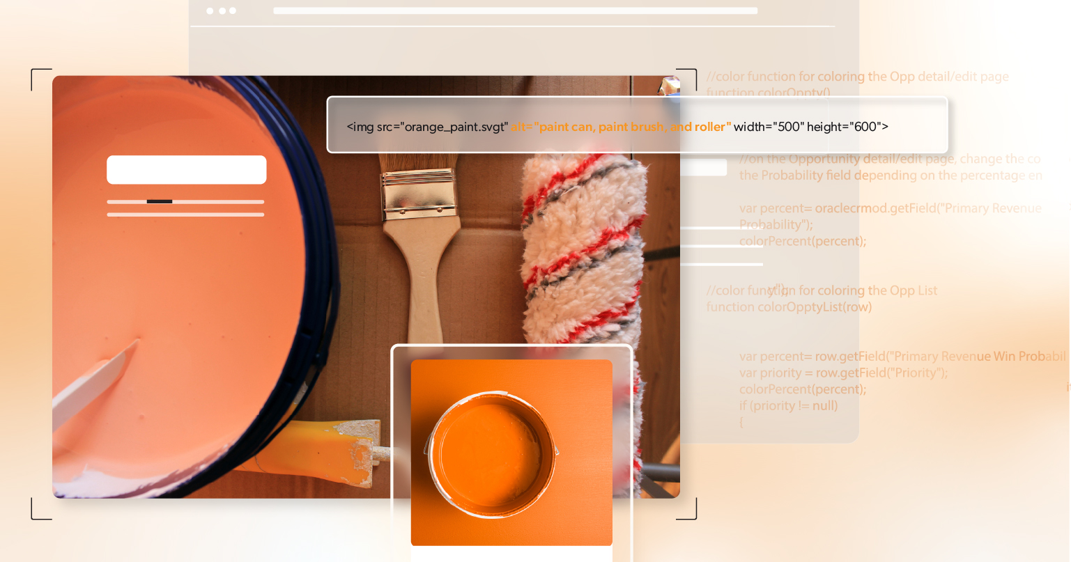
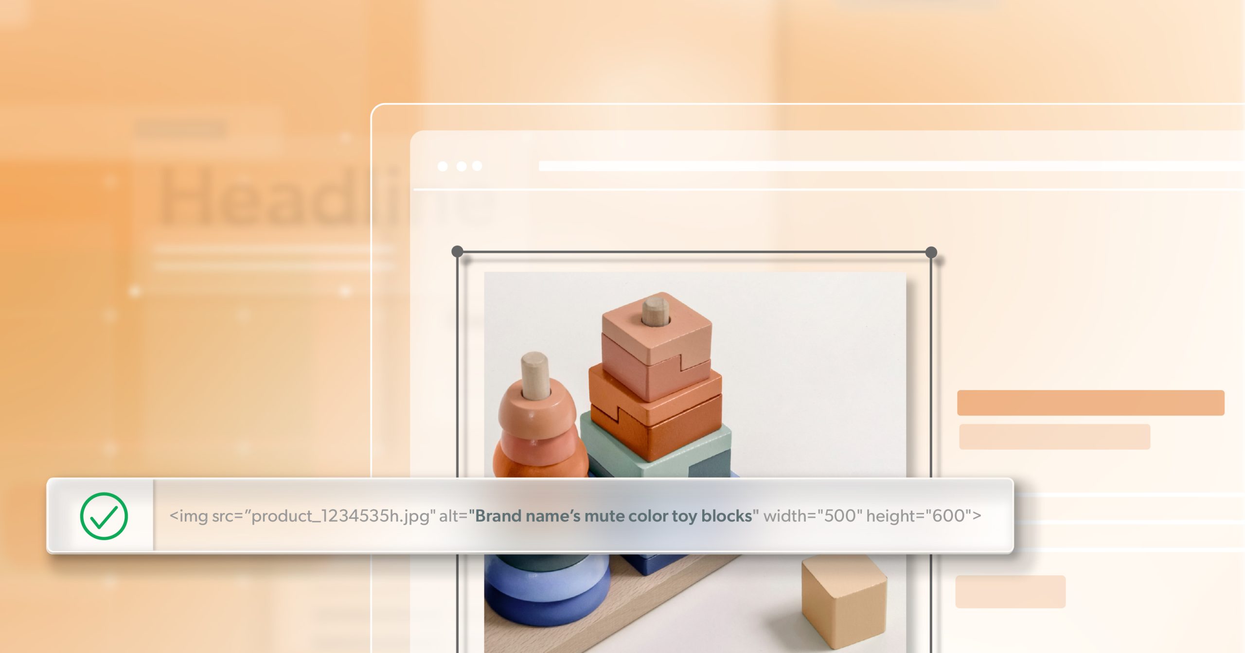
- Different colors or finishes:
“Red ceramic table lamp with linen shade” vs. “Blue ceramic table lamp with linen shade.”
Each variant should have distinct alt text. - Unique features or components:
If an image highlights stitching, a removable part, or a texture, mention it briefly. - Lifestyle or context photos:
When a photo shows the product in use—like a jacket being worn or a sofa in a living room—include that context to communicate scale and purpose. - Images with embedded information:
If an image includes text such as a sale banner, sizing chart, or label, that information must also appear in alt text or nearby HTML. Screen readers cannot interpret text embedded in images.
Writing Effective Alt Text
Good alt text is concise, factual, and written with purpose. It shouldn’t describe every detail—just what matters to understanding the product.
Best practices include:
- Keep descriptions under 125 characters when possible.
- Avoid phrases like “image of”—screen readers already announce it.
- Use specific, factual terms: “brushed,” “polished,” “textured,” “matte.”
- Mention what changes between images, such as angle or color.
- Adjust wording for context—a banner image may need different phrasing than a gallery thumbnail.
A consistent alt text style guide helps teams stay aligned, especially when managing large catalogs or working across departments.
2. Optimizing Product Media Formats for Accessibility
Accessibility also depends on clarity and performance. Large, slow-loading images can undermine user experience, particularly on mobile.
Use formats that balance quality and speed:
- WebP delivers high-quality visuals with efficient compression, improving load times.
- SVG is ideal for scalable graphics such as logos or icons, maintaining crispness on any screen size.
Fast, responsive images ensure your store remains usable across devices and assistive technologies alike.
3. Avoiding Text Embedded Within Images
If an image includes text—like promotional banners, product specs, or sale messages—screen readers can’t interpret it.
Keep all essential text in HTML or nearby captions.
If embedded text is unavoidable, repeat the information in the image’s alt text or elsewhere on the page so that it’s accessible to every shopper.
4. Maintaining Visual Clarity and Contrast
A clean, modern aesthetic is appealing—but not if it sacrifices visibility.
Low-contrast product photos (for instance, light gray items on a white background) can be difficult for users with low vision to see.
Maintain at least a 4.5:1 contrast ratio between the product and its background. Adding subtle shadows, reflections, or gradient overlays can improve visibility without compromising your design aesthetic.
5. Labeling Interactive Product Media
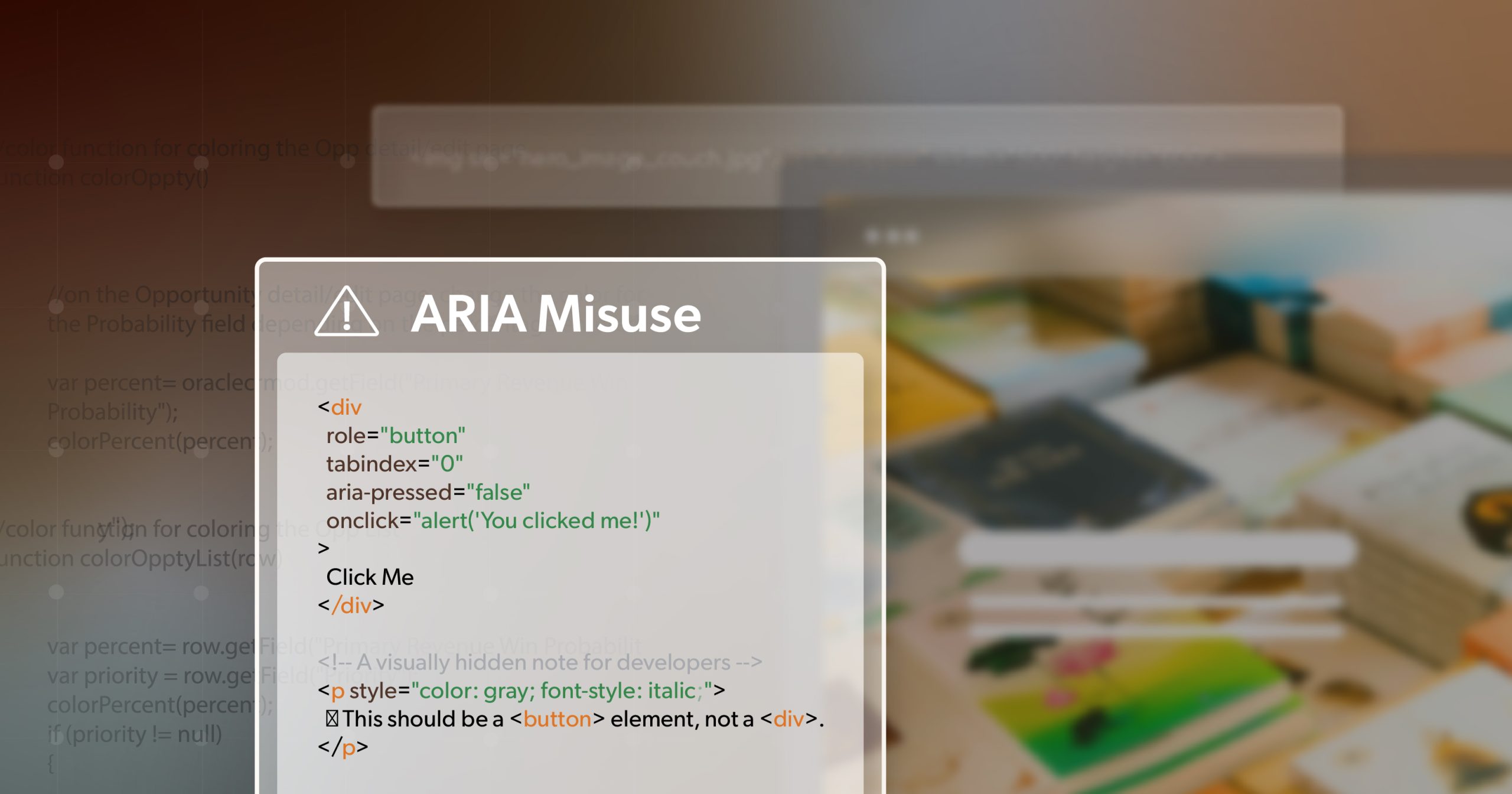
Any clickable image or icon—such as a “zoom” button, “add to cart” symbol, or “view gallery” thumbnail—should have an accessible name or aria-label.
Describe the action, not the appearance:
- “Zoom product image”
- “Add to cart”
- “Open gallery view”
These small details help users navigate your site predictably and confidently, no matter how they interact with it.
Testing Tools and Workflow Integration
Accessibility isn’t a one-time audit—it’s an ongoing habit built into your development process.
Automated tools:
- WAVE and Lighthouse in Chrome DevTools identifies barriers and improvement tips for each image.
Manual checks:
- Test your pages with NVDA, VoiceOver, or JAWS to hear how descriptions are announced.
- Disable images in your browser and ensure text alternatives still convey essential information.
Workflow tip: Integrate accessibility validation into CI/CD pipelines. Use pre-commit hooks or CMS checks to block uploads missing alt attributes. Over time, this normalizes accessibility as part of the build process—not an afterthought.
Product Media That Speaks to Every Shopper
Accessible product media is about more than compliance—it’s about communication. Every shopper, regardless of ability, deserves the same opportunity to understand your products clearly and confidently.
From writing meaningful alt text to maintaining contrast and responsive performance, accessibility transforms static visuals into tools that inform, guide, and convert. It strengthens trust and creates smoother experiences across every device and interaction.
When your product media works for everyone, your brand stands out for the right reasons: clarity, quality, and care.
If you’re ready to assess your current approach or bring accessibility into your creative workflow, schedule an ADA briefing with 216digital. We’ll help you turn accessibility from a checklist into a lasting standard for digital craftsmanship.