
Navigation menus sit at the heart of every website. They guide visitors, shape first impressions, and quietly influence how people experience your content. When they’re designed well, users glide through your site without a second thought. But when they’re not—especially for those using assistive technology—they can become invisible walls.
Here’s the encouraging part: most accessibility issues in navigation menus aren’t complicated bugs. They’re small implementation gaps—an unlabeled toggle, a missing focus state, or an overzealous ARIA role. Once you know what to look for, these problems are simple to fix. A few mindful adjustments can turn a confusing experience into one that feels natural and dependable for everyone.
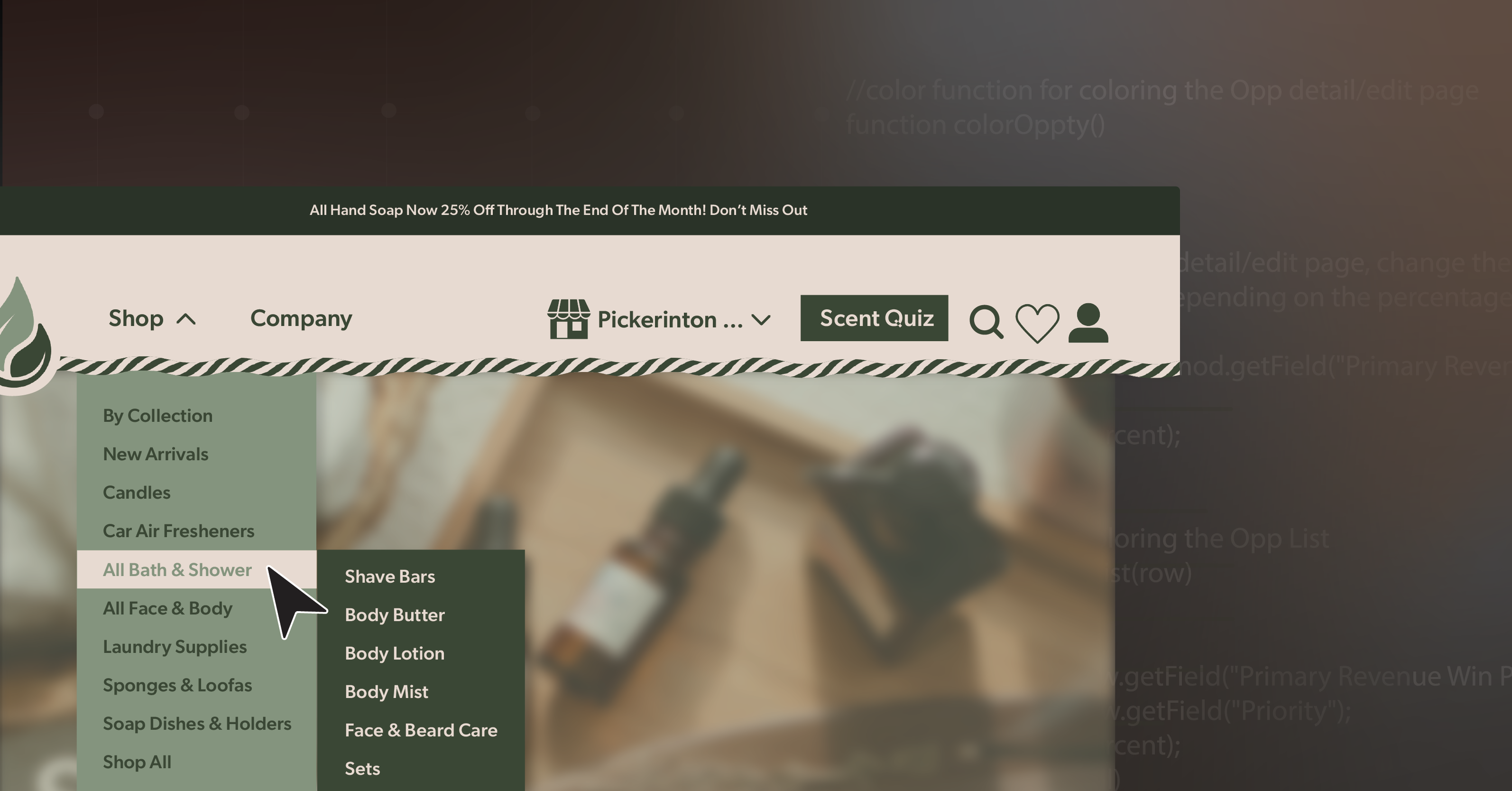
Let’s look at some of the most common pitfalls—and how to create navigation menus that are clear, responsive, and genuinely inclusive.
When Icons Don’t Tell the Whole Story
Hamburger and grid icons are practically universal now, but they often leave assistive technology users guessing. If the icon has no accessible label—or if it always says “Menu” even after opening—someone using a screen reader won’t know what just happened. They can open the menu but might never find their way to close it again.
A simple solution makes all the difference. Use a real <button> instead of a <div>, and include a label that changes dynamically:
<button aria-expanded="false" aria-controls="nav-menu" aria-label="Open main menu">
  <svg>...</svg>
</button>
When the menu opens, toggle both the aria-expanded value and the label text so it says “Close main menu.” Keep the visible and programmatic labels consistent, and test it with a screen reader—you should hear “collapsed” when closed and “expanded” when open. That small update transforms an ambiguous icon into an accessible, reliable control.
When ARIA Does More Harm Than Good
ARIA is powerful—but it’s easy to get carried away. Adding role="menu" or swapping links for clickable <div>s often seems helpful but can actually break keyboard navigation. What once felt intuitive suddenly becomes disorienting.
For most global navigation menus, semantic HTML is your best ally. Let the browser and assistive technology do the heavy lifting:
<nav aria-label="Main navigation">
  <ul>
    <li><a href="/shop">Shop</a></li>
    <li><a href="/about">About</a></li>
  </ul>
</nav>
Reserve ARIA menu roles for true application-style widgets—not your site’s primary navigation. And if you’re stacking attributes like role, aria-expanded, and aria-owns on every element, take a step back. Clean markup almost always leads to cleaner accessibility.
When Submenus Don’t Communicate Clearly
Expandable submenus can streamline navigation beautifully—unless they leave users guessing what just changed. If the menu opens visually but nothing is announced, or if keyboard focus jumps unpredictably, it can feel like losing your place mid-sentence.
The fix is all about clear communication and focus management. Each expandable section should use a labeled <button> with aria-expanded and aria-controls. When the submenu opens, move focus into it; when it collapses, return focus to the button. Keep the tab order logical, steady, and consistent from top to bottom.
You don’t need fancy transitions or animations to make it feel polished. Reliable, predictable focus behavior builds confidence faster than any design flourish ever could.
When Focus Bleeds Through the Overlay
Full-screen or overlay-style navigation menus look modern, but without careful handling, they can trap or confuse users. If keyboard focus slips to content behind the overlay—or if pressing Escape does nothing—you’ve suddenly turned a convenience into a barrier.
To prevent that, treat your open menu as a modal. Use aria-modal="true" or temporarily set background elements to inert so they can’t receive focus. Keep keyboard focus inside the open menu, and when it closes, send focus back to the toggle button. Include Escape key support, for instance:
if (event.key === 'Escape') {
  closeMenu();
  toggleButton.focus();
}
This might seem small, but it’s the kind of polish that separates a functional menu from a professional one. Every interaction should have a clear start and finish—no guesswork required.
When Hover-Only Menus Leave Users Behind
Hover-only submenus often look sleek but behave unpredictably. Move your pointer a little too far, and the menu vanishes. Keyboard users can’t open them at all. WCAG flags this under guideline 1.4.13 (Content on Hover or Focus), and it’s one of the easiest ways to unintentionally exclude users.
The better pattern is to use buttons instead of hover triggers, so the same content can be opened with a click or a keypress. Add a slight delay before closing or a “grace zone” so menus don’t disappear the instant a cursor slips away. Support the Escape key for dismissal.
Improving hover behavior doesn’t just make your navigation menus more accessible—it creates a smoother, more forgiving experience for everyone, from stylus users to touchscreen visitors.
When Small Targets Cause Big Frustrations
Tiny icons and tightly packed links might look minimalist, but they’re not friendly to real-world use. On mobile screens—or for anyone with limited dexterity—they can turn simple navigation into a precision test.
Aim for tap targets that are at least 24×24 pixels, or use padding to achieve the same result. Stick to flexible units like em or rem so spacing adapts naturally to user settings. And always test your navigation menus at 320px width and 200% zoom. They should remain readable, functional, and scroll-free.
If you can comfortably use your site one-handed on your phone, chances are others can too.
When Users Can’t Find Their Bearings
Good wayfinding is subtle but essential. Without clear navigation landmarks or skip links, screen reader users can’t easily tell which menu they’re in—or how to bypass repeated links.
Make orientation effortless. Label every <nav> region descriptively:
<nav aria-label="Primary navigation">
<nav aria-label="Footer links">
Include a “Skip to main content” link that becomes visible on focus:
<a href="#main-content" class="skip-link">Skip to main content</a>Consistency matters just as much as code. Keep link names and order uniform across your site so users can build reliable patterns as they move from page to page.
Building Navigation That Truly Guides
Accessible navigation isn’t just about compliance—it’s about creating confidence. When every visitor, regardless of ability, can explore your site without hesitation, you’ve built something far more meaningful than a working menu—you’ve built trust.
Each small improvement—a descriptive label, a focus fix, a skip link—adds up to an experience that feels intentional and human. Accessibility isn’t about limitation; it’s about refinement.
If you’d like an expert review of your site’s navigation structure—or want to chart a practical roadmap toward WCAG compliance—schedule an ADA briefing with 216digital. We’ll help you evaluate your navigation menus, identify quick wins, and design sustainable improvements that keep accessibility woven into every future update.