
Mobile accessibility isn’t just about conforming to WCAG guidelines. With most users browsing on phones and tablets, it’s essential that your designs scale, respond, and support every interaction with ease. For teams building interactive components like tabs, modals, and accordions, mobile behavior and overall mobile accessibility are just as important as how things look on a large desktop screen.
Even small design and coding choices — like touch target sizing, color contrast, or label structure — can make the difference between a smooth, intuitive experience and a frustrating one. In this article, we’ll walk through practical ways to fold accessibility into your everyday workflow so every tap, scroll, and swipe feels natural, predictable, and inclusive.
Start with a Solid Responsive Framework
Use Flexible Layout and Relative Units
Building accessibility starts with flexible design foundations. A responsive framework ensures that your layout, text, and controls adapt fluidly to any screen size or orientation. Strong responsive foundations are one of the easiest ways to improve mobile accessibility before you write a single line of JavaScript.
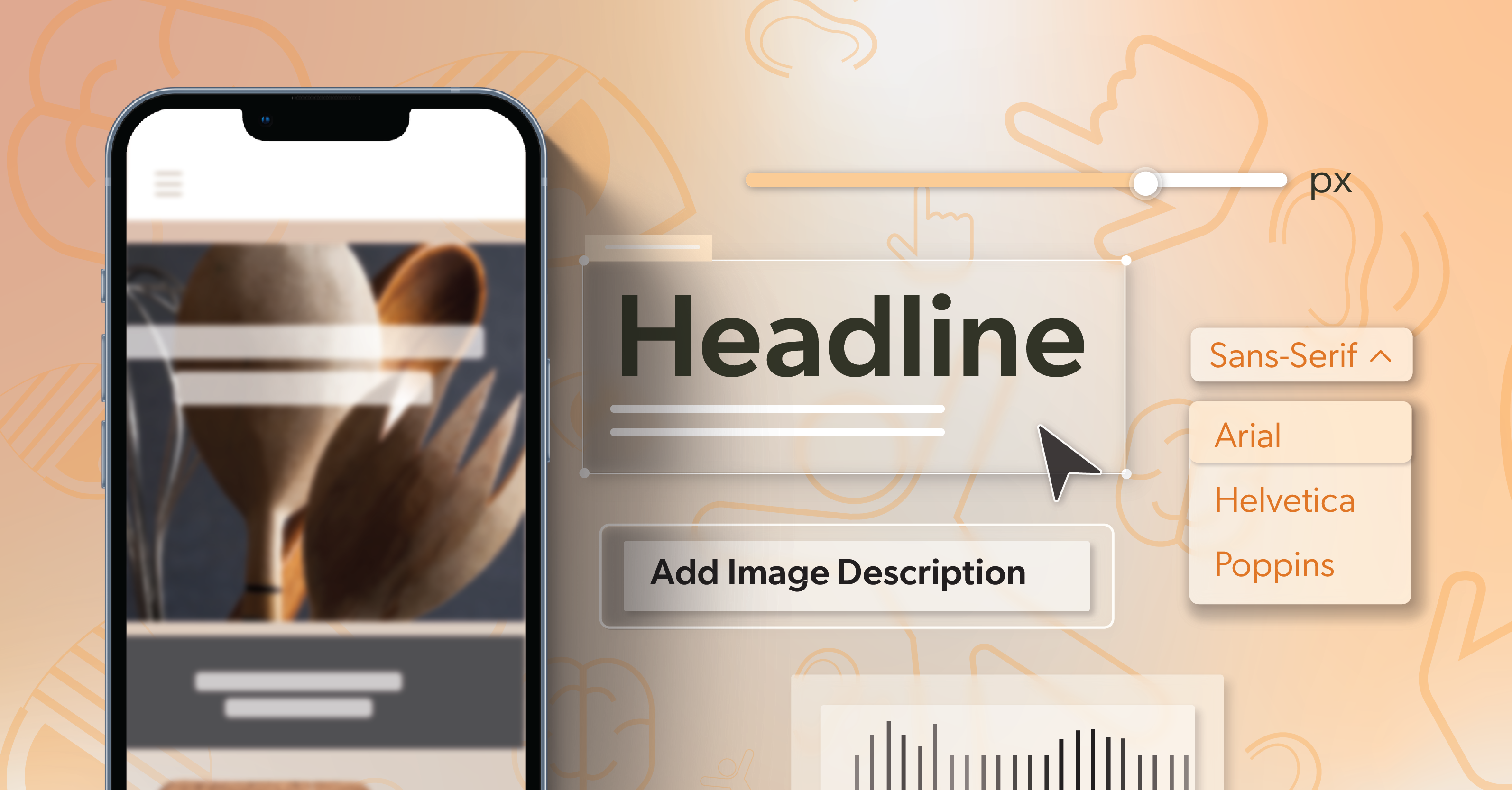
Use relative units like em, rem, %, or vw/vh instead of fixed pixel values. This allows text and elements to scale naturally when users zoom in or change device settings. Avoid rigid containers that break under different resolutions — instead, rely on CSS Grid or Flexbox to help content reflow cleanly.
Set the Viewport and Respect Zoom
Always set your viewport meta tag correctly. Add:
<meta name=”viewport” content=”width=device-width, initial-scale=1″>
This ensures your content fits the screen properly while allowing users to zoom. Never disable user scaling — it’s essential for users with low vision who need to enlarge content.
Test Orientation Changes Early
As your layout takes shape, test orientation changes early. Rotate your device between portrait and landscape to catch:
- Broken layouts
- Cropped images
- Misplaced or partially hidden buttons
Fixing these issues early in the process is far easier than patching them close to launch.
Use Responsive Testing Tools
Finally, make full use of your testing tools. Browser DevTools, responsive modes in Chrome and Edge, and cross-device testing platforms like BrowserStack can help confirm that your site behaves predictably across a range of screens and devices, not just your test phone.
Make Touch Interaction Effortless
Design for Comfortable Tap Targets
Touch interaction is where mobile accessibility truly lives. If users struggle to tap, swipe, or input data, your design loses usability fast — especially in dense interface patterns like accordions and tab sets, where every tap needs to land reliably.
Keep these principles in mind:
- Size matters: Interactive targets should be at least 44x44px (about 7–10mm) — the recommended minimum to help prevent accidental taps.
- Give everything breathing room: Provide enough padding between buttons, links, and icons so people can tap comfortably without frustration.
Keep Gestures Simple and Discoverable
Avoid complex or multi-finger actions without alternatives. Not all users can perform pinch or long-press gestures, so offer single-tap controls or visible UI options that accomplish the same function.
Make Forms Clear and Supportive
When designing forms, think ease and clarity:
- Use tap-friendly toggles, switches, and radio buttons where possible — they’re easier to use than long text fields for many tasks.
- Support autofill so users don’t have to retype predictable information.
- Add clear labels, and use aria-describedby for inline help or error messages so users understand what’s needed without guessing.
Respect Reach and Alternate Inputs
- Think about reach: Frequent actions like “Next” or “Submit” should sit within the natural thumb zone — generally the middle to lower part of the screen.
- Plan for alternate inputs: Make sure your mobile experience is fully navigable using keyboards, styluses, and switch devices. A touch-friendly site should still work well for users who rely on other interaction methods.
When these patterns are in place, complex interactions — including accordions — feel lighter, more predictable, and less error-prone on small screens.
Use Relative Units for Scalable Text and Elements
Scalable typography is one of the simplest ways to improve readability and accessibility. Replacing absolute pixel values with relative units helps your design adapt to user zoom and different display settings.
A few practical habits:
- Favor relative units: Use rem, em, %, and vw/vh for type and spacing rather than fixed pixel values.
- Test at 200% zoom: Zoom your interface to 200%. Text should remain readable, and your layout should stay intact. If it doesn’t, adjust spacing, line height, or font scaling strategies.
- Lean on fluid type: Adopt fluid typography using modern CSS. The clamp() function lets type scale gracefully across screen sizes:
font-size: clamp(1rem, 2vw + 0.5rem, 1.5rem); - Avoid fixed positioning for essential content: Pop-ups, modals, or sticky elements should reflow naturally instead of overlapping or disappearing when users zoom or rotate their device.
When text and key UI elements can scale without breaking the layout, more people can comfortably read and interact with your content — regardless of their device or settings.
Build Consistency Into Layout and Navigation
A predictable interface builds user confidence. When navigation, buttons, forms, and interactive patterns like accordions behave consistently, users can move through your app or site with less cognitive load and fewer surprises.
To support that predictability:
- Use semantic HTML to describe structure: Elements like <header>, <nav>, <main>, and <footer> help screen readers and assistive technologies understand your page organization automatically.
- Label icons and actions clearly: If a button uses only an icon, include a descriptive aria-label so its purpose is announced reliably.
- Keep the order and flow logical: Consistent menu placement and button order reduce the learning curve and make navigation easier for everyone.
- Standardize components: Consider building a shared design system or component library. When your buttons, forms, modals, and accordions are built with accessibility baked in, those best practices carry forward across every project and release and directly support stronger mobile accessibility in your product.
Consistency is what turns individual accessibility improvements into a cohesive, trustworthy experience across your entire product.
Refine Color Contrast and Visual Hierarchy
Meet Contrast Ratios for Text and UI
Color plays a big role in mobile readability. Good contrast ensures visibility across different lighting conditions and for users with color vision deficiencies.
Follow the WCAG contrast standards:
- 4.5:1 for normal text
- 3:1 for large text and UI components
- 3:1 minimum for icons, borders, and input outlines
Beyond ratios, test your designs under real-world lighting:
- Bright sunlight
- Dim rooms
- Dark mode
Mobile users interact in unpredictable environments, and contrast that looks great on your monitor may fail in the field.
Use More Than Color to Convey Meaning
- Don’t rely on color alone. Combine color with icons, text, or patterns — for example, pair error messages with red outlines and clear, descriptive text.
- Use hierarchy to guide attention. Thoughtful spacing, font weight, and color contrast help users quickly understand relationships between elements and scan content without extra effort.
Tools like Stark, WebAIM’s Contrast Checker, or built-in accessibility plugins in Figma and Sketch can help you validate your palette before development begins, so you’re not chasing contrast issues late in the cycle.
Provide Strong Text Alternatives
Every image, icon, and multimedia element needs a meaningful text alternative. This is foundational work that has a direct impact on how usable your experience is with assistive technology.
Good practices include:
- Alt text with purpose: Use alt text that describes the content or function of an image. If it’s purely decorative, leave the alt attribute empty so screen readers can skip it.
- Captions and transcripts for multimedia: Even short video clips benefit from lightweight subtitles or transcripts, especially for users in noisy or very quiet environments.
- Name icon-only controls: If your app relies on icons alone, use aria-label or aria-labelledby attributes so each control can be understood by assistive technology.
For expanding sections and other interactive disclosures, accuracy and clarity matter:
- Ensure expanded/collapsed states are exposed to assistive tech.
- Make sure focus moves in a way that feels intuitive for screen reader and keyboard users.
- Confirm that each trigger or header clearly describes the content it reveals.
Validate with Screen Readers
Before launch, run a screen reader check using VoiceOver (iOS) or TalkBack (Android). Listen to how your app is announced — are the labels clear, logical, and concise? If not, revise until the experience feels straightforward and reliable.
Strong text alternatives and well-labeled controls are some of the most important building blocks of mobile accessibility, especially for users who rely on screen readers to navigate touch screens.
Integrate Accessibility Into the Development Process
Start Accessibility Reviews Early
The most sustainable way to maintain accessibility is to make it part of your normal workflow, not an afterthought.
Start early:
- Evaluate accessibility during wireframes or prototypes, not only after development.
- Validate color contrast, layout flow, and focus order while the structure is still flexible — including how components behave for users who depend on assistive tech.
Add Accessibility Checks to Your Pipeline
Automate where it makes sense:
- Use tools like WAVE or Lighthouse in your CI/CD pipeline to catch common accessibility issues before code review.
- Treat failures as signals to improve your shared components and patterns, rather than one-off fixes.
Balance Automation with Manual Testing
But don’t rely on automation alone:
- Automation can’t replicate real user interactions.
- Test with screen readers, high-contrast settings, and keyboard-only navigation.
- Include scenarios that specifically cover key mobile flows — forms, navigation menus, and high-traffic interactive components — alongside other critical interactions.
Make Accessibility a Shared Responsibility
Remember, accessibility is a team effort. Designers, developers, and QA testers should all share visibility into accessibility requirements and results, and understand how their work affects users with disabilities.
Finally, document and iterate:
- Keep a living accessibility checklist for your team.
- Note what worked, what failed, and what needs refinement in future sprints so patterns like menus, dialogs, and other interactive components continue to improve and reinforce mobile accessibility over time.
Keep Improving — and Get Expert Support When You Need It
Accessibility isn’t a finish line. It evolves with new technologies, operating systems, and user expectations. Revisit your mobile experience regularly, especially after framework, library, or OS updates.
Make a habit of:
- Gathering real-world user feedback, especially from people who rely on assistive technology.
- Comparing that feedback with automated test results to uncover gaps that tools miss.
- Continuing to test, train, and refine your approach so accessibility remains second nature for your entire team.
Partner with Experts When It Matters
If you’re ready to strengthen your mobile accessibility strategy and build experiences that feel natural across screen sizes and devices, schedule an ADA briefing with 216digital. Our team helps you identify hidden barriers, streamline your workflow, and build digital experiences that stay inclusive across every screen size.