
Every interface makes choices about what to show and what to leave unseen. Most of the time, that’s about layout or aesthetics—but it’s also about communication.
For users who rely on assistive technologies, much of that communication happens through structure, labels, and semantic relationships. When visual clarity comes at the cost of semantic clarity, accessibility starts to break down. A clean UI is great, but clarity for assistive technologies is non-negotiable. When we drop visible text in favor of icons or compact layouts, we still owe users the same meaning.
A practical answer is visually hidden content. It’s a technique for keeping information available to assistive tech—screen readers, braille displays, voice navigation—while keeping it out of visual view. Done well, it bridges the gap between a clean interface and a complete experience.
You’ve seen it everywhere:
- A magnifying glass icon that announces “Search.”
- A “Read more” link that includes the article title.
- A skip navigation link that quietly appears when tabbed into.
Each example keeps the design clean while preserving meaning for users who don’t navigate visually. It’s not a trick—it’s thoughtful design expressed through code.
When Hiding Breaks Accessibility
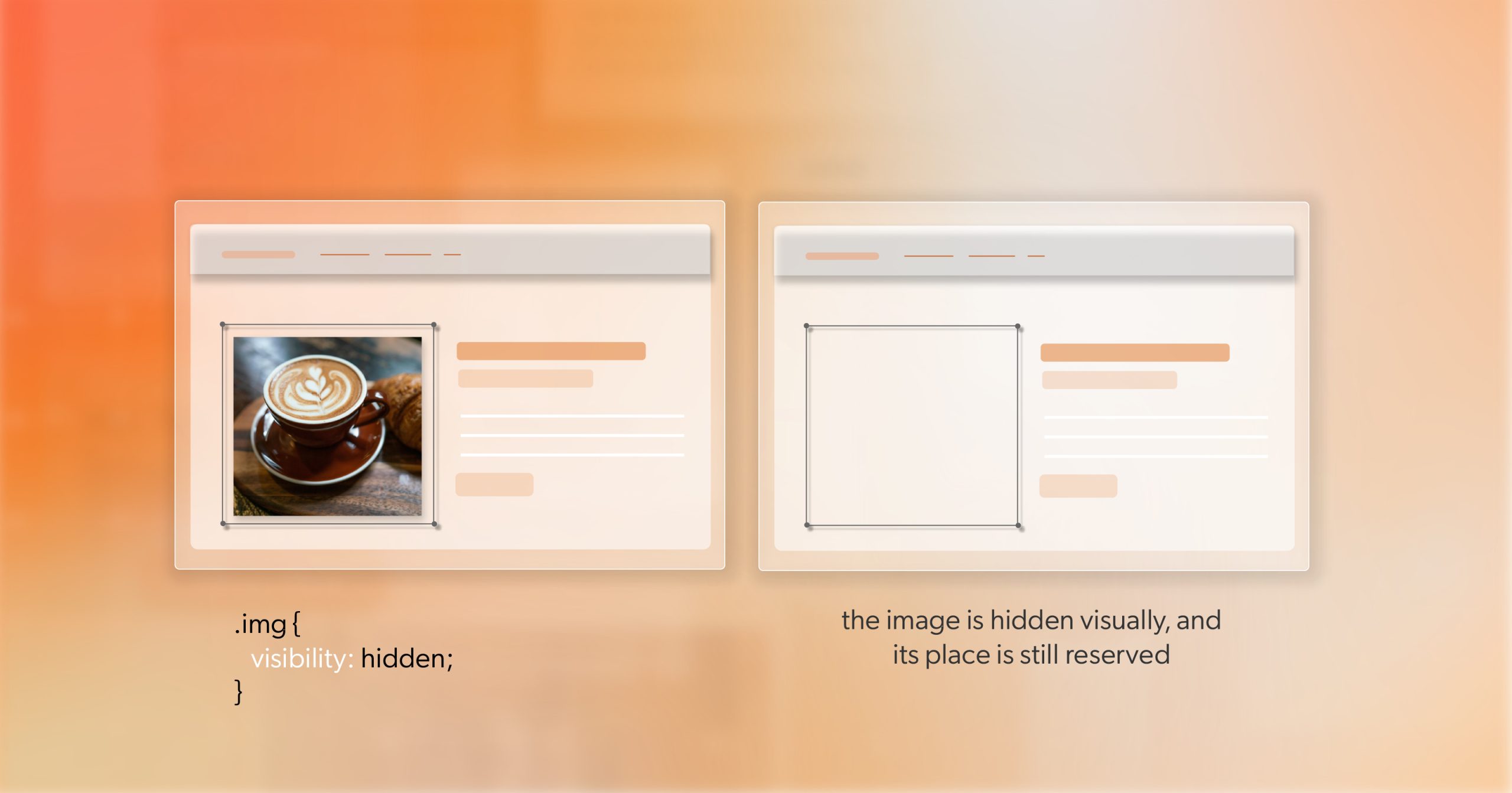
It’s tempting to reach for display: none or visibility: hidden. Both make an element disappear—but they also remove it from the accessibility tree. To a screen reader, that content no longer exists.
The same problem appears in older workarounds—moving elements off-screen with huge negative positioning or marking the wrong element with aria-hidden="true". They achieve visual cleanliness but erase meaning for assistive tools.
If the accessibility tree is a map of what users can explore, those declarations tear off a corner of it. The HTML remains, but users can’t reach it.
When something needs to be read, referenced, or focused, it must stay in the tree. The goal isn’t to hide it from everyone—it’s to make it visually invisible while still programmatically present.
A Modern, Reliable Pattern for Visually Hidden Content
Most modern teams rely on a single, standardized utility for this purpose. It’s simple, maintainable, and works across browsers and devices:
.visually-hidden {
  border: 0;
  clip-path: inset(50%);
  height: 1px;
  margin: 0;
  overflow: hidden;
  position: absolute;
  white-space: nowrap;
  width: 1px;
}
Each property plays a specific role:
clip-path: inset(50%)hides the visible area.position: absoluteremoves it from the layout but not the accessibility tree.heightandwidthshrink it to an imperceptible size.overflow: hiddenensures no text leaks visually.white-space: nowrapprevents wrapping or accidental exposure.
This approach replaced older hacks like clip: rect() or sending text off-screen with left: -9999px;. Those caused issues for magnifiers and high-zoom environments. The clip-path pattern is clean, modern, and predictable.
Use it with intention. Adding visually hidden content everywhere can overwhelm screen reader users. The best implementations give context—not clutter.
Making Focusable Elements Work for Everyone
Skip links, “Back to top” anchors, and similar utilities need to stay hidden until they’re actually used. If you apply .visually-hidden directly, keyboard users can focus the link but won’t see it—an invisible focus trap.
The solution is a focusable variant:
.visually-hidden-focusable:not(:focus):not(:active) {
  border: 0;
  clip-path: inset(50%);
  height: 1px;
  margin: 0;
  overflow: hidden;
  position: absolute;
  white-space: nowrap;
  width: 1px;
}
This keeps the element hidden until it receives focus. Once active, it becomes visible—making skip links discoverable without cluttering the design.
A few practical habits:
- Always provide a visible focus outline and clear contrast.
- Keep the revealed link’s position consistent (usually top-left).
- Use short, direct text—users should immediately understand its purpose.
This small adjustment is what makes keyboard navigation intuitive, discoverable, and consistent across accessible websites.
Visually Hidden or ARIA? Understanding the Difference
Developers sometimes treat these tools as interchangeable. They’re not; they work at different layers.
Use visually hidden content when you need real, localizable text in the DOM—context for links, helper hints, or dynamic status messages that assistive technologies should read naturally.
Use ARIA when you’re labeling or describing elements that are already visible:
aria-labeladds a brief text label.aria-labelledbypoints to a visible label.aria-describedbylinks to explanatory text or error messages.- Live regions (
role="status") announce dynamic changes.
Often, the best solution combines both. A decorative SVG can be marked aria-hidden="true", while a hidden text label provides a proper name. A form field can have a visible label and connect to hidden guidance via aria-describedby.
Knowing when to use which—sometimes both—is what turns compliance into genuine usability.
Writing Hidden Text That Adds Value
Hidden text should earn its place. It’s part of the user experience and deserves the same editorial care as visible copy.
A few best practices:
- Add what’s missing visually—don’t repeat what’s obvious.
- Keep it short and natural; users will hear it read aloud.
- Avoid filler or redundancy—screen readers already announce role and state.
- Localize it so it fits each supported language context.
When written thoughtfully, visually hidden content enhances understanding without adding noise. The best examples are invisible to some, indispensable to others.
Testing What You Can’t See
Accessibility isn’t a box to tick—it’s a conversation between your design and your users. Testing is where that conversation becomes real.
Here’s how to validate your implementation:
- Keyboard: Tab through the page. Ensure focus moves logically and stays visible.
- Screen readers: Use NVDA, VoiceOver, or JAWS to confirm that hidden text reads in context.
- Accessibility tree: Check DevTools to make sure hidden content remains part of the structure.
- Zoom and magnification: Scale up to 200% and confirm no visual artifacts appear.
Automation can’t tell you whether your content makes sense—but a quick, human pass will.
From Utility to System
Once you’ve validated your approach, make it part of your toolkit.
- Include
.visually-hiddenand.visually-hidden-focusablein your design system. - Document their purpose, examples, and edge cases.
- Encourage teammates to review hidden content with the same care as visible UI text.
Frameworks like Tailwind’s sr-only class use this exact foundation. Aligning with established patterns makes your code predictable and your accessibility practices easier to scale.
This is how visually hidden content becomes part of your craft—not just a snippet you copy-paste.
The Invisible Work That Shapes Experience
A few quiet lines of CSS can completely change how people experience your site. Visually hidden content doesn’t alter what most users see, but it transforms what others can access, understand, and trust.
That’s what accessibility is really about—creating clarity that transcends sight. And that’s what good front-end work does at its best: it makes meaning visible, even when the code itself is unseen.
If you’re working through accessibility fixes or want a second set of eyes on remediation, consider scheduling an ADA briefing with 216digital. It’s a focused, collaborative session designed to help you identify barriers, prioritize what matters most, and move confidently toward compliance.