
MrTakeOutBag: Responsive Website Design
Total Makeover from Old School to Responsive State-of-the-Art Store
Jeff’s Problem: A Website on the Back Edge of Web Evolution
In the summer of 2014, Jeff Holmes, the President of MrTakeOutBags.com, came to us looking to embark on an extensive redesign of his company’s website. Jeff had been a 216digital client for many years, but now he was looking to take his online store to the next level. In almost ten years online, the MrTakeOutBags site had seen just one revision. It was a static design that didn’t emphasize custom products. It also made checkout difficult and counterintuitive. After an extensive site analysis, we crafted a solution for Jeff that would vastly improve site functionality and customer experience.
Jeff had seen a dramatic rise in mobile traffic on MrTakeOutBags over the last few years. However, his mobile conversion rate was stagnant. Mobile users were hitting his site, but they weren’t hitting the checkout button. Clearly, a mobile-friendly shopping experience was critical to the growth of Jeff’s business.
How Important is Mobile? Absolutely Critical.
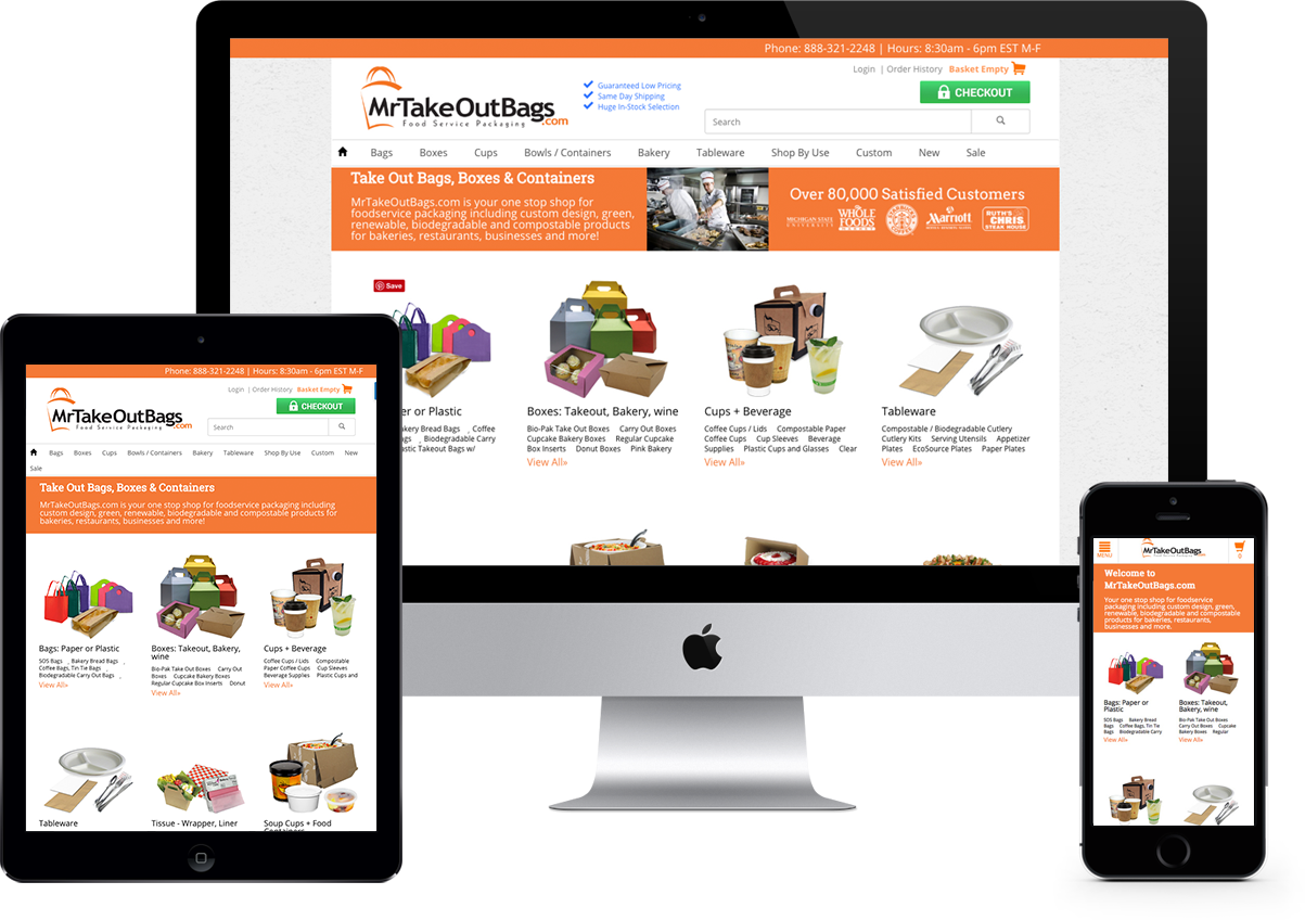
If you’re new to the webmaster game, take note: a mobile-responsive site, or “responsive site” for short, responds to the different screen resolutions of tablet and mobile devices and adjusts its display accordingly. This is the next wave of web design and web reading. Any webmaster who wants to stay up to date must consider how a site will look on mobile.
On the left, you can see how the old design looked on a typical smartphone screen. The category links are far too small for finger navigation. In fact, they’re almost too small to read. Worse, half the site is cut off on the right. This forces the visitor to scroll all around the page. On the right, you can see how the responsive design scales perfectly to fit a mobile screen. The entire width of the page appears, with no need for scrolling. The result is easier to read, and the category links are far enough apart to allow easy touch selection.
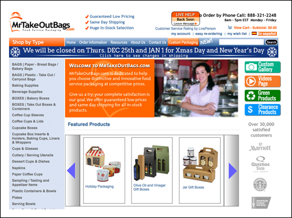
MrTakeOutBags.com in the summer of 2014, before we began the redesign process.
Great Results on Mobile AND Desktop
So far, the redesign has made an incredible difference—much of it due to the incredible functionality and responsiveness of the Miva platform. Since the launch, MrTakeOutBags has seen a 47 percent increase in customer conversion on mobile devices—and customers are weighing in with their opinions. “I like the new process and page improvements,” says Cara V. in a verified online review.
The new navigation structure on the homepage isn’t just for mobile users, though. Desktop users are also seeing an incredible improvement in ease of use. With the old tree of category links, finding the product category you wanted was difficult. Worse, the only products you could see on the home page were in two carousels displaying only four products at a time.
Thanks to Miva, the new navigation structure fixes this problem. It places the most important categories front and center, each with a descriptive picture. The navigation guides user attention to the bestsellers and the most popular items, giving a clear call-to-action. The home page is less cluttered, with important but distracting details moved to more appropriate places.
“Since the launch, MrTakeOutBags has seen a 47 percent increase in customer conversion on mobile devices.”
With this restructuring of priorities, the new site shows the customer more of what they need right now. The new design features clear pictures for each category type and simple navigation to subtypes, guiding customers to more and more specialized pages. All of these changes add up to a product selection process that is easier and more intuitive.A Streamlined Custom Ordering Process
Jeff specifically asked us to streamline the user experience of ordering custom printed packaging products. He’d always offered custom printing options through BABCOR packaging, but the process of ordering them through MrTakeOutBags was clunky at best. Jeff’s customers love the professional look that custom packaging provides, and from a revenue perspective, these custom-printed products had always performed well for MrTakeOutBags. The larger minimums and personalized process created lasting relationships between Jeff and his customers, and he wanted to maintain this as well as give it everything it needed to grow. Clearly, a streamlined solution to custom ordering was critical to the redesign.
“MrTakeOutBags received more than double the number of custom printing leads from the previous full month.”
We listened to Jeff’s concerns and began designing a solution. We improved visibility of the revamped custom services section by placing references inside the welcome banner at the top of the home page along with trust-marks from prominent customers. Then we placed a large banner below the category links to capture any customers that scrolled all the way through. Then, for each customization-eligible product in their catalog, we added a call-to-action right next to the Add To Cart button that takes the customer directly to the order options form. Now, once customers find the items they want, they can begin the customization process right away. Before the redesign, customers had to find the item they wanted, then find it again inside the Custom Product category. The change blew Jeff’s mind. In the first two weeks after the redesign launch, MrTakeOutBags received more than double the number of custom printing leads from the previous full month.
An Invisible Friend That’s Not Imaginary: Smart Search
Some pieces of the usability equation are visible to customers. Some are invisible. A smart search tool is one of these critical invisible aspects. We partnered with an incredible smart search solution called SearchSpring that’s far more robust than the basic search that comes packaged with Miva. SearchSpring can integrate individual customer behavior into its search, returning results that are tailored to that particular customer. The tool also lets customers take advantage of a huge range of facet filtering within the results page. Search on MrTakeOutBags now includes autocomplete, filtering options, and average customer ratings for products displayed.
As we communicated about the redesign, Jeff made it clear he wanted to reduce shopping cart abandonment. We had a solution. We built a new checkout process using intuitive radio buttons for payment and shipping methods.
 We also reduced the overall number of clicks to complete an order. Per Jeff’s wishes, we even made it possible to checkout without first creating an account. The new checkout process has gone a long way to reducing cart abandonment and has increased overall customer conversion by 22 percent.
The Big Picture: A Great Success
Jeff made it clear that he wanted the new MrTakeOutBags.com to satisfy every customer, no matter what device they used to access the store. We listened to Jeff’s concerns and matched them with solutions tailored to the needs of his business. Jeff’s catalog is extensive, with numerous custom options.
“Going into this project, we had significant confidence you guys could do the job, and you did it.”
The team at 216digital created a solution that makes Jeff’s catalog more available to every type of user. Jeff has already seen a tremendous difference in his bottom line. His customer service representatives have noticed a significant ease in navigating the site while helping customers on the phone.
Jeff told us, “Going into this project, we had significant confidence you guys could do the job, and you did it.” That kind of praise from a longtime customer makes our day. We’re proud of the work we’ve done with Jeff and his team at MrTakeOutBags, and we look forward to partnering with them into the future as their business continues to grow.
What’s your situation? Don’t worry, no ecommerce catalog is too complex for a redesign at 216digital. Contact us today to discuss your unique online presence needs.