Those Conversion Rates Don’t Lie.
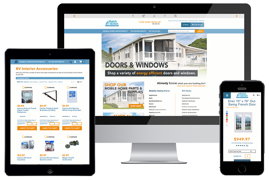
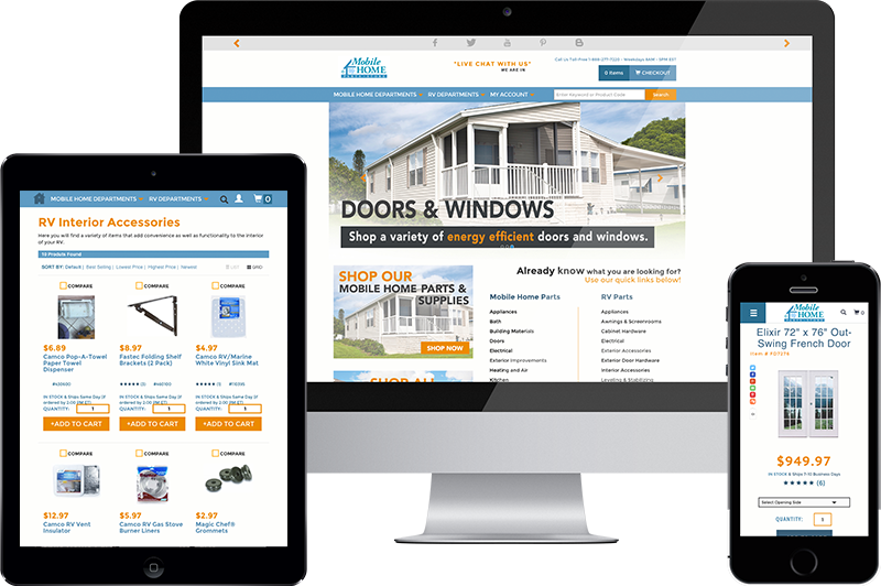
Yes. Yes, it will. Just ask our client, Mobile Home Parts Store. We built a new responsive ecommerce website for them, and mobile users said THANK YOU in a big way.
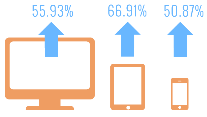
What does this mean? As of this writing, in the time since we launched the new Mobile Home Parts Store website, conversion rate on desktop is up 55.93% compared to the same period last year. It’s up 50.87% on mobile, and it’s skyrocketed 66.91% on tablet.
The first 5 days after the launch of the new site were incredible. Compared to those same 5 days last year, conversion rate on desktop was up 66.39%. The mobile conversion rate increased by 56.08%, and tablet conversions rose by a whopping 133.48%.
Mobile Home Parts Store has worked with 216digital since the late ‘90s. We manage every aspect of their online business–affiliate marketing, PPC, SEO, email, and text club messaging. In their time with us, they’ve seen their online business grow dramatically. Today, Mobile Home Parts Store is the online source for all things mobile home and RV.
“I wanted a responsive design. The majority of my traffic is coming from mobile. I wanted the site to look better on mobile and tablet.”
As web design trends have evolved, Mobile Home Parts Store has always recognized the need to stay current. They’ve gone through 3 different website designs. Their last site was highly functional and easy to use on a desktop computer. It communicated a cohesive brand. There was one problem: it just didn’t work on mobile, and a growing segment of Mobile Home Parts Store’s customers were shopping from their phones and tablets.
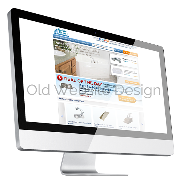
As owner Tim Peele put it, “I wanted a responsive design. The majority of my traffic is coming from mobile. I wanted the site to look better on mobile and tablet. Plus it was just time for a redesign. It was at least 5 years since the last one.”
Ecommerce stores come in all shapes and sizes. Some businesses sell only a few products and don’t need a lot of custom functionality. Others need a complex, full-blown ecommerce presence. Mobile Home Parts Store carries a large catalog of products, and they have many marketing and customer experience functions built into their site. Some of these functions were present on their old site, and we had to integrate them seamlessly into the responsive design. Some of these functions didn’t exist before, and we added them.
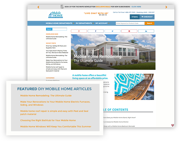
In a DIY niche like mobile home maintenance, content marketing is critical. There’s tons of hands-on knowledge to share! Customers see great value in detailed, accurate, in-depth guides to working on mobile homes. For Mobile Home Parts Store, this meant that their existing WordPress blog needed to transfer smoothly to the new mobile responsive website. Furthermore, the blog needed to be accessible. To facilitate this, we added an area called “Featured DIY Mobile Home Articles.” This area automatically displays links to the 5 latest blog posts. We integrated this fully into the Miva store.
We also integrated a text club signup modal. This function works off of cookies. On the fourth page view on the site, the modal will display to the customer, inviting them to sign up for text alerts about upcoming deals.
Since the text club is an opt-in service, it provides Mobile Home Parts Store with a powerful direct marketing opportunity for customers who really do want to get the deals and promotions.
We designed and built a slick slim header for Mobile Home Parts Store. On desktop and tablet, this header sticks to the top of the screen as customers scroll. That gives them easy access to search, navigation, checkout, and their account–but the header is slim enough that it doesn’t take up too much of the screen. That means more real estate dedicated to products.
For an ecommerce store, design decisions like this are critical to maximizing conversions. (Remember that cranked up conversion rate we mentioned at the beginning?) When customers come to shop, it’s crucial to create a balanced overall experience. For example, great content marketing actually counteracts business objectives if it gets in the way of selling the product on screen.
We undertake a deliberate, informed approach to every ecommerce store we design, and Mobile Home Parts Store was no exception.
For a big brand like Mobile Home Parts Store, a seamless customer experience is critical to success. At this point in the ecommerce game, customers assume they can save billing and shipping data as a returning customer. Having to enter this information for each new purchase can be an aggravating surprise. For Mobile Home Parts Store, we included an Authorize.net CIM integration. This function allows customers to save shipping profiles, billing profiles, and credit cards with total security—just as they would when ordering from Amazon.com, for example. This was a critical piece of functionality for the new store.
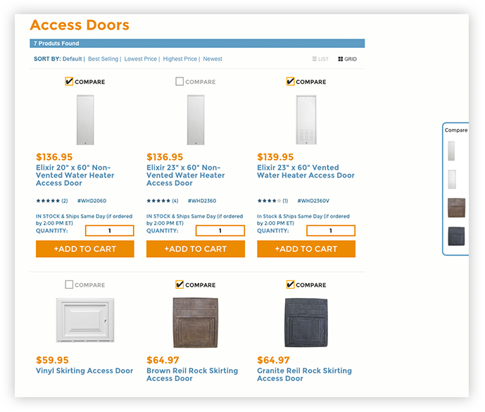
We also tackled the challenge of custom product comparison. We built a version of this function which allows customers to compare up to 4 products side-by-side, simultaneously. For a complex catalog like Mobile Home Parts Store, this function allows customers to compare many similar options and choose the one that’s perfect for their needs.
In addition, we built a Hello Bar at the top of the new responsive site. This area scrolls through custom marketing messages which the Mobile Home Parts Store team can create and publish themselves. In this bar, you’ll see an email newsletter signup prompt, links to social media accounts, and more. This bar is perfect for limited time sales and deals, and it’s seamlessly integrated into the overall brand experience on the site.
Conversion rates will always fluctuate somewhat over time, based on many factors. However, an upswing this big tied to the launch of a new website is a fairly obvious indicator of web success. We believe the data already point to a steady, sustainable growth in Mobile Home Parts Store’s business.
At 216digital, we don’t rely on hunches to decide if something is working. We dive deep into Google Analytics. But data alone isn’t enough to paint the picture; you have to know what that data means, and you have to communicate it to the client clearly and accurately. At 216digital, we practice total transparency with our clients. If a client doesn’t understand what’s going on with their digital marketing presence, we take the time to educate–and we use laymen’s terms whenever possible.
In the land of customer reviews, detailed opinions on web usability can be scarce. Customers generally focus on product, price, and service. An unsolicited comment about the website itself is something special. In the case of Mobile Home Parts Store, several customer reviews rolled in after the redesign–reviews which actually praised the new site!
At 216digital, we understand that every ecommerce store is different. We take time to analyze each client’s market, and we let that research inform every decision we make. In the case of Mobile Home Parts Store, we built a killer site that’s perfect for our client’s thriving business. Mobile Home Parts Store is doing better than ever, and that gives us great pride.
What about you? Whether you need a little WooCommerce customization or a full-blown custom Miva or Magento store, we deliver mobile responsive website design and development. Our clients’ success stories speak for themselves. If you’re ready to move forward with your vision, get in touch today. Let’s start talking about your next big thing.